
Please use aaronblythesktechbook.tubmlr.com/tagged/sketchbook/chrono to see the sketchbook in chronological order. Alternatively use the tabs to view each project indivualty.
Don't wanna be here? Send us removal request.
Statistics
We looked inside some of the posts by aaronblythesketchbookunit1-blog and here's what we found interesting.
Average Info
Notes Per Post
4
Likes Per Post
2
Reblog Per Post
2
Reply Per Post
0
Time Between Posts
6 days
Number of Posts By Type
Photo
16
Video
1
Last Seen Tumblr Blogs


Fun Fact
When “GIF” was named word of the year in 2012, Oxford Dictionaries U.S.A. credited Tumblr for pushing the word.
Photo
Wayne playing around with texture and the forms


aesthetic experiments continued
3 notes
·
View notes

Photo


For the pride poster decided to go with a teal riso inspired by outfits worn in the movie, the green in the welsh flag and the countryside where the film is set. This time we used the bars to cover the mouth of the main character in the image to reflect the censorship the film speaks out against.
1 note
·
View note
Video
tumblr
This is a compressed version of how the final two films would look together. The red and blue are a lot more vivid when it comes straight from Isadora to a projector but in order to record this on my blog I needed to screen record the outcome.
0 notes
Photo


If I had more time...
I’m very happy with the outcomes I’ve created for Split Cinema but I feel that the branding has got so much further it could go. I’d love to experiment with applying red and cyan to more elements of the cinema experience such as the settings, confections and tickets. I also came up with what could be a very effective campaign strategy, using two people sat next to each other with different reactions but watching the same film. This has a really nice nod to the Theatre masks and I think the imagery would really intrigue people.
0 notes
Photo


These were the final images I decided on for my portfolio shots. The images on the left are the unedited files and the right are my final post edited shots. Overall I’m very happy with the images and I think as a set the narrative explains how split cinema works.
0 notes
Photo


Once I had completed the glasses I went down to Corner House cinema to take some photos of the film and glasses insitue. I worked with a photographer to capture the atmosphere of a cinema without making it obvious that there were only two people watching the film.
0 notes
Photo


After I was happy with the final poster I began to work on creating the red and cyan glasses. I decided that I didn't have enough time to create the glasses to the quality I would have wanted, so instead I traced the pattern then hand cut the glasses which I intend to photoshop the lenses into in post.
0 notes
Photo

This is a scan in of my final poster, I think that without the glasses it looks great as the overprint created a really interesting mauve colour instead of the black. This poster is also the most successful print I have had when looking through the glasses as its had the least amount of ghosting.
0 notes
Photo


I made some final tweets to the type on the poster as when printed the gap from Split Cinema presents looked too big. After that I then continued to experiment with attempting to get the perfect colour for this poster to look great outside of the glasses and work well in the glasses. I ended up testing various different print techniques on the ink jet printers but I had problems recreating the same results as the printers weren't perfect. in the end I realised that instead of printing a overlaid photoshop file to get the right colour I needed to actually overprint the document.
0 notes
Photo


After printing my previous poster design I wasn't very happy with it so I approached Andy for some advice on the poster. He pointed out that the most important part of my poster was the imagery and I wasn't really allowing it to stand out as much as I could. After this I decided to let the image bleed off 3 sides at the bottom. I think this is much more successful and frames the image well. It also means that Im not trying to fill space anymore as I have reduced section for the info.
The printers did not do a very good job at all of recreating the image as the cyan is all wrong. The main issue with the cyan being wrong is that it actually doesn't work as well in glasses and it creates layer ghosting.
0 notes
Photo


I realised that until this point all of my poster designs had been on screen and I hadn't tested wether the cyan and red glasses work on prints. The imagery worked fairly well however the type and blue lenses had a lot of ghosting due to the poor quality of the cyan ink in the printers. I think that I may need to change the opacity of the cyan.
0 notes
Photo

These are some of the of the different concepts I had for the Split Cinema logo.
I started by trying to adapt my illustration from the Swifty workshop however I felt that it was just too different to the photographic elements which made up the majority of my poster. Next I tried to make the SC monogram into the shape of anaglyph glasses, this might have been appropriate for a different brand but it doesn't go with the imagery and posters I have been working with.
Ultimately I decided to go with a custom SC monogram in the circular typeface, I designed the C character from the curves of the S to create consistency between the two forms so that when they were overlaid they worked well together.
0 notes
Photo


For the logo I wanted something that had a clear nod to cinema but celebrated the unique overlay aesthetic of split cinema. The way that Bradbury Thompson overlays type is particularly interesting to me as I think i might go for a simple monogram as the posters are already quite image heavy so type would sit nicer along side it.
0 notes
Photo


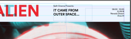
After extensive research into film posters, film festival identity and vhs and dvd covers I finally began working on the poster. I wanted to evoke a sense of classic cinema through my use of boarders and white space but challenge that aesthetic with a modern geometric sans serif typeface to target the youth this event is directed towards. The poster has gone through several different variations and I’m not entirely happy with how they are going. It feels as though I am filling space quite often so I may need to revisit and reconsider what information is going on the poster. These were just some initial tests to try out a few different styles but I definitely feel like its on its way to a final piece.
0 notes
Photo


For the poster design it was very important to me that I retain some of the style of classic cinema posters. I think my main nod to this style will be the use of a white boarder.
0 notes
Photo


throughout the project I have been collecting and gathering interesting visuals as well as terrible examples to inspire the design elements of this project. Even though I have moved away from B-movies specifically I noticed a lot of terrible mishmash design used. Im much more in to the clean visual style of the Jewish international film festival to visualise my two films. I also have been gathering appropriate content that works with duel imagery as well as overlay design. I think the simplistic overlay style on the Nike work and 2010 Shepely Bulfinch Summer Design piece could work really nice as abstracted large type like in the Odeon identity potentially masking or overlaid onto the compositions I created earlier.
0 notes