
Statistics
We looked inside some of the posts by abbbie-h and here's what we found interesting.
Average Info
Notes Per Post
1
Likes Per Post
1
Reblog Per Post
0
Reply Per Post
0
Time Between Posts
6 hours
Number of Posts By Type
Link
2
Text
1
Photo
11
Video
3
Last Seen Tumblr Blogs


Fun Fact
Tumblr was created by web developers David Karp and Marco Arment.
Text
Evaluation
This final major project has probably been one of the toughest but also one of the most enjoyable projects I have done at uni. (no shock there)
Initially I felt very out of my depth as I struggled to land on a solid idea to start this project, I think I had a bit of creative block which didn’t help so I was trying to force the ideas which wasn’t ideal. However I did eventually develop my idea so that I could move forward (if this project taught me anything its how to get out of creative block because that is not fun).
I wouldn’t say that corner shops was a huge passion of mine, however the themes & visual communication disciplines I explored through looking at corner shops reflected me well as a designer. I have been interested in photography for a while so it was rewarding to be able to experiment and gain more practice - I was actually really happy with the photos featured in the book! Looking at themes like vernacular & cultural relevance are things that I am really interested in so again it was good to be able to get immersed in them through the context of corner shops.
The actual design of the book took a while for me to develop a style I was happy with, although once I got it, I was really able to push the style and continually refine it. The research & experimentation phase was very important to this as it really brought out the style that I wanted. This project was a big one, I had 264 pages worth of content! The main problem to solve was how to design the book so that it really celebrates the content & didn’t feel repetitive. I think I achieved this by adopting a playful aesthetic throughout & using a bright colour palette to bring out the colours in the photography.
I am still very keen to print & bind my book to bring it to life, although because of the digital format for submission, I have been able to work with brighter colours than I would in print which I think has been beneficial to my project.
During this project I also worked back into my ISTD project to submit to Creative Conscience, I think this was very beneficial as I was able to push that project in ways that I hadn’t before, although I did struggle a bit to manage both projects it helped me to allow for different deadlines & I started to become a lot more focused in my time management to make sure I wasn’t forgetting about FMP. I think the card game feels a lot stronger now! Also something I hope to bring to life physically when we can!
This isn’t how I imagined to finish uni or my FMP but this has been one of my strongest projects I’ve done I think & I’m very happy with how my final book has turned out!
SEE YA AUB XX
0 notes
Photo


spreads in a flat image // mockup
The green might be a bit too strong but i think showing the spreads in this way could be really helpful as i have a lot!
will continue to add to these after submission for my website maybe
0 notes
Photo

updated learning agreement
not many changes but just altered the last paragraph so that it reflects my body of work - ‘an editorially designed book, showcasing my findings and photography.’
0 notes
Photo

business cards
using the same design that i managed to print & make physically at uni! really liked how they turned out and i think it reflects me pretty well
0 notes
Link
using issuu to host my book digitally until I can print & make it !!
issuu felt like the most relevant way for my to digitally display my book for now, it retains the quality well & is very easily shareable however the free version does not let you embed the project :( but i think it will do for now as I am keen to print & bind this book once it is possible
0 notes
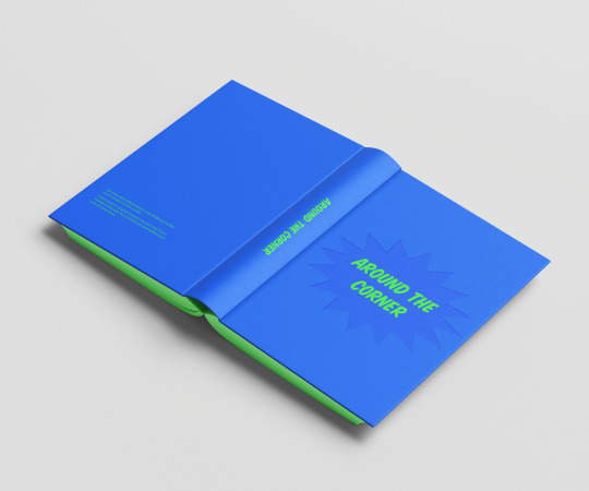


Photo

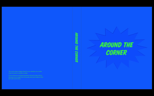
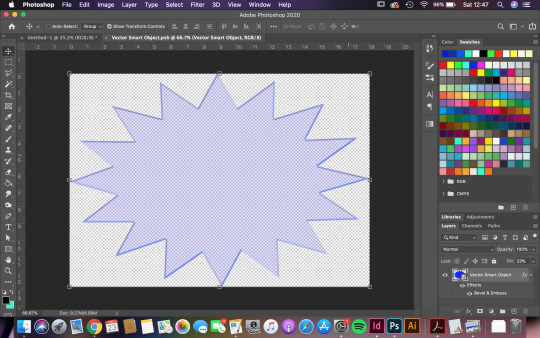

book cover development
spoke to joseph about my book cover & sent over what i had so far - was going waaaaaaay too overboard with the stars if i wanted to deboss them!
decided to refine it back a bit and focus on one bigger star to use for the debossing when I actually make the book - I think this will work well & means that the title can sit in the middle of the indented bit, maybe vinyl could work well for the title or could print directly onto the cover.
he also sent a link to a tutorial for embossing in photoshop so that I could visualise it without being able to make it
https://helpx.adobe.com/photoshop/how-to/embossed-bevel-effect.html
I think this works soooo much better & feels more like what I had in mind for my cover initially.
0 notes
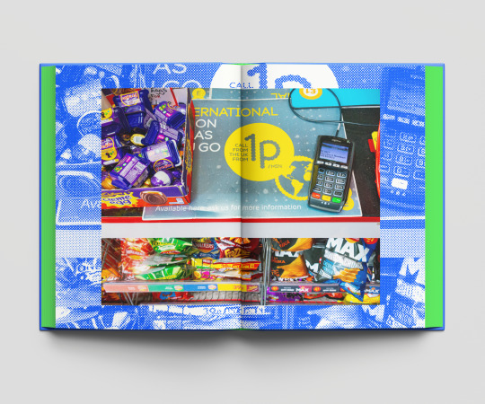
Photo

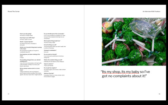
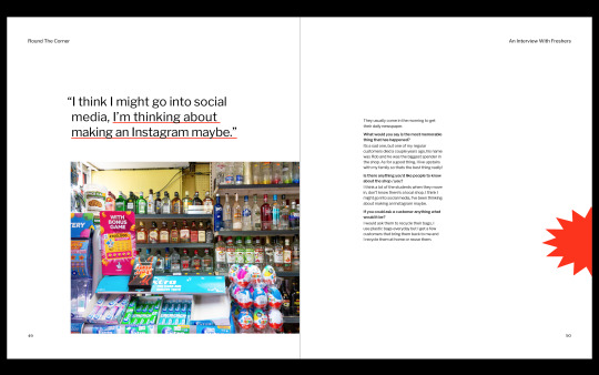
final adjustments to spreads / layouts
instead of using the response style for the contents, sized it down to the smaller quote style & the page numbers down to body copy size - think this feels so much nicer // it looked a bit too big before
moved around the quotes / images for the freshers interview so they sit better in the spread - more balance / harmony
adjusted a few spreads by moving the images slightly to create a nicer sense of balance on the spread
0 notes
Photo

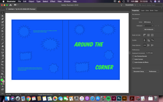
trying to show the debossed effect I want to go for in illustrator - not that great but will keep going
i’m liking the placement of the stars i think - the type feels a bit better but still not that successful (made the copy on the back a bit smaller
0 notes
Photo


book cover research: pinterest finds
https://www.pinterest.co.uk/abbihopper/fmp/
inspo - debossing / shapes on cover / bright colours etc
love the palm beach covers!! deffo thinking of a solid colour bg for the cover - I think it will work well with the end pages of the book well.
really like the uncovered cover with the type over the fold of the spine although I feel like my title will be too long for this to be effective?
0 notes
Photo


book cover design development - debossing stars on cover (darker colour)
trying to visualise the sort of thing i would like for the cover - very rough at the mo and not that great
really keen on a full colour background with the blue & type printed on top with debossed stars - need to keep developing & refining
the placement of the type needs more work - thinking of also having a lil bit of copy on the back to get the rough feel for whats inside the book too
0 notes
Video
tumblr
3/3 last section of the book woo
I feel pretty happy with how the book is looking at the mo, i think just a few final adjustments are needed and I’ll be ready to hand in!
I wasn’t too sure on having the laura craik article as the last spread, but i think it helps to round the book off nicely - it talks about how we are using them more than before now & the idea that for some people they are a ‘lifeline’ which I think is a nice thought to end on // shows that they are integral to communities etc
0 notes
Video
tumblr
2/3 had to split the clicktrhough up as the full video was too big oops
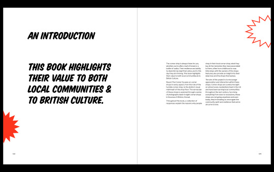
i think the halftone backgrounds & full bleed images really help to break up the book and allow the reader to be able to take in the photos / get submersed with them compared to the smaller images in the response spreads
0 notes
Video
tumblr
current clickthrough of all pages of my book!! (bit glitchy) 1/3
after the refinements made i wanted to have a look at all the pages of the book to see how the overall feel of the book is doing etc
i think that it feels pretty successful & i think i’ve got a strong style carried throughout the book!
i’ve tried to get a good flow of using the colours throughout the book which I think helps with the overall pacing of it ??
0 notes
Photo


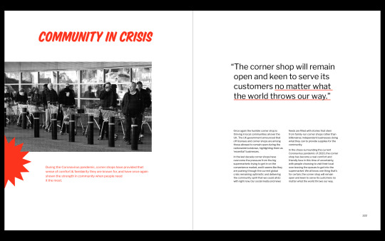
refining / hanglines for article spreads
developing a more consistent style woo
also went through the article spreads to play around with the layouts as i wasn’t too happy with them - i think they feel a lot more successful now and they all feel more cohesive together. - using 2 styles for the quotes to help with heirrchy & layout - some worked better bigger than others but i think this helps to pick out the more significant quotes etc
0 notes