
Don't wanna be here? Send us removal request.
Statistics
We looked inside some of the posts by ablackburnarts102-02 and here's what we found interesting.
Average Info
Notes Per Post
1
Likes Per Post
1
Reblog Per Post
0
Reply Per Post
0
Time Between Posts
12 days
Number of Posts By Type
Text
6
Last Seen Tumblr Blogs


Fun Fact
Tumblr was the first site to host the blog for President Barack Obama in 2011.
Text
Process Blog Six
Reading Response:
Chapter Seventeen (pages 276-291) is about user experience in design, and its influence in making good design work. I have similar thought on being knowledgeable with user design as I did with interface design. Understand both can help to make more efficient and streamlined design work, as well as making the process of using designs to create a project digitally quicker for everyone involved.
Chapter Eighteen (pages 292-298) is about programming and its ability to improve work flow when a designer is programmer-savvy. As a designer who has a passion for programming, I can definitely begin to see the appeal of hiring a designer with programming knowledge. This is especially true in fields of design that are in high demand. Having a proficiency in programming can help to push over the tipping point of gaining or losing a job opportunity.
Chapter Nineteen (pages 301-327) is about design and art education, and its importance in producing competent designers and efficient design work. I may have disagreed with this point about "needing" some sort of formal education in order to be a good designer when I was at the beginning of my design journey, but now at my fifth year of designing I definitely feel as though formal education makes a significant difference in skill and the production quality of design work. While formal design education isn't strictly required, it helps to fast track learning design, and it gives a well structured environment with peer feedback in order to force designers to create designs, especially ones outside of their comfort zone. If I hadn't taken all of the design classes that I've taken so far, then I wouldn't have found some of my favorite areas of design.
Reflection:
This week's assignment has been about preparing our portfolios for out final projects. I have been focusing on gathering final images, inspiration images, and as many clean looking process images for each project as I can. I have also been looking at and thinking about the possible layouts I can use for the portfolio, as well as color palettes and styles that might look good with all of my works in order to elevate them, but not take away from their designs. I plan to possibly sketch out some layouts for the pages in order to determine the best layout to display the many images that I plan on including.
0 notes
Text
Process Blog Five
Reading Response:
Chapter Fifteen of the textbook reading Becoming a Graphic and Digital Designer: A Guide to Careers in Design, by Steven Heller, pages 246-253) is about interface design. Interface design is incredibly important in modern society. Bad interface design is incredibly disruptive in someone's online experience. With the dependence of people's entertainment, education, and careers on all things digital it has placed a demand on people who are able to study and professionally execute well designed interfaces. It's very important for designers to understand how an interface can be navigated effortlessly and efficiently, even if they do not do interface design. If a designer is designing something for a website or an app, it is still important and useful to know a bit about what their design might be surrounded by, what users are used to, what the design's purpose is going to be, etc. even if they are not the ones putting together the interface as it can help to make an interface designer's job easier and make the interface better for users and their client.
Reflection:
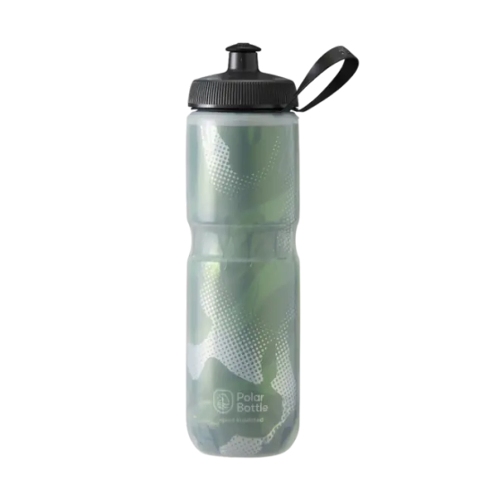
This week's process blog is about syntax and semantics. I am lucky enough to have already learned about syntax and semantics in a different class, so I was pretty comfortable with this assignment. The item that I chose was a water bottle. I googled water bottles, and used the tools feature for searching Google's images to make sure that the background would be transparent and the file size of the images would be large enough to have a good amount of detail. When searching for images, I kept in mind the different denotations, connotations, feelings, and presences that the water bottles I was seeing would have in order to try and pick four fairly distinct water bottles for this assignment. I chose a pastel metal water bottle, a squeeze-style sports water bottle, a plastic disposable water bottle, and a kids baby shark themed water bottle.


Before bringing everything into InDesign I pulled the images into Google Docs in order to figure out what I wanted to write about each image's syntax and semantics.


I then brought everything into InDesign and made sure to get the formatting and the fonts how I wanted in order to match the example assignments.

0 notes
Text
Process Blog Four
Reading Responses:
Chapter Eleven of the textbook reading (Becoming a Graphic and Digital Designer: A Guide to Careers in Design, by Steven Heller, pages 186-203) is about understanding change in the world of graphic design. As someone who has grown up with digital media and design, it's interesting to think about it as something new that people would reject, however I can definitely connect the idea to people in my life who reject the use of technologies such as social media. I like how the textbook mentioned that some people considered it, "nothing more than advance production tools," as I think that is the best way to think of digital design. While it makes it more accessible to people without design knowledge, you do still need those skills in order to make something effective that uses digital tools in order to enhance the product rather than relying on it to create the product that otherwise couldn't have been created. The textbook also discussed how there isn't much that graphic design can't improve in some way, which I agree with though it is fun to consider cases where this might not be the case. One such example is furniture that is made to be very visually appealing and artistic, while leaving the function of the piece less than optimal. There have been many chairs designed with beautiful curves and bold colored plastics that are uncomfortable to sit in, as well as tables and shelves with similar traits that aren't flat enough to serve as useful surfaces.
Chapter Twelve of the textbook reading (pages 204-219) is about original and unique design. This chapter begins by tying to describe and define 'eccentrics'. It goes on to say that, "you cannot replicate what they do - nor would you want to," which does not seem to be accurate to the example images that follow within the chapter. Not only do plenty of the works look familiar in style (such as Charles Anderson's poster designs and the art style that Nick Ace directs in 'Chapter 48: Doom Lyrics'), but these 'eccentric' designers are clearly of some renown if they've been interviewed and used as examples in this design textbook. Who wouldn't want to replicate what they do? There is nothing wrong of course with recognizing the unique talents of designers, especially if they might drive and inspire design trends, but I feel as though this explanation of eccentric is off.
Chapter Thirteen of the textbook reading (pages 220-229) is about transitioning and new opportunities. The section at the beginning of the chapter discusses how with the shifting and changing of language, graphics will be able to, "speak deeper than words". I definitely agree with this sentiment, but I think that it's ironic that it feels like a rewording of, "a picture is worth a thousand words," as that simple phrase gets the meaning across very well, especially for originating about one-hundred years ago (found with a quick google search). There's also an argument to be made that graphics tend to depend on cultural and societal symbols, which can be just as prone to change and evolution as language is.
Chapter Fourteen of the textbook reading (pages 232-245) is about interactive design. The beginning of the textbook discusses how interactive design leaves much more of an impact on people in today's society, especially since they consume hundreds or thousands of images, posts, videos, etc. every week or even day. I completely agree with this, and I think that it is important to consider how to make things more memorable. Making the target audience a part of the experience is a wonderful way to do this, and as an example part art or design, interacting with fans on social media inspires them to keep reacting and make a more personal connection with a creator. Back to interactive design, I always find the experience of moving through websites with animations that follow the mouse and graphics that shift as you scroll are typically more visually appealing than those without.
Reflection:
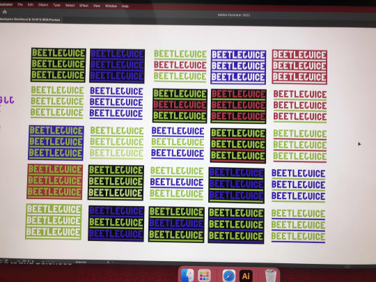
The class project that we are currently working on is about making logos for fictional characters. I feel very comfortable doing this project, as I've done logo design for previous digital art and design classes. I was very excited to read the project requirements and see that characters from the movie Beetlejuice were an option. Beetlejuice is one of my favorite movies from my childhood, and I have a preference for the "strange and unusual". Lydia Deetz was my first choice because she is my favorite character from the movie (and one of my favorite characters in general) and because I love Winona Ryder. My second choice was Betelgeuse, because he has a lot of typical imagery that could be used such as his green hair and pinstriped suit. Another reason I chose these two characters is because they are the natural choice to choose if picking characters from Beetlejuice. I started off with thumbnails for Lydia based on just a bit of looking her character up on fan-made wikis just to jog my memory on some traits for her that I could be inspired by. When I moved on to Betelgeuse, I used the sheet provided that was mean to be lined with traits and attributes of the character in order to try and spark ideas to combine them. I then redrew the best of these ideas larger in my sketchbook next to my sketches for Lydia.

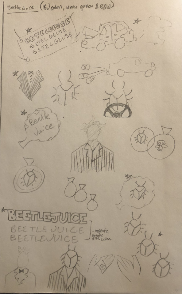
So far I have picked favorites for both characters. I chose the raven skull holding a quill for Lydia (to represent her love for poetry and the macabre) and a combination of two for Betelgeuse: the triple "BEETLEJUICE" as well as the beetle headed suit. I have already made the font and many color options for the "BEETLEJUICE" text.
0 notes
Text
Process Blog Three
Reading Responses:
Chapter Six of the textbook reading (Becoming a Graphic and Digital Designer: A Guide to Careers in Design, by Steven Heller, pages 120-137) is about designing book interiors and book covers / book jackets. It was quite interesting to read this chapter, as the designs were phenomenal, and it brought my attention to designing book interiors which I had never really considered much before. While I understood that book interiors and layout had to be designed, I didn't realize that there were designers who devoted their entire careers to the typography and flow of the fairly simple seeming pages of books.
Chapter Seven of the textbook reading (pages 138-147) is about editorial design such as magazines and newspapers. Personally I think I would prefer designing magazines over newspapers, as I already have a little bit of experience designing a magazine layout for my high school art magazine. However, I feel like designing a newspaper would allow for the designer to focus more on the layout and the flow of the design rather than worrying about how to fit in all the images with their variation in sizes and style.
Chapter Eight of the textbook reading (pages 148-155) is about social innovation through design. Using design as a tool for social innovation is incredibly meaningful and important, however I can't really see myself going out of my way to pursue it in a career or without someone prompting me to pursue it.
Chapter Nine of the textbook reading (pages 156-161) is about branding and packaging. I also have slight experience with branding and packaging, as I had a number of assignments previously with rebranding certain companies and designing product packaging as well. I feel as though I fit better with designing products and branding rather than product packaging as I have slightly less experience with packing. However, I could completely see myself focusing on these in my design career and I would be thrilled to design product packaging and branding for my own company.
Chapter Ten of the textbook reading (pages 162-184) is about illustration design. While illustration design is beautiful and I love to look at it, I am not particularly interested in making illustration design myself. When it comes more to creating visuals in this sort of way, I would prefer to draw or paint in a way that focuses less on how to 'design' it.
Reflection:
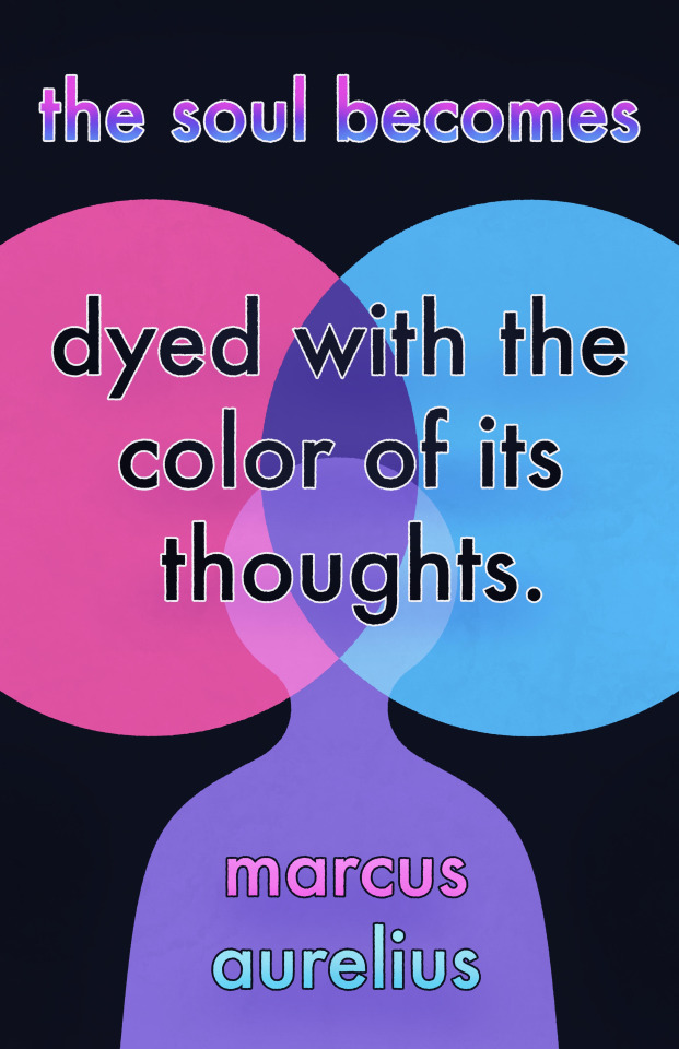
The class project that our class has been working on since the last progress post is our Great Ideas Poster. I started off with a quote that I liked by Marcus Aurelius where he said "The soul becomes dyed with the color of its thoughts." I chose this quote because I thought that it would pair perfectly with some really colorful imagery, which I thought would be really nice and fun for a poster design.


Then I refined these designed on my iPad in Procreate and created three refined sketch images.
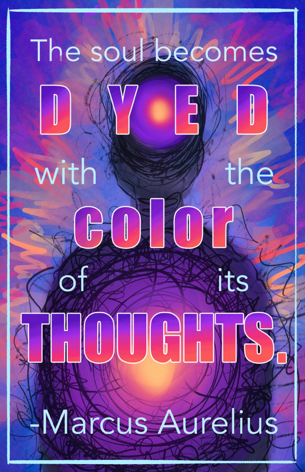

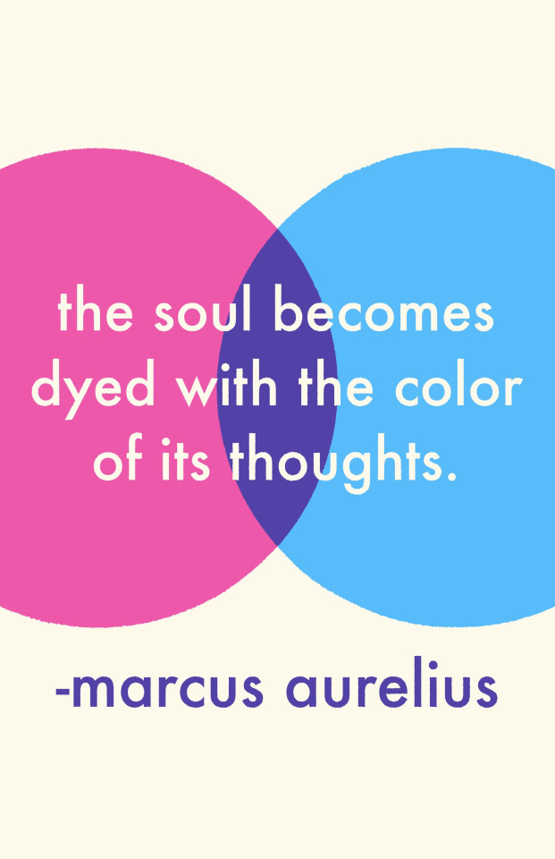
I had a lot of fun playing with the colors and looks of all three images, but the third image was my favorite conceptually as I really liked the simplistic and less messy look as I had become very used to the messy look while designing the first two. I did however LOVE playing with the text and color gradients in the first image.
I then began to create the shapes of the third image in Adobe Illustrator for my final poster.

Once I had the shapes the way I wanted, I brought them into photoshop to play with the layer options as well as to add in the text. After that, I brought it back into procreate to add some colors and character back to the image that I lost when I chose the simple design over the chaotic ones in the refined sketch process.
0 notes
Text
Process Blog Two
Reading Responses:
Chapter Three of the textbook reading (Becoming a Graphic and Digital Designer: A Guide to Careers in Design, by Steven Heller, pages 78-95) is about working in design collaboratively. I could see myself working collaboratively with a team of people that I don't know on a personal level, as I tend to take some form of confidence or leadership when in these situations. I could also see myself working closely with an artist friend of mine, as she and I have very similar thought processes when it comes to being creative, however we can both be a bit stubborn when we have differing ideas that we both think are better than the others. I could also see myself working alone, so I think it's lucky that I'm very flexible.
Chapter Four of the textbook reading (pages 96-119) is about lettering and type, as well as owning a type foundry. When I started digital art and design, typography was my least favorite part of any work. I especially hate drawing thumbnails and having to consider the typography, because I prefer to experiment with it so that it fits around my piece the way I'd like rather than feeling like I'm making my piece fit around it. However I understand that working with typography and the other graphics of a piece so that they fit together before you get started on the work is important, so I know that's something that I need to work on. I could NOT see myself doing only typography or lettering without allowing myself to focus on the parts of design that I love.
Reflection:
Our class project that we recently finished was the Type Abstraction project. As I mentioned before, I'm not huge on type, however I was able to put my focus for this project on the composition and space involved in this project without getting bogged down by the typography. This is especially true since each work had all of the letter in one font, and one font size.
My first word was "Cassiopeia" which is what Cas is short for. I chose the font Lao MN, because I liked that the letters had thick and thin stokes, without transitioning between them so it was able to have a blocky feel, but still allow for more variation. I like the end result of this one, and I feel like I used my space well which is what I was trying to do. I do understand that the letters are still understood, but I find the piece visually appealing so I wouldn't have wanted to change it.
My second word was "Saturn" which goes thematically with Cassiopeia because it is a star from a constellation. I have much of the same thoughts about this piece as I did the previous one: I can still understand some more letters than I would like to be able to for the objective of this project, but I still think it is visually appealing and balanced. I used a type which had stokes with consistent line width, which I think was beneficially in balancing the appearance of negative and positive space.

My third word was "Irregular" which is meant to go with Saturn and Cassiopeia because irregular is a classification of galaxy shape that I thought would be an interesting word to use for this project. I originally started off with a very thin and simple font, and then after I completed it I realized that I wasn't satisfied with the outcome and I wanted to start from scratch with a new font. I hadn't yet done a serif font, and I came across a really nice one similar to Times New Roman. I am really happy with this work, as I think I did a good job of balancing my space, and making the letters appear more abstract with the way the letters flow into each other. Its hard to tell which shapes are which letters for sure, and I think the thick lines and the serifs look beautiful. I definitely think that the practice of the previous two works as well as the failed first attempt at this word really gave me a better understanding of how to do this project in the way I wanted.

0 notes
Text
Process Blog One
Reading Response:
Chapter One of the textbook reading (Becoming a Graphic and Digital Designer: A Guide to Careers in Design, by Steven Heller, pages 16-35) is about what starts a graphic designer on their graphic design journey. My graphic design journey was inherently linked to my art journey which started in 6th grade. I found a passion for art while watching content online from other artists, mostly on YouTube. I then pursued art relentlessly through classes and clubs wherever possible, which led to an intrigue in taking digital art and design classes in high school. It was there that I learned about what it would mean to be a graphic designer, and what that could look like as a career for myself. I ultimately decided that this is what I wanted to pursue, which led to taking this class.
Chapter Two of the textbook reading (pages 36-77) is about whether or not a graphic designer chooses to work for themself, or to start their own business. The reading also acknowledged that many designers who ultimately start their own businesses, will still work for a different design company to get used to the industry and the responsibilities that running their own business will take; though some designers may start their own business right out of whatever training they pursue. I can't yet tell where my design journey will take me, however I do know that I feel as though I would enjoy working at or running my own custom design print shop. I do feel as though I would prefer to prepare for running my own shop by working somewhere else to get used to the process and the requirements however. I could also see myself working at a shop long enough to take it over myself.
Reflection:
These past two weeks our class objective has been to complete our "Artificially Intelligent Six-Word Memoirs." This project aimed to AI generate two square images using a program called Craiyon to match two six word sentences (or groups of words). The two images were meant to go together in some fashion.
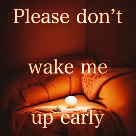
The two six word memoirs that I came up with were "Okay, can I go home now?" and "Please don't wake me up early."
I began with the "Okay, can I go home now?" memoir, and I began by typing in the memoir itself into the AI prompt. After finding that the AI did not produce the images I was looking for, I tried a couple other simple prompts, focusing mainly on long trails. I focused on long trails, because I felt that they invoked the thought of going home, but taking a long and treacherous journey to get there, which I felt fit the way that I wanted the memoir to be interpreted.
I had three images to work with, one of which was an image with lots of purple and cool colors, picturing a house which was not very detailed or focused even after enhancing the image size. I ended up removing this image from consideration, due to the lack of focus or detail in the image, and preferring the longer trail imagery that I achieved with my two other options. The two remaining images are ones that I experimented with the typography of. One was a green image of a forest with a long trail. I chose a serif font, and used a technique on Photoshop that copied the layer and shifted it down slightly. I repeated this multiple times to get an interesting 3-D effect. As much as I liked the typography in this image, I ended up choosing the third option, due to peer preference.
My third image was an orange image that resembled a wasteland, with forests on the side, a blue tinged river in the middle and a group of ominous floating figures in the sky. This is the image I ended up working with. The typography I chose was a serif font with thin strokes. I put an outline around the text with a darker tone of orange than the paler orange I eye dropped from the image itself. I added a bit of shadow and highlight on the text to create a nice soft gradient. I centered the text on the image, and it was finished.

For my second memoir I decided to use the orange coloration to connect the visuals of the two images. I again started prompting the AI with the memoir itself, but didn't find any results I liked. I ended up looking for orange cozy bed images, and I found two that I liked.
The two images were very similar, and I ended up going with one that had a round, off-white orb on the bed that seemed to be serving as a light source. I added another serif font (which I'm sure you can tell by now that I have a preference towards) and I added some shadows and highlights onto the text in order to make it look like part of the image by following the glow of the orb light source. The text was separated into three lines, and centered within the image, and outlines much the same to the first one. I also added an interesting effect where there were translucent copies of the text slightly off from the text itself in order to mimic the feeling of waking up and having your vision be blurry before you've rubbed the sleep from your eyes.
1 note
·
View note