Don't wanna be here? Send us removal request.
Statistics
We looked inside some of the posts by aceb and here's what we found interesting.
Average Info
Notes Per Post
432K
Likes Per Post
232K
Reblog Per Post
199K
Reply Per Post
607
Time Between Posts
8 days
Number of Posts By Type
Text
9
Photo
7
Video
1
Last Seen Tumblr Blogs


Fun Fact
Hackers stole 65M passwords from Tumblr in 2013.


Text
Layers
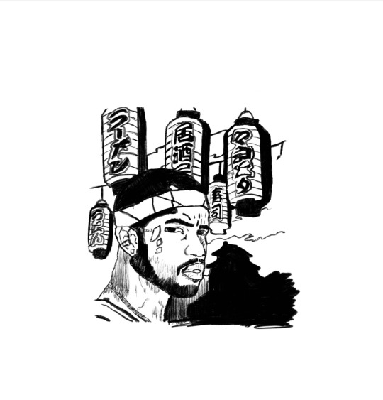
"Point, line, and plane are the building blocks of design." (Lupton 33) The point can be defined as a mark in a position of space. A line can be described as a single point that continues for a distance, or as the connection between two points. The purpose of a line in graphics is to help the artist to communicate to the viewers what it is they are supposed to be seeing or taking notice of. Layers can create a sense of depth in an image with point, line, and planes. Layers are the different levels at which one can place an image. Layers can be stacked, merged, or defined when creating a digital image. In this design, I used both point, line, and plane and layers as a way to create a nostalgic image. The person in the image is an African American singer and songwriter named is Frank Ocean. He is best known for his song “Thinking About You” on Channel Orange created in 2012. The reason I decided to draw him is his music speaks to me differently than anything I’ve heard before, you can say he is one of my favorite artist. I wanted my favorite artist to be in many favorite city, so I choose Mount Fuji in Japan.
Rhythm and Balance
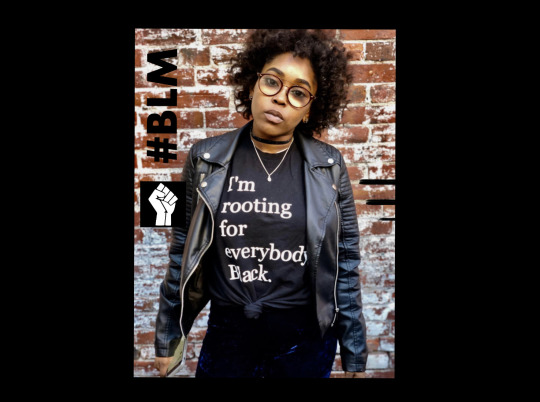
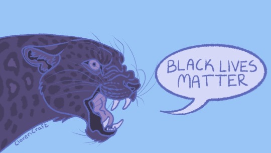
In this design, I explored the power of perception or the ability to see, hear, or become aware of something through the senses. The words I choose to explore was the famous hashtag started by black Twitter “BLM’. BLM stands for “Black Lives Matters” which is a decentralized political and social movement advocating for non-violent civil disobedience in protest against incidents of police brutality and all racially motivated violence against black people. I wanted to emphasize the issue of Black lives to raise awareness of the death of innocent black bodies in America. I used a black woman as the face of this design to show the power of the black women’s role in the movement. Most of the time a black woman is defending herself and others on the front line. As Lupton said, “By exploiting the brain’s capacity to find and create order, designers construct simple, direct logos, layouts, and interfaces. In addition to seeking out clear, direct communication solutions, they can also use the processes of perception to invent surprising forms that challenge viewers to fill in the gaps.” (265) I wanted to challenge the viewer to fill in the gaps and think about why BLM is important to them by boldly presented the issue. I used eye contact as a way to manipulate perception as well.
Color
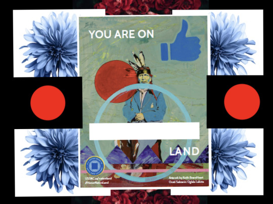
The perception of color depends on how the color is presented, the brightness, and the character of light. We can also perceive a given color in relation to the other colors. “Color can convey a mood, describe reality, or codify information. “Words like “gloomy,” “drab,” and “glittering” each bring to mind a general climate of colors, a palette of relationships. Designers use color to make some things stand out (warning signs) and to make other things disappear (camouflage).” (208) When creating the art based on Immigration and Native American land I thought about politics. During the election month, America seems to be divided into two. I wanted this design to bring awareness to the divide and create a central understanding. To create relationships between color and monotones I used the color red to emphasize the blood of millions of Native Americans and blue to express the beauty and pride that still exists. I used monotone green to create a feeling of warmness.
Boarders
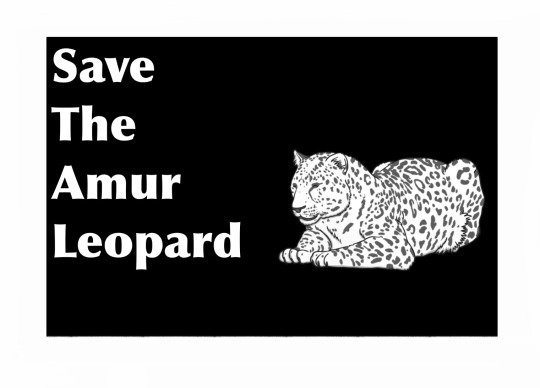
A border is a design that runs lengthwise along the edge of a design.“Whether simple or decorative, a border creates a transition between image and background. Against the pale wall of a room, for example, a black picture frame sharply separates a work of art from its surroundings. Alternatively, a frame whose color is close to that of the wall blends the work of art with the room around it.” (Lupton 364) The purpose of my boarder was to emphasize my design of the Amur Leopards. These animals are one of the top ten animals to go extinct. The Amur leopard is threatened by poaching, habitat loss, and deforestation or of their land. Their natural habitat is also threatened by forest fires and the construction of new roads. I choose a black border to express boldness. I also juxtaposed the image to make a point that they're endangered.
Gestalt Principles
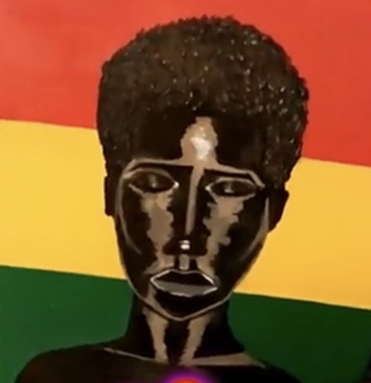
(5) Gestalt principals. Gestalt principles include similarity, continuation, closure, proximity, ground, symmetry, and order. “Building on memory and experience, the brain fills in gaps and filters out extraneous data.” (p. 99) Gestalt theory emphasizes that anything is greater than its parts. Gestalt principles can elevate a design that seems like it's fighting for a user's attention to one that offers a natural interaction that makes your design feel familiar while guiding users toward the action you want them to see. The goal of Gestalt’s theory is to teach people to become aware of sensations within themselves and their environment so that they respond reasonably to a situations. In this design, I used this Ghanises woman to communicate beautiful and pain. The interpretations could go in many directions but one thing you cant deny is the Ghanises flag behind her. In this flag, the star would normally be in the middle. However, she is the star. Her heart shines bright but her skin is brighter.
Frame
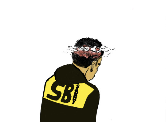
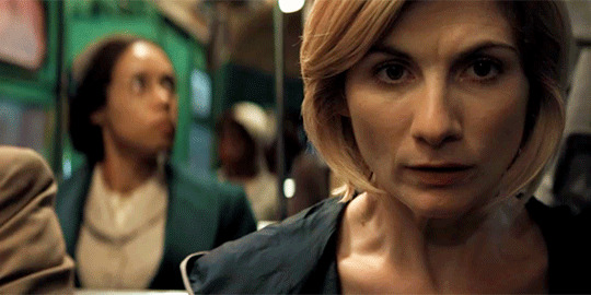
Framing is the presentation of visual elements in an image about other objects. Indeed, balance is a prized commodity in our culture, and it is no surprise that our implicit, intuitive relationship with it has equipped us to sense balance--or imbalance--in the things we see, hear, smell, taste, and touch.” (p. 49) Framing can make an image more aesthetically pleasing and keep the viewer's eye focused on the framed objects. “A frame can serve to either emphasize or downplay its contents.” (p. 125) In this design, I used the frame to make the perception of the camera looking down. The jacket as well as flying plane is meant to catch the viewers eye first. Jacques Derrida defined framing as a structure that is both present and absent. The frame is subservient to the content it surrounds, disappearing as we focus on the image or object on view. The mechanical eye tends to cut the camera into fields of vision. The point of this frame is to look deeper into the mind of the person in the image. The statement is that the person is at a higher level of thinking, his mind is open. This frame created a condition for better understanding of the image.
Transparency
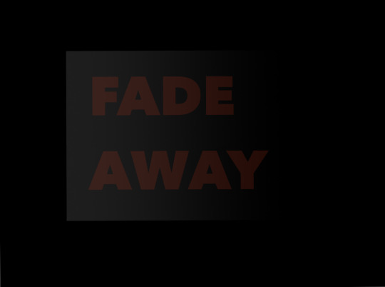
In design, transparency can be defined as something that is nearly or completely invisible. Words, pictures, and textures can all become transparent. Lupe suggests that “…transparency suggests clarity and directness.” Yet in design, transparency is often used to create dense, layered imagery built from color and texture. In this design I used a brand name I’ve been experimenting with called “fade away”. Fade away represents the fading of the mind from the world in order to elevate and become closer with the universe. “Transparency means a simultaneous perception of different spatial locations. . . . The position of the transparent figures has equivocal meaning as one sees each figure now as the closer, now as the farther one” Gyorgy Kepes”. (Lupton 451) Transparency is often used not for the purposes of clarity, but to create dense, layered imagery built from veils of color and textures. I lowered the opacity to 17 and added red lettering to a black background to make the words stand out.
Diagram
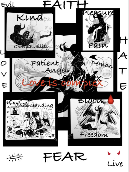
This diagram design was inspired by anime styled drawing in a series called “Monster’’. A diagram is a simplified drawing showing the appearance, structure, or workings of a design in a schematic structure. “Diagrams allow us to see relationships that would not come forward in a straight list of numbers or a verbal description.” (Lupton 215) This diagram has both words and pictures laying out more background information. The words directly respond to the image falling under the category of either good or bad. I wanted to explore the visual aspect of the words “good” and “bad”. I used angel to represent good and devil to represent bad. Though a simple style the message was still able to be understood. The overarching message of the image was that love is above all. In all images love has been presented in some way or form. Diagrams add a layer of detail to a design that can make it look more professional.
Grid
(8) Grid. In graphic design, a grid is a structure made up of intersecting straight or curved lines used to structure content. Grids are tools for organizing space, text, images, and other elements placed in a design. Grids add structure to a design. They lead to rational standardized systems that help people absorb the information trying to be communicated. The grid serves as an framework on which a designer can organize graphic elements in a rational manner. Grids allow designers to add elements to a layout while using the grid structure. In this design, I wanted the theme to be digital so I used colors like deep blue, red, and yellow. The Grid also gives this design a digital feel with horizontal, vertical, curved, and straight lines. The lines give depth to the image but also gives the image a 3D effect.
Motion

Motion is one of the most exciting aspects in graphic design. “Motion is a kind of change, and change takes place in time. Motion can be implied as well as literal…” (Lupton 233) Motion in graphic design is often used in the film industry with Openings to movies, television shows, and news programs can use photography to make the introduction. In this design I used motion to show the process of a seed growing. Before the seed grew, it rained, the sun came out, and once the seed finished growing a flower bloomed. This process is not easy it involves patience and time. Motion graphics are pieces of animation or digital footage that create an illusion of motion or rotation. Animation is my favorite form of motion. The design is all hand drawn using the flip book method. The flip book method is basically taking multiple flashcards and combining them by flipping them to create the illusion of motion.
0 notes

Text

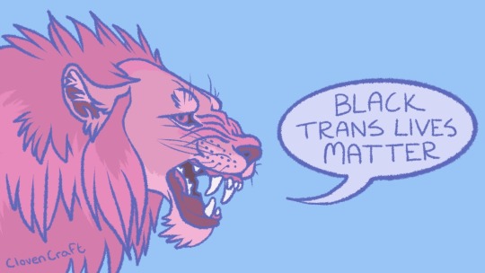
Indya Moore wears earrings with the images of 16 trans people killed so far this year and holds a clutch bag showing the 17th.
. . . . . . . . . . . . . . . . . . . . . . . . . . . . . . . .
The life expectancy of trans feminine individuals in America is 35. The most recent person killed was just 17 years old.
. . . . . . . . . . . . . . . . . . . . . . . . . . . . . . . .
43K notes
·
View notes


Photo

Calm before the storm by pquarme Shop for prints @ https://shop.pquar.me
404 notes
·
View notes


Text

Layers
"Point, line, and plane are the building blocks of design." The point can be defined as a mark in a position of space. A line can be described as a single point that continues for a distance, or as the connection between two points. The purpose of a line in graphics is to help the artist to communicate to the viewers what it is they are supposed to be seeing or taking notice of. Layers can create a sense of depth in an image with point, line, and planes. Layers are the different levels at which one can place an image. Layers can be stacked, merged, or defined when creating a digital image. In this design, I used both point, line, and plane and layers as a way to create a nostalgic image. The person in the image is an African American singer and songwriter named is Frank Ocean. He is best known for his song “Thinking About You” on Channel Orange created in 2012. The reason I decided to draw him is his music speaks to me differently than anything I’ve heard before, you can say he is one of my favorite artist. I wanted my favorite artist to be in many favorite city, so I choose Mount Fuji in Japan.

Rhythm and Balance
In this design, I explored the power of perception or the ability to see, hear, or become aware of something through the senses. The words I choose to explore was the famous hashtag started by black Twitter “BLM’. BLM stands for “Black Lives Matters” which is a decentralized political and social movement advocating for non-violent civil disobedience in protest against incidents of police brutality and all racially motivated violence against black people. I wanted to emphasize the issue of Black lives to raise awareness of the death of innocent black bodies in America. I used a black woman as the face of this design to show the power of the black women’s role in the movement. Most of the time a black woman is defending herself and others on the front line. As Lupton said, “By exploiting the brain’s capacity to find and create order, designers construct simple, direct logos, layouts, and interfaces. In addition to seeking out clear, direct communication solutions, they can also use the processes of perception to invent surprising forms that challenge viewers to fill in the gaps.” I wanted to challenge the viewer to fill in the gaps and think about why BLM is important to them by boldly presented the issue. I used eye contact as a way to manipulate perception as well.

Color
The perception of color depends on how the color is presented, the brightness, and the character of light. We can also perceive a given color in relation to the other colors. “Color can convey a mood, describe reality, or codify information. “Words like “gloomy,” “drab,” and “glittering” each bring to mind a general climate of colors, a palette of relationships. Designers use color to make some things stand out (warning signs) and to make other things disappear (camouflage).” (208) When creating the art based on Immigration and Native American land I thought about politics. During the election month, America seems to be divided into two. I wanted this design to bring awareness to the divide and create a central understanding. To create relationships between color and monotones I used the color red to emphasize the blood of millions of Native Americans and blue to express the beauty and pride that still exists. I used monotone green to create a feeling of warmness.

Boarders
A border is a design that runs lengthwise along the edge of a design.“Whether simple or decorative, a border creates a transition between image and background. Against the pale wall of a room, for example, a black picture frame sharply separates a work of art from its surroundings. Alternatively, a frame whose color is close to that of the wall blends the work of art with the room around it.” The purpose of my boarder was to emphasize my design of the Amur Leopards. These animals are one of the top ten animals to go extinct. The Amur leopard is threatened by poaching, habitat loss, and deforestation or of their land. Their natural habitat is also threatened by forest fires and the construction of new roads. I choose a black border to express boldness. I also juxtaposed the image to make a point that they're endangered.

Frame
Framing is the presentation of visual elements in an image about other objects. Indeed, balance is a prized commodity in our culture, and it is no surprise that our implicit, intuitive relationship with it has equipped us to sense balance--or imbalance--in the things we see, hear, smell, taste, and touch.” (p. 49) Framing can make an image more aesthetically pleasing and keep the viewer's eye focused on the framed objects. “A frame can serve to either emphasize or downplay its contents.” (p. 125) In this design, I used the frame to make the perception of the camera looking down. The jacket as well as flying plane is meant to catch the viewers eye first. Jacques Derrida defined framing as a structure that is both present and absent. The frame is subservient to the content it surrounds, disappearing as we focus on the image or object on view. The mechanical eye tends to cut the camera into fields of vision. The point of this frame is to look deeper into the mind of the person in the image. The statement is that the person is at a higher level of thinking, his mind is open. This frame created a condition for better understanding of the image.

Transparency
In design, transparency can be defined as something that is nearly or completely invisible. Words, pictures, and textures can all become transparent. Lupe suggests that “…transparency suggests clarity and directness.” Yet in design, transparency is often used to create dense, layered imagery built from color and texture. In this design I used a brand name I’ve been experimenting with called “fade away”. Fade away represents the fading of the mind from the world in order to elevate and become closer with the universe. “Transparency means a simultaneous perception of different spatial locations. . . . The position of the transparent figures has equivocal meaning as one sees each figure now as the closer, now as the farther one” Gyorgy Kepes”. Transparency is often used not for the purposes of clarity, but to create dense, layered imagery built from veils of color and textures. I lowered the opacity to 17 and added red lettering to a black background to make the words stand out.
0 notes