
Don't wanna be here? Send us removal request.
Statistics
We looked inside some of the posts by achronalart and here's what we found interesting.
Average Info
Notes Per Post
207K
Likes Per Post
99K
Reblog Per Post
108K
Reply Per Post
212
Time Between Posts
17 hours
Number of Posts By Type
Text
15
Note
2
Last Seen Tumblr Blogs


Fun Fact
Tumblr Inc. has $15.1M in annual revenue.
Text
I've been thinking of the "Can Granny Weatherwax beat Bugs Bunny" question and this is my full take for Discworld characters:
Vimes - Cares too much, too easy to piss off. Has the innate chase instinct that makes characters run into walls with realistic tunnels painted on them. Might get to arrest Bugs Bunny but the beast will just slip out of the handcuffs to help him lock them, then walk out of the jail cell to have a union mandated coffee break.
Ridcully - Classic hunting season scenario, but has enough charisma to probably still get a few good shots off before the inevitable.
Rest of the wizards - No survivors, only Bugs.
Carrot - The intense near-magical narrative aura of well meaning innocence should make him immune, Bugs will likely be forced to be the villain of the episode.
Lord Vetinari - Flattened by a comically large anvil in the first few minutes of the episode, unclear if it was all a part of his long term strategy or not.
Moist - Has the 'lovable trickster getting away with it' energy, but nowhere near Bugs level. Already fell for the "old lady who swallowed a fly" scenario with the stamp slugs once, won't fare any better here.
Death - Definitely one of those "character is trying to avoid death" episodes, would go back and forth. Might actually get to end Bugs but his spirit will reappear in Death's domain and ruin his garden.
Nanny Ogg - The ultimate in anti-Bugs technology, a gleefully annoying old lady who doesn't give a fuck and definitely won't be the first to instigate the plot bearing conflict. This is a full sweep, he's the episode antagonist.
Granny Weatherwax - Too win-motivated to not lose. Would have to break the story to have any chance. Might do it.
Magrat - Will have sappy ideas about helping the poor animal which honestly has the 50:50 chance of either getting slapsticked or Bugs ending in a ye olde stroller&pacifier gag.
Colon&Nobby - Designed in a lab to be totaled by Bugs Bunny.
Tiffany Aching - A child that also has a large pan that is the perfect thing to hit someone over the head with and make a BOIOIOINGGG sound, so great odds.
5K notes
·
View notes
Text
Animated Alinua based on chap 5 of Aurora, and I'm pretty happy with how it came out :D Did I mention I love this webcomic? Because I do
2K notes
·
View notes
Text

🗲 Tess from @comicaurora first time rendering gold, liked the results but then I remembered-
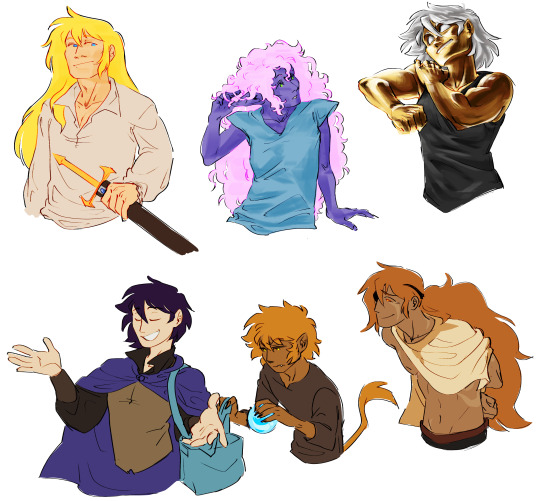
now I gotta render all of them..
1K notes
·
View notes
Text
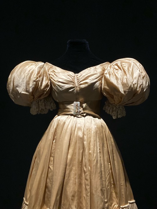
1830s silk gown at the Museum of Vancouver last year
254 notes
·
View notes
Text


a very gentle PSA that a writer is not a short-order cook, please do not try to order off the menu
2K notes
·
View notes
Text
a very gentle PSA that a writer is not a short-order cook, please do not try to order off the menu
2K notes
·
View notes
Text
So if yall didn’t know, in The Hobbit book, Thranduil had the Dwarves locked up for approximately weeks, and Bilbo was just invisible and wandering in the palace the entire time, vibing miserably.
My headcanon, therefore, is that the Mirkwood Elves now have a local legend about a ghost haunting Thranduil’s palace, never seen but generally thought to be harmless. Thranduil scoffs at the idea, but has been seen glancing around at the dark corners of rooms. Legolas fully believes in it and is known to say hello out loud when he enters an empty room, in case the ghost is nearby.
It’s not until Legolas joins the Fellowship that he figures out that the supposed ghost was actually an invisible Bilbo the whole time. He never tells Thranduil, because he thinks it’s funny to see his regal father unnerved by the idea of a ghost.
18K notes
·
View notes

Text
A detailed knowledge of fashion history has always been good for precisely dating artworks and identifying forgeries and misidentifications.
It is also good for spotting 100% AI-generated fakerino nonsense like this.

Let’s look at why this image is blatant AI nonsense.
There are big obvious clues, like that the image is an exact square. The focus is weird. The background figures don’t make sense and melt into weirdness. There are all kinds of errors, like how the front and the back of the plaid skirt in the middle figure do not line up. Or the abortive “toes only” shadow of the leg on the far left figure.
But it’s the fashion errors that really make it stand out as a fake image.
The women’s hair is vaguely like the styles of around 1964 (in some of them the hair seems to be mutating into hats).
But miniskirts weren’t much of a thing before 1966. And they were NEVER this short. Fingertip length was as short as they ever got.
When miniskirts were in fashion, the fashionable shoes were NOT 1980s-style super-high pointy-toed shoes. They were either low-heeled square-toed ballet flats or mild-high thick chunky heeled go go boots, things like that.
The absolute UNIFORMITY of these figures — boobs all in a row, uniformly short skirts all in a row, 1980s-style heels all in a row — is a structural clue. And close observation will reveal all the weird AI errors.
But really it’s the fashion details that betray it.
33 notes
·
View notes
Text
Something I’m becoming aware of as I study aspects of cultural history is how prefabricated and unprecedented the image of the 1950s was even at the time.
This is important because at the time and ever since, reactionary forces keep trying to jam the nation into that image as some kind of blissful idyllic ideal.
But the image of suburban America in the 1950s was pure fantasy sold to cover over the wounds of a deeply traumatized nation.

The US 1950s ideal of one employed breadwinning man and one unemployed housekeeping wife living with 1d4 minor children in a freestanding house in a sprawling new-built suburb pretending to be an idyllic small town/country estate was invented in the wake of the massive unaddressed generational trauma of the one-two-three punch of the First World War, the Great Depression and the Second World War.
The image was never fully embraced and even at the time was a regular object of mockery.

The image of women as ditzy housewives was violently enforced to erase the gains women had made in employment and the competence they had displayed during the war. Likewise the attempt to crush the Black people who had also demonstrated competence and capability. Veterans’ trauma was swept under the rug.
The very idea that the prefabricated commercial advertiser-driven idyl of the lone nuclear family swathed in its swaddling 1950s housing development, sold to anesthetize a still-war-traumatized generation living in the 1950s of the Korean War, of “Losing” China and the McCarthy Communist witch hunts, of the great eruptions of the Civil Rights movement, of the Cold War and bomb shelters and sundown towns, is the way things are “supposed” to be is utter, ahistorical nonsense.
We can’t go back. We were never there in the first place.
446 notes
·
View notes
Text
"May I have your name?" the faerie said.
"William," she said with a smile.
"Ah ah!" The faerie gave a wicked laugh. "I have your name! Now no-one will call you by it!"
"Thank you," she said.
"To win it back, you must- what?"
"I will find me a new one," she said, "one that suits me better."
4K notes
·
View notes
Text
A PSA about art materials and longevity: If you intend your art to last, you should use archival lightfast art materials made for artists, NOT paints or markers made for hobbyists or designers (Looking at you, Copic markers). Know your materials!
Whether it’s old fashioned gouache paints or modern markers, designer’s art materials WILL fade and change or even destroy your artworks, no matter how strong or bright their colors may look at first.

An example: This is the cover of the “New Yorker” magazine dated March 12, 1938, made from a color photograph of a gouache painting by illustrator Garrett Price.

(The pale greyish splotches on the 1938 magazine cover are age spots on the paper and not part of the original artwork.
This is called "foxing" in the antiquarian book collecting world.)
This is a photo of Garrett Price's original gouache painting — in the condition it was in at a 1999 auction.

Haunting!
What happened? Over the years daylight or maybe just even time passing faded the colors of the gouache paint Price used … Because designers’ gouache paint is not a permanent artist’s material. It’s not MADE to last.
When you put the two images side by side it’s even more stark. The central woman's deep rose pink dress has faded to a barely-there ghost-beige.

The rich green cornucopia looks completely different.

Most of the blue ribbons and pink flowers are completely gone, leaving the purple parts as faint mauve ghosts hanging in the air.
Even the nice black outlines are gone. Black should be a permanent color!

The pretzels have faded to a pale doughy mass.

Gouache paints are made to be bright for ephemeral advertising art and posters. They really are not suitable for any art that is meant to last. Any artist interested in the longevity of their hard work should use archival materials such as artist’s watercolors or professional acrylic paints instead of designers' gouache or markers, no matter how attractive the colors.

And don't think that because this was from 1938 things have changed that much. They were still selling designer gouache with fugitive pigments when I was an art student and art supply stores are still selling them now. And those markers are modern.
Know your materials!
118 notes
·
View notes
Note
Hi Red! I've seen in a few places that apparently today's your birthday so I wanted to say happy birthday :D I want you to know that your work is amazing both in the comic and in the channel, it has really impacted my life in more ways that I realise and I wanna thank you for it all. Have a great day and year!
thanks! I hope to spend it continuing to do and make the things I love doing and making!
1K notes
·
View notes
Note
@storytellerash here,
Do you have any tips for making art faster? I figured I would ask you since making a comic requires lots of illustrations at a consistent speed. Other than simplifying the art, is there anything else you've found helpful?
unfortunately shitloads of practice is the only thing I've found that meaningfully helps you get faster, but fortunately if you're trying to draw a comic you're going to get shitloads of practice anyway
To be more specific, in my experience what slows down my art is having to correct things - redraw lines, rework figures that look improperly proportioned on a second glance. But practice is what makes your lines smoother and more confident, and what makes you better at clocking errors earlier and faster. It also helps to practice drawing a diverse range of things - faces from multiple angles, bodies in unusual poses from non-head-on angles, background elements like rocks or trees or buildings, complex textures like fire or the surface of water or a translucent crystal. The more practice you have, the smoother your drawing of it will look and go, because anything will be slow and wobbly the first time you try to capture it on paper. Doing something slow is the first step towards doing it fast.
248 notes
·
View notes
Text
A PSA about art materials and longevity: If you intend your art to last, you should use archival lightfast art materials made for artists, NOT paints or markers made for hobbyists or designers (Looking at you, Copic markers). Know your materials!
Whether it’s old fashioned gouache paints or modern markers, designer’s art materials WILL fade and change or even destroy your artworks, no matter how strong or bright their colors may look at first.
An example: This is the cover of the “New Yorker” magazine dated March 12, 1938, made from a color photograph of a gouache painting by illustrator Garrett Price.
(The pale greyish splotches on the 1938 magazine cover are age spots on the paper and not part of the original artwork.
This is called "foxing" in the antiquarian book collecting world.)
This is a photo of Garrett Price's original gouache painting — in the condition it was in at a 1999 auction.
Haunting!
What happened? Over the years daylight or maybe just even time passing faded the colors of the gouache paint Price used … Because designers’ gouache paint is not a permanent artist’s material. It’s not MADE to last.
When you put the two images side by side it’s even more stark. The central woman's deep rose pink dress has faded to a barely-there ghost-beige.
The rich green cornucopia looks completely different.
Most of the blue ribbons and pink flowers are completely gone, leaving the purple parts as faint mauve ghosts hanging in the air.
Even the nice black outlines are gone. Black should be a permanent color!
The pretzels have faded to a pale doughy mass.
Gouache paints are made to be bright for ephemeral advertising art and posters. They really are not suitable for any art that is meant to last. Any artist interested in the longevity of their hard work should use archival materials such as artist’s watercolors or professional acrylic paints instead of designers' gouache or markers, no matter how attractive the colors.
And don't think that because this was from 1938 things have changed that much. They were still selling designer gouache with fugitive pigments when I was an art student and art supply stores are still selling them now. And those markers are modern.
Know your materials!
118 notes
·
View notes
Text
set a layer combine mode wrong and accidentally made the psychic torture slime bisexual

1K notes
·
View notes
Text
I’ve been waiting since March to post this...
165K notes
·
View notes