
Don't wanna be here? Send us removal request.
Statistics
We looked inside some of the posts by akfmp2021 and here's what we found interesting.
Average Info
Notes Per Post
1
Likes Per Post
1
Reblog Per Post
0
Reply Per Post
0
Time Between Posts
2 days
Number of Posts By Type
Text
17
Last Seen Tumblr Blogs


Fun Fact
Women make up for the other 50% of Tumblr’s audience.
Text
Final Outcomes
https://www.youtube.com/watch?v=h1-1VNWZc_s&ab_channel=AntaresTrade


0 notes
Text
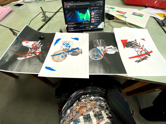
Outcome Of Final Moving Image Image
https://www.youtube.com/watch?v=h1-1VNWZc_s&ab_channel=AdrianKoszowski


Started off making the video in after effects by adding adjustment layers and also adding motion tiles for the glitch to work with the glitch parts and give it an encoding of wiggle (2,200) code for the wiggles speed of the glitch.
then added displacement map for the colour to change for the glitch to look more alike to a glitch.
the thing that most got into my time consuming was getting the glitch to switch between the posters as my original plan was to create the moving image with my 3 posters flicking between each other while the glitch is there with the distortion.
then the next trouble that ive came across was getting the file exported in a shorter amount of time and at a high quality video and i had to to reduce the video quality which didnt make much of a difference but still ended up being faster in the end.
At last the troubles of uploading the file onto tumblr and getting it to work in any type a way and for the last result i had to upload it to youtube that in the end atatched a link above to the video/moving image.
0 notes
Text
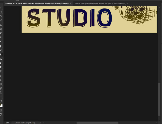
Poster 1


The way ive created this poster was through getting an outline of an manipulated image of the bridge from USA and then just got the lines which then i had to change to a white outline instead of a black one. then when i was satisfied with it i duplicated it and turned off the red channel in one of the layers and then in the other duplicate of the layer turned off the blue and the green channel and then off set the layers to give the outlines a glitch effect which i repeated this on the nest images shown on the screenshots and in the end added my logo which vie manipulated it into the poster giving it a Chicano style blend between the theme.
Then added a downloaded font from dafont which i didn't manipulate to keep the things simple.
0 notes
Text
Poster 2


Poster created through creating a manipulation between a Mexican and US flag and cut up into corners to blend in the way presented on the first screenshot.
Next my idea was to add my logo ADZ into the centre of the page and add text around the the logo. To create the text I've used a font from Dafont and downloaded that which then I've duplicated and turned off the channels of blue and green on other duplicated channel of the text and then turned off the red on the other layer that was a duplicate of the text layer to create the 3D finish effect you slightly off set either of the layers to separate the colours out.
0 notes
Text
Poster 3


So for the first poster ive ended up using an free stock image form google which I took into illustrator to manipulate it into a traced image with the effect of “black and white logo” as shown above.

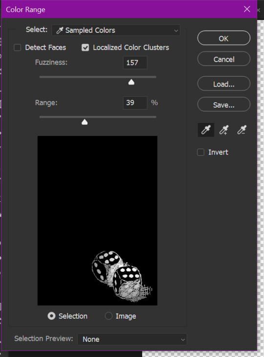


So my next steps and focus was to make the dice white which was done through selecting colour range and picking just the outline and removing the background out the equation and leaving just the outlines on one separate layer to keep everything floating about the way it should be.

The next thing that ive used was some previous work form an on sight task “mono-printing & Dry point printing”.

2 dry point prints form one of the on sight tasks that was set and used for this poster, which this photo got thrown into photoshop to then get manipulated to the way where the poker chips have its kind of spotlight and highlights and its shades with getting rid of the background leaving just the outline and at last inverted the colour of the outline to white from black.

Which ended up being the Casino chips/poker chips and this was work that was done using the dry point printing method that vie took a photo of the work and then manipulated it in photoshop to neaten the edges up to make it slightly sketched but also neatened up type sketch.
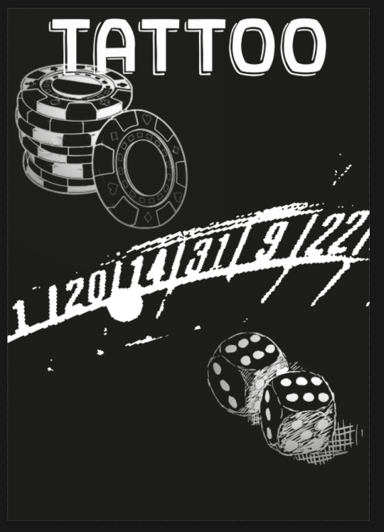

Also as for adding in the basic and the names/ text for the poster to present this design as a tattoo studio poster and to give its giveaway that its a tattoo studio which the imagery is the theme and the text to give it away but also the dice and the sketched poker chips. Where I've also went online and to be more specific to dafont to get the font called Gothic Ax Hand which ive to manipulate it in my own way but the font being form a gothic theme or another words set of font styles.

After being pleased with the font ive decided to get some kind of simple pattern to use inside the font to give the font more of its own character and its own unique look than some kind of simple bold one the idea was to get rid of the background/white space between the pattern and then blend it within the text.


These where the tools and also the brushes that I've used to create either the top grainy texture on the font. Starting with the gradient tool onto a larger b ut more soft brush with a larger scale to get the nice fade away.


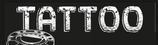
The progress of the font transforming.The first thing that ive ended up doing after the pattern was without the white bits was to put it into the text then blend it and also scale it to the size that fits perfectly to my preferences and also add texture into the font just to give it more of a characteristics.


After i was as close to the finish ive decided to play around with another layer on top of the whole outcome to then dissolve the layer or other type of ‘FX’ change to the layer that was effective in its way and that caught my attention. Which ive ended up experimenting with all the ‘FX’ features and these where the two that stood out the most or actually worked as not all that ive experimented with didn't give me a response.

This was the one that really stood out along the side of the screenshot above but the reason why I appreciate the last one more than the green gold tint as of the nice lighter finish offs where the focus points of the imagery isn't solid its fades round the edges as of the manipulation made earlier.

My last step was to add the logo somewhere suitable on the page and then blend it in so the letter A curves around the poker chip.
0 notes
Text
Logo

From the basic concept of Chicano style Calligraphy from simple calligraphy into more unique way of finishing the calligraphy ends off to have their own character and personal style. The first thing that was my challenge here was to actually get the letters the way i would want them to be without looking too common.

As soon as the font and calligraphy met the standards of my criteria I've decided to fill in the font in true black to give a simple and clear presentation of my design of font and logo itself.


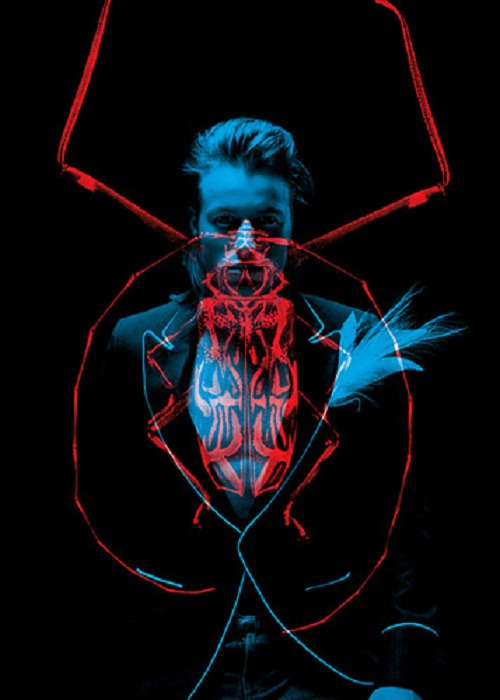
The two screenshots above show the representation of how the 3D/ glitch effect was done using the layer style option to get into the layers blending option to get rid of the red channel for that layer and for the duplicate layer of the text/logo but on the duplicate layer instead of removing the red channel this time the blue and green channel removed.as shown above in the first two screenshots.


my next goal was to work on the ace of spades to give it a blend between the gradient of black coming form the left towards the whit on the right which was made with the gradient toon and the dragged towards the chosen side and then also the length of the drag decides on the length of the cross fade. And also ive experimented with the inner shadow and the outer glow to give the logo a glowing effect with the splattered spades in the background gently glowing through.


Next outcomes of the logo are more based about the experimentation with the HUE levels and also possible colours for the logo in different outcomes or further into the future use.


After playing around with the hue levels of the whole logo ive decided to go with...

Ive decided to go with this one as for the simplicity in the higher balance between the blue and the lower balance between the red giving the logo more of a 3D look and effect the reason why i also went for this colour combination is as it gave out more of the inner outlines creating a depth field between the edges of the font and this was what i was looking for while experimenting with this logo.


also extra experimentations that where accidentally made but actually ended up liking them and they could be used in the future.
0 notes
Text
Double Exposure Research


Helmo - Thomas Couderc, Clement Vauchez
Thomas Couderc and Clement Vauchez is a talented graphic, design, and photography duo, founded in 2007 as “Helmo”. French artists create various projects, experimenting in different techniques and genres of art. Helmo excellent series of artworks entitled “Betes de Mode” means Fashion Animals. Red animal portraits combined with blue model portraits using a system of coloured gels that only reveal one of the facets or both depending on the viewing angle. Their works in large scale decorate the windows of the famous Galleries Lafayette in Paris using a lighting system. The creative French duo Helmo consistently produce stunning photo sets and designs, and experimental projects.
The reason for this artist really co-operating with my style of designing and my perception into double exposure and glitchy effect styles and that's the reason for this artist really catches my eye and also his artwork really inspires me
0 notes
Text
Double Exposure


Starting off with an image of fingers creating the letter “L” and “A” to create the “LA” gang signs to represent “LA” without actually using letters. As soon as i was done with getting the outline i threw it into photoshop to get the right size and put the both bits together. Reason for this choice is that when it comes to Chicano culture from the gangster/street life there would be alot of gang signs used for their representation of loyalty and representation of their gangs. This was also done intentionally to give the outcome in the end a unique finish and characteristics.

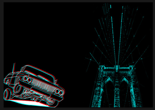
My next goal was to add few more things that are based around Chicano theme which happened to be an old Chicano style car that perfectly fit with the theme so ive decided to to take the JPEG of the internet and then image trace it to get just the outlines and that lead me to get a crisp outline of the car that vie decided for this outcome to be a simple outline piece witch minimal coloured but also glitched effect imagery.


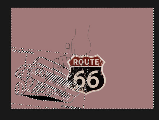
The next part of this was to actually change the colour of the outlined work to “white” as this would be the thing that changes the outline work when manipulated into the glitch effect where the white would stay as white but when the Duplicated layers of one image get set off that's when the small lines around the image start appearing creating the glitch effect. Right after I had that sorted out vie had a JPEG of “Route 66″ Shield that ive manipulated with the FX levels to give it a pastel kind of finish and kept bit in colour as for it being one of the most know places about America.


In Progress
0 notes
Text
Digital Abstract Typography Research
David Carson


David Carson is an American graphic designer, art director and surfer. He is best known for his innovative magazine design, and use of experimental typography. He was the art director for the magazine Ray Gun, in which he employed much of the typographic and layout approach for which he is known
Born: 8 September 1955 - 65 years Corpus Christi, Texas
Personally love the way David Carson creates his textures for his text and also the collages with text the way they compose together with the rest of his outcomes really blends and works really effectively.
0 notes
Text
View From Here - drawing
The main focus of this task was to look at things around the class and draw them down onto paper and the square box that was representing the small view coming form the small paper frame that we go handed in to create these small images/ freeview images.
I don't really think this style would really suit my style in terms of actual styles creating out of one image that has been manipulated to make it unique in its own way with its own unique characteristics. the thing that ive noticed with this task is that its good for freestyle drawing and it gets you used to the fact your drawing what your seeing and not what you think your seeing.
0 notes
Text
3 Chicano Style Collages +Screen printed Collage


Collage made on a base of Chicano style imagery and their style of creating some kind of message and personality in the collages that they do.
The reason for my choice of layout is the hand with the La lettering in the middle of the top part of the hand is supposed to be the symbol of La and main focus of the image representing Chicano style coming from La and with the fingers crossed representing the “West Coast” with the gang signs of the letter “W” then the old school West Coast car in the left corner in a larger scale to fill in most of the empty space and not creating too much of a cramped space within the collage and representing the Chicano side of old school automotive side of the culture and the American dream cars with the people in the background creating a representation more about the style and culture.
The choice in my colour has to do more to define more of the darker tones of where the shading comes in and the detail of the shadows which in my opinion creates more of a powerful come across from the image and representation of the collage.
And the last two photos are about screen printed workshop that was based around screen printing some kind of text with shapes ect. on top of the collages that where manipulated in photoshop.
0 notes
Text
5 images from artists researched and analysed “Klawe Rzeczy”


Colour/imagery- The artist from “Klawe Rzeczy” shows a cool and creative in a simple way art style that portrays small meanings within the images and also religion or also feelings. The artist also uses a small range of colours within each art work of theirs which flows well with their composition of simplicity and small range of colours to limited amount of imagery in the middle or also uses
Texture/type- The artist uses “sugar paper” type style texture in each of their work creating an old paper and old imagery style artwork. The artist don't really use type in these images provided above maybe here and then there would be some punctuation used within the imagery to represent the feeling or to fill in the blank space
Layout/how it inspires me- The lay out of every artwork from this artist is based around the middle point of the page and some if not most of the work is scaled down with the background left as it leaving the background to create a border around the work. The thing that really inspires me about this work is the simplicity and the limited amount of art added into each art work in some sense creating this abstract thought of the artist not putting enough time into their work and still succeeding that way really fascinating to see this in art form.
1 note
·
View note
Text


This quick bit of text that I've manipulated into the image as presented on the screenshots above form just the text into the text hiding behind the people in the photos with the lettering in red saying “West Coast LA” which the text was manipulated in the same way as the previous post that also explains in more detail on how to do the “Layer Mask” effect.
0 notes
Text
Layer Mask Tutorial


This art style technique is a basic way of combining/manipulating text to blend into the background or whatever thee image is and its based around the concept of using “X” as the button to switch the selection between black and white in a layer mask white as adding the text in this case into the background and then with the switch of “X” what that does is remove the text/ part of the text from the view leaving the background to come through. The last image shows the two squares that switch between black and white depending on the selection that your using.
0 notes
Text
A4 & A5 Images converts for mono + intaglio/dry printing


(Analyse in progress)
0 notes
Text
Principle Of Chicano Images


A bit of a manipulation using the collage technique/blending ways and ideas tom create an image Chicano style collage as for the last image on photoshop

Small collage using drawings and a photo which will be manipulated into a drawing for a better concept for this collage and switched the bank notes with mask alike faces into casino chips to give a better collage effect and slow a little nicer if for example this was to go onto someone for their arm as a tattoo the (collage is used as an example just for a tatttoo)
0 notes