
Don't wanna be here? Send us removal request.
Statistics
We looked inside some of the posts by albya18 and here's what we found interesting.
Average Info
Notes Per Post
42
Likes Per Post
19
Reblog Per Post
14
Reply Per Post
9
Time Between Posts
8 days
Number of Posts By Type
Text
11
Video
2
Photo
1
Last Seen Tumblr Blogs


Fun Fact
Tumblr.com rank in the US is 25.
Text
Untitled c.2022


I chose Jackson Pollock because I loved the energy, dynamic movement, and randomness from his paintings. I felt immediately drawn towards the wild, free energy that his paintings portrayed. I also liked how the drips, flows, and splatters of the paint on many of his art works were spontaneous but also controlled in an unique way. This makes his paintings even more unpredictable and enjoyable to me. Specifically, I chose to reinterpret Jackson Pollock’s painting called Untitled c. 1943. I found the painting in the MoMA Museum website.
My painting is a loose copy of that artwork. The original painting had somber paint colors of black, blue, grey, brown, and white on an off-white background. To make it my own, I reinterpreted this painting with more positivity and bright colors. I would keep the black background, but I want to add and use more variety of bright, colorful liquid paints. I reinterpreted this painting with colors that I found to be more cheerful, lively, and joyful.
There are five fascinating facts I learned about Jackson Pollock’s life and artistic process. One interesting fact I learned was his dedication to his paintings, for once he knocked down a wall to make his room large for a 20ft canvas. Another interesting fact is that his artistic style is called “drip painting” or “action painting”, which consisted of dripping and splashing liquid household paints onto a horizontally positioned canvas. Third, Pollock was married to Lee Kraser who was also an abstract expressionist painter like himself. I find it interesting that they both married someone in the same career field and art expression. A fourth interesting fact that I learned about Pollock was his reasoning for why he abandoned the use of names and titles for many of his paintings. Many of Pollock’s artworks had either odd names like “Number 7” or were left untitled because he wanted people to look at his paintings for what they truly were – purely painting. Numbers were neutral and they didn’t add figurative elements. I found his reasoning to be inspirational and quite exemplifying to the abstract expressionist art movement. The fifth interesting fact I learned was how Clement Greenberg, a historically well-known and significant art critic, personally organized Pollock’s first solo art show at Bennington College in 1952.
In full honesty, I loved so many art works that were blogged this semester by my classmates. Everyone’s drawings and paintings captured such a unique and beautiful expression. They were all priceless. While everyone’s work was inspirational to me, one work that captivated and comes to my mind is Sam Floyd’s surrealism drawing. I admire it because of the creativity and illusion it gave me. It portrayed the reality of nature. It depicted two different emotions to me: one that is giving and beautiful but also sadness and loss.
3 notes
·
View notes
Text
It's okay, let it out

This is my Dada art piece. Everything done from brush strokes, and drawings, to the arrangement of magazine pieces I have glued on the paper happened by random chance. And sometimes it's okay to let chance show you the way.
2 notes
·
View notes
Text
Worlds of Wonder

For my Surrealist dreamscape, I used a combination of both drawing and painting medias. My strange and dreamy world captures two of the most vast unknowns to mankind: the galaxy and the deep, blue ocean. I used different line movements like swirls, waves, hatches, and straight lines to portray complexity as well as a groovy world with motion. There is still so much to do, to see, and to explore in my world!
3 notes
·
View notes
Text
Title: City Falls

For this week’s futurism artwork, I created my own original conception of a futuristic alternative reality, in which technology and nature fuse together. In this artwork, specifically the image is depicting the fusion of nature and technology through the waterfall and cityscape. The floor exhibits digital cubed platform along with a flowing waterfall. I created majority of the cityscape with lines and squares to align with a digital, rigid vibe. In contrast, I used circular and wavy lines for the waterfall and trees to show the freeness and openness of nature. The contrasting line movements show the juxtaposition of nature and technology.
5 notes
·
View notes
Text
Buy Me
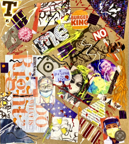
For this Cubism artwork, I used the cardboard of an Amazon package as my canvas. I cut out all sorts of geometric shapes from magazines and newspapers. I made sure to even use the extra scraps. In terms of my artistic direction, I went out of my comfort zone and tried an abstract arrangement with the clippings and paint element. I embraced chance and played around with it. I used lots of image overlaps and warm colors, to emphasize consumerism chaos and pop out the images.
2 notes
·
View notes
Text
the colors of her


For my Fauvism portrait, I drew my friend, Ashley. Blue represents her need for inner peace and truth. She chooses to live her life with peace and harmony. Blue and pink also brings out her sensitive and reliable personality; one who thinks of others. Blue and purple also symbolizes her stability, which is an extremely important aspect to her life. Purple shows her spirituality and trustworthiness; she is a loyal and gentle soul. Green shows how down-to-earth and practical she is in her life. I chose black for some portions of the portrait to show that she’s serious about her goals and the people she chooses to have in her life. I also used brown because it is a solid, strong color often associated with the Earth; similarly, she is a modest and humble person. I used orange to represent her productivity and drive to dive right into work and get things done. Yellow shows her calming and happy self when she is with the people she loves. Overall, I mainly used cool colors to portray Ashley because she is never overpowering others and has a calming aura.
4 notes
·
View notes
Text
(Post)Impressionism


For my art assignmnet, I chose the jellyfish scene from Finding Nemo movie. I used a combination of both drawing and painting to make this artwork. The energetic paint swirls and wavy lines for the ocean capture dictinctive movements in expression for post-impression. I also attempted techniques like stippling and drybrushing on the jellyfishes to demonstrate impressionism.
4 notes
·
View notes
Text
Filter Me


1. Selfies seem to be the biggest forms of how we express and view ourselves. Over the last decade, my relationship with selfies has surely changed and impacted how I view myself. A decade ago, selfies exchanged were just silly and fun. I used Snapchat filters like big mouth, puking rainbow, and puppy face. As I got older, selfies became a way that people looked more attractive and how they stood out from others. More filters seemed to capture the ideal, young face – a face with poreless, plump skin, high cheekbones with a cute button nose, full lips, catlike big eyes, and long lashes. While these selfies made me feel beautiful, the filters also changed my view of beauty. Sometimes it made me question my own beauty. These selfies began to pick at my insecurities. It became hard not to rely on filters to feel more beautiful and be more confident with my appearance.
There is definitely a social and emotional affect from selfies. Socially, selfies helped me present myself in the best possible way. However, that “best” look didn’t seem to be my natural face. Emotionally, there seemed to be a pressure to always look happy and beautiful in pictures. Taking selfies used to be a way to be funny and creative but now selfies seem to be something I had to “create” and “edit” to look beautiful. It’s not as natural and effortless as it used to be a decade ago. But as I am getting older, I try to step away from the digital concept of beauty. Though I do still add filters to my selfies, I try to make it as true and wholesome to my natural self.
2. Be it guys flexing their muscles or girls pouting their lips, selfies became the new trend very early on! As selfies became more prominent in our generation, so did the angles we took them. There were high angle selfies, mirror selfies, the half-face selfies, the Bambi-eye selfies, and pouting selfies. These different selfie angles show how individuals want to be portrayed as. Some angles create a petite, cute look, while other angles portray confidence and dominance better. In the last decade, I believe that many of the selfie angles were taken at a high angle to accentuate the facial features, especially our eyes.
Generally, most selfies are now taken arm-length straight from face distance. This angle helps capture the face in natural view. However, for the most part I feel that the current selfie angle is not as defined as a decade ago. Now people are becoming more creative with their angles to create interesting dimensions to their images. In fact, selfie sticks have contributed to wide range of angles, bringing all sorts of spicy, fascinating angles into the lens. People would take pictures low on the ground to accentuate the subject’s height and captivate confidence and dominance. Some angles capture the subject off-center, and other angles capture up high to focus on the subject in bird-view perspective.
3. Personally, I do not believe that we have reached a plateau with filters. I feel that filters are endless creations, especially when the creativity of filters can be made by anyone. Filters do not necessarily have to be face altering and complex. Some filters are simple as beach warm colors or adding gif sunglasses. Since there is a way for any person to create and publish their own filter, I feel there is always going to be new filters to engage viewers.
Companies can continue to keep us engaged with filers by giving more voice and taking opinions from active members. Companies also can trend their filters by keeping up with pop culture references and styles. If companies create more funny and creatively beautiful ways to capture people, I feel that it would keep people engaged. Filters can also alter location. I know there are filters that change your surrounding like creating fog or blooming flowers on the walls. If snapchat can create a virtual reality from the camera lens, I think that would captivate the audience as well. As long as there are people actively scrolling and sharing pictures through social media, I believe that filters will be interesting, popular, and reused for a long time.
5 notes
·
View notes
Text
"Try Me"
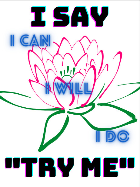

I’m empowering people to face their challenges and inner demons. Take the situation as it comes, instead of worrying about it. Have the gut and might to face it head on. Take part and grow in the process like the lotus flower. First, you got to believe it (I can), then you prepare for it (I will), and finally you act it (I do). Every choice and change starts with yourself, which is why I start every statement with “I”. Once you believe in yourself, no one can stop you.
The text was purposefully designed to be black, bold, and uppercased to spark determination and courage. Likewise, the words in the middle were written in blue as a reflective, calming mantra. As the background, I put the lotus flower to symbolize the growth, strength, and beauty within all of us. The lotus flower is a beautiful flower that only grows in the mud. The mud is like our problems. We can’t avoid the problems of life, but we will get through them. Just as the lotus flower, we can also rise beyond the muddy waters, blooming remarkably beautifully. As midterms are rolling in, I felt that the library would be the best place to empower students who may be stressed and worried! :)
2 notes
·
View notes
Text


For this week’s art assignment, I had my friend and roommate, Rama, as my model! I used the complementary color combo blue and orange. I had her dress up in an orange top, blue jeans, and wrap herself in my blue, fluffy blanket. With the snowy environment and the passing of the winter storm last weekend, for the element of fashion I wanted to emphasize warmth and comfort using my fluffy blue blanket. It also kept her warm during the photoshoot! Blue and orange can also be seen in the background, the stark contrast between the blue sky and the orange bricks of the houses behind the model. I used the compositional S-shape for my background and on the model herself. The strong curvature of the street shows the background S-shape. And I made the model put her hand on her hip so that a S-shape can be seen along the (left) side of her body through the blanket. Using blue and orange as my color combo, I was trying to create a dynamic and interesting scene exhibiting figuratively blue as the “coolness” of the cold, snowy background contrasted by the orange being “warmth” seen by my model covered up in blanket and the cozy houses.
2 notes
·
View notes
Text


Here's a sweet poem for you!
"Roses are red,
Violets are blue,
You are Berry special,
No one is as sweet as you!"
3 notes
·
View notes
Photo

Name: Alby Alex
Pronouns: She/Her/Hers
From: New City, NY
Academic Path: Pre-med
Favorite Artist: Leonid Afremov
Hobbies: taking pictures, traveling, watching movies/shows
Favorite Quotes: “In three words I can sum up everything I’ve learned about life. It goes on” – Robert frost
“I will not be another flower, picked for my beauty and left to die. I will be wild, difficult to find, and impossible to forget” – Erin Van Vuren
3 notes
·
View notes