
Don't wanna be here? Send us removal request.
Statistics
We looked inside some of the posts by aliceininteractiveland and here's what we found interesting.
Average Info
Notes Per Post
20
Likes Per Post
20
Reblog Per Post
0
Reply Per Post
0
Time Between Posts
5 days
Number of Posts By Type
Text
7
Last Seen Tumblr Blogs


Fun Fact
70% of Tumblr users say the Dashboard is their favorite place to spend time online.
Text
The project so far...
The app so far:
Kip is an animated interactive storybook which will gently reassure anxious children while showing them methods to deal with their anxiety.
The reader joins Kip, a bear, who is lost in a quirky dreamland. Together they must travel towards sunrise. Along the way, they help some of the anxious characters they meet and enjoy the world around them.
The business so far:
Team of 7: writer, illustrator, programmer, SFX coordinator, audio talent, proofer, project manager. More on marketing in a bit.
Funding hopefully in partnership with a charity who could tap into pots of money I can’t. NSPCC, Save the Children, Action for Children, Children 1st etc.
Development Timeline would be 3 months.
Marketing would be helped by the social profile of the charities involved, but also The Scottish Book Trust, Bookbug, Schools/community centres. Reviews on Common Sense and Apple’s App Store are key.
Route to market is something I don’t quite understand – yet!
Distribution would be through Apple.
Development Costs are bundled in the price below.
Cost of Product seems like a lot at £11,000 for a book app. Broken down per person per job it doesn’t. Is it even enough? I’d set things up to have files to use for possible down the line products (print format, audio book, etc.), but not adding those costs in.
I work in similar teams, but with animators more than programmers, so I think my timeline is fair but my costs could be way off. I’ll revisit my calculator and see.
0 notes
Text
Trajan’s Column - History or Propaganda?
I think that should be the title for National Geographic’s transmedia piece which is actually titled Trajan’s Column - Reading an Ancient Comic Strip (2015).
The landing page is an interactive graphic that lets the viewer scroll up and around a two thousand year old stone column to view the scenes carved into it which depict two Roman wars. Clicking on arrows leads us up the column and some brief text explains twelve of the carved scenes. The rest of the carvings are left for self-exploration. The graphics were beautiful and smooth, but I was left for wanting more. Firstly the lack of sound is a huge oversight - an audio element would really bring it to life. I then clicked and hovered and dragged in various places expecting more information which I eventually extracted from the lengthly article in the next section. With more description, pop-up text boxes, and atmospheric sound, I’d be here scrolling for hours.
Next stop, via a top of the page tab: article. It was a fascinating read but long, and the embedded video was missing entirely. The video’s description was tantalisingly there though, and after a quick search I found it lurking on Vimeo. The stop animation was a fresh style change and the information was nicely presented in a simple narrative. Could it be sponsored by Adidas?! Either way, it was lovely and educational and a shame that it wasn’t seamlessly integrated. This would have brought everything together and livened up the article which, in my opinion, should be halved with the rest of its information delivered partly via the interactive graphic and the rest in another video or static infographic.
Overall I think the piece is engaging, but wonder what its purpose is? If it’s aiming to educate about specific historical events, the interactive graphic is under-performing. If it’s aiming to question the carving’s accuracy and whether these artefacts are historical evidence, that perspective needs to be brought to life outside of the article. If it’s aiming to be a general all-rounder, then perhaps the information its trying to impart should be equally delivered across interactive graphics, text, video, and sound. It’s a really nice piece that falls just a little short and misses the odd trick. Still - I learned a lot and am now inclined to say: historical propaganda.
2 notes
·
View notes
Text
youtube
Having thought about visual style last week, this week I’m mostly thinking about burst space hoppers, ice cream sandwiches and swirling snot due to the wonderful Even Monsters Get Sick.
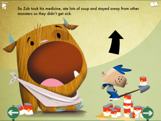

The mix of familiar storyline and fun engagement is bang on. I want interaction to push the story forward, but not inform it. I’m aiming to keep it simple. The other book in the series, Even Monsters Are Shy is equally great, an orange squeeing contraption being the highlight, though main characters other than white boys with blue hair would be ideal.

I did go down an interesting and slightly glitchy rabbit hole with Nick Fortugno about games and storytelling, but this project is not headed in that direction. These fun monsters, crossed with a dreamy Hilda look, are keeping me on track.
5 notes
·
View notes
Text
I’ve been thinking about colour scripting in animation (this article made my heart lurch by referencing the opening sequence of Up). I thought I was just avoiding narrative work, but turns out I first needed to picture the world I’m in.
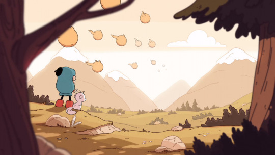
We start the story at bedtime which should be fairly saturated but relaxing, not upbeat garish (I’m shielding my eyes from you, Minions). We need calm.
In dreamland, colour will be everywhere, feelings are all encompassing after all. The palette will align with narrative, acting as mood indicators. Again, keeping it calm. I’m picturing mood dependant gradient skies from across the rainbow.

I love Luke Pearson’s Hilda, both the graphic novels and the animated series. The colour palette is beautifully understated and whimsical and, you guessed it, calm. The sky and the land unite to help focus attention on the action.
It’s a world I feel both at ease and curious in, which is exactly what I’m after.

Now, totally inspired, I’m diving into story...

3 notes
·
View notes
Text
This is a journey into...
Well, research. This week, exploring child anxiety has led me to consider how anxiety and therapy are journeys themselves, and I wondered: could they be embedded into my narrative’s journey?
I’ve been delving into medical journals written by music therapists and podcasts with child psychologists (this NPR one was particularly good) and noticed how layman’s guidance on supporting an anxious child often follows a process along the lines of calm, validate, plan, build.
Is it possible to echo this journey through the order of events in my narrative? I’m willing to try.
Will it be noticed (probably not) and is there any point (possibly not), but I like the idea of reassurance and understanding and theme being embedded deep in story. So, I’m delving into narrative design this week with an approach that’s part osmotic, part toolkit, with the rest being a lot of dream land weirdness and fun because, at the very least, an anxious child needs an opportunity to smile.
2 notes
·
View notes
Text

Sesame Street really hits the nail on the head when it comes to interactive storytelling and resources for kids. The Monster At The End Of This Book is pure joy, and their Breathe, Think, Do app is purposeful and simple. My aim is to equip kids with approaches to deal with anxiety, but I also want narrative. And to aim for somewhere around 5 or 6 year olds. I started thinking about why CYOA books and text adventures appealed to me when I was a kid (albeit slightly older), and explored Eastshade and Dear Esther, thinking how the concepts could be adapted for kids. I watched Rockford’s Rock Opera which, despite being way more 1970s than 2020s, my kids loved. It just lacks interactivity, and is quite long. I can see how an interactive story game, with short story branches, choices based on coping mechanisms, and a bunch of songs might be a good direction to go in. Now to work out if it already exists...
3 notes
·
View notes
Text
I can’t remember my first interactive experience. Maybe Choose Your Adventure stories from the 80’s - both in print and on a juddering IBM. I wasted a lot of hours with Sonic on a Gameboy circa 1993. Much more recently (December 2020) I was blown away by the Ray Harryhausen exhibition at the National Gallery of Scotland.
The exhibition’s purpose was to celebrate 100 years of the artist, showcase his puppets, contextualise his work in its era, and recognise how he influenced stop-frame animation. Ferocious skeletons and towering cyclops are a childhood mainstay of mine, when there were 4 channels on the telly and their Saturday afternoon schedules were always films like The 7th Voyage of Sinbad and Clash of the Titans. So, I was excited to see his work on display as I write for and have an interest in animation, but was surprised when it was the interactive elements that bowled me over.
In one spot multiple screens hung, inviting visitors to step in and be transported to a 50’s set to see how these early animated films were layered, and the order of a shoot. Elsewhere, Playdead, a Glaswegian company adept at all things animated, had designed a narrative played out by a few iconic Harryhausen characters projected onto exhibit slabs between which the story moved. It was a touch of magic, the kind of magic that animation always brings to the table. Or slab. A final stop on a green screen set with sword-wielding skeletons and a dragon in a Sinbad-style ruined city topped off the physical exhibition, but another thread, perhaps under-marketed, was a series of online workshops in conjunction with Aardman Animation. The Aardman facilitators discussed how Harryhausen pushed the limits of his field, which techniques remain unchanged, and how a stop motion animation set works, reinforcing what had been communicated in text at the Gallery as well as teaching us how to make a Gromit and Shaun the Sheep.
It’s a real treat seeing behind the scenes of pioneering films that influenced the likes of Star Wars, Jurassic Park, and Aardman (all themselves pioneers in my opinion) and it was fun, light-hearted, surprising, and genuinely educational. I’m a big fan of learning for all, and believe that museums and galleries can be at the heart of it if all exhibitions were as engaging and broadly appealing as this. So, in a way, Ray Harryhausen is still pioneering, 100 years later.
5 notes
·
View notes