amalbaidas-blog
Amal Baidas
Graphic Design + Branding
www.amalbaidas.com/portfolio
9 posts
Don't wanna be here? Send us removal request.
Last Seen Blogs
alextbaer
FotoBaer
resistas
2000

my-introverted-self
I'm just plain boring

depress-ed
Pequeño Saltamontes
brainless-but-thats-all
{guitar rift}
Video
Motion Graphics II @ Mercy College
Animated Info-graphic using After Effects.
Meow.
1 note
·
View note
Photo


Graphic Design III @ Mercy College
CURIOUS magazine - thoughtful and ingenuous.
I extracted the bigger themes and patterns that embody my student work and created a magazine that showcases and discusses a few relating topics in the field of graphic design. Presented are a few spreads of the 52 page magazine.
Stay Curious!
0 notes
Photo
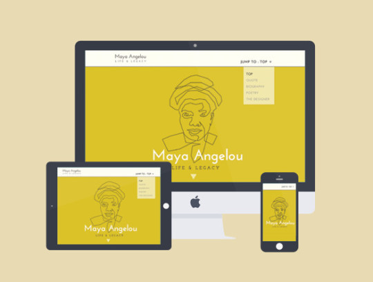
Web Design II @ Mercy College
How is print matter represented on the web? I translated my previously created Maya Angelou Spreads into a one page website using html/css/bootstrap.
To view: http://amalbaidas.tumblr.com/maya
0 notes
Photo


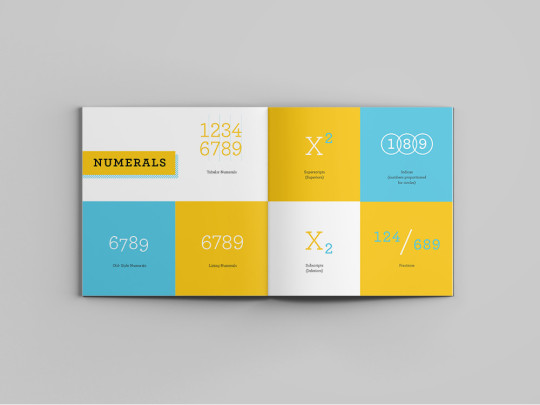

Typography @ Mercy College
Archer is a beautiful typeface designed by Tobias Frere-Jones (with Jesse Ragan). The purpose of this project was to choose a typeface and create a specimen book that enhanced its typographic features and aesthetic characteristics.
0 notes
Photo

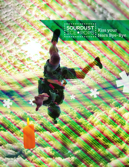


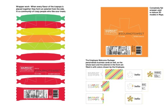


Graphic Design II @ Mercy College
Throw away your sweet tooth people-- there’s a new popsicle in town.
0 notes
Video
Motion Graphics I @ Mercy College
Short Promotional/Info-graphic piece on The Public Theater.
0 notes
Photo

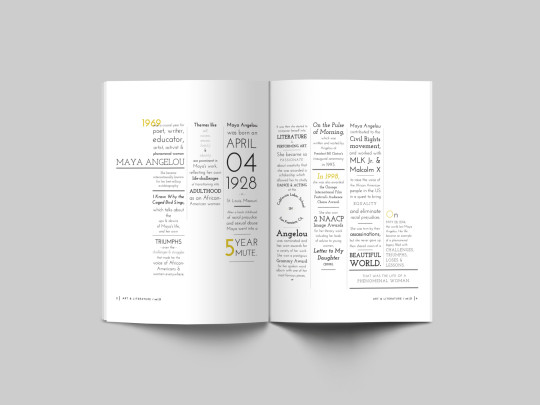
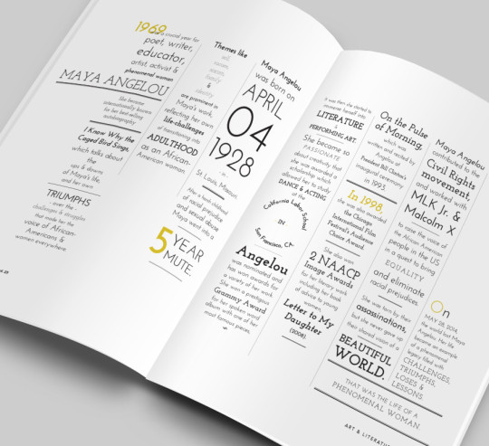

Graphic Design II @ Mercy College
Graphic translation of Maya Angelou’s persona in light of her poem “I Know Why the Caged Bird Sings”. Listening to her interviews and recitation of her work, rhythm was no doubt a part of the typographic treatment of the biographic article and poem.
0 notes
Photo
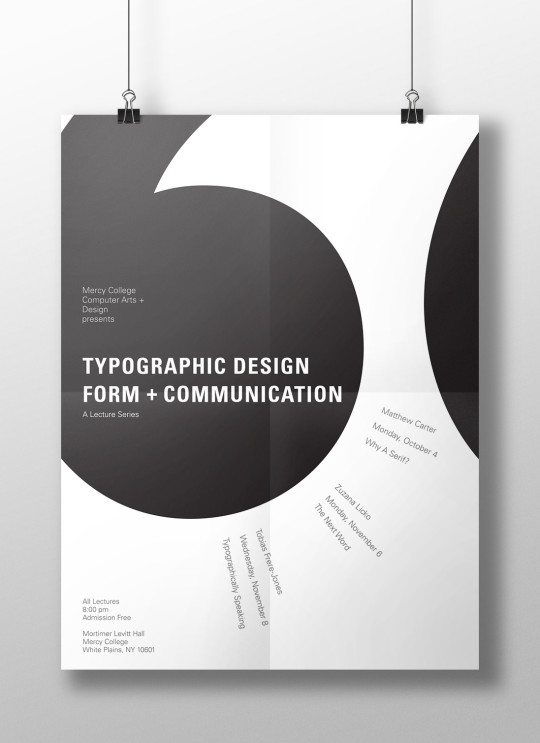
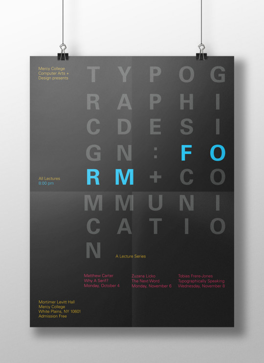
Typography @ Mercy College
To understand the different ways to create hierarchy, we made multiple posters starting with limiting typographic exercises (using line breaks only for example) working our way up to more complex designs.
0 notes
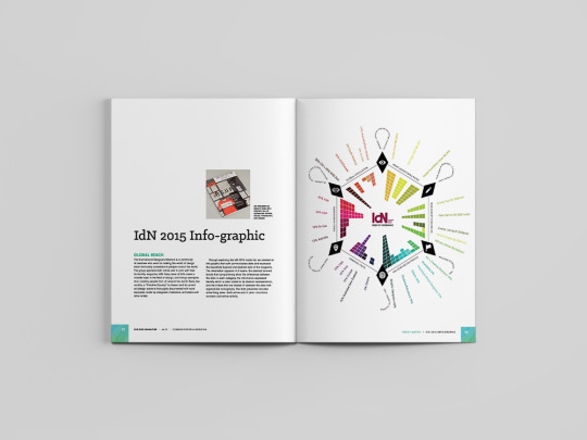
Photo
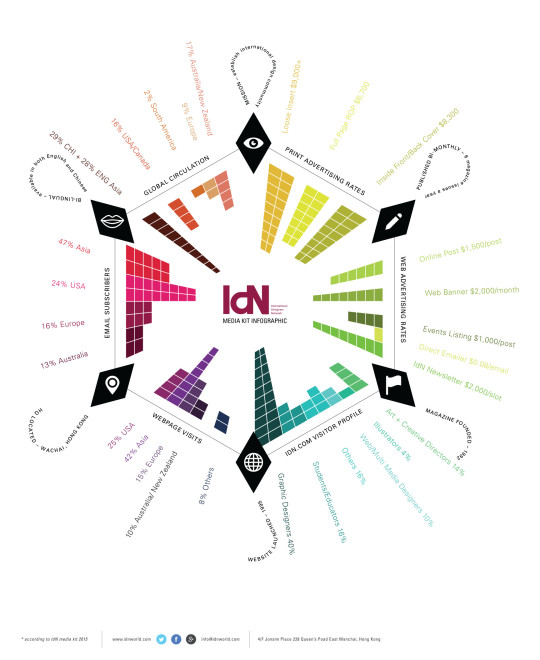
For Graphic Design III @ Mercy College
The purpose of the project was to design a poster that clearly visualized data taken from a magazine’s media kit (a document that shows stats for annual activity). The result was a kick-ass info-graphic inspired by the layered aesthetic of the International Designers Network Magazine (http://www.idnworld.com/).
0 notes