Don't wanna be here? Send us removal request.
Text
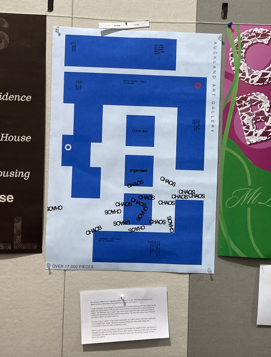
Final Poster - Pinned up
The final poster colours did not translate accurately, as it was too bright. I had gotten this printed at The Warehouse Stationery. I tried again using the Pinklime service at university however the colours turned out darker and too muted. I am happy the final marked version is based on the pdf version.
0 notes
Text
Final animated video
Rationale:
The theme of "chaos" is more evident in the animated video as it shows the type moving out of the frame at different time speeds and positions. The movements are fast, then paused before resuming again to mimic spidery movements (as spiders can often be thought up of quite chaotic in nature to people).
It remains out of the frame for a few seconds to let the audience breathe/process before rapidly appearing again however this time there is more of them, and appearing all over the poster - to show the theme of unified chaos and how unsettling it could be.
The type begins glitching in unison to reinforce this, before fading out from the frame. This leaves one "chaos" type in the original room, so the viewer can fully digest the animated poster with the "chaos" type in its intended "peaceful" view ("come view organised chaos").
This is meant to make them reflect on the disarayment of the chaos they have just witnessed; and to invite them to come see it at the chosen setting.
0 notes
Text
Animation process:
Originally after the "chaos" type leaves the screen I was thinking of rotating them and bringing a lot more in so that black fills up the whole screen (kind of like a doodling vibe animation). However, I found that was too difficult to do with the font type and style (maybe a doodling font would have been better however that would have been too different from my original font that I wanted to keep). I would have too many layers and it would also follow a motion similar to the first half of the animation.
Instead, I opted to fill the poster up with the type and have them appear in place in a single rapid movement. I then animated them to glitch at the same speed (but slightly different times) as another way to communicate chaos. I think this had a similar effect.
0 notes
Text
Animation poster - process
Besides animating the chaos in a couple of ways, I also experimented with animating the other type elements.
For example:
I made the "come view" and "organised" type drop in from the top of the poster, however, I felt like it made the animation feel too gimmicky.
I made the "exhibition" texts change positions, however I felt like that distracted the viewer too much from the "chaos" type.
I made the "Auckland Art Gallery" text fade in and out
I attempted animating the red and blue circles by making them "jump" up and down, and glitching them.
In the end, I decided to keep the focus of the animation on the "chaos" element and keep the motion for the rest of the elements as still to place emphasis on this.
0 notes
Text
Animation - process
A struggle I faced after exporting to Illustrator was removing some of the sublayers and groups in Illustrator. I had to redo this process many times, as it would show up as one layer in After Effects.
-Other "sub groups" I tried to delete looked like they were nothing however as I deleted more of them I realised they were were part of the textured images I added. Removing a lot of them made my layer not as visible, so in the end I just left them.
-As I had added stroke to my "chaos" text, Illustrator had divided the normal type and the "stroke" into different groups of 2-4. After exporting into Aftereffects, I realised I needed to go back find them (they were scattered) and group them under the same group in order to animate them together as one text, for each individual "chaos" text. This step was the most time-consuming.
Another struggle I faced was having to go back and make all the CMYK colours for my poster into RGB and find fitting colours for them (as After Effects works in RGB). This meant I had to go back to step one, and repeat the process of importing through Illustrator all the way to After Effects again. However I was glad I did this as the original colours showed up way too bright on Aftereffects.
0 notes
Text

This is the still poster final version I have decided to hand in for summative. I have decided to keep the chaos text not as crazy as the previous versions as I feel like it is enough that it is inside and around the one room and also gives the poster time to breathe and take in the other elements such as exhibition names on the blueprint. However for my the animation part of the poster I will most likely make the text go crazy all over the page
0 notes
Text
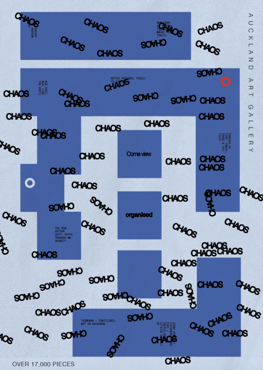

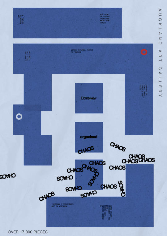
Experimenting more with placement and rotation. I have decided to keep the font colour black as I feel it fits best with the typewriter feel I am trying to achieve
0 notes
Text
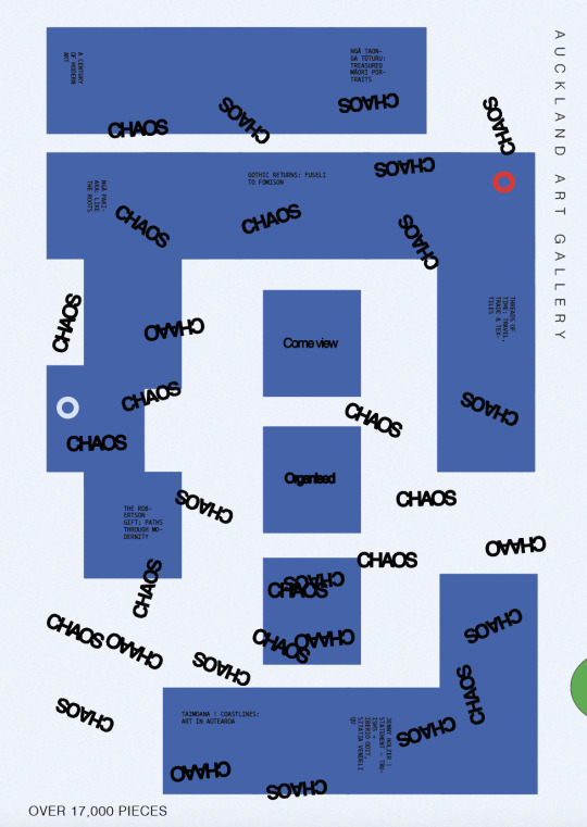
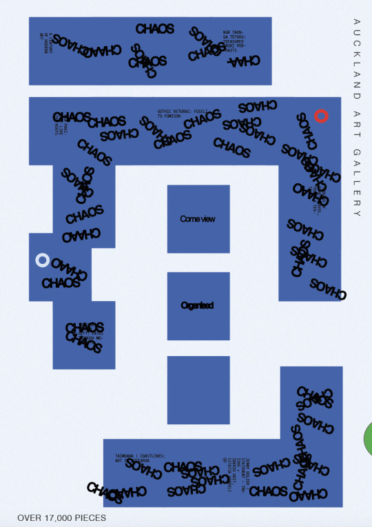


Playing around with incorporating the chaos elements more into my design by playing with position, scale, colour, and rotation. I experimented with different fonts and spread words outside of the room to try and convey the "scattered" idea of chaos, or connecting the chaos to the other rooms in the blueprint
0 notes
Text


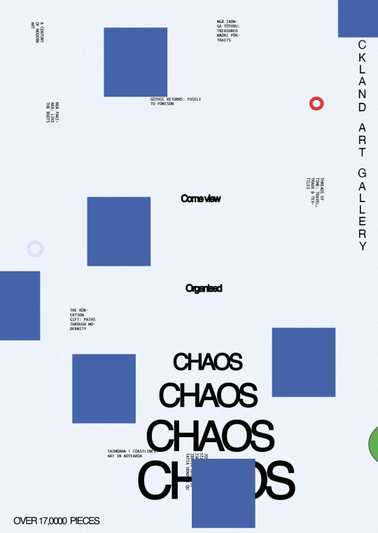


Trying to develop the squared blueprint idea. There was a lot of ways I could play with it, however I have decided to stick with the version I handed in for formative based on feedback as I think having the full version of the blueprint showingmakes it more unique to my setting; it is also quite common to have scattered shape texts posters created by artists before
0 notes
Text

Contextual Annotation—Animated Poster
Enlisted by David Moloney, this poster is a part of the 21 posters created by different creatives to inspire positivity at a time when graduates may be finding it challenging to break into the creative industry. It achieves this through playing with motion graphics to relate to its type (thus drawing the audience in in an interactive way).
For example, it plays with scale by zooming into “look closely”; this contrasts with “listen carefully” where no motion is being shown, it then plays with position by making “learn continuously” travel in an endless loop.
Aside from that, the little robot animators are interacting with the text by moving in a way that is indicative of the verb of the text (looking, staying carefully, reading).
Utilising the above creative strategies, the designer was able to create a lighthearted yet thoughtful and inspiring poster for other young creatives out there.
David Moloney (2021). Making it 21 [Motion Poster] Multiadaptor. https://www.itsnicethat.com/news/david-moloney-makingit21-graphic-design-010221
0 notes
Text
Week 8 SDL - Animated Poster
instagram
Week 8 - SDL - Animated Poster
Paul Voggenreiter
The type in this poster clearly outlines the intention of the message - to draw people in to see the international film festival.
The colour of the font is cohesive with the circle shape (indicative of of the sun) and the gradient (indicative of the sunset).
Motion-type's opacity fades out as its position moves behind the sun; it then fades in again, but appearing in a new position.
The speed of the motion transitions from slow to faster as it hides behind the sun and back.
Animated visual - Indicating the flm festival will be appearing over a span of a couple of days.
0 notes
Text
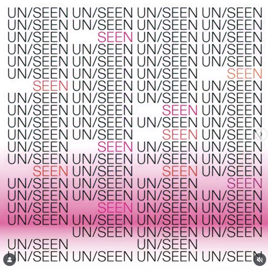
Week 8 SDL - Motion graphics - Contextual annotation
This motion graphic’s intended message is a call to action for people to attend a Wikipedia workshop to bridge the gender gap between female and male designers. It successfully achieves this by articulating its message through type and motion graphics. For example, the typography for “unseen” is black, however, the “seen” typography is coloured pink and orange which is representative of feminine colours and energy. The blinking and disappearing motion of the “unseen” text represents women feeling unseen and unheard throughout the workforce over the years. After a pink gradient line passes through it (the supposed call to action); the “seen” texts appears. Once the line passes up again it is only the “seen” text that are present on screen.
Utilising position, opacity, and colour, this motion graphics makes viewers think about the change and impact they could have on this cause by showing them a visual story and representation of it.
Unseen Women design (2024). Unseen Women design [Motion Poster]. https://www.instagram.com/p/C7QsDDHiKuc/
0 notes
Text
Week 8 SDL - Motion graphics - Short notes
instagram
Husmee Studio
This motion poster gives the impression of a sensory overload through its animation. It’s communicating the message of using our senses to see and discover the architecture around the city. The type which reads “Experimental”, “visual language”, and “about store” are moving continuously with the textures. The main motion used is the changing of position. This generates interest and curiosity from viewers. The colour change from black and white to colour also accentuates this message.
0 notes
Text
instagram
Wk 8 SDL - Motion graphics - Short notes
Skala Design
This motion graphic is interesting as it plays on the idea of moving and adapting through motion and space, as a call to action for people to visit Baden's new exhibition location.
This is achieved through the way type the type is moving about and interacting with the bright green tape (which also stands for the bold and daring arts that live inside the new exhibition).
Its positioning is moving, rotating, and sliding about in a fluid energy; signalling the exhibitions fluid and adaptable nature.
0 notes
Text
instagram
Wk 8 SDL - Animated Poster - Short notes
Husmee Studio
The positioning of the text mimics a hand on a clock, giving the audience an impression this poster could be about time (the rapid rotation of the type reinforces this).
The speed of the animation is rapid and fast, mimicking the beat of a drum.
The vibrant colour changes are representative of the changes in night and day. The red and blue indicate night (capturing the audience's attention), while white and blue stand for day.
Surrounding type in smaller scale informs viewer of the event and date.
0 notes
Text


Week 7 SDL - formative poster reviews
Poster 2 - Caitlin Church
The use of negative space places an emphasis on the shape and type which is the main focus. This creates curiosity and invites the viewer to pay closer attention to the message.
The use of text content is engaging but a little hard to decipher.
Although the font isn't the most expressive, the lighter gradient colours and textured overlay of the shape makes the type stand out and adds a nice visual style.
Poster 3 - Bree Luca
The folded bold + it being in all caps lock captures the viewer's attention
The dark blue colour contrasts well against the lighter pink colour and makes it stand out
The typeface works well with shapes as they look similar and match the same vibe.
The text at the bottom clearly communicates message to the viewer about what this poster is about.
Poster 3 - Lambert Oscar
Good use of negative space, draws in the viewer to type which is the main focus.
Text content clearly communicates its central idea.
Type looks like glyphs, I like the stacking placement of them as if creates an interesting dynamic within the space
The smaller type surrounding the poster gives more detail and adds to the overall final design
0 notes
Text
Storyboard - Animation

The animation will be focused on "chaos" elements"
Chao types in its original position from formative submission (inside box
Chaos types moves out of the frame at different speeds (fast then stops), mimicking spidey movements
Chaos type stays out of frame, building viewer anticipation
Chaos appears inside the frame again, rotating side to side and growing bigger in scale until covering the whole screen (similar to animated stop motion)
0 notes