
Statistics
We looked inside some of the posts by amber-budd and here's what we found interesting.
Average Info
Notes Per Post
3
Likes Per Post
3
Reblog Per Post
0
Reply Per Post
0
Time Between Posts
5 days
Number of Posts By Type
Text
17
Last Seen Tumblr Blogs


Fun Fact
The most popular pages on Tumblr are about Minecraft, GIFs, and David J. Peterson.
Text
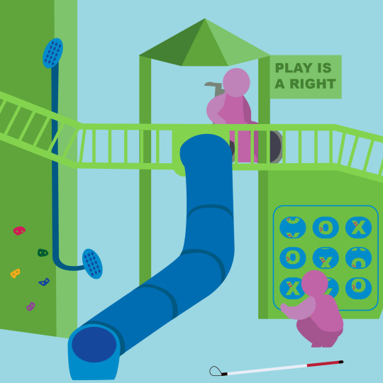
Revised Manifesto #6
Constraint Recipe Used: Random (type + image + colour)
Revisions: When I entered the class, I felt like my design was more complex than necessary, which is a common issue for me, but I wasn’t sure how to simplify it. The in-class critique, as always, was incredibly helpful because I received a variety of opinions and suggestions from my classmates. I decided to simplify my design by removing unnecessary details, like the path and some playground equipment. I also integrated the type into the design by turning it into a "sign" on the playground. Ultimately, the main adjustment I needed to make was to focus on my focal point and clarify the message I wanted to convey.
0 notes
Text

Manifesto #6
Constraint Recipe Used: Random (type + image + colour)
Comments
In British Columbia, about 12 percent of children and adults live with a disability. Play is crucial for a child's development and well-being, as it fosters growth, creativity, and happiness. However, children with disabilities may face challenges in using standard playground equipment. When designing play spaces, it's essential to consider the diverse needs of all potential users and how they will interact with the environment. Ensuring that playgrounds are not only engaging but also accessible for everyone is just as important as creating spaces for play itself.
0 notes
Text


Summary #6
Summarize
With the older populations growing larger, making products and services more accessible becomes increasingly important. As we age many of the senses weaken. Older adults may experience declines in vision and hearing, which can make it harder to interact with everyday products and services.
There is a common misconception that accessible design sacrifices the style aspect. Even if designs are made to be more usable for all, the aesthetic and look of the product get forgotten. Practical design can still be useful to serve its specific purpose while still looking stylish.
Designers should help guide clients to focus on accessibility. Help them to ensure to keep in mind the colour, size, font, contrast, and language to make it accessible to all potential users. simplifying and reducing the amount of information that the user has to process is crucial. Unnecessary content should be removed to avoid distraction and confusion. Especially in public systems like elections, easily understandable design is essential. Without the government focusing on good communication design, many people will suffer the consequences of misunderstanding.
Take-Away-Statements
Design can be practical and stylish
Ensure everyone can participate
Good communication design
Remove unnecessary complexity
Accessibility = enrich
True design is not just what we see but also how it functions
Sources Used
I Wrote a Book on user-friendly design. What I see today horrifies me, Don Norman, FastCompany.com
Design Issues: The State of the Ballot, JP Williams. Accessibility: A Practical Handbook on Accessible Graphic Design, RGD, RGD.ca
Real World Example
When designing, it’s essential to consider factors such as contrast, hierarchy, size, and other key components. One thing that often gets overlooked is the longevity of a design. Now this isn't in terms of trends, but ensuring that the physical product lasts. This example highlights how the frequent rainfall on Vancouver Island wasn't prioritized in this design process. As the sign may read okay to someone with perfect vision, those with colour blindness might struggle to distinguish between the contrast of dark and similar colours. Additionally, someone with poor vision would find it difficult to understand the meaning and text of the sign. If the sign was made of plastic or aluminum it could withstand continuous exposure to rain without the risk of rusting.
Take-Away-Statements
Design Durability
Stand the test of time and function
Design for longevity and easy or no maintenance
0 notes
Text
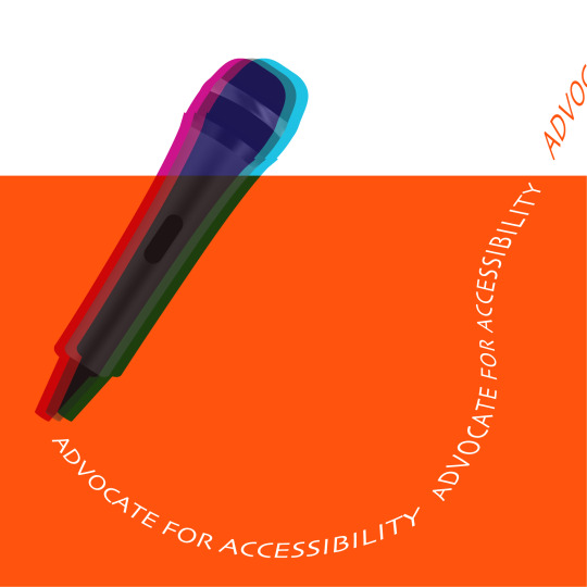
Revised Manifesto #5
Constraint Recipe Used: Reverse Type + Colour Revisions: When I brought my Manifesto Statement to the class, I felt that certain aspects needed adjustment, though I wasn't sure exactly what. My classmates and instructor pointed out areas for improvement and offered some great suggestions. One idea I decided to incorporate was adding a shadow or effect behind the microphone. To achieve the overlapping colours, I took the shapes into InDesign and applied the Multiply effect. The original text was hard to read due to the serif font, so I changed it to a cleaner sans-serif font for better clarity.
1 note
·
View note
Text

Manifesto #5
Constraint Recipe Used: Reverse Type + Colour
Comments
The article Visual Accessibility in Graphic Designer: A Client-Designer Communication Failure discussed how designers sometimes hesitate to raise concerns about accessibility needs. This reluctance can stem from various factors, such as the fear of challenging or questioning the client. In the article, it reads, “Consequently, if clients are not interested in accessibility then the designers cannot justify using what they believe to be potentially expensive and time-consuming tools.” Even if a client hasn’t mentioned accessibility in the brief, it is still essential to keep everyone's needs in mind. This hesitation may stem from a lack of experience or awareness, especially among newer designers. I was inspired to design my weekly manifesto with the article's messages in mind. Communication between the client, designer, and users is the key to creating an accessible design that meets everyone's needs.
Sources Used:
Visual Accessibility in Graphic Designer: A client-designer Communication failure, Katie Cornish, Joy Goodman-Deane, Kai Ruggeri, & P. John Clarkson, ScienceDirect.com.
0 notes
Text
Summary #5
RGD - Accessibility: A Practical Handbook on Accessible Graphic Design
Summarize
The RGD Accessibility Handbook is for those who are involved in the design process. The text describes how a significant part of the population will experience disability at some point in their lives. Even for those who may not, everyone has a unique way of thinking, learning, and interacting with the world. Therefore, accessibility must be an essential part of the design process. The text suggests aiming to present information in a manner that is easily understood by all by minimizing the “cognitive load”. Design must have clear and universal language while keeping accessibility checks regular, such as considerations for colorblindness. Prioritizing accessibility doesn’t have to compromise your work, rather it increases readability and legibility, ensuring that everyone can engage with the content.
Take-Away-Statements
Accessibility checks
Minimize cognitive load
Accessibility doesn't mean compromising
Visual Accessibility in Graphic Designer: A client-designer Communication failure
Summarize
The article emphasizes the importance of integrating accessibility into the design process, with a particular focus on print-based materials. Collaboration and effective communication between clients and designers is essential for reaching a wider audience. Clients must understand what is being said and how to make it more accessible by addressing the needs of the users. Researching different perspectives can provide valuable insights into how information may be perceived or interpreted. The text suggests that relying on your instincts to solve problems can be misleading, accessibility can often be overlooked. Clients may not think to include accessibility in project briefs or understand the importance of prioritizing inclusive practices. The paper looks at how clients and designers need to work together to collaborate on creating visually accessible designs. A study in the text asked designers about the tools and methods they use for accessibility needs. It was revealed that many designers were open to learning more about new accessibility tools and methods. The communication gap between designers and clients has designers sometimes hesitant to raise accessibility concerns if they are not explicitly mentioned in the brief. While both parties are responsible for communicating visual accessibility needs, designers are trained to source solutions. Some designers would prefer to not use the tools provided in favour of their own judgment to save time and costs. Developing more user-friendly and cost-effective accessibility solutions could prove beneficial to all involved.
Take-Away-Statements
Verbalize concerns
Communication gap
Collaborate creatively
Source solutions
Sources Used:
Accessibility: A Practical Handbook on Accessible Graphic Design, RGD, RGD.ca.
Visual Accessibility in Graphic Designer: A client-designer Communication failure, Katie Cornish, Joy Goodman-Deane, Kai Ruggeri, & P. John Clarkson, ScienceDirect.com.
0 notes
Text

Revised Manifesto #4
Constraint Recipe Used: Hand Lettering & Sans Serif
Revisions: After the “musical chairs” critique in class, I received several sticky note suggestions to enhance my manifesto statement. Many classmates felt that my text needed adjustments; some thought it should be larger, while others recommended making it smaller. There were also suggestions to utilize more of the negative space. In response, I decided to not only enlarge the text but also integrate it more closely with the illustration. I adjusted the proportions of some of the lights and centred them as well. Overall, the piece now feels more cohesive and legible.
0 notes
Text

Constrain Recipe Used: Hand Lettering + Sans Serif
Comments: Last week’s resources highlighted a powerful message: Everything has value. Even materials that seem discarded can be repurposed into new products. This approach embodies the principles of a circular economy, where items are kept in a continuous reuse cycle instead of being thrown away. Establishing a closed-loop system benefits manufacturers, consumers, and the planet. The Cradle to Cradle - Reggs video emphasizes that we are constantly surrounded by commercial products, making it essential to consider the materials used in their creation and whether they can be reused or will end up in the trash.
Sources Used:Cradle2Cradle | Reggs,Youtube.com
0 notes
Text
Summary #4
Design Technology (website)
Summarize
The website explored the concept of Eco-Design, which focuses on assessing a product's environmental impact throughout its lifecycle, including materials, energy use, and waste. Key principles outlined by the United Nations include minimizing toxic substances, increasing recyclability, and advocating for renewable resources. Eco-Design is based on two primary philosophies: Cradle to Grave and Cradle to Cradle. Cradle to Grave evaluates a product's environmental consequences from production to disposal, while Cradle to Cradle seeks to eliminate waste by designing products for material reuse. The site also emphasizes life cycle analysis, which examines environmental effects across five stages and discusses the product life cycle, which consists of four phases: introduction, growth, maturity, and decline.
Take-Away-Statements
Product lifecycle
Seeks to eliminate
Enhance recyclability
Promote renewable resources
Cradle to Grave - Gore-TEX (video)
Summarize
The video features the brand Gore-Tex and how they follow the LCA, an internationally recognized scientific method standard. The LCA evaluates the entire product life cycle, from materials to the disposal of the product. It scientifically measures the environmental impact of a product by analyzing the company's carbon footprint. Customer choices play a vital role in reducing waste and energy.
Take-Away-Statements
Consumer choices
Cradle to Cradle - Reggs (video)
Summarize
This video discusses the cradle-to-cradle design philosophy, which promotes sustainable production. The current strategies to reduce waste, such as reducing, reusing, and recycling still lead to resources being depleted. The Cradle-to-Cradle strategy encourages a shift from minimizing waste by putting materials in a continuous cycle, to being remade into new products. The video also touches on how in the design industry it is important to celebrate diversity, by drawing inspiration from the world around us.
Take-Away-Statements
Materials in a continuous cycle
Celebrate diversity
Surrounded by commercial products
Do Good Design (book)
Summarize
In his final thoughts in Do Good Design, David Berman discusses the responsibility of designers to use their creativity for good. He encourages them to develop practices that consider the life cycle of a product and the time it takes to decompose. The book advocates for a focus on design that is ethical, long-lasting, and accessible for all. It also pushes for commitment to dedicating a portion of professional time to projects that contribute positively to the world.
Take-Away-Statements
Design is a strategy
Accessibility is good for people and business
Descan (website)
Summarize
The design professionals advocate for sustainable design that integrates social, cultural, economic, and environmental considerations. It calls for collaborative and innovative approaches to find solutions to global challenges. DesCan encourages designers to use their creativity to promote positive change.
Take-Away-Statements
Global Challenges
Sources Used:
Design Technology, Eco-Design, DesignTechnology
Do Good Design. Chapter 10-12. David Berman (Book)
Life Cycle Assessment: GORE-TEX Footwear, Youtube.com
Cradle2Cradle | Reggs, Youtube.com
Descan, Pro Practice, Sustainability, Descan.ca
0 notes
Text

Revised Manifesto #3
Constraint Recipe Used: All Hand-lettered
Revisions: After presenting my design in class, I received feedback that my work was difficult to understand. The additional details I included, intended to illustrate how designers can sometimes overcomplicate a composition, ended up cluttering it instead. With this feedback, I decided to simplify my piece by removing some elements to enhance clarity. Ultimately, the vision I had in my mind didn’t translate as well in the final creation.
0 notes
Text

Manifesto #3
Constraint Recipe Used: All Hand-lettered
Comments: While a focus on aesthetics can elevate the visual appeal of a design, prioritizing it over functionality can leave it impractical. Designers may focus on creating compelling works of art that can overshadow the design's main purpose. Good design is a balance of functionality and form. This idea was explored in Do Good Design, in which the author gave me the idea to create this piece.
Sources Used: Do Good Design. Foreword; By Erik Spiekermann, Berman’s Manifesto, 3 Step Pledge. David Berman (Book)
0 notes
Text
Summary #3
Do Good Design
Summarize
The provided document discusses the instinctual drive designers have to prioritize aesthetics, even if it comes at a cost. The author emphasizes the importance of developing processes that resonate with personal values. Erik shares his perspective as a designer, highlighting the need to spread awareness of the social impact of graphic design.
Take-Away-Statements
Reflect on Personal Values
Designer Drive
Prioritize Aesthetics
Berman’s Manifesto
Summarize
The manifesto advocates for personal responsibility in creating designs that builds a more sustainable world. The text encourages individuals to rethink their habits and seek long-lasting products. The message is to be mindful of your consumption and make ethical choices in all aspects of life
Take-Away-Statements
Mindful Consumption
Rethink Habits
Three Step Pledge
Summarize
The pledge brings forward the significance of professional ethics and upholding ethical standards. It inspires designers to make a positive impact with their designs and play a role in making a more sustainable society. By implementing small changes and making thoughtful design choices that create positive change and contribute to social good. The author discusses that it is possible to work ethically while also achieving financial success.
Take-Away-Statements
Small Change can have Big Benefits
Ethical Choices Drive Social Good
Code of the Ethics
Summarize
The document outlines the framework for ethical standards in graphic design, emphasizing the crucial responsibilities that designers have towards their clients, employers, and society. Designers may be pressured to deliver visually appealing work while ensuring their designs are truthful and respectful. The document underscores the importance of teaching proper practices and ethical decision-making in design education.
Take-Away-Statements
Responsibilities to Clients
Role of Educators
Teach Proper Practice
Design to Re-nourish
Summarize
The text highlights the Systems Thinking portion of the design process, outlining the benefits of following this model when developing the project and its goal. This can help designers understand the relationships of the elements in their work and the impacts they may have. When beginning a project before anything else, it is important to determine the goals of the assignment and any problems that need to be addressed. Creating a project brief helps document these goals, ensuring that everyone involved remains aligned. Additionally, the text discusses the long-term consequences of design choices. The chapter highlights the need to source solutions that fit the client's needs while having the greatest positive impact.
Take-Away-Statements
Define project Goals
Long-term Impact of Design Choices
Focus on Systems Thinking
10 Principles for Good Design
Summarize
The website discusses Dieter Rams and how during his design career he began to reflect on the environment around him and his role as a designer. Rams connected several key principles to characterize good design. He believes that good design should be innovative, useful, aesthetically pleasing, and easy to understand. It should also be honest, down to the last detail, unobtrusive, long-lasting, and environmentally friendly.
Take-Away-Statements
Focus on Key principles
Design that is Honest & Innovative
Rams (video)
Summarize
The Rams documentary features discussions with Dieter Rams, who emphasizes the importance of questioning unsustainable design choices. He advocates to design with the future in mind by creating a product that is built to last, both physically and aesthetically. Rams argues that new doesn’t always mean better, highlighting the overwhelming presence of unnecessary and cheaply made products in today’s market. He believes individuals should think beyond a daily basis and help shape the environment by keeping materialism in mind. Rams challenges designers to rethink the systems put in place and aspire for a more sensible and environmentally conscious system. The documentary influences designers to use their creativity to give freedom. Dieter Rams' known phrase “Less, but better”, encourages design that does not distract but provides function.
Take-Away-Statements
Simplicity and Functionality
New ≠ Better
Core Philosophy
Mindful about Materialism
Sources Used:
Do Good Design. Foreword; By Erik Spiekermann, Berman’s Manifesto, 3 Step Pledge. David Berman (Book)
RGD/GDC/SDGQ Code of Ethics, RGD, GDC & SDGQ
Design to Re-nourish. Chapter: 2. Eric Benson & Yvette Perullo (Book)
10 Principles for Good Design, Design Museum. DesignMuseum.org.
Rams, Gary Hustwit. (Documentary) Dieter Rams - Quote, “Less, but better”
0 notes
Text

Tweaked Manifesto #2
New Constraint Recipe Used: Type + Texture + Colour
Revisions: In this composition, I initially focused too much on the constraint recipe. I aimed to create an effect using the word “path” in the background and included the number two as a rebus. These details made the design wordy, problematic to read, and overall confusing. I wasn’t able to realize these things on my own because I had been immersed in the project for so long that I became blind to the clutter. My peers were able to help me notice the imperfections of my work in the class critique. With their excellent suggestions, I was able to simplify the statement by not focusing on the constraint recipe. I removed the rebus elements and concentrated on conveying my intended message more clearly. Additionally, the words on the direction signs needed some refinement as they didn’t quite make sense. Another great comment was to change the red on the top of the pole to gray, ensuring it wouldn’t detract from the main focus point of the composition. I adjusted the path to align more with the signs and occupy more space on the artboard. Lastly, adding a texture to the dark brown background to enhance depth and visual variety.
0 notes
Text

Designed Manifesto Statement #2
Constraint Recipe Used: Rebus + Type
Comments: This week’s readings highlighted the significant impact graphic design has on public perception and behaviour. Ethical design has the potential to contribute to positive change, while unethical practice can harm or mislead. In Design to Re-nourish, the authors emphasize the importance of designers considering the societal and environmental consequences of their work, encouraging them to reflect on the choices they will need to make in their careers. The chapter inspired me to create a composition about the “paths” they choose, such as whether to take on a client who promotes unethical design.
Sources:
Design to Re-nourish. Chapter: 1, Eric Benson & Yvette Perullo (Book)
0 notes
Text
Summary #2
Summarize
Design to Re-nourish
The book Design to Re-nourish explores the many different areas of work in graphic design and how they can have a positive or negative impact on the world. Designers should be aware of the repercussions their work can have on the environment, economy, and society. The text discusses how companies with “well-designed” branding are perceived as more trustworthy. Good design can make people's lives easier, by keeping accessibility, human rights, and equality in mind. Persuasive artwork can be used to influence viewers purchasing decisions and shape their opinions. Overall the chapter examines how as a designer it is important to consider how ethical your choices are when it comes to working in the design world.
Take-Away-Statements
Persuade for positivity
Conscious of repercussions
Promote ethical practices
Do Good Design
Chapters six and seven of Berman’s Do Good Design, discuss the ethical implications of design and how in the graphic design world the use of sexualized imagery, men’s and women's bodies has been used in advertising. Marketing this type of imagery influences vulnerable groups of people, such as children and teens, and the long-term effects on their values. It is important as a society to shift toward more meaningful marketing and truthful advertising. The book also emphasizes that designers have the responsibility to promote ethical practices and produce work that challenges stereotypes rather than follows them. Advocate for responsible design practices and learn from past mistakes. These chapters raise the important question about the impact that advertising has on individuals, especially those who are more vulnerable, and why there is an urgency for change.
Take-Away-Statements
Challenge stereotypes
Promote healthy behaviors and ethical practices
Using beauty and youth to sell products
Advocate for Responsibility
Should designers take responsibility for the Ethics of their clients?
The article, Should Designers Take Responsibility for the Ethics of their Clients? emphasizes the importance of making ethical choices in design and how these choices can influence society, culture, individuals, and the environment. Designers have a responsibility to consider the ethics of their clients, if a project promotes harmful ideas, designers should refuse to participate. The document highlights that ethical decision-making should be part of the design processes and when deciding whether to take on a client.
Take-Away-Statements
Importance of ethical choices in design
Design affects the environment
Action against harmful ideas
Designer Responsibility
Sources used:
Design to Re-nourish. Chapter: 1, Eric Benson & Yvette Perullo (Book)
Do Good Design. Chapters; 6 & 7, David Berman (Book)
Should Designers Take Responsibility for the Ethics of their Clients? James Cartwright (Online Article).
1 note
·
View note
Text

Tweaked Manifesto
Revisions: With the help of my classmates I was able to identify that my composition was overly complicated. The extra elements in the piece were taking away the effect of the main statement. By simplifying the artwork and removing the plane, banner, and clouds, it not only looked cleaner but also became easier to comprehend.
1 note
·
View note
Text

Manifesto #1
Constraint Recipe Used: Type + Image Comments: The materials provided for this assignment, such as the reading and the video touched on how advertising is everywhere. Brands and logos are displayed on billboards, sky rises, and even on a welcome sign when entering a new city in Africa. Although many brands have a positive intent, it is good to consider how those who may live in the area are affected by advertisements. For this composition, I wanted to convey the feeling that ads rule our world. Using my statement “How much advertising is too much?”I began creating a billboard to turn it into an ad. After adding the background and clouds I found the horizon looking too empty, so I crafted a plane and banner to fill the sky with advertising.
0 notes