
Don't wanna be here? Send us removal request.
Statistics
We looked inside some of the posts by amberwhilesyear3-blog and here's what we found interesting.
Average Info
Notes Per Post
0
Likes Per Post
0
Reblog Per Post
0
Reply Per Post
0
Time Between Posts
10 days
Number of Posts By Type
Photo
11
Last Seen Tumblr Blogs


Fun Fact
Tumblr has been banned in Indonesia for providing people with access to pornographic content.


Photo

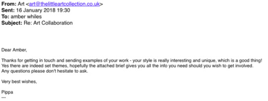


As soon as I seen this brief advertised, I knew had had to be a part of it. I emailed the given address asking for more information, and added a link to my Instagram art account also.
The owner of the company, Pippa, was lovely and replied to my emails promptly. She sent me the brief (which was great and full of everything I needed) and also gave me some lovely feedback on my work.
Although, at first I naively read the first reply from Pippa wrong, and did not see the attached brief as, as I found out a few days later, links do not show on mobile phones. Therefor, I spent a few days creating designs that had no relevance to the brief what so ever. Although, I am still pleased with the work I produced at this stage, and it could also be useful for any future projects.
When I finally realised there was indeed an attached brief, I got to work immediately to create some new designs. The themes were great and fit my current ‘style’ really well, and I had so much fun creating the final designs.
Pippa seemed really happy with what I had sent, which I am obviously extremely pleased with.
This brief has opened my eyes to pattern design, and it could possibly be a route to think about in the future.
I’ve included some examples of the work I created before reading the brief above.
0 notes
Photo


Another brief I decided partake in was to create a new, contemporary design for the popular KFC Bucket.
I began by highlighting the important points of the brief such as the colour palette and other specifications. This helped me to remember to include everything, and not to go against what the company were asking for.
To get a better understanding of KFC’s usual style, I also researched previous bucket designs, old and new. It was pretty clear from this research that their style is usually minimalistic with nothing too crazy going on, and although I wanted to keep this in mind, I also wanted to change things up slightly.
I wasn't too sure about this brief. I didn't feel I had as much freedom as the previous two, although, I am pretty happy with the outcomes. They succeed in being fresh and contemporary, which is what the brief was asking for.
https://www.ycn.org/awards/ycn-student-awards/2017-18-ycn-student-awards/briefs/kfc
0 notes
Photo


Another brief I came across on Briefbox was to design a Christmas card. Although not necessarily set by a brand/company, I decided to still take part as, who doesn't like a good Christmas card?
I decided to go with a particular ’style’ I have recently been working with - bright coloured, full of texture with a touch of collage.
I wanted the card to be minimalistic as not to overpower the main focus, and so I decided to go with a plain white background.
Overall I was really happy with the outcome of this brief, it helped me to realise that sometimes, less is more.
I have received some pretty good feedback and views from these two Briefbox briefs, even having Briefbox follow my personal Instagram art account. I believe Briefbox could be a way of gaining more vies of my work and could possibly benefit me in the future, therefore I aim to regularly check up on new briefs to partake in.
https://briefbox.me/briefs/design-a-modern-christmas-themed-postcard/
0 notes
Photo


Finding a Placement
I was really looking forward to this part of the module, I especially wanted to secure a placement and a company that was right for me and that I was completely happy with, to gain some industry knowledge and experience.
After researching into local illustration based companies and studios, I wrote down a list of possible placements and began emailing (see above examples).
As for replies, just over half did get back to me, although many didn't reply at all. I also had one particularly negative reply, which if I’m being honest, made me wary and disheartened to email any other places.
Unfortunately not one of these replies were particularly good news as I failed to secure a placement in one of my chosen places. I’m unsure whether that was mostly down to me being too picky about where I wanted to go, or just bad timing.
On the other hand, I was excited to begin researching and taking part in a live brief instead.
0 notes
Photo


As Iv’e got some time spare before the exhibition, I decided to create some work for myself to possibly sell or give away at the exhibition.
The top two images are a design I created for business cards. I think they work pretty well as they showcase my style of illustration, as well as having my contact details and Instagram tag also.
The others are collage/digital character designs that I thought I could make into A4 prints.
I’m not sure yet whether I’ll be taking these along to the exhibition or not, but they’re there anyway if I decide to go ahead.
Submitting to the curation team/The exhibition
It was time to submit the work we would like to be exhibited to the curation team, in order for them to decide what work would be shown.
After spending most of my time designing the posters, I didn’t manage to get round to creating anything new for the exhibition. I decided to submit two pieces of work that I had previously made, the ones chosen being two pieces I believe sum up my personal illustrative style pretty well.
Although I’m disappointed in myself for not creating anything new, these pieces are two that I am pretty proud of, and would be really happy for these to be exhibited. Another reason I chose these two in particular was because I think they could look pretty interesting in a Wild themed exhibition.
I was lucky enough to get both of my pieces chosen by the curation team to be showcased at the exhibition, which I was obviously very excited about.
On the day of the exhibition, I joined the team at the Castle Emporium two hours before opening time in order to help out with the finishing touches. There were a weeks to be done but mostly we were ready.
The exhibition itself was great. The turn out on the opening night was pretty good, not too overcrowded with people which worked well with the size of the area.
I also took a few family members to view the exhibition on the few days it was there, and each had nothing put positive things to say.
Overall, I think the exhibition was a great success. Although not as big/impactful as I hope our final exhibition will be, it was a good opportunity to get our foot in the door and to prepare ourselves for our final end of year exhibition.
0 notes
Photo


The posters are done!
After settling on a final design, adding the information and getting the teams approval, the posters are finally finished and ready to be printed.
I’m extremely pleased with how these designs have turned out. I was slightly worried that the text would drown out the initial design, but having spent time playing with layouts and moving things around, I think I’ve manages to fit it all in pretty well.
This task of designing the posters was a challenge for me as I find it hard to create work knowing that it needs the approval of not just me, but the whole class. The thought of having my work displayed on posters for potentially the whole university to see was pretty terrifying, but I’m glad I overcame that and produced work that I am proud to be showcased.
I highly enjoyed the whole process of designing these posters, going from a design that I didn’t exactly love, to four designs that I’m proud of.
0 notes
Photo


Class presentations
Today we had to present to the class the progress we had made within our teams. I spent the morning gathering everything everyone had posted to the Facebook group and putting it into a powerpoint presentation, laying it out specifically to show the progress that had been made, starting with the very first logo and poster designs.
The presentation went really well, everyone seemed to be on board with our ideas and designs, and the feedback we were given was all pretty positive.
Part of that feedback was to change the ‘WILD’ writing on the poster to match the logo, or to find a way to include the logo onto the poster in a way that works well. Taking this on board, I spent the rest of the day playing with layouts and designs, eventually settling on the design above. I believe it works well, possibly better than the original as it does showcase the logo, as well as still keeping my original designs of the posters.
I sent them to the Facebook group to ask for their opinions, and they all seemed to agree that this design works well.
We also got to learn about what progress the other teams had made, such as the set location for the exhibition, the curation process etc. All teams seemed to be heading in the right direction, and seemed to also be on track with what they were currently planning.
Everything seems to be coming together really well!
0 notes
Photo


I decided I wanted to come up with three more ‘versions’ of that last design, in order to have four posters in total to showcase. I’m extremely pleased with the outcomes of these four designs, I believe they look well as a set and also, they don’t portray the wrong message of what the exhibition is going to be about. The feedback I had from the team was also very positive.
We also got a few more designs for the logo by Huw and Seren. To make it a fair decision on who’s logo design would be used, Carys created a poll for the team to vote. I think this helped a lot as we all contributed our thoughts on the logo, not only in the vote but also in the comments. I’m pleased with how involved the team is being in regards to making decisions, and also with how well we are all working together.
We’ve got our logo!
Things seem to be progressing really well in terms of the designing. Huw has made the final design of the logo, we have some flyer designs by Dani and the posters are also on their way.
It’s exciting to see it all come together, especially in such a short space of time.
0 notes
Photo


September 27th
Today, progress was really starting to take shape. Ideas were being posted for logos and posters etc onto the Facebook group and feedback was being given by others. This proved just how useful having a Facebook group for our branding team was, as it made it easy for me to show the group what I had been doing, and to also get their opinions and suggestions on how to improve.
I’m really pleased at how interactive the team is being on the group in regards to giving their feedback and opinions, and also how on the ball the team is in regards to creating work and posting their ideas.
I’ve also included the first two posters I’ve designed.
Looking back at the first poster (pink), I’m not 100% happy with it as it has way too much going on, it’s slightly cliche for the theme and I’m also not the most keen on the colour pallet I have used either. I don’t believe it looks professional enough to be used for the exhibition.
With the second one, I am slightly more please with the outcome. It’s less complicated in it’s design, It’s not as cliche, and the colour pallet is more visually pleasing than the first. Although, I am still not set on this design as it’s still not the most processional looking. I think if I spend more time playing around with different ideas, I could come up with a much more interesting poster design.
After taking a break from designing, I got back to work and came up with this design using cut-out collage and digital. This is definitely more my taste and style, it’s simple yet interesting, it’ll hopefully grab people’s attention, and most importantly, it looks professional.
Although I was concerned that this design wasn’t going to be to everyone’s taste, after posting it to the Facebook group, the feedback I had from the team was all very positive. They seemed to prefer it to the earlier designs which I was also very pleased about.
Creating this design has made me even more excited to see the finishing pieces for the exhibition.
0 notes
Photo


September 26th
Today was our first lecture on the Pop up Exhibition. We found out we would be responsible for the planning, curation and promotion of our very own pop up exhibition.
We were put into randomly selected groups and asked to brainstorm ideas primarily for theme and location, which would then be pitched to the class and included in a group vote.
The Undecided.
I was put in a group with Rebeckah, Ffion and Luben, and out first task was to come up with a group name. Many were suggested such as The Wannabes and The Wazawskis, but as neither of us could decide, we settled with The Undecided.
We then discussed possible themes we thought would be suitable for the exhibition. These ideas included Dreams, Mythology, Social Commentary and Imagination. After discussing the pros and cons of each one, we decided on the theme Monsters. This would allow each person to perceive the theme however they wish, be that through Literature, Mythology, Character design, Social Commentary or even Mental Health. We thought the theme Monsters was broad and open to many styles and inspiration, allowing a range of illustration to be showcased.
Next was the venue.
We decided we wanted to choose a venue that would compliment our theme well. Some of the suggestions were Castle Emporium, Urban Outfitters and Dissused shops. I suggested we look at Kongs, an underground bar in Cardiff that specialises in vintage arcade games. This would’ve been suitable for our theme, the only con we found was that no under 18′s were permitted at any time, which would have effected who could visit the exhibition.
To sell our idea, we came up with possible ideas for the exhibition, including ways to dress the space, branded promotional material, monster portraits and so on.
Overall I’m happy with how the group came together to decide on a strong theme to pitch to the class, especially in a short space of time. We each threw out ideas and suggestions, working together as a pretty good team.
Class Decision
The next task of the day was to pitch our group’s idea. I believe we pitched our idea pretty well. We focused on the fact that our theme would be very open to different styles and views, giving the opportunity to use the theme as they wish. The class seemed to like idea, and when it came to the vote, we were second to being chosen which although disapointing, isn’t too bad. Although our groups idea didn’t get chosen, the ideas other groups pitched were all pretty interesting. I especially liked the theme Death With Pazazz, which unfortunately didn’t get chosen either.The theme that was chosen was Wild. Right now I’m a bit apprehensive of this theme as it has the potential of being highly cliche and dis-interesting. It’s a theme that has been done a thousand times over, especially in illustration. Although, with everyone’s different interpretations combined with different styles of illustration, it could work out all right. Then was the task of allocating roles. We had to re-join our groups and decide who would take on each role of the exhibition. I volunteered for the role of branding and design, as this is something I’d like to get into in the near future. I believe my style of illustration suits branding pretty well, and I’d like to challenge myself and aim to get my illustration more “out there” and seen by a wider range of people.
Branding & Design
Within the group we decided to allocate specific roles for each person to take on. This way it guarantees each task is completed and everyone is clear on what is needed.
I was allocated the role of poster design, along with Dani also.
I’m pretty happy to have this role as Poster design is something I particularly enjoy doing, and I believe my illustrative style suits poster design pretty well. I’m excited to get started on this project, and also to see what we as a branding team come up with.
Carys was allocated the role of Team leader as she’s confident in guiding the team in the right direction. She has created a Facebook group so that we can post our progress and discuss each piece as a team. Above is the timetable Carys has conducted in order to ensure each task is completed on time by each person.
I think this timetable is a good idea as it gives clear instruction of what is needed, which will hopefully help the process of creating the exhibition happen more smoothly.
0 notes