
Don't wanna be here? Send us removal request.
Statistics
We looked inside some of the posts by amieviscom and here's what we found interesting.
Average Info
Notes Per Post
0
Likes Per Post
0
Reblog Per Post
0
Reply Per Post
0
Time Between Posts
10 hours
Number of Posts By Type
Text
2
Photo
13
Link
2
Last Seen Tumblr Blogs


Fun Fact
Tumblr has a 66 index score for customer satisfaction in the US.
Text
Unit Evaluation
Throughout this unit I feel my design decisions were influenced by a number of factors, particularly the illustrations. In order to maintain a style and feel to the magazine, I needed a consistent style of illustrations. This was also reflected in the consistent type handling. I therefore felt that my visual research largely inspired my design decisions, along with the content of the interviews that I was working with.
I found starting the FMP very difficult as I struggled to narrow down what I wanted to focus my project on. Despite having the same issue last year, and making lists of my interests, I felt it took me a while to properly start the project as I spent a lot of time changing my mind and doing unnecessary research. That being said, I eventually went with the overheard conversations concept, which then evolved into storytelling. Due to this delay in finding my topic, I felt I could have managed my time a bit better over the first half of the project, potentially creating more experiments to help speed up the process. Having said that, I felt I managed my time well when I knew what I was doing, ensuring I gathered stories, illustrated them, and created the magazine in time for hand in.
As I received feedback in the tutorials over the weeks, I felt I responded to feedback well, experimenting with the playfulness of the illustrations and their compositions on the spreads. While staying true to my preferred design elements and decisions, I made tweaks and changes in response to the feedback to improve my spreads, also constantly responding to visual research that inspired me.
Over this unit I have learnt to just go with my gut and try to stop holding back and worrying about things. Design wise, I have learnt more about what should be considered when designing a magazine, considering elements such as the cover, contents, introduction and types of spreads. I found it was also a bit like branding, as I had to think of a name, concept, tone of voice, and consider how the magazine could be continued across many editions.
Overall, I found this unit both daunting and exciting, both due to the amount of freedom we had. Although there are things I am not entirely happy with and wish I did differently, I am happy with my outcome. I am particularly happy with the way it came together and I could imagine how it would work in real life with the little details, like the quote on the back cover and reaching out to readers for their stories for following issues. I wish I had gone with a slightly more sophisticated style of illustration, as I felt they were quite cartoony, although they did express the humour and facial expressions well which helped to narrate the stories. I also could have experimented with different typefaces.
0 notes
Photo

Self Promotion: Business Card
This is the design of my business card. As I often use soft pastel colours in my work, I chose to use a lilac colour inverted on the back. While I wanted my business card to stand out, I felt this reflected my personal style well. I used the typeface used for my process book, website and portfolio, including my name, email, website and phone number on the back. I kept it minimal and simple. The website url is also not the current one I have, instead it is one I would use once paid for and can easily be changed.
0 notes
Link
Self Promotion: Website Link
This is the link to my website. As I have not yet paid for a subscription, the domain name is the default that Wix provided and there is an advert at the top. However, it still displays all of the projects I have included in my portfolio, using the same typeface and style. Once paid for, the domain will most likely be something like www.amiecarterdesign.com or just simply my name.
0 notes


Photo


Final Magazine (Part 1)
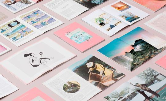
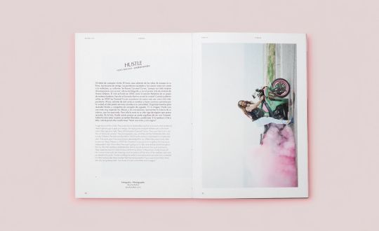
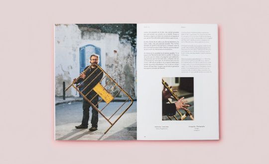
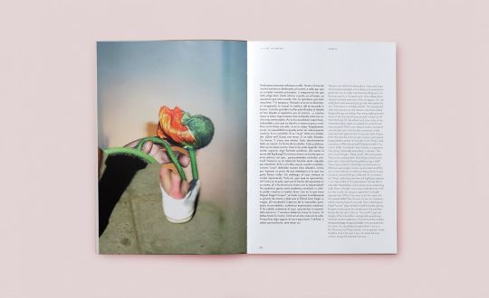
These are the final magazine spreads. As I have been unable to print and photograph the magazine myself due to the current circumstances, I used mock-ups to present the final spreads. They are also spread over two blog posts in order to fit them all in. They are organised in chronological order, starting with the front cover, running through the spreads and ending with the back cover, as it would be read. Some spreads have also been slightly manipulated in order to fit the mock-up. They real proportions however are evident in the pdf version.
0 notes
Photo


Spread Development: In The Next Issue
For the final spread, I wanted to create a platform to reach out to readers to send in their stories and apply to be interviewed for the next issues of the magazine. I therefore invented the next issue in order to make it more realistic, choosing a travel stories edition. This demonstrates how the magazine would function in real life, indicating at the type of content and how it would work across several editions. To further visualise this, I illustrated a plane and some clouds to show how the illustrated style would continue.
I also added the heading ‘In the next issue’, a short paragraph on the next edition, and information on how readers can get in touch and share their stories to feature by inventing a website, Twitter handle and email address.
0 notes
Photo


Visual Research: Frankie Magazine
This magazine is another that had inspired the layouts and development of my magazine. The front cover designs are simple and consistent in design with a bold title and illustration. I love the style and colour palettes used across the magazines, as well as the layout of the spreads and use of colourful headings.
https://www.frankie.com.au/past-issues
0 notes
Photo


Spread Development: Shorts Spread
Following the last tutorial, it was advised that I try reducing the size of the illustrations and creating a pattern for the short stories spread. I therefore compiled the stories together into a centred box, enabling me to experiment with a surrounding pattern. I changed the style of the text to fit more with the rest of the magazine, also because I removed the serif typeface. I then created a pattern, having some illustrations falling off the page and overlapping the text box slightly. I then experimented with the background colour using the colour palette, choosing the light turquoise.
0 notes
Photo

Visual Research: Illustrated Patterns
As it was advised that I could try to create an illustrated pattern for the background of my short stories spread, I did some visual research. I liked the idea of the pattern creating a border around the text - this would also differentiate the spread from the rest of the magazine.
https://www.behance.net/gallery/55168239/Illustrated-Garden-Pattern-and-Graphics
0 notes
Photo


Cover Development
These images show the development of the front cover design. After changing the name from Reveal to Recount, I also changed the typeface to Aileron, the one used throughout the magazine to maintain the style and played with the text of the ‘Work Stories Edition’ subheading. I struggled with this as I felt it never looked quite right, eventually using a lighter colour and increased leading in uppercase type to reduce harshness.
For the back cover, I wanted to keep it simple as the front has a large illustration. I also did not want to put content that was unnecessary; I therefore used the same character style I created for the subheading for a short quote chosen from the article I found. I thought this would be a nice final thought for readers to find on finishing the magazine.
0 notes
Link
Contextual Research: Storytelling Quotes
As I started to consider what to put on the back cover of the magazine, I thought it would be effective to have a simple quote as a nice way to leave readers and encourage them to continue storytelling. As the front cover is consumed by illustration, I wanted to keep the back simple with minimal content. I therefore did some research into quotes I could use, finding this link the most useful. These are the quotes I have selected as options and will choose from the following:
“Inside each of us is a natural-born storyteller, waiting to be released.” - Robin Moore, author
“We are all storytellers. We all live in a network of stories. There isn’t a stronger connection between people than storytelling.” - Jimmy Neil Smith, Director of the International Storytelling Center
“Storytelling is the most powerful way to put ideas into the world.” – Robert McKee, professor
“There’s always room for a story that can transport people to another place.” – J.K. Rowling, novelist, screenwriter and film producer
"There is no greater agony than bearing an untold story inside you." - Maya Angelou, poet, memoirist, and civil rights activist
Although some of these are based on fictional storytelling, they still apply to the concept of the magazine. The quotes I do not use could be hypothetically used on the back covers of future editions to keep the design consistent, always leaving readers with an encouraging quote.
0 notes
Photo


Spread Development: Intro and Contents
Following the feedback from my tutorial and having done some more research into magazine introductory pages and contents pages, I took the advice and broke them into two separate spreads. For the introduction, I used a full bleed image of one of the illustrations featured in the magazine as a preview of what readers can expect. I also named the edition and had the introductory paragraph.
For the contents page, it took a lot of playing around with the layout and structuring the text, but I finally settled on having the text broken into two columns across the two pages next to more illustrations that feature. I included the subheadings of the articles as descriptions, also using some light dotted lines to create structure and to indicate which articles the illustrations are from.
0 notes
Photo


Visual Research: Stanford Business Magazine
Pentagram was a good source of research as it allowed me to source a variety of editorial examples which helped me with layout and structure a lot. These spreads are from Stanford Business Magazine, which I particularly found useful as it featured a lot of illustration. The layout of the full bleed illustrations on one side with text balanced with white space on the opposing side is a layout I had come across a lot throughout research and inspired some of my spreads.
I also found it useful to look at contents page examples to help find structure. I noticed that the use of columns to list the contents with a balance of preview images is a common approach and organises the information well.
https://www.pentagram.com/work/stanford-business-magazine?rel=discipline&rel-id=10
0 notes
Photo


Visual Research: Magazine Covers
These are my favourite examples of magazine covers from the article ‘22 of today's best print magazines for creative inspiration, insight and ideas’ on Creative Boom. I like them for their simplicity and balance of bold text and image. They often have borders or relatively plain backgrounds to reduce busyness. They often have borders around images which is a look I like. I want to try to edit my cover design perhaps by changing the typeface and text to be more bold and work with the imagery more.
https://www.creativeboom.com/features/22-of-todays-best-print-magazines-for-creative-inspiration-and-insight/
0 notes
Photo
Visual Research: Perdiz Magazine
I found this magazine a useful source of research as the layouts and compositions are so simple and beautiful. The use of slanted headings is interesting and something I have not seen much of before; I think it adds interest and quirkiness to the spreads. Although I have not used any photographs, I love the slightly faded tones of the images and how the white space on the opposite page with light text balances them and work well. Although my magazine is a different style, this has encouraged me to reconsider the design of my titles and headings.
https://www.creativeboom.com/inspiration/perdiz-a-magazine-about-people-and-the-things-that-make-us-happy/
0 notes
Photo


Visual Research: Breathe Magazine
Breathe Magazine is an all round good example of the type of magazine I am aiming to create. It focuses on health and well being which differs from my focus of story telling, but the illustrated style and compositions are a good representation of what I’m aiming for. I particularly like the design of the covers with minimal text and a large illustration, immediately signalling at the content.
The contents page is nicely structured and features previews of the illustrations on a small scale with the list of contents organised beneath them, which could be an effective way of organising my contents page. The spreads are playful with their compositions of the illustrations, which are sometimes full bleed page images, while others are broken up with text. The illustrations often break free from structures and flow well.
https://pocketmags.com/breathe-magazine/issue-026#
0 notes
Text
Tutorial
04/05/20
This tutorial with Rich was the last scheduled tutorial of the unit. I presented what I had changed in my magazine since the last tutorial, including the contents page, cover, shorts spread and the contact information, receiving the following feedback:
Move the introduction away from the contents - have intro first spread, then contents. Limit the different typographic variations and typefaces, add more illustration as previews
Reduce the scale of the illustrations on the shorts spread - look into creating a pattern to surround the text, perhaps have a white border around the text
Play with the position of the zoomed in character - perhaps try a raw illustrated edge instead of a smooth edge to fit with the style
Bring the van across the spread with the large quote
0 notes