
Statistics
We looked inside some of the posts by amnarritiveandeditorialblog and here's what we found interesting.
Average Info
Notes Per Post
1
Likes Per Post
1
Reblog Per Post
0
Reply Per Post
0
Time Between Posts
2 days
Number of Posts By Type
Text
11
Last Seen Tumblr Blogs


Fun Fact
Tumblr Inc. is using 66 technologies for its website.
Text
Course Reflection
------------------------------------------------------------------------------
For once, my reflection on the course elective is... odd. It wasn't what I expected going into it, which of course wasn't a bad thing, and opened me up to expanding my knowledge beyond what I knew. I also didn't mind the amount of work given to us. I did hear about other elective choices being far less demanding, but I much prefer to be pushed to my limits, so no complaints there either.
But even after all of that, I was still not convinced on my fondness of these tasks, mostly for one reason: It. Felt. Too. Restrictive. I felt like I was unable to let my creative juices flow freely because each task we were given had heavy guidelines we were meant to follow (even for the final assessment task, which I will get too later). And though I understand that sometimes that is the nature of working for, say, a magazine, that is definitely not where I want to go career-wise. I much prefer my art to be made because it's something I enjoy, or something I'm interested in exploring (such as the freedom of choosing our own article for the feature piece), this overall just felt far to micro-manage-y for me to feel excited to boot my laptop up and do it. Art should be something unique to its creator, fueled with passion and telling a story through its makers eyes, and all the corporate jargon within the elective felt counterintuitive to me personally.
To 'combat' it, I tried to push the boat out a little further with prompts- doing something political for the feature piece, and doing my won prompt for the final sequence art comic. Everything inbetween felt like a chore.
0 notes
Text
Final Comic Assignment
------------------------------------------------------------------------------
For the final art piece of the elective, we were told to create a longer form panel comic utilizing mix media and roughly following a prompt list given. Immediately the idea of a prompt list irked me, so I instead tried to stretch the narrative given into something I could more easily work with. My favourite thing about digital art is that I can create stories with my illustrations, and to ensure I was motivated enough to make a piece of work I was of, I knew I would step outside of the box narratively speaking.
This was super easy for me. I have a large backlog of fully fleshed out characters from a world I've been building and designing for over six years now, and since all my school projects tend to involve one of them, I picked an older OC and their dramatic demise. Beta, and her older brother Alex. To tell a long story short, after disappearing and leaving Beta to deal with the consequences and blame, Alex reappears in her apartment only to kill her (at request of the Syndicate he works for, no weak links after all).
I used a series of film like shots as well as a few comic specific framing for drama and emphasis, such as smaller panels for fast action scenes or a longer full body panel. Heres both the sketch and lineart for my thirteen panel comic.


Here you can see the use of split panels, fast tracked panels, long shots (both height and length) as well as a large text box meant to resemble Betas happy and overzealous ramblings at the sight of her brothers reappearance. I really wanted to see just how many comic book tropes I could get into one page to make it look less boring.
My block colours for the comic took a dull and sad approach. This was fully intended, due to both the world Beta inhabits as well as her story taking place right after Americas cold war, and how being a Belrusian immigrant is affecting her mood and hence her surroundings. This is also where I added my mix media element.
The wallpaper and pictures on the walls are imagery off of the internet! Doing this made me feel reminiscent of the show Chowda, which used a similar styling for it's characters.
The blocked colours:

You can also see that here I changed around the layout of my sequence. The solo eye panel switched places with the over the shoulder shot of Beta. This was due to personal preference. At first, the eye (which is Betas) was meant to represent her staring at her brother in shock before stepping back, but after consulting with some of my friends, I decided that it would make the message far clearer to have the eye catching sight of Alex drawing his knife on Beta, hence the change of iris placement.
After colours was rendering. For this, I just used my normal rendering style, while trying to make sure I kept the gritty and dark feeling that encapsulates Beta and her life. This way I would be able to highlight items I saw as important, which mostly speaking, was the blood, to show the horrific gory nature of the crime. The final full render:

I was quite happy with the end results. I hand wrote the text since I felt using a font would look to corporate and take away from my personal style. For the closeup shots I made sure to keep the background simple (the wallpaper texture blurred, with minimal shading). Whereas the establishing shots were a little more detailed.
This was probably the thing I enjoyed most in the course. I love drawing my characters in different ways, with different styles. I can't say I've ever drawn a comic before with them in it, so it was a perfect experience.
0 notes
Text
Comic Mini Assignments
------------------------------------------------------------------------------ Assignment 2.1
For the final week, we shifted focus onto comics and what techniques they use and how they use them to show a story.
The first task was a prompt given, and we had to create a four panel comic on what we got. My prompt was:
'An interest in all that is artistic'
I decided that this was a relatively easy to visualize, and I wanted to go as bare minimum as possible to see if I could change up my style to fit more with the style found in newspapers. Art and being artistic comes in many many shapes and sizes. There is a countless range under the 'art' umbrella that I could go for, but I decided to pick options that had a wide variety between them; From the delicate nature of ballet, to the loud violent noises of a rock indie band.
This was my final four comic panel strip:

I think it got the message across nicely and in a simple to understand way, and I even managed to sneak in a Spider-Man reference, which is always fun. ------------------------------------------------------------------------------ Assignment 2.2
The second task of the week was a little different. It was exploring yet another prompt based activity, though this time it was a little more vague to allow for more freedom within it. We had to draw a three to five panel comic depicting and everyday task. One could be in our usual medium, the other had to be traditionally drawn.
I thought for a while about this one. I wanted to go back to my regular art style, and I wanted my everyday task to be more unique that what other people may come up with. I decided to base it off my morning routine of putting on my makeup. There hasn't been a single day I haven't done my makeup for the Polytechnic, so it's naturally a very integrated part of my weekly schedule.
I went for the max amount of panels (five) and tried to capture my make-up steps as best I could, since I always do them in a specific order. It was kind of meant to be like an anime girl transformation, except static, and instead of a cutesy bow clad result, it was instead your friendly neighbourhood goth. Here was my result, digital and traditional:


I even added the time stamps up on the top, because yes, due to living way outside of Dunedin, I unfortunately have to get up at the crack of bloody dawn every day.
And even after all of that, I was still not convinced on my fondness of these tasks. It felt too restrictive, I was unable to let my creative juices flow freely because of the prompts given (even for the final assessment task, which I will get too later). I much prefer my art to be made because it's something I enjoy, or something I'm interested in exploring (such as the freedom of choosing our own article for the feature piece), this overall just felt far to micro-manage-y for me to feel excited to boot my laptop up and do it.
0 notes
Text
Assessment Spots
------------------------------------------------------------------------------
To go along with my feature artwork, I created two spots to support the narrative text of the article. These would focus mostly on what was discussed, with some additional creative flare.
I decided to do my spots in black and white monochromatic themes, so that the simple colouring of the feature illustration would stand out.
The first of my two spots was a simple silhouette of a human head, the top half exposing the brain which is pricked with vaccination needles. This can leave the message up to the viewer, but overall it's supposed to represent the ridiculous claims that vaccinations cause mental disorders, namely autism and ADHD. Half of the reason I chose this article is due to how it resonates strongly with me in regards to my own personal experiences with autism, so being able to depict this was quite interesting. Spot one:

As is evident, I didn't leave the piece entirely black and white, with minimal amounts of shading and texturing. I just felt it added a nice amount of subtle depth.
Spot two is a bit more obscure. It represents Baphomet, and his 'As above, so below'. The origin of the quote has many different associated meanings, but overall it is said to show the unity between opposites, in this case both the far right and the far left, and how they hold more similarities than they like to admit. I replaced one of the hands (the lower), to be a gun; This is because of not only the finger placement looking like the classic 'finger gun' but also to showcase the excessive gun violence and control that the Right has, as well as the heavy Christian influence they have (seen with the use of a religious figures gesture). In war propaganda, the opponents are often depicted with their weapons, and this I felt went hand in hand with the symbolism I was trying to convey, as well as calling back to C.R Millers use of hands in his original poster works. Spot two:

Overall, though these were only miniature additions to the Feature piece, I wanted to cram just as much (if not more) meaning and symbolism into them as I could.
------------------------------------------------------------------------------
0 notes
Text
Feature Step by Step
------------------------------------------------------------------------------
For my feature, I knew I wanted to do something simple that conveyed a very harsh message. In many ways, the power of the Republican party is similar to that of the oppressing forces found during both Word Wars, and I wanted to express how that much like kinetic energy, evil doesn't just disappear, rather it takes a different form, with it's bigotry better concealed after centuries of failed dicatorships to act as a guide on what and what not to do.
Having an image that represented the massive, destructive power of the Republican party meant working perspective, so I ended up starting my project by using plain stock images I could then distort and mess around with. It wasn't about colours at this point, but rather getting the main idea blocked down in a cohesive manner. The block up:

You can see here that I chose to represent the shoe as a classic businessman's leather. The global superpowers of today are extremely deep into the money and high-traffic business world, which is where the CEO stereotype comes into play. The expensive looking shoe and dress-trousers would act as the way to show the status of our opposition.
After I finished the blocking out, I moved onto lineart, which would simply refine the image before I began to play around with colour. I played with weight density here to put emphasis on the right areas.
The lineart:

You can see this is were i put the slogan in. Usually war posters held short and impactful sentences that jumped out at the viewer. Though I technically didn't need the text since it was an illustration feature, I still wanted to make a final version that was more poster like, even if it was just for myself.
Next was the flat colours. Usually I would take forever to find something I was happy with, but I found that when fueled by an archives worth of inspiration, I was able to quickly gather the types of shades and tones I wanted. The flat colours:

Subconscious colour messaging is a very real factor to consider as an artist, and holds just as much importance as the image itself. Here's how I broke it down for myself: The powerful shoe should be shrouded in dark, while the fragile vaccine bottle is a white colour. This can represent good and bad, yin and yang and contrasting beliefs or ideas. In most war posters, the enemy is shrouded in dark as an ominous figure, and I wanted the same effect for my own art. The background contains a slight graduation of texture, while the shoe is lit brightly from behind to add to the mighty overhead power. I chose red because red is heavily associated with violence, warfare, and religious fervor. It also hits with Nazi imagery. It also matches with the GOP on the tread.
The stand out point should be the GOP symbol on the tread, which has it's original colours simply dulled down. The coloured:


My final touches were adding texture and additional shading.
0 notes
Text
Final Assignment
------------------------------------------------------------------------------
After the weeks introductory lessons, we moved onto the final editorial illustration assignment. It followed the same basic outlines as previous tasks, with the added twist that this time it would be us that was choosing our article (and it would not be given to us at random). We are creating three designs overall.
A whole page illustration that incorporates the news story.
Two supporting spot drawings.
In all honesty, this struck me as surprising. I assumed we would be doing something different to our warm up tasks to give a fresh experience. Though the topic we're exploring isn't massive, I definitely wanted a taste of variation for this task.
------------------------------------------------------------------------------ FINDING AN ARTICLE
This was the easy part for me. Considering that currently (as of writing) the USA is coming up on it Presidential election, there is a large variety of interesting media coverage I'd like to get my two cents in on.
I ended up choosing an article from The Guardian, an English Newspaper that me and my family have used for years. It goes over the controversy surrounding RFK Jr's promised vaccine and fluoride in water ban, and Trumps backing of the claim. RFK claims that vaccinations cause a number of mental disorders, including autism- and as something who has autism, I definitely had a strong few points I wanted to share through my artwork.
Link to the article: https://www.theguardian.com/us-news/2024/nov/04/election-trump-rfk-jr-vaccines-fluoride
To meet the briefs conditions, all I had to do was answer a few questions provided. The questions were as follows: CAN YOU CONDENSE THE ARTICLE INTO JUST A FEW SENTENCES? Trump and RFK Jr. seemingly share same worrying stance over vaccine ban, with Trump possibly endorsing RFK if elected. WHAT IS THE CORE NARRATIVE/ MESSAGE/ THEMES OF THE STORY? The theme is, of course, vaccinations, and whether or not they are problematic. CAN YOU LIST ANY POTENTIALLY USEFUL SYMBOLS AND/OR VISUAL CUES THAT COULD HELP WITH CONCEPT SKETCHING? Absolutely. There is the obvious vaccine conspiracy (needles/syringes and the like). Trump is another very strong visual media character that people can recognize. Republican propaganda as well is incredibly easy to spot (the elephant, the red and blue with stars, the confederate flag).
------------------------------------------------------------------------------ INITIAL IDEAS
Part of the assignment brief was to chuck down as many ideas as possible whilst reading through the article. Here's what I ended up with (a surprisingly decent amount of concepts, if I do say so myself). The concepts:

Right off of the bat I had a few ideas that I wanted to try flesh out for my two spots and my one main page illustration. Knowing I wanted to show the overbearing power of the rich Republican authority, I found that making something more like a war-time propaganda poster would be my goal, not only because I've been playing far to much Fallout lately, but also because I struggle with perspectives, and this would be a rather nice challenging draw for myself. That being said, I picked my main at the foot stomping down on the broken glass vial of the vaccine, which also ties in with they're 'putting their foot down' on public vaccinations.
------------------------------------------------------------------------------ ARTIST RESEARCH
All my artist research took place in American National Archives of war propaganda posters, mostly from around the second world war. I wanted my poster to convey the overbearing power that Hitler and the Nazi's were portrayed with, so my greatest source of reference was simple, yet hard hitting designs. Websites I visited: - https://www.archives.gov/exhibits/powers-of-persuasion - https://dc.library.northwestern.edu/collections/faf4f60e-78e0-4fbf-96ce-4ca8b4df597a
The three artist I ended up going with were James Montgomery Flagg, C.R Miller and J Howard Miller. ARTIST ONE - James Montgomery Flagg
James Montgomery Flagg, American born artist, was both a cartoonist and the creator behind the infamous WW1 posters of America's 'Uncle Sam'. He was the definition of an Illustrator! Creating everything from comic strips to spot drawings for a number of magazines, including New Yorks LIFE, since the age of twelve. Despite the fact that he wasn't part of the Second World War propaganda, I still felt it was necessary to give him mention, since his designs are so highly regarded and known. Something interesting about Flagg, was that though his Uncle Sam character was a man, he would often portray the country of America as a woman, to motivate female participation in the war efforts. His medium focused on hand drawn, painted pieces, that he would often get his neighbours to pose for. This posters were motivation based, rather than fear or hate driven, and like most war propaganda- meant to put place pressure on the reader to do their unique part. Flaggs posters 1917-1918:


ARTIST TWO - C.R Miller
Chester Raymond Miller, American born and self taught, was an Art Director during his career, working for the TAI and releasing several WW2 poster prints. Something I really love about Millers art is how it look almost digital. Due to the techniques used when printing it, it has a very ahead of it's time feeling that I adore. Finding information regarding Miller was surprisingly difficult, since there isn't much written about him at all, he would also go by several pseudonym names such as Chet, to keep himself protected, so you can imagine how much trouble I had googling him at first! His art was very text heavy, compared to the other examples, with a more polished style in comparison to classic painters such as Flagg.
His works were focused around portraying the possible futures if the Nazi's won the war, with over dramatic depictions and angles to give that sense of foreboding. He also drew a lot of hands, which I would as well, if I was as good as he was at it. Millers posters 1940's:


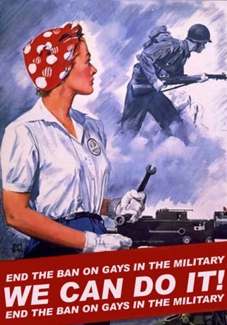
ARTIST THREE - J Howard Miller
In no way related to the previous Miller, J Howard Miller was another American born graphics artist, who made some very iconic posters during WW2. His posters were motivational like Flagg, but unlike Flagg, he was entirely focused on the womens effort during the war. This lead to the award winning 'Rosie the Riveter' design, that became a large staple in his painted illustrations. Howard was probably the most progressive with his style and messaging, and many of his art pieces were adopted a few years later by the feminist movement across the world. Howard's art 1940's:

I chucked together a compositional sketch for each artists style. With additional notes attached, explaining my thought processes on how they worked.
0 notes
Text
Spot-ing
------------------------------------------------------------------------------
In this next task, we were told to tackle a miniature version of our previous work. We had to find an article and create a spot for it, a miniature picture that breaks up the text.
Spots are often themed throughout the entirety of the media they're for, so there is a consistent, often corporate style recognized within the images themselves.
------------------------------------------------------------------------------ FINDING AN ARTICLE
Since we had to choose something recent, I simply scoured over my laptops inbuilt news source, and found an interesting article talking about the lies associated with alcohol, essentially the wives tales that come with consuming it. I knew it would be something easily sketchable, and since I had a few different ideas right off the bat, I decided to go with it!
Link to the article I chose: https://www.msn.com/en-nz/health/nutrition/7-lies-about-alcohol-you-need-to-stop-believing/ar-AA1pkBhO?ocid=winp2fptaskbar&cvid=35064bbd738a4ae9c440ea35ea8adf72&ei=32 But there was a plot twist however. Turns out the article we chose, we weren't going to illustrate, rather, we would pair off and draw somebody elses article, and act as the Art Director, the one who has the overall say on the end design. I paired with Ash, and was given a recent August article about the meth laced lollies handed out in Auckland through a food donation package. Link to the article HE chose: https://www.nzherald.co.nz/nz/meth-laced-lollies-given-to-auckland-city-mission-police-recover-nearly-30-lollies-investigation-ongoing/YXWLHRUZ7NHL5O4OBPA4NULQ54/#google_vignette ------------------------------------------------------------------------------ DEVELOPING IDEAS
I was going to make four drawings for this task, since it was more of a morning activity before the final assignment. When talking with Ash, he told me how he wanted the lollies to be mixed someway with the imagery of drugs/methamphetamine, so that was my starting point for the project.
For myself, I wanted Ash (for my chosen article) to involve imagery of faceless alcohol and some reference to one of the specific de-bunked wives tales.
Here are the sketches I came up with for the meth lollies:

There are four separate ideas, which two would be picked from (by Ash).
A hard lolly wrapper torn open, with the other half being crystal meth, to show the spiked chocolate
A plastic baggy of the spiked lollies, reminiscent of how dealers often give out drugs
A hard spiked lolly sat on a spoon being heated from beneath by a lighter. A common way of taking methamphetamines is by liquidizing them over lighter flame, with the drug representing as the lolly itself.
A lighter with a lolly wrapping around it
Out of the four, Ash picked the first and the third to be sketched and then reimagined. I wanted to use a monochromatic shading for the spots with minimal lighting applied through a 'Soft Light' layer. I ended up with this as the final result:


We were definitely working in a far smaller framing size than I was used too (60mmx60mm), so I rather just drew them big before shrinking them down to save myself the pain. I was quite chuffed with the end result, and Ash liked them as well, though we both agreed that the first spot is the best overall. ------------------------------------------------------------------------------
1 note
·
View note
Text
Task Two
------------------------------------------------------------------------------
Believe me, if I had known that for the next task we weren't going to be allowed to use our usual medium, I would have done the first task in the lesser style.
For task two, we were given a (randomised) bigger article to dissect and then conceptualize, except in our opposite medium and directly out of our comfort zones. For me, this meant a traditional art piece drawn by hand. Now I'm not entirely unpracticed in the area, I will often doodle when bored and I am fairly competent in my skills on paper, I just know that I am BETTER with digital art. I got given the article:
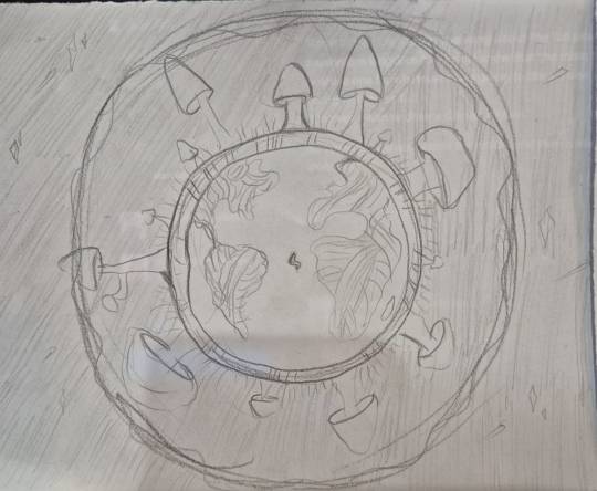
"The Unexplored Kingdom of Life"
And one quick glance will tell you that the paper is speaking about how vital mushrooms and fungus are to our planets eco-system. Aside from the usual editorial rambles and pointless chatter about everyday personal life that definitely doesn't need to be included, it was a rather interesting read.
------------------------------------------------------------------------------ THE FORMATION OF IDEAS
I wanted to challenge myself to come up with six separate ideas for this article. Since the minimum submission was three, I found this created an equal balance.
Since the article itself is speaking about the fun positive side of the mushroom kingdom (wa-hoo) I knew that the main tone should be a positive one for whatever I was going to draw, I also immediately thought to myself...: "Oh man. I wanna draw a Clicker so bad." I knew I also wanted to have a flesh-like biological element to represent how the fungi are a global strength that supports our ecosystem.
So I printed and annotated the article and then rustled up my sketches. I decided on colouring a few I knew I wouldn't use, just for fun.
sketches:


------------------------------------------------------------------------------ THE FINAL PIECE
After consulting with others, I decided to go for the depiction of the globe, with its continents shown as the tangle of roots of the mushrooms all around the exterior, which is the visual key to how mushrooms deserve to be a part of the animal and plant kingdom. I used a darker thicker black paper for the space background and cut out white paper rings for both texture and visual variation. I had the fungi intersect with the white paper for an interesting visual, as well as had them vary in size, shape and species. the finished product:


As someone who doesn't often use this medium, I wanted to really take a shot and delve into as much detail as I could. I thought it would be an interesting learning experience for myself to stretch my abilities when it came to art. I was actually rather proud of my final product.
------------------------------------------------------------------------------
0 notes
Text
Speed-Run Pt. 2
------------------------------------------------------------------------------
For my solo editorial render, I wanted to gather references before going any further. This is the process I usually follow, to ensure that I fully understand the image I have in my mind. ------------------------------------------------------------------------------ REFERENCES
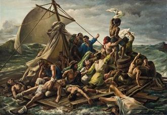
I knew I wanted my art to resemble a Baroque oil painting. Something I discussed in my previous elective workbook, is how I personally find that the particular medium/style of artistry holds the most emotion on canvas, with painters such as Ilya Repin being a big inspiration. Lucky for me, there were many available paintings that had piles of bodies crawling over one another in this chosen style.


I also took inspiration (mostly for anatomy), from modern day art installations or performance pieces.

As for the paper money boat, all I did was google how a dollar bill would look when folded in such a manner so I could get a more accurate read on how the illustration would be warped into the boat shape.
------------------------------------------------------------------------------ SKETCHING
After collecting all my images, I headed into my drawing program with a 83cm canvas set to 300DPI. In this part of my process, I tend to get the rough idea down as fast as possible, so I can more quickly move onto lineart, colouring and shading. I will also got through several different sketch layouts to ensure everything is to my personal standard.
Eventually I landed with this as my sketch, something I knew I'd definitely be able to propel myself off from into an actual render.
the sketch:

With the sketch done, I started with the rendering process. I wanted to keep things as simple as possible due to time restraints. I also knew I wanted to play with light, keeping the majority of the image a scuzzy brown with an almost halo-like effect around the main character. the render:

------------------------------------------------------------------------------
0 notes
Text
Speed-Run
------------------------------------------------------------------------------
Our first class task contained both group and solo work. It follows the way a commissionable artist would be hired to create imagery related to story that in of itself describes the article. The group work included brainstorming ideas for different articles and picking the two strongest contenders. The solo work was directly after, where we were asked to pick a singular design and expand upon it in our own styles.
------------------------------------------------------------------------------ ------------------------------------------------------------------------------
THE GROUP TASK
Working as a group on creative projects such as this isn't exactly my favourite, but after all the group work I have endured this year, I can comfortably say I have grown more inclined toward it. My team consisted of three people (Ash, myself and Loki), and I'm happy to report we were able to come up with solid ideas for each article.
I would supply pictures, but due to the timed nature of the task and the way it rotated, I wasn't able to capture each of our drawings.
------------------------------------------------------------------------------
THE SOLO TASK
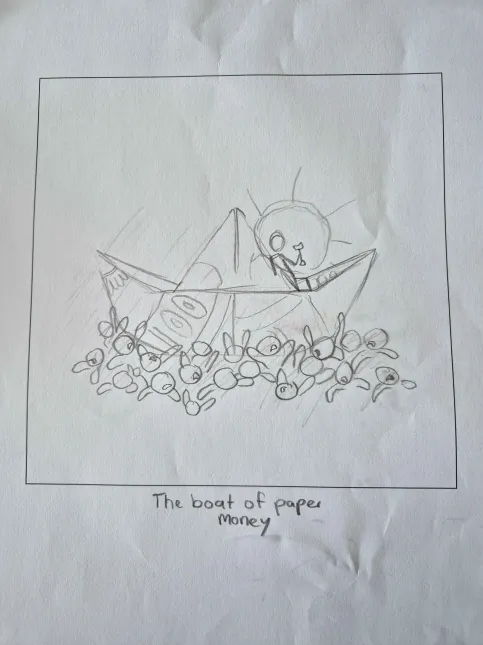
Falling back into much more familiar territory, I picked one image from our randomly given article (Carbon Emissions of the 1%). I ended up going with one of my own designs because I felt I could understand the vision behind it, since I created it myself.
The original sketch here, depicts a one hundred dollar bill folded into a paper boat, floating on a sea of writhing bodies- the world dark and grimy will one lone star shines ontop of his vessel, unaffected by his own evil. The boat is a representation of how specifically yacht gas emissions are one of the highest contributors to global warming, with the ocean of people representing the lower class that it is shamelessly affecting, their hands reaching desperately for a hold, so they too can have the wealth of the 1%. paper sketch:
My chosen medium to expand this with is digital art. I have been in the field for over five years now, and I am a successful international commissions artist online. My program go to is Clip Studio Paint EX for its wide range of materials as well as the ability to animate easily with the built in timeline.
Over the next post I will layout my process of how I go from a paper sketch to a rendered piece of art, as well as where I gathered my inspiration.
------------------------------------------------------------------------------
0 notes
Text
Introduction
------------------------------------------------------------------------------
Kia Ora!
This is my informal introduction to my DT5 blog. I've grown attached to using Tumblr as my documentation source so I have chosen to format it this way. I'm unsure what this course will bring, and to be honest I'm just here for the drawing aspect. I did the Digital Character Design elective earlier this year, and hope that this class will expand in that direction.
------------------------------------------------------------------------------
0 notes