
Documenting my progress studying Games Design. Specifically this blog is focused on the Honours Project module.
Don't wanna be here? Send us removal request.
Statistics
We looked inside some of the posts by amybyrnexb3992 and here's what we found interesting.
Average Info
Notes Per Post
7
Likes Per Post
7
Reblog Per Post
0
Reply Per Post
0
Time Between Posts
5 days
Number of Posts By Type
Text
17
Last Seen Tumblr Blogs


Fun Fact
Post activity is at the highest at 4:00 pm EDT; notes peak at 10:00 pm EDT.
Text
Honours Project OneDrive Link
Please find attached the OneDrive link containing all of my work for Honours Project.
XB3992 Honours Project
0 notes
Text
Illustration progress update #1 - Loyalty Deity
This post is a combination of multiple days of work.
For the next project I wanted to do a god based on 'Loyalty', I began by looking through Pinterest for inspiration of concepts that could work for my idea.
Next I started to explore my ideas, I thought a lot about dogs when I imagined loyalty. I started on some sketches.


Next I worked on the outline, I went through 3 versions of the outline to create one that worked well.


I then laid out some base colours and painted in different shades for lighter and darker parts.


Next I wanted to create a background of stone tiles on both the floor and the wall, almost like the deity is on a bridge.


I worked on some shading and lighting for the background to make it look more interesting.

Next I added some detail to the character, and reworked his body slightly and his face.

To add some contrast I drew in some harsh outline shapes around the armour.

I added some colour and shine to the armour before creating a Multiply layer to add some more shadow to areas.


Below is an image of the finished piece, I am glad I finished another piece before the deadline. He is definitely a much more fun deity!

#university#illustration#characterdesign#photoshop#xb3992#digitalart#gamedesign#gamesdesign#artist#painting
0 notes
Text
Illustration progress update #3 - Justice Deity
After completing the character, I made some changes to make the design look better.
I started out by trying to make the armour look more reflective and colourful. I added a Colour Dodge layer with white paint to make a more reflective look. I set this to 50%. I then added in some blue to give more colour just using an Overlay layer.


Next I added in a Multiply layer to create shadows of the characters silhouette.

I added a further Multiply layer to add more shadow to areas where the helmet plume, arms and outfit would cast shadow.

Next I added a Vivid Light layer to cast light onto the helmet and top of the outfit, this is to show the light from the helmet being cast onto the metal of the collar, chest and shoulders.

To create more contrast I added areas with darker edges to make the piece stand out more.

If any more changes are required I will update again but this is the final illustration for now.

#university#illustration#xb3992#characterdesign#photoshop#digitalart#gamedesign#gamesdesign#artist#painting#fantasy
1 note
·
View note
Text
Illustration progress update #2 - Justice Deity
This post is a combination of multiple separate days of work.
After getting the outline prepared for the character, I put down some flat colour and chose the colours I wanted to work with. (Image 1)

I wanted to try to use a looser style and stick to just one layer for the colour and detail, it was definitely a challenge but I was able to work much faster and still show the idea of the character well. (Image 2)

I added some blood splatters onto the axe head to make it more interesting and show the idea of an executioner a bit better. (Image 3)

I created a dark blue layer set to Overlay and put at 50% to make the armour look better, I also used some red on a Soft Light layer at 70% so make some of the lighter red areas stand out more. (Image 4 + Image 5)


I added another Soft Light layer at 50% specifically for the red glow coming through the helmet. (Image 6)

To finish off, I did some work on the background and lighting. I painted a fog like effect behind the character and using a dark gradient added some shadow. (Image 7 + Image 8)


Next I added in a gradient Hard Light at 50% and a Soft Light at 40%. I really wanted it to look as though light was coming through from the top left of the piece, almost like it was coming through a ceiling. To finish that effect I added a final gradient set on Overlay at 20%. (Image 9 + Image 10 + Image 11)


Then it was time to clean-up and merge the layers together. Giving the final result.

It was definitely challenging to work on this piece and finish it without blending everything so it looks smooth, but it was good to experiment with a different style.
#illustration#characterdesign#art#painting#photoshop#digitalart#gamesdesign#university#xb3992#artist#gamedesign
3 notes
·
View notes
Text
Illustration progress update #1 - Justice Deity
Since working on the Time Deity I have moved onto another concept. I want to design a Justice Deity.
This post is a summary of work I have done the past few weeks.
I started out by looking on Pinterest for inspiration. First I looked at traditional representation and symbols for justice, such as scales, fasces and swords.

I then started to look at other character designs that represent authority and justice.

I looked at knight designs as I think of knights when I think justice. So I looked at different art to inspire me.

The idea of judge, jury and executioner came to mind. For the idea of jury I looked at masks and character designs with multiple faces.

After looking through Pinterest, I did some sketches to represent different things that could represent justice. Masks to show the idea of a jury. Scales, a blindfold and a judges hammer to represent a judge. And a variety of weapons, an executioners axe, executioners sword and a greatsword (leaning into the knight idea).

I used these ideas to prompt my initial designs. The first character representing judge, with a crown and scales at the hips. The second character representing a jury with multiply floating faces and an eye at the chest. An executioner with a large axe and a knights armour. And a final character with a large hammer and a cloak obstructing the face, a sort of different take on the executioner idea.

I painted each character to get a better idea of which concept I liked most. I tried to experiment with a more painterly style and only painting on one layer. It was definitely a challenge but it allowed me to be more free.

I next looked to see what elements of the designs I liked and which I disliked. I enjoyed the crown on the first character and part of the outfit, and the second character I really liked the idea of multiple faces representing a jury. I also liked the eye emblem on the chest. The third character was probably my favourite. I loved the armour, the fabric, the helmet and the weapon. The fourth character I couldn't really find much I loved about it.

After looking at everything I began work sketching out the base for the illustration. Working on a pose and trying to get the proportions right.


Next I began to design what I wanted the outfit to look like, I definitely liked the idea of the character appearing knight like with an axe. Though I may add the multiple faces element floating around the helmet. I also might change the layout of the piece and go for something torso and up rather than a full body pose, I really want the focus to be brought to the axe and the feather (and the multiple faces if I add this).

Next time I work on this I will potentially make some changes e.g. the multiple faces and moving away from a full body piece. Then I will start painting on the same layer as the outline I settle for and go for the painterly style I did in my sketches but with more detail.
2 notes
·
View notes
Text
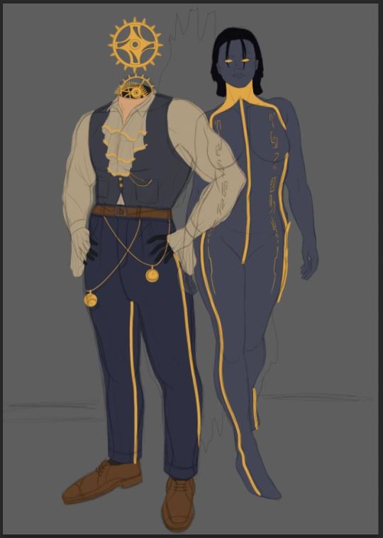
Illustration progress update #4 - Time Deity
Over last night and some time this morning I completed the piece.
I will explain the cleanup process as I don't believe in previous posts I have explained what I do. When I merge the shadow and highlight layers to each section it usually leaves a pixelated outline around each area with the starting colour for the shadows and highlights before setting to overlay and multiply etc.
So a light purple outline was around each part of the painting. I went through each layer and erased this outline to give a smooth edge to everything.
Another thing I do during cleanup is look out for errors and correct these as I go. It could be areas where blending isn't as smooth or there's a problem with shape and I will correct these by either editing the layer the part of the painting is on, or, I will create a new layer above everything and paint over any issues.
When I am working on the cleanup process I usually do this on a seperate photoshop document as it requires me to begin merging layers, so I leave the original document untouched in case I ever need it again.
Once cleanup is done I create another version of the file specifically for merging everything together and exporting, once again, this is just to ensure if I needed to change anything and export again I wouldn't loose all of my layers.
In terms of other changes, I applied a perspective warp to the floor to give the effect of it getting smaller further into the distance. I also duplicated the portal, setting the blending mode to 'Soft Light' then tweaking the opacity and blending the edges. To give a sort of shadow to the edges of the portal.
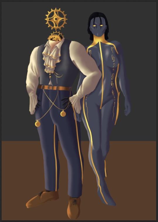
And that is everything I did for this final stage. Here is the completed piece.

While I definitely could spend longer on the work and adding more detail, I am approaching final deadlines so want to try to get another character done before submission.
0 notes
Text
Illustration progress update #3 - Time Deity
This update consists of progress made yesterday and today.
I started off by working on the lighting for another cog as I realised I had missed it previously. I used the same method as I have so far on shading everything else.

I worked on the shirt altering some areas and adding more detail to the pocket. I also used a texture I found online to make the waistcoat a bit more interesting visually, I found this texture on Unsplash, made it black and white, set to 'Overlay' and erased some of the details in the shadows.

Here is the image I used: https://unsplash.com/photos/im8y4BO2hso
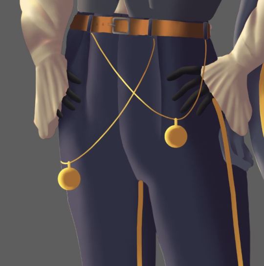
The top of the pants probably had the most change, I worked on the belt to add more detail, I also added in a fly to the pants, and worked on the faces of the pocket watches. I am really happy with how they turned out. I also moved the hand of the second character so it was in the correct place.

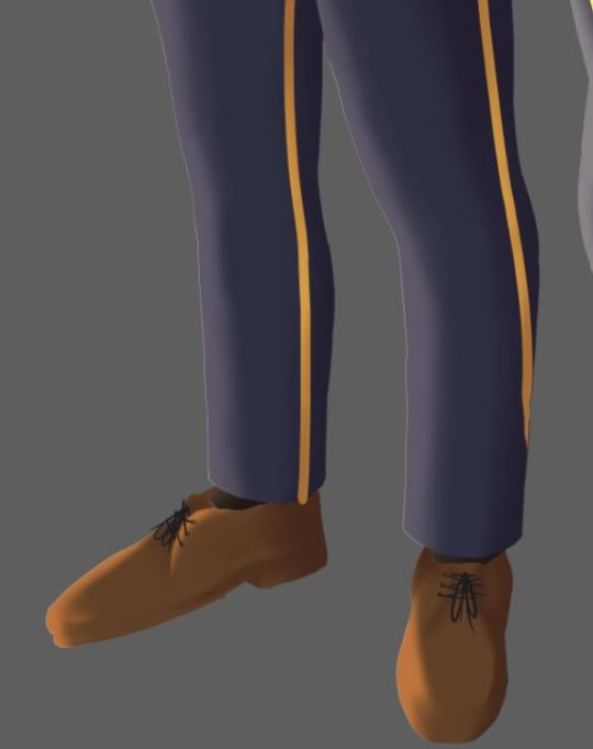
I added a hem to the bottom of the pants and more details on the shoes.

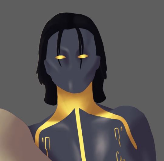
The second character I spent a lot of time working on the face, it took me a little while to get it how I wanted. I will attempt to run through each of the stages I went through before I settled on the final look.
Starting out I painted in an outline for the lips, then some general structure using shadow and highlight for the rest of the face.

It didn't feel right so I painted in some eyelashes and eyebrows hoping it would pull things together.

It definitely helped, but it still wasn't working for me, I added in some further highlights.

I then reworked the nose and face structure further, I also added more detail to the lips.

I then made the lips smaller and tweaked the nose and felt this looked much better than how it started.

Finally I reworked the hair, I also duplicated the fringe, setting to 'Overlay' and decreasing the opacity to give a slight shadow on the face from the fringe. I added in highlight and shadow for more detail.

The rest of this character didn't need too much work because of the simplicity of her design. But I added some further highlight particularly towards the thigh. I also reworked the hands to make them look better.

Next I worked on the floor, added in simple lines to separate each panel of wood then setting the layer to 'Overlay' at 50% opacity. I did the same with the detailing on the wood.


I added in a gradient from the right to bottom right of the piece to add more intense shadow and I added in another gradient coming from the top left corner to indicate the light source.

While I could probably spend a lot more time on this piece, I am conscious that I have already taken too long on getting it completed. So I am now going to move onto merging groups together and cleaning up.
I will post this update now, but I believe my next update will be the last one as I plan to be just finishing up. I aim to get this done either tonight or tomorrow, then I can move on to the next piece.
0 notes
Text
Illustration progress update #2 - Time Deity
I have been unwell lately so haven't been keeping on top of my blog with progress, though here is an update covering progress over the past week including today.
I continued to work on the outlines for the piece until I was happy to begin with colour.

I chose the colours I wanted to work with and I attempted to go for cooler blue tones and contrasting golds on the opposite end of the colour wheel to draw the eye of the viewer.
Initially I experimented by painting my shadow on one layer for everything and the highlights on one layer for everything, but it didn't really work well as I kept painting over areas I didn't want covered. So I decided to do each part individually.
The process was the same for the shadow and highlight for each part. I painted an 'Overlay' layer each time I wanted to highlight, and a 'Multiply' layer for shadow. I used a light cream colour for highlight and a lilac for shadows. I will show the process using a part of my painting to demonstrate.
The shadow here started as lilac, I then applied 'Multiply' to create the shadow.

The highlight started as a cream colour, I then used 'Overlay' to create the highlight.

I will now include images of each part with shading and highlights so far.
I worked on the neck and top first, I wanted a gold trim on the ruffles of the shirt to go with the other gold detailing. I also added so highlight and shadow to the waistcoat though more details will be needed.
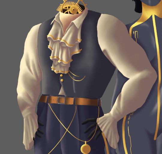
I worked on the pants, gloves, belt and pocket watches. Obviously cleanup will be done once layers are merged as everything still looks a bit rough around the edges here. I will do cleanup once I feel all details are complete. I also need to move the hand of the other character.
I worked further on the pants and the shoes and socks. More detail will be added particularly to the shoes. But this shading gives the detail needed for now.
More shading and detail still needs to be done for the second character on the piece, but here is how she looks so far as a starting point.
I wanted symbols to run down her body in a golden colour. I may also make these have a glowing effect but I am still undecided for now.
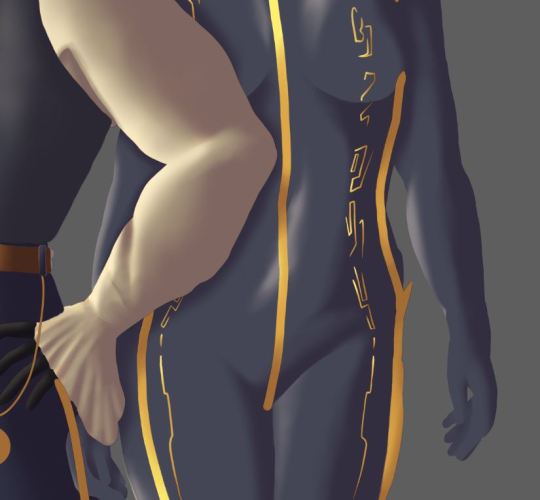
I then finished the legs, she also has a similar gold trim running down her legs like the other character.

This is an image of how all these details come together so far. (Image 13)

I wanted to get a better idea on the background. I decided that I wanted the floor to be wooden and the wall to be a simple painted wall. I filled the background with a grey colour and added a strip of brown for the floor.
To quickly create texture I imported an image I found online to give texture to the wall. The image was from Unsplash a free site for downloading images, the link to the image is as follows; https://unsplash.com/photos/0tgMnMIYQ9Y
I simply used 'Overlay' on the layer to get the desired effect.

Next I added in a highlight and shadow to the floor using the same methods I have used for the highlights and shadows across the piece. I also added in the portal behind the characters.
I added rough shadows to the ground coming off the characters and some gradients to the page to make the lighting stand out more.

That is all the progress made so far, I need to do more work on the background, mainly the wood on the floor. I also need to add in the details to the piece and potentially some more lighting details and to clean up everything.
Base colours and shapes were drawn in earlier in the week and I began trying to figure out the best way to do the shading, however, almost all of the highlight and shading I managed to get painted in today. I feel good about the amount of progress I have managed to make, and the piece is starting to come together.
I am upset that I haven't been able to work on this piece more this week due to being unwell, but I am happy with how it is coming along currently.
0 notes
Text
Illustration progress update #1 - Time Deity
I began by replacing the outlines I initially put on the painting as they were too complex to work from. I replaced them with the poses without clothes.

Next I drew out a more firm outline for the bodies and hid the old layer.


I then began to work on the outfit and details for one of the characters.

I am happy with how the design looks so far, though I need to add more cogs potentially as well as pocket watches and potentially a vest and a hat floating above. Then I need to design the outfit for the other character.
0 notes
Text
Finalising ideas
After the initial sketches I further experimented with my ideas for the clock based character and the character the ghost-like character.
I started by finishing some last ideas for my first sketch of the clock character.

Next I drew out a rough face and hair for the ghost character before painting on some colour, blending roughly and applying as an "Overlay".


I worked on another idea for the clock character, this time with a top hat floating above his cogs to match the outfit more.

And finally another iteration on the ghost character, this time with robes loosely covering her, once again doing the outline of the outfit before following the same process as previous. A colour layer blended roughly, then with "Overlay" applied.


These are the final ideas.

I dropped two of the ideas into the illustration file just to act as initial references before I start sketching the illustration.

Next I went through both sketch pages to circle elements of the designs I liked in green and parts I didn't like in red. This will make designing the outfits for the final piece a lot easier.


Next time I will be working on the actual illustration. Creating the outline and working on blocking out the colours and outfits.
0 notes
Text
Further sketching
I continued exploring my initial ideas. Ultimately I decided that the time and portal ideas felt strongest, I think I could make an interesting piece using both of them.
Next I began to experiment with more ideas for the characters I am wanting to do, starting on the clock one. While he is not finished yet I played with his outfit a bit more and the cogs for his head.

I will continue to explore these ideas before moving on to the illustration.
0 notes
Text
Gathering research and sketching
My next deity design will be a Time Deity. There a few different ways I could take this design, so I started off by exploring Pinterest and pinning some initial ideas.
Below are some screenshots of some of the things I pinned, I wanted to look initially at characters designed around time, space or mage characters. I also looked into how characters that control time are portrayed in games, tv and comic books.


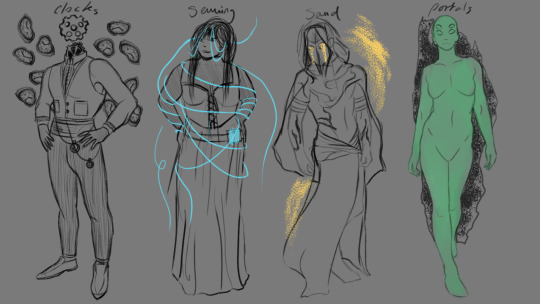
I sketched out some things I think could be associated with time as a starting point; clocks, space, magic (e.g. creating portals into other time periods), sand hourglass', sewing (again possibly magic related, sewing changes into the fabric of time).
These initial ideas are what I want to explore in some initial designs, though as I have already made a Star Deity I will likely avoid covering space.

Next I sketched out different figures to act as bases for my ideas. I set the opacity to 50% so I could sketch costumes over the top.

I started designing around the clock idea. Leaning into the Victorian-Steampunk style. I want to try to avoid this portrayal of time if I can, but I felt it was important to at least explore it.

I then added in some melting clocks floating around the character.

Next I will be working on the other ideas before settling on one to develop fully.
0 notes
Text
Illustration progress update #5 - Nature Deity
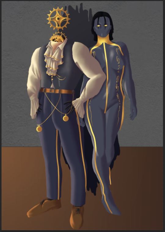
Whilst researching my next piece I was about to post my Nature Deity on my portfolio but felt the shadow gradient at the top was a bit too dark, so I edited and re-exported.

0 notes
Text
Illustration progress update #4 - Nature Deity
For final touches I added a gradient starting at the top to make it darker. I also cleaned up each of the layers before merging and worked through the background to make it look more foggy. I added more shadow on the bellybutton area, and more shine to the oil.

1 note
·
View note
Text
Illustration progress update #3 - Nature Deity
I began working on the plants, starting with the shadow, using 'Multiply' to get the desired effect.

Next I began to do the lighting, using 'Overlay' on the initial lighting layer, then 'Linear Light' for the second layer.


I then merged the layers and cleaned up around the edges.

For lighting the oil, I didn't have to do a shadow layer so just followed the same process for lighting without that stage.

All that is left to do with this piece now is the clean-up and possibly touching up the background. Then I can move on to the next piece.
Unfortunately, I have been very unwell this week and had a hospital visit, so I haven't been able to get as much done as I would have liked. But I think a few more hours of clean-up should see the end of this piece.
I am away from home until Monday, but Monday I hope to finish this off.
0 notes
Text
Illustration progress update #2 - Nature Deity
After working on the body I moved on to the skull. Starting with a layer of purple shading then using 'Multiply'. I then duplicated the layer, erasing some areas to make the shadows more intense in certain areas.


Next I added in some lighting by painting a light cream colour and using 'Overlay'. I also created a rim light layer similar to the body, but for now I am going to keep it hidden as I don't think rim light would be on the skull due to the flowers surrounding.

I carried out the same set of steps for the horns. Beginning with a base shadow, then duplicating that layer.


I added a layer of highlight, but it didn't seem as bright as I wanted, so I added another layer using 'Linear Light'.


Next I began to work on highlights on the oil. Using a near white colour with 'Overlay'. It is not complete yet and further layers of shine will be added.

I also painted in a fog style background. I may refine further closer to finishing the piece.

Next I will continue work on highlights for the oil. I will then work on the flowers and leaves. Adding lighting, shadow and further detail.
After all those stages I will move on to adding any further final details and cleaning up the layers once all combined with the lighting layers.
0 notes
Text
Illustration progress update #1 - Nature Deity
I started drawing the outline for the nature deity, creating a body of a woman with a deer skull and deadly nightshade.

Next I did base colours, then added the oil.


Then I started the shading by painting in a light purple, then using multiply.

Next I started adding the main and rim light, using overlay for the main light and luminosity for the rim light.


Then I added another layer to the main light, using the linear light filter.

Next time I will work on the lighting further then add detail to the oil.
0 notes