
Don't wanna be here? Send us removal request.
Statistics
We looked inside some of the posts by angoarts245-02 and here's what we found interesting.
Average Info
Notes Per Post
1
Likes Per Post
0
Reblog Per Post
0
Reply Per Post
1
Time Between Posts
12 days
Number of Posts By Type
Text
17
Last Seen Tumblr Blogs


Fun Fact
12.7% of mobile users access Tumblr.
Text
Arts246 Course Reflection
Arts246 taught me to design letters and visuals that delivered the intended message effectively. That was what I thought Arts245 would mainly be about when I signed up for it, but certainly, that course was quite an unforgettable experience, and Arts246 has been a worthy continuation. There were a lot of things that I learned. Design-wise, I learned to utilize different digital applications to create things that I wanted to create. Part of this lesson pushed me to look at my vision of a final product from the angle of consistency, versatility, and accessibility. When I designed a new logotype for the Soda City Market, my professor encouraged me to go to the market in person to understand the vibe and purpose of the place. Same thing when I designed the poster of the same subject (same thing for any poster, really). There were a lot of elements going on to think about: the texts, the photos, the visual hierarchy, etc. The question is how to pull the viewers in, keep them hooked, and make them want to be there. I needed to know how to keep the visual style consistent, where my poster would be hung, how the logotype could be adapted to new media, etc. The questions and suggestions my professor provided were helpful, as they helped me think and look at the problems from different perspectives.
Along the previous line, there was also my enduring struggle with trusting the letters. The communication potential of such static symbols was at least peculiar to a designer like me, who's primarily interested in shapes and imagery. I tried to do a collage graphic for my Soda City Poster and an illustration for a poster I submitted to a competition. I had to abandon both of them eventually because, besides turning my schedule upside down, they drowned the presence of the supposedly main element, the type. Throughout this course, I have learned to trust the letters and type as entities capable of breathing, having a voice, and adapting to artistic needs through countless alterations.
As for personal improvement, I have gotten better since Arts245 at seeking and receiving feedback. My tendency to take the path of least resistance when it came to pushing for room for improvement was a major problem I had in Arts245, and it did not go away, at least until I was halfway through Arts246. In every single project, I was required to print things for critique, actively engage in any feedback opportunity, and push through the final design as well as I could. I learned to go the extra mile, that is, doing the extra work and jotting down questions, before meeting up with the professor for critique.
Arts246 was a major step towards the goals I set for myself coming into this field. It drew my attention to the world and its problems and strengthened my passion to bring forth messages that promised diversity and unity. With only a few moments away from the GD+I application deadline, I want to say thank you to both Professors Nace and Valdes for being a valuable part of my journey, and whether or not this journey will end here, I regret nothing, for I have grown so much both personally and professionally thanks to my classmates and you both.
0 notes
Text

Arts246 Blog Week 10
For this week, I watched this video that offers some quick tips to leverage an average design. Much of what I took away from the video was a reiteration of what I learned this semester, but it's nice to be reminded once again of these important points, which are discussed in the video, especially when I am still a beginner. Some highlights:
(1) Thinking about the vibe or mood that you want to express before doing any work, and then choosing the colors accordingly. Throughout the semester, I gradually learned to see why this is important. Design is a process, and research is part of the design. I think I won't do myself any favor until I spend some time learning about the goal of the project, the intention of the clients, the message of the products, etc. Otherwise, I risk overthinking without ever moving forward
(2) Include contextual elements that the viewers can use to link what they see in a design to the presented message. I kind of understand this tip. It's like including an image, icon, or colors that help viewers connect what they see on my Soda City poster to the market, because without those elements, the viewers are going to get confused. I guess this tip is a no-brainer, right? It appears so, but when I look back at some posters we have in class that suggest anything but a fun and vibrant place, I think I need to keep this tip closer.
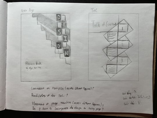
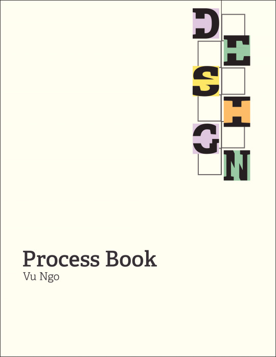
For this week, I did tons of research for my process book and prepared a color palette, a design that will tie my projects together, and text material. I sketched and digitalized the first versions of my table of contents and cover page. I also figured out some of the layouts that I'd like to go with, and for this weekend, all I have to do is put things together.
0 notes
Text


Arts246 Blog Week 9
This week, I watched a video about the principles of design: Balance, Unity, Contrast, Emphasis, Repetition, Pattern, Rhythm, Movement, Proportion, Harmony, and Variety. There's a lot to take away from this video, but each point is made as clear as possible that a reiteration is not really needed. I loved the video; I might as well pin up these principles on the wall. This week and the week before (spring break), I spent time visiting past projects and making revisions in preparation for my GDI portfolio review. It's hard to pay what has gone by a visit, but I did relish every second of fixing little things that, as I failed to notice, made a big difference. It's only a little over a month away from the GD+I deadline, and the more I pay attention to the old projects, the more I regret that I did not have the mindset back then to make each and every project as perfect as possible. Well, it's less about perfection and more about learning to do better (Anyway, I am glad that the Soda City poster won't sit in my portfolio collecting dust with that ugly diagonal or logotype. The extra mile I decided to go really paid off)
Also this week, I worked on my UCDA poster. Such a unique project as I got to submit an artwork of mine to an actual competition. My biggest struggle with the poster was the fine balance between complexity and simplicity. I wanted to go for the zen-like style, but where should I draw the line beyond which the artwork simply becomes too simple?
0 notes
Text

Arts246 Blog Week 8
This week, I watched this video by Vox on YouTube talking about what makes a great logo. At this point, I am aware of several types of logos such as wordmarks and pictorial logos, but I learned a new type of logo today called "the logo system" - which is sort of like a framework that can have endless permutations. Google's daily doodles are a great example; they lend Google a place to be part of some conversation, which Google expands beyond its own name.
Michael Beirut, the guest speaker of the video, told Vox that he thinks logos are overrated. One takeaways from this point of view: logos are just empty vessels waiting for someone to pour meaning into them. If Nike were to have a different logo and keep up its genius marketing apparatus, then whatever that different logo were could be something big. I think that's super interesting considering Nike has been around for long enough that people associate its mark with the very idea of athletic achievement. In many ways, logos are just logos until we bring them to bear something bigger than useless symbols on the page.
But the video does not undermine the process of logomaking. The video mentioned how people are divided over new logos, whether it's out of nostalgia or the way they are designed. Bad logos aside, Beirut thinks the evolution is necessary, as the video says, "Logos need to have a long life, not win points in a discussion." Some empty vessels, as logos are, are better at holding a meaning than others do.
So I guess logo designers can stay. For this week, I gathered my mood board and other materials to begin the first sketch of project 3's poster. I made the brutal mistake of focusing on the illustration first, so I was well behind on Monday's critique. It's all good though. I took a step back and went back to what I had to say about "mindfulness", and then worked on the type first. This weekend, I might try out a few ideas the professor gave me on Wednesday's critique.
0 notes
Text


Arts246 Blog Week 7
Some notes I took while watching the documentary of Scher the designer
In one scene, Scher said the physical loss during the art making process was a huge loss for her, and I cannot relate to that. Why did she return to painting when her professional practice required her to use a computer anyway? I guess that's the same reason I still come back to my sketchbook from time to time.
Yes, the state of play. I need to go outside more and observe things more for inspiration and let my subconscious take over. Got it. It's incredible how self-motivated Scher is for her design, going outside, somewhere out of the ordinary for inspiration.
"They want proof that this is really gonna work. The problem is there isn't proof. It's how do people see and perceive and accept things" - This is probably the most useful thing I've heard since I became a designer
"I am driven by the hope that I haven't made my best work yet" - Truly an inspirational quote. Each project I do feels like a process, but I often forget it's part of a larger journey as well. One day I sit to think about how to do a, b, and c, and the next day I throw all the sketches and whatnot into the trash without reflecting on what could have been done better. I admire Scher's mindset on finding the joy in the making of stuff and continuous pursuit for improvement.
This week, I made my moodboard and sketched out a few ideas I had for the 3rd project. The other day, my art history professor discussed romanticism vs. enlightenment, where the former one emphasized human emotions and nature, much opposed to science and logic, stuff like that. I turned to romanticism to explore how I would define the concept of mindfulness.
Looking at romanticism paintings inspired me to create a semi-abstract kind of poster. The type will be the hero of course. Right now though, I am playing around with shapes and imagery, connecting the dots together.
0 notes
Text

Arts246 Blog Week 6

This page is from Communication Arts Illustration Annual #59, and my question is, Why is the text below "Departments" not aligned with the heading above it? This bothers me. I demand an explanation for this mind-twisting decision to break the grid. Besides that, I had a good time looking at basically everything else about this issue. The grid layout - very useful; there's a tone of them that could have helped throughout my 2nd project, even more so after I learned about grids and visual hierarchy. Every time I turn the page, the invisible grid just pops up in my mind that automatically organizes everything I see next.
As for the content, I love the illustrated pieces. I have to agree with Labieniec that the use of motion and illustrations is both effective and "completely engrossing". Some concepts shown are so strong, that they stand out from the rest, like Tim O'Brien's Portrait of Betsy DeVos, which in my opinion is a piece of art, more so than your average piece of illustration.
For this week, I finalized my poster and prepared to send it next Monday. It's a long process of taking risks and losing my mind over the smallest details possible. I did several versions; version #2 was the best. Now all I need to do is put my photo somewhere so it does not drown out the type.
0 notes
Text


Arts246 Blog Week 5
In this week's reading, I learned about grids, which I've reflected on learning about for several weeks straight, so perhaps it must be very important moving forward with visual design. The reading went into detail regarding different types of grids and their applications to different media, from books and postcards to online websites. Loved the analogy of a playfield, and the fact that "the grid doesn't fill up the space - it defines it". There's not much to talk about, so I'll just list some interesting terms I learned: Hang line, serial design, viewport.
This week is the poster week (woohoo!). I did some research, got some ideas for my poster layout, set up my grid, and down the hill I rolled. The photo design part was the highlight of this week (I know this class is about typography); I gathered a bunch of textures and very old photos of people and played around with the effects in Illustrator. The type is the hero, of course, but what if the photo could accentuate the type more. I received feedback on my logotype, but sorry for taking too long to fix it; I'll fix it soon. Right now I want to focus on the photo, which guides my decisions as I progress through the finalization of the poster.
0 notes
Text


Arts246 Blog Week 4
It's funny how every reading I have gone through so far managed to challenge my preconceived notion regarding texts and virtually anything else they are not. I'd say now that a page of information is exactly like a canvas. It has a dynamic skeletal system, the grid, that allows for hierarchy, balance, things you are to think about when constructing a composition. Especially with the relationship between typography and balance, I find the mentions of the gestalt principles to be helpful, the principles I first encountered in my art fundamental class last semester.
For this week, I sat for some hours drawing the same letters over and over again. I did not have the mental capacity to concentrate for that long; if anything, I learned about the importance of switching between hand sketching and digital, as well as the courage to be more generous with my tracing paper use.
The more I study typography, the more I realize how genius this field is. How can a simple twist of existing letters evoke certain feelings or emotions? How do you even create a composition when letters are among the most unchanging visual identities? The latter question is kind of dumb, but back in elementary school, my teachers thought bad handwriting was a crime. Every letter needed to adhere to a system that told where the strokes that constructed them went. The letters didn't change.
Now, I can make letters look like bad handwriting and call it self-expression. 🙂
0 notes
Text


Arts246 Blog Week 3
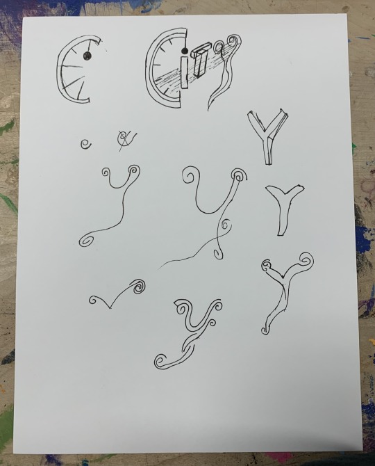
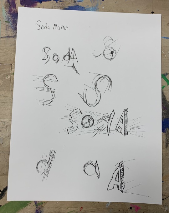
I dealt with kerning quite a few times in my last type class. This week's reading introduced a lot more concepts, sort of like an expansion from spacing letters to words and paragraphs. It's interesting to see how even just a small change in the space between each word or baseline or paragraph can determine the feel and coherence of a text block. This becomes more useful when I later read about hierarchy, which I am always interested in learning more, much more so than tedious letters' "kerning therapy". For this week, I focused on developing my logotype. This was the most I've ever sketched one single letter since my Arts245 final project. The process is supposed to be fun, I guess (me and my pencil against the world), but I can't deny the growing frustration of not getting that one mark right or the letters feeling a bit off. It was satisfying in the end, however, when I finally got it the way I wanted, and especially when I looked back at all the sketches that the professor told me to keep (grateful for that).
0 notes
Text


Arts246 Blog Week 2
This week's reading is simply helpful. It establishes text and space not as a rigid unit on a layout but as a "shapeless fluid" that designers can utilize to help readers traverse bodies of content. I love the analogy of the text being a fluid or an instrument that the reader "plays", because text is found not just in books, but also potentially everywhere else where visual communication is needed. The reading also introduced basic tools like kerning, tracking, and indentation, as well as some principles concerning line length and space. These concepts are not new to me, but I can see myself coming back to this reading from time to time.
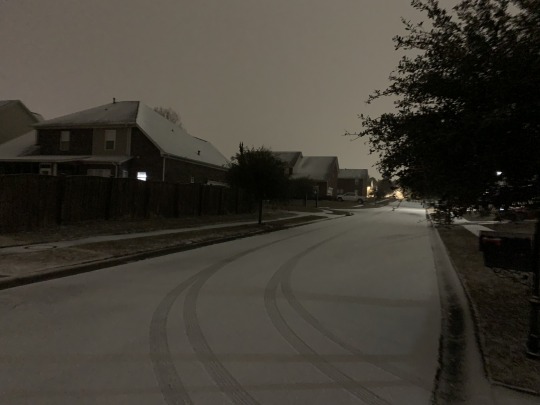
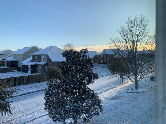
This week, I started my first project by exploring the Soda City Market, including its features and ethos. I wish I had done more sketches before showing them to my classmates on Wednesday, but I plan to do so this weekend and hopefully catch up with the calendar. As I have said countless times before, the hardest part of the research process, to me, is narrowing down the ideas, or ideating solutions, but I've learned quite a bit from our class' first online critique. Had some fun with the snow. The cold was too much for me though.
0 notes
Text

Arts246 Blog Week 1
I plan to start on our 1st project over the weekend, so here's me reading the textbook and going over Project 1, wondering why it looks just as bad as Arts245's final project, and still better than the 9-square one.
This week's assigned reading was very interesting. There's a lot to talk about, but I want to briefly touch on what I learned: x-heights, em boxes, side bearing, monospace vs. proportional fonts, and tips for choosing & pairing typefaces. For me, these terminologies unlocked possibilities concerning what we can do with typefaces and, coupled with the lecture we went over on Wednesday, show that typographic design is truly an art because of how it can play with humans' emotional and cognitive abilities. I used to wonder why it mattered if a business receipt used Times New Roman, nonsense like that, but to know more about the typefaces and their fonts available out there, has given me a deeper appreciation for the ways they are used in different mediums and settings.
I learned something from Jessica Fischer as well. It's cool to hear about the process behind a design genius, but I wished she could go into more detail regarding how she does things.
0 notes
Text
FA24 Arts245 Reflection
The GD+I program has been my main aspiration going into this field, and with the registration date getting closer, there is not much time to mess around. This course has been a reminder, of course, and often a painful one. "Would this career path be tedious like the gray reading project?" "Would it be laborious like the 9 square project?" "Do we really have to give up ourselves for someone else's presentation?" Every project gave me different kinds of simulations, but they did get me to think, "What do I really want to do?" I wanted to draw, and I did; I sketched logos and letters. I wanted to exercise my creativity, and I did; the rebranding project took quite a toll on my schedule, taking me hours to search for something only as clear as an idea. What did I want from all the handiwork? I didn't know. And I guess that's the point with this course: to expose myself to the things I knew I wanted to do as well as the things I thought I hated, only to look back at how far I have come and once again have the confidence to say, "oh, this is not that bad. I think I can do something a bit more challenging than this."
So, I want to thank you Prof. Nace for this opportunity to work alongside you. Your feedback and encouragement really are the stepping stones that reinforce my confidence as I prepare to reach new heights. Although I have to say, you are like that one really picky teacher my 2-year-ago self would imagine having. But keep being like that. I don't talk much, so I want to let you know here that I appreciate your criticism along the way. It really helped me grow, as it did for countless students you had before me.
Thank you for an incredible journey.
1 note
·
View note
Text

Team: The Indiana Fever
A new name I can think of: The Indiana Vitality
The Indiana Fever are the women’s professional basketball team based in Indianapolis, Indiana. Founded in 1999, the team joined the WNBA as an expansion in 2000 and took shape in the following years with the drafts of basketball legends like Tamika Catchings. Known for their competitive spirit and core values of commitment and teamwork, the team went on to win three conference titles in the 2010s and championed the WNBA Finals in 2012.
Beyond the basketball court, the Indiana Fever is a team of people and strong advocates for youth education, equity, and inclusion. The Indiana Fever, through the Indiana Fever Anthem Assists Award, honors "champions of the community" who have made overwhelming contributions to the lives of others in education, wellness, and female empowerment. The Fever also provides merchandise donations to non-profit organizations in Indiana and accepts player appearance requests for charitable events and fundraisers.
Everywhere they go, the colors of navy blue, red, and gold become the representation of the team's bold and competitive spirit, emblematic of their rich history, unequivocal hoops dream, and enthusiasm in supporting their community.
0 notes
Text

Typographic Design Blog - Week 8
For this class, I spent the past week putting my characters and other elements into inDesign, and another day or two this week tweaking small details for this Tuesday's critic. This project has been a blast because everything is quite new, from learning how InDesign works to how to put different things together to create a coherent and interesting design.
The least discussed aspect of the project, as I noticed from the in-class critic, was the formatting of the text, in particular the kerning, the hyphening, that kind of thing. I tried my best to not have hyphenated letters, but also to keep a uniform width and feel for each text block to make room for more important elements, like the character. In doing so I think I've lost some dynamics in my design, but from the feedback I received yesterday, I could do some work to revise it before next Tuesday. Coincidentally, this week's reading also kind of deals with texts, specifically the punctuation and dashes. "Dumb" and "Smart Quotes" stand out to me because how could you tell them apart without wearing binocular glasses?
0 notes
Text

Typographic Design Blog - Week 7
The mood board discussion has been a real blessing. I learned a lot of interesting things this week, from the importance of making a mood board and asking silly questions to how to not give a darn about what we like artistically. Outside class, I spent some time tweaking my two letters, getting them ready for the next major part of the current project.
Speaking of the next part, this week's reading is decently helpful. I am not much of an InDesign person (I use Canva), but the stuff with hierarchies of different elements on a page really makes me want to hop onto InDesign and do all kinds of things to my paragraphs. I love the concept of arranging texts and other elements in a way that guides readers across the page, and I am just surprised to see how this concept has been used not just on printed materials but also on virtually any website. Excited to apply what I have learned to the current project.
0 notes
Text

Typographic Design Blog - Week 6
I find it intriguing that you can fake a new typeface by compressing, condensing, shrinking, or italicizing it. Also find it interesting how easy it is to create a new typeface simply by changing the weight of a line or adding a little stroke. No wonder why typography is an art because inspiration happens, which is exactly what compels people to create classifications for different typefaces. Plus, what is the most haunting typeface I've encountered? Probably the pixelated typeface, which I often see on gas and food bills, and whatnot.
For the past week, thanks to my successful time management, I was able to sketch 16 letters, get feedback, pick two letters, and participate in a group critique this morning. Grateful that I was not affected by the recent hurricane so that I could keep everything on track. Power and peace be with those who have been!
0 notes
Text
Typographic Design I Blog - Week 5
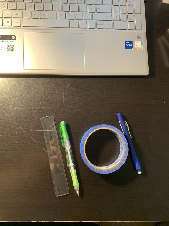
For the whole week, I spent time tracing the letters for assignment #3 while asking why I decided to take this class, simultaneously. I forgot to take a picture of my finished project, so above is a picture of the tools I used to do the project. There's no French curve here. Many students agreed that the tool only screwed up the tracing further.
Today I learned about the different arrangements of text blocks on the page, including flush left ragged right, flush right ragged left, and centered text. I also learned about how the arrangement of individual words can affect the legibility or overall look of a text block. This is some very helpful information for when I return to Indesign ( I have used it only one time before) and do the booklet thing for assignment 4. This assignment is also an opportunity to apply what I learned about letter kerning to help me design a booklet that is legible and organized.
0 notes