
Don't wanna be here? Send us removal request.
Statistics
We looked inside some of the posts by animation-practice-aru and here's what we found interesting.
Average Info
Notes Per Post
0
Likes Per Post
0
Reblog Per Post
0
Reply Per Post
0
Time Between Posts
1 month
Number of Posts By Type
Text
7
Last Seen Tumblr Blogs


Fun Fact
Celebrities use Tumblr as well.
Text
AUDIO PROJECT
This week we attended a museum to look at portraits. We had to choose one to make into a modernised character and story. I have attended this museum multiple times before so I had some ideas in mind. I tried to push this aside and go for something new.
I decided to pair up with my friend Amy and we both looked at the paintings together. We saw a lot we liked and had many different ideas but we kept coming back to one in particular.

This painting interested us most, the composition is striking and jumps out at you. It feels like this woman is here, looking down at you with a sense of superiority. The rendering of the silk is also gorgeous and shows great technical skill.
We imagined her as a goddess before we knew anything about the painting itself. The gigantic sphere representing power over the world, and the godly aura of the glowing clouds made us come to that assumption. We later found out it really was a depiction of a woman as the Roman god Fortuna. This shows how skilled the painter actually was to convey this message so accurately.
I began to work on the character design. Me and Amy agreed that she would be a middle aged, somewhat fancy looking woman in modern clothes that resemble her original outfit. We decided to keep elements from the painting such as her colour scheme and the pears around her neck and head. We also kept the ball and sceptre in a sense, though they are exaggerated.
Our initial idea was to have this woman watching over her descendent and keeping him out of trouble. Keeping with that I edited the sceptre to have a scale on the end to represent the ability to manipulate fate. I drew up some sketches and experimented with different styles of dress, faces and hair styles.

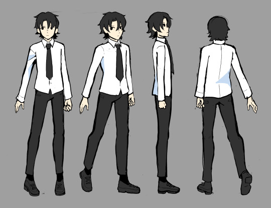
I finished the character design process off with a digital character turnaround which we could use for the animating process

Next we moved into storyboarding, which is my favourite part of animation. I did multiple storyboards, initially my storyboard was not suitable for premier and editing as the ratio was very off. It was a rookie mistake that I didn’t think about much, so I redrew a lot of my panels again in a better ratio so they could be put into premier correctly.
I had already envisioned what the animatic looked like in my head, so doing the storyboard was relatively easy and fun. Both me and Amy worked on the animatic together and highlighted which frames we liked from each others storyboards to add them into the animatic. Once we had chosen which ones we liked or didn’t like, I decided to work on making the complete animatic with camera movements and sound effects whilst Amy did work on Maya for the backgrounds.
This suited our strengths a lot better, I think it was a good way to work as a team.
Overall the animatic came out nicely and we were confident with the direction we were going in. We divided the animatic into 4 scenes around 10-12 seconds long. We’d each do 2 scenes each, I chose the beginning and final scenes as there were elements I think I could animate well. Either way I was intimidated by the project, it seemed daunting and it felt that way the entire process.
As for animating, I found it pretty difficult. This was the largest animation I had ever done, with a combined total of around 20 seconds. I feel I could have done better had I not gotten sick halfway though the term, my animation felt too choppy and I wasn’t overly happy with it. There were a few scenes I liked, such as Rachel running and dropping her sceptre. Overall, the animation was made with panic in my mind, despite having an extension I still would not have the necessary equipment to work at home and so I had to finish my animation work by the 28th at the latest.
For this project overall, I had a lot of fun working with Amy and it was definitely something I’d do again. I believe this project was just a lot for me to handle when I had to miss 2 weeks of classes. I think I did the best I could, but I wish I could have had those 2 weeks back to really push myself and make something I’d be more proud of.
0 notes
Text
WEEKS TEN, ELEVEN AND TWELVE
For the final three weeks I worked on completing my lip sync.
First I had to break down the audio into phonetic parts. I found this part pretty difficult. For example, in the audio one character says ‘sorry?’. If I were to spell that out phonetically just from memory I would write ‘soh-ree’. However when listening to the audio, the ‘ree’ sound wasn’t actually there, instead it was more of a ‘ur’. When playing the audio in its original speed it sounded like ‘sorry’ but when slowing it down it was more like ‘Sur’. This tripped me up, as I kept trying to find the ‘ree’ sound as my brain was telling me it had to be there.
I followed the storyboard I had made and started making key frames in TV paint.
0 notes
Text
WEEKS SEVEN, EIGHT AND NINE
LIP SYNC PROJECT
Our next project is doing a lip sync. Going into this project I'm very intimidated. I have never done a lip sync before and it sounds extremely complicated. I'm nervous to start
We started by listening to different audio options. I knew I wanted a feminine voice and a masculine voice so I could draw both genders. I don't draw male characters often so I wanted to challenge myself whilst also having the female character to draw so it wouldn't be too difficult.
Once id chosen my audio I wrote it out in my sketchbook and created a mind map of ideas. I really struggled to do this even though mind maps are my usual way of coming up with ideas. I think the audio didn't give me much to go off. I could clearly see how I wanted the animation to go, I wanted to draw my ideas rather than write them. I did both at once, drawing as I wrote more ideas and this helped.
I created a mood board after this before I went any further. I focused a lot on the 90's. For some reason the audio just gave me lots of 90's vibes so I decided to run with it.
I moved onto my favourite part of the process, character design. However, I found it harder than usual. As I was creating a character for animation, the design had to be very simple. I'm more of an illustrator so my designs are usually quite detailed and not suited for animation.
This meant an overhaul of my style in general. For example, the way I draw hair is complex with lots of strands which would take a long time to animate. I had to simplify my characters which I found extremely hard. I spent a couple pages trying to find a style to animate in and when I did I drew it over and over to practice consistency. Overall I'm happy with the style I've chosen. Its simple but not too far from my usual style.

Next I had to do turnarounds. I've gotten used to doing turnarounds by now, both from my own practice and work related to the course. I found myself losing a bit of passion whilst making these turnarounds. I'm not used to such simple designs and I like to make things 'pretty' and intricate. I feel I've gotten into the habit of believing more is better and so don't feel very proud of this character design. However I acknowledge that this style was the best style I could have chosen for this project. I also didn't render them to my usual standard, as its also not suitable for animation
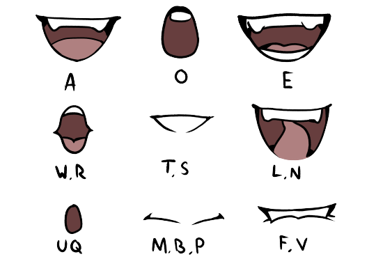
I had to create different mouths to use as custom brushes. I cant say i struggled much with this. I draw a lot of comics so I'm very used to drawing stationary mouths.
Finally, I did a rough storyboard in my sketchbook before doing anything in TV paint. It is only 12 or so panels but it gives me an idea to follow.
0 notes
Text
WEEKS FOUR, FIVE AND SIX
CREATING THE NOVEL
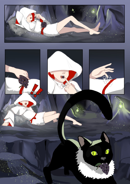
I started off my novel by sketching, I always found it easier to figure out my ideas traditionally rather than digitally. I figured out my panels pretty quickly. I had done a 20 page long comic for my final major project in foundation year so I already had some experience in making graphic novels and similar. I also read a lot of manga. One element I incorporated into most panels was the characters or objects breaking out of the panels, especially when the characters were in motion, such as running, as I felt it made them stand out more. I was initially concerned that the character jumped out of the panels too often and that it would be overwhelming for the viewer so one of the pages didn't have this. Though this disrupted the flow I had established with the characters jumping out of frame on every page but one. Because of this I decided to keep my characters out of frame for every page.
Sketching the initial pages has been my favourite part of the process, it made me debate doing my entire novel traditionally. I stick pretty heavily to digital art, its the medium I've used predominately for upwards of 5 years and so I'm really comfortable with it. Had this project been longer, I likely would have done it traditionally however for the time we had I decided digital was the most time effective method as I could edit my pieces easier. If I messed up traditionally I likely wouldn't have the time to re-do it. I did do my medium tests on paper though. I tried coloured pencil, chalk pastels and gouache. I made the backgrounds dark, even still it felt like my characters clashed with the background.
During a lecture, it was pointed out how sometimes the background is painted while the characters are done in simple block colours. I wanted to do that, I had the backgrounds be fully rendered in detail whereas the characters were in flat colours with little shading.
I drew directly over my sketches to create the line art. I made the line art red and slightly opaque to make the characters seem softer. This gave the effect of my characters being big blocks of solid colour helping them stand out.
In the end i opted for no dialogue. One, because the other character isn't human and therefore couldn't respond and two because of my time period. In my time period, stone age, humans didn't communicate with words and a spoken language didn't seem to fit at all.


I was really happy with how the initial sketches came out and I liked the way my digital renditions developed them. I wasn’t really good at backgrounds, so it was a challenge to have fully rendered backgrounds when I wasn’t used to drawing them. However I’m actually pretty proud of how the backgrounds came out. I based the cat on my own, I had a lot of references I could use for the cat because of this. I incorporated my cat also because in the beginning, I really struggled to come up with a story. I was advised to focus on something happening in my real life to draw (pun intended) inspiration from. At that time, I missed my cat a lot. This is what gave me the idea to focus on a cat in my novel. I based the cats behaviours on my own cats behaviour. I think drawing with her in mind put more love into my novel.

0 notes
Text
WEEKS ONE, TWO AND THREE
CHARACTER DESIGN
For the first class we were given three prompts to base our character around. I absolutely love character design, it’s my favourite aspect of art. I have many pre-existing characters and I am happy to be able to make more on the course. Before we started on our new characters we learnt about shape language, something I was familiar with but didn’t actually incorporate into my work. When I was asked to draw a character I knew well, I of course drew my own character Kira. From this I found out I had given her a rounded figure which signifies benevolence and kindness. However when I was asked to draw her with a triangular shape and a square shape, I found I liked her appearance more with triangular shape language.

I really enjoyed this exercise, and I’d like to do it more in the future with all my other characters. I had been confident in this characters designs for years but the small change of triangular language made her look much more like her. Something I wouldn’t have known had I not done this exercise.
For the next half of the day, we went out into Cambridge and did some life drawing. I am not confident in life drawing, actually it makes me very anxious. So I wasn’t really thrilled but I understood why we were doing it. I focused on female figures as it’s what I wanted my character to look like. I also wanted to draw taller, thinner women because one of my prompts was “willowy”.


RESEARCH

For my time at home, I focused on my character. My three prompts were “Willowy, Stone Age France and impish”. I liked these prompts, except Stone Age seemed harder to do and I didn’t know much about France. I started with a mind map
This helped me to develop ideas. I focused also on French legends and I found one that I really liked.

For willowy, my first thought that fit the body type I was going for was 90’s models. They are notoriously known for being thin and very skinny. I decided I would also draw them to develop my understanding of this specific body type. Whilst the bodies portrayed in the 90’s aren’t healthy, they are exaggerated and will be good references for a spirit who is going to be inhumanly tall and thin.

The main thing I took from this was the limbs being very slim and the joints protruding more than usual, especially the knees and elbows.
DESIGN


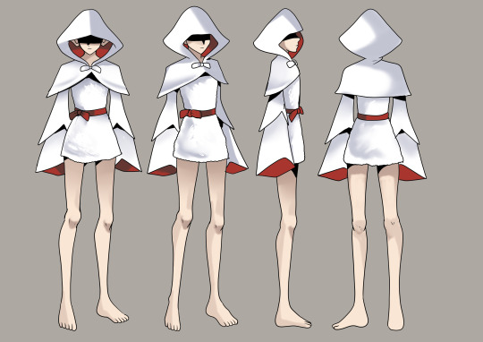
For the start of my design process I did silhouette studies. I had never done silhouette studies before, initially I thought it would make everything harder. Instead, it was extremely helpful. I had to really think about how to incorporate my characteristics, such as willowy, without specific details. This led to my character being a lot simpler than my usual designs. I don't think that's a bad thing, simplicity can be more memorable such as snoopy. its also better for this project as ill have to draw this character multiple times.
For shape language I chose triangular shape language as it fit my characters personality trait of impish. I made her hood, sleeves, ears, legs and cloak triangular. This gives her an edgier vibe. I knew id done something right when my friend, who had not seen the project before, said that she looked like some sort of fée. This made me really happy as an aspect of my character was able to be determined with only their appearance.
I then moved onto colour. I focused on more natural colours, as Stone Age was my time period and clothes were usually beige. However my friend pointed out my red design and said they liked it. I asked why and they said that it would help the character stand out against all the natural colours a Stone Age environment would have. I decided to go with the white design with pops of red. This design was inspired by the design of Weiss Schnee by Einlee. Weiss, similar to my character, represents the colour white. Of course, having a character being entirely white would be difficult to pull off. Einlee added pops of red and black for visual interest and to draw the viewers eyes to the best places

The pop of red at the collar draws your eye to her face, I wanted to employ this for my character as well. This gave me my final design.

STORY
To establish my story I created a mind map and thought about the tree act structure. Initially I planned to have her story be based on the Dames Blanche, but this was holding me back and I wasn't really able to come up with anything. I decided I didn't want to have another human character, instead I focused on a cat.
My synopsis so far is as follows;
"The story follows Sylvie, a mischievous spirit who likes to roam in caves and forests. Sylvie loves her beloved berries, and she’s on her last before she must gather more. Unfortunately for her, an equally mischievous cat steals what berries she has left. An initially annoyed Sylvie chases the cat through the windy caves she calls home. Eventually, accustomed to being alone, Sylvie begins to have fun chasing the cat. The two play with each other over the berries, seeing themselves in each other. The cat gives up the berries after the chase, maybe the cat had come to lighten up Sylvie’s day and give her some company, or maybe the cat simply got bored. Sylvie would never know, either way from then on, they kept each other company."
I wanted to do a wholesome story rather than a dark one. A lot of my stories are dark so I wanted to do something different. I also feel this character would suit a light hearted story much more.
0 notes