Statistics
We looked inside some of the posts by animba1b and here's what we found interesting.
Average Info
Notes Per Post
3
Likes Per Post
3
Reblog Per Post
0
Reply Per Post
0
Time Between Posts
1 hour
Number of Posts By Type
Video
2
Photo
12
Text
3
Last Seen Tumblr Blogs


Fun Fact
Tumblr has been providing a Korean-language service since 2013.
Video
tumblr
This is a turntable of my final treasure item with lighting. I decided to create the set of Kanto gym badges from Pokémon, as I though this would be interesting to create. I looked at many different ideas for what to create, looking at the buster sword from final fantasy, a time piece from a hat in time and a bag of bells from animal crossing. These objects were all from games, as gaming is one of my main interests and pastimes. I am very happy with the way this item turned out, especially the badges themselves as they are the main focus of the object. I think the subtle textures on the display section of the box also give a nice effect, and make it look more interesting and convincing. I am also happy with the lighting in this scene, as it nicely reflects on the metallic parts of the object, mainly the badges themselves and the gems put into the side of the box.
0 notes
Photo


This shows my final scene created from the “King’s treasure” file. I tried to create a dark midnight kind of feel to the scene, and I think the blue reflections on objects like the coins and some of the badges reflects this well. I am also especially happy with the jar object to the side, which I decided to fill with fairy like orbs that emit a nice pink light on the rest of the scene. To make the blue lighting more realistic and interesting I decided to move the scene over to the window, allowing the blue light to better reflect onto the objects. I also added a background to be seen out the window that added some simple stars to make it look more like a midnight sky.
0 notes
Photo
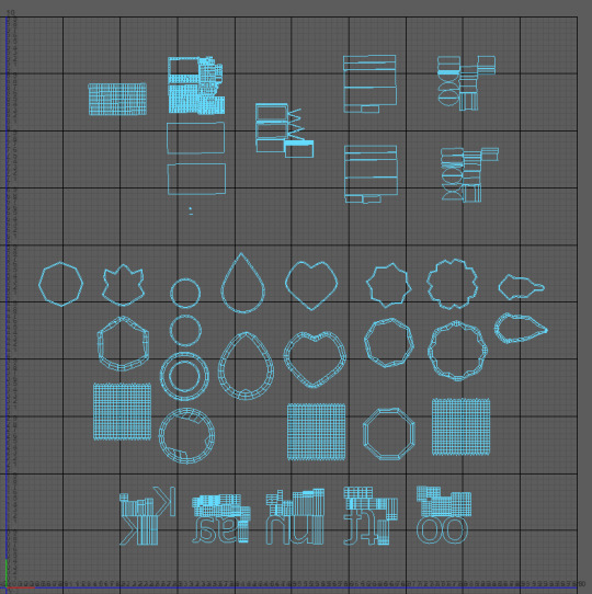
This is the unwrapped UV’s of my custom treasure item that I created. I think the best UV’s shown here apply to the badges themselves, as I think they are the neatest and easiest to understand, however this is mainly down to the range of different shapes that they have. While I think the overall layout here works well, the UV’s for the box and letters could be more organised and neater to make it easier to understand which part fits onto each part of the box.
0 notes
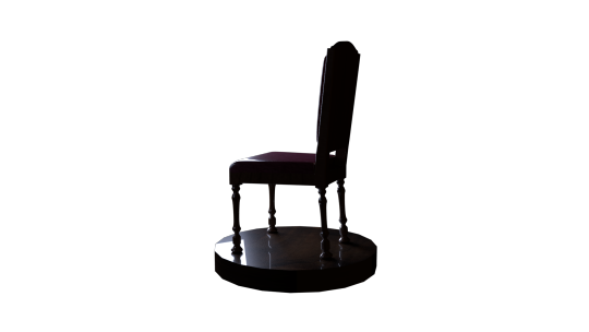
Photo
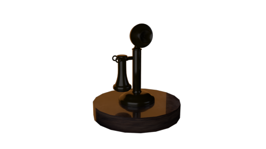


This phone was the second model created as part of the Maya project, and is similar to the chair in the way it is presented. I think this turned out pretty good, with a bronze like material put onto it.
0 notes
Photo
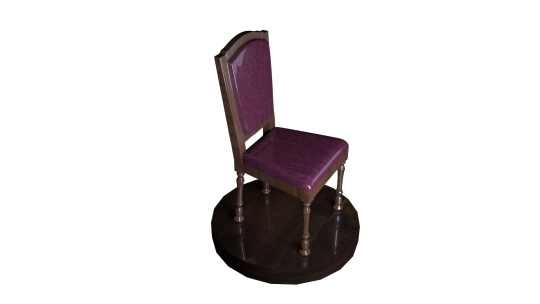
This is the final version of the chair model, with textures and lighting applied to it. I think some of the textures around the cushioned areas of the chair could have been improved to be less shiny and reflective, making them look more like a softer material.
0 notes
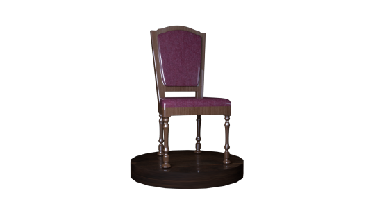
Photo
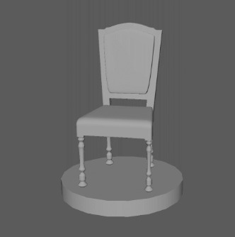
This is the first complete model I created wit Maya. We used a reference image to make it easier to create the chair and to make it as accurate as possible. I am happy with this model overall and I think it looks good and works well as a simple model.
0 notes
Video
tumblr
This is the final reel containing all previous animation exercises, flour sack iterations and walk cycle iterations. I also decided to add some music to this to make it nicer to watch, I used two tracks from Ikson, titled “With you” and “Day off”.
0 notes
Text
Film Language Essay Plan
Title
Analysing the use of colour and light within scenes of emotional significance and conflict presented in Disney Pixar’s “Up” and Columbia Pictures’ “Cloudy With a Chance of Meatballs”
Analysing the use of colour and light to signify a change in narrative or emotion within scenes in Disney Pixar’s “Up” and Columbia Pictures’ “Cloudy With a Chance of Meatballs”
Films and sequences using
Up, Beginning scene, Kevin being captured, Using dark lighting with each contrasting to the lighter scenes of the film, Up has scenes that are much brighter with much softer lighting than others.
Cloudy with a chance of meatballs, The food falling from the sky, The final scene against the machine, Both with brighter colours presenting the scenes as happier in contrast to the beginning of the film. Cloudy with a chance of meatballs uses a rainbow of colours.
Techniques being compared
Colour and light
Statements being made (Bullet points)
· The use of dim lighting up to enforce sadness and emotional moments
· The use of Bright colours in Cloudy with a chance of meatballs to enforce joy and hope.
· In each of these instances, The opposite effect is introduced before or after to move the narrative forward to a different effect to the scenes.
· In up, light is used to invoke a feeling of hope, as the sun rises while Carl flies up to rescue Russel
· Similarly, cloudy with a chance of meatballs contrasts the greys at the beginning of the film with bright colours as the food falls from the sky.
· Up, while the audience don’t know it at the time, introduces the villain of the film in a dark cave with the giant airship, and has the main emotional conflict between Russel and Carl At night.
· Light used in different ways within Up, both hope and despair, spotlights used to create ominous feelings, sunrise and natural lighting used to create a feeling of hope.
· During the scene where Kevin is captured, giant spotlights shine down from the airship in an intimidating manner. This scene also involves the orange light from the fire under Carls house, giving the scene a somewhat ominous and threatening red lighting effect. Cloudy with a chance of meatballs uses a rainbow of colours with all the food that falls, making it a more joyful part of the movie, while also using similar colours during the final scene but placed in a darker environment to create a more ominous effect.
· The progression of time can be seen through the colour and lighting of each movie, with up changing colour throughout to show the progression through night and day, and cloudy with a chance of meatballs doing a similar effect with lighting.
· Cloudy with a chance of meatballs introduces tropical and bright colours to introduce a more alien and wonderous effect to the food falling.
The power of color in animation (baianat.com)
Lighting and Color in Animation Films | Animation Mentor Blog
0 notes
Text
Guest Lecture: Maria Paneer Rajan
This was a guest lecture led by Maria Paneer Rajan, who works in vfx. Some of the highlights of their work comes from early on, as they started building simple flash games with the first being “adventures of the dude”. After this they then joined the graphics industry and worked on some vfx projects, one of these being “hangin out with spidey and mace windu”, which involved adding the two characters into different shots of a real life scene. They then worked on “legends of chima” for cartoon network.
I think this talk was interesting and I found the way they started with creating flash games especially interesting, as it is a simple first step that allowed them to move forward and go into much larger projects later on.
0 notes
Text
Guest Lecture: Indigo Illusions
This guest lecture had 2 people from Indigo Illusions talk about their journey from university to working on their own projects. I found it interesting to hear about how they worked together in university and moved on to create a much wider business, creating their own animations etc.
They also gave some good advice towards the end, adding that it is ok to make mistakes on the course, as it allows for further learning of the software being used. They also said that spending time collaborating and getting peer feedback was worth doing, as it allows for greater improvement of further work.
0 notes
Photo

This is the final version of my characters walk cycle. I added some wind lines to it to give a better effect that they are walking against a strong wind. This character has an extra piece coming from the scarf that is not on my character design sheets, however I think it adds a bit more detail to the coat instead of it being a flat colour for the whole thing. I am happy with the way this walk cycle turned out, and I think it is successful in giving a bit more life to the character created through the character design part of the unit.
0 notes
Photo
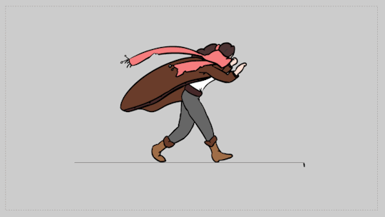
This shows the final linework of the walk cycle, as well as a coloured version. This is pretty much the same as the previous iteration, it is just cleaner and slightly more consistent in areas. The colours use reflect the colours I decided on in my character design sheets.
1 note
·
View note
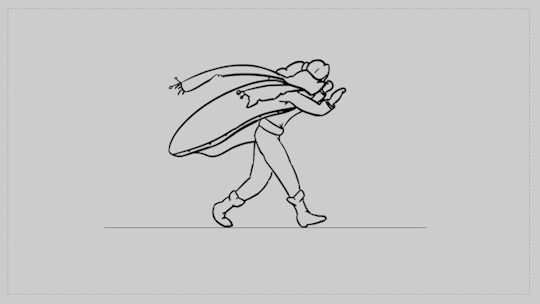
Photo

This version of the walk cycle is close to the final iteration. The linework will need to be cleaned up a bit and colour will be added for the final version. It shows the added clothing that has been put over the top of the lined guides I had in the previous version, however I have decided that the hair will stay down and appear heavier. This is mainly because I felt it was too much with the coat, scarf and hair blowing together, and I think it looks better with just the two.
1 note
·
View note
Photo

This is the final version of the flour sack mystery project, keeping most of the aspects of the previous iterations and being cleaned up in certain areas, for instance the jump now keeps the line across the flour sacks body to maintain the positioning of the feet and keep the orientation more consistent. I think this flour sack animation works nicely, and creates a cute short story of the flour sack sneaking up to the rocket and being surprised when it takes off while it is holding on.
1 note
·
View note
Photo


These were short drawing exercises that involved drawing animals and finding what shapes made up each animal. Once finding the shapes and basic form of the animals, it becomes easier to exaggerate or characterise certain parts. This is something that I did with one of the giraffe pictures, to make a sleepy or sad looking giraffe character.
0 notes
Photo

This was a short exercise in which we drew different poses referenced from images of real people. This was something that was very useful for me, as posing and accurate proportions in poses is something I need to work on, and I think I made some good progress on it through these poses.
0 notes
Photo

This was a short exercise we did that introduced different folds and how they apply in different ways. This definitely helped me understand how clothing can fold over different parts of the body, and how to draw this in a realistic and convincing way.
0 notes