
Statistics
We looked inside some of the posts by annahmacha and here's what we found interesting.
Average Info
Notes Per Post
494
Likes Per Post
355
Reblog Per Post
134
Reply Per Post
5
Time Between Posts
5 days
Number of Posts By Type
Text
15
Video
1
Last Seen Tumblr Blogs


Fun Fact
Premium Tumblr themes are available from anywhere between $9 to $49.
Text
Week 16- Reflection of the course based on the readings done
Lessons Learned- Conferences and Final Reflection of the whole class and take aways
I can proudly say, this course has taught me a lot, as a teacher of Technical Writing sometimes I take for granted that since we are in the information age and my students know how to use and appreciate images, as they are on social media all the time. They post and share images all the time and everyday. But this is not the case, this course has taught me that they do not know. We need to teach them visual communication, and how to effectively communicate with visuals, how they can critically evaluate, use and ethically infuse images on their academic work. Bezemer & Kress, Takayoshi & Selfie; Hocks; and Bremberger advocates for a Visually communication pedagogy. Teacher of composition should not be caught in the middle of not knowing what to teach between technology and visual rhetoric.
Looking at this brochure below I am able to critically identify the good and the mistakes made by the designer. This brochure was designed with medical colors for doctors in mind. These colors include teal color for clothing, white, and sky blue. The color combination are inviting to customers to want to read, because the important information is written on a white background and bulleted. It has an appealing look to it and the contents will persuade the customer to visit the medical center as it has outlined the medical services they offer such as surgery, cardio dentistry, and cosmetology. The one thing that I notice in this brochure is that the sub-headings are written in upper case instead of lowercases, they are shouting to the customers.

I am proud to say this class has contributed to my knowledge of teaching, I will be a better Technical writing teacher. I will apply the knowledge I gained such as applying the four basic document design rhetorical functions learned from Hassett, alignment, invitation, credibility and persuasion to my design of document and even teach them to my students.
0 notes
Text
Week 15 - November 29th - Hocks- Visual Rhetoric in digital writing environments
Hybridity of images and test and juxtapositiong all of them
This week Hocks provided us with an explanation of a framework that can help us read 'the multiple media of texts,'-websites by applying the general concepts of “hybridization”and “juxtaposition” to make sense of visual-verbal compositions. She used the two key terms for describing visual -verbal composition, explaining them through her reading of Anne Wysocki and Christine Boese but the problem is that she gives broad information instead of detailed specific understanding of word-image or media-to-media relations. From the reading I can begin to understand a way to make general sense of the complexity of Web texts.
The hybridity of the Web interface allows Boese to swap different kinds of media—texts, pictures, sounds, links, data sources, and citations in and out of the various sections of the screen and pop-up windows. She juxtaposes textual explanations with purely visual arguments.” An example of her explanation is the website below, which has many tabs, virtual tour of the campus, text and images all in one page. The user has to move from one page to the next.
It reminded me of Bolter and Grusin remediation of media where they discussed hyper-immediacy stating that it is the promotion of the medium that is delivering the stimuli and it promotes opacity. Hypermediacy is comprised of a combination of images and sounds and text and video in order to construct multiple representations within a heterogeneous space. The description that Hocks provide is a standard desktop interface with multiple windows open. I can relate to it as I normally have multiple Word documents, Google search pages, YouTube, Adobe PDFs, and UNM email, UNM learn tabs all open on my computer screen; and sometimes I will be on my phone texting friends and check social media. This experience is constantly mediated, as a user my windowed computer is both automatic and interactive. Hocks states that it is typical of websites and the demands they put on readers like me when we have to move from panel to panel or screen to screen and make sense of the diverse elements in those panels, pages, or screens.
0 notes
Text
Week 14: November 22nd - Brumberger Visual Rhetoric in the curriculum; Hasset- Teaching the rhetoric in document design
Visual Literacy
After reading Bumberger's article about Visual Rhetoric in a Business course, I tended to agree with him that nowadays communication in the business world has turned to be visual. Business reports and memos incorporate more visual materials than they have in the past There is a shift from the traditionally way of understanding literacy to the new way introduced by technology and the digital era.

The above image is a Netflix report, an example of a business communication with characteristics that Brumberger mentioned that it is "keeping up with needs of clients, customers, and colleagues, people who still use documents but do not necessarily read them in them in traditional sense because these users demand quick and easy to access information, and they have come to expect documents that communicate both visually and verbally" (p.319). In report the title has a bigger font size and bolded to attract the attention of the reader. The graphs are colored to create a friendly tone. If a Netflix subscriber is reading it they will quickly browse the section with ease and be able to tell which genre is it they like and how will the price increase affect their subscription. The business report contains tables, bar graphs to report their sales and how their business is doing. The images help to read the report quickly as the eye can scan through and identify the important information sort without having to read all the text on the report.
Brumbeger states that it is important that when graduate and undergraduate students they should posses skills for creating multimodal documents. Hasset also adds to the argument by explaining the the four characteristics of document design (alignment, invitation, credibility and persuasion, in addition to readability and aesthetics) that students ought to learn and master, sine their costumers in the working world we require from them.
0 notes
Text
Week 13: November 15th- Takayoshi & Selfe - Thinking about multimodality; Bezemer Kress - Writing in multimodal texts
A picture is worth a thousand words
youtube
Takayoshi and Selfie are imploring teachers to use multimodal stories below instead of reading black and white text as found in the traditional books, then our student will be more interested in stories and listening and watching than they with reading. The video above combines visuals and written subtitles, narrator, with animated characters and sub- titles so that slow students can read and see the correct spellings of the words. The reasons why writers today like to communicate in a multimodal way other than alphabetic text is because in certain situations, a visuals have the potential to convey an idea more effectively and more quickly than written text. This why an English says “a picture is worth 1000 words.” Images can help readers to better engage with the topic and experience a moment in a way that could be more difficult to accomplish with words alone

The images above show two types of books, historical traditionally black and white books with just text, no image and modern books with color, images, illustrations that help children understand the characters and story they are reading. When reading abstract concepts with images to illustrate the content it become easier for students to understand.
The argument by Bezemer and Kress further advocates for the inclusion of illustrations and images on textbooks, thus multimodal school resources. I agree with all these authors, colorful textbooks and are crucial in simplifying content for students.
0 notes
Text
Week 12: November 8- Laurie Gries - On becoming rhetoric; Tufte- Visual explanations
The Importance of images, visual and statistics
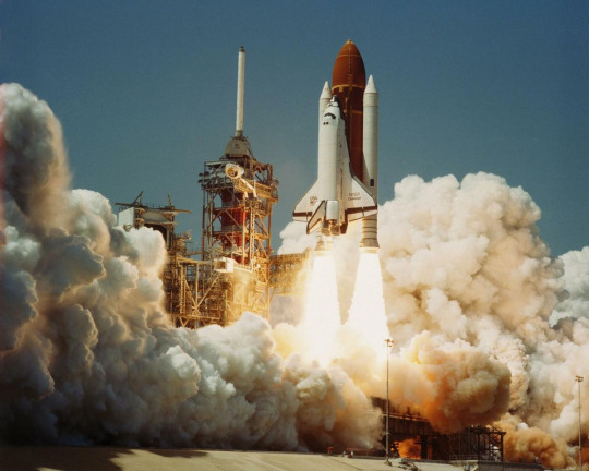
This week we read very informative texts about the importance of paying attention and the detrimental end results of not paying attention to graphic information. Tufte's articles that explained the importance of reporting correctly the statistics or quantiles accompanying the images in the incident of the Cholera outbreak in London and Challenger space craft that exploded. Tufte's chapter presents two case studies in which the quality of a graphical presentation had significant consequences. The first example-a success story, is that of John Snow's analysis of the 1854 London cholera epidemic. Snow's analysis and presentation convinced the city fathers to take appropriate action to curb the epidemic. The second, cautionary, example analyzes the failure of viewgraphs prepared the engineers to convince NASA officials to postpone the launch of the space shuttle Challenger. Tufte makes effective arguments of how a tragic flaw of visual information is deadly, "had the correct scatterplot or data been constructed no one would have dared to risk the Challenger in such cold weather." Tufte implores people who use graphics in their daily professions to pay attention to detail and be meticulous both presenting and interpreting visual information in order to avoid deadly mistakes such as the one experienced by the challenger engineers.
Rhetoric as becoming emphasize the role of rhetoric in collaborative meaning making. Obama Hope image first appeared in public in Obama's first presidential campaign and it quickly took on a life of its own as it was reproduced across multiple contexts and appropriated to fit the innumerable purposes of often anonymous creators. According to Gries Obama Hope is an important example of visual rhetoric because it constitutes what she terms a 'single multiple image' that has consistently undergone and continues to undergo numerous rhetorical transformations. As a result of both its now long-term and wide-ranging rhetorical movements, Obama Hope constitutes a valuable site for intensive study of the ways visual rhetoric circulates in public culture today. Laurie Gries uses the Obama Hope image to introduce iconographic tracing by imploring Bruno Latour’s (2005) explanation of how empirical, digital research can make visible how new media images circulate and reassemble the social. He introduced ecological rhetorical model which he termed iconographic tracking thus a method that makes use of innovative digital research and traditional qualitative strategies to account for an image’s circulation, transformation, and its resultants. In order to demonstrate this method’s affordances, Latour (2005) described how to enact this method and weave in sample findings from an ongoing case study that employs iconographic tracking to trace the Obama Hope image. Furthermore he introduced a new materialist approach to explain some of the theories and philosophies that underpin this method.
Two images that come to my mind that have also received multiple rhetorical transformations though at a lesser extent are those of Marilyn Monroe and Madonna who were famous actresses and their images have been reproduced to show their provocative, feminine, sexuality and beauty. The two key figures though controversial played a role in the movement of women’s roles and expectations.
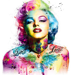
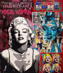
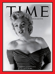
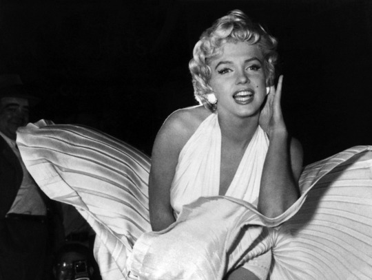
Marilyn Monroe tested the boundaries of her generation repeatedly, especially with her image that caused severe controversy during her time, showing her flirtatious portrait pushing her skirt down above her knee (black and white above). It is said to be found in any 1950s magazine, or pictured with any book or article written about her, or brightly framed and displayed to draw the public’s eye. Some of her images were reproduced as graffiti as an expressive art form. The other image above show her body instead of being covered with clothes its all covered with colorful flowers and two words sweet and love as metaphors for how provocative, feminine, sexy and beautiful she was.

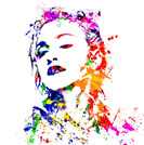
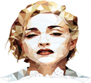
Similarly, Madonna has her images drawn in unique colors and dimensions as she was at one time considered on the lower side of the cultural scale because of her erotic videos, which included controversial issues such as homosexuality. She is one lady who has tested today’s moral boundaries with songs and videos that depicted aspects of society, which were still under, mainstream cultural turmoil, this has led her to her reign as a modern day social icon.
Both women became a consciousness in the male-dominated world and as shown above their images have been reproduced in many different ways.
0 notes
Text
WEEK 11: November 1st: Charles Hill- Reading the visual in college writing; Keith Kenney - Building visual communication theory
Visual literacy in the college classrooms
Charles Hill begins by lamenting the neglect of visual literacy in classrooms. According to Hill, this neglect is largely due to the perception that the visual is some how “less than” the verbal. He claims this idea is based largely on invalid assumptions including that the visual and verbal are separate entities. He refutes this and argues that the visual is not simply another way to say something that can be said verbally. This idea leads into a discussion for visual rhetoric pedagogy. After posing a list of current questions in the field, Hill tries to answer the question of how we determine which images to consider rhetorical. He identifies “imagistic events”(first-hand images) and “symbolic events” (second-hand images categorized by “intent”) as the two types of visual images. He does go on to caution that these are both subjective; our perceptions of these events are influenced by our cultural values and assumptions. After discussing the why of visual rhetorical pedagogy, Hill poses suggestions for implementation:
Looking at the image in the context of American culture by having students consider how images work in society
Teaching images as rhetorical constructions, students should learn how images are persuasive and
Teaching the visual aspects of written text as a way to ease students into a discussion of visual rhetoric.
Hill then turns to the application in First-Year Composition (FYC). He argues that the visual should be taught in FYC because it is often the only exposure to rhetorical theory that students have in their college careers, and the primary purpose of rhetorical education is to teach students how to respond to messages in the “real world.” He ends the discussion of FYC with the acknowledgement that general education writing courses are considerably over burdened. His solution to that problem is a multi-departmental rhetoric program built around the idea that writing, visual literacy and oral communication are all essential and relentlessly intertwined.
In Kenney’s article, he proposes that the best way to use visuals as arguments is to translate verbal rhetoric techniques into imagery. When explaining how cartoonists do this, Kenney states, “Like speakers, cartoonists use contrast, commentary, and contradiction as formal organizing principles, or nature. For style, rather than finding verbal equivalencies for verbal figures and tropes, the author explained how use of line and form, exaggeration of facial features, placement within the frame, relative size of objects, relation of text to visual imagery and rhythmic jumble have persuasive potential.” In other words the size and placement of the text within a frame, and the exaggeration of physical features can be used as persuasive material.
Historically, traditionally rhetoric was mostly public and orally persuasive. According to Kenny, Aristotle’s five canons- invention, disposition, style, memory, and delivery are some of the tactics utilized in political cartoons, and are a large part of the reason they are so effective to the audience (pg. 4). He further states that, “in the classical tradition, speakers could use volume, tone, rate, pitch, and so forth; to get and keep listeners’ interest when delivering their message. When applied to the medium of newspapers, the cannon of delivery is re-conceptualized as image placement, size and typeface, to get and keep readers’ attention. The example below clarifies this,

President Donald Trump says he wants more immigrants from Norway instead of "(expletive) countries like Haiti and nations in Africa. Published Jan. 16, 2018
In the above political cartoon, many of these rhetorical techniques, explained by Kenney, can be seen in action. For example, the exaggeration of Trump's facial features are clearly present. His face and neck are excessively fat and big, his eyes painted pink have bags under them and closed because he is too fat, mouth twisted, with dimple cheeks that are yet is hand and finger are the opposite ridiculously thin for that huge body. His hair looks like a cap. However, the Norwegian speaker seems normal even though his hair style is exaggerated. The text is limited in use to just the speakers, with color choice of yellow and red. The background is rather plain, white on the side of Trump and on the of Norway there are blue waters, mountains, and a yellow rising sun, people walking about near the river to emphasize peace and tranquility in Norway. This cartoon has Norway written in red and blue on a red background that symbolize colors of Norway's his flag.
0 notes
Text
Week 10: October 25th - Robert- Visual arguments in intercultural context; Bernhardt - Seeing the text; Stroupe - Visualizing English
Juxtaposition of the image and the text
Building a Visual Communication Theory- this week's readings were all based on building a curriculum for students in college. The question by the authors was what might is look it look like to include visual communication/ literacy in the college syllabus? When Stroupe was writing his article in the year 2000, visual literacy’s place within the classroom was still very new, and as new media continues to expand English teachers must adapt to their conceptions. Stroupe argues for an inclusion of visual rhetoric to the English curriculum and that is why he calls it Visualizing English, thus making the content and its teaching adopt visual literacy. In addition describes a specific approach to reading, composing, and teaching the problematic combination of verbal and nonverbal features in texts conceived for or in electronic environments. In Visualizing English, Stroupe provides insightful analyses of the close and illustrative relationship between words and images and the more dialogic and less illustrative relationship of words and images in the “hybrid composition.” The word-picture relationships are “not simply . . . formal or generic, but ideological and historical” which implies that visual-verbal elements within a text or Web page have either a complimentary or contrasting relationship. According to Stroupe, when an image and text are placed next to one another, they enter into a "dialogic relationship" which he calls juxtaposition that allows the image to "respond to and resist" the text and vice versa, complicating the possibilities of meaning for each.

In the picture above, we have the image and the words that gives the viewer an explanation of what is taking place, in this case the text is responding to the image- thus the dialogic relationship mentioned by Stroupe. Furthermore, he maintains that the availability of desktop publishing and Web authoring tools make it possible for teachers and students to create documents that illustrate this dialogic relationship between image and text. However, both the writer and reader of such documents, cannot understand the implications and possibilities without a "critical tradition for describing these effects and a pedagogical apparatus for teaching them." Stroupe argues that teachers have long worked to teach their students to critically evaluate the text on the page, but the students have not been taught to critically evaluate the images on that same page, and less to consider how the two (image + words) might function together.
Bernhardt's article, "Seeing the Text", on the other hand shares that there must be some kind of visual context or learning within a piece of work or else there is missing information. In order to get your point across, there needs to be some kind of visual information in order to be persuasive enough. Some examples are speeches, brochures, businesses etc. Bernhardt characterizes the typical classroom essay as consisting of "full, declarative sentences, arranged in paragraphs with low visual identity" (p. 36). I tend to agree with him because whenever I read a conventional, low-visual type of paper, I always struggle when it comes to reading the information. This is most likely because it is not interesting whatsoever, or because I am having a hard time processing the information in front of me. There is no creativity in "declarative sentences, arranged in paragraphs with low visual identity". If there were more visuals in the paper, I would most likely pay attention to what I am reading and therefore, I could generate the information a well. I would like to pick a sentence that I thought resonated with me;
"Writing, especially when visually informative, encourages the writer to be exact about grouping related ideas, delineating beginnings and endings, and using cues to signal to the reader a graphic representation of cognitive organization."(p.35)
This quote above is trying to emphasize is that visual presentation of text on a page, or screen is as important, if not more important than textual information. By using visually informative texts the author can interest more than one audience. Bernhardt gave us an example in the paper of the wetlands, where the author writes for both nature conservationists and legislatures. The writer uses visually informative text to entice both audiences through her headings. The front of the article contains information about the wetlands, which would interest the conservationists, while the back gives information to the status and protective laws, in order to entice the legislatures.
The image below is comparison of a resume

In the image above, the first document is a traditional black and white resume, without any images with headings and text but on the second document is the same information now with color, different layout and different font sizes. It is much easer to read an eye catching document than the first black and white resume. This view of visual information as a compliment to textual information provides the theoretical basis for seeing the production of multimedia texts as an extension of the writing process. Organizational strategies are as important to visual texts as they are to traditional print-based texts. Bernhardt stresses that visual texts require “rhetorical organization” and that visual analysis is as important in understanding a text as is textual analysis. The visual presentation of text on a page, or on a screen, is rhetorically important to both readers and writers of the text. This view of visual information as a compliment to textual information provides the theoretical basis for seeing the production of multimedia texts as an extension of the writing process.
Bernhardt further outlines four useful gestalt rules for rhetorically composing a visual text. These are four information design principles that students can use as a procedure to guide them as they grapple with turning a white page into an aesthetically appealing and informative page. These principles are:
i) Equilibrium or pragnanz – Strive to balance the text against the horizontal, vertical, and diagonal axis of the page
ii) Good continuation – Strive to balance the figure/ground relationship of objects and texts on the page
iii)Closure – Strive to provide this for the reader with a professional-looking print job (so all of the text can be read) and images that don’t float off the edges of the paper
iv) Similarity – Strive to couple units which have similar meanings into groups by typography, spacing, and direction, as these units will then be grouped by the reader into a homogeneous chunk.
0 notes
Text
Week 9: October 18th - Arthur Asa Berger- Basic elements of visuals; Paul Lester- Visual cues
This week is our Fall break, and I have decided to pick some of the authors whose papers I have not analyzed since each week we have more than two readings from different authors. I have decided to look at the basic elements of visual rhetoric. These include dots, lines, shapes (circles, squares, triangles), volume, scale, spatiality (cluttered pages versus sparsely designed ones), balance, direction, lighting, perspective, proportion, and color. The four main types of visual cues are color, form, depth, and movement. Each one plays a role by itself but together they maximize the information being communicated and allow enough pause for the viewer to take in more information than they realize. The human brain recognizes 3 types of forms: Dots, lines, and shapes. Lines can be straight or curved, thick or thin rigid or organic, horizontal or vertical, broken or continuous.


In the drawing of the shoes the lines have been repeated to create a sense of movement and my eyes keeps going over and over the lines that has ended up as shoes, the color yellow around them is formed by repeated lines. Lines gives one the opportunity to create some interesting juxtapositions. You can use line to reiterate the form of the subject by following the contours.. While on the drawing of the lady, one is able to notice how outlining the boundary of her face and her scarf are curved through the use of curved lines. It helps me distinguish it from its surroundings, the round eyes. The end result of this drawing is a delicate and intricate drawing.

Color has three main elements: i)Hue: is often used as a simile for the term color, red, blue, yellow, orange, green - these are all different hues. ii) Saturation: refers to the richness, vividness or intensity of a color. iii) Value: refers to the lightness of a color. In the above three paintings color has been used to demonstrate the way color fades from its rich brightness i) first painting to iii) the last one which is black and white. In the 3rd picture color is only showing value. Although dozens of considerations go into selecting rhetorical colors, one's primary focuses should be contrast, saturation and psychological impact. Because color is key to conveying meaning, therefore people should choose their hues (or colors) wisely. Some colors such as red bear cultural meanings. There are mental and physical attributes that go into allowing a person to interpret a color. This would mean that two people may interpret the color 'green or red' differently from one another and that is because color is also subjective to an individual(s). Color is an important part of communicating visually as it displays an in-depth connection between emotions and experiences.
Heading and Text Fonts: Finding the Right Type
Some styles of type are utilitarian. Some are attention grabbing. When a technical writer designs a visual project, he/she should choose fonts carefully to achieve their goals, by considering the audience. If they are creating business communications, a type style like Times New Roman or Arial is a logical choice. Serif fonts have extra strokes at the ends of the letters and are great for reading printed material. Both fonts are simple, straightforward and easy to read. In visual rhetoric, the choice of an unusual text font not only affects readability but also may prevent your message from being understood by the audience if it too distracting.


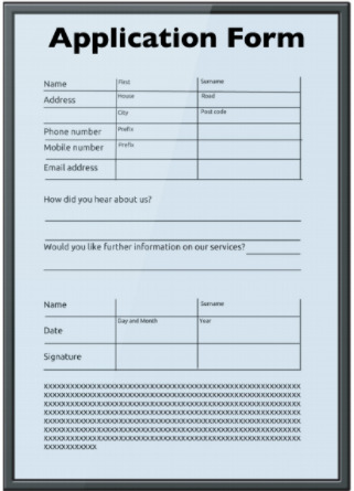

One must choose fonts for headings or headlines that are easy to read, words that are written in lower case are easy to recognize – we read them faster. Upper case can be used for short titles and when one wants to emphasize a word.
Studies conducted reveal that headlines set in capital letters are significantly less legible than those set in lower case. For example, in the Application form samples above, the headings have been bolded, written with a larger font than the sub-headings. The second sample has a sub-heading while the first does not which is an example of poor document design. When uppercase is used on main body of text, is perceived as “shouting.” When creating a poster for an music event it is beneficial to use slab serif fonts, as they are viewed as funky and modern. Maybe you want to make your word bigger, bolder, or use color to emphasize. The better the contrast between your text, images and background, the more powerfully they will convey your meaning.
0 notes
Text
Week 8: October 11th -Blair - The Rhetoric of Visual Arguments
Blair (2004) explores the connection between argument, persuasion and visuals. He states that arguments are supposed to be tools of persuasion, emphasizing that the argumentative potential of visuals if and when they are able to engage an audience in assenting to a claim
Aristotle defined rhetoric as “an ability in each particular case, to see the available means of persuasion” (Aristotle Rhetoric I.1.2). The traditional paradigm case of rhetoric is the use of the spoken word or verbal argument to persuade an audience, where we find primary purpose of an argument is to influence people to change their beliefs, attitudes & conduct. Blair (2004) posit that arguments in their traditional sense consist of supplying grounds for beliefs or actions through a proposition. In so doing they will be supplying us with reasons for accepting a view point, hence it is upon us to accept or reject it. Aristotle assumed that the agent of persuasion is the speaker and therefore, the principal tool of persuasion must be the speaker’s medium, thus language. The main ingredient in persuasion as a kind of cause of behavior change is that the person persuaded assents to the pressure of the vector of influence by agreeing with the arguer.
When it comes to visual argument we find a different kind of persuasion, the images engage viewers and persuade them to accept a particular idea or point of view. However, viewers should not make a mistake of thinking that a visual argument is a substitute for verbal argument. The images are the ones that contain the premise and the conclusion of an argument. Take a look at the picture below;
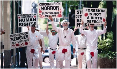
With the picture above we are being persuaded to accept or reject the premise about the horror associated with circumcision. By looking at the colors that they chose, the red blood stains on their front pants, we must first understand the cultural symbolism of the color red, for sop or danger. According to Blair when showing viewers an image like the one above we might want to understand the following questions about them as our audience;
What is the setting? How does it introduce opportunities and constraints?
What visual imagery will the audience understand and respond to?
What historical & cultural modes of visual understanding does the audience bring to the situation?(Blair, 2004, p. )
Visual arguers answer the above questions in creating their visual enthymemes thus, drawing the audience to participate in in completing the construction of the argument. Visuals have immediacy, realism & concreteness that help influence acceptance that are not available to the verbal. A visual argument further connects the audience to the argument making it a rhetorical form of argument. It has the emotional power to evoke involuntary reactions but Blair (2004) states that emotions do not constitute an argument.
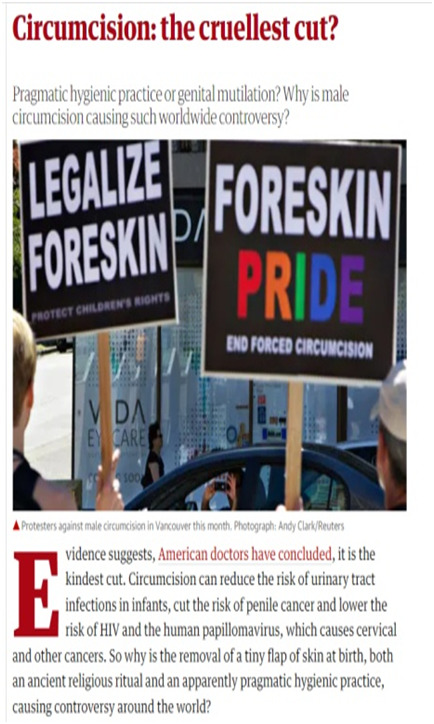
The newspaper article above is arguing that people should accept and encourages men to circumcise even though the image above, images are presenting a contrary viewpoint.
0 notes
Text
Week 7: October 4th - Mitchell- Picture Theory
The Pictorial Turn and Metapictures
Mitchell (2004) argued that there has been a visual turn, what he calls a “pictorial turn,” in contemporary culture and theory in which images, pictures and the realm of the visual have been recognized as being as important and worthy of intense scrutiny as the realm of language. Mitchell states that in the 1960’s Rorty talked of a “linguistic turn” where he made people to notice the role of language in culture, theory, and everyday life. Now in this book Picture Theory, is signaling the importance of pictures and images; thus highlighting the model (idea) of a “pictorial turn.”
Furthermore, he challenges us to be observant and to be informed critics of visual culture. Mitchell points out that the picture pervades the cultural environment; and rather than being a cultural phenomenon in which images have come to play a more demanding and meaningful role in 20th and 21stst century cultures, the “pictorial turn” is a pressing realization that visual literacy is more complicated than we may have previously perceived and that the current model of textuality employed to understand and study images is not sufficient considering the complexity of visual culture. The pictorial turn is post-linguistic and looks at the picture as a complex interplay of modes of representation within human society (Galindo, 2017). Mitchell (1994) states in this way;
“The pictorial turn is a “postlinguistic, postsemiotic rediscovery of the picture as a complex interplay between visuality, apparatus, institutions, discourse, bodies, and figurality” (p.16)
Mitchell suggests that we begin looking to pictures themselves for answers to their nature, function, and history. Mitchell’s approach leads toward looking at images and texts in relationship as second and first order discourses that references each other. Mitchell challenges readers to begin conceiving pictures and all media as image-texts; separating writing and image is nothing more than an “ideology, a complex of desire and fear, power and interest” (86). In addition, he suggests that we begin to conceive of language as a “medium rather than a system, a heterogeneous field of discursive modes [“already situated within institutions, histories, and discourses”] requiring pragmatic, dialectical description that then a univocally coded scheme open to scientific explanation” (p.97- 98). Conceiving of language as medium and media as image-text has the potential to frame all language as dialectic.
Mitchell goes further to introduce a the meta pictures in which he mentions that the metapicture is a “place where pictures reveal and “know” themselves, where they reflect on the intersections of visuality, language, and similitude, where they engage in speculation and theorizing on their own nature and history” (p.8

Mitchell looks at pictures as a complex interplay of modes of representation within human society. The picture above, shows priests in the Roman Catholic church, the Pope and other people around them, while one of the priests looks like he is holding a dove next to his chest or heart with red, it is bleeding? The other man seems scared as on his shoulder a man who seem to be representing Satan or the devil has his hand place on him, with an elongated red tongue out, this kind of picture is a pictures about a picture. So many things happening with one picture, its an example of a metapicture.
1 note
·
View note
Text
Week 6: September 27th - Bolter and Grusin
A presentation of Remediation - Understanding New Media
Remediation is defined in and through two concepts which are the logic of immediacy and the logic of hypermediacy. Immediacy is the process of having a person experience a medium without the actual medium being present. For example, when someone is using FaceTime application to call and talk to a friend of family member through video call. FaceTime makes it look like they are talking to each other face to face, but in reality, they are using a phone to complete this process and they forget about the phone and focus on the conversation.
Hypermediacy makes sure that this process becomes opaque and the people speaking on the phone through FaceTime become used to having all this information through applications that help them do everything from shopping to communicating with other people. Users should be able to recognize the medium is still a medium. Remediation is the way of how new media finds purpose doing the things old media has done. Another example of remediation is when one creates a digital photo album and views it on the computer like Google photos. When one does that they are combining the old media (photo albums) with a new media (computers). Virtual reality wants to erase the media logic of immediacy but it is not possible. There is a contrary tendency, the proliferation of multiplying media thus logic of hypermediacy- where the presence of the media is continually made apparent. The person in the image below is holding a remote control so that he can scroll through his digital album.

Total immediacy is never possible because a trace of the media remains, nor is total hypermediacy possible or desirable. One of Bolter and Grusin’s key assertions is that these two logics are not necessarily mutually exclusive, there are examples of media that simultaneously rely upon both logics to heighten the viewer’s experience of the event as authentic. For example, CNN news coverage of war has been known, in the logic of immediacy, to provide live reports that take the viewer to the scene, where missiles are falling and buildings crumbling. At the same time, in the logic of hypermediacy, these reports are framed in a TV window on the screen alongside a simultaneously viewed window with a studio broadcaster who interviews the reporter in the field, tele-text runs at the bottom of the screen and there is a web-address for the viewer who wants additional information on the news item.
youtube
Remediation rests on the dual logic of immediacy and hypermediacy, new media refashion prior media forms.
0 notes
Text
Week 5: September 20th- Roland Barthes, Camera Lucida
A photograph can have many functions, it shows that an event has happened, at a specific time in a specific location in the past. The observer of a photograph recognizes what Barthes calls the studium which can make him/her like the photograph without it invoking a strong or significant emotional response. The studium is the surface-level function of a photograph. It is reflected in a general interest in the photograph for aesthetic, sociological, historical, or other reasons. While another angle is when the same observer of a photograph can observe beyond just the liking but go deeper to where the same photography can invoke an emotional reaction which Barthes calls punctum -the pricking element of a photograph that touches the viewer's soul and goes further to wounds the psyche of the viewer.

This is picture above has caused a lot of riots in the US in the past year, one wonders, how it it affected the viewers. Was it the studium or was it because of its punctum that it invoked a strong or significant emotional response nationally and globally. America was in turmoil because of these images above.
The spectator of a photograph recognizes the studium and can "like" a photograph without . Recognizing the studium means having a "vague, slippery, irresponsible interest" in the photograph. The spectator acknowledges the photograph for what it is and what it signifies and understands the photographer's intentions.
Another important point raised by Barthes that struck me was when he made a comparison between photography and cinema. He stated that the noeme of cinema is not the same as that of photography. Photographs capture a pose, however brief while in cinema, "the pose is swept away and denied by the continuous series of images." Cinema is an altogether different art from photography. It eliminates the need for historians as mediators of the past. Photographs verify what the historian can only suggest and it is as much a science as an art. It was invented by a chemist, not a painter.
0 notes

Text
Week 1 - (23th August 2021): VISUAL RHETORIC - Introduction- OWL
Rhetoric is the art of speaking or writing effectively; commonly defined as the art of persuasion. Mark & Metz (2015) define it as "a process of recognizing and using most effective strategies for influencing thought (p.8), which is viewed as a positive and critical process of asking questions.
Understanding the definition of rhetoric will them help us move to the next step of introducing Visual Rhetoric. The Purdue OWL states that visual rhetoric refers to the use of images as argument, the way elements are arranged on a page or the use of typography and most importantly the analysis of existing images and visuals. The term visual rhetoric falls under the umbrella term Visual Literacy which is categorized into three broad groups i) visual thinking, ii) visual learning and iii) visual rhetoric or communication (Purdue OWL, 2021).

Visual rhetoric deals with text, for example the different type faces show different levels of formality. It also deals with color- contrast is one of the most basic and critical choices for color. Lastly, it deals with images ranging from charts, graphs, photos, and paintings. When a person is choosing a visual they must think of the extra information that it will convey. For example in the image below, the skeleton dressed in black and holding some kind of stick with its white teeth, on the other end of the stick red, one can associate red with blood and black with death.
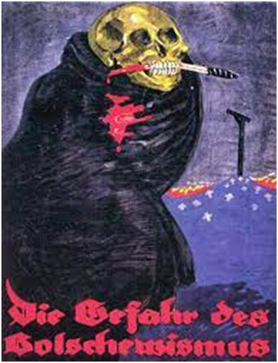
The color combinations or contrast is so strong and symbolizes something negative, persuading the viewers in Berlin Germany in 1919 of the dangers of Bolshevism. This is a picture of German anti-Bolshevik (Caivano & Lopez, 2010. p.6).
0 notes
Video
Week 2 - (August 30th 2021): The Work of Art in the age of mechanical reproduction - Walter Benjamin
The short clip above is a work of art that has been reproduced, changing its original state of being an art painting to a video clip with the portraits singing. Benjamin’s (1936) article about the Works of Art in the age of mechanical reproduction established how works of art created and developed in the past centuries are different from the contemporary works of art. Benjamin (1936) presented an analysis of the changing nature of art with the change in technology of production by tracing its socio-economic causes and hinting the political consequences. According to Benjamin, cult value of a work of art resides in it not being seen frequently whereas exhibition value resides in its opposite. It was the cult value of art that had been predominant for a significant portion in history, the modern world with its mechanical reproduction has given precedence to exhibition value and that the quantitative increase in art production has consequently resulted in a qualitative shift in the nature of art itself. Benjamin points out clearly that works of art have always been reproducible throughout history. For instance, he mentions the procedures of founding and stamping in, ancient Greece, the medieval additions to the development of woodcut graphic art (engraving and etching), the appearance of lithography in the nineteenth century. His argument, however, is that mechanical reproduction, which is a result of the advanced stage of capitalism he lived in, represented something new, the digital age introduced by the camera, photography and later on film.

Above is one of those first cameras that revolutionized art and painting era. It made it possible for the image to be reproduced into mass production. However, the most perfect reproduction lacks one element, 'its presence in time and space,' or its unique existence. Thus it lacks a history in which changes in physical condition and ownership occur. Furthermore, Benjamin mentions that perfect reproduction lacks authenticity and ‘the presence of the original is the prerequisite to the concept of authenticity.’ He goes on to say that the sphere of authenticity is outside technical reproducibility. Benjamin argues that reproduction detaches the object from that realm of tradition in which the aura appears. It substitutes a plurality of copies for a unique existence.
Digital art in the internet age is everywhere at any given time, thus weakening the idea of a “unique time and space” that a work of art supposedly occupies. If mechanical reproduction resulted in the “withering of aura,” digital reproduction decreased that vital distance between artwork and the recipient to such an extent that the viewer previously had unprecedented say in its reception, the cult value further go back in the background and the exhibition value and its perception is modulated by the mass responses which mutually inform one another.
The digital age with its online platforms allow the viewer not only to comment on what they see but also make their comments known on the various available platforms such as Instagram, Facebook, Twitter, YouTube etc. They are free to like-share-comment-subscribe. The viewer is now the critic in an age where the exhibition value of art has has vastly surpassed its cult value because every time an important artwork is reproduced, its aura decreases.
We also read three big authors who are said to be pioneers of the topic on the sign, these are Charles Sanders Peirce (1894), Ferdinand de Saussure (1910) and Daniel Chandler. They will be discussed in the next blog for next week.
tumblr
491 notes
·
View notes
Text
Week 4: September 13th - Saussure and Pierce - Sign
Week 4- September 13th - Saussure, Semiotics
In week 4 we continued with more analysis and understanding of a sign; based on the 3 authors who are pioneers of the concept – what is a sign? Saussure defined the sign as a pair that is made up of a signified and a signifier. These two terms are the core elements for semiotics. A signifier is either a word, a sound or an image. According to Saussure (1993) a sign is not an object that is related to a name but, it is a concept related to a sound pattern; thus a sign is a signified concept. When formulating his theory Saussure was taking into account the linguistic sign and not the material sign. Furthermore, a sign, in order for it to be a sign, it has to be consisted of both the signifier and the signified concept. “You cannot have a totally meaningless signifier and a completely formless.
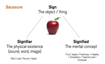
For example, in the image above “apple” the signifier is the written word “apple.” The signified is the idea of freshness, health, or in this age of computer the signified of apple can also mean a computer, thus the essence of what an apple image signifies. The meaning or idea it generates is signified. More examples of the explanation can be further applied on the images below. They are the signifiers and the meaning or idea they generate is the signified.

Pierce an American linguist furthered the theory by Saussure
There are lots writings found in the web which are full of signs, icons and indexes. Icons and pictorial symbols play an important role in wed navigation, they are visual symbols that provide that are markers which aid navigation. Most users want to accomplish a task on a website, in order to do that they have to navigate to the right place using various signs and symbols. In order to do that, they have to follow signs and most importantly they must understand what these signs and symbols mean in order for them to be successful. They are learned by users and after a long time of using them are transferred to long term memory.
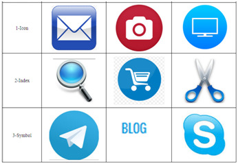
The icons, symbols and indexes above by being visual rather than textual are more intuitive and overcome the need for one to be literate in order to carry forward the communication. These tool icons are a subset of the interactive icons that modify graphical or text elements of an application by association with real-life tool objects. These icons represent tool functions such as drawing, painting, cutting for scissor, or modifying graphical elements. For example, just to pick a few of the symbols and icons in the box above we tend to understand the signified meaning associated with the envelop which refers to an email, while the magnifying glass is symbol used to enlarge text; when buying goods online we put them in a cart and then go and pay just like we do in a grocery store. These are the associations that we make online about things we do and know physically. The symbol of a camera on our cellphone helps us know when we want to take photographs.
2 notes
·
View notes