
Hi, I’m Aravind. I design interfaces for Data-driven products.
Don't wanna be here? Send us removal request.
Statistics
We looked inside some of the posts by aravindbachu and here's what we found interesting.
Average Info
Notes Per Post
1
Likes Per Post
1
Reblog Per Post
0
Reply Per Post
0
Time Between Posts
2 months
Number of Posts By Type
Text
8
Last Seen Tumblr Blogs


Fun Fact
There are dozens of funny blogs to kill time on Tumblr.
Text
ClearSave by ClearTax

Revamping the ClearTax Mutual Funds Platform to improve conversions
ClearSave is the Mutual Funds investments platform from ClearTax, encouraging Indians to save their income taxes via investment route into Equity Linked Saving Schemes.
The Problem
ClearTax attracts over 2 million people each year, who file their income taxes via the online platform. Indians can save upto ₹46,800 in taxes by investing about ₹1,50,000 in a number of government mandated schemes.
ELSS is one such scheme and is a very large and attractive option for people to save their taxes. ClearSave is the homegrown product from ClearTax which encourages users to invest into Mutual Funds.
The months of June-August are the time when a bulk majority of the people file their taxes in India and is the time when ClearSave sees a major influx of new signups. Our task was to improve and increase the number of people signing up through effective changes through design and story-telling.
FY2018 saw about 4% conversions and we wanted to double that number for in FY2019.
Tackling the problem
I had joined in May 2019, when tax-filing was in full swing. After about two weeks of extensive experience of understanding the nuances of filing income taxes, studying the laws and sections with the help of CA’s and our support staff, I embarked on charting the growth path.
Out of every 100 people filing taxes with us, only 4 signed up to invest in mutual funds. There were a myriad of reasons and I had to hunt them down in detail.
So, after extensive research by calling up users, through extensive user surveys and data from support staff, I was able to deduce the following:
Liquidity Problems: Most don’t have any money remaining after paying their taxes, which squashes their liquidity and interest in further investments.
Dismal Returns: The RoI for mutual funds FY2018 was low single digits to negative, prompting even lower interest.
Awareness: A major chunk were totally unaware of the knowledge to save taxes in general, and those knew a bit - were unaware of this option or the benefits and issues along with it.
Issues in platform: There were a few UX glitches in the platform and users affected by those were immediate drop-offs.
Lack of support: Users interested in knowing more had no options but to raise tickets which were sub-optimal way of addressing a valued customer for a self-serve product.
Weak Pitch: After a user files their tax, there is a gap of 6 minutes when ClearTax submits the tax with the government. Over 80% of our new signups happen during this time and it’s precious moment of storytelling when a right pitch was needed. We needed an even stronger pitch to elevate the numbers.
The Solutions
After identifying the issues, we set out dismantling them and here is how it went:
Fixing existing UX: Identifying and fixing the existing UX issues was the prime concern. I’d identified over 165 issues with the help of two interns, who tested the product in and out and we had documented them all, along with solutions for the engineering and product teams to fix them at the earliest.
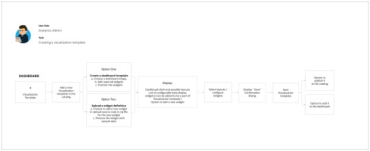
Segmenting users: All tax paying users were not the same due the wide variations in their incomes and the slabs they pay. So I created 9 segments of users, based on their age, income and gender - the most differential sets we could observe.
Building Awareness and Support: Newsletters with effective communication were periodically sent to users, with stories resonating with their daily lives and pop culture in general. Automated support over Whatsapp was also added to help reach the customer sooner, along a few dedicated staff to address the issues.
The Pitch: The most crucial part among the solutions, We had 60 days in store and we came up with 27 variants of new pitches addressing 9 segments, giving each story, ample time to go in and incoming statistics were monitored real-time. These frenetic efforts gave us ample insights to effectively modify the pitch every 3 days and see the resultant effects.
Weekly and Daily reviews were conducted to monitor the effects and we ourselves manned the support channels sometimes to help the users and build confidence in our users.
Information Architecture

Redesigning Pages
By studying all existing pages using tools like Hotjar for Heatmapping and Eyeball tracking, and using other insights received through various channels, I redesigned the pages where users generally landed and eased the purchase flows by making them less strenuous.

It resulted in massive gains and by A/B testing the same with minor variants, we released the optimised pages for the same. Focussed groups of CA’s were invited for testing as well.


F2S Variants
It was now time for us to get our pitch for investment straight. The ideal pitch would give us a home run and the one’s which didn’t would give us qualitative answers
We tried over 9 variants, with multiple long pitches of over 5 storyboards, shorter pitches with 1/2 storyboards and finally we had to settle for the sweet spot of 3 storyboards, with the core pitch hitting the attractive psychological point of getting insane returns on meagre amount of investments.
Concept Boards

Research, Experiment, Iterate, Repeat!


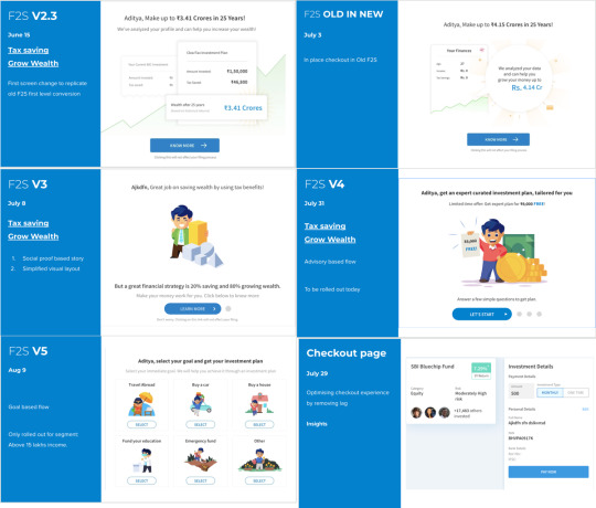
By the end of the filing season, we were able to breach the 8% conversion mark, which was double the previous performance, but it is worth noting that it came in a time of global meltdown in financial markets.
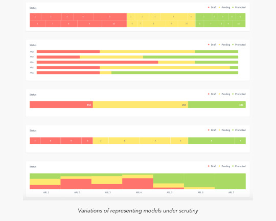
Metric Monitoring
Below is an example of micro-monitoring of metrics for understanding the seepages
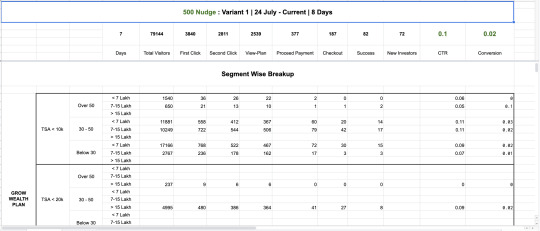
More Variants and More A/B testing!
In each variant, we tried to test a specific experience - higher interaction on returns, greater focus on trust markers, social validations, details of mutual funds, The copy - including language and tone. Each variant gave us different insights and the final version which went live was a mix of the all best performing elements of each version.


Actual Live Links
Example of an Investment Plan: https://cleartax.in/save/plan/26
Business Services: https://cleartax.in/services/
Mobile App: To be released by the end of May 2020
What I learnt
Metrics, Metrics and More Metrics: For a consumer product with such a heavy churn, Monitoring real-time metrics is the best way to go - for every minor change in design, we gathered numbers in real time and dug down deeply analysing both qualitatively and quantitatively to find the issues and improve upon the same.
Impact
We achieved our initial targets of doubling the conversion rates to 8% by the mid of Tax filing season and soon crossed 10% over subsequent weeks with our limited range of test users.
FY2020 will see all the new changes deployed at full scale with the 2.4 Million Tax filing users.
0 notes
Text
Diagram Framework
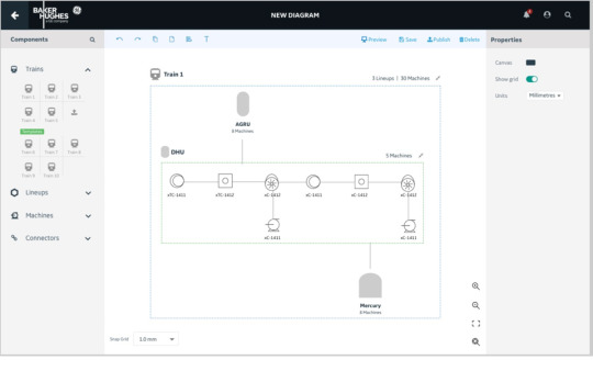
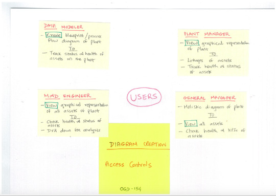
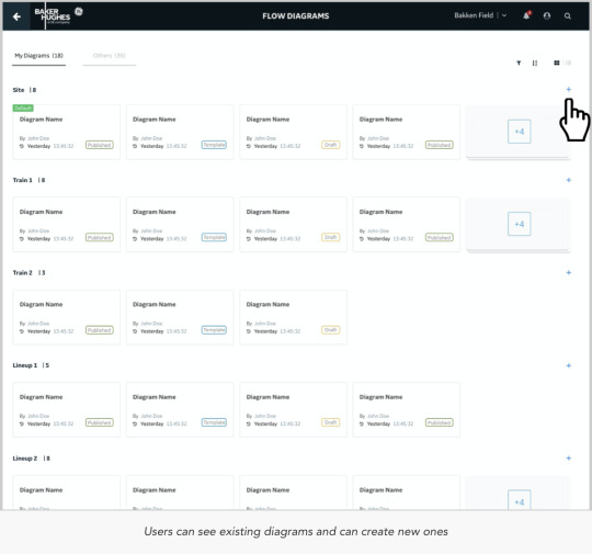
Application to let Users create asset-aware diagrams and workflows
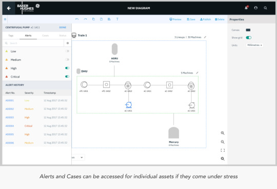
Diagramming Framework a.k.a Process Flow Diagram is a product that will allow customers or professional services teams to build and configure diagrams that are Asset-Aware and can visually display a variety of APM and IntelliStream data elements (tags, alerts, states, KPIs, etc.) associated with those assets.
The Product
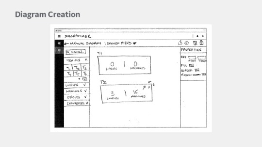
The product was envisioned to have a rich set of features to enable the creator to build everything from simple block diagrams to that of complex PFD and P&IDs
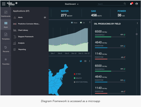
The Process Flow Diagram should be a generic component that can be embedded in Dashboard, Analysis or in any other micro-apps depending on the user's use case. The editing and viewing and other capabilities would remain consistent across different micro-apps and also could be placed as an image for PFD diagrams.
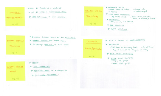
It would carry the following core features:
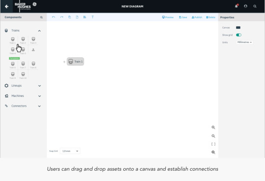
Authoring: An author would have rights to take CRUD actions, create and share templates and also context.
Palette: A board of components/assets that can be dragged and dropped to a canvas (The components/assets will get populated as per the back-end data from the verticals) Assets segregated as per the asset type. Each component is individually a mini product line in itself and would carry parameters to configure, connect and share data.
Configurations: Global and local level configurations and assited navigation patterns include alerts, cases, notifications, KPI’s and statuses.
Interactivity: Intuitive interactions with easy and conventional navigation patterns, including global level CRUD actions
Challenges
Extensive number of white-boarding sessions went into designing the final approach that would be taken. References to similar other applications in the field of geospatial mapping were considered to understand how layers are put together.

Sketches


User Flows
PFD Home: :https://www.dropbox.com/s/63qizqtq10qdyo2/1.%20Creator%3A%20Home.pdf?dl=0
Create Diagram Diagram: https://www.dropbox.com/s/o2t68xtl7fwu26i/2.%20Create%20Diagram.pdf?dl=0


What I learnt
Designing an application that lets its user design further components is a mammoth task. When Users have no intuitive idea of what the next step is going to be like, it becomes an uphill task as a designer to help them find navigate to discover value in the application and also make it enjoyable in the process of doing so.
0 notes
Text
Blending Flow Optimizer
Crude Oil blending simulator for operations in Venice
Blending Flow Optimizer was a PoC to demonstrate the capabilities of remote simulation and testing of blending crude oil using IoT devices on BHGE digital services.
The Background
Dr.Giacomo Veneri, Sr.Artificial Intelligence Engineer heading the project to create a PoC to demonstrate the remote monitoring capabilities of handling a Blending plant in Venice.
A Blending plant is a place where crude from different parts of the world are brought together and stored. However, the crude from different geographies carry different chemical compositions and aren’t supposed to be mixed without calculating the aftereffects of such a blend.
Mixing different crude blends without consolidation could be disastrous whilst refining and hence scientists manually sample and test the crude for various parameters such as Fouling, Desalters and Fournace heating etc.
The Product Statement
When data about all blends are available, we could digitally run simulations to simulate the amounts needed to mix since they’re deeply tied to economies of scale. Also, digital simulations could automate and run parallel tasks, using the models from AI Framework to efficiently carry out the tasks.
A PoC to demonstrate the various controls needed to carry out such a n operation was envisaged and I was asked to research into the requirements and later design a simple PoC to demonstrate to the team.
Getting down to Research
I started working the european team of plant managers and scientists to understand the architecture of this entire workflow. I could break it down in simple steps into:
Step 1: Complete the input data from excel
Step 2: Update the simulation model with the input data
Step 3: Optimize the crude blend
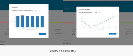
Step 4: Calculate Sensitivity and ASI dependence
Step 5: Suggest Recommendations
Step 6: NFIT evaluation (if approved by the fouling team)
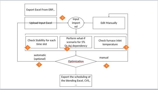
In short, I figured out are 3 stories to execute in this project
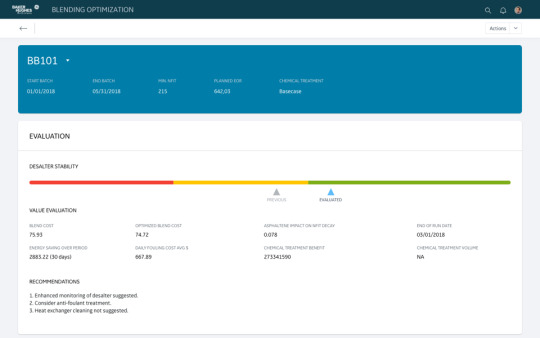
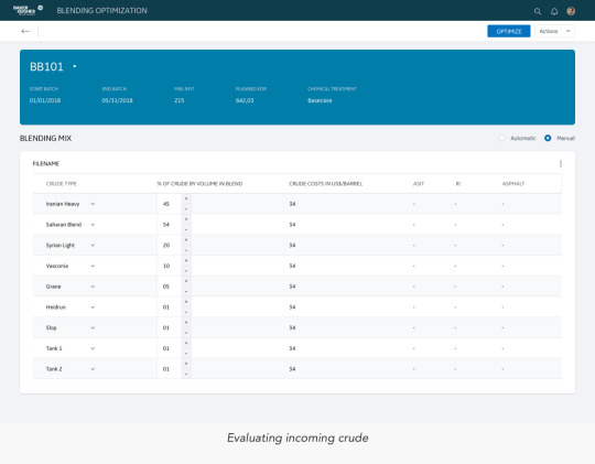
The first story involves Evaluation, Wherein a user import blending data into the platform, usually from Excel. The user tries to evaluate few data points at this stage such as Desalter Stability, Blend costs, Asphaltene impact and fouling costs. Next, they try to evaluate ASI Dependence and also try to simulate the what-if scenarios of difference factors on ASI dependence. At the end, they check for the readings of furnace inlet temperatures.
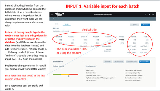
The second story involves Manual Editing, Wherein the users edit the different blend values of new incoming crude oil to see if it’s chemically compatible and if not, what and how much of chemical composition has to be altered to do so. The system will gradually build intelligence to suggest better results as the efficiency of the models begin to improve.

The third story is about Optimization and Backup, where users get recommended actions to implement, for the resulting changes based on simulating the optimisations.


The Design
The entire design was about getting the Information Architecture and the User controls correct. The entire thing fell into place as is.
We took phased approach at developing the product, where very user-familiar controls would be given to the users in the first phase and later, improved interactions would be introduced as the user learns to use and utilise the platform.
There would also be module to monitor and collect real-time feedback.
There were two sets of users, a set comprising of scientists who would simulate and generate output, whereas there’s a second set comprising of field executioners who would simply follow orders and execute the findings.
For the initial phase, The application was limited to generating optimised output and sharing the results with the field engineers.
I started with White-boarding, working remotely with Dr.Veneri to understand the project well , later switching over to making paper-prototypes and sharing them with him for collect feedback. Very soon, I converted them into a PoC based on Predix components, the design library system used by GE.


The Feedback
Since it’s very closed loop project, Dr.Veneri and his team were the only stakeholders. Having them in loop from the start was very valuable, where constant feedback would be shared via Email, Skype Calls and occasional presentations.
The PoC was later made into a limited release project to test the efficacy of the model, which was created in MLM and imported from AI Factory.
What I learnt
Creating magic requires knowledge: As Designers, we need to acquire knowledge about allied industries too, if we want to design a product that seems intuitive and creates a “magical” feel for the users.
User research can help understand and create an interface that eases the pain at first points of interaction, but to weave magic that transcends layers of intuition, requires us designers to acquire knowledge beyond the realm of the current project and learn more about allied products and environments.
0 notes
Text
Predictive Corrosion Manager

Monitor and predict corrosive defects in assets
Predictive Corrosion Manager (PCM) was a product meant to monitor and predict various stages of corrosion in the assets all along the supply chain to enable better economic viability of operations, using real-time data being streamed by the IoT devices attached to the assets.
The Background
Corrosion and Wear and tear is an inescapable reality in an industrial operation such as crude oil drilling and supply. Huge manpower goes into checking and maintaining the health of the assets, which work non-stop 24/7. Manual efforts to maintain costs a lot of money and has become inefficient over the years, with unexpected downtimes costing millions of dollars in operational expenses.
With advanced IoT based monitoring devices now available, BHGE decided set up operations to monitor corrosion on real-time basis and then predict downtimes even before they actually happen. Global Monitoring Stations would be looking at the datasets and work out ways to predict and assign tasks to the personnel responsible towards fixing the assets.
Hence, PCM was one of the most awaited product in BHGE’s digital portfolio, which would have multiple variants across various business verticals.
As Designers, we had to come up with a PoC to demonstrate the capabilities from the digital team and we had to work our way out.
The Research
The biggest part of solving the problem for a product like PCM is all about setting the Information Architecture. Users of different use-cases are going to approach the product for only one reason - to get essential information that gets their specific work done. They aren’t going to explore the app for more features or even try to use the secondary features.

Our initial research involving the study of lives of field engineers was essential in getting the trial PoC’s done. We mapped out their day-to-day activities as a state diagrams and prioritised the IA accordingly.

The TPM’s helped us remote test and validate the PoC’s with users across various verticals for crucial feedback.
Data visualisation
When you require to understand huge amounts of data in order to find patterns and make a decision, Data visualisation helps cut down the efforts by a huge factor.
Choosing the right visualisation depends on clubbing your data into one of these fundamental categories addressed by your data:
Relationship
Distribution
Composition
Comparison of data
“Visualization gives you answers to questions you didn’t know you had.” – Ben Shneiderman

Getting the story right
Data-driven storytelling is a powerful force as it takes stats and metrics and puts them into context through a narrative that everyone in the organisation can understand. As one of the first and biggest projects, I decided to setup few broad questions as a framework for the forthcoming projects as well
What story do I want to tell?
By asking myself what kind of story I wanted to tell with the data and what message I wanted to convey to the users, I would be able to choose the right data visualisation types for the project
Who do I want to tell it to?
We may be aiming the data visualisation efforts at a particular team within the organisation, or may be trying to communicate a set of trends or predictive insights to a set of selected users. We need to take the time to research the audience and then, we’ll be able to make a more informed decision on which data visualisation chart types will make the most tangible connection with the people we’ll be presenting our findings to.
Am I looking to analyse particular trends?
Every data visualisation project or initiative is slightly different, which means that different data visualisation chart types will suit varying goals, aims, or topics.
Do I want to demonstrate the composition of the data?
If the primary aim is to showcase the composition of the data – in other words, show how individual segments of data make up the whole of something – choosing the right types of data visualisation is crucial in preventing your message from becoming lost or diluted. Examples include Pie charts, Waterfall charts, Stacked charts, Map-based graphs (for geo-spatial Data)
Do I want to compare two or more sets of values?
While most types of data visualisations will allow us to compare two or more trends or data sets, there are certain graphs or charts that will make your message all the more powerful. eg: Bubble charts, Spider charts, Bar charts, Columned visualisations, Scatter plots
Is timeline a factor?
Predictive analysis is entirely based on time-series data and by understanding whether the data we’re looking to extract value from is time-based or time-sensitive, we’ll be able to select a graph or chart that will provide an instant overview of figures or comparative trends over a specific period.
How do I want to show the KPIs?
It’s important to ask oneself how to showcase your key performance indicators as not only will this dictate the success of the analytical activities but it will also determine how clear the visualizations or data-driven stories resonate with our users.
We’ve to consider what information we’re looking to gain from specific KPIs within the product and how they will resonate with the ones trying to make a decision out of it – if necessary, we have to experiment with different formats until we find the graphs or charts that fit our goals exactly.
Key Design Usecases
PCM was a wide-scale project and it involved us taking hundreds of decisions which would be humongous to list them all, so I would be highlighting a few cases to help understand the path we undertook


What I learnt
Design has no boundaries: As a project, PCM unlocked so many dimensions for me that I had to keep learning and unlearning a lot of information. Also the fact that having a solid background in Maths and Physics helped me immensely in understanding the use-cases deeply.
Visual Bias is real: Users are drawn to products that are well designed and provide novel interactions. our users were fascinated by the novel interactions in their data and were eagerly asking a lot of questions. Having accustomed to dull and static interfaces, our new PoC’s gave them a very refreshing taste of what the suite of products would look like.
0 notes
Text
Model Lifecycle Manager

Application to create specific analytic called ‘Model’
Model Lifecycle Manager, The second part of the Carbon Suite of applications, was a platform to build, upload and host the analytic type - Model.
Models were peer-rated by scientists across the globe and had to be configured and tested by multiple scientists before pushing them out and making them available for the wider world through AI Factory.
The Background
Models were defined by BHGE as Code based Simulations built to estimate/rate/predict asset performance.
Such Models were developed by scientists across every vertical of the organisation - and they used a variety of programming languages and parameters to build and save the models. Models would then be deployed by cross working teams across verticals - for simulating various aspects of drilling.
Data used and generated in such processes would also be shared across teams for analysing the performance of the Model. They would then be rated based on their efficiency and performance ratios, before sharing with wider audience
Key Observations & Challenges
Standardisation of processes was the biggest challenge. Although every model adhered to the basic definition of their purpose, the way they were built and used varied widely across teams.
We faced two choices - either build a product from ground up that adheres to all users or build a process flow that becomes a standard across the organisation. After interacting with all stakeholders, it was decided to pursue the latter method.
The following key feature standardisations were decided upon:
Adherence to one programming language
Avail multiple modes of import and later system based conversion into standardised models
Follow a specific format structure to include visualisation templates, model code and other paraphernalia
An Inbuilt IDE to check, modify and retest the code
ARL Score: Analytic reliability score - a rating mechanism on a scale of 8 to measure the reliability of the model
System generated Tags to help scientists to efficiently dig for models sitting in a repository
The Design perspective
The decisions to standardise features wasn’t taken in isolation but involved the Engineering managers, Scientists, Product managers and Designers (myself).
I had initially researched into workflows of creating models by different people and charted out their journeys onto a flowchart and observed standard patterns in their journeys. I took over 20 personal user interviews to determine what works best for them and opened them up for options which they could decide and provide reasons to choose or not to.
The entire process took over a month while the meetings to decide the product features were ongoing. After presenting the findings we were able to take the calls on final decisions. Some key findings were:
Python was used by over 86% of the people and the rest used java or a myriad of smaller options. However, almost all non-Python users were looking to migrate - enabling us to take the key decision.
Users were using Github, Self databases and other myriad modes. We choose to enable import via 3 modes - Docker images/Github/Manual upload - covering 100% of use-cases.
Building an IDE: Users were using a number of different IDE’s to edit and modify their code, but the business required users to use the internally built IDE to safeguard the IP they’re building - So we took the decision to imitate any one of the popular IDE’s with simple functionalities to help their cause.
Bug-Fixing: This was a big problem, where users frequently ran tests on code to generate a log of errors as a separate file - which they would then scan it via excel logs to determine what mattered to them the most and then modify the codebase for fixes. It was a drudgery that needed a properly parsed GUI to help them make key decisions.
ARL Rating was an interesting use-case where any user could start building a model, share it with senior peers to test and rate the model and apply a rating. If rated lower, it had to be reworked in order to achieve a higher score. An ARL score of 7/8 was mutually agreed in the fraternity as pre-requisite for pushing a model into AI factory.
As I dug deeper, I found that the scientists had a specific tasks to test and confirm before assigning the score. If we could internalise and automate those specific tests, The system could automatically suggest a viable score - This idea was very well received by most scientists and we decided to build upon that.
Research, Research and More Research
Observations, Analysis and User Interviews were the key research techniques applied to get the information from the scientists.
Building a product that involves such wide anomalies requires sustained research efforts. The initial versions of the designs carried out as low-fidelity wireframes were mostly used as research prototypes.


Consistent feedback and iterations over the wireframes gave us clear directions and insights towards building the product.
The biggest problem was nailing the user journeys, communicating the same and helping everyone come onto one platform. The biggest strength here was that it was an internal product and users were employees of the same company, however the wide variations and interpretations were certainly a hindrance.

Testing and feedback
Throughout the process, iterative testing was done to filter the feature sets and get the go-ahead from the scientists. Focus groups were created and individual features were tested, the users were allowed to test the prototypes of the design and their interactions were closely monitored and video-recorded and their observations noted for introspection later.
Every test was given a rating on our internal System Usability Scale and the succeeding tests were relatively graded to determine the results. Metric based analysis proved to be a great interpretation with the scientists as well, who helped us add even more vale to our metrics!!


What I learnt
Your product is what your UX is: In purely Engineering driven projects that involve code consolidation, never compromise on the user experience. In these cases, the best design option is the one where users don’t notice any difference.
Working closely with data scientists is a completely different ball-game, with intense discussions upon feature requirements and the possibilities of developing a futuristic product.
0 notes
Text
AI Framework

Repository of multi-stage analytics modules for simulation & deployment
AI Framework, a part of the Carbon Suite of applications, was a repository of Analytics, to be used by stakeholders of varying responsibilities to host, manage, deploy, run, share and orchestrate the models to create bigger frameworks
The Background
BHGE has a team of brilliant scientists operating from the GRC (Global research Centre) Facility, who churn out Analytics modules which would then be used by teams across their global operating facilities for various purposes.
Analytic Modules are nothing but pieces of code, which are bundled up in wrappers and deployed across oilfields and have a wide range of purposes such as driving simulations, calculating results, instructing hardware, data capture etc. The use cases were endless.
These modules would be designed, developed and tested by data-scientists all across the globe, and were also delivered to oilfields through various methods. When Baker Hughes joined forces with GE, The operations immediately required a product that could seamlessly allow users to access these modules right away and subsequently build more products around creating and testing the modules.
Key Observations
Analytic modules were pieces of codes, wrapped in containers and encrypted according to the standards of the region and deployed as and when required.
Analytic Modules were defined in types according to the structure they were written and the purpose they served.
At the moment of debriefing, The organisation had three types of analytic modules to be delivered - Models, Templates and Methods.
Models were the basic set of analytic modules, largely Python based and could be used for a wide variety of applications.
Templates were a different type of modules that found use in simulations.
Methods could be defined as a metamorphosed form of Models and Templates which could be orchestrated to achieve bigger functions. It had it’s own set of requirements and we were wondering if it required a whole new product of it’s own

Observations at every stage generally gave us a broader idea of the operations and also cropped up needs for developing more niche products for the eco-system as a whole.
Majority of the three types of modules were already in use and were scattered with users across the globe.
23 different roles of users were identified who would directly interact with this product, which finally led to creating the roadmap for a entirely new product, just for user and role management within the digital suite.
It was finally decided to enable the product only for data-scientists, till they decided to open up the product to others.


My Role
I was the sole designer for this product, tasked with giving shape to the ideas that the team had in store for the product. The following people were instrumental in guiding me towards understanding the requirements of the product.
YB Ravi, VP- Data science and Analytics
Dr.Venkatesh Rajgopalan, Senior Director - Data Science & Analytics
Piyush Jethwa, TPM
Building the Information Architecture
The first step was into understanding how the modules were made, tested and deployed. Models were the first type of modules to be supported and we started working hand-in-glove with the engineers since much of it was constrained by engineering limitations.
We started out by creating mental models of the process with help from the data-scientists and that helped us understand where the product actually sat and would add value to the chain of operations.
After a lot of careful vetting with the TPM’s, it was decided to build a product with very limited functionality - only to the point of making a repository.
This made sense, since modules were already in use and there needed a way to have them all in one accessible system. The only other big feature this application could support was to deploy and access the runtime logs for the Modules.
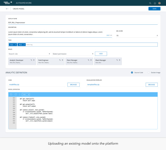
Users could create a model within the system, which essentially was uploading a structured piece of code they created somewhere else. We identified some key tenets towards organising such a Model:
Display name: The data-analysts used to assign random working names to their Models and we had to start getting them to give the Models a standard uniform nomenclature.
Descriptions: A description limited to 150 characters to describe the purpose of the Model.
Tags: User had to assign pre-generated tags to help aid sorting later
Code: The zipped piece of code the user had with him.
Visualisation Template: The users could visualise the results of the code in the form of graphical format, which usually was encased in another piece of code.
Model Definition: This was a piece of code usually attached as pre-curser before testing the Model.
Card Sorting was primarily used to determine the order of information in a page, breaking the tenets into more modular pieces of information.


2 Sets of Data scientists were divided into groups of 4, who were given the tasks to sort and prioritise the cards as per their understanding. It gave us really important insights into the actual components necessary in the product and helped us segregate the components into primary, secondary & tertiary buckets.
The Design
Whiteboarding and Paper prototyping were the most utilised methods to help validate our concepts. Having no background knowledge of the subject proved quite an hindrance when we tried to introduce newer features. After initial stages, we tried testing few screens as a hi-fidelity mockups with the scientists, who overwhelmingly rejected the idea of minimalist designs.
They were so used to legacy softwares that minimalist designs scared them. So, we strategised around building a UI closer to home turf - The Predix Design structure followed in GE


We decided to roll out the features in stages, following the strategy of progressive disclosure, over a span of next five to eight years.
Even the UI interactions were kept very much limited to prevent anxiety building up with the users. One key learning for me was about introducing new interactions to users who are completely unaware and also who are very much averse to trying out new patterns.
So, How do we get out of that deadlock? Though it seems a very complex problem, it has a very simple & elegant solution wherein as a designer, I need to empathise with my user and understand him. Users might face issues which they may not even realise as one, until we wear their shoes and repeat their tasks with them - One we establish that connect, users start discovering the value addition that new design patterns can solve for them.
I did such exercises over my entire period at GE, and got me great results. It also helped built camaraderie with teams outside of my working realm.
What I learnt
Stay focused on fundamentals: The biggest learning here was that no matter what age, profession or the country the user may belong to - The design fundamentally has to begin right as User-first. Staggered releases: The other biggest learning was about building the product in phases - how does one get to breakdown the phases, based on multitude of factors, the effective communication that has to be delivered across the global teams for the same, Keeping the stakeholders in loop etc.
Impact
VP Arun Subrahmaniam, making the use case for the platform: https://www.youtube.com/watch?v=sYi1i7YXT3Y
This project was released as MVP with a limited release to test the efficacy of the analytics being uploaded into the platform. Release for direct Onshore and Offshore users was expected to be around by late 2019.
0 notes
Text
Understanding users at BHGE

The journey of digitising the Oil & Gas Industry for BHGE
GE Oil & Gas and Baker Hughes merged together to create one of the the world’s biggest oilfield services company on the planet and they had a mission : to digitise the Oil & Gas drilling industry.
My Role
I was a part of the 5 member UX Design team based in Bangalore, that provided horizontal design support for the suite of digital products being built for the various verticals within BHGE. There were other smaller vertical teams sitting in San Ramon, Kochi, Mumbai & Singapore as well, but were dependent on global support from our team.
Operating out of JFWTC in Bangalore, we were a close knit product team of about 100 people, with the vibes of a Startup, within a legacy organisation. It gave us the freedom to explore, experiment and present new ideas with relative ease.
The Premise
Oil & Gas is a legacy industry where all processes at every level - right from survey of oil reserves to supply of refined products is operated under heavy regulatory environments. In short, the Industry was very much reliant on analogous operations, and spent huge fortunes in maintaining such operations.
At this juncture, BHGE decided to utilise the value of IoT at an Industrial scale in helping reduce the operational expenses. This decision led us towards a roadmap that heralded a suite of IoT based digital products to streamline and simulate the operations digitally.
The Product Roadmap
The entire Digital Product framework was bundled under the nomenclature called “Hydro-Carbon”. It was a suite of analytics, aiding operations at different levels and different purposes.
In summary, Hydro and Carbon were a suite of products themselves, aiding them in their three main areas of operations - Upstream, MidStream and Downstream Operations. The entire framework was being called as FullStream Analytics suite.
The “Hydro” Suite was mainly about collecting the data, channeling it from various sources and make it available for consumption by the global teams who will then use it as training data for the products under “Carbon” suite, which will help them generate simulations and predict and improve operational efficiencies on ground.
My journey at GE was totally into the Carbon Suite, with about 8 products being shipped in my 2 years of work.

The Beginning - Understanding Users
Getting initiated into the Oil & Gas Industry was no mean task. We had an over-arching product framework but no in-depth industry knowledge, so we had to go through a stream of induction sessions to help us understand how the industry operates, the terminologies, the people and much more.
This helped us in streamlining our first assignment which was to understand our users. BHGE was a global company with varied users working in umpteen roles. The Suite of products being designed were supposed to be used by a wide range of employees, so we had to have a deep understanding of how they work and what their actual work entailed them to.

Identifying Opportunities

Roles & More Roles
We conducted our research by personally interviewing users, meeting them, talking to them and trailing them in their day-to-day activities. It gave us insights into what their roles permitted them and what didn’t.
The good part of such a regulated structure is that, people had well-defined activities to perform and each one had their fixed boundaries to operate. Crossing it was a legal offence and even performing one’s own tasks were itself bound by stringent rules and regulations.
We had to identify all such roles and prepared a multitude of persona’s, because it was these persona’s which would guide us later in building the products.
We used personas constantly throughout the project to guide design decisions, priorities, and create empathy among the users and our team.
Eg: There was a generic role called “Data Scientist”, but by deeply interviewing them, we could identify that 4 levels of the same role existed - Data Admin, Data Ingestor, Data Modeler and a Data Orchestrator. All 4 levels had varying access and permissions and it had to mirror in the product as well.

Detailing out users

Creating User Journey Maps

Key Takeaways
We had a structured approach at taking a stab at the product, because our vision required us to fully understand the users first
Framing the Problem was the biggest design challenge.
Interviewing Users is of utmost importance, and documenting their day-day activity in case of work based applications prove crucial
We conducted Design Thinking workshops for many of the the users and stakeholders, allowing them to think out of the box and come up with new solutions to pressing problems
Not every legacy approach could be digitised. We had to understand the legal boundaries and fixed operational frameworks.
Knowledge of Statistics and Data Analysis became vital in understanding the data based predicaments

Finding limitations

What I Learnt
In a Purely Engineering driven company, bound by heavy regulations - it becomes very vital to blend in with the surroundings and spend more time understanding the user than the problem itself. Having a library of User Persona’s proved very crucial because we could always guess what the right product fit was and how the deployment had to take place for testing later.
Impact
By creating a database library of 250+ profiles, across varied spectrum over a period of 2 years, we were able to effectively identify and communicate opportunities and user pain points with relative ease.
Involving the stakeholders at every stage, helped us evangelise Design Thinking as a core part of Problem Solving - highly necessary for making the paradigm shift from Analog to Digital landscapes.
0 notes
Text
Gympik

Launching and evolving Gympik’s fitness based products
Gympik was a small 20 member startup in 2016, has now grown into one of the biggest aggregator for fitness options in India, with operations in both B2B and B2C verticals.
My Role
I was the first designer to join Gympik, with the task of spearheading the UX direction for the company, improving the visibility, scale and operations for their products. Over the course of an year, we hired 3 more designers to form a solid team to take up the upcoming projects.
Gympik had just been a simple aggregator or fitness options till now, and was now looking to provide personalised fitness services for everyone.
Creating a Roadmap
Creating products personalised for users requires a thorough understanding of your users, their day-to-day lifestyles, their aspirations, demands and problems.
All this required me to mount an attack ground up, researching deep into the user psyche and knowing their needs so that we could exactly understand the scale of personalised services we would be offering.


Understanding Users
We carried out extensive research, spanning nearly a month, spending time with users - starting from friends and family, extending to colleagues, actual users at fitness centres, forums, community threads and groups.
We profiled users based on multiple factors like age, gender, profession, education, medical history, lifestyle habits and aspirations.
We conducted 15 minute one-to-one personal conversation to know their story and understand our users deeply. Users were sometimes incentivised in order to motivate them into sharing their stories
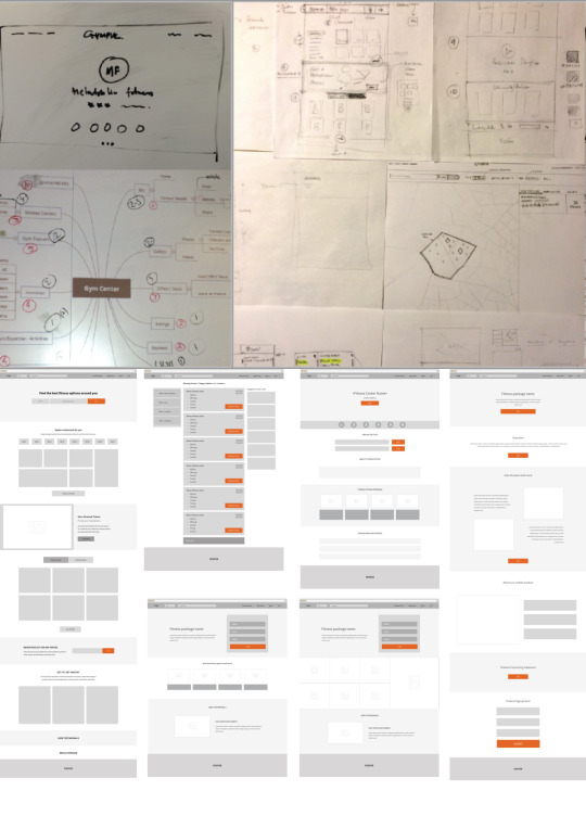
Card-sorting techniques were used to analyse their priorities and mental models whilst picking up or understanding fitness options
Users were given free access for a limited time with our in-house fitness trainers for fitness consultations which revealed a plethora of information.

Key Takeaways
Here’s what we had found out:
Fitness for most was a spur-of-the moment action and not a lifestyle.
Most fitness decisions were not based out of advice from a professional, but rather through generic information on web and from other pseudo-professionals.
Understanding of fitness was bleak, with users having specific problems to fix in mind like “weight-loss”, “diabetes”, “marriage” etc.
Fitness wasn’t observed as a lifestyle but it had expiration dates for most.
Nutrition was never a part of their concerns whilst opting for fitness options.
Most chose their options on what was “cool” and “trendy”, rather than what was actually required.
A large chunk were interested into looking for magic pills and other miraculous treatments
Lack of access to authentic information was a genuine pain-point
Lack of access to proper tracking mechanisms was another issue for those users who were informed and disciplined.
Self-motivation to continue a fitness regimen fell drastically over time for most users. They needed something fresh and unique everyday to keep up the motivation

Charting the Path Ahead
Following the User research above, We charted out our goals to execute prior to receiving their next round of funding from Roundglass Partners in an year’s time and established the key metrics and KPI’s to track.
Brand Revamp: The existing Website required a proper revamp and in order to increase visibility and promote new features. We decided to carry out a full brand overhaul.
Launch Mobile Apps: Personalisation was the holy grail and mobile devices were the key to such initiatives.
Community fitness: We initiated plans to launch community fitness programs, where a user in a community can organise a regimen through an app and Gympik would take care of the logistical aspects of it.
Fitness Parties: We initiated Soul-o-fit parties - a one of a kind fitness party where users would gather around for a intensive physical fitness session organised by a reputed trainer.
Personal Trainers & Nutritionists: We decided to foray into providing professional help at scale where users would be given access to trained professionals on-demand. These users would then get slowly initiated into a fitness based lifestyle and reap the benefits on their own.
Brand Identity

More

Prototype: https://projects.invisionapp.com/share/N78SALSZ2#/screens/192856418
Web Platform: https://www.behance.net/gallery/45917305/Gympikcom-Fitness-discovery-platform-Ver-40
Coach App: https://www.behance.net/gallery/45711089/Gympik-Coach-Android-App-Extension-Modules
Android App: https://www.behance.net/gallery/46611125/Gympikcom-Android-App
iOS App: https://www.behance.net/gallery/46710043/Gympikcom-iOS-App
Rollout & Impact
9X Growth: The primary metrics we wanted to keep track were the visitors to the main website, who were later guided to different other products. After the full revamps, we registered a hyper-growth in numbers and ended the years with a full 9X growth.
The successful growth, along with increase brand recognition in fitness circles helped gain their second round of funding from our VC - RoundGlass Partners.

What I learnt
Users come first. Always. Designing for any application, any product requires decisions which cannot be taken in isolation. User comes first - The stakeholders might have list of requirements or problems to fix, but prioritising them and picking the right ones are fully dependent on understanding what a User really needs. Gympik, being my first job and a smaller company was a great place to put my learning in practice.

1 note
·
View note