
ardn631-haydenmiddleton
Hayden
He / Him — Photography ARDN 631
79 posts
Last active 60 minutes ago
Don't wanna be here? Send us removal request.
Last Seen Blogs

izmaritkokusuyasamak
Izmarit

ode-to-cats
al 💀

largando
Untitled

lohearst
a dance with the devil might last you forever.

the-girl-in-black-18-blog
在我最黑暗的时刻,音乐是我最好的避难所🖤
Text
PHOTOBOOK TESTING PT.3
For the final photobook making I followed Raymond’s feedback to make all the necessary changes like move some images and allow some images to sit by themselves to breathe as a single image. Here are the screenshots of me working on it.
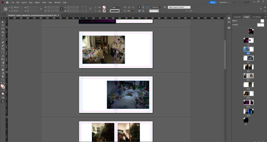
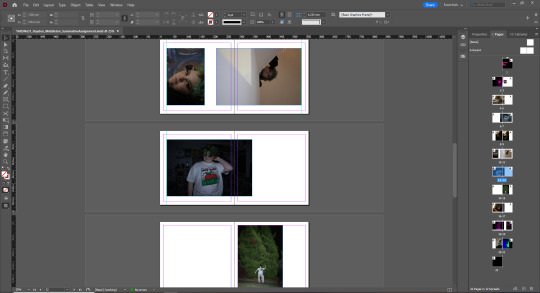
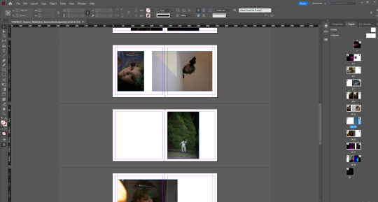
I’m finally at a point where I really like what the photobook looks like and I believe that others and an audience will too.
0 notes
Text
REFLECTION WRITING
Below is the start to writing the 800 word reflection on my photography work and photo book. A lot of this was taken from the research I’ve done in this blog and it was a really helpful starting point.
ARDN631 PHOTOGRAPHY COMMENTARY
It has been a real joy this semester to get a chance to explore portrait-style photography. I have enjoyed having an excuse to get my friends, family, and myself in front of the camera to capture the essence of someone or myself. It’s something that is typically out of my comfort zone since I usually find taking photos of non-living things to be my strength, and at the beginning, I was awkward at directing living, moving subjects in a shot. With lots of research and exploration of other great portrait photographers and with feedback from my peers, I really believe I expanded my photography skills this semester and found a new love for taking photos of people.
At the beginning, it was hard to come up with an idea for what or who I wanted to take photos of. I think I had a lot more elaborate ideas as to what I could shoot, when really what I found myself enjoying photographing the most was just candid shots of people doing tasks within class and then of my family just around the house. When I knew we were doing a photo book, I wanted to explore something personal to me and did consider fully doing self-portraits as an exploration into myself and who I am, but when it came down to actually taking photos, I was most inspired when taking photos of my best friend Cat. It was really easy taking photos with Cat since they’re someone I’m fully comfortable with, and it was a lot easier to break away from that awkward feeling when taking photos of someone else. Cat is also someone I hang out with a lot anyway, so I was able to come up with an idea for the week, then come over and hang out and work on the ideas I wanted to explore for that photoshoot, and it became a very efficient routine.
So that is why my photo book and photo series are all portraits of Cat and who they are as a person. I wanted to make sure every single portrait in the photo book explained something new or different about them to keep the book interesting for each page or image that is revealed every time you turn the page, and a lot of this was helped by the inspiration I picked up from others.
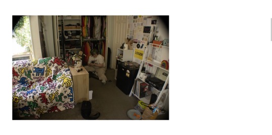
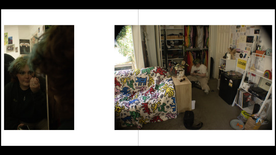
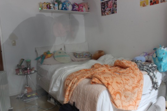
I think Cat’s room is an extremely important element about them. I love going to Cat’s room because it’s such a vibrant and personality-filled place with all the trinkets, posters, and collections kept all over the place. This is why I wanted to include an image of Cat’s room, especially after looking at Adrienne Salinger’s work and how she captured the rooms of teenagers in the 1990s. It’s not only a glimpse into Cat’s life, but it’s a glimpse into what it's like to be a young adult in 2023, and it's an image I think will continue to get more interesting with age, just like how Adrienne’s work has evolved.
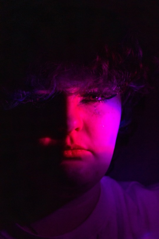
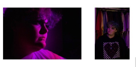
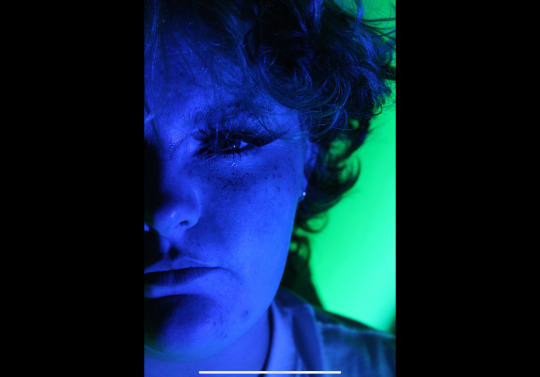
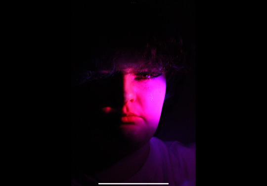
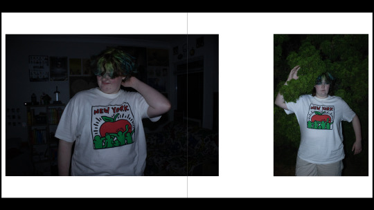
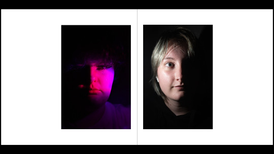
The images where Cat is covered in colourful light were set up with some loose LEDs that were in their room, turning them on and then turning the lights off. Shooting photos in the dark with these bright, colourful lights that cast dramatic shadows onto Cat’s face was a real challenge camera settings-wise, but a good thing to learn, and I’m proud of how the images developed as I continued to learn during the session. These images were inspired by Petra Collins work and her series "24 Hour Psycho," which works with colourful lights, emotions, and how these things interact with each other. For example, a blue light can represent sadness, while a pink light is something more fun and playful. I wanted to explore Cat’s emotional state, or how they feel on the inside, like Petra Collins does. Using pink and blue light is perhaps a bit cliche, but I wanted to make a comment on how Cat shows themselves to the world as a gender-fluid person. Some days they feel more masculine and tell me that putting on makeup can feel a bit like putting on drag, and then other days they feel a lot more feminine. I just think there are so many interesting elements about Cat that they don’t always tell the world about, and I think these images allow an insight into these deeper elements of Cat using the Petra Collins style.
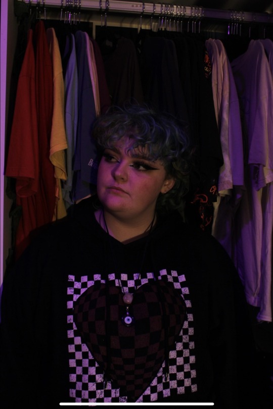
Another influence on my use of colour is Lissy Elle, who focuses on the fuzzy, dream-like elements that photography can capture. Lissy uses bright, in-your-face colours like Petra Collins but also has a diffused coloured lighting style that fills the whole shot and gives some of her shots a colourful hue. I really enjoyed how she explained her art as this capturing of dreams or adolescents, and so I wanted to capture that within my own work with Cat, which is why some shots are done under warm purple light, which wasn’t with the perhaps harsher LEDs I set up but instead just a purple lamp that set the whole scene in this colour. The image chosen in the photo book where I use this technique is the one where Cat is standing just in front of their wardrobe. Their wardrobe worked as a cool backdrop because you can see a lot of Cat’s colourful clothes and the things they like to wear, which is just another element of who Cat is.
Overall, all of these images and shooting styles were done with the style of Olivia Bee in mind, who has plenty of series of images where they’re just candid shots of her friends messing around and doing stuff on film. I was not using a film camera for my photography work, but I did really enjoy the raw, grainy texture of these shots, which made me feel a lot better about having to bump up the ISO while taking photos in the dark, as I think it mimics this natural texture that shooting with film might give. Olivia Bee’s candid shots are really impressive because, although they’re candid, they are still extremely clean and thought-out images, and so as I was working with Cat and capturing just the two of us as we joked around and hung out, I kept this idea of that balance in mind, keeping the shots candid and fun but also keeping things balanced and thinking about the fundamentals of photography like the rule of thirds and angle. Looking at Olivia Bee’s images can make me feel nostalgic for a time I wasn’t even apart of, and that’s an interesting emotion for the work to make me feel. It’s an emotion I hope I can capture with my series of work with Cat as the images age and we look back on them. I hope remembering the fun we had as I took the photos of them makes us feel this warmth of nostalgia.
0 notes
Text
PHOTOGRAPHIC A4 PRINT EDITING + PRINTING
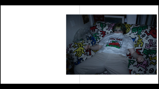
Before going up to the printing labs to print the A4 photographic print I needed to make the edits based on what Cornelius told us in the editing lesson. I was told by Emil that my hero image was the dark pink lit photograph and then Raymond said he enjoyed the salt-lamp photo best. I ended up editing both to a standard that would be good to print and then could see which one Cornelius thought would come out best.
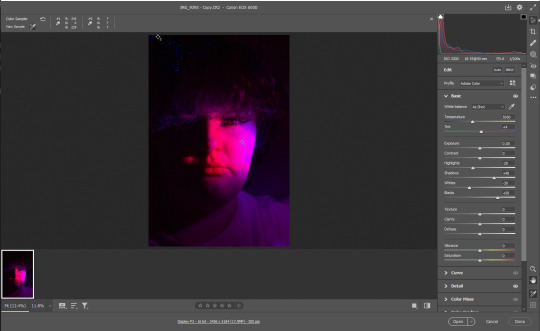
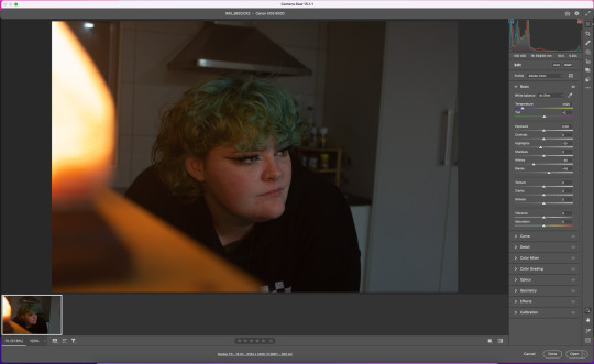
I did all the tricks, making note of the darkest and lightest value and then making it the closest to 250 and 5 as I could so I could get a good tonal range. I was also told by Cornelius when I was up there to make them lighter than it seems since the print will always print a lot darker than it looks on screen. Here are the edited images of both.
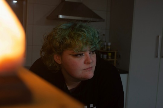
Cornelius and I both enjoyed the salt-lamp one more and believed it would just be more likely to print better with that good tonal range which is ideal. He also helped me make a few more tweaks so the print would come out perfect. Then he also taught me how to use the fancy printers up on level 7 and which paper went with each printer. It was an educational experience and here is the photographic print I got out of it which I will use for hand-in on Friday.

0 notes
Text
PHOTOBOOK FEEDBACK PT.2
When in the final class for photography today I made sure to get lots of feedback on my photobook so I could make the final tweaks before hand in. Here are the quick bullet points and what I will be working on over the next few days.
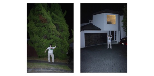
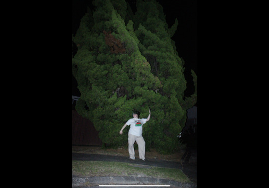
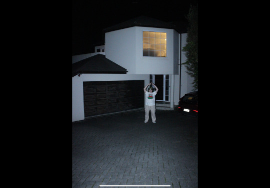
- leave the tree photo alone on a page and get rid of house photo since it’s not as successful because of the flare light on the license plate.
- Make the salt lamp photo my hero image and edit that for printing.
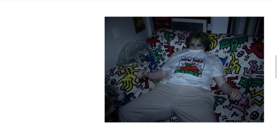
- Move the couch photo to the second page after the room photo as it brings together that Keith harring couch!!
After making these tweaks I just have to edit my photos and get ready for the A4 print and then write up 800 words!
0 notes
Text
PHOTOBOOK TESTING PT.2
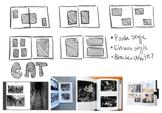
Following feedback I got and then after picking favourites from another photoshoot I decided to lay out another photobook with a bit more design added to it now. I was starting to get a lot more thoughtful about the design especially about the use of black for the covers and back cover and then white on the inside. Also the font was important I wanted something fun, fluid, playful and funky which is what I think the variable font “Chee” does well. Obviously I’ll still need more feedback to make final tweaks for the real deal but for now this is a good start and draft. It also only showcases 14 photos which I will make sure is an appropriate amount for this photobook.
Below are the designed double page spreads.


0 notes
Text
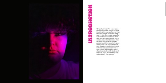
PHOTOBOOK INTRODUCTION
Following the change in my idea and getting feedback from Emil I decided that since the photobook was actually going to explore my best friend Cat as my main subject that the introduction should tell the audience about them and why they are important. So that’s what I wanted to capture in this written statement that will go at the start of my photobook.
“Sincerity is scary” is a photobook following my best friend Cat and the title is the name of one of their favourite songs. I think this song title also makes sense for Cat and this exploration of them and our friendship as I get some really candid, natural and sincere shots of them. Capturing photos of Cat was easy because it really was just a fun process with equal levels of studio style serious shots and then also these shots of Cat being truly authentically themselves.
0 notes
Text
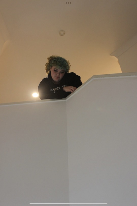
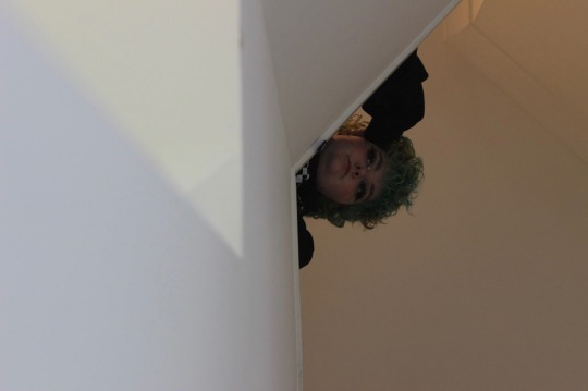
PHOTOSHOOT ANALYSIS
From my Week 11 photoshoot I wanted to look back through with fresh eyes and pick some of what I thought were stand out images. Below are my picks of the bunch.
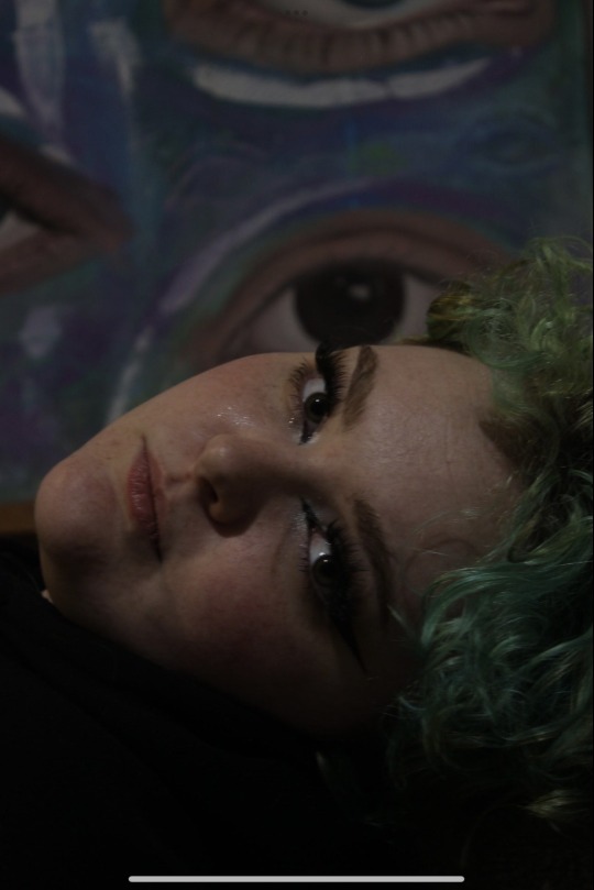
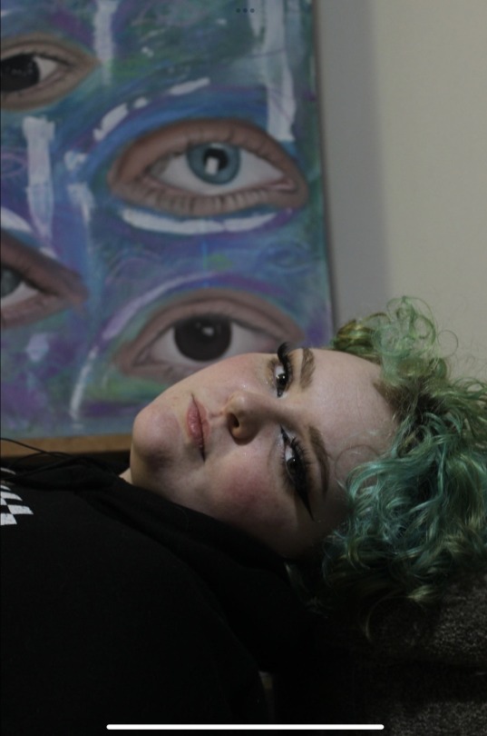
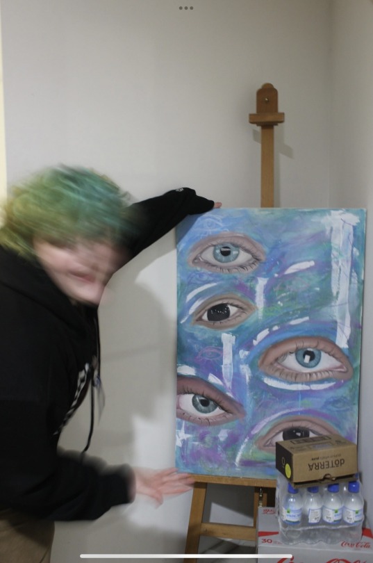
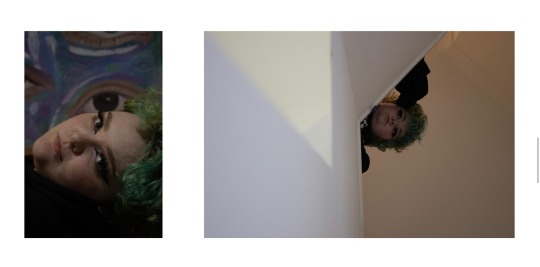
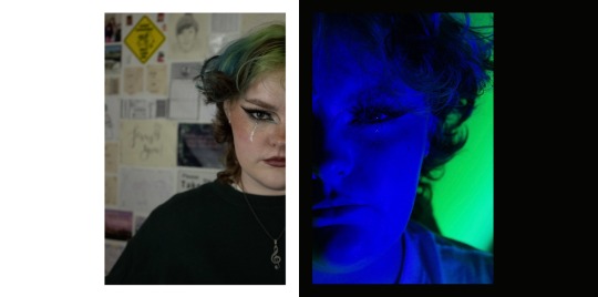
These photos are taken in front of a painting Cat did since they are a talented painter. I thought getting their own eye with the eyes of the painting in the background was really interesting and worked as a personal backdrop to a portrait with Cat in it. The last image I really like the energy of the painting because even though I had the camera shutter open for longer than maybe I should have I thought it created something playful, fun and energetic.
The next group are just staged portraits of Cat around their house and room. I really like the one where they’re in their closet with all their cool colourful clothes behind them. I also really like the ones where it seems like I’m watching from afar the only word I can put to it is stalker-esk photos. I think they capture Cat well and has cool angular elements to them.
0 notes
Text
WEEK 11 CONTACT SHEET
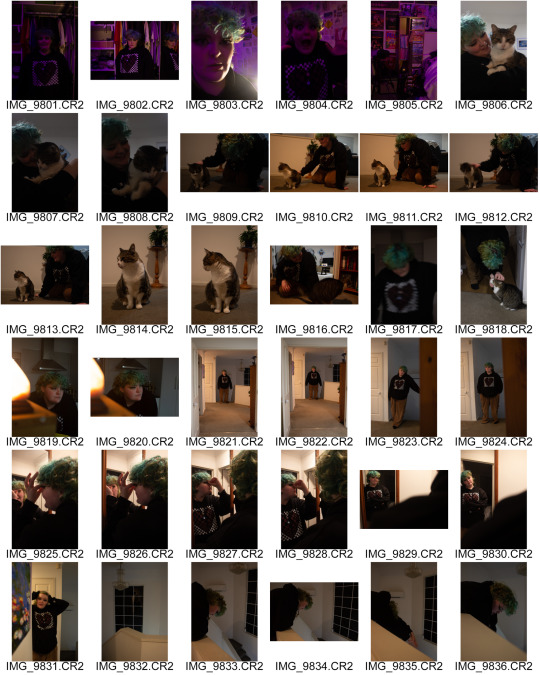
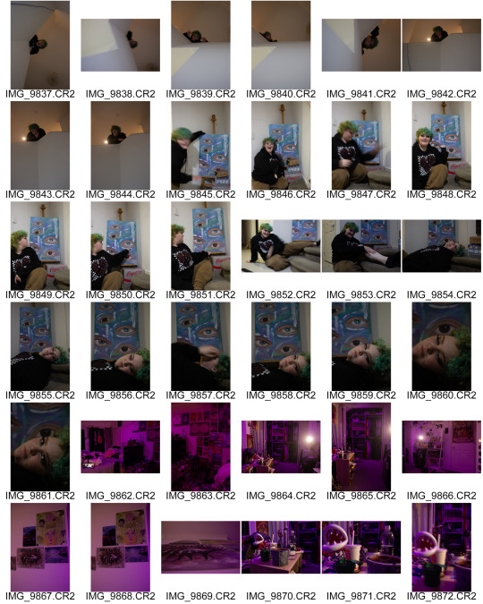
After listening to the feedback given in class I decided to do another photoshoot similar to the one where I got a lot of my hero images before. This meant going to Cat’s place to hangout and capture them being silly but also getting a few planned out photos as well. It’s always a good mix with Cat and I of just messing around and having fun but then also getting down to business to get the work done. I really just wanted more photos with the same vibe but this time more obvious that it was a different photoshoot because Cat would be in a different outfit so it could cut up the flow of the book in a more even way.
0 notes
Text
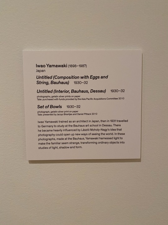
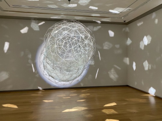
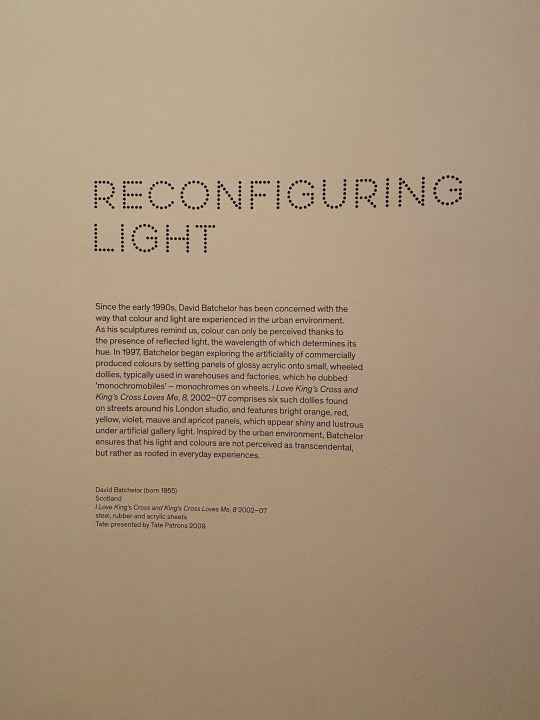
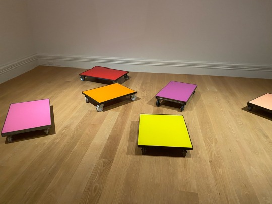
LIGHT FROM TATE EXHIBITION PT.2
Then we took a look at photographic print work which was especially helpful for us as photographers to check out. Also just being in the space and seeing how the exhibition was laid out was very similar of how maybe a photobook would also be laid out, every image carefully deciding where they would look best and how a series of images were positioned together to create a specific mood. So it was really important to be in the space physically and to take a second to think about what a gallery director or creator would be thinking about when laying the images out.
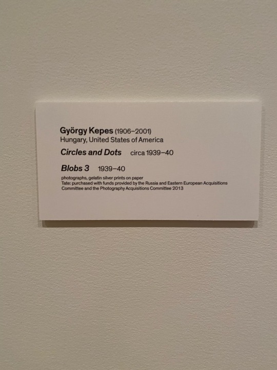

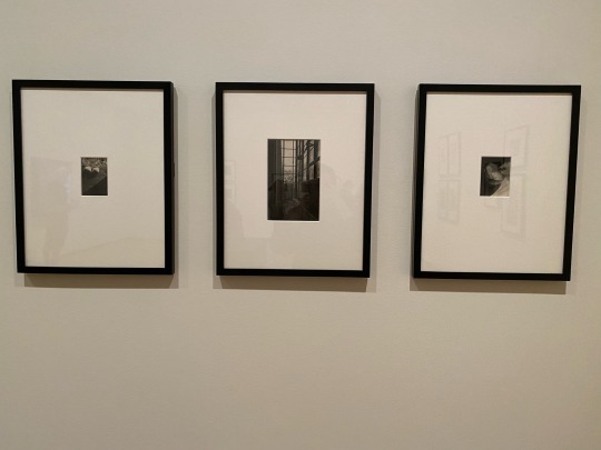
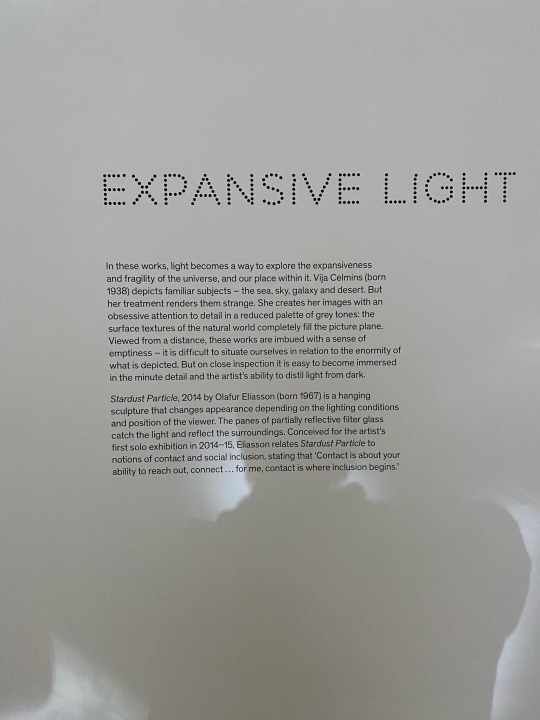
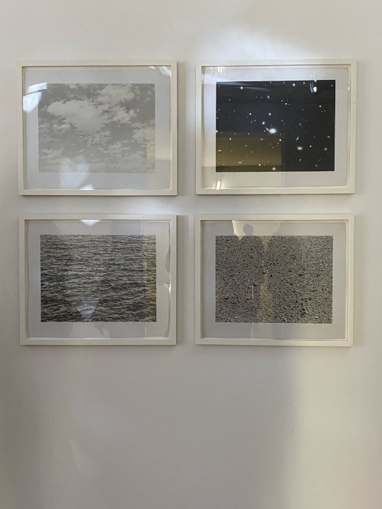
Then it was timed for my favourite room and sculptural piece which was paired with a series of photographic images that I also think became my favourite after hearing about how they were made looking at the details of earth and making it look like a whole new place, planet, or world entirely. And because of this huge light feature spinning and creating fractured light around the room it gave the whole place a super light, ethereal and airy feeling which was weirdly nostalgic and reminding me of summer and the light that would come through a window or a light catcher.
0 notes
Text
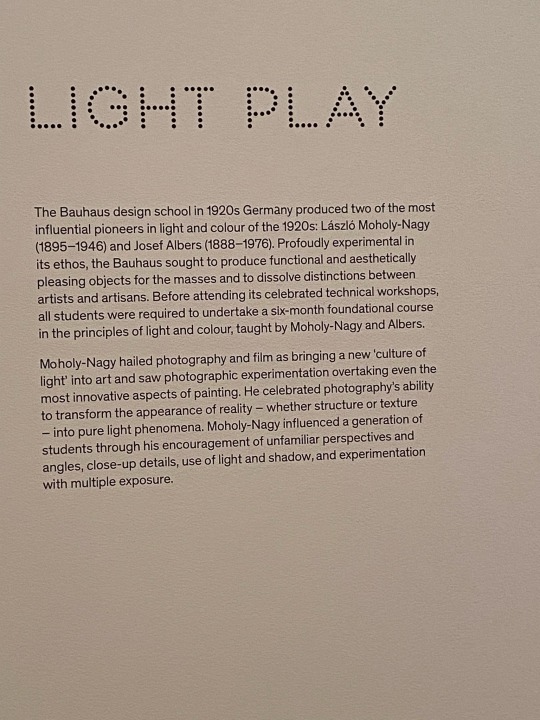
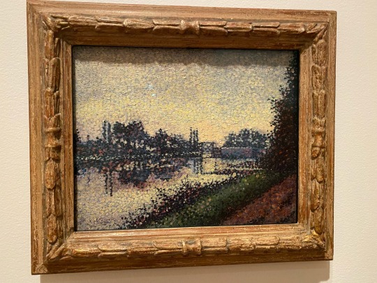
LIGHT FROM TATE EXHIBITION PT.1
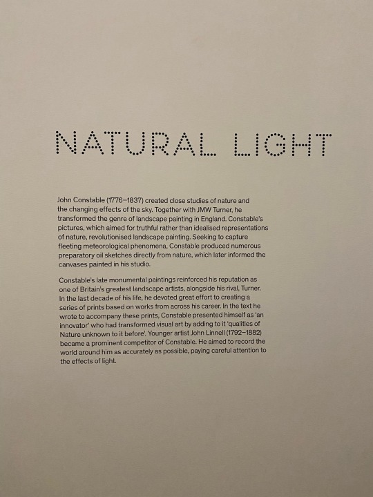
In class on Friday we got the chance to see the Light From Tate exhibition at the Auckland Art Gallery. The exhibition explores about light in artistic work and how expressionism painting came to be influenced by capturing light in new and interesting ways after a picture perfect image could be created with a photograph instead which caused this move for a need for realism painting.
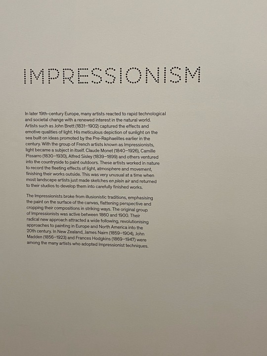
Here we saw some very famous pieces by Turner and Claude Monet alongside other important impressionist artists who employ the use of light to enhance painted image and artwork. It was good for us as photographers to see this to be reminded how photographers also paint with light and its how we decide to use or capture light with a camera that can create a different and interesting composition.
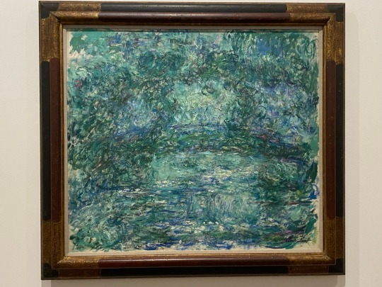
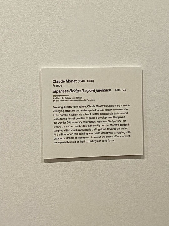
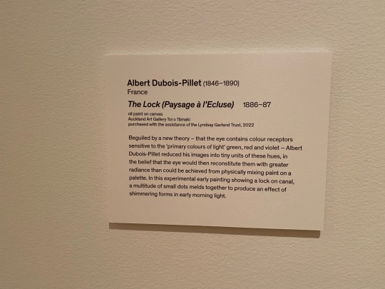
I took a lot of images of the explanations of light and how it influenced art and painting since I found it really informative and interesting to read about. It was inspiring to be reminded that its all about how we use light that is important to an art piece.

0 notes
Text
LECTURE FEEDBACK
Quick notes from the feedback I received from the lecturer.
- The dark pink image is awesome and should be a hero image. Start of the book and then the blue one at the end as a parallel contrast.
- It’s obvious to see that a lot of them were taken in the same day so even just retaking some but with different clothes.
- A lot of them images either have lots of flair and then also a lot of darkness so making edits to change this.
- Also that margin on images is too awkward and small up against the edge, commit to graphic full bleed or bump it up more.
- Explain who Cat is and why you’ve enjoyed taking photos of them. Also explain the mix of fun and candid versus staged and dramatic.
- Do the writing and the font choices etc, etc.
These were the images that Emil enjoyed most. The first one gives more of a sense to Cat’s humour and I agree. Then the paralleled blue versus pink opening image and closing images. Then he thought that the representation of these natural forms with the tree and the house and I agree that these could be quite fun as a page together.
Here is also a quick exploration of more punk, busy layouts that represent Cat more as a person.
0 notes
Text
PHOTOBOOK TESTING PT.1
I began thinking of ways to start laying out a photobook. Drawing on the images I already had and were pretty proud of from the first part of the semester I changed the idea of what I wanted to show in my photobook slightly. Beginning to make layouts of photos also showed me where I might have some gaps in my work and so it got me thinking of another photoshoot as well to fill in the gaps. I want to have some more shots of Cat and me together and hanging out. It’s something we do a lot so it shouldn’t be hard to get together and take some photos so I can have a photobook almost dedicated to Cat and their friendship.
Either way here were the first few spreads I made with the images I had on hand. At this point it’s pretty basic and later on I’m thinking of exploring a perhaps more chaotic way of laying out images rather than a real classic way since I want too represent my friend Cat and I and almost our experiences in life and being queer, young adults and I think that laying out the images really basically and following the rules of other typical photo books would almost be a disservice to the message I want to tell.
0 notes
Text
WEEK 10 CONTACT SHEET
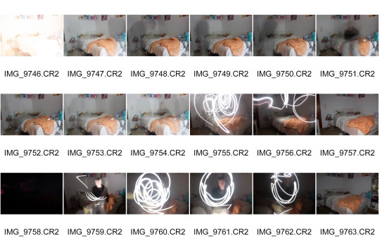
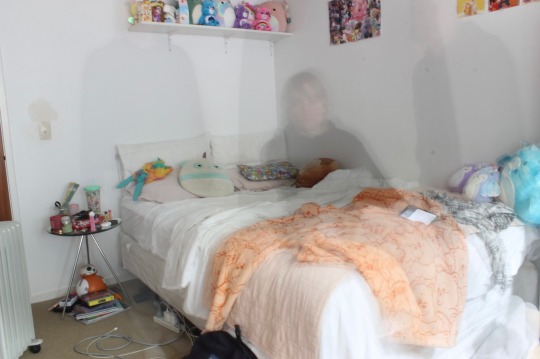
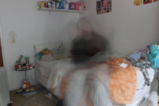
Here was a smaller photoshoot I did where I played with long exposure shots and light. Also getting myself in the shots of my room but almost like just a whisp or ghost of myself. A lot of these shots are really experimental and quite silly but it was fun to test myself in camera settings to get this done. I had to make up for the long exposure by changing the iso and aperture to make sure it wasn’t too light and the images weren’t over exposed. I’m happy with these images but I’m not sure if any of them will be good in the photobook since they don’t convey the message I want the photobook to have but I will see when it comes to image picking and cutting down. These were my favourite images of the shoot.
0 notes
Text
INTERACTING WITH PHOTOBOOKS
Here I went into the Auckland library while I had time to take a look at some physically printed photobooks where I could enjoy the physicality that a photobook has and hoped that looking at these could inspire how I want to layout and compose my own series of images.
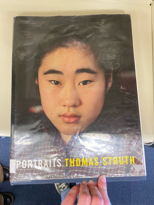

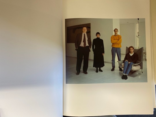

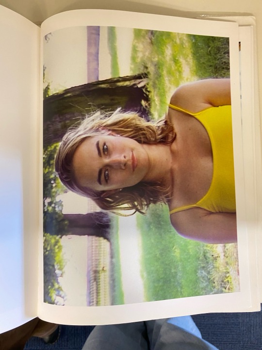
Portraits by Thomas Struth
This book was printed on glossy paper but it had photos with a lot more light which allowed for this, or perhaps because its a book all about portraits Thomas Struth maybe also wants us to be reflected and apart of the book as another portrait. There are also a lot of different ways that the images in the book are laid out, some images with landscape sizing and more background to them go across two pages, and then some just on one page, and then closer or medium portrait shots taking up the whole page and then also if the portrait is landscape it fits horizontally onto the page. Some are given more white space or area to breathe but then some go right to the edge, but every single spread has the left empty and then the right to showcase the image.
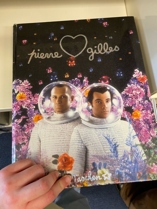
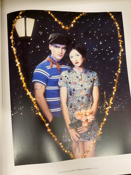
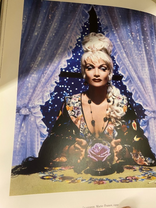
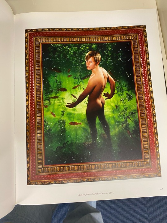
Catalogue of Pierre et Gilles Work by Paul Ardenne
This book felt important to look at cause the cover, aesthetic and style was just calling to me because I love something colourful and creative and different. This is a catalogue of Pierre et Gilles work but is actually designed and arranged seemingly by a different person altogether so it’s an interesting collaboration of different visions coming together to make this piece of work for me to enjoy in my hands. The pieces really are placed quite similarly until all of a sudden theres a longer piece taking over two pages, compared to the earlier photobook this one is more high energy in how it tries to keep the audience interested by the changing flow of the book where as the one before was sort of sectioned off by style of portraits and all the pages in a section were laid out all the same. It shows the different kind of styles or flow or story there is to be told with photobooks and within a series of photos.
1 note
·
View note
Text
EDITING DOWN CHALLENGE
In class today we did a task to create a story with images given to us. First we had to cut down the original 16 photos down to 8 we thought were the most important and then arrange them in a way that told a cohesive story. Here is the images and order I would personally show them.
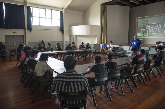
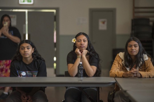
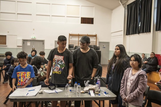
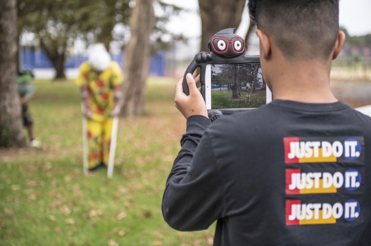
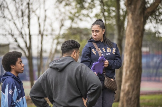
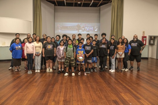
Here is the order I followed. The story I wanted to tell with these images is starting off with the group photo which introduces the people and context and event and then going into some medium group shots of the students a little closer and with a little more detail. Then it goes into a closer detail with a close up shot of a specific kid apart of the group and then immediately goes into another shot of him dressed up and into character while filming, like a transformation of sorts. Then it goes back into medium shots of the groups filming before finally another wide shot of everyone together at the end. This was a good challenge and was fun to begin thinking about how to edit down a number of photos to tell a put together and concise story which is what we will have to do at the end of this assignment.
1 note
·
View note
Text
WEEK 9 CONTACT SHEET
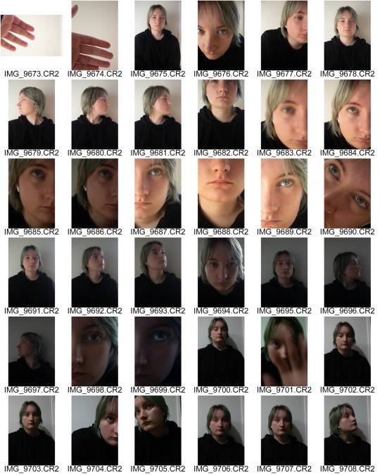
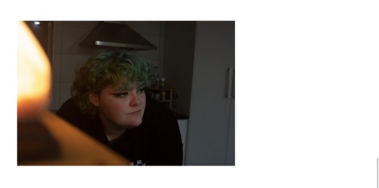
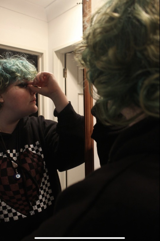
Here I did a photoshoot where I set up the camera in a static place with a basic background and focused on taking photos of myself in different light levels. I used a tripod I finally found that was compatible with my camera and set it up and then based on the time of day I set up the settings which I’ve been getting a lot better at doing. Then I had it on a 2 second timer but it was doable with this short time because I wasn’t too far away from the camera. I played around with angles and wide shots versus extreme close up shots, overall just playing around to see what I liked most and since I don’t like taking photos of my face it was uncomfortable and hard to get around but was good to push myself out of my comfort zone to get the right shots I want to convey my photo books message. I also added in artificial light just from my phone flashlight which I really enjoyed how it put some really extreme shadows and highlights on my face and form
This was a good way to play around and get use to setting up a self portrait shot. Next time I want to play around with different light colours and exposure times. I’d really enjoy doing some long exposure and get some lights to move around to create that iconic streak of lights, play with light colour and emotion or action and then long exposure in somewhere like my room where I get myself moving around in my space. So this is where I need to go to next.
1 note
·
View note
Text
DAY 30 (EVERYDAY PHOTOGRAPH)
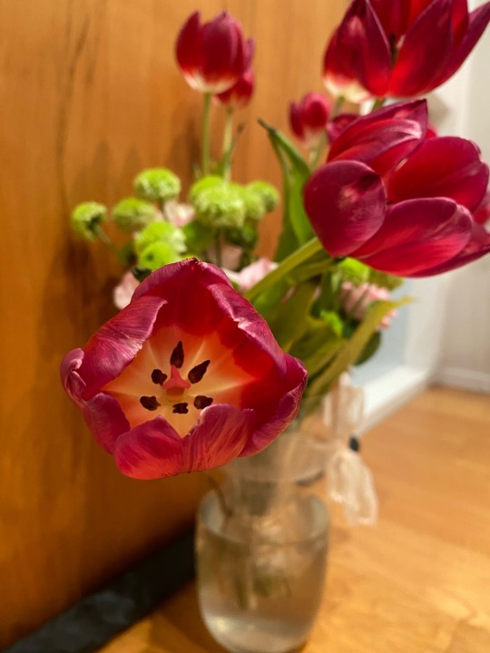
8/05
Here is the final photo. It’s just a photo of some tulips my sister was gifted at her graduation.
1 note
·
View note