
Statistics
We looked inside some of the posts by arshusman and here's what we found interesting.
Average Info
Notes Per Post
0
Likes Per Post
0
Reblog Per Post
0
Reply Per Post
0
Time Between Posts
6 days
Number of Posts By Type
Link
8
Photo
4
Last Seen Tumblr Blogs


Fun Fact
The KCSC sent more than 20K requests to delete posts related to prostitution and porn to Tumblr from January to June 2017.
Link
This article discusses the significance of web accessibility as well as methods to increase it. Accessibility is vital as everyone should have access to and utilize websites. People with impairments can observe, comprehend, navigate, and interact with the Web, as well as contribute to it. Web accessibility also aids persons who have temporary or permanent limitations, which might include age, a sluggish internet connection, a broken arm, and so on. If accessibility is not developed and implemented at the basic level of a website, these folks will be unable to use it.
A substantial number of prospective clients/customers would be lost as a result of inaccessibility from the perspective of a freelancer/business. Because of Covid, everything has become web-based, therefore accessible websites gained great profits while many companies lost a lot of money.
I believe it's fantastic that, owing to HTML 5, we can now make websites more accessible with relative simplicity. It should be noted that we employ title attributes since they are brief descriptions that notify the user about the link. After reading this post, I realized that appropriately using headings is equally important for making the website accessible. Because the user knows which portion is the sub-section, and so on. Many of us, including me, overlook headlines. Every time I've ignored header elements, I couldn't come up with a good excuse for doing so.
When creating a website, we should keep web accessibility in mind at all times. That way, we can be certain that we are designing for everyone who has access to the internet.
0 notes
Link
Website layouts determine the content structure, direct users across the site, and most effectively communicate our message to them. Website design, in my opinion, are crucial components that determine whether a website succeeds or fails.
A good layout keeps me on a website when I'm browsing since it makes critical information simply accessible and straightforward to locate. A poor layout irritates me, and I soon quit the site since I can't locate what I'm searching for.
So, I believe when designing a website, we should take as much time as we need to design a solid layout because viewer will only give us a few seconds of their time. Majority of users prefer simplicity and ease of navigation as the most important factors in website design. Which means when selecting a design we should keep in mind that the information is being communicated to them in a straightforward manner.
While looking for website inspirations, this post caught my eye, and there are a variety of layouts to pick from. This aided me in picking a layout design for the website project as well, and I spent a lot of time doing so.
Split Screen Layout particularly caught my interest. This layout refers to screens that are split horizontally or vertically—or both, as shown above! This style is commonly used for websites that separate their offerings for men and women, or adults and children, or distinct sectors of their business.
I think it's a terrific method to catch readers' attention when they first visit your website, in my opinion. For instance, have a look at https://www.enginethemes.com The website makes it apparent that their company is divided into two parts: design and development. It also make it appears very premium as well.
0 notes
Link
I've been curious in knowing about the future of web design, and I came across a nice article that discusses the possible factors that will shape the future of web design.
We are now in the twenty-first century, and technology has probably infiltrated everything we do. The internet is available everywhere. Keeping track of us as we travel, keeping track of our steps as we run. Bringing us our news before we get out of bed. Still, the internet is useless without the technology to access it. Unless you've discovered a way to browse in thin air.
Let's be honest about this. Here, technology is in charge. A customer's money will be spent primarily on gadgets and gizmos, and they will expect apps and the internet to be optimised for that device. It cannot be the other way around. The eight-second attention span will remain in effect. That is, if your websites aren't optimised, they will bounce. I believe that having a simple design and an interface that is easy to navigate and almost automatic for the user will keep websites in the game.
It's mind-boggling to read and consider these limitless possibilities, as well as how our society and daily lives will be in the future with all of these technologies. I have no idea what it will be like.
0 notes
Link
When the assignment for Wordpress site I thought it would be straight forward as it was more to do with the customizing but how wrong I was. After copying WordPress to the server, I couldn’t install it but after struggling for good few minutes I managed to get through that error, felt like a milestone!
Some of the themes were preinstalled and it was a requirement for us to install a new one, so I began my search for finding the perfect theme. I looked through many options on the wordpress site, viewed their demos but couldn’t make up my mind as which would look good as a blog. Finally found this theme, Primer, which looked decent and customizable. So, after downloading it when I started to copy it to the server, to my horror I couldn't transfer it so I assumed maybe I am not doing it write, tried renaming the file but that didn’t work. Then I thought maybe filezilla has some issue as I use Mac and even previously, I had few issues because of this so that’s the first thing that came to mind. So, I looked for other mac friendly ftp options and found cyberduck, tried through that but didn’t work. I literally spent the whole day struggling and emailed IT and Gemma as well. Next day I found out it had to do with the space, couldn’t believe I spent the whole day trying to fix this.
While my research for looking to fix the errors I was getting now and then I came across this article and I found it handy as it discusses almost all the issues one could encounter with wordpress..almost all!
0 notes
Photo

What’s the Big Deal About Mobile First?
I came throughout this article, it discusses why a mobile-first strategy is so critical in this age and time. Take a look around and you'll see that nearly everyone is pressing, scrolling, and clicking on their mobile. Mobile consumption will only rise, and only a mobile-first strategy will enable you to ride the wave of the mobile revolution.
A mobile-first strategy improves Google rankings, increases conversions, and generates leads. You will only add appropriate content when building mobile-first, and as you switch to desktop, you will realize what needs to be added while retaining flexibility, allowing us to strike a balance between need and usability. When you start small, it's also very simple to scale.
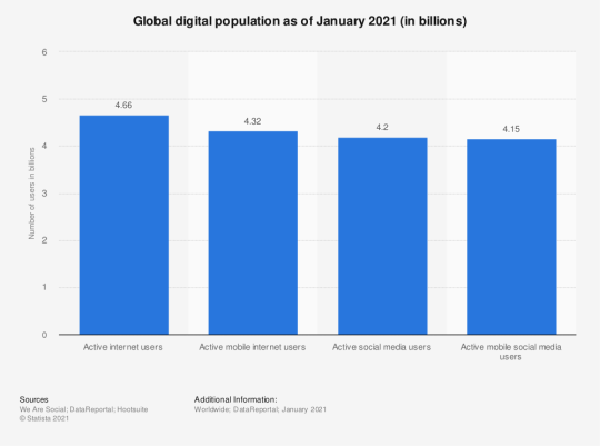
According to the recent report by Statista, the number of people currently using mobile devices to access the internet is 4.18 billion, with mobile devices accounting for 70% of all online traffic which sums up why mobile-first approach is essential.
0 notes
Link
Wix versus Wordpress is a topic that I've seen a lot of people argue over. As a beginner, I used to think that if Wix works, why bother with Wordpress; but now that I've used Wordpress, I've gained a deeper grasp of why the HTML/CSS/Wordpress is worthwhile.
This post certainly explained some of my own doubts about why using WordPress or a custom site is 'better' than using Wix or Squarespace. Overall, Wordpress provides you complete control over adding extras to your site, such as e-commerce solutions. When you choose Wix instead of Wordpress, you have less options for ownership and customization. Wix appears to be good if you only need a basic functioning website and have no knowledge of coding, but if you want a high-quality website with a variety of features, Wordpress is the way to go.
So, I believe the article proved why you should learn to code and create a Wordpress site rather than a Wix site. On the other hand, using additional CSS while designing wordpress site will polish coding skills too. Wordpress looks like it's going to be a useful skill to have!
Nowadays, you must be able to stay up with and add new features to your website especially after Covid, websites become the full shop for people as it was the only mean to sell stuff.
0 notes
Link
We've seen a lot of significant developments this year, due to COVID-19 designers have been pushed to produce real-life experiences and make them available digitally as a result of our stay-at-home reality. Web designers have experimented with a variety of visual communication methods that might boost engagement - typography art, distinctive color palettes, and 3D product simulations for online buyers are just a few examples.
This article covers many other design trends which we could be seeing this year. It's not all about implementing every trend on the website but more about choosing whatever trend best meets our company objectives, this way it will have a beneficial influence on our audiences and their behavior.
Scrolling cards catch my eye, and it's wonderful to see how they're becoming more common in designs. They offer snappy motion to a website and are a terrific method to convey information, whether scrolling horizontally or vertically. Card layouts have been around for a long time, and I love how they're being used in new ways.
Using a video on your website homepage is another trend that I've seen making a wave in 2021. It's a unique technique to catch the attention of viewers and help them grasp the brand before they scroll down the page. The videos may be played automatically or on clik and they may also be stopped. There's also a subtle animation that shows how far into the video you are. A rich user experience is created by combining graphics, text, video, and audio.
0 notes
Link
For the first assignment when I started CSS, it seemed so difficult to get done., whilst now I'm getting comfortable with the HTML, the CSS is what's causing the issue. I couldn't seem to get the layout I wanted; it was always an alignment or positioning problem. Things will never go where I wanted them to go, but as I continued to code, it became simpler and more obvious. After doing some research on best practices and CSS tips and tricks, I was able to get the hang of it.
I came across this article which proved to be extremely useful. Knowing the differences between margin, padding, and border, and how they play into the width of an item, is probably the best basic thing to learn about CSS. Every web design feature is a rectangular box. This was my "ah-ha" moment, that helped me really start to understand CSS.
Learning the various display styles (e.g. block, inline) and how they deal with margins and general positioning is the next step in fixing the templates and such. Finding examples and working from there has proven to be extremely beneficial for me.
0 notes
Link

Smashing Magazine is one of the most well-known web design blogs. It includes a large number of high-quality papers on subjects like CSS, graphics, and typography. Since September 2006, this German blog has provided web designers and developers with useful, accurate, and most importantly practical posts. Many freebies, including plugins and templates, are available on this web design site. This blog is also well-known as a go-to hub for all things web design. You may ask questions and get responses from other designers or peers. You can also purchase printed books and e-books in PDF, ePUB, and Kindle formats, as well as subscribe to a newsletter and attend SmashingConf workshops and seminars.
0 notes
Photo


Why is Airbnb one of my favourite websites?
I feel as web designers we should make usability a priority as this would make visitors more involved, ensuring that they remain on the site longer. A completely responsive interface makes website user friendly, where all the essential buttons, media links, contact information is available.
The AirBnB website has always inspired me with its beautiful and practical web design. At first glance, we can see how form and function combine to create a site that is on trend with the lifestyle and promotes their product using holiday imagery. Overall, using and viewing the web is a real pleasure.
The website is simple where the use enter the necessary details for their travel needs, and they are automatically presented with home listings. This is assisted by the inclusion of a simple filter that allows the user to specify their own parameters to assist in our quest for the ideal house.
Essentially, it is easy and intuitive to use, and using the map to find properties is actually enjoyable. And even if you don't have a vacation scheduled, it makes you want to return again and again. The design layout makes each individual home listing work in such a clear manner that you can find the details you need.
0 notes
Photo


Oh Code!
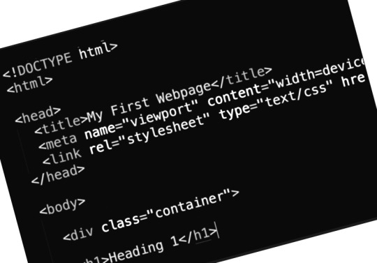
In the next lecture, we were introduced to more complicated coding. We were introduced to adding tables, links, images and lists to the coding. We were taught to open the source code of any page on the web (which is super cool) and also to identify certain HTML features and know how they affect what is displayed in the browser window. Adding a hyperlink seemed straightforward in the start but i When we were introduced to internal links, external links and opening a link in the new page..I I found it slightly tricky to remember. So I am still trying to grasp this through practice! Next step was to add the images, don't we all agree that webpages full of text are boring. I'd say the best websites have lots of images! We learnt to add an image using the <img> tag and it's the only element that doesn’t require a closing tag. Within the given tasks for the lab we practiced to add the list in the html, in this tricky part was the nesting within the list - this means we can have lists within lists. We learnt plenty of new tags in this lecture which seemed overwhelming at that moment as I am completely new to all this but I am finding it fascinating that there's so much we can do, and I am eager to learnt more each day now!
This made me curious and I wanted to see the first webpage ever, and while browsing I came across it which is dedicated to World Wide Web project. It’s so impressive that coding has come a long way!
0 notes
Photo
At first glance, it seemed complicated and extremely confusing, I mean how do you go about learning how to code a website if you have no programming experience whatsoever? But first lesson on html went on pretty smooth, we started off with the introduction and then went on to download all the required soft wares. Here’s the list:
• Atom • Visual Studio Code • Signed up for Stack Overflow (I find it awesome!) • Signed up for Free Code Camp
We familiarized ourselves with the main components of the language and practiced how to write some basic coding. We started off from a simple task of coding “hello, world”, which felt so difficult but surprisingly, I finished all the required task way before time. I think Coding is all about practice, throughout the week I am spending few minutes every day to practice, and going through different books to get to grips with the programming theory, which is helping me to polish my skill. I also came across few games like : Code Combat, Code Wars, and CodinGame, which I think are a great resource and very handy as these games walk you through concepts and steadily gets more complicated, but makes learning fun! I’d get a bit hard on myself when I’d get stuck somewhere but it’s always best to take a break and go step by step!!
0 notes