
Jump to LauraMakesArt Jump to Laura Makes Comics >>>ASK **Posts Tagged: Tutorials Resources Words Artists
Don't wanna be here? Send us removal request.
Statistics
We looked inside some of the posts by artanecdotally and here's what we found interesting.
Average Info
Notes Per Post
137K
Likes Per Post
86K
Reblog Per Post
50K
Reply Per Post
44
Time Between Posts
12 days
Number of Posts By Type
Photo
4
Video
6
Link
2
Note
3
Text
2
Last Seen Tumblr Blogs


Fun Fact
Tumblr is used by 21% of adults online aged 18-29 years.
Photo


A study in panel borders Part 2: Digging Deeper
Okay so this one studies fewer comics but talks about what the writers are doing with them in more detail. Very particularly, let’s talk about Pacing, Writing, and Tone in each of the comic examples above.
First example: I am the President of Ice Cream. This comic is “deep indie” in that I have a ratty copy on newsprint, folded over into an oversized magazine with no thicker paper for the cover. It is also one of the most intentionally delirious, weird comics ever. Plot lines appear and disappear, characters go mad, die, and are forgotten in a whirlwind of weird. But look at how orderly the panels are! Every page is sliced into five strips and then divided up however the script wants it to go. Panels which use even two of these strips are rare, and as such they have a big impact. I think there’s one that uses three and it packs a whallop. Pacing in I am the President of Ice Cream is mostly done with segments in the five-strip grid, in a rhythm that goes from staccato to very slow, often (although not quite always) by having tiny panels as nearly instantaneous moments and big ones as slower ones. Sebesta also uses varied amounts of words to change perceived panel length. The tone of I am the President of Ice Cream and the panel style stay out of each other’s way, because the job of panels in this work is to keep the bass line of the comic pumping, NOT to bathe you in crazy. That’s what the art and writing style are for. This comic’s main goal is to deliver a sense of frenetic delirium. Making something feel “trippy” is easy to do with hard-to-parse panel layouts, but such layouts will never feel fast. I am the President of Ice Cream keeps a super-tight lid on its panel dynamics to keep the reader reading at breakneck speed. The casual reader might conclude Sebesta is very crazy. Yeah, Crazy like a fox.
Next, Zot! by Scott McCloud is a pretty great read, mostly because it represents McCloud “imitating an Anamist” to use a term from his better-known Making Comics. Like with I am the President of Ice Cream, Zot! keeps the panels from getting too crazy for comprehension reasons, but he isn’t trying to make you read super-fast, and in fact quite often he wants you to slow down. He sometimes mashes panels together to cause the reader to halt, or presents a few panels in an organization that causes the reader to briefly consider an image by itself rather than as the flow of the read. Panels in Zot! are rarely meant to be read in rapid succession: McCloud wants you to savor this baby. When there are a lot of small panels close together, they’re often what he calls “aspect to aspect” transitions, creating a sort of cinematic in-out-fade effect. Tone often couples tightly to panel design in this work: Strange panel layouts usually mean something is happening that demands attention and emphasis. It’s important to note that, being Scott McCloud, you can rest assured he’s doing practically everything on purpose.
V for Vendetta relies on a highly regimented panel layout, with one big exception being the opening of Book 2 in which Moore puts an entire musical score directly intertwined with the action in extremely high aspect ratio panels. This creates a very potent sense of strangeness to the panels. Everywhere else, the page is divided into three horizontal strips, although, unlike in Watchmen, they are allowed to “breathe” and change height relative to each other, and also may contain up to four panels, sliced into narrow vertically-oriented slips. Alan Moore once wrote that your job as a writer in comics is to prevent the reader from questioning what they are reading, to the point of hypnosis. The layouts in V for Vendetta are organized to do just that most of the time: the eye never has to ponder its next move across the page, so it just does it. Short panels are frequently used to pack in more dialog without creating walls o text, although it’s worth noting this is a comic that “got rid of thought balloons” in a time when they were pretty much ubiquitous. Panel design doesn’t interact much with tone in the comic, except for the sideways pages.
Transmetropolitan is a prolonged exercise in barely-contained craziness. “Barely Contained Craziness” is actually a hugely central theme in the comic, so it is entirely natural that it would have a treasure trove of seriously messed-up looking layouts. Panels slide over each other, dumping background and foreground elements on top of one another. Done for its own sake, this sort of thing leaves me feeling a little tired and frustrated, but in Transmetropolitan, it’s there for a reason. Like with the drug abuse, violence, and wall-to-wall depictions of a world that is at once amazingly interesting and trainwreck disturbing, the whole point is to make you feel queasy but interested. This isn’t entirely uniform, sometimes the panels get organized, but usually only to set up a drumbeat which will later get interrupted by a horn trumpet of weird panels again later. Tone and layout are working together “harmoniously” here, although the word should be used a little loosely: in a way not all that much unlike Stravinsky’s Rite of Spring, Transmetropolitan is actively mixing things you want to see with things you don’t, and it does this at every level. Putting this into straight-laced panels that read easily from left to right would be like asking Spider to stop cursing. Not gonna happen.
Perspective! For Comic Book Artists is a tutorial in graphic novel format, and as such its panels are organized from concept to concept, clean, neat, formal. There wouldn’t usually be much to add here except to draw your attention to the middle page I put up there: while it’s a very formally organized comic (despite it using a nicely balanced amount of humor to keep it engaging) you sometimes get big, weird, zigzaggy panels whose purpose isn’t any fancy thing with tone or story: it’s to provide a canvas onto which can be dumped a lot of examples.
Digger might not (quite) be my favorite comic of all time, but you should be warned, I’m not really objective about it. I really LOVE this comic. Mostly, it’s doing about what V for Vendetta is doing: being readable so you won’t think about the fact that you’re reading a comic. But every once in a while Ed will tell a story from Hyena lore and the comic borders fuzz out into soft blurs of grey which barely serve as separators. These areas feel strange, not-quite-there, and important for this reason. It’s a really effective way of making the audience perceive an entire aspect of the story in a really different way. This is not to say that Vernon doesn’t pull off a few clever tricks with panels though: one trick she uses quite a few times is the “panel bleed” where the background of a panel extends out into the gutters around other panels, pulling the reader in. This effect is used subtly and sparingly though. Like Moore, Vernon doesn’t want you to think about the fact that you’re reading a comic.
Final thoughts: the more straightforward a layout is, the more it starts to look like text: horizontal lines with vertical separators. “Clean” layout isn’t necessary for legibility, but it can definitely be used to make your audience read faster, or think about the book less. The more regimented your system, the more impact it will have when you break the rules. The same goes for panel size: the less your panels usually vary, the more serious it will feel when they vary by a lot.
Rules are made to be broken, but if you break them often enough, broken rules become the rule.
258 notes
·
View notes
Photo


A study in panel borders: Inspired by this awesome post about making comics quickly, I took a look at some comics I own to get some sense of different kinds of panel design choices.
I came away feeling like I’d learned a little less than I’d hoped, but here are some takeaways:
* You can get away with smaller panels than you think * Extremely weird comic panels CAN work, but when it fails it looks painful and forced. * Simple is not bad. * There are actually a LOT of possible combinations.
Specific notes:
Scott McCloud uses a 4x3 sliceup of the page, and it’s four VERTICAL slices and three HORIZONTAL ones, which is weird because it makes the panels, on average, LESS square. This works with the particular comic really WELL though, because he draws himself in closeup, talking, a LOT.
DAR and Narbonic both are webcomics mashed into book format, but both worked surprisingly well as page layout in the end.
Blacksad is REALLY variable and the page layouts are hand-crafted on a per-page basis. No speed gains here, but perhaps a message that full custom has its place.
The Resonator is fairly formal but never *too* rigid with panel choices. Lots of narrow or tall panels, which works as a way to alternate between big establishing shots and dense dialog. Very tall panels for single speaker, long ones for two-person dialog or to combine a lot of text and visuals. In general, Resonator is print-native and has TINY text…
Ultimate X-Men is a fun read but the panel design is a disaster. Almost none of the choices of graphic design work at all. Occasionally an establishing shot hits home, but in general the layout is trying WAY too hard.
Watchmen. Formalism raised to the ultimate. It’s precise, it’s a 3x3 grid, it’s piss-on-a-plate-with-no-spills precise and that’s fine, for two reasons: one, everything is about time, and two, it gets the panels the hell out of the way of the story.
Augustus is an example of what Ultimate X-Men was trying to do, except it succeeds. Lots of variation, but on average very orderly. Kind of strikes me as the sort of thing you “have to be GOOD” to pull off well.
17K notes
·
View notes
Photo
A study in panel borders Part 2: Digging Deeper
Okay so this one studies fewer comics but talks about what the writers are doing with them in more detail. Very particularly, let’s talk about Pacing, Writing, and Tone in each of the comic examples above.
First example: I am the President of Ice Cream. This comic is “deep indie” in that I have a ratty copy on newsprint, folded over into an oversized magazine with no thicker paper for the cover. It is also one of the most intentionally delirious, weird comics ever. Plot lines appear and disappear, characters go mad, die, and are forgotten in a whirlwind of weird. But look at how orderly the panels are! Every page is sliced into five strips and then divided up however the script wants it to go. Panels which use even two of these strips are rare, and as such they have a big impact. I think there’s one that uses three and it packs a whallop. Pacing in I am the President of Ice Cream is mostly done with segments in the five-strip grid, in a rhythm that goes from staccato to very slow, often (although not quite always) by having tiny panels as nearly instantaneous moments and big ones as slower ones. Sebesta also uses varied amounts of words to change perceived panel length. The tone of I am the President of Ice Cream and the panel style stay out of each other’s way, because the job of panels in this work is to keep the bass line of the comic pumping, NOT to bathe you in crazy. That’s what the art and writing style are for. This comic’s main goal is to deliver a sense of frenetic delirium. Making something feel “trippy” is easy to do with hard-to-parse panel layouts, but such layouts will never feel fast. I am the President of Ice Cream keeps a super-tight lid on its panel dynamics to keep the reader reading at breakneck speed. The casual reader might conclude Sebesta is very crazy. Yeah, Crazy like a fox.
Next, Zot! by Scott McCloud is a pretty great read, mostly because it represents McCloud “imitating an Anamist” to use a term from his better-known Making Comics. Like with I am the President of Ice Cream, Zot! keeps the panels from getting too crazy for comprehension reasons, but he isn’t trying to make you read super-fast, and in fact quite often he wants you to slow down. He sometimes mashes panels together to cause the reader to halt, or presents a few panels in an organization that causes the reader to briefly consider an image by itself rather than as the flow of the read. Panels in Zot! are rarely meant to be read in rapid succession: McCloud wants you to savor this baby. When there are a lot of small panels close together, they’re often what he calls “aspect to aspect” transitions, creating a sort of cinematic in-out-fade effect. Tone often couples tightly to panel design in this work: Strange panel layouts usually mean something is happening that demands attention and emphasis. It’s important to note that, being Scott McCloud, you can rest assured he’s doing practically everything on purpose.
V for Vendetta relies on a highly regimented panel layout, with one big exception being the opening of Book 2 in which Moore puts an entire musical score directly intertwined with the action in extremely high aspect ratio panels. This creates a very potent sense of strangeness to the panels. Everywhere else, the page is divided into three horizontal strips, although, unlike in Watchmen, they are allowed to “breathe” and change height relative to each other, and also may contain up to four panels, sliced into narrow vertically-oriented slips. Alan Moore once wrote that your job as a writer in comics is to prevent the reader from questioning what they are reading, to the point of hypnosis. The layouts in V for Vendetta are organized to do just that most of the time: the eye never has to ponder its next move across the page, so it just does it. Short panels are frequently used to pack in more dialog without creating walls o text, although it’s worth noting this is a comic that “got rid of thought balloons” in a time when they were pretty much ubiquitous. Panel design doesn’t interact much with tone in the comic, except for the sideways pages.
Transmetropolitan is a prolonged exercise in barely-contained craziness. “Barely Contained Craziness” is actually a hugely central theme in the comic, so it is entirely natural that it would have a treasure trove of seriously messed-up looking layouts. Panels slide over each other, dumping background and foreground elements on top of one another. Done for its own sake, this sort of thing leaves me feeling a little tired and frustrated, but in Transmetropolitan, it’s there for a reason. Like with the drug abuse, violence, and wall-to-wall depictions of a world that is at once amazingly interesting and trainwreck disturbing, the whole point is to make you feel queasy but interested. This isn’t entirely uniform, sometimes the panels get organized, but usually only to set up a drumbeat which will later get interrupted by a horn trumpet of weird panels again later. Tone and layout are working together “harmoniously” here, although the word should be used a little loosely: in a way not all that much unlike Stravinsky’s Rite of Spring, Transmetropolitan is actively mixing things you want to see with things you don’t, and it does this at every level. Putting this into straight-laced panels that read easily from left to right would be like asking Spider to stop cursing. Not gonna happen.
Perspective! For Comic Book Artists is a tutorial in graphic novel format, and as such its panels are organized from concept to concept, clean, neat, formal. There wouldn’t usually be much to add here except to draw your attention to the middle page I put up there: while it’s a very formally organized comic (despite it using a nicely balanced amount of humor to keep it engaging) you sometimes get big, weird, zigzaggy panels whose purpose isn’t any fancy thing with tone or story: it’s to provide a canvas onto which can be dumped a lot of examples.
Digger might not (quite) be my favorite comic of all time, but you should be warned, I’m not really objective about it. I really LOVE this comic. Mostly, it’s doing about what V for Vendetta is doing: being readable so you won’t think about the fact that you’re reading a comic. But every once in a while Ed will tell a story from Hyena lore and the comic borders fuzz out into soft blurs of grey which barely serve as separators. These areas feel strange, not-quite-there, and important for this reason. It’s a really effective way of making the audience perceive an entire aspect of the story in a really different way. This is not to say that Vernon doesn’t pull off a few clever tricks with panels though: one trick she uses quite a few times is the “panel bleed” where the background of a panel extends out into the gutters around other panels, pulling the reader in. This effect is used subtly and sparingly though. Like Moore, Vernon doesn’t want you to think about the fact that you’re reading a comic.
Final thoughts: the more straightforward a layout is, the more it starts to look like text: horizontal lines with vertical separators. “Clean” layout isn’t necessary for legibility, but it can definitely be used to make your audience read faster, or think about the book less. The more regimented your system, the more impact it will have when you break the rules. The same goes for panel size: the less your panels usually vary, the more serious it will feel when they vary by a lot.
Rules are made to be broken, but if you break them often enough, broken rules become the rule.
258 notes
·
View notes
Video
youtube
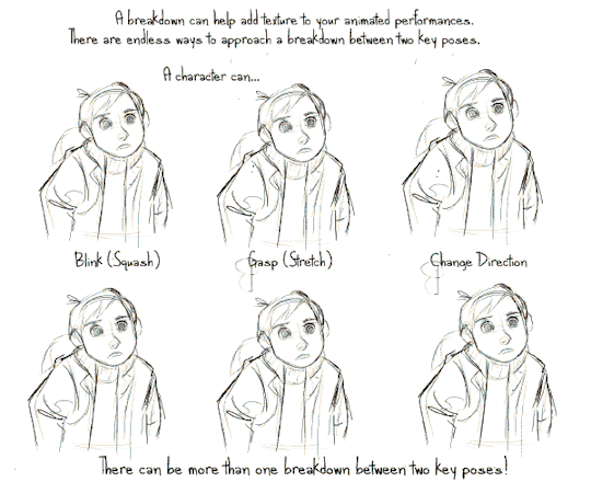
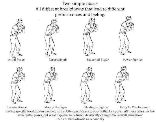
Today’s episode on the Powow Workshop (Formerly Stringbing Workshop), I introduce the animation breakdown, what it is, and how it can be used.
Please check out my patreon page and give it a support: https://www.patreon.com/StringBing
Gumroad (Buy exclusive tutorial material): https://gumroad.com/stringbing
Music: Boom de Boom - Aaron Lieberman FunkDown - MK2 Happy Mandolin - Media Right Productions

39K notes
·
View notes
Video
youtube
Not super in-depth, but a nice little overview.
3 notes
·
View notes
Link
Hey here’s a podcast I was on last month!!!!!!
55 notes
·
View notes
Video
Animators have to pay attention to so much, and I love them.
vimeo
Skip Animation Tutorial by Felix Sputnik
2K notes
·
View notes
Photo


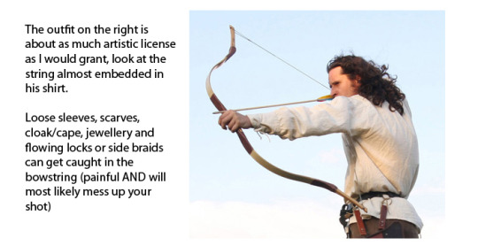


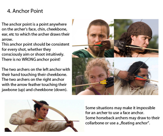

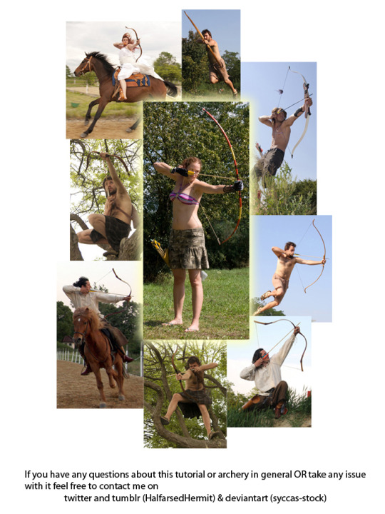
Spent the last two days working on this little archery guide in art and writing. Considering the rise in popularity of archers in pop culture this hopefully comes in handy for a bunch of fandoms.
75K notes
·
View notes
Link
236 notes
·
View notes
Video
youtube
Awesome video on character design!!!
401 notes
·
View notes
Note
Hey man I really enjoy your fan art! It's wonderful & very inspiring ✌️ My question: I can draw, but only if I have something to look at. I can't draw from my imagination. I'm like a photocopier. Do you have any suggestions of where I can go online to learn proper illustration? Thanks so much & I sincerely hope you create more fan art! 🖖
Hi! Drawing from a picture doesn’t mean you’re not using your imagination. It’s just a different approach. Not sure if this sounds weird but copying things I liked when I was little was how I started. I copied and traced anime posters and paused movies, placed a piece of paper on top of the tv screen, and traced what I saw. Even in school we did a lot of master copies and I know artists who copy images they see but turn it into their own or they make it obvious that they copied it. I think it only becomes an issue when you copy something and try to pass it along as your own original idea and also try to make money off of it.
When you’re copying, think about what you’re doing while copying. Like in the case of master copies, I try to understand the artist’s process. Trying to see what he/she saw while he/she was creating that piece of work. It’s like walking in the artist’s footsteps. So instead of copying for the sake of copying, do it with purpose. There really is no “proper” illustration but I guess you should look at what successful illustrators are doing now. A great place to start is to look at places like:http://www.juxtapoz.com/news/illustration/http://www.juxtapoz.com/news/illustration/http://3x3mag.com/http://lightgreyartlab.com/There are a lot more great places to find illustrators but these are just some places off the top of my head.There is also the Society of Illustrators which I feel is a great launching pad for students trying to get some recognition.http://www.societyillustrators.org/Also, if you want to gear your work towards feature animation/film try taking a few schoolism or cda classes! I believe they offer online courses if you’re not close to the campuses. They’re really great and you get to learn from people currently in the industry. For more references for visual development artists that are currently in the industry I recommend looking at the “Art of” books for a lot of the animated films from studios like Disney, Pixar, and Dreamworks, etc. Just remember to keep drawing and develop “taste” to create a style and see how far it can take you :) Hope this helped! Please feel free to ask more questions if I missed anything.
249 notes
·
View notes
Note
how do you use the animation feature in clip studio paint?
First, clip studio makes a couple references to traditional animation in the terms it uses:

when animating traditionally, to be able to put your animation over a painted background, you draw on transparent cellophane - or cels / transparencies.
one cel is one image in an animation on a transparent backgroundor to put it in digital art terms - equivalent to one layer.

These are then kept together in a folder (at least, they are in CPS)
now, here’s clip studio’s timeline:


if you can’t see it on your screen, go to Window > Timeline!
you don’t really need to know the names of everything, but it helps to know where the different parts are.
The way the timeline works is like this:
you first need to create a timeline by clicking this button to actually be able to do anything

Then to animate, you create an animation folder, which is a special kind of layer folder. Any layers put in this folder will become cels.


for a cel to be visible, it first needs to be specified

one cel will be visible at a time

the quickest way to add cels is to click New Cel, which will create a new layer & specify it on the timeline

anyway, those are the basic controls for the timeline, but there’s other stuff you can do too!
Keep reading
1K notes
·
View notes
Note
This is a big thing to ask, but would it be possible for you to make a process video for your landscape speedpaints? They're so fascinating to look at, minimal but conveying so much, I'd love to see how one comes together.
Hi! Well, I’m always trying to experiment and streamline so this is not how I always go about it. Here’s the basic idea:

I start with a photo (this is from a trip I took years back to the canyons.)

Then I do a quick line sketch so I know where the basic elements go. Then I color block to get values and basic schemes going.

Add in quick detail (all with the same brush, since it’s supposed to be quick.) Then use another layer for foreground elements.

Then use some quick overlay gradients to re-establish values. I left it big so you can see how messy it is. This is all really quick. No real erasing, just blocking shapes with lassos and brush sploches.
Hope this helps! I’m still a beginner, but going quick has helped with not overthinking this stuff.
763 notes
·
View notes
Text

メガネわからん。って描いては消してをしてて、こうやったらそれっぽく描けたで!っていうアレ。 pic.twitter.com/UVduMnjhkl
https://twitter.com/po_yomo/status/782525221567733760/photo/1?ref_src=twsrc%5Etfw
I’m furious that I’ve never thought to do this. Furious.
31 notes
·
View notes
Text
If you’re nervous about inktober, that’s cool! I understand ink intimidates me quite a lot lmAO
but! you don’t need to post anything if you don’t want to, and you also dont have to draw anything every day. It’s just a month meant for self improvement, you can do this at whatever pace works for you.
To help you with getting started though, you might find these resources useful:
vimeo
youtube
Line quality
Draughtsmanship exercises
Inking shadows
good luck, and have fun !!
729 notes
·
View notes