
Don't wanna be here? Send us removal request.
Statistics
We looked inside some of the posts by arthistorywithelys and here's what we found interesting.
Average Info
Notes Per Post
1
Likes Per Post
1
Reblog Per Post
0
Reply Per Post
0
Time Between Posts
4 days
Number of Posts By Type
Text
8
Last Seen Tumblr Blogs


Fun Fact
The Tumblr office adopted Tommy, an 11-year-old Pomeranian.
Text
Final Project: Album and Book Covers


I chose The Crucible by Arthur Miller because it’s one of my all-time favorite pieces of modernist literature. I felt I knew the story well enough to include iconography that accurately represented the relevant themes.
If you haven’t read it, The Crucible was written by Arthur Miller during the Second Red Scare. The play takes place during the Salem witch trials of the late 17th century, which served as an allegory for the moral panic invoked by Senator Joseph McCarthy against political adversaries. McCarthy weaponized the American public’s fears of foreign invasion by Russian communists during the Cold War by falsely alleging that the U.S. government had been infiltrated and was compromised. In the play, the main antagonist, Abigail, uses similar tactics to manipulate the Puritans, baselessly accusing various members of the town of witchcraft, coercing others into giving fake testimonies, planting evidence, etc.
Overall, the story is about the destructive power of mass hysteria, the weaponization of religion, and how perception of reality can be altered to fit an agenda.
Contrary to popular belief, the Puritans didn’t burn anyone at the stake during the Salem witch trials. Instead, most of the accused were publicly hung. This is something that Miller did extensive research on and deliberately chose to include in the plot, which is why I depicted a noose hanging from a rosary. The hands holding the rosary-noose are implied to be that of a preacher’s or other religious authority, as indicated by the cuffs on the wrists.
Note: I am aware that Puritanical communities in colonial America saw the use of rosaries, crosses, and other symbols associated with Christianity as a form of idolatry, which they were vehemently opposed to. The goal of the cover art is not to be historically accurate, but to be a visual representation of story beats and themes.
The album I chose is another favorite. It’s called “French Exit” by the band TV Girl. I selected this album in specific because, for one, it’s my favorite out of their entire discography, and secondly, TV Girl’s album covers and sound would be fitting to translate into a 1970s style graphic design. Most of their album covers contain a silhouette of a woman, vibrant colors, and the use of pure black as an accent.
I approached this assignment by first making a color plan in my sketchbook, took photos of myself and a volunteer (my brother whom I bribed with a Snicker's bar) to use as references for anatomy, and transferred the sketches onto the canvas before painting.
I opted for simple, vector-based imagery rather than complex rendering. My design philosophy was to avoid details that would distract the viewer from the text.
The artwork I’m most proud of is the book cover. I do like how the album cover turned out as well, but I felt more inspired while working on the former. If I could do this assignment over again in my own time, I definitely would have poured more than a single week’s worth of work into it.
0 notes
Text
Midterm Assignment - 6/8/2025

Artist's Statement:
This assignment was probably the most creatively challenging one yet; I honestly didn't think I'd be able to finish it on time. After days of research, color planning, workshopping ideas, a few accidents with the exacto knife, and caffeine intake that would probably be lethal to a small child, I managed to end up with a final product that I'm happy with.
Before I even began coming up with ideas, I first studied the color and compositions of other non objective art I found online. Most notably, I drew inspiration from Henri Matisse's Jazz series and the Robert Berry Gallery's 2021 exhibit called "Truth in the Face of Reality." I strongly recommend going to the gallery's website and viewing the pieces by Nick Aguayo and William Bradley to get a better sense of where my initial thought process came from.
As for my approach, I think I can show you better than I can tell you. Attached is an excerpt from my sketchbook where I started to lab out my color scheme.

Before I picked a scheme, I took a picture of these and added a black and white filter over it. Some hues have an inherent value, even at full saturation (i. e. purple reads "darker" than yellow). It was this discovery that helped me eliminate most of my options. Options B and C both had the highest contrast in value. I did eventually choose B over C because the colors felt more cohesive and intentional.
After I selected what colors to use, I then had to decide where and how to place them. This sent me back online to study my references more closely this time. I made sketches of a few pieces I found interesting and labeled the function/effect on the viewer's gaze of every shape in the composition.

The next step of the planning was to actually begin drafting the assignment, which was a bit of a daunting task. I sketched out and erased ideas over and over again. In the end, I used colored pencils and alcohol markers to force myself to create something permanent and stop obsessing over minutiae.

Even though I still didn't like it at this point, I figured that it was a good enough jumping-off point and just needed some cleaning up. I arrived at a result I was happy with after diving into work, adjusting things as I went along.
0 notes
Text
Color Combinations HW
The instructions online said to do thirty of these (15 sets of 2) but there is another post referring to the same assignment that said to do only 24. I didn't know which instructions to follow, so I did 34 and hoped to compensate.


As you can see, I started pairing colors with their complementaries at first, then I did the primaries, and lastly I just started messing around with tertiary and quaternary colors.
I also played a lot with color mixing. Mixing complimentary colors will often result in a muted, muddy, and sometimes downright brown hue.
I found this particularly challenging, as I'm used to working with the CMYK pallet for pigments, and RGB digitally. I always had trouble intuiting the red-yellow-blue system.
0 notes
Text
Kline Inspired Line Compositions
For this assignment, I planned out my compositions in my sketchbook first, using the rule of thirds to guide my placement of the lines. I then covered an 8x10 area in titanium white on all four bristol sheets, took a variety of brushes and mars black paint, and recreated the layout from my sketches.
1: Horizontal and Vertical Only

2: Diagonals Only

3: Curves Only

4: All Line Types

0 notes
Text
Shape Composition (2/2): Order
I'm not sure if anyone else has done this before, but I didn't see anything similar in the student examples. I will simply assume it hasn't been done, despite its visual simplicity.
In the interest of brevity, the top of this post will contain only the information necessary for grading. Should you be interested in seeing it, I have elected to include more in-depth documentation of the process below the cut.

I began by drawing my 8x10 space, covering the edges in masking tape, and covered the remaining space in titanium white. I then took a 4x4 square painted in mars black and cut it into triangles, pasting each triangle in a square formation, as seen above.
Now, this piece took me an abnormal amount of time. I know cut and paste assignments are supposed to be quick and uncomplicated. Unfortunately, when I began to plan the composition as I always do, the idea grew legs of its own and I had no choice but to follow it.
Here is the original concept, drawn hastily in my sketchbook to use as a reference later on. You will notice that the size of the area I drew is proportional to the 8x10 rectangle.

This is the skeleton of the project. It's also the mouth of the rabbithole I fell down while I was coming up with ideas.
The piece is meant to be viewed in tandem with another assignment for this class, as they are thematically linked. This one in particular is inspired by the geometric concept of flipping a regular polygon along an axis over and over again. The axis, in this case, being one side of each square. Visual guide below.

* The lines in red are the axes. The other colors are there to show where each square was cut from.
As I was developing this idea, I noticed something interesting. If you were to draw a point that bisects every individual axis, you end up with a fibonacci spiral.

This took me a long time because a project of this nature requires a level of precision that is just not humanly possible. Even being as meticulous about it as I could, the squares still aren't perfect. I also had to adjust the placement of the triangles so that they wouldn't go off the page, resulting in a more extreme curve in some places. (I chalked it up to the fact that it's in a 3:4 aspect ratio, which a fibonacci spiral isn't exactly suited to fit in.)
I think if I were creating this digitally, or at least with different tools at my disposal (i.e. laser cutter, projector, 9:16 frame, more comprehensive understanding of trigonometry, etc.) then I'd be able to create something that is more in line with what I was aiming for— technical perfectionism. The closest I could get without spending hours on calculations that would make Pythagoras cry was with the following method:
I took a ruler, compass, protractor, pencil, and an exacto knife.
I measured the side of the square, and placed the point of my compass along one vertex, swinging it to create a quarter-circle that touches both adjacent vertices.
I repeated this process on each vertex.
I then found the points where two of my curved lines met, and drew a point.
Taking two points parallel to each other and using a ruler as a straight edge, I drew two lines that are perpendicular to the edges of each square.
The points where each line bisects the edges of the square create the diagonals along which I'd be cutting.
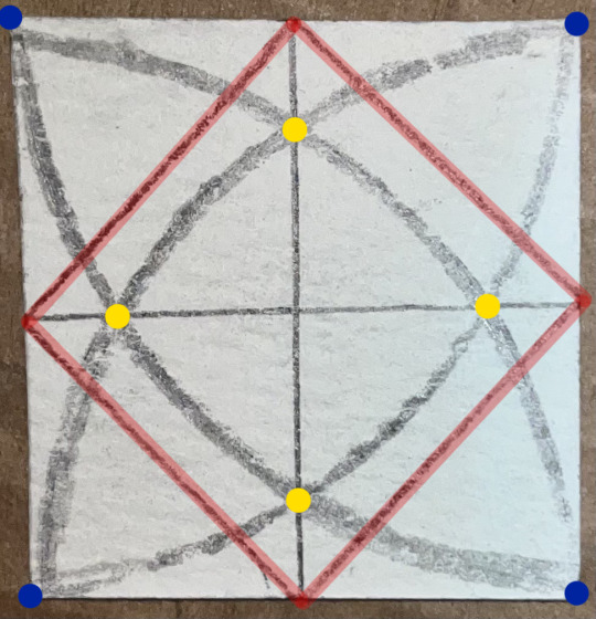
** This is a separate square of paper, made strictly for demonstration.
The dots in blue are the corners where I placed the compass. The yellow dots are the points where I laid my straight edge to create the perpendicular lines, and the red lines are where I would cut with my exacto knife.
You may have noted that I stopped at 7 squares when I seemingly could have kept going. Unfortunately, as the pieces I was working with got smaller and smaller, so did comfortable room for error. In theory, the pattern is a fractal, and can extend off into infinity despite being derived from a finite area. I wouldn't know how to recreate that without breaking several laws of physics, though.
0 notes
Text
Shape Compositions (1/2)
5/19/25
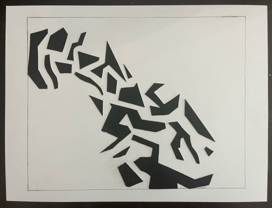
Collage 1: Black shapes on white space.
I realize now why we've been limited to a 4x4 in. square. It forced me to be more resourceful with the shapes I could use and got my to think about the harmony of my composition differently. Every little scrap of paper counts, and requires planning in order to make the piece both harmonious and interesting looking.
I opted for simpler polygons, mostly quadrilaterals and rectangles, with the occasional irregular shape. It helps create dynamism in the negative spaces rather than working only with the positive spaces like a bad Henri Matisse copycat.
I implemented what was taught in the lecture and anchored some of the pieces of paper to the edges of the space I was using. I also tried not to put too many large, distracting shapes at the top of the composition.
0 notes
Text
Franz Kline Inspired Works
This is my series of Franz Kline Inspired pieces, entitled "Downward Spiral" (Acrylic paint on bristol paper).

(Please excuse the shih tzu torso, he absolutely refused to move.)
Methodology:
I began by covering each sheet of bristol paper in a thin layer of titanium white. I waited until it was almost completely dry to the touch, then went in with a thick faux horse hair brush and mars black paint.
I worked on all three pieces at once, utilizing more black paint the further down I went to create the impression of a single idea becoming progressively more overwhelming.
Below is each painting individually.

Downward Spiral 1: The Initial Conundrum

Downward Spiral 2: The Root of the Problem is Yet Another Problem

Downward Spiral 3: The Peak of Derangement
0 notes
Text
On Franz Kline and Etel Adnan
Both artists were considered abstract expressionists, yet their aesthetics could not be further apart from one another. While Adnan would include as many vibrant hues as she saw fit, Kline liked to work almost exclusively in black and white paint--- shades of grey be damned. Kline's work was a reflection of his turmoiled inner world, whereas Adnan's paintings were her personal interpretations of the beauty that surrounded her.
Etel Adnan:
Etel Adnan's favorite subject to paint was Mount Tamalpais, a mountain she saw from her window outside her home in California. Every single painting of this series, despite always being the same subject, was distinct from the last. The world looked different to her from one moment to the next; when the weather changed, so would the mountain, and so she painted what she saw again. She claims it taught her that everything is transient. She captures the beauty of impermanence not only in her paintings, but in her essays as well.
Franz Kline:
Kline will typically place his focal point on one side of the canvas rather than in the middle, but still not leave the other side of the page empty. Line in his work typically flows with the power of his gesture. He would most often work on massive canvasses that required him to contort his entire body for a single brush stroke. The longer the brush stroke, the slower and more vigorously he'd have to move in order to keep the same weight throughout the line. Kline really liked to play with the weight of his lines it seems. He'd sometimes mix in thinner brush strokes with his signature thick, bold, unapologetic ones. Unlike other artists, he never makes an effort to make a stroke of a brush look like anything other than just that. The edges of his lines are very raw and inconsistent. Kline uses an additive painting method, where he covers the entire canvas in white, creating space, and then goes in with the black, forming a (usually) continuous line that moves throughout the piece. It's difficult to tell when he lifts the paintbrush, as he will intentionally obscure places where one line ends and another begins.
1 note
·
View note