Your local lore writer and artist in this dumpster-fire where we proudly display an obsession with dragon neopets. Welcome!
Don't wanna be here? Send us removal request.
Statistics
We looked inside some of the posts by artificiary-fr and here's what we found interesting.
Average Info
Notes Per Post
497K
Likes Per Post
286K
Reblog Per Post
212K
Reply Per Post
285
Time Between Posts
3 months
Number of Posts By Type
Text
12
Photo
5
Last Seen Tumblr Blogs


Fun Fact
When “GIF” was named word of the year in 2012, Oxford Dictionaries U.S.A. credited Tumblr for pushing the word.
Text
a list of 100+ buildings to put in your fantasy town
academy
adventurer's guild
alchemist
apiary
apothecary
aquarium
armory
art gallery
bakery
bank
barber
barracks
bathhouse
blacksmith
boathouse
book store
bookbinder
botanical garden
brothel
butcher
carpenter
cartographer
casino
castle
cobbler
coffee shop
council chamber
court house
crypt for the noble family
dentist
distillery
docks
dovecot
dyer
embassy
farmer's market
fighting pit
fishmonger
fortune teller
gallows
gatehouse
general store
graveyard
greenhouses
guard post
guildhall
gymnasium
haberdashery
haunted house
hedge maze
herbalist
hospice
hospital
house for sale
inn
jail
jeweller
leatherworker
library
locksmith
mail courier
manor house
market
mayor's house
monastery
morgue
museum
music shop
observatory
orchard
orphanage
outhouse
paper maker
pawn shop
pet shop
potion shop
potter
printmaker
quest board
residence
restricted zone
sawmill
school
scribe
sewer entrance
sheriff's office
shrine
silversmith
spa
speakeasy
spice merchant
sports stadium
stables
street market
tailor
tannery
tavern
tax collector
tea house
temple
textile shop
theatre
thieves guild
thrift store
tinker's workshop
town crier post
town square
townhall
toy store
trinket shop
warehouse
watchtower
water mill
weaver
well
wind mill
wishing well
wizard tower
#resources#ive been trying to compile shit like this for ttrpgs and my personal worldbuilding lmao#and also for fr worldbuilding
114K notes
·
View notes
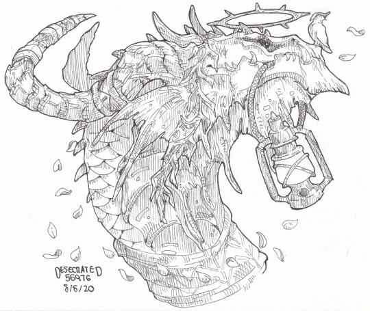
Photo


Smoke Banners that I never posted here, at least, not in the fulll color variety besides the six above.
Please link back to the post if you use them..!
More under the cut!
Keep reading
466 notes
·
View notes
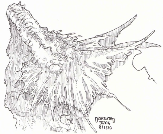
Text
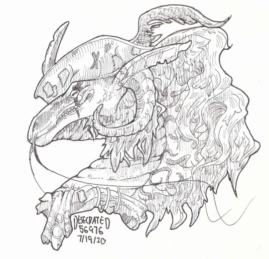
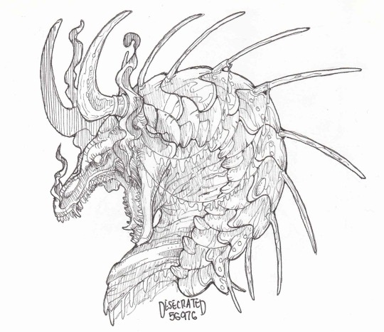
"When my time comes around Lay me gently in the cold dark earth No grave can hold my body down I'll crawl home to her"
Setanta, my beloved <3
------
click for better quality
if you like it, PLEASE REBLOG IT!
173 notes
·
View notes
Text
everyone should be weirder about their ocs more.
47K notes
·
View notes
Text
Tutorial: How I Render Accents
PART 2: COLORS
I usually do not recommend 'pixel hunting' aka going over your work with a fine tooth comb and picking out stray pixels to erase. However, for setting up a proper base layer for accents it is imperative to do so.
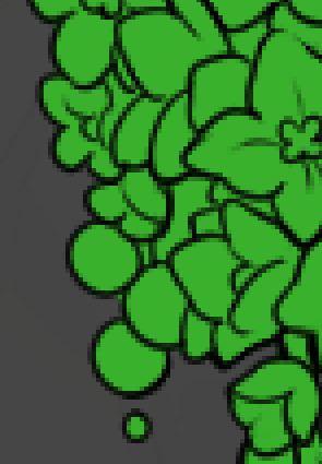
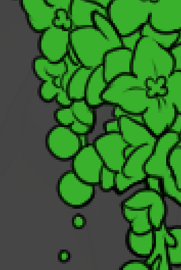
To explain my method of color blocking: I select everything outside of the lines, invert that selection, then fill in. This does a more accurate job than going into each and every section and filling them all in individually, and is also significantly faster. Only downside is small sections like above where you can see bits of the green (which I use bright green against a dark grey background to contrast the base color, lines, and background) poking out, as well as the inner section where it filled in a spot I did not want filled in. Getting all of this right in this stage will make your life easier as you go. (It's also the method I use to color block all my work, even beyond accents)
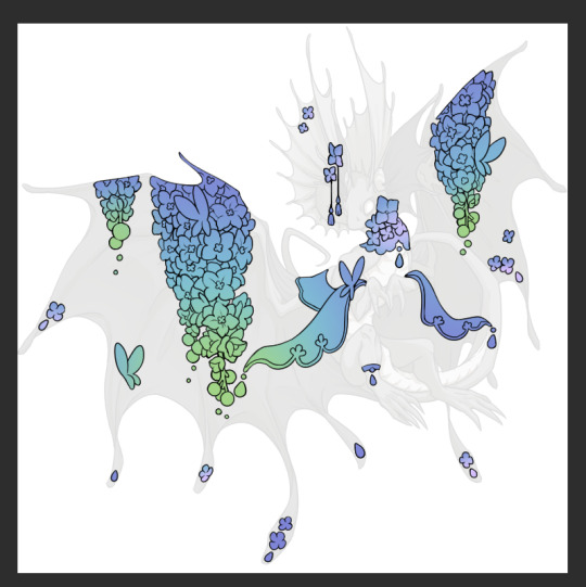
Now this where my style of rendering color may come off intimidating and, tbh it might be. I do gradients first and then I color over them with "normal" blend layers. I typically don't use multiply layers unless I'm shading something that has a lot of textures. If this scares you, it's okay I'll keep walking you through it. Here, my gradient goes from a pastel but deep periwinkle, to a soft more cyan blue, then to a lighter pastel green. Skipping steps and going from the periwinkle to green will give it a different look. There's also hints of a pinkish tone as an accent color.
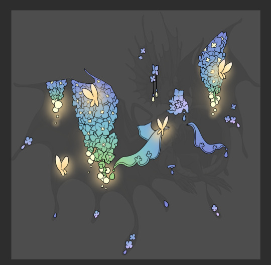
So as I said, these additional layers are done with regular "normal" blend mode layers. I've placed one in between the butterfly line art and the line art for the rest of the flowers, and then an additional layer under everything else. This allows me to create a glow effect specifically around the butterflies, and then specifically under the flowers. Going back and forth with the proper amount of opacity (by using the airbrush transparently) helps to make it glow but not be Too Loud. Also checking it against a dark background can help to check for spots where it spills past the borders, as well as really gauge how Bright it is. I've also color matched the butterflies with the flower pits and the bulbs. This adds extra cohesion and makes them all look uniform but different enough with the gradients.

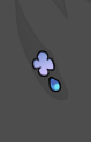

The stages of how I render gems/dew drops. Take the base color, make it a bit darker and less saturated (as well as changing the hue a bit depending on what the default color is. For yellows I go more orange/red, for blues I go more purple or even pink. It depends), add a small drop light at the bottom thats a fairly saturated version of the base color, and then a stark white/ near white highlight. That's it. Don't over complicate it, it will not matter when it gets shrunk down. Note that I do not use multiply/overlay/screen layers for these types of things as it adds too much bulk to the files and doing it manually helps to strengthen your color theory skills.
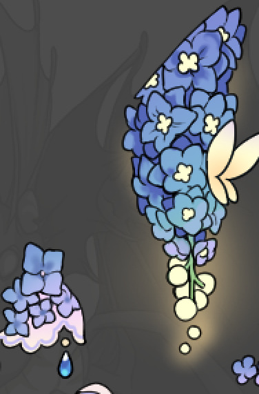
For shading and rendering, again, I create a "normal" layer and simply. Draw over what exists. Color picking and hand blending allow me to create the exact shades and effects that I want that multiply/screen/overlay layers may not be able to achieve. (which isn't to say I dont use them! i just don't use them for the main meat and potato part of my coloring) All of what is shown here is also achieved with the CSP asset SOIPEN (which can be found for free in the asset store)
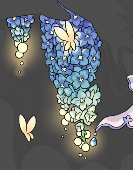

another example. The one on the right is showing how the layer looks without the gradient base layer under it. All of this is rendered by hand. I also specifically put a highlight color around where the butterfly is sitting to give a better illusion that it is properly sitting on the flowers rather than just in front of them.
Next is changing the color of the lines, if needed. A method i'll use is I color just the sections I want (on a separate clipping layer) then lock that layer's alpha setting to them add in a gradient. It's a small and subtle effect that adds more depth without doing a lot of effort. (work smarter not harder)
Now we get to the Polish Layers!
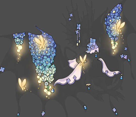
first image is how it looks as a base. second image is with an overlay layer applied. I've used some dark purples and mid tone desaturated greens to push the values a bit further (especially evident on the top left wing) Third image is with a screen layer applied, highlighting the inner most part of the flowers and adding some additional bounce light.
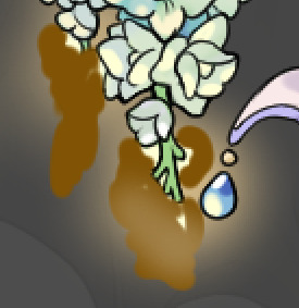
An important thing to note about making accents vs making full coverage skins: OPACITY AND LAYER TYPES MATTER OVER TRANSPARENT SPOTS. What I mean by this is that if you use a soft, light grey to shade with a multiply layer, don't clip it to anything, and have it go outside the lines - that will no longer appear as a 'shadow' when it comes to the final result. Instead you will have a section of soft light grey that is simply laid on top of whatever the image under it is. The same applies for overlay/screen/add layers and so on. If i use a very dark color on a screen layer (to give a soft highlight) and airbrush it over a bunch of stuff and don't clip it, it will end up with this horrible dark splotch over everything that isn't opaque. To this end, mastering normal layers is imperative to having well rendered and convincing accents.
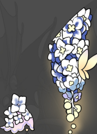
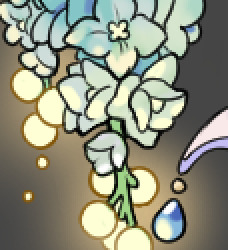
Another thing of note: when it comes to sparkles/small details, note how 'large' the sparkles behind the butterflies are. They seem a bit chunky, yeah?
this is what they look like at proper size. If anything, I could have gone larger on the small metal beads connecting the dew drop jewels to the lace.
Another trick I also like to do is this:

a slight hint of transparency! It's just enough to let the dragon's lines underneath show through but not enough to be super noticable. I like to do this a lot when it comes to sparkly and magical effects.
Next is the worst part of all: destroying all that beautiful hard work with the shadow and line art layers! (sobbing)
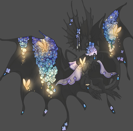
This stage always agonizes me. This is my first pass of the shadow/line layers and let's hope it's dark enough.
But yeah that's a start to finish look at how I create my accents. Unfortunately a lot it devolves into needing to know, yknow, line weight and silhouette importance, color theory and the ways that drawing applications actually apply color to a png vs how its rendered in app. All of these things impact the finesse of the accent, and are things you do have to learn gradually over time, but hopefully this has given yall some additional insight and perhaps some helpful tips.
And this should also explain why I get so mad when people go 'hey can I get this accent in another color' no! no you literally can't!
161 notes
·
View notes
Text
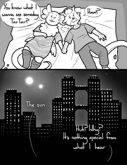
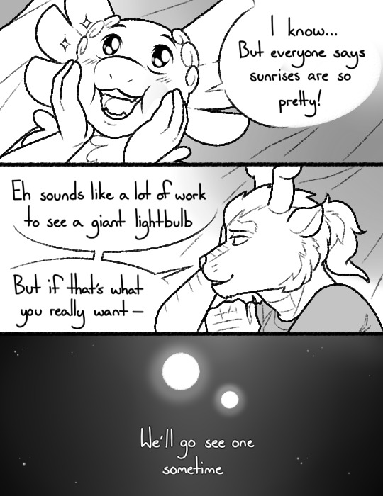
to flow like water~
a finished sketch commission! ♥
250 notes
·
View notes
Text
hot artists don't gatekeep
I've been resource gathering for YEARS so now I am going to share my dragons hoard
Floorplanner. Design and furnish a house for you to use for having a consistent background in your comic or anything! Free, you need an account, easy to use, and you can save multiple houses.
Comparing Heights. Input the heights of characters to see what the different is between them. Great for keeping consistency. Free.
Magma. Draw online with friends in real time. Great for practice or hanging out. Free, paid plan available, account preferred.
Smithsonian Open Access. Loads of free images. Free.
SketchDaily. Lots of pose references, massive library, is set on a timer so you can practice quick figure drawing. Free.
SculptGL. A sculpting tool which I am yet to master, but you should be able to make whatever 3d object you like with it. free.
Pexels. Free stock images. And the search engine is actually pretty good at pulling up what you want.
Figurosity. Great pose references, diverse body types, lots of "how to draw" videos directly on the site, the models are 3d and you can rotate the angle, but you can't make custom poses or edit body proportions. Free, account option, paid plans available.
Line of Action. More drawing references, this one also has a focus on expressions, hands/feet, animals, landscapes. Free.
Animal Photo. You pose a 3d skull model and select an animal species, and they give you a bunch of photo references for that animal at that angle. Super handy. Free.
Height Weight Chart. You ever see an OC listed as having a certain weight but then they look Wildly different than the number suggests? Well here's a site to avoid that! It shows real people at different weights and heights to give you a better idea of what these abstract numbers all look like. Free to use.
331K notes
·
View notes
Text
Old wip of this gurl and this gurl
852 notes
·
View notes
Text
man, the lowkey existential horror of realizing its been so many years (really???) since i've had this blog that theres ppl im following that havent posted in like 7 years. i feel like i might be one of them. lmao.
hi everyone who even remembers i exist, been a while!!
#hi i guess?#wow last time i was here tumblr wasnt... this#what happened lmfao#but im into flight rising again these days so hey ill be around nice to see yall again
6 notes
·
View notes
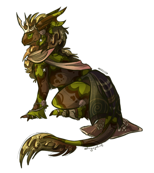
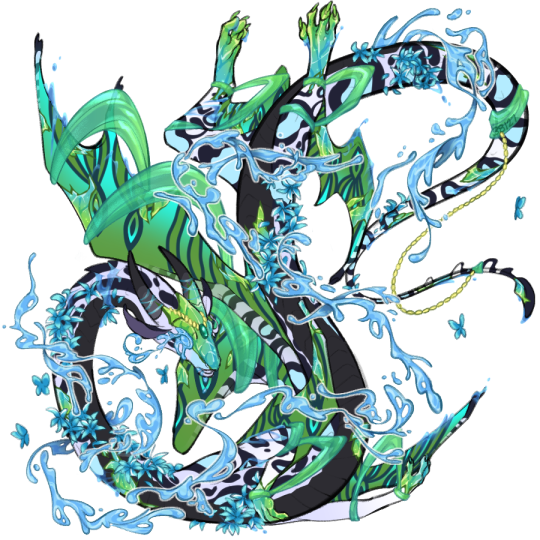
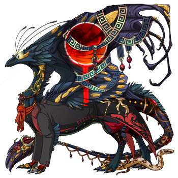
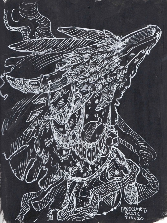
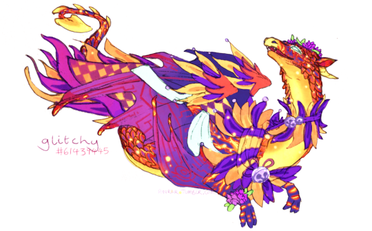
Text

This is one of my favorite pieces in my portfolio. It was a rendered halfbody commission for a user on Flight Rising. It didn't do well on my other platforms because of how busy and bright it is, but maybe it'll do better here.
929 notes
·
View notes
Text


some cheeky april fools achievements for you all :PPPP
810 notes
·
View notes
Text
It's Eclipse Day so I'm legally obligated to share West, who was born during the 2017 one
38 notes
·
View notes
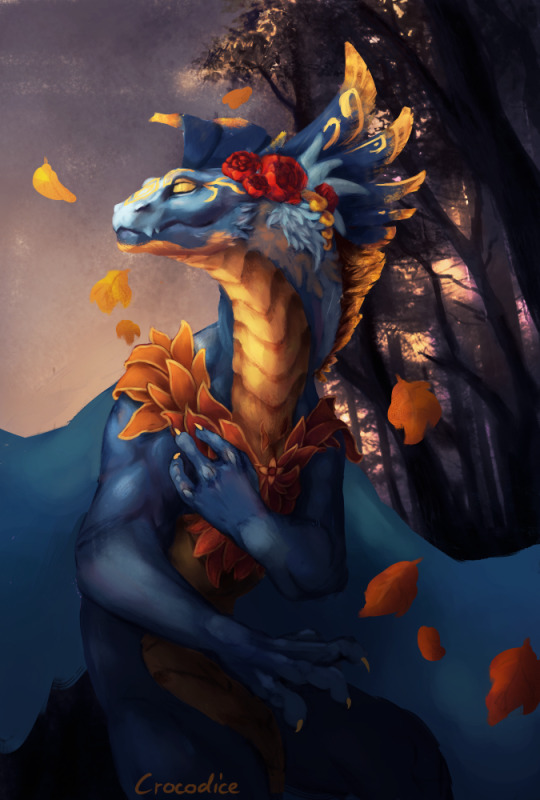
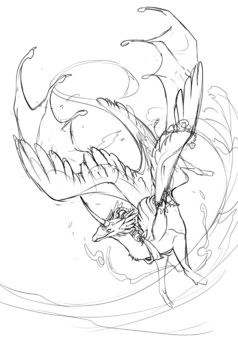
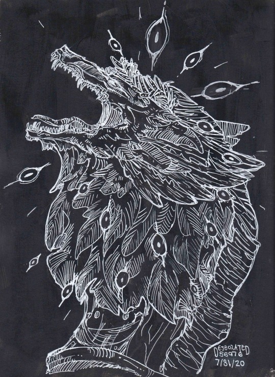
Photo
I tried to draw something outside of my comfort zone and I learned a lot in the process!
For Ithosra (#60390487) in the dtday thread :)
(please excuse the repost! this wasn’t showing up in the tags the first time around)
442 notes
·
View notes
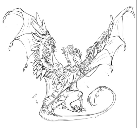
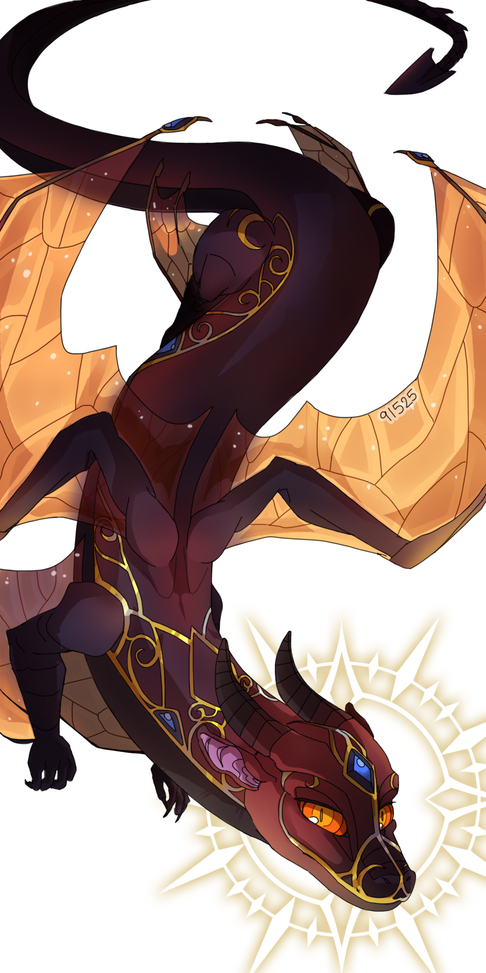
Photo

draw the dragon above you thread #…8?
note to self: work out how complicated the apparel will be before starting
144 notes
·
View notes