
Don't wanna be here? Send us removal request.
Statistics
We looked inside some of the posts by astingad and here's what we found interesting.
Average Info
Notes Per Post
0
Likes Per Post
0
Reblog Per Post
0
Reply Per Post
0
Time Between Posts
20 hours
Number of Posts By Type
Text
17
Last Seen Tumblr Blogs


Fun Fact
Tumblr has 411 employees.
Text
Thoughts on Final Piece (book cover)


When it comes to my book cover design I am very pleased with the end result. especially on the book mock up, the final render looks very professional. I've never been fond of digital work. However this makes me want to create more digital work.
I'm very pleased with the look of the book cover. I particularly like the subtle crinkled paper effect. It helps further emerce the audience, The orange glow of the candle is complemented by the sepia filter. To create the sepia finish I literally played around with the white balance, contrast, brightness etc on my phone settings. This may not have been the most professional way to do this. However in previous projects I have used colour editing on the computer to archive a sepia finish so it's not like I don't understand how to do it properly. I'll explain as to why I didn't add the sepia colour more professionally a bit later.
When photographing my wooden book, I wanted it to have some props mixed In with it to help make it feel more complete. I brought in some props from home. When I came to photographing it I used my iPhone camera, this is mainly due to the speed and convenience.(This is the same reason I aded the sepia finish on my phone) The fact I had to take the photos and edit my image on my phone may indicate that I need to be better at time management.
If I could improve on another thing it would be the white label at the bottom of my book cover. I previously expressed how it draws the attention away from the main image of the cover. I could change the colour of the white label to gold as this would mirror the orange glow of the candle at the top of the cover. This would draw the eye to the centre of the book cover.
0 notes
Text
Thoughts on Final Piece (wooden book)


After many weeks of work I'm finally able to review my work. I'm extremely pleased with everything I've made. My wooden book turned out really good, the only thing I'd change is the binding on the book. I originally planned to make my own naturally cord binding. However I never ended up doing this, instead I opted to use already made cord.
Things I do like about wooden book. The wood grain on both book faces was. complete accident, I sawed in half a piece of an old workbench for my book, it turned out the work wench was comprised of hardwood panels plated in plywood. It was a very welcome surprise when I noticed the hardwood panels. I feel they have much nicer look to them compared to the plywood I was originally going to use for my book.
I'm also very fond of the coffee stained pages in my book. However I defiantly could have done more with them. If I used charcoal, dirt, graphite and used water on the pages to grow mildew. This would have elevated them to the next level. I did get some ink splatters while using the quill, this defiantly helped make the pages look more authentic.
I'm relatively happy with the occult designs in the pages in my book. Most of them feel quite cluttered and uncreative if I'm being honest, that being said there're some pages that I took far more time on and I'm extremely pleased with. What I learned from the is that taking my time, and only having a handful of thoughtfully designed occult illustration is a far better idea. For some reason I felt the need to have lots of different drawings, when actually it would have been a better idea to just focus on a few good ones.
0 notes
Text
Frankenstien Book Covers
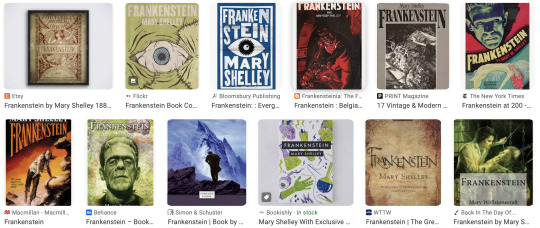


Here are some different Frankenstein book covers. I'm surprised just how much variety there is. Part of this is due to the age of the book an it reaching many different audiences, in order to help this process the book has a large amount of different book covers. for example: The bottom left book cover has a very retro 60's feel to it. Opposed to the top left cover that feels very philosophical and artsy. personally I'm not a fan of this philosophical style of the book. It feels very clinical and boring, a book cover made for the simple purpose of being studied and examined by philosophy students or something to that effect. That being said I understand why it exists.
My favourite Book cover is the bottom right, this if for a few reasons. The book cover is tailored for a very specific individual. This particular book cover is known as the Prometheus (the original name of the Frankenstein book). The book is marketed towards the most devoted of fans, the book has an excellent level of craftsmanship put into it. The clean design and embossed designs further reflect this craftsmanship, its a book for those who appreciate and love the story and want a piece that reflects their passion for Frankenstein.
Someone who simply wants to read the book Frankenstein wouldn't buy this book. It's too expensive and this wouldn't appeal to someone who just wants the read the story of Frankenstien. A better option would be a paperback version of the book with large easy to read text, more importantly its cheap.
0 notes
Text
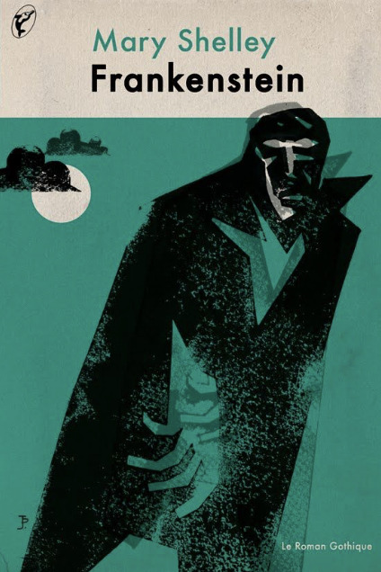
Book Cover Crinkled paper


To further sell the effect of an old photograph or aged book cover, I downloading a crinkled paper effect from google classroom into photoshop. From there I created a new layer and put the crinkled paper effect over my book cover design. By turning down the opacity on the crinkled paper it created a subtle ageing effect. Overall I'm very happy with end result. I wouldn't want to add another crinkled paper effect onto of the already existing one. I feel I would clutter the effect and I would no longer have the rally nice subtle finish.
0 notes
Text
Book cover work sheet

Here I've comprised a little work sheet showing some the elements all used in the making of my book cover.
Elements include:
-different Frankenstein book covers
-crinkled brown paper overlay
-before and after of my book cover
-finished end product
0 notes
Text
Book Cover pt 2


Using the book mock ups Chris posted to Google classroom, I uploaded my book cover design in exactly the same way I did before. to do this I downloaded one of the mock ups from google classroom and uploaded it into photo shop. Next I went into the cover layer and uploaded my book cover design, and just like that I had uploaded my design onto the book mock up.
The end result look very professional in my opinion. If I were to improve upon what I've already done I would deign the back and spine of my book cover. To create the back of my book cover I would use images of the pages from my wooden book. using the same sepia and dark tones to insure the book cover would feel cohesive.
If I want to improve my book with very little effort I can change the colour of the white label where the authors name currently is. This would draw the focal point of the book cover back to the middle. Opposed to the bottom of the book where the white label currently is.
0 notes
Text
Book Cover Mock pt 1


Starting the process of creating my book cover, I started by selecting my book cover photo and adding it to an A4 size photoshop document (this would later have to be resized). Next I made the background black, this was an easy enough process. Using the Brush tool it only took a few seconds to make the background black.
To get the font for my book I went to: (Dafont.com), from there I downloaded a Halloween themed font as I wanted to lean more into the spooky side of my book. After downloading the font and some fiddling around I was able get the Halloween font onto my book cover. However once it was on the book I actually feel it cheapened the overall feel. After seeking some advice from Kystie, it was suggested that I instead use a more formal font rather than using the Halloween style font. The playful Halloween font would work better of a children's book (similar t the ones I reviewed).
Employing the help of Kystie she helped me redesign my book. starting by reorienting my photo on the book cover. Reorienting my photo allowed for the photo to cover more of the book, This helped helped make it feel more blended into the rest of my book cover.
Next I added the text to my cover. Picking a more modern feeling font for my title. ( this was suggested by Kystie) Also adding: "The Legacy" below the main tile. This implies it's a modern extension to the original Frankenstein book. This also compliments the modern style font. I like this because it ties into my main project better. There was never an occult book in the original Frankenstein book. But perhaps in my revised version the Occult book plays a critical role in the story.
Next I added the authors name at the bottom of the cover, I thought it'd also be a good idea to have a little label icon to put Mary Shelly (the author) onto. This would help distinguish/separate different parts of the book making it clearer to read. With the help of Kirstie we simply downloaded a label icon into photoshop and use this. Overall it create a very professional effect. My only issue with the label is that it's bright white. This instantly takes the attention away from the main image of the book cover. It may be a better idea to change the label to a gold colour, as this is more subtle and would mimic the candle light on the top of the book cover. Having two golden/orange colours on ether end of the cover would draw the eye to the centre of the book, this is much preferred compared to the current situation where the attention is immediately taken to the bottom where the white label is.
0 notes
Text
Book Cover Inspiration


These two book covers are similar to what I want my final book cover to look like. I want my picture and then text in-front of it. I also want to experiment with Halloween themed text for my book. From what I understand I have to base my book off an existing 19th century book, for this I'll choose Frankenstein as its the most similar as to what atmosphere I want to create, likewise Dracula could be a very good alternative.
When I say I want to use Halloween style text for my book cover, I use this term loosely. I don't want the over the top bright orange Halloween font. However I do want something similar to this. The only way is to experiment and find a text/font that works for me.
I now feel I'm ready to start experimenting on photoshop with different designs.
0 notes
Text
Book cover Mocks


Here are two book cover designs, I have a sepia finish and black and white version. Out of the two my favourite is immediately the sepia one. I love the atmosphere and emotions it evokes, it makes me think of Halloween and all things spooky (I feel this is largely due to the brown and orange hues). I'd like to take my book cover in a more
On the other hand the black and white version feels rather washed out compared to the sepia finish. It has a colder more distant feel compared to the sepia version. I have already explained why I prefer the warmer tones of the sepia. However this is made even more present when compared with the black and white. I can undoubtedly say that I want my photo to have a sepia finish.
Something to consider is how I'm going to incorporate my book cover design into the book. The landscape style photos I have won't work, as books are 99% of the time have a portrait shape. I may have to pick a different image, the photos above are only there as an example of what the two different colours look like, those being: (sepia and black&white).
It is possible that I keep the sepia photo above as my final book cover, instead of having the photo cover the entirety of the book. I could have it only cover a portion of the book instead. I'll create some trials on photoshop and see what my favourite are.
0 notes
Text
Book Cover Colour Ideas


When it comes to my book cover colour I have a few ideas. My personal feeling is that a sepia finish would work best. This is because black and white feels too washed out in my opinion, I feel I would lose the emotion and character of the book cover. Especially since some of the darker photos are lighten by the candle light. By making my photo black and white I'm concerned it may take away from the atmospheric orange glow of the candle. On the other hand, by making my cover sepia I'll be able to keep the warm glow of the candle.
0 notes
Text
Photographing Book Cover


In preparation for making my book cover, I decided it'd be a good idea to photograph my book in an atmospheric setting and use it as my book cover. By bringing in some curiosities from home I was able to create a convincing set. I tried various camera angles and lighting, but these are my favourite.
when it came to creating the darker more atmospheric shots, I archived this by turning out the lights and setting up a backdrop with my hoodie to block the light. this resulted in a more moody photo, the candle is crucial as its what creates the atmosphere.
For my other photos I shot them with the lights on. these defiantly don't have the same atmosphere. However if made them black and white I imagine they could create a rather nice end result. Or maybe even better would be a sepia finish.
While I was photographing everything I tried capturing the smoke from my incense burner. I personally feel this is one of the best photos and could easily be the cover to my book. Maybe I could play around with different sepia and black and white finishes.
0 notes
Text
Book Page Designs Pt 2


These are my favourite pages I have made. The bottom right is my favourite. I feel I have captured a good level of detail and contrast. I based it off of the Hindu Shacra guid.
I drew and rough evolution tree, I thought this was fitting as my book revolves heavily around Darwin. All of my early drawings are very rough and undetaled, I tried in later drawings to add more detail and this helped created the feel of multiple different authors.
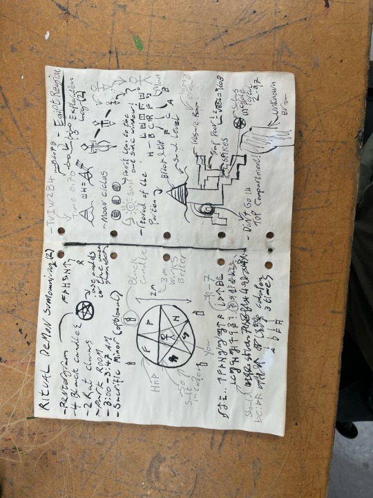
For another one of my pages a wrote out instructions for a Skin Walker summoning ritual, the instructions I wrote were all made up. I also added some illustrations of what the necessary materials look like. some of these included: a lighter, white sage bundle, pentagram and secluded area in the forrest. Improving on this I could add an illustration of what the Skin Walker looks like. Overall I'm happy with this page.
a common theme with my pages is that they can look rather chaotic, this is both a good and bad thing. To try and remedy this I’ve started doing more detailed work.
0 notes
Text
Book Page Designs Pt 1


Here are some more drawings I made in my book, I wanted to focus on more refined detail. I wrote down a list of made up magic ritual instructions. I made sure to add some made up letters, as well as some nordic runes as they add an extra layer of occult mystery. On my next few pages I tried adding more illustrations along with the instructions. This is because if I just have writing and no drawing it can become very hard to determine what the writing is about without reading the text. I found having a balance between occult drawings, runes and writing is important. Too much of any and it becomes unclear what the page is about.
Im a really big fan of the ink and quill I used for a majority of these pages, it gives a far more realistic effect and if I were to age and weather the paper the ink would stay the same shade. opposed to biro pen that turns blue as it's weathered.
0 notes
Text
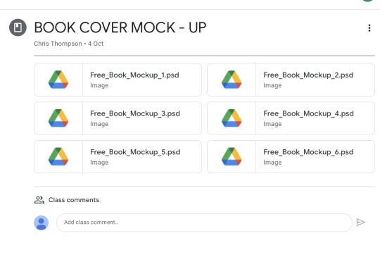
Book Cover Mock Up


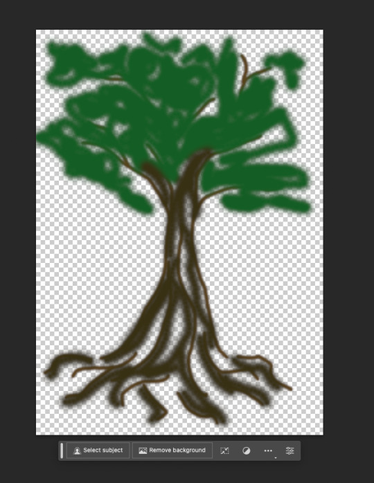

This week I had to create a mock up book cover. To do this I went into google classroom and selected one of the six free mock ups. Next I download the free mock up and uploaded it into Photoshop. It came with pre downloaded layers, in theses layers one is named "cover". By clicking on this layer it takes you to the cover of the book, from this point I was able to delete the old cover and replace it with my own design. I drew a very simple tree design as a proof of concept. Once I finished my tree, I saved it and the design automatically went onto the book. The end result worked rather well.
For my actual book cover I plan to take a cinematic photo of my book. I will then upload the photo onto photoshop and add it the the book, from there I'll simply need to add some basic text and It'll be done.
0 notes
Text
Nick Tesla Blueprint Designs


I wanted some more technical and mechanical looking drawings in my book. I looked at some old Nick Tesla designs. I drew my own versions of these. I tried drawing mechanical looking designs and diagnostics. It's difficult trying to find a balance between adding too little and too much detail. Too much and t can feel cluttered and messy t look at.
Overall I feel I was able to archive a nice balance, for my other page I drew a more mathematical
0 notes
Text
First Book Page Designs


Begging the process of designing the pages in my book, I started by drawing some rough sketches of cool occult designs I liked. I then translated my designs into my book.
Throughout this process Pinterest was my best friend. The amount of awesome occult drawings is fantastic. I wanted my book to go in many different directions, I started by drawing more occult and paranormal designs. However for my other page in my book I drew a more conspiracy themed page.
In the future I want to experiment with different designs in my book. I would like to have some nick tesla and leonardo davinchi inspired pages.
0 notes
Text
Old Books vs New books


The older design of book cover has a really nice balance of simplicity and detail. The detailing/texturing on the cats fur has an immense level of realism. comparing this to the rest of the book cover, its clear that the cat has the most effort put into it, this may be because the cat is the focus of the book. The mice, pineapple and plant pot are all very basic designs an colours. Colour is another thing to mention, the colours used in the older book cover are far more drab and simple. The only colours used are: black, red, yellow, green and white. This is mostly dew to the inks they would have had available at this time, not to mention the printing process couldn't only allow for complex designs and colours.
0 notes