
Don't wanna be here? Send us removal request.
Statistics
We looked inside some of the posts by awesomecatedesign and here's what we found interesting.
Average Info
Notes Per Post
15
Likes Per Post
14
Reblog Per Post
1
Reply Per Post
0
Time Between Posts
5 days
Number of Posts By Type
Text
17
Last Seen Tumblr Blogs


Fun Fact
Tumblr.com is the 103rd most visited website in the world.
Text
Tweaked Manifesto
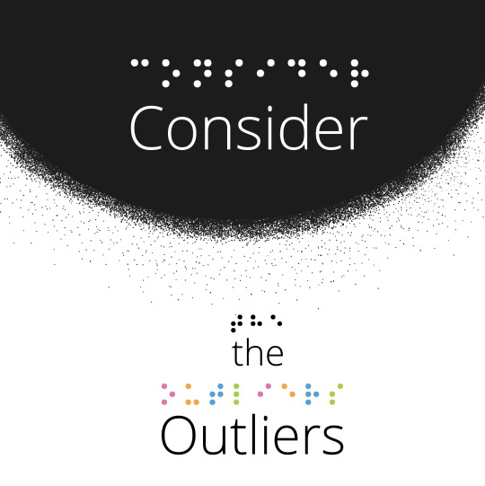
I changed the positioning of the and outliers. I moved both closer to the black space above them. I optically aligned the O with the pink braille. I fixed some of the spacing around the braille as well. I added more space between the leading of the and outliers.

0 notes
Text
Blog Post 12 (Manifesto)
Type Constraint: Reverse Type + Colour
I thought of the phrase consider the outliers because accessibility is about remembering the smaller groups in your audience who require extra help to understand designs. I experimented with different ways people read and how I could visually express them. That's why I decided to include the braille that says the same thing that is written on my manifesto statement. I also wanted to include the idea of a crowd from above. Then I purposefully wanted the word outliers to visually not be placed in association with that crowd because they don't fit in with the majority. That's where I got the idea to use reverse type and put a word within a suggested crowd of people. As you move away from that circle the people disperse till you get to the braille. I wanted to use colour to show the people's diversity. Each coloured dot in the braille represents the diverse abilities every person has. I used a stipple brush to create the faded dotted pattern around the black circle. I did have a bit of trouble properly lining things up to the circle so that the pattern looked gradual. To include the braille, I found a very helpful website where I could type this statement in and then the website gave me the braille version. However I found I couldn't put the braille into a text box, which I thought was kind of confusing considering braille is a way of reading. Instead, I had to place a screenshot and live trace the screenshot the braille for this image. With this manifesto statement, I didn't choose the type till I had finished figuring out the braille and the black circle with the faded stipple brush add-on. My previous manifesto statements were all executed by first finding a font and then evolving the design to the final image. I created this manifesto backwards because I found the myriad Pro very similar to the font feeling that I was looking for. Myriad Pro works well enough to leave the font choice till near the end process. The font I did choose is a little slimmer, the x-height is higher and the letters are a bit more square and distinctive. This font also has slightly taller counters making the letterforms better for legibility because they won't have rotational problems in every direction like very geometric fonts can. I wanted this font be very easily readable and legible. I'm really happy with how this manifesto turned out.
0 notes
Text
Blog Post 11 (Summary)
Accessibility is crucial for the elderly population. Often the elderly population face difficulties seeing, hearing and standing. I think it's really important to honour that we all will eventually face our deteriorating bodies as we get older. As designers today, I think it's a brilliant idea to make sure that people can read and understand our design work or use designed products regardless of their age. The idea that people would stop using canes, walkers or scooters to help with their mobility issues because these devices were ugly is astonishing. Yet, I know society does have a negativity towards getting old. This societal construct has woven its way into the poor visual design of canes, walkers and scooters. This ideology really doesn't help anyone. I often find that I can learn a lot from my grandparents if I decide to truly listen to them. I absolutely love the idea that when a designer uses accessible design and helps the elderly; the designer is in fact helping everyone.
I was shocked that something as important as a voters ballot was designed so poorly. It's incredible to see how important design is when people don't understand who they're voting for because of terrible layout. This voting ballot really shows how important visual communication is. This makes me think about the question of why the public doesn't understand how crucial design is to live in a functioning society. I hope as I grow older more and more people understand the importance of good design in the multitude of ways design impacts our life. Something like a voters ballot is so important for clear communication. This article really left me wondering how do designers make the public understand something that the public take for granted? Because I find the only time there's a design problem and people notice, is when something has gone terribly wrong. A call to action to spread awareness about the important work designers do is a difficult challenge. But spreading awareness about the importance of design is the first step to avoiding catastrophic decisions being made without people knowing who they are voting for.
For accessible design, I had not considered how important using simple language is. When creating accessible design, the best practice is to avoid jargon, homonyms, heteronyms and other complex structures. The article made an important point about making sure your audience will understand any pop-culture references or words with multiple definitions. When choosing a font to use accessibility, there are a lot of different factors to consider. Some of these factors include x-height, aperture, counter forms, weight and stroke contrast. Although these variables are a lot to consider, being able to read something clearly is arguably the most important part of type design. I appreciate mentioning avoiding fonts with letters that look identical to each other and letters that can flip around and look identical. These issues are very infuriating when I'm trying to read. If I don't have to read something I will likely stop reading when I come across these problems. Readability is more important for longer blocks of text whereas legibility is more important for short text. Overall, choosing a font for accessibility is a difficult task and will come down to where this font is being read in its unique situation.
Takeaways
1. Consider outliers, help everyone
2. Engage all ages and abilities
3. Make accessible design regardless of age
4.Visually communicate to all ages and abilities
5. Reading is hard, choose type wisely
6. Create designs your whole family can understand
My real-world accessibility design problem is two bags of cat food that look almost identical. (See the images below) The problem is one bag of cat food is a specific indoor formula with chickpeas and salmon. Whereas, the other bag of cat food is green peas and salmon and not specific to indoor cats. I would change the bags main colour. The indoor cat formula used to be a bright orange. I would change the back to a bright orange colour to easily distinguish between these cat food bags.


1 note
·
View note
Text
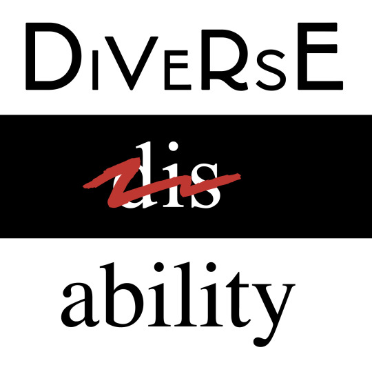
Tweaked Manifesto
These changes really make a big difference! I changed the alignment so that dis and ability were properly aligned in the center. I fixed the kerning between the letters i + l and t + y in the word ability to give them more breathing space.
1 note
·
View note
Text
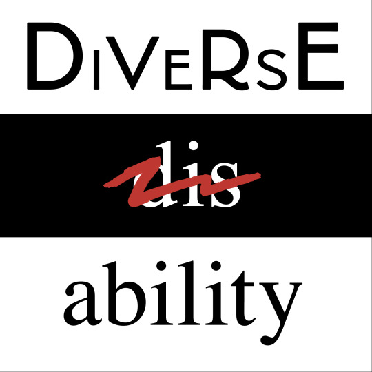
Blog Post 10 (Manifesto)
Type Constraint: 5. Combine Reverse Type and Positive Type
This week I focused on a manifesto that is very important and personal to me. Disability is currently the accepted word people use to label themselves if they have some physical, mental, sensory or cognitive impairment that hinders their ability to complete everyday tasks. The word disability itself has extremely negative connotations. If a person has a disability, it does not mean that person is at a disadvantage. Although the word itself makes some people believe the statement to be true. People with disabilities often face unique challenges and become stronger because they must face these unique challenges and find their own ways to work through the struggles they face. In recent years, diverse ability has been used to replace the word disability. I would absolutely love to see the word diversability used in all circumstances. I would happily enjoy never having to associate myself with having a DISability ever again. Diversability is simply a more beautiful, open and neutral word to explain how people diversely function in life. While making this manifesto, I knew I wanted the word dis or disability scratched out. However, finding the right brushstroke definitely took a while. I ended up downloading a free set of illustrator brushes and using one that looked like a marker. I specifically decided to use Times new Roman as my font for the word disability. I chose this font because almost every novel you read is using Times new Roman. For me personally, Times new Roman has strong academic intentions and purposes. Times new Roman is traditional and comfortable. This connection between disability as the common word to describe a certain group of people and the Times new Roman font in almost every book I found very fitting. Especially when considering because of my dyslexia, Times new Roman has often caused me problems. With the word diverse, I changed around the point sizes of the capital letters to further the diversity within the word. The font itself also has little unique quirks with each letter form that speak towards accepting, openness and diversity. This composition took a while to evolve. At first, I had the black bar at the top with the word dis. In the end, I realized that the black bar in the middle reads a lot easier. I really enjoy how boldly the black, white and red combine to really pack a punch. I find the dark background on the word dis adds the negative connotation of the word without actually saying anything. I really enjoyed making this manifesto!
1 note
·
View note
Text
Blog Post 9 (Summary)
The two RDG accessibility projects that struck me as really powerful were the guide dog advertisement and the masks that help people read lips. The simple illustrations and limited colour palette helps the accessible design for the guide dog advertisement. The masks made with clear plastic help people who are hard of hearing read lips even when someone's wearing a mask. These projects are really inspiring that people decided to fix these problems and make the solutions inclusive and accessible. The pill bottle redesign was absolutely genius. I found the overall layout much more beneficial to the user and simplified for minimal confusion. I like the addition of differentiating by coloured containers the pills for each person in the same household.
A study contracted addressed the problems with designer and client communication about visual accessibility. Accessibility is important because users need to understand the information given to them. This study decided to focus on visual accessibility for print design. Unfortunately, tools for visual accessibility and print design are widely underused industry. Often, clients don't express the need for visual accessibility or they assume designers will automatically incorporate visual accessibility in their designs. The study resulted in finding both graphic designers and clients care about visual accessibility. People considered visual accessibility in half of the projects. The majority of people used personal judgment and relied on design guidelines to judge whether visual accessibility should be considered. A few people relied on either the client or the designer to figure out visual accessibility. Often visual accessibility is not taken into account due to time and cost restraints. Talking about the problems with visual accessibility between graphic designers and clients will improve graphic designs visual accessibility for everyone!
Accessibility works best as a core part of planning in graphic design. To help clients understand the importance of accessible design, explain that almost every person will experience a disability at some point in their lives and accessible design will reach a wider client audience. There are also legal requirements for accessible design. Clients will expand their potential client base and more effectively communicate to their entire audience. A company's efforts to increase accessibility shows their audience the company is socially responsible. If the client's time or budget cannot allow a fully accessible design, propose a realistic option to address the most important and necessary accessibility issues. Let clients know if certain design requests will propose a problem with accessibility. Accessibility can cause constraints to designs but this still creates cool results. Educating your client on the ongoing ability to improve accessibility is crucial to encourage its growth in the design industry.
Take Aways
Assess access
Diversability not disability
Seek to help all people understand
Use accessible design constraints make designs amazing
Design for everyone’s ability
Accessibility is very important to me especially concerning legible typography because I have trouble reading. Simple clear letters make reading a lot easier. Usually, I completely skip over content if the font is too confusing. I don't want to give myself a headache. In the image below are some bad fonts that would not want to read in any practical scenario.

1 note
·
View note
Text
Tweaked Manifesto
I changed the font to a simpler handwritten sans serif. This adds more contrast to the illustration and type. I added colour to the two rebuses to make the illustrations pop. I changed the positions of all the elements in the composition. I love how this manifesto turned out!

2 notes
·
View notes
Text
Blog Post 8 (Manifesto)
Type Constraint: Rebus +Type
I decided to create a new takeaway statement for this week. I chose the statement love yourself others and the earth. This statement came from the discussion with Lisa Hemingway from backyard creative. She talked about how important self-care is. Self-care is definitely something I'm still working on. This takeaway statement really embodies my values. I believe it's very important to be kind to yourself, others and the planet. While creating this design, I used the noun project to help me find the correct icons for my rebuses. At first, using the noun project was a little confusing because I started downloading the wrong files. I realized it's better to download the SVG file instead of PNG file. The PNG file is rasterized and cannot be scaled to larger sizes. I struggled at first with positioning the heart icon and the words yourself others & around the earth icon. What really helped bring my design together is using the type on a path tool. I slightly curved the word yourself and others & so they replicated the earth icons shape. This little detailed really created a more unified piece. I struggled to find the correct glyph for the Y in the word yourself. Luckily, the font I was using had several different glyphs to choose from, so I was able to find a better fit for the capital Y. I wasn't sure if the heart icon was going to bleed off the page or stay contained within the page. This took me a while to figure out. I also kept running into the issue of the heart feeling too detached from the content when the heart icon was straight up and down. When I put the heart icon on a slant, the hearts bottom point points towards the earth which more thoroughly integrated the heart into the whole composition. Overall, I really enjoyed using the rebuses in the composition!

0 notes
Text
Blog Post 7 (Summary)
Eco-design evaluates the environmental impact of the product system or service. Eco-design evaluate designs based on the following categories: waste, material and energy. Cradle-to-grave refers to considering a design and the environmental impacts from the time it's created to the time in the landfill. This comes from a linear economy. Whereas, a circular economy uses the cradle to cradle principal which eliminates product waste by being able to make the product continuously over and over again. Lifecycle analysis helps designers evaluate the places in the five's product life stages where environmental impacts can be reduced. These stages include preproduction, production, distribution, utilization and disposal. Conducting lifecycle analysis on a product is a time-consuming and expensive endeavour that will require not just one designer in most cases. As designers, we should keep in mind that certain areas of the lifecycle analysis are difficult for us to change for more environmentally friendly choices. Products have a specific cycle that includes four stages: introduction, early, mature and late stage. In the production of products the designer is not necessarily control in control of this cycle. Our responsibilities lie with a product being designed, sold and then discontinued. We have to take on all the impacts of that product in each stage.
Both products and the process have equal impacts on the environment. What we create as designers reflects how we think. Each object we possess represents our values. The process of understanding sustainability and design can happen one step at a time. Sustainability practices will slowly become the new standard. So if we don't learn this now will be left behind in the future. I think one of the most important steps in starting a more sustainable design project is to have a written strategy about addressing the issues within the triple bottom line. We all have the ability to make an extraordinary changes in the world. Sustainability can that amazing change. Design at its core is about strategy for results and sustainability. Accessibility and appropriate cultural understanding is crucial to the triple bottom line and design. The most important things to remember are now is the time to design sustainably. As designers, we should make our designs lead towards positive change for a more powerful sustainable solution. Each of us has a role to make the world a better place together. Each of us can create a brighter future.
Take Aways:
We chose whether products will punch or hug the earth
Design with the ground in mind
Our possessions show our values
Get uncomfortable and make changes
Make your mark in peoples minds
Begin changing today
The first step forward is the hardest

The image is Noissue’s paper stickers that are created with soy inks, FSC Certified paper and acid free processes. This alternative to stickers seems like a cool place to start if someone is designing stickers sustainably!
1 note
·
View note
Text
Tweaked Manifesto 3
I changed a lot with this tweaked manifesto. The image of tree rings is way more readable as a background image. The type has been rewritten more clearly and concisely with a double meaning. This is so awesome! I am really glad I used the great feedback I received because this is my favourite manifesto I have created so far!

#simply#sustainability#sustain#sustainable#sustainableart#simplesustainable#treering#treerings#treeart#tree#natural#naturaltexture
1 note
·
View note
Text
Blog Post 6 (Manifesto)
I used the type constraint Black and White + Texture.
This week, I noticed how the objects simple designs in the Rams documentary were beautiful. The simplicity aimed to create a calming energy. This calming energy is quite lacking in our modern day. The exact opposite of simplicity is extremely prevalent within the constant bombardment of social media and advertisements. I believe the object simplicity helps our mental health and the earth. When designing simply, we create designs that honour our planet's finite resources. We only use what we need to make our designs. This idea is so crucial moving forward to sustain our planet. Another idea to consider is evaluating a designs lifecycle using simplicity. Because if you simplify your materials, understanding your design lifecycle will be easier. I really wanted to emphasize the manifestos simplicity. Adding so much negative space to this manifesto was a little daunting but intentional to get my point across. I was thrilled that simple and sustainable were able to use the same letter to reinforce their similarities. The difficulty part about this manifesto was finding the correct image to insert into the word sustainable. I had to find the correct balance between a good amount of texture, legibility, and contrast. I used a different photo for the large S then the remaining word sustainable. I did this because the large S was able to retain more detail while still being legible. Whereas for the remaining letters, the type lacked good contrast to the background. Instead, I changed that same photo several ways in Photoshop. I found an image with detail and a lighter shade for increased contrast. This image fits really well with sustainability because the image emphasizes that trees live hundreds and hundreds of years. Each fine ring creating this texture represents an entire year of tree growth! I find trees remind me how truly important sustainability is. Trees are a living plant and resource that humans definitely take more than they can regenerate. By designing simply, we can encourage a good design process and healthy home.

0 notes
Text
Blog Post 5 (Summary)
Dieter Rams 10 Principles of Design are amazing. He believes good design means being a good person with the power you have influencing people through design. Good design requires you to be honest, eco-friendly, practical, simple and useful. I agree with these values in this work.
Systems thinking is essentially remembering that everything is connected to everything. This idea includes people, animals, the earth and elements. I've find it interesting that when they mention this natural network, they assume that the designers don't understand the biology behind this reasoning. However, with my experience growing up with two biologist parents, I often notice again and again how interconnected the natural world is. Systems thinking applied to design is to dig deeper and ask questions that not only address the actual design but the bigger impact both socially and environmentally. As designers, we must recognize our impacts when creating products from natural resources because these resources are finite. The paper industry has problems with negative impacts on biodiversity, global warming, deforestation and flawed reforestation. The digital world also exploits resources in terms of energy. Fortunately beneficial certifications to help choose more eco-friendly paper and sustainable energy website host data servers are available options. Taking the current inverted pyramid design process shape and changing this visual to a interwoven sphere is beautiful example of biomimicry in design.
Connecting design problems to intended audiences create better understanding of peoples deeper motivations and connections. The sustainable design process and asking questions will take time. But designers hold responsibility to the people and planet impacted by our design decisions. We must openly accept the processes imperfection doing what we can to help the biosphere. A variety of people should critique designs. We should look at design problems within both small-scale and large-scale impacts. This approach helps the designer make positively impacting designs. Our biological systems use the idea that waste equals food. Taking into account the designs lifecycle means asking questions about the materials, transportation and company values. Paying attention to ethical workplace standards at those companies is also important. Collaborating with other people who have expertise on eco-friendly options for printing, energy usage and any other topic is a great way to learn more about sustainable options. This action reinforces demand for sustainable options and helps build community around sustainable choices. How can I create the greatest positive impact while satisfying the client? This question states exactly how I plan to work in my design career.
The whole world is connected to how you act. Compromises will be made with my sustainable design choices if necessary. Sustainable choices are not going to be simple or easy. I know I care whole awful lot for our home. I’m ready to take on this challenge.
Take Aways:
Be the change
Be honest, don’t exploit
simple design protects our home
create for good
Care for the earth and the earth will care for you
simple is sustainable
ask uncomfortable questions
valuable work means working with your values
The image below is an instagram post from little fox design studio. This green graphic design studio has amazing information about sustainable design! The old growth forests of BC are so important for storing carbon, cleaning air and increasing biodiversity. As designers, we can choose paper stocks that protect these old growth forests to help the earth and our own health. We rely on these trees all the time to breathe!

0 notes
Text
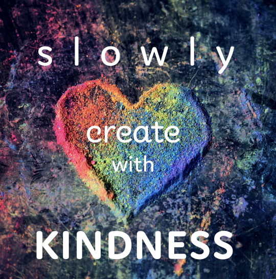
Tweaked Manifesto 2
I decided to change my font for the word create to increase the contrast a lot more than my original manifesto. The word slowly was taken down quite a bit in point size but still spaced out in tracking enough to actually read slowly. The word with changed places. This let the word create and the heart shine happily on their own. The vertical alignment of kindness and with mirrors the heart shape in the photo.

3 notes
·
View notes
Text
Blog Post 4 Manifesto 2
My Type Constraint Recipe:
7. Type + Image
I was struck in this weeks reading by the honesty about how much time creating beneficial design for the people and planet takes. I know asking questions about sustainability and ethics can cause a lot of overwhelming feelings and uncomfortable problems. This uncomfortable situation is necessary if designers want to truly make a difference in the industry. This got me thinking about how designers and artists usually see the finished product and we don't know anything about the process of how an artist made artwork on Instagram for example. As artists, I have realized how easy someone else's work can look and inhibit myself from understanding actual effort the artwork took. We compare ourselves assuming someone else can create visuals in record time. This idea can be detrimental to your own art process. Slowly creating art is the best method I found to use in creating any design work. This means I take breaks and respect my body and my mind while creating art. I don't do this all the time because I'm not perfect. But I try to remember to work with these values in mind most times. I hope this manifesto can be a reminder that taking your time to create a single piece of artwork is worth the effort. Accepting that you won't get something done immediately is important too. There is no quick way to make a magnificent artwork. We will not see results or even improvement immediately. In the end, as designers we must choose to step into the uncomfortable places and show clients that it's okay to exist in an uncomfortable place. Because in that uncomfortable place, amazing amounts of progress can happen. Making this piece, I decided I want to emphasize the word slowly by increasing the tracking a lot. I wanted the word create to have a sort of curly, quirky and semi handwritten written vibe. I wanted the word create to feel creative in its overall shape. Then, the word kindness is bold, simple and friendly but still loud in an unapologetic and calm but firm way. The heart shape I had decided on using pretty early on in my thumbnails. I was able to find this photo on Unsplash. I found the colourful rainbow colours fits the joyful feeling of creating slowly and intentionally art from the heart.
1 note
·
View note
Text
Blog Post 3 (Summary)
The design industry often makes designers feel uncomfortable with their work. The industry often can produce a solution without understanding the problems responsibility. Some companies on the surface look ethical and sustainable, but behind the scenes possess different values. Most designers cannot find a completely good company to work for because companies are not perfect. The debate exists for whether designers or companies are at fault for unethical, inaccessible or unsustainable practices. Some people think that big companies have trouble keeping ethical and gaining financially. Nothing exists in isolation, both designers and organizations create real impacts and consequences. Ethical conscious design studios exist, but they don’t exist everywhere. Luckily, options to volunteer design work for worthy organizations are available.
Designers are becoming more climate change conscious. Some reacted by designing sustainably. Climate change will affect people, the environment and the economy. This is more commonly known as the triple bottom line. Quality designs make companies look trustworthy to their clients. This responsibility means designers choose what organizations are worthy of peoples trust. Package designers need to pick out sustainable materials. If not, some materials cause hazardous leachate. Designers have to consider the goods transportation, water usage and ethical logging practices for people and the planet. The current packaging system persuades us to consume and dispose of products resulting in a garbage-filled biosphere. Packaging proves both costly for clients, consumers and manufacturers. Furthermore, graphic design work can encourage economic inequality if products are higher in price due to costly materials. Major problems occur when certain people can’t access basic needs. The triple bottom line are interconnected. If one is affected the others are affected also. Clients may refuse to spend time and money for a sustainable outcome. If we question our designs to help the earth and people, then our designs will re nourish and reinforce the ideas we want to see in our world.
Design can exploit people to sell products in many ways. For example, women's bodies are used to make these products look like you'll get a girlfriend. These advertisements range from painfully obvious to extremely subtle. The problem is most are generally negative on women's self-esteem and body image. These designs reflects societies accepting women objectification. Really, it's quite gross. Children also were exploited in advertising to buy cigarettes and fast food. Unfortunately, ads in other places such as Lebanon visually represent success with western culture. Children in Lebanon grow up feeling less than other people, which is horrendous. Design should aim to highlight the product’s benefits and not rely on people's insecurities and weaknesses to sell. Consumerism in advertising makes people want to buy more instead of accepting and enjoying what we have. As designers, we have a responsibility to the environment to discourage humans product overconsumption. The hopeful future vision is to use visual messages promoting healthy behaviours and metaphors reinforcing them in society.
Take aways:
Visual representation matters.
Compassionate design encourages smiles.
Celebrate human uniqueness.
Take time to create with kindness.
Let ideas grow from love.
Ignore advertising, You Are Beautiful!
Stand up for your values!
The image below is an example of a barbie doll toy marketed for young girls on the left. Beside the toy is an accurate representation of a women’s anatomy as a barbie doll. The difference is massive. No wonder most women and girls are insecure about their bodies at least once in their life. Why do we accept these absolutely unreasonable body standards? I know I will avoid working for any design company that uses any inaccurate anatomy or objectifies women's bodies to sell products.

1 note
·
View note
Text
Blog Post 2.5 Revised Manifesto
I tweaked the orientation of the words our and create to center align. The center alignment gives the manifesto statement a more balanced and straightforward feeling which works well with my manifesto. I also made the word choices smaller to add more contrast to the word change. I allowed more white space around the first three words in the manifesto. This manifestos message visually is expressing a clear and intentional idea.

1 note
·
View note
Text
Blog Post 2 (Manifesto)
I choose to use the manifesto statement: Our choices create change. It’s important to realize that everybody can create positive change in the world with their everyday choices. I used the constraint recipe of hand lettering and sans serif. I created the word change by live tracing a photo of my handwriting. Afterwards, I tried adding a gradient to the background and instead settled on adding the gradient within the word change. For the sans serif font, I used Thin Objektiv Mk1. I really had a lot of fun creating this manifesto design!

1 note
·
View note