
Don't wanna be here? Send us removal request.
Statistics
We looked inside some of the posts by awesomesteveny-blog and here's what we found interesting.
Average Info
Notes Per Post
1
Likes Per Post
1
Reblog Per Post
0
Reply Per Post
0
Time Between Posts
9 days
Number of Posts By Type
Text
6
Photo
3
Last Seen Tumblr Blogs


Fun Fact
US Tumblr user growth rate is estimated to slow down to 4.1%.
Text
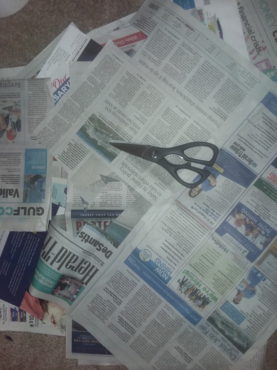
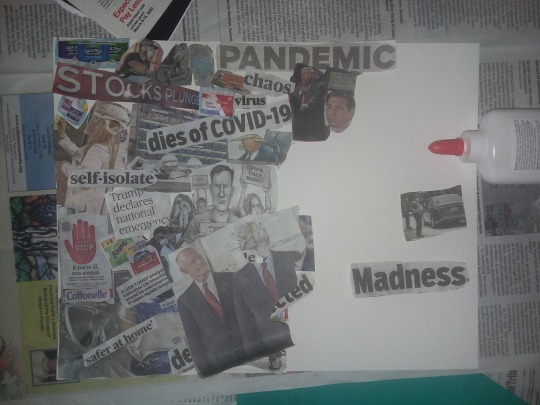
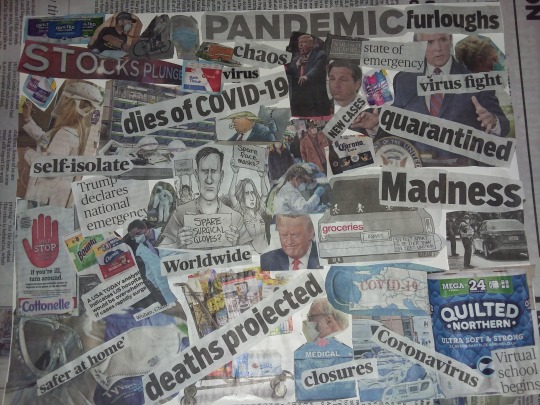
Final Exam Project
Documentation of Collage (Final Picture is of the finished project)
The name of the final work is Coronavirus Madness

0 notes
Text
Virtual Sketchbook #4
I think Jackson Pollock went from using abstract imagery in his paintings to removing all imagery in his famous “drip” paintings, because he was trying to be revolutionary. There were only a few others doing drip paintings at the time and Pollock most likely wanted to rebel against a more traditional style. It is noted that some of his work was used as propaganda to show the soviets what is possible in western society (“The Case”). The bizarre thing however is that Pollock was a member of the communist party (“The Case”). Being a part of the communist party, especially in the United States, shows how Pollock was rebellious and revolutionary. Pollock did struggle with alcoholism and being famous did put him in the spotlight. Being in the spotlight probably added stress to his life and his drip paintings may symbolize some of these strong emotions he was feeling with the rather chaotic amount of drops and splashed paint. The paintings appearing to have no beginning and no end, may symbolize his struggle with alcohol.
The Case for Jackson Pollock, Khan Academy, www.khanacademy.org/humanities/art-1010/abstract-exp-nyschool/abstract-expressionism/v/the-case-for-jackson-pollock.
0 notes
Text
Virtual Sketchbook 3
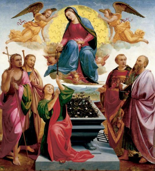
https://emuseum.ringling.org/emuseum/objects/21946/assumption-of-the-virgin;jsessionid=6505CA48B5B673C1ADCE4F9CB5682C81?ctx=7f36e5e5-ceb6-4fcf-8b09-0ba8b302e41a&idx=0
The painting entitled “The Assumption of the Virgin” by Francesco Granacci, is an oil painting that measures 90 inches by 81 inches and was done in 1515 (“THE ASUMPTION”). This painting contains a wide color palette from red and blue, all the way to dark green and black. There are some very clear shapes such as the circle behind the Virgin Mary and the grey rectangular structure that St. Thomas is kneeling on as well as the grey rectangular tomb holding plants that is behind St. Thomas and below the Virgin Mary. In the painting are depicted the Virgin Mary whom is center in the painting and floating above the other individuals, and is surrounded by angels that are of a yellow glow (“THE ASUMPTION”). The Virgin Mary is handing her belt over to Saint Thomas whom is kneeling below her, and to Thomas’s right are Saint John holding a cross, and Saint James (“THE ASUMPTION”). On the Virgin Mary’s left and closest to her is Saint Laurence whom according to tradition, was burned alive on a gridiron that is seen next to him, for not handing over the church’s treasures to the Roman Prefect, claiming that the treasure was for the poor (“THE ASUMPTION”). To the left of Saint Laurence is pictured Saint Bartholomew whom was flayed alive and then crucified by heathens while preaching in India and is seen holding a filet knife under the book he is holding (“THE ASUMPTION”). The work is balanced with the focal point of the Virgin Mary in the middle with two angels and two Saints on either side of her. There is much contrast with the Virgin Mary’s face being very pale against her dark clothing along with the yellow back of her throne against her dark clothing. Many directional forces can be seen with almost everyone in the painting looking at the focal point whom is the Virgin Mary.
This painting makes me feel a sense of awe as all the subjects excluding the angels and the Virgin Mary, were martyred and in gruesome ways (“THE ASUMPTION”). It is fitting that everyone whom is either already dead or will be killed, are pictured at a tomb. This painting also makes me feel sad as these people were murdered for their faith and still people today are killed for their faith and there are wars fought over ideals. This painting is however not supposed to be accurate in regard to events because Saint Laurence and Saint Bartholomew were not alive when the Virgin Mary died and so would not have been at the assumption of the virgin and this can feel confusing at first.
Granacci was an Italian artist that worked mainly around Florence, Italy and the Assumption of the Virgin was a very big deal in that area because the belt that the Virgin Mary gave to Saint Thomas, was supposedly held in a chapel in Prato, Italy right next to Florence (“THE ASUMPTION”). This work was commissioned for the family chapel of the Medici whom were Florence’s most powerful and wealthy group in the church of San Piero Maggiore, Florence (“Assumption of”). What this work says about the painter is that Granacci was proud of where he lived and the history of the area and wanted to do his best on a painting about a subject that the area was well known for in regards to holding the belt of the Virgin Mary. What I think the artist was trying to say is that we should not be afraid of death and I think the artist did a good job of displaying this as all the people in the painting had a calm face and did not show any fear or sadness. This work is from the Renaissance period and the scene depicted in this piece, was a common one done in many other paintings at that time.
In conclusion, based on my research of art and artists, I believe that this painting is of high importance to society and the world because of how excellent of an example it is of art during the Renaissance period. It contains many of the elements from the Renaissance period such as three-dimensional figures, linear perspective with the countryside in the background, and foreshortening with the tomb appearing very close to the viewer. Granacci studied with Michelangelo and Giorgio Vasari whom was an art critic at that time is noted saying that the Virgin Mary and Saint Thomas depicted in the painting, could have been done by Michelangelo, it was that good (“Assumption of”). Religious paintings of this subject matter, were common at this time and so this painting really does exemplify art during the Renaissance.
References
“Assumption of the Virgin.” EMuseum.ringling, emuseum.ringling.org/emuseum/objects/21946/assumption-of-the-virgin;jsessionid=6505CA48B5B673C1ADCE4F9CB5682C81?ctx=7f36e5e5-ceb6-4fcf-8b09-0ba8b302e41a&idx=0.
“THE ASUMPTION OF THE VIRGIN.” Ringlingdocents, ringlingdocents.org/pages/granacci.htm.
0 notes
Text
VIRTUAL SKETCHBOOK #2
Journaling: Principles of Design

“Circulo de Vida” by Jade Leyva.
https://www.abqjournal.com/1342675/artist-focuses-on-love-unity-and-mother-earth.html
Unity is when there is a close comparison, parallel, and or resemblance within a work (Frank & Preble 2019). The “Circulo de Vida” by Jade Leyva is an example of unity with the similarly painted flowers, corn husks, and what appears to be kidney beans.
Frank, Patrick, and Duane Preble. Prebles Artforms. 12th ed., Pearson, 2019.

“Giant Wood Turtle” by Artur Bordalo
https://www.cbc.ca/news/canada/new-brunswick/festival-inspire-art-piece-artist-trash-animals-1.4203748
Variety is one of the principles of design and it means the opposite of unity and refers to diversity within a work (Frank & Preble 2019). The piece above shows variety in that there is a variety of colors and materials used and in this case, a variety of different pieces of garbage.
Frank, Patrick, and Duane Preble. Prebles Artforms. 12th ed., Pearson, 2019.
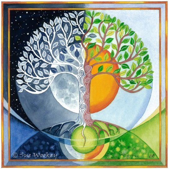
“The Tree of Life” by Sue Wookey
https://www.suewookey.com/photo_14503237.html
Balance is one of the principles of design and is when things are held in equilibrium thru either symmetry and or asymmetry to balance out equal and opposing forces (Frank & Preble 2019). An example of balance in art is shown above with the watercolor painting called “The Tree of Life” by Sue Wookey, where both sides of the painting show symmetry.
Frank, Patrick, and Duane Preble. Prebles Artforms. 12th ed., Pearson, 2019.

“Third of May” by Francisco Goya
http://www.bbc.com/culture/story/20131108-the-10-greatest-war-paintings
Emphasis is one of the principles of design and is when an artist points the viewers’ attention to an area or a focal point (Frank & Preble 2019). This for example can be achieved by putting the focal point in the middle of the work and making the focal point of stronger color intensity (Frank & Preble 2019). An example of emphasis is with the painting entitled “Third of May” by Franscisco Goya where the focal point is the person with his hands up whom is wearing a white shirt in an otherwise dark painting. Subordination is another one of the principles of design and it deals with creating areas within a work that purposely don’t stand out so as to make the focal point stick out more (Frank & Preble 2019). This same painting shows a good example of subordination with the darker areas of the painting making the focal point of the man with his hands up, stick out more.
Frank, Patrick, and Duane Preble. Prebles Artforms. 12th ed., Pearson, 2019.

“American Gothic” by Grant Wood
https://en.wikipedia.org/wiki/American_Gothic
Directional forces is one of the principles of design and is the artist’s way of drawing our attention to a certain area of the work thru either implied and or visible lines (Frank & Preble 2019). An example of this is with the painting entitled “American Gothic” by Grant Wood where the house behind them forms a triangle and the two points of the triangle are where each of the farmers faces are.
Frank, Patrick, and Duane Preble. Prebles Artforms. 12th ed., Pearson, 2019.
Repetition is the reappearance of visual features and rhythm is essentially a pattern or ordered repetition of visual features and both are considered principles of design (Frank & Preble 2019). An example of repetition in everyday life is working a Monday thru Friday job every week and an example of rhythm in everyday life is working Mondays, Wednesday’s and Fridays from 8am till 5pm and working Tuesdays and Thursdays from 8am till 3pm every week.
Frank, Patrick, and Duane Preble. Prebles Artforms. 12th ed., Pearson, 2019.

“Swan (Blue), Ballon Monkey (Red), Balloon Rabbit (Yellow)” by Jeff Koons.
https://www.widewalls.ch/scale-in-art/
Scale is a principle of design and is how big or small something is to another thing. An example of scale is with the over-sized sculptures of common balloon animals by Jeff Koons. You don’t realize the scale of these sculptures till you see them next to a person.
Frank, Patrick, and Duane Preble. Prebles Artforms. 12th ed., Pearson, 2019.
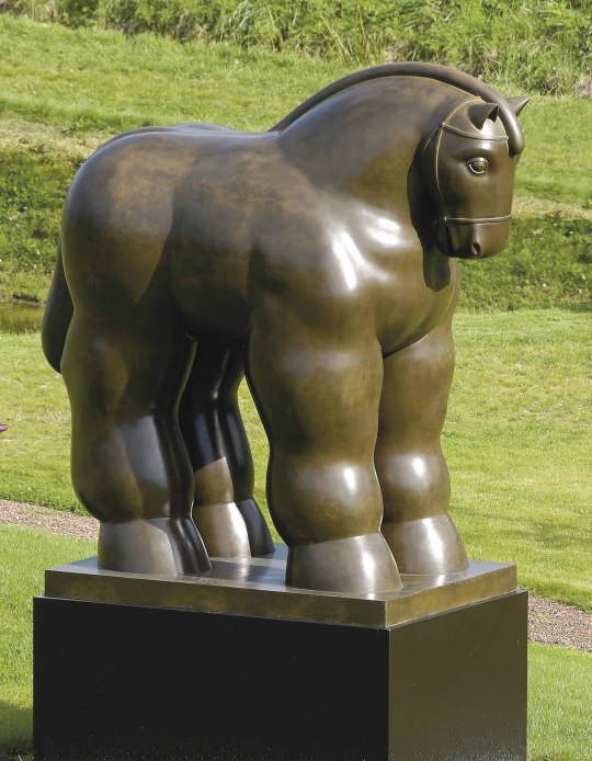
“Horse” by Fernando Botero
https://www.christies.com/lotfinder/Lot/fernando-botero-colombian-b-1932-horse-5617562-details.aspx
Proportion is a principle of design and is how the size of parts relate to the whole or to another thing (Frank & Preble 2019). An example of proportion is “Horse” by Fernando Botero. This piece has exaggerated proportions where the legs are extra big on the horse and the head is very small compared to the rest of the body.
Frank, Patrick, and Duane Preble. Prebles Artforms. 12th ed., Pearson, 2019.
WRITING AND LOOKING

“Bullfight: The Agility And Daring Of Juanito Apinani Bullfight” by Francisco Goya
The etching entitled “Bullfight: The Agility And Daring Of Juanito Apinani Bullfight” by Francisco Goya has a strong use of directional forces with the implied vertical line in the middle with the bullfighter and the implied diagonal axis running from the bottom left to the upper right of the work. The bull’s shadow on the right of the vertical line adds balance to the work as does the audience being on the left upper corner of the work and the stands being empty on the right upper corner. These directional lines help emphasize the focal point which is the bullfighter and the bull. Emphasis is used with the focal points being of darker color and clearer than the background. Subordination is used with the background being blurry and helping the focal point stand out. The black and white colors are examples of complimentary colors and the bullfighter and the bull being clearer than the audience in the stands, give the appearance that the bullfighter and the bull are closer to the viewer.
CONNECTING ART TO YOUR WORLD
How color has affected my life is that I love to go to the beach and see the amazing colors of the sunset. I love the hues during a sunset such as the color purple, red, orange, and yellow and how the value is at first very light on surfaces and then darkens with the ending sunset. The colors are very intense at first during a sunset and then become more saturated as the yellow turns to orange and then red and purple and then to black. If I had to choose a color scheme for my life, I would have to choose a color scheme of a sunset as I love these colors when they are all together and they bring me many fond memories of going to the beach after a long day and just watching the sunset. Watching a sunset really puts things into perspective and helps me relax which has also helped change my life.
ART PROJECT – ARTIST’S CHOICE
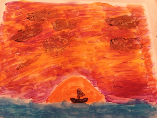
I did a painting of a sunset because of how I love sunsets and how they really help me relax and see things from a different perspective.
Photography/Film/Digital/Design
GOOD DESIGN LAYOUT

https://images.app.goo.gl/Q1pvwEWHjzBRzBdi9
BAD DESIGN LAYOUT

https://images.app.goo.gl/iHTSekb5dydDNAKg7
What makes a good design is that the message is conveyed in a clear concise way and that the layout is visually appealing. The intent for this design layout from this example of a good design layout is to convey the message to get out and vote. This poster does fulfill its purpose because in bold letters in the middle it clearly says the word “vote” and the fist in the middle is a symbol of empowerment and the two go together to form the idea that voting is empowering and protects your rights. The red, white and blue colors are patriotic colors so it can be inferred that voting is patriotic and at the bottom of the poster in the grey bar it says to “get out the vote” just in case the poster’s message wasn’t already understood. The intent for the layout from the example of the bad design layout is to advertise a play that was originally done by William Shakespeare. This design layout does a poor job in displaying its purpose in advertising the play because of how the letters are very hard to read against the background.
0 notes
Text
Perceptual Profile
I am a 27 year old male whom aligns himself with that same gender and I am originally from Sarasota, Florida. I am Caucasian and I like to play tennis, ride my bike, workout, and go to the beach for fun. I am not a member of any particular organized group other than I like to go to a church that has mostly adults my age. I work at Sarasota Memorial Hospital as a registered nurse and what makes me uniquely me is that I am very philosophical and goal driven. I have lived in Central America before and have traveled extensively thru Central America and parts of South America and have seen how people live in other countries and it affects how I view life. Being a registered nurse also makes me very goal driven and organized but it also makes me philosophical because of how I see people in their worst states and how life can change in a blink of an eye. For that reason I try to live life to the fullest and have a purpose.
0 notes

Photo

Above is a blanket that I lay on either my couch or my bed for decoration and I sometimes it use to wrap myself in. I had originally bought it at Walmart because it is very soft and it looks beautiful. It is made of 100% polyester and it was made in a textile mill in china. I think this blanket is beautiful because of the many colors and shapes and it also reminds me of Native American designs I have seen in New Mexico and Colorado. It also reminds me of the desert in New Mexico with the colors reflecting off the mountains during sunrises and sunsets.
0 notes
Photo
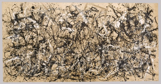
Autumn Rhythm (Number 30) by Jackson Pollock
1. This painting is considered abstract and is considered a drip painting (“Autumn Rhythm”).
2. This piece of art helped start the abstract expressionism movement (“Autumn Rhythm”).
3. The artist of this painting never asked his wife whether it was a good painting but whether it was a painting at all (“Autumn Rhythm”).
4. The painting was done on upholsterer’s canvas as the artist could not afford painter’s canvas (“Autumn Rhythm”).
5. A drip painting is done by laying the canvas on the ground instead of placing it on an easel, and applying paint to the canvas in manners such as dripping and splashing on the paint (“Autumn Rhythm”).
The way I think about how the art changed from when I first looked at it was Autumn Rhythm by Jackson Pollock is supposed to be like a music composition as it is random but still harmonious and flows well together. Originally I thought the artwork was more representing either a battlefield or bad feelings as it contains dark colors and looks like a big mess of paint strokes and confusion. I also didn’t realize how big the painting was and how it must have taken a long time and effort to spread the paint out over the whole canvas instead of what I was originally thinking that the painting must not have taken very long to complete. I do see now that the art has some order as one side of the painting looks similar to the opposite side and it is not completely random but follows a similar theme.
“Autumn Rhythm, (Number 30) by Jackson Pollock .” GalleryIntell, http://www.galleryintell.com/artex/autumn-rhythm-by-jackson-pollock/
0 notes
Text
One little known fact about me is that I can understand and speak Spanish almost fluently.
1 note
·
View note