
Don't wanna be here? Send us removal request.
Statistics
We looked inside some of the posts by bandrowskisblog and here's what we found interesting.
Average Info
Notes Per Post
2
Likes Per Post
2
Reblog Per Post
0
Reply Per Post
0
Time Between Posts
7 days
Number of Posts By Type
Text
2
Photo
8
Last Seen Tumblr Blogs


Fun Fact
The KCSC sent more than 20K requests to delete posts related to prostitution and porn to Tumblr from January to June 2017.
Text
Reflections on Brainstorming #2
For my photography series reflection on brainstorming for the second week I was told that my ideas were really good and that the one picture I had done was well done. There were definitely some good feedback and reflection I received from my professor and my peers. They told me that my title (Story Book) and my ideas are very personal and well thought out. Their main issues from my professor was to figure out how much of my hand I wanted in the images and how big I wanted the subject of the photo to be compared to the size of the polaroid image (size proportion). Another thing one of my peers wanted me to add to the image was for each caption to say the person, place and something I want to say to the person in the photograph to say goodbye to them. I really liked this idea and I am definitely going to include it in my final series. Overall with my final series, it is going very well. I only need to take one more picture then I have to add captions to each photo and add an overall big caption for the entire series. Then I have to write the paper which I don’t think it will be that bad because my entire series is about the people and places around London that mean a lot to me and I will write about each person and place and why they mean a lot to me and what I want to say to them to say goodbye.
0 notes
Photo


The series that I chose to analyze was Margaret Courtney-Clarke’s Cry Sadness into the Coming Rain. Top right is the first image of the series I am writing about.
1.1 I think this series was created for someone that could use a bit more of an understanding about what the world is like outside their little town. I think it was created because they are beautifully taken photos that are ascetically pleasing to look at. People might not understand why these photos are together in a series, but I think that makes a photograph series more interesting because the viewer has the chance to interpret it themselves.
1.2 From this series what I can tell about life here is that it may be hard but that doesn't mean they can’t have fun and smile.
1.3 Reading the captions it made me realize that this entire series is this family waiting for rain to come because they are running out and need it to live. I think that at the beginning when the women are happy and dancing compared to the end when the woman is all sad and unhealthy because she hasn't had water is so important to this series. The captions make the series easier to understand but also harder because the captions don’t always make sense and you have to figure out what it means in your own opinion. The captions have nothing to do with what is actually happening in the photos, which is something I don't see very often.
1.4 I really think this series is very well done because it is very aesthetic to look at and it obviously has a very deep meaning. I think that it is very worthy of my praise because the meaning behind these pictures is what makes it so great. One problem I have is that I don’t really understand what some of these images are suppose to be of and it confuses me a little.
1.5 a. The photos in the three series I chose from are all from war or famine related series’. The subjects in two of them are very clear but the subject in the bottom left photo is very hard to depict. The photographer decided to not include (top right) anything other than the subjects and one little plant and desk on the right. They probably did this in order to make the understanding of the subjects easier and make them the entire focus. In the second photo (2nd left) the photographer decided to make this photo much more chaotic because it is about being in a state of emergency and therefore it is more intense and the situation is unknown; kind of like how the image is. The last one the subject is the man holding the baby and they decided to include other soldiers on the sides to reinstate the idea of where they are and the situation they are in. The first photo has lots of color while the other two have little to no colors in them.
b. For some reason I feel like in these photos the photographer doesn't really have a relationship with the subjects. That they are a journalist and are taking these photos for something like a magazine or newspaper. Maybe it is because of the locations. The photographer is at eye level in all of them.
2.1 I think it illustrates “Thousands of families have travelled for days across scorched scrubland from Somalia to Kenya.”
2.2 This photo makes the text seem real and makes the viewer know it is actually a huge problem many people don't know about.
2.3 It makes me visualize what the people looked like and what they were wearing on their long travels and that just makes the text even more sad to read.
3.1 This photo illustrates “no food or water after their crops and livestock were destroyed by drought” to me.
3.2 It makes me think of this quote because of the animals walking aimlessly around not having anything to eat or drink either.
3.3 This image makes me realize how little water and crops there are during this time and how the entire area is sand with people around.
4.1 This makes me think of the quote “child refugees from Somalia are dying of causes related to malnutrition either during the journey or very shortly after arrival at aid camps” from the text.
4.2 It makes me think of this quote because this child is being tube fed at this young of an age because they are unable to eat or drink because of the lack of resources.
4.3 This photo makes me understand the text better because it makes it real and makes me think more about this problem and how sad it is.
4.1 The quote is “More than 10 million people have been affected across the Horn of Africa.”
4.2 It reminds me because I feel like this little boy is not the only person this bad off because of the lack of food and water and it makes me imagine all the young children who are malnourished.
4.3 It makes me understand the text better because I couldn't comprehend 10 million malnourished children and after seeing just one I can imagine way more as sad as it is.
I think the leader imagine is the little boy in the basket because it is the one that is easiest to tell that malnutrition is a huge issue because you can see he doesn't eat. Along with that, but you can also connect with it and that is so vital in photography.
For my photos that I took this week (bottom 2) I decided to photograph someone smoking cigarettes. It is something that is obviously happening everywhere around London but it is not something that many people think about when we are told to photograph something we don’t the part in. It is definitely something that a lot of Londoners and people in Europe in general do. It is definitely something I think of when I think about Europe and London because smoking is so common in Europe compared to the US. It was taken in a way that was very authentic because the person was walking and smoking very casually and that is what I like about the photos I took. I like that they aren’t super artsy or thought out because smoking is such a casual part of life here just like the images I took for this series. I also edited the pictures and added a darker filter to go along with the idea of London being a dark and gloomy place. It is kind of hard to tell what the person is doing but honestly that makes the photos so much better because it was very casual, too. Nothing really specific is in the photo or not in this photo series, except the river and the park that I was on a casual walk on watching people smoke in front of me.
0 notes
Photo


1.1 The photo is relatively blurry in this first photo, which makes the viewer think why everyone is equally blurry, as if there isn’t one specific subject. There is no color contrast in this photo because it is in sepia/black and white as they didn’t have color printing in the 30s yet. The camera angle in this photo is really important because I feel like Maar was watching this situation happen and then decided later to take a picture. She is at the level where she is just standing up, but it is still looking down (barely) as the subject is on the ground. The composition of this photo was just what was happening. Maar didn’t set or arrange anything in this photo because it is really candid.
1.2 What I see in this photo is a man looking into the sidewalk inspection door. What I think this means is that this man is working and doing his job, while other people are just walking past and not even acknowledging his hard work. The viewer also can't see his face, which makes it mysterious about who he is what he looks like, etc. This image does not remind me of anything I have seen before and before I saw the name of the photo I was very confused what this man was doing.
2.1 In this second photo, there is a lot of contrast because of the reflection in the window and the shadows. What this does is create a lot of lines that point toward one another and create the illusion they are one thing, not a reflection. The photo is not specifically focused on anything in particular, pretty much the entire picture is in focus. There is no subject. The angle in this photo is not that important because it is just from slightly below in order to get the entire subject in the picture. Lastly, Maar made sure the instruments and the church were in the right place to make the photo work to see both of them by themselves and together.
2.2 What I see in this photo is a music store and in the reflection of the window is a church. I think this photo is showing what Paris was like in the 1930s and how possibly how important church is to the citizens in Paris at this time. The title did not help because it is relatively easy to know what this picture is of, but the problem is that it is much harder to know what Maar wanted to picture to mean. This reminds me of pictures people take where in is in a reflection of a window and that's the main purpose of the image.
Middle: Caption 1 - Dark and gloomy day in Central London
Caption 2 - Beautiful day in Central London
Caption 3 - Beautiful day in Central London before two people were stabbed to death
For my photo that I created that was inspired by Dora Maar was her generic photography of buildings in different cities. In this photo, London looks gloomy and sad and deserted; Big Ben is just scaffolding and all the viewer can see is the outline of the building which makes the composition harder to see and understand which is what Maar is really good at. Maar is really good at creating an illusion and the illusion in my photo is that no one knows if it was a gorgeous day out or if it was raining. I used texture and shape because of the buildings and the clouds on the left. They look as though you can know what you’re touching without touching it. I feel like this picture can tell a story and that it can mean something different to everyone, which is why Maar doesn't caption her pictures (I think). I edited the second photo by editing out the water and the sky and only having the buildings and a little of the sky to reinforce the importance of the buildings in the photo. It is more obvious that Big Ben is under construction which makes this photo more gloomy because everything else is really pretty and well built but there is just ugly construction on the biggest attraction. Lastly, the lines all lead up the sky which makes you question once again what the weather is like.
0 notes
Text
Photo Series Analysis
https://docs.google.com/presentation/d/1N63q69DlbvEoOzqN4oo6z6I2RlNHbe8pfWWk3ZYqNdc/edit?usp=sharing
For this group project about our photo series analysis on Laura Pannack’s Young Love, we chose 5 specific photos from the series (the first and last) and then 1 from each pose that the photographer decided to have the couples pose in. This series was not what I expected when I clicked on the link to “Young Love.” I was expecting to see a bunch of young couples head over heels in love, but instead we got a more realistic view of love from Pannack’s personal experience. Visually, this series is constructed in a way that is aesthetic to look at but also taken with natural light, all the same kind of couples (white, heterosexual), shot from eye level, and the subjects are always centered. I think contextual information can change meaning because now when I look at these photos I think they are a happy couple because of what Pannack is saying but before I might have thought they were unhappy in their relationships. I also would not have known that she relates to this photo series so much.
0 notes
Photo


Elliott Erwitt: USA. New York. Marilyn Monroe. 1956
1.1 The composition of this photo is that it is a portrait, but not your average portrait. I like that Marilyn is the very obvious subject in this photo and that in relation to all the other objects in the photo, she is definitely the most lit up and is so prevalent. Marilyn seems to be smiling while looking at someone and that makes the photo that much better.
1.2 The lighting in this photo is really interesting because even though it is in black and white it is really obvious who the subject is because she is lit up and all the other objects are darker. Her face is lit up and makes you look there first.
1.3 The mood of this photo at first seems gloomy because it is black and white, but when you look at it more, I started to feel happiness as I looked at the smile on her face. She is almost covering up her smile, but not entirely so you can see slightly see it.
1.4 This photo is a portrait of Marilyn Monroe.
1.5 This photograph is about Marilyn Monroe and her life. It is a beautifully taken photograph that shows her true smile but also shows that she is trying to cover up her face and not be seen.
1.6 I have learned more about what is like to recreate photos but with my own spin on it. I have also learned more about taking portraits and the importance of capturing the person’s essence and meaning, not just their body.
Recreation: For my recreation of this photo, I had my friend sit in a chair, lounging, looking out into the distance while covering up part of her face with her hand. For lighting I had one small light on and it was dark outside. I then blurred out the background so it was very focused on her and edited it to make it a little more vintage and make it black and white. Overall, I am very happy with this work.
Response: For the response photo, I decided to have her sit on top of the desk in my room and look at me very serious with the same hand up on her face. I recreated the idea of her hand being a barrier between her and the photographer which I really liked.
Progress Report
So for I have still not decided what to do for my final series. I have a few ideas in mind, but I don't know if any of them are good or not. My main idea was to do Beautiful Pictures of Something with an Ugly Undertone, and with that I was going to photograph things that may look beautiful on the outside, but in reality they have a dark history or underlying tone.
After I though more, I realized I wanted to photograph more people not things, so I have been thinking maybe photograph my sister as we walk around London for her first time. I would call it something like “Seeing London for the First Time” and have her pose in different areas of London and really focus on her eyes.
Or I was thinking I could do “Same place Different Style” and take pictures of 6-8 people in the same place but who all have very different style of clothing and talk about how their clothing changes who they are and changes how people view them.
I am stuck, so if anyone wants to help me pick one, I am open to it! Thanks.
0 notes
Photo


Philip Braham - Different Histories of Light
Top and Middle: 1.1 My first impression was confusion and the all different types of photos being taken. So much diversity, but why some of these things were photographed.
1.2 This is a series because the subject is in the same spot in all four pictures (my eye is drawn to the same spot in all four pictures). They also have the same lighting because it is dark in all four pictures.
1.3 The title makes me think of the different times of the day and how lighting affects how you see things and/or life. It influences my reading because it makes me think more about the history of the lighting and how it changed over time.
1.4 These images are temporal because the entire series depends on time and location of the photo; it influences it because it makes you think about how different the photos are because of the time and subjects.
1.5 My first impressions changed because it made me think more about what the pictures mean and why it is so important to think about how ideas change because of lighting, time and location.
Beautiful Pictures of Something Ugly
For the series, I decided to take beautiful pictures of something ugly. My decision was to photograph trash on my way home from school. London is a beautiful place with so many beautiful things, but as I was walking home from class one day I noticed how much trash there are on the streets and decided to photograph it as a series. These 3 pictures work as a series because they were all taken in the same area of London and have the same subject and angle. They are all taken from eye level with what I was photographing, which makes this series work. I also like that they are all just random things I found on the street as I was walking. They have absolutely no meaning alone, they only make sense when they are in the series I created. Overall, I think this series is beautiful pictures of something ugly because I took pictures of trash, graffiti, and random things I found on the street, but I managed to make the photos look good even though the subject wasn’t ideal.
Photo Series in Tate Modern
Bottom Left, Middle: 1.1 Goldin is trying to show her life by these pictures. She is telling a story about how she struggled with life and how she was abused and not treated right until she left home and never looked back.
1.2 Techniques being used in these photos are real images. They might be staged but they all definitely happened and I think that is what makes these pictures so well done and real. Also the lighting and angle makes you feel as though the viewer is actually there taking the pictures.
1.3 Yes, they are very pretty to look at and I like having to think about the backstory as to why Goldin would be taking these photos in the first place.
1.4 Yes, Goldin wants to show that things can change for the better, and the difference between the photos in the series really shows that things can get better with time and effort.
1.5 It makes me think more about why she made the series in the first place, which is because she wanted to photograph her life after her sister killed herself. When you look at these images as a series, you notice that all the subjects are different but the message is the same.
1.6 It made me feel like I knew the artist a little more even though her photography made me feel like I knew her without the caption.
Bottom Right: 2.1 The artist is trying to show daily life in the town that they live in.
2.2 The artist is using different lighting, different angles to show that life is different in different part of the town they are from, depending on which part of town they want to photograph.
2.3 I would consider these images very average to look at. They aren't very aesthetic to look at and they don't seem to have that deep of a meaning in my opinion.
2.4 Yes, they are very obviously showing the daily life in this town with the images of the barber shop or the grocery store. The artist did a good job photographing the city and different areas of it.
2.5 When I look at the series as a whole, it makes me think about how many things there are to do in this town and how different people do different things around the town and how everyone is living their own lives.
2.6 I do not have the backstory of the artist as of right now, I am sorry.
*Disclaimer: I was only able to put two pictures from the first series and one from the second because Tumblr has a set amount of pictures allowed in a post and I would surpass it.
0 notes
Photo


Top Middle & Left(One not pictured because it was flagged and couldn’t be posted): 1. Within all these pieces and portraits of and by Jo Spence, she is trying to show not only what breast cancer does to your body physically and mentally, but also the different ways in which people deal with it and try to get into remission.
2. I would consider some of the photos in the exhibition to be portraits, probably most of them, but the one titled “Drugs” is not, that is an article that explains more about ways doctors try to heal their patients with breast cancer. The other two photos I chose are portraits because they show the essence of Jo Spence into more detail.
3. Seeing a lot of her work together makes it easier to understand what Spence was trying to say and do by creating this exhibition. She wanted to not only share her story, but also the story of so many women with breast cancer.
4. The technique in these pictures are relatively simple but also really hard to completely read, which connects back to the message because even though we know Spence was going through a really hard time during her fight with breast cancer, she never only made it about herself. She wanted to help others and represent others, which explains why the photos are so simple yet so hard to look at.
5. Some information that was included in the captions are about how she was in the hospital having her lumpectomy operation, she decided to draw an X on her breast to mark her start of her fight with breast cancer. It says she continues to use this idea to “reclaim her marked body as an act of refusal and restore agency.”
Revisiting Genesis (Not Pictured): 1. I think what Oreet Ashery is trying to say with this video is about how people’s lives have meaning, but as they die and become invisible. This man preforming is in a white body suit blending in with the background and their body is suspended above the ground. Ashery might be saying that some people that are struggling to live are in a halt for life and at the point of disappearing into thin air.
2. I do not consider this video to be portraits because it does not show the essence of anyone, all I see is a white body suit covering up all emotion and realness. The only emotion I get from this art is the dancing and the music, not the photography/videography.
3. The effect of seeing the work in one place makes it easier to understand the different chapters of her videos and what each of them means and how important each one individually is to the story line.
4. The technique in this video is very important because of how dreary and sad it is. The way the man was dancing and in a full body suit shows how sad the story being portrayed is and without these effects, it would be much harder to understand the message.
5. This changed how I looked at the video because of how Ashery explained what she was trying to do with the video. She was trying to show the end of someone's life by suspending them in the air and making them blend into the background, which makes them seem as though they are disappearing, aka dying.
Exhibition as a whole: 1. Some information that was included in the captions are about how she was in the hospital having her lumpectomy operation, she decided to draw an X on her breast to mark her start of her fight with breast cancer. It says she continues to use this idea to “reclaim her marked body as an act of refusal and restore agency.”
2. I think the number one overall message of this exhibition is that although there are various options to try to fight breast cancer, that doctors are not giving out any that truly work. Chemo is the most reliable and used treatment, but nothing is 100% certain to work. Spence wants to touch on the fact that she is owned by breast cancer. How it takes up so much of her life, how it is all she can think about. It consumes her, there is not much else she can do.
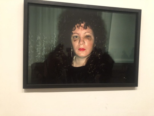
Top Right: 1.1 I believe this is a portrait because it is a photo of a person that shows her personality in one way or another. You can see more about her just by looking at this picture, which makes it a portrait.
1.2 The composition is the black background with her black sweater and black hat contrasted with her pale and wrinkly face makes her face stand out even more.
1.3 Lighting is from the front onto her face and everything else is dark and colorless.
1.4 It is hard to see if anything other than her face is in focus because it all blends in, but her face being so clearly in focus makes the photo even better because she can tell a story just with her face.
1.5 This pose makes me feel as though this woman is relatively old and doesn’t have the best posture. I can’t tell if she is sitting or standing, but it does make me ask who she is, where she is, and what she did with her life.
1.6 The background is just black. Is it a backdrop or is it dark out using flash just on the face?
1.7 I feel as though the mood is gloomy just because of how everything is black and she isn’t smiling or seem as though she’s enjoying herself at all.
Middle/Bottom: This photo I chose was taken in Bangor, Wales of my good friend. My decision to take this photo was because of the fully green background and white clouds contrasted with her bright red lipstick, very blonde hair, and black and white jacket. You can see in this photo that she is smoking a cigarette and holding some sort of pamphlet, maybe indicating the we were in a new place (traveling). I think this really shows her personality because of the big smile on her face and that her outfit obviously says “city girl” but she is in the country. I love this picture because it can tell a story, but it also doesn't have to. The viewer can glance at this picture and be like “oh what a pretty portrait,” but then they look deeper into it and ask themselves who is she, why is she there, what is she holding, why is she smiling so big? That’s what I like about this portrait, that it doesn't have to tell a story, but depending on the person looking at it, the story can completely change. I also think the point of view in this photo is important because it makes it seem like they are the one who took the photo, makes them feel as though they were there; this makes them connect even more to the subject because they want to get to more about her. I chose these two photos to recreate because of how simple the backgrounds are and how obvious it is who the subject is. My eye doesn’t go anywhere except to the person and I think that is what draws my attention to these three pictures. Also it is her natural reaction to me taking a picture of her, like the second.
0 notes
Photo


Top Left: 1.1 This photo series is of four different artist’s left or right eye.
1.2 This photo series is about these four different artists and how each of them has their own vision of what a photo can be about. Everything depends on the person’s viewpoint and this viewpoint changes the perspective of how the artist feels about different situations and things.
1.3 The photographer uses a straight on viewpoint for the top two photos and a side angle for the bottom two. The other choices the photographer used was how close up the pictures were taken from. They only photographed the eye and a little bit around the eye, because they wanted to focus directly on the eye, as it is the subjects. The final choice they made was to use black and white instead of color.
1.4 What unites this series is that although they are all the same subject (eye), they are all different people/artists and each of them have a different perspective on different sorts of things.
Top Right: 2.1 The think the focus of the photo is the most important aspect of this photo and how the rain makes everything seem blurry and hard to see, which is what the artist is trying to say.
2.2 I believe that focus is the most important aspect in this photo because it really makes everything seem super gloomy and sad, which is what I think the artist is trying to describe and say with his artwork. The gloominess is very evident in this photo because of the lack of focus and the rain, which tells an obvious story.
2.3 I believe this picture was taken with a smaller aperture because of how blurry it is in the background.
Middle Left: I decided to photograph a necklace hung up on a wall. The first photo is used with regular natural lighting. The mood is simple, there is nothing more to think about other than why this necklace is here and whose it is.
Middle Middle: This photo was taken with a pink piece of plastic over the light I was using, the light was also head on. This pink piece of plastic made me feel like the viewer would be confused why there is a pink tint and where it came from. The mood this photo brings out is deep thought, in my opinion.
Middle Right: This photo’s lighting is above the object and it creates an obvious shadow under the object on the wall. In a way, this picture makes me feel small because of the shadow being small and under the object, but it overall it doesn't really make me feel any specific way.
Bottom Right: This photo’s lighting is taken from below, which is quite obvious because of the large and long shadow above the object, on the wall. This photo makes me feel particularly large and as though the necklace is the most important thing in the world. This is because of the long shadow and the bright lighting in the photo. It gives the illusion that the necklace is more important than anything else in the picture. None of the other photos I took gave me this feeling.
Bottom Middle: This photo’s lighting was taken from the top right side of the necklace. The viewer can see the brighter light in the top corner and the long shadow on the left side of the object. Not only can they see the shadow of the ball, but the strings from the necklace are evident in the shadow, too. This photo makes me feel like the strings of the necklace are more important than the actual necklace because my eyes are drawn right to that.
Bottom Right: The lighting in this picture is taken from the bottom right hand side of the object, the shadow from the ball is the most evident and longest in this photo and that makes me feel like it was the best picture I took. Although it does not make feel any specific emotions, except confusion because the shadow is so much longer than the necklace itself, I think it is the most well done picture because the shadow is the most evident and the string shadows aren't taking over the picture.
0 notes
Photo


Top Left: 1.1 I chose this photo because the vibrant colors drew me to this photo, especially after comparing it to the other pictures in the exhibit.
1.2. I think what the photographer is trying to say is something about the person that is holding the knife - make the viewer think what his story is and why they ended up where they are.
1.3 The first compositional aspect that this photographer uses is the point of view, shooting from above. The second aspect is the color; the photographer used very bright colors in this photo compared to other photos they have taken previously.
1.4 I think the photographer uses the shooting from above point of view to create more of a full picture, but still create the mystery of whose hand is holding the knife. With the second aspect, I think that they use vivid colors to create a happier relationship within the photo taken, compared to other pictures in this exhibition.
1.5 This photograph is of cut pieces of watermelon with a person’s hand holding a knife in the middle of the photograph.
1.6 When I look at this photo I makes me think about the person that is holding the knife; why are they cutting up watermelon in 1975 in Brazil? What is their story? Are they being paid? The watermelon is not the main subject of the photo, the person’s hand/the knife is.
Top Right: 2.1 I chose this picture because it so obviously had a political side to it and it really intrigued me to know more.
2.2 The artist is trying to say that this man is trying to run away without being hurt (by others) because being from Mexico City, there are dangerous situations that could happen, without even realizing. Just because of who he is makes for a higher chance of being hurt by others.
2.3 The artist uses eye level point of view and shape of the shadow in the background and his body to attribute to the photo.
2.4 The eye level point of view makes the viewer feel as though we are there to create an even more real situation. The shadow and shape of the man’s body shows that he was obviously running away from the gun on the wall because he is afraid of being hurt-he is making it a political photograph to show the problems with today’s society.
2.5 The photograph is of a man running away from two drawn on guns on a wall in the middle of Mexico City.
2.6 What this photograph means, in my opinion, is how messed up society was then and still is now. Men and women are scared for their lives of being shot or hurt and society is not doing anything about it. The title of this picture is “If you shoot, I shoot,” which makes me think about how the guns are facing at each other and he ends up being in the middle, being shot by both guns (maybe because he is trying to settle a dispute).
2nd Row Left: 3.1 I chose this picture because of the gloomy vibe and the mystery the fog and gate adds.
3.2 I think the artist is trying to point out the loneliness of the world and focus on how lonely of time it was in Argentina in the 1950s for everyone.
3.3 I think the two compositional aspects this artist uses are color (lack there of) and lines.
3.4 The black and white color adds to the picture because it makes it so much more gloomy and dark than it would be with color. The lines in the photo all lead to the gate and that leads me to believe that the subject of the photo is the gate and everything else in the photo is in the background creating even more of a mystery about what is behind the gate and why it is gated off.
3.5 The photograph is of a large closed gate with a foggy city in the background. There is two separate drawings on the walls beside the gate.
3.6 This is about how lonely the world is and the gate and fog in the city in the background is showing how no one is in the city and it is describing the failure of Argentina at the time of the 1950s, socially and economically.
2nd Row Right: For the “seeing” activity we did in class, the first couple things I noticed about the photograph was the man running and his shadow; my eye is drawn there first. The shadows in the background against the water and the black and white effect made me think the photo was gloomy, but then I found out the picture was taken in the 1930s, so there was so other option. The entire picture is in focus except the man running and the lighting draws attention to the water. The point of view is from eye level, a side profile. The subject of this photo is the man running, which makes me ask myself, why is the man running? This picture seems old to make it seem like it is important history or from a documentary, maybe about unionism. This photo makes me feel two different ways - it can make me feel gloomy when I see the black and white, but it also just makes me think it’s another day in the life. I thought the artist was trying to make the viewer feel as though these men shouldn't be here because of the closed off gate. This photo is a social comment taken during the industrial/unionism time. After I kept looking at the picture over and over, I started to question what is happening behind the fence and why it is gated off. I thought the hardest part to answer from this worksheet was the meaning of this picture because it just seems like a pretty average day in the life for these men.
3rd Row: The shooting from eye level point of view creates the illusion that the viewer of the photograph there and experiencing the same things as the subject in the photo and the photographer. It is easier to create an emotional connection to a picture from this point of view and this angle gives the whole and real picture, without changing how the viewer sees the picture.
4th Row: In most cases, photos being shot from above makes the viewer feel superior to what is below them and gives them the illusion they are greater, thus more important. In this case, it doesn't. In this photo of the flowers the shooting from above point of view makes it easier to see the entire picture and individually see each flower separately, instead of just seeing one big clump of multicolored flowers.
Bottom Row Left: In the shooting from below point of view, I decided to photograph a large building with very interesting architectural structure. This point of view makes the viewer not only feel small, but also inferior. The building is so small compared to the photographer that the viewer feels unable to obtain or reach their future goals. When we look up to the top of a very large building we feel undermined, kind of how we feel in real life; with our parents, teachers, siblings, etc.
Bottom Row Right: When shooting using the becoming the subject point of view, it makes the viewer of the photograph to feel as though they are experiencing this situation first hand. In my photo, you can see my shoes at the bottom of the picture, but you can also see the reflection of my shoes in the glass, too. The viewer feels like they are in my position, which makes it easiest to connect with on an emotional level; they want to know what I was feeling and I want to know how they feel currently.
0 notes
Photo


Middle Left: 1. What drew me to this specific picture was the angle it was taken from, the lighting, and the mystery of it, not being able to see the whole bodies of the players or the look on their faces. The thing that makes this photograph special is the point of view that it was taken from. It was taken from the bird’s eye view and that gives the viewer ability to know the basics of what is happening, but also creates a mystery about the details of the situation; who will play what, who is winning... The lighting is coming from the top of the image, probably a light fixture or lamp and it really makes the image stand out because the viewer can see every little detail in the photo. It shows that Omaha is a place of love and friendship because even at a corrections facility, there is still friendship in the air.
Middle Middle: The dark and gloomy background contrasted with the bright fire drew me to this photo. The photographer made it seem like the viewer was there because of the height they took the photo at which makes it more special than most. This photo makes Omaha seem like a gloomy place, but also a wonderfully beautiful place to start a fire one night.
Middle Right: What drew me to this photo was that it reminded me of a snowy day at home. The photographer seemed to use leading lines to create an effect that the road is never ending, which intrigued me. This says that Omaha is a very cold and dreary town in the winter, but at the same time a wonderful rural place with snow falling.
Top: In the photo I have taken I was inspired by “Road in Snow” because of the mystery of the leading lines. I took the picture at the Graffiti Tunnel in London. I took it from my head level, which makes the viewer feel like they were standing there with me. I was looking at the entire tunnel and the leading lines makes it seem like this beautiful tunnel goes on forever and the picture starts out in focus and as you go further back in the tunnel the less focused the picture becomes. There is not a single subject, everything in the picture brings something meaningful, but the leading lines is what makes this photo more interesting when first glanced at. The light is coming from the end and top of the tunnel and each of them bring a different type of lighting to the photo. Colour in this photo is a huge addition to the photo, it is what makes it so bright and happy and it really catches the eye. The cars in the photo should not be there, but sometimes there is nothing the photographer can do.
Bottom: The first thing I noticed about the image was that the woman was overly excited and the color contrast and lighting. The story could be about a wedding/wedding reception. The photographer was very focused on the girl in the middle and made the colors bright to lighten the mood. Something exciting is happening beyond the frame and I think hugging and more excitement and love followed the picture being taken. I think that happened after the photo was taken because of her facial expression and the people’s facial expressions behind her.
2 notes
·
View notes