
Statistics
We looked inside some of the posts by bchanelleturner and here's what we found interesting.
Average Info
Notes Per Post
19
Likes Per Post
16
Reblog Per Post
3
Reply Per Post
0
Time Between Posts
2 days
Number of Posts By Type
Text
17
Last Seen Tumblr Blogs


Fun Fact
Tumblr Inc. has $15.1M in annual revenue.
Text
instagram
1 note
·
View note
Text
My end Summary..
So sadly this course has come to an end and after all of the hard work and effort I have put into my studies.. I feel as though I have learnt a lot about communication and design.  The experience that I had within Communication and design studies is a very positive one. I had Andy as my tutor and class was great even though we had to transition from face-to-face to online learning. I didn’t find this course difficult however I did find challenges and learn new experiences with layout and composition as well as what message I am trying to get across/ portray to a viewer. 
I have a Tumblr it was a completely new learning curve for me... before this course I never even downloaded the app so I felt like a grandma when I first opened it up and tried to learn how to use it haha. However I found it very helpful as a notetaking device as well as a journal where I could show my progress and reflect upon that as well as seek information and inspiration from my other peers and how their mind works within the conceptualisation of their ideas which was great for me to encounter.
I feel like I met a whole lot of new people and established new relationships with my peers as while transitioning to an online platform, the way to communicate to one another was by Facebook or a textmessage. I’m a social butterfly and like to engage with people so by not having the opportunity to do that in person I took advantage of what I did have and that was Facebook and text message to be able to share my thoughts and ideas aswell as have a good conversation with my peers outside of the collaborate ultra classes. I had some great times while learning about what I want to do in the future somewhere along the lines of design as well as demonstrating all my knowledge that I have accumulated from this particular course into my every day lifestyle
Lots of love from b
Keep it simple ☺️
3 notes
·
View notes
Text
Week 12 lecture
Within this lecture it was summary of our overall course
This was great to recap everything and see how much knowledge I have accumulated from this course over this semester. How I have “evolved over time”
I loved how engaging the YouTube videos were of the lectures... I never got bored and loved the new content and personal story’s Andy and Karen brought to the course!

1 note
·
View note
Text
I love this so much
The bold white text looks awesome
WEEK 11
I have been working with a clothing company called flames apparel. I have been really excited to trial different styles.
My client really wanted the use of skulls and flames within the t-shirt design as well as simple bold type!
It has been such a great experience to design for this company, I am so excited to grow within this field and really become my own!!


2 notes
·
View notes
Text
Here’s some sneak peaks on the “ ask me anything assignment” I have finally finished it, layout and all... I’m so happy with how it turned out !


3 notes
·
View notes
Text
Week 12 tutorial
Today in class we updated the slides doc with our latest WIP , we then checked the progress on our tumblrs and finally gathered any questions about delivering the tasks.
We listened to some music of which different people in our class liked, aswell as speaking about different genres of music and interpreting how famous artists are showing there talents to the world today with coved 19 restricting live concerts and such..
It’s really great seeing how my peers are going with there assignments, I love learning from other peoples efforts and how everyone has there own particular unique style of working it’s so inspiring to me.
0 notes
Text
Week 11 tutorial
This class was focused on the progress off our progress, I showed the class my sketches and finished designs that I had completed for my assignment on Theodore Low DeVINNE, so far so good

0 notes
Text
While diving into some extreme eye boggling research I’ve realised I want to interview de vinne himself, well Theodore Low De Vinne.
He wasn’t inspired by the Victorian era at all.. his fonts were just used by typographers in this era aswell as designers today to create this type of Victorian” style...
DeVinne actually preferred simplicity over ornaments and creativity ... how strange, I guess I’ve led myself to a topic more simplified in design but more intreugung than i initially planned ..
5 questions asked and answered ... next up design time
1 note
·
View note
Text
Decision of topic for ask me anything
After realising that my project topic for ask me anything was way too broad I had to refine my findings and find a particular type face throughout the Victorian era.
I have decided to go with DE VINNE
I wanted to do a tight face that was made within the 1800s period instead of just being inspired by the Victorian period and being created today, this way I would be able to get a little bit more history in depth into the questions I would like to answer. Due to the tight face being within the Victorian style that I like to vote throughout the design process of my project I already have a design layout that I would like to portray. However I am still trying to make up my mind whether I would like to create this with in a zine or have individual posters or almost advertisements. If I would like to place this back in time and create an old style type of document using warm colours to create a sense of the past, or creating a shopfront window type of affect.
My original thoughts that I had going into this project was to create a video of myself drawing the concept of my design while answering the questions within and then merging this with a video premier file and adding in modern images throughout the video but due to being an isolation and having a workload with other classes and a time frame I have decided to go with the simple options above and put more effort into that

1 note
·
View note
Text
Lecture 11
In this lecture we went about boundaries on what we consider communication design today.
We started off by watching a video on the Ireland project which was designed for people who had no movement within their bodies to create artwork with their eyes and using technology and algorithms with eye-movement to create images and artwork, I found this so intriguing as if anything had ever happened to any type of artist this technology wouldn’t let them lose their passion for being creative, i’m physically creating at work.
The next topic within the lecture was based on what was next for design and how our world around creating art is a hybrid state of digital and a physical realm. We looked into how artists that have used technology have combined the sense of the real world to show things that we can’t see. I was quite intrigued by the artist Jason Salavon, he Created artwork with photoshop layering which created a blurred effect of Playboy centrefolds over the years. It showed the difference and shift within tones and colours over time and showed the idea of repetition within, and how it can be extracted into a piece of artwork. Elaborating on to this artist he also did works that were of normal children sitting on Santas lap for Christmas and how that repeats over time. This use of repetition was a major element within his works. I just find them so beautiful and different!

Next in the lecture we focused on artificial intelligence and how that has manipulated art today, with the use of websites like Metapolator.com and pixel weaver Pixels and typography are able to be manipulated into types of art work that can be printed or 3-D fabricated. These works are often created to evoke awareness as it is a system of art and design of what we can see.
One of the size that was mentioned in the lecture that Made me feel very questionable about humanity was the website ‘ this person will not exist.com’ - it is a website using artificial intelligence and pixels along with algorithms to create a portrait over human beings face that look lifelike. Due to some errors some of them don’t look right however I found this very intriguing and may use some of these as references in my artwork for portraiture as they are unique.
What I have learned is that a lot of tools that we use to create our art practices today are very reliant on artificial intelligence.

1 note
·
View note
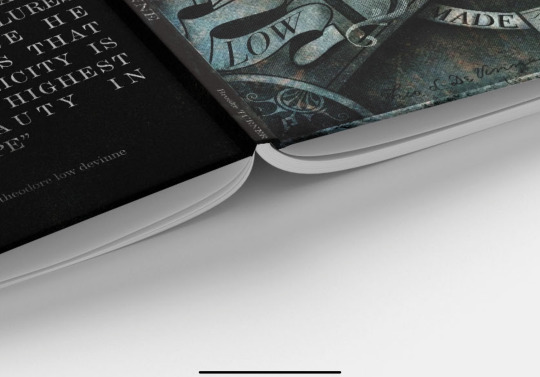
Text
Week 10 tutorial
In today’s class we ended up doing a collage workshop as we didn’t get to complete this last week due to the lack of materials provided by fellow peers, due to being in isolation it can be difficult to find materials that you wouldn’t usually have in your home such as magazines. But with the initiative of asking my dad for his work magazines that come in the mail every month I ended up having something to work with...
We had to create a happy word within a group of four, My group decided to go on With the approach of how many people in our group- with how many letters in a word. We searched up happy words that had four letters and came up with the word calm. This was our result, I did the letter C,I was in a group with naman, Stella and yanjie
After this activity and class I decided to go further with this activity and create letter forms and make the alphabet after that I then created words from the letters that I had cut out from magazines and such, this was the result
I did the words undo and bro


1 note
·
View note
Text
Week 10 lecture
This lecture was a very long lecture with a lot of information that I found very useful towards design, it’s focused on why design is how it is as well as art design activism’s.
How we can contextualise objects, this is how they aren’t defined purely by their functionality but by their context. Post modernism which we learn a previous lecture has intertwined with this.
Where is conceptualism is perceived is my collage and using multiple tools such as desktops within this lecture we looked at order such as Mimmo rotella, whom of which door are away advertisements from the surface that they were placed on to reveal what was underneath creating an inverse version and reframing the context behind the design.  when it came to the tools that we use; we delved into how these tools (computers and technology) can shape what you create, to make an idea and to have the language of art within.
We looked at symbols of design from particular artists from the early times to the 20th century of how they can manipulate objects to communicate a conceptualised design such as the manifesto of the things first, following the rainbow flag the design of flags and magazines in the early tothousands such as ad busters- going against the norms of society, having the use of collage and drawing attention to issues this magazine was mass distributed and so the approach of distribution having lower quality images and colour didn’t apprehend its worth and meaning as the visuals were quite striking and had a high engagement and response with people of the world. The use of visual language was used highly using the colours of the magazine and having an advertising technique was very controversial. As having an advertisement type layout in a magazine wasn’t considered as the normal.  this then lead into contemporary design activism with the use of typography collage and how something has been appropriated. And example of this would be the wall around America blocking of Mexico and so a group of designers built a wall around Donald Trump’s star on the wall of fame, IKEA also took an approach to this creating the border wall instructions manual.
In summary I learnt quite a lot in this lecture and I was very intrigued by the amount of artists that had use conceptualism within design the use of collage was highly used and I loved the style and dramatic approach that some of the artists use towards getting a message out to the world within their artwork
Here are some images of the works that I found intreuaging aswell as examples referring to the text above


0 notes
Text
Week 9 tutorial
Collage is the French word for glue
It is the combination of pictures images and things
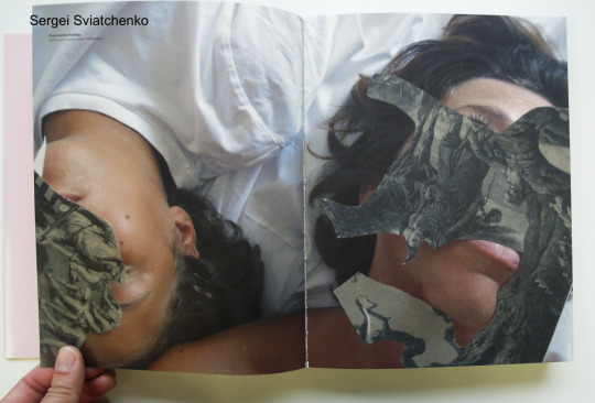
In this class we looked at some artists that had created collages
We spoke about Moholy-Nagy, who created combinations of objects with photography plates
The activity of collage consists of Composition, collating and the positioning as well as finding objects
The way they combine is what matters, creating relationships, including the negative space and objects
Design starts by looking and working with materials in relation to collage
We also delved into works created by Sergei sviatchenko
He uses one to two images with a strong colour field in the background, uses scraps over the top of photographs
The post modernism movement is about appropriating existing materials, eg. Using the photographs that you see
The use of waste is subverted in collage
Some can have a copy paste effect, aswell as digital composition to create collag, creating different effects on the viewer, it’s all about exploring. Whether that be the subject, texture or shape/form.
After we delved into some artists we relayed this back to the notion of typography,
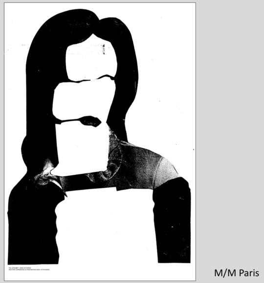
One artist m/m Paris had used models photographs and cut out a letter form from that photograph as the first letter of the models name.
Here are some images from this class


2 notes
·
View notes
Text
Week 9 lecture
Today we spoke about the end of the future and post- modernism.
This lecture briefly spoke about the end of the future and what came after this, post modernism and how we are rapidly evolving society (design) within the punk rock culture. 
we spoke about post-modernism and how it is classified as breaking the rules and design whereas modernism is the production ideological pathway of design. Having improvity, expanding and veiny growth.
Post modernism is chaotic & un instructed, it was highly influenced by the punk movement,  Bring the 1970s in influenced designers such as posters and visuals, eg. The sex pistols and there collage poster piece from the europunk visual.
This demonstrated a way in how typography was used, having an unpolished feel with no intention for following the rules of the grid. This type of deisgn was constructed for high/ quick repoduction, as an example of breaking away from the mega narratives
Then we learnt about the Memphis group
This group posed the authenticity of materials in design, often having reactions that were hated and divided they wanted to create humour and mischief. One way to describe them was “ IKEA on LSD”
During this time in the 1980s this creative movement was highly influenced by the use of computers as they became more available artists and smaller companies.
Without the use of having to go through a technician, artist were able to dynamically manipulate images words and graphics into a page layout ready for production.  soon developed creative processes such as collage experimentation and design hacking as some may call it. 
An artist that was heavily inspirational in this movement was Neville Brody, He had a highly contrasted style in design he embraced modernism and he wasn’t phased about breaking the rules in design as he had a restrained approach in typography. I was highly influenced by his work so I liked how he incorporated portraits and text in an edgy way. The following images are some of his works that I was highly influenced by and would like to incorporate in some of my works in the future.


They are simple get so aesthetically pleasing an shave a retro feel to them , the text or the image overpower each other, it looks as though it was always meant to be there.
These are some images that contributed to the lecture


1 note
·
View note

Text
Week 8 tutorial
Today we showed our peers in breakout groups what we wanted to do our final assignment on with an image of example from that topic,
I had originally to do the Victorian era
However, after conversation with my peers and Andy, it was considered to be too broad and I won’t be able to delve into a lot of depth, so I have decided to do a font from this era that was inspired by it, in that way I can elaborate further and dig deeper into my research that I can portray thru my questions.
1 note
·
View note