
Statistics
We looked inside some of the posts by beawleggatt and here's what we found interesting.
Average Info
Notes Per Post
1M
Likes Per Post
348K
Reblog Per Post
928K
Reply Per Post
208
Time Between Posts
8 days
Number of Posts By Type
Photo
2
Text
8
Last Seen Tumblr Blogs


Fun Fact
Tumblr posted its first advertisements in May 2012 and subsequently earned $13M in revenue.
Photo
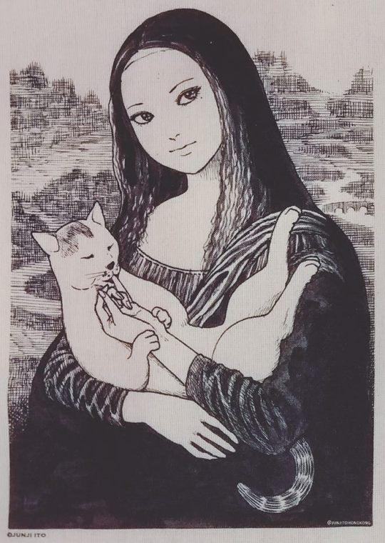
The full illustration of the Mona Lisa parody by Ito, posted by the Junji Ito Hong Kong club.
62K notes
·
View notes
Text
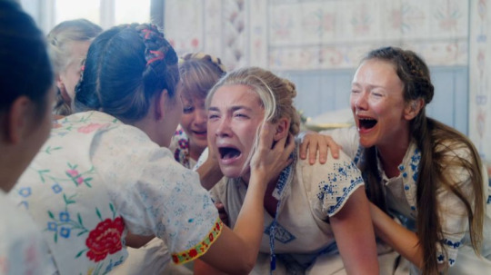
Midsommar
Midsommar is an A24 film directed by Ari Aster that was released in 2019. I watched it recently for the first time, and had been anticipating watching it since it’s announcement. Overall, I found many aspects of this film to be incredibly inspiring especially the cinematography and overall visual style. i feel that as a horror film, it exceeds it’s status in the horror genre as I usually find films within the same category to be oversaturated and tacky.

In particular, the execution of the opening sequence always stands out to me with the starkly contrasting cold colour palette of blues and greys, as well as the winter landscape, which creates a direct juxtaposition to the scenes later on in the film, heightening the sense of distress and bleakness.
I was also very impressed with Florence Pugh’s performance and how she was able to portray the harrowing trauma that Dani experiences, and the final resolution at the end. Overall, I really enjoyed both the aesthetic and narrative within this found, and used the colour palette especially as reference in a lot of my digital artwork.

0 notes
Text
BTS CONCERT O2
10.10.18
At the end of 2018, I had the honour of going to see one of my favourite bands, BTS, live at the O2 arena in London. I first discovered them and their music in 2015, and since then their popularity has grown exponentially. Hearing the songs I had listened to and loved for years was an incredible experience and something that I feel was a historic event, as it was the legendary band’s first time ever visiting the UK.

As a band, BTS have an official lightstick that can connect to Bluetooth and changes colour to the beat of the song when the concert starts. This makes the experience 10x more exciting due to the aliveness of the arena and the effort that has gone into the visual effects. Where I was sitting in the stadium at the time, I had a full view of most of the seats, making the lightsticks seem like an ocean and complimenting each separate performance.
Overall, the songs I enjoyed being shown live the most were Dope, Idol, Epiphany, Singularity and Anpanman. The concert was an incredible first London tour and a memory I will never forget.
Spotify playlist of the concert setlist
Full concert
0 notes
Text
Over The Garden Wall
Over The Garden Wall was a 10 episode cartoon network series created by Patrick McHale which aired in October of 2014. This series is one I revisit every year around the Autumn time due to the strong memories I have of watching it for the first time the year it was released. OTGW is, I believe, very different in comparison to any other Cartoon Network show released, having much darker themes yet still remaining beautifully poetic and incredibly funny throughout. The story follows two brothers lost in the woods in what seems to be a very 1920′s themed time period, and the adventures they go on as they struggle to make their way home.
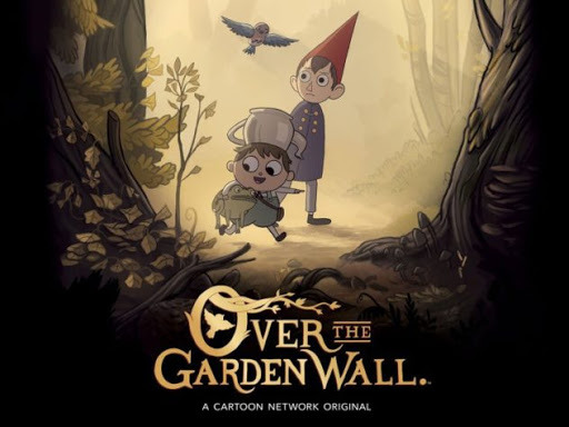
The series gradually becomes darker as the episodes go on, with the protagonist wirt slowly losing hope that the two will ever find their way home, and the beast that has been following them this whole time consumes him. The colour palette and aesthetic within this series is always coherent and visually pleasing, and its mode of storytelling is something that I find endlessly inspiring.


The character designs within this show in terms of shapes are also visually coherent, wirt being the older, wiser of the two brothers is tall and made up of longer rectangles with his signature triangular hat conveying a nervous energy he has (shape theory). Whereas greg, the younger and more carefree brother is made up of primarily circles to reflect his jovial attitude and naiive outlook on life.


The soundtrack for this show is also incredibly beautiful, with many fun and catchy themes to go along with the characters Wirt and Greg meet on their journey. However, I find the main theme song ‘Into The Unknown’ the most poignant, and summarises the overall melancholic tone that is carried through all of the episodes.
0 notes
Text
The Cat Returns - Studio Ghibli
I recently re-watched the first Studio Ghibli film I can remember enjoying when I was younger, The Cat Returns. This film has been a large source of inspiration in terms of the animation style, characters and soundtrack for as long as I can remember.
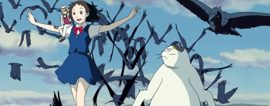
I really enjoy the way in which, as most Ghibli films do, the animation style makes the most simple parts of life seem joyful and appealing. The attention to detail when it comes to mundane things such as preparing food or walking home from school seem vibrant and exciting thanks to the fresh colour palette and the softness of the movement within frame timings. In particular, I adore the attention to detail on the breakfast Haru’s mother prepares for her that she comically, can’t eat as she’s running late to school.


The original soundtrack, particularly in the ballroom scene after Haru enters the Cat Kingdom compliments this moment beautifully. The sense of wonder as Haru tries to figure out who the man she dances with is, along with the growing anticipation and anger within the audience that watches and the Cat King himself, who abruptly brings the score to a halt, makes the scene much more exciting and tense to view.

Finally, one thing I particularly enjoy within this film is the character design and difference in silhouette. Baron’s design always stood out to me, as I adore the combination of his cat like features with the neatness of his attire, proving a lot of thought went into his appearance due to his backstory of being crafted and brought to life.


1 note
·
View note
Text
Artbox Cafe
The Artbox Cafe in Brighton is somewhere I had been anticipating the arrival of for quite some time. I am familiar with the store in London which I visit whenever I go up there, and as a fan of the ‘Kawaii’ aesthetic and various mascots and Sanrio characters, I was very excited that it would be a character themed cafe that rotated every few months. I visited several times, when it first opened and when the theme changed again later on in the year (2019), as well as most recently, when the character changed to Gudetama.


I very much enjoy the layout and design of the cafe, especially how Pusheen’s signature colours of pastel pink and turquoise have been taken into account with every detail such as the wall colours, furniture, cutlery and more. Something that makes the cafe even more special is the themed food and drink, and the way in which a lot of artistic effort is put into designing the menus as well as food toppings and other decorations.


As of a few weeks ago, the character has officially changed from Pusheen to Gudetama, and the downstairs shop area now has a wider range of Sanrio merchandise, and I particularly appreciate each character shelf layout and how it correlates with the signature style and aesthetic of each mascot. The menu for the cafe area has also changed to more savoury foods, due to Gudetama being an egg yolk.


0 notes
Text
Hastings Gallery Visit


I was surprised to see the works of Quentin Blake at a gallery I visited recently in hastings, his illustrative and cartoon like style is something that I would like to study more and is also something I have admired for a long time. Seeing the room in which his works had been displayed also inspired me to think about character design withing my art as well as ways to frame and put together a figure within a composition. Many of his works on the days featured a character in an environment, and landscape studies are something I hope to develop and improve on within my own artwork.


There were many painted portraits at the hastings contemporary by the artist that I deeply admired. The portrait titled ‘Justine’ (pictured above) was inspired by Willing’s daughter, and I deeply admire the way in which the character and likeness of the subject is captured in such a simplistic way. Furthermore, the block colours and brush strokes work well with the muted colour palette and block colou background. Seeing this portrait and the others on display by made me want to explore painting in a different style.

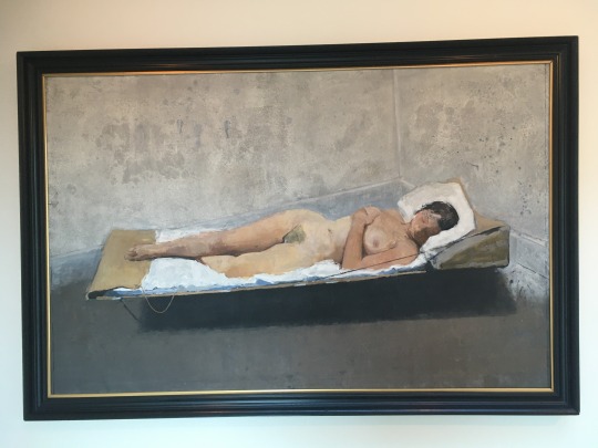
Whilst I didn’t photograph everything at the gallery, there were a number of figure studies mainly in paint that stood out to me. I enjoy the way in which flesh tones are created in the above reclining figure pose and painting from life is something I would like to explore deeper in the future hopefully, as I have only thus far had experience with drawing and sketching. Furthermore, the ink portrait studies above caught my attention due to the level of tone depth and the way in which shadow and light have been caught in such a restrictive medium. Ink is something I would personally like to explore more in depth, especially after seeing Quentin Blake’s ink washes over his illustrations.
Overall, I’m very happy I decided to visit this gallery while I was staying in the area, and am encouraged to go to more galleries in the future, due to the way in which this one inspired me to think about different mediums, as well as allowed me to see and artist whose work I have admired for a while in person.
1 note
·
View note
Text
MikuExpo 2020 London
11.01.20
Overall, I have been a huge fan of Hatsune Miku and Vocaloid in general since a young age, so the opportunity of seeing her live was one I was ecstatic to receive and had been waiting for, for a very long time. Seeing the songs I love performed live as well as the general atmosphere and visuals were a big inspiration towards my work.

Before the concert, a friend and I decided to cosplay two of the Vocaloid characters; her as Miku Hatsune and myself as Kagamine Rin. We took inspiration from both the character’s designs themselves whilst also merging their outfits with aspects from japanese street fashion subcultures seen in harajuku such as decora kei and fairy kei.

Miku and Rin, as seen in the Project Diva game series

Examples of the cosplay
The concert itself was incredible, and the atmosphere in general was friendly and made the experience of queuing and waiting much less unpleasant. The set design overall complimented the hologram screen at the centre, changing colour depending on the mood of the song of the assigned colour palette of the character on stage at the time. The screen displaying the projections was slightly iridescent and reflective, allowing the light sticks held by audience members to surround the characters on stage, overall having an impressive visual effect. The live band made the whole experience feel much more real and less like watching a film or theatre performance, despite the characters graphics being pre animated. Overall, I think the performances that stood out to me the most were Miku and Kaito’s Ohedo Julia Night, which incorporated the graphics within Mitchie M’s orginal animated music video very nicely, as well as Kagamine Rin and Len’s energetic performance of Giga’s Bring it On, which received the most energy and chants from the audience.

Vocaloid music and music videos have been a big part of my inspiration in terms of my personal artwork for a long time, and being able to see those same songs performed live was both an exciting and emotional experience.
https://www.youtube.com/watch?v=PlQIdq5mv_k
Full Barrier POV of the London Performance
1 note
·
View note
Text


faces of fresh fruits (2005) pt. 2
4K notes
·
View notes