Florida artist posting my art, my music and pretty much anything I like. If you want anything designed for you or a beat email me. [email protected] Link to RedBubble FaceBook Page This work is licensed under a Creative Commons...
Don't wanna be here? Send us removal request.
Text
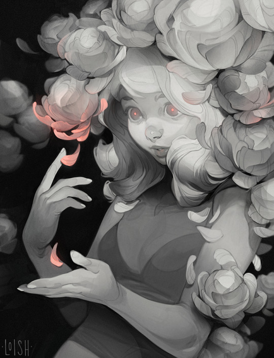
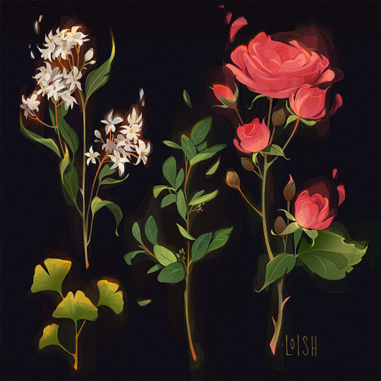
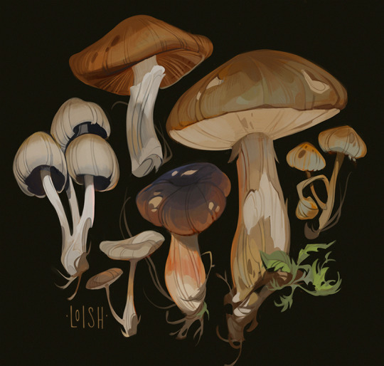

I just updated my print shop with some new artwork! So if you’re looking for some art to put on your walls, take a look: https://www.inprnt.com/gallery/loish/
11K notes
·
View notes
Photo

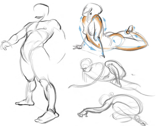
Repetition trains your brain into intuitively recreating it. So practicing ‘default poses’ and simple gestures can be helpful and save yourself time not having to actively think about or guess how something is build.
the easy way to draw hands… or basically anything, really- is to simplify and break the form into simple shapes that make it easy for you to construct and pose. You can do that by just ignoring unnecessary details and focus on the key elements that translate the gesture you want to represent.
construction can be hard, especially for beginners, don’t be afraid to use reference if you need.

drawing feet is hard, i struggle with it alot sometimes. i like to imagine them wearing socks to not have to deal with arranging all different toes- which can become frustrating.
also unrendered feet tend to always look a little- flat. Tilting and posing gives them more dimension and makes them seem more dynamic
875 notes
·
View notes
Photo

or more like: ‘generally helpful books for the artist’
- DER NACKTE MENSCH - Hand- und Lehrbuch der Anatomie für Künstler by Gottfried Bammes (the only thing you’ll ever need, it’s in german tho…) or- the artist’s guide to HUMAN ANATOMY (which is basically the 'light’ version of it)

- Andrew Loomis : drawing the head and hands; figure drawing for all it’s worth; successful drawing; creative illustrations

- THE PRACTICE AND SCIENCE OF DRAWING by Harold Speed
- Atlas of Foreshortening: The Human Figure in Deep Perspective
- Anatomy for Sculptors Understanding the Human Form

- Burne Hogarth - Dynamic anatomy; drawing dynamic hands; drawing the human head;
- The Figure in Motion: A Visual Reference for the Artist - Thomas Easley
- how to portray the figure with accuracy and expression - Robert Barret

- GESTURE DRAWING a story-based approach by April connors
- FIGURES FROM LIFE & THE ANATOMY OF STYLE by Patrick J. Jones
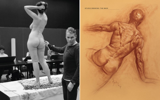
- Brigmans Life drawing; the Human Machine; Constructive Anatomy; by George B. Bridgman - Atlas of Human Anatomy for the Artist - Stephen Rogers Peck
- FORCE - dynamic life drawing for animators
- drawing the female figure by Francis Marshall
- THE HUMAN FIGURE by John H, Vanderpoel

- Mastering drawing the Human figure from life, memory, imagination by Jack Faragasso
- DRAWING PEOPLE how to portray the clothed figure - by Barbara Bradley
- A HANDBOOK OF ANATOMY FOR ART STUDENTS - Arthur Thomson

there are some more but i got tired…
again- i can only recommend books i have actually read so if there are any additions you want to make feel free.
731 notes
·
View notes
Note
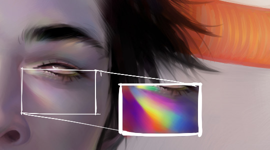
do u have any tips on how to paint that fluorescent skin effect??
sorry im not quite sure what you mean but im assuming youre talking about the rainbow shit
i dont know all the art terms so bear with me
to add to this post, i start by just putting some random colours down then blending them out. for trolls i use lots of green blue and purple cos i guess my ocular cones n rods tell me cool colours are closer to grey than warm ones are

then i pick a colour for the high points and blend out with adjacent colours to get that rainbow effect
yellow is a good colour cos you can blend from yellow to red or yellow to blue and it will look nice + allow you to include lots of different colours which adds to the holographic/iridescent/whatever effect and still give an impression of depth without having to add heaps of black and muddying up the colours

you dont have to use yellow though, i just reckon its the easiest jumping off point. below i just changed the hue in photoshop n got cyan. it still looks like its got depth and all that but now are colours are limited, we missing yellow and orange. try different shit out though. pink is nice too
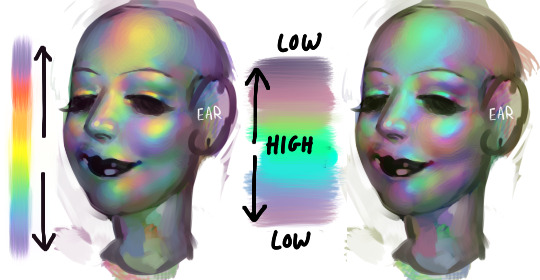
these are like fairly bad pics but below are some ways to do this with yellow as the colour of your high point/bits where the most light is bouncing off
think of the arrow going from the highest to lowest points. i like doing it the way i have in the middle pic cos i reckon its a bit more fun and dynamic. but yeah dont limit yourself to yellow! plenty of other colours out there in the big wide world. and dont worry if it looks garish you can always edit it later on
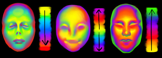
anyway you dont have to think too long and hard about like colour order or anything though. the main thing is just putting the right colours next to one another, so if youve got a green patch and a red patch blend them together with some yellow, orange/red goes between yellow and purple, etc etc
sometimes its better not to plan things too much
19K notes
·
View notes
Note
do u have any tips on how to paint that fluorescent skin effect??
sorry im not quite sure what you mean but im assuming youre talking about the rainbow shit
i dont know all the art terms so bear with me
to add to this post, i start by just putting some random colours down then blending them out. for trolls i use lots of green blue and purple cos i guess my ocular cones n rods tell me cool colours are closer to grey than warm ones are

then i pick a colour for the high points and blend out with adjacent colours to get that rainbow effect
yellow is a good colour cos you can blend from yellow to red or yellow to blue and it will look nice + allow you to include lots of different colours which adds to the holographic/iridescent/whatever effect and still give an impression of depth without having to add heaps of black and muddying up the colours

you dont have to use yellow though, i just reckon its the easiest jumping off point. below i just changed the hue in photoshop n got cyan. it still looks like its got depth and all that but now are colours are limited, we missing yellow and orange. try different shit out though. pink is nice too

these are like fairly bad pics but below are some ways to do this with yellow as the colour of your high point/bits where the most light is bouncing off
think of the arrow going from the highest to lowest points. i like doing it the way i have in the middle pic cos i reckon its a bit more fun and dynamic. but yeah dont limit yourself to yellow! plenty of other colours out there in the big wide world. and dont worry if it looks garish you can always edit it later on

anyway you dont have to think too long and hard about like colour order or anything though. the main thing is just putting the right colours next to one another, so if youve got a green patch and a red patch blend them together with some yellow, orange/red goes between yellow and purple, etc etc
sometimes its better not to plan things too much

19K notes
·
View notes
Text

I wonder what G Man's view was like from the vault
2K notes
·
View notes
Note
Not sure if I've asked this, butt in regards to your last picture you uploaded and all of your drawings, how do you know where to line up the head/cranium with the rest of the spine in cases where the head is turned or posed?
well that is simple, the head ideally sits in the middle of the spine…

positioning the head is not the difficult part, in most cases ‘artists’ don’t need to make things ‘look’ right but make it ‘feel’ right. specially when drawing idealized and/or from imagination altering proportions and poses is rather common ⁽ˢᵘᵖᵉʳʰᵉʳᵒ ᶜᵒᵐᶦᶜ ᵃʳᵗᶦˢᵗˢ ᶠᵒʳ ᵉˣᵃᵐᵖᶫᵉ⁾

the easiest way⁽ᶦᶰ ᵐʸ ᵒᵖᶦᶰᶦᵒᶰ⁾ is to use the shoulders. Most of the time when drawing poses i will actually place the shoulders first and then draw the head. Maybe try ‘gesture drawing’ as exercise.
6K notes
·
View notes
Photo
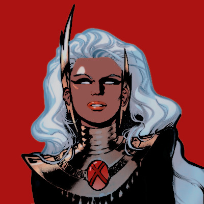
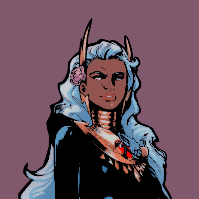
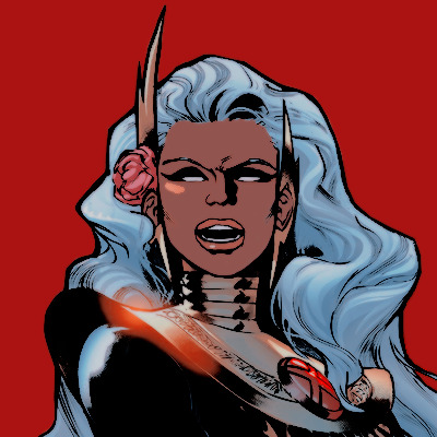
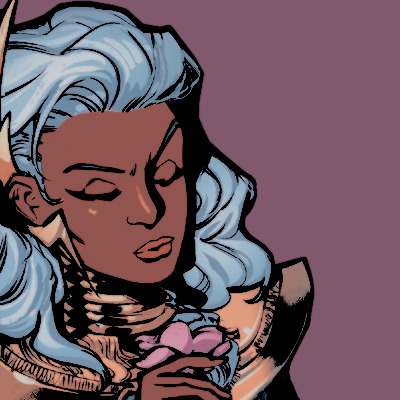


ororo munroe | storm icons
• made by @clacefall
• if you save or use, please don’t forget to like or reblog
• don’t edit them or claim as your own
• open the image before saving for better quality
• more storm │ make your request
261 notes
·
View notes
Photo

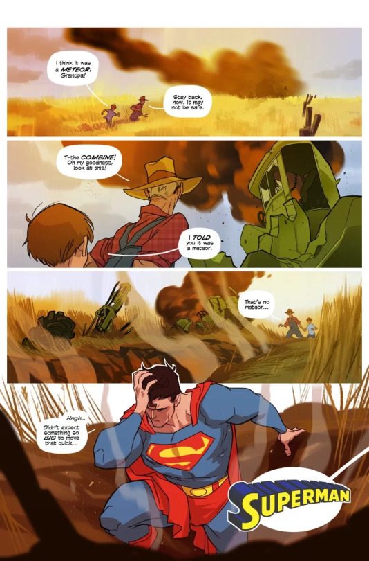


A Superman short story by Scott Kurtz and Karl Kerschl (September 2, 2021)
In 2013, Scott Kurtz tweeted randomly that he had written a short Superman story. He asked if anyone wanted to take a crack at illustrating it. I said yes. Scott sent me his short script and it was great. It captured the simplicity and positivity that I always long for in a Superman story, and it was only five pages long! I started drawing it in my spare time and finally got around to finishing it eight years later. ~ Karl Kerschl
29K notes
·
View notes
Photo
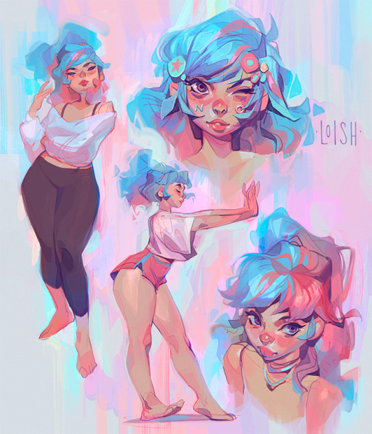
My OC ~ I have been drawing her for 18 years and have still not gotten tired of this color palette.
4K notes
·
View notes


