
Don't wanna be here? Send us removal request.
Statistics
We looked inside some of the posts by beeillustrates-blog and here's what we found interesting.
Average Info
Notes Per Post
12K
Likes Per Post
7K
Reblog Per Post
5K
Reply Per Post
4
Time Between Posts
2 months
Number of Posts By Type
Text
12
Photo
5
Last Seen Tumblr Blogs


Fun Fact
69% of Tumblr users are millennials.
Text
Professional Practise Lecture – 9th March 2018 Led by 2 out of the 4 artists in residence
Pilar Garcia de Leaniz – from Spain
Was on illustration course, did a year of Master’s Degree in illustration and has been an artist in residence at the uni ever since. Is in process of publishing book and just returned from Finland on a residency.
Describes herself primarily as businesswoman who enjoys networking. Had a bad illness as a child that has affected the mobility of her hands so never wanted to do anything related to art – hence why she pursued marketing and business studies.
She met an important Instagrammer in Madrid in 2009, met her because she was one of the first people in Spain who started doing Instagram meet ups. She created events and competitions within the Instagram community.
Moved to Edinburgh six years ago, worked as a nanny for girl called Imogen who she called “Imomo” and began making bracelets for her. She has now created a minimalist fashion brand with tote bags and jewellery with the brand name Imomo.
She doesn’t use pencil or erase anything. She loves imperfections and makes them work for her. She goes straight in with pen!
She often listens to stories with her eyes closed and draws. This is a really interesting technique that I would like to use in my work.
“If you want to be successful you have to think big” she advises starting with big companies and asking for work.
0 notes
Text
Professional Practise Lecture - Sarah Sheard
Sarah Sheard is an artist in residence currently based in first year studio, graduated in 2014 with Ba(Hons) in painting.
Gives serious topics/pieces of art a humorous twist.
Favourite image making tool = black mid thickness pen
She creates a self-deprecating persona within her work when she started on painting course she was too busy trying hard to make ‘good’ art rather than what she enjoys and is good at.
Says she made questionable art and struggled to know what sort of art she should make. The part of herself that’s too scared to draw attention to herself in real life likes the comic illustrations as a medium to express herself.
When she started making work she found humorous she was worried she wouldn’t be taken seriously and given credit. A lot of the time we as artists are just worrying about how to appear legitimate.
She likes the idea that artists are people advertising products for sale and produced a series of paintings combining advertising style text with ‘high-brow’ fine art style language. Art is often about insinuation and context.
“I find art that we are supposed to hold with a lot of respect being treated in the same way as a bottle of coke quite funny”
– in relation to art being priced as 99.99 etc
Finds sketchbook work much more interesting than work people end up exhibiting in galleries

Not much difference in pretending to be able to do something and actually being able to do it. She wants to develop her textile printing skills and explore animation. It’s important to her to know as many processes and techniques as possible.
She’s finally making the work she WANTS to make rather than the work she believes she SHOULD be making.
0 notes
Text
Witchcraft Symposium - Postmodern Occult
So yesterday I had the pleasure of attending a symposium/conference on witchcraft in the modern age, held at the University of Edinburgh. As it is currently my ‘reading week’, I have no scheduled lectures and therefore have found myself at a bit of a loose end.
As part of the Festival of Creative Learning my university is holding, I decided to step out of my comfort zone and sign up for a few events that sparked my interest. As witchcraft and the supernatural world is a recurring theme in much of my artwork, I thought this talk would be relevant to my practice, despite my skepticism!
The symposium proved to be fascinating, and I was able to attend three of the scheduled talks given by various academics. The nature of these talks was that of Science, Technology and the Postmodern Occult.
The first talk was given by Dr Dee Harding, an independent scholar who discussed how ‘One of these things is not like the others: data reduction as occult practice’.
To give a summary of Dr Harding’s talk, essentially occult practice is full of short lists of things, whether elements, symbols, demons, or sins. When presented with the list of seven deadly sins, there are certain questions we are inclined to ask. For example, is seven enough? What is the difference between gluttony and greed? How will these descriptions be used? Are those uses acceptable? There are a lot of potential questions. The full list is not really present in mysticism; it is much more evident in mathematics. The idea of a category is fundamental to the field of statistics, which provides further questions about scope, capacity for change, and bias.
The original 7 Deadly Sins were formalised in 1410 with the ‘Lanterne of Light’ - an anonymous Lollard tract written long before the beginning of statistical history. Subsequent demonologies all attempted to refine a catalogue of social threat despite not having a map of how such a catalogue could or should be categorised.
Dr Harding stated that using statistical concepts, we are able to gain a more thorough understanding of how essentialism and symbolism, when applied to abstracts and value systems, can hide or obscure parts of a thing we are trying to invoke or understand. The history of demonology is just one example of how problems with categorisation can have or illustrate very real issues. Did an immutable and essentialist view on human sin contribute to public support for witch hunts? Did the nature of the categories at hand help create that issue? Dr Dee Harding emphasised the fact that statistical concepts are unlikely to provide us with the answers, but they can ensure we are asking some of the right questions.
0 notes
Photo


claudemonet
Sea Study, 1881
@claudemonet-art
7K notes
·
View notes
Photo
Beautiful! I need to try and experiment with embroidery... I’ve always loved it
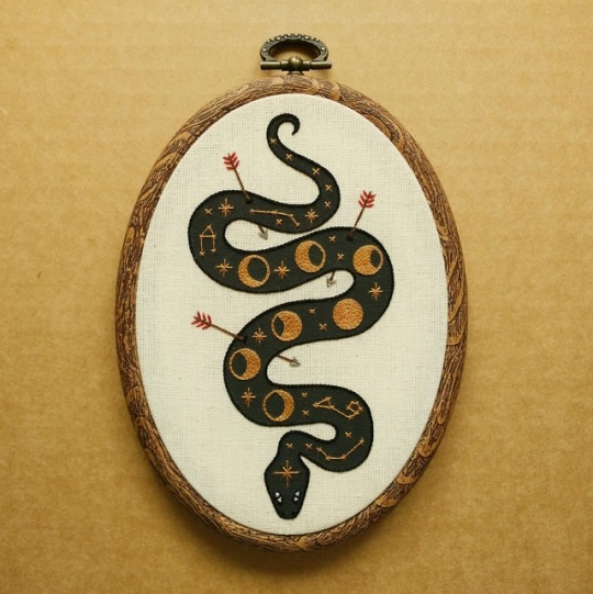
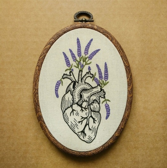
DIY Embroidery Art Patterns, by ALIFERA on Etsy
5K notes
·
View notes
Text
Dr Simon Grennan Professional Practise Lecture
Dr Simon Grennan
(Comic maker, scholar and artist)
University of Chester
During his lecture today, Grennan’s aim was to give us insight into what we think about comics as a comic scholar, as well as an introduction to comic scholarship.
He primarily focused on the historic contingencies of comics - which is the situation under which something exists.
Languages
The first characteristic of a comic that Grennan discussed was the element of language. Comics appear in French (BD), English and Japanese.
French
- Comics in French began being comics historically in 1837. Rudolphe Toppfer was Swiss born but invented the first French comic.
English
In English, there are three categories of comic.
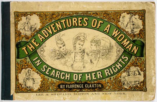
- Comic book (traditional types of comic, such as Marvel and DC) - Comix (a variety of underground comics that appeared in 60s, counter-culture/youth culture) - Graphic Novel (a single story, produced for grown ups. It aspires to adult literature, and is essentially a graphic version of literary novel. - Some of the earliest comics in English were made by women, for example Florence Claxton and the 1870 satirical piece titled “The Adventures of a Woman in Search for Her Rights”. Of course this was not widely recognised as the first English comic as it was made by a woman.
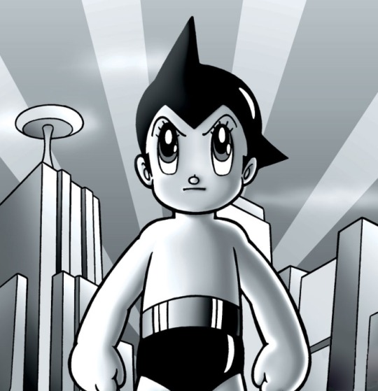
Japanese - Manga, Manhua, Manhwa. These types of comics have an immense following globally. - In 1947 Osamu Tezuka created ‘The Mighty Atom’ (know as Astroboy in Western culture). Tezuka was a revolutionary figure in the field of comics and essentially invented manga after the Second World War.
Ways of Reading Comics
The second topic Grennan discussed with us was the ways in which comics are read. The way of reading the comic dictates the form of the comic and the story.
“Form, use and story are all integrated.”
- The frequency at which the story is produced (these can go on forever – everlasting story arc. For example, manga is designed so that you read the latest weekly instalment then bin it, whereas graphic novels you keep forever.)
Simon Grennan then went on to explain how a story is comprised of 2 things. • What happens in the story • Who the story is told by and to It is important to not that comics show stories rather than tell them, through drawing.
All of the qualities mentioned above that Grennan discussed with us go on to make up the Comic Strip REGISTER. This is a term used by scholars in the field to categorize comics in to genres.
A genre is a habit of use/what the reader expects, genres feed themselves and from this, forms develop.
Another key part of the historic contingency of comics that Dr Grennan elaborated on is the notion that comics are bad for you. It is primarily an English idea that comics are for young people and therefore influence behaviour. This idea has then spread globally, and then the idea that content is important because it needs managing and censorship. It was not uncommon for certain types of comic to be banned in the past.
Depiction Depiction is another way of describing the act of “seeing in” – seeing a visual representation and imagining that you see its object. Depictions are meant to resemble the things that they show, and require the use of visual imagination to work out what is going on. Most comics are depiction based. The alternative would be an abstract comic!
Grennan then clarified the difference between ‘trace’ and ‘index’ - although there is still much debate amongst scholars regarding the characteristics of the two.
They are primarily used to refer to drawing. ‘Trace’ and ‘Index’, are lexicons of comics, lens-based depictions and digital comics. Index points to the presence of the body but isn’t a direct trace of it. Drawing has access to kinds of technology with the body that other media do not.
Overall I found this lecture gave me new insight on comics which i previously would never have experienced. Looking at them from an analytical and academic point of view allowed me to take them more seriously as an art and storytelling form. It is also particularly useful for my current project ‘Unspoken’ - in which I have to create a four panel wordless narrative based on a painting i viewed in a gallery recently. Initially i found this project very challenging, but after this lecture I feel I have gained some clarity in the mechanics of comics, and therefore should be able to create my piece with a little less difficulty.
#comics#marvel#dc comics#comic books#comicon#comicart#manga#professional#contextual studies#illustrator#Illustration#illustagram
0 notes
Text
Michael Kirkham Professional Practise Lecture
Michael Kirkham is a practising illustrator, and has been for the past 11 years. He primarily works in the fields of advertisement, editorials and design.
He primarily draws people, focusing on human nature by placing them in various settings and carrying out various normal and nonsensical tasks – Kirkham cites Wes Anderson’s filmmaking style as an influence, and said he likes drawing wooden looking people, capturing their nature and rather than only creating a realistic representation of them.
Kirkham stated that he tends not to start with an idea, he instead just draws and idea happens in the creative process. He also doesn’t draw what things realistically look like but how people understand things, the sense of what we make of it, in our imagination. Despite his work being diagrammatic in one sense, it is important to Kirkham to have strong sensory feeling, and he is able to maintain this through his use of colour and inclusion of weather in his images - much like the use of pathetic fallacy in literary pieces.
A key element of his style is the way in which he plays with scale and perspective. Kirkham advises to bend the rules of pictures so you can achieve what you set out to achieve. Perspective is ongoing theme in his work, and the manipulation of depth is exciting and gives opportunity to play. He shared the importance to him of making clear pictures, crafting elements and composition to make it undeniable what is being communicated.
From working with several major newspapers, his work is often of a political nature. This gives Kirkham an opportunity to deal with subjects that he considers pertinent. He elaborated that he endeavours to get an even mix of sexes and ethnicities in his work. (guardian review 09.09.17)
He explained that there are often short deadlines in editorial work, and that the subject matter very prescribed, thus rendering Kirkham’s level of emotional involvement with the piece limited. He does try to combat this however, stating
“I go out of my way to become interested in everything I work on”
He then went on to explain how he particularly enjoys doing books because the creative process lasts longer and he is able to become emotionally involved.
Personally, I really enjoyed this lecture. I felt Kirkham gave a frank, unbiased insight in to what it means to be an illustrator - much to the discomfort of some of our lecturers! It was really exciting to get to grips with his creative process and I will definitely aim to play with scale and perspective like he does in future.
0 notes
Text
Johnathan Gibbs
Johnathan Gibbs is the head of the illustration course at Edinburgh College of Art (where I currently study) and today he led the professional practice lecture.
He primarily discussed his various influences for his work, as we get to see a lot of his content in the flesh at our studios, and having him as a lecturer at ECA means that we are able to get valuable contact time and discuss any questions we had regarding his work further.
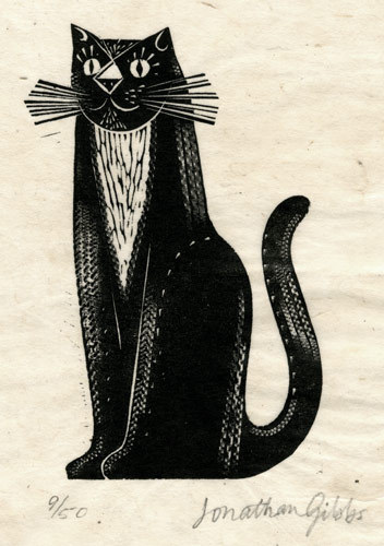
Johnathan Gibbs paints, draws and manufactures prints. He works in oil on wood panels primed with Gesso. (which is a white paint mixture consisting of a binder mixed with chalk, gypsum, pigment, or any combination of these)
His designs are then engraved onto the wood blocks, then printed onto Japanese paper by hand-burnishing with a bone spoon.
Gibbs’ work includes traditional book illustration as well as drawing & painting, printmaking, editorial and pattern design, with his work frequently being exhibited both in London and Edinburgh.
Johnathan Gibbs uses the mediums of Holly, Box and Whitebeam to fashion his wood blocks, and his illustrations are seen in a wide variety of locations - from packaging, to mural design, to his own books! He has a wide variety of clients and is a very successful artist.
0 notes
Text
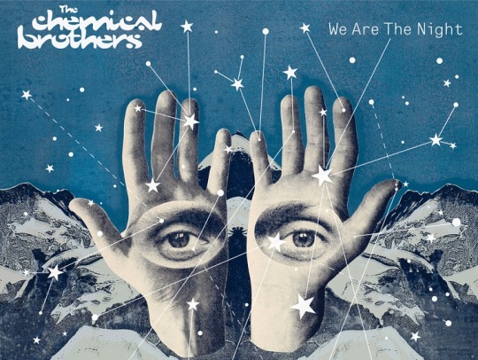
Kate Gibb
On Friday the 29th September 2017, I attended a lecture by printmaker Kate Gibb on professional practice.
Gibb has been an influential silkscreen artist for over 20 years, and has undertaken a variety of huge commissions for the likes of The Chemical Brothers, Vogue, Penguin Books and many more.
Kate Gibb emphasised the importance of having a nice creative space, customised to your needs - and stated that collecting things is an important part of her creative process.
“Have inspiration around you”
Because of her reluctance to conform to conventional printing methods, Gibb is primarily referred to as an illustrator.
After completing an MA in textiles at Central St Martins, she landed her first job for a band called mono. She then went on to post work out to agencies such as village green, and directly contacting people looking for work.
Kate Gibb believes in adapting her process to fit her environment – in her early days as a professional printmaker she didn’t have studio so worked around it.
She recommends putting experimental new ideas and interests in portfolio – making it for yourself, in the hope that you get work in that vein. She also emphasised the importance of experimenting with revamping old ideas – the same image can be transformed for new needs and clients.
Gibb got lots of jobs from bad photographs – everything in her early days as a printmaker was done on film so if clients weren’t happy with the initial photographs they would turn to her, and she would adapt them to silkscreen prints.
I felt I could learn a lot from Kate Gibb as an illustrator, as she is constantly trying to move her work forward and challenge her previous ideas. She stressed the importance of self initiated ideas, and collaborating with friends to make yourself known within the commercial art world. I found the talk to be thoroughly useful and inspirational, and hope to be able to use her words of wisdom to my advantage in the future.
0 notes
Photo
Another in a series of illustrations im doing atm
1 note
·
View note
Photo
First of a series of illustrations ive been working on recently .....
0 notes
Text
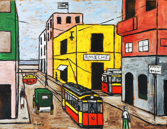
American Modernism… Continued
Pop Art was born in Britain in the mid 1950s. It was the brainchild of several young subversive artists-as most modern art tends to be. The first application of the term Pop Art occurred during discussions among artists who called themselves the Independent Group. This was part of the Institute of contemporary Art in London, which began around 1952/1953. Acquiring consume a good, responding to clever advertisements and building more effective forms of mass communication galvanised energy among young people born during the post-World War II generation. Rebelling against the esoteric vocabulary of abstract art they wanted to express their optimism, after so much hardship. They went about this by exploring a youthful, fun and bright visual language.
American Pop Art:
Andy Warhol understood shopping and he also understood the allure of celebrity. Together these Post-World War II obsessions drove the economy. From malls to People Magazine, Warhol captured an authentic American aesthetic: packaging products and people. It was an insightful observation. Public display ruled and everyone wanted his/her own fifteen minutes of fame.
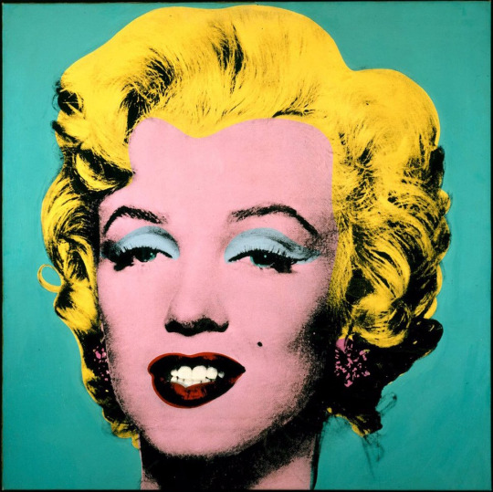
Pop Art usually incorporated very bright colours, images of celebrities or fictional characters in comic books, advertisements and fan magazines, recognizable imagery, drawn from popular media and products, and in sculpture, an innovative use of media.
#art#artists#artist#artists on tumblr#pop#pop art#andy warhol#warhol#warholpopart#marylin monroe#america#illustration#illustagram
0 notes
Text
American Modernism
The definition of Modernism is that it is more than a rebellious state of mind than an artistic style. American modernism questioned all autistic, scientific, social, and moral conventions.
The characteristics of modernism were:
-embracing nihilism
-rejecting every system of belief
-believing in the self sufficiency of each individual work of art
-adopting primitivism and exploring perversity
-focusing on the city rather than nature
Modernists viewed the world and especially human existence as being meaningless. Modernists rejected the belief that morality and organised religion provided the means of the social evolution and and/or the betterment of man.
They questioned all accepted systems such as the sciences, political, social, or economic paradigms, and the arts - especially the Academy. They also believed that each individual work of art should be judged on The basis of how well an artist is able to communicate the purpose of the work as well as the relationship between meaning and form.
Modernists rebelled against the dictates of the Academy. Each country has its Academy, and institution that judged what was proper and what was not in the depiction of reality. The academy so it's task as the education of artists in the practice of an idealising art in the classical tradition. The Academy was a school as well as a regulatory body. The Modernist artist would systematically and deliberately develop an art that testifies to all that is strange, unknown, and unlabelled in the self.
They created a new language of images that describe the inexpressible and expected the viewer/reader to interact with the work. Modernists rejected technology and the rigidity of society and its institutions. Modernists embraced the natural primal roots of primitive man. Modernists also embodied the pursuit of personal and artistic freedom. They would explore the uncivilised nature of man and suggested that being civilised was merely a veneer that quickly vanishes.
Modernists would focus on the City and would shift away from nature within the heart. They would explore the city as a place of lonely clouds and marginalised individuals. Forces that shape to modernism included technology and the new science, new philosophical paradigms such as those by Albert Einstein and Alfred Whitehead, The new psychological paradigms such as those created by Sigmund Freud, Carl Jung and Henri Bergson.
#art#artist#artists on tumblr#illustration#painting#paint#american modernism#city#context#studies#contextual studies#anderson
0 notes
Text
Bauhaus and WW2 - Contextual Studies
Walter Gropius, the founder of Bauhaus formulated a manifesto for it which stated “the final goal of all artistic activity is architecture.” The Bauhaus principles are best summarised by Alfred Barr in the preface to his book “Bauhaus”. He was the director of the Museum of Modern Art in 1938.
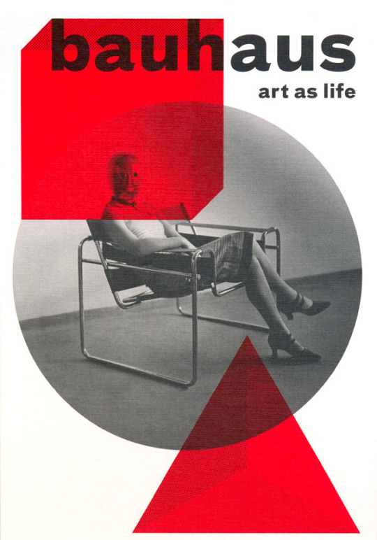
Bauhaus was one of the most definitive design movements of the modern age reaching its peak between the two World Wars.
Literally translated from German, Bauhaus means ‘school of building’ or ‘house of construction’. Bauhaus was a completely new type of art school fusing the teaching of art and design, which previously had been taught separately. Bauhaus offered foundation training in a wide variety of different creative disciplines. They believed in the variety, and understanding mass production was a key aspect of the curriculum. The school sought to produce students that were able to unify art with craft while embracing new technology.

Unfortunately the prevalence of Nazi regime at the time meant that the Bauhaus was closed down despite being one of the most celebrated Art schools in Germany.
Interestingly the Nazi uniform of 1934 was designed by Hugo boss. One of the most surprising aspects of Hitler’s arrival in power in 1933 was the foundation of a German fashion Institute. Known as the 'Deutsches Modeamt’, it was a reflection of Nazi attempts to control every aspect of women’s lives, including what they wore.
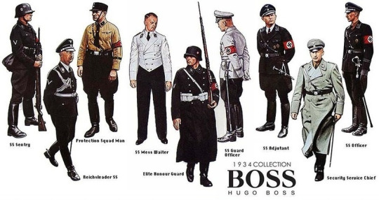
Hitler was an unlikely fashionista - despite overseeing the uniform for the Bund Deutsch Mädel, his approach to feminine adornment was generally negative. He hated make up and often remarked that lipstick was composed of animal waste. He disapproved of hair dye and was disgusted by perfume though he bowed to Eva Braun’s enthusiasm for it.
#hitler#germany#German#art#artist#artists on tumblr#bauhaus#Illustration#illustrator#hugo boss#fashion#design#designer#fashion art
0 notes
Text
Contextual Art 1925-1939
Beginnings of Photo journalism
Dada - Dada emerged in the art world during the First World War.
A key feature of his work was was to highlight the degradation of social structures that led to such violence: corrupt and nationalist politics, repressive social values, and unquestioning conformity of culture and thought.
Dada-ists declared an all-out assault against not only on conventional definitions of art, but on rational thought itself. “The beginnings of Dada,” poet Tristan Tzara recalled, “were not the beginnings of art, but of disgust.”
Dada-ists did not share a common style or practice so much as the wish, as expressed by French artist Jean (Hans) Arp, “to destroy the hoaxes of reason and to discover an unreasoned order.”
By using materials and chance-based procedures, they infused their work with spontaneity and irreverence. With simply scissors and glue, Dada artists innovated with collage and photomontage.
German Expressionism (film)
We are able to trace just about all of our cinematic vampires back to Nosferatu, which is reason enough in itself for the film to hold an important place in movie history. But it was also a superb example of German expressionism, a style with emphasis on subjective, emotional perspective rather than strict reality would become part of the basic grammar of film. (When a character is drunk or drugged and the picture goes fuzzy and wobbly to reflect how they are feeling is an example of German expressionism at work on a very simple level)
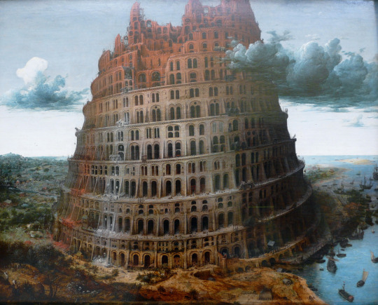
Art Influences on Film The tower of Babel by Pieter Bruegel the elder was a key influence in Fritz Lang's iconic dystopian silent film "Metropolis".Lang looked to Bruegel's the "Tower of Babel" with its impressive sky dominating height and breath, providing the perfect attributes for his own film setting of the same name. The Tower of Babel featured in the movie updated the building with a few nods to the art deco aesthetic that pervades the film but aside from those changes the building's form and visual dominance in the frame follows Bruegel's painting from centuries earlier.
While doing press for 'Django Unchained' Quentin Tarantino often expanded on the enormous influence the westerns of yesteryear have had on his own revenge western. While riding on a horse back to a plantation run by the villainous "Big Daddy" Django is revealed to be sporting a bright blue outfit that would seem more at home in 18 18th-century Britain than in the antebellum South. Although the outfit is played for humour in the film is very closely reminiscent of the subject's attire in Thomas Gainsborough's portrait "The Blue Boy". Why Tarantino would cite such an unusual reference wthin this film outside of aesthetic purposes remains a subject for debate. Some fans believe the theory that the painting's influence on the well regarded German film producer Friedrich Wilhelm Murnau's debut film "Der Knabe in Blau" may provide a deeper clue to the normally outspoken director's true motives. p>
Surrealism Surrealism is a cultural movement that began in the early 1920s, and is best known for its visual art works and writings. The aim was to "resolve the previously contradictory conditions of dream and reality." A cultural music movement that was expressed through art, literature, and even politics. World War I had a profound effect on Europe, and many people believed that the conflict was the result of excessive rational thought and the materialistic values in the middle and upper-classes. Artists of this belief were known as "Dadaists"and they embraced chaos and the irrational. Surrealism developed out of this thought process in Europe in the 1920s. Surrealism also embraced the psychoanalytical idea of unconscious desires, or things we want but we aren't aware that we want. The Surrealism movement focused on these ideas of chaos and unconscious desires in an effort to dig deep into the unconscious mind to find inspiration for political and artistic creative 80. They believed that this rejection of overly rational thought would lead to ultimately superior ideas and expressions. A key aim of surrealism was looking to free the imaginative human mind and expose the unconscious, encouraging radical change and rejection to logic and reasoning. Surrealism literally means "above and beyond reality". Frottage: A technique of obtaining an impression of the surface texture of the material such as wood, by placing a piece of paper over it and rubbing it with a soft pencil or crayon, as for taking brass rubbings; The name is also applied to the impression so obtained. Frottage was also used by Max Ernst and other prominent members of the surrealist movement, for whom it often provided the starting point for more elaborate compositions such as paintings and collages.
#dada#dadaism#photo#photography#photooftheday#art#surrealism#german#expressionism#expression#artist#artists on tumblr#illustration#film#influence#collage#photomontage
2 notes
·
View notes
Text
Contextual Art 1914-1925
Art Movements:
Cubism - Invented in 1907 in Paris, by Pablo Picasso and Georges Braques. It was the first abstract style of modern art. Cubist paintings ignore the traditions of perspective drawing and show you many views of a subject at one time. The Cubists believed that the traditions of Western art had become exhausted and to revitalize their work, they drew on the expressive energy of art from other cultures, particularly African art.
Futurism - Futurism was created in 1909 by the poet Filippo Tommas Marinetti. It was a revolutionary Italian movement that celebrated modernity. The Futurist vision challenged traditional Italian art. Industrialization, technology, and transport were the key characteristics of urban life that futurists channeled. The Futurists work was fairly visually similar to Cubism. In a Cubist painting the artist moves round the subject, whereas in a Futurist painting the subject itself seems to move around the artist. The effect of this is that Futurist paintings appear more dynamic than Cubist ones.
Fauvism - was a style of painting that involved using vivid colours. It was developed by Andre Drain and Henri Matisse in the early 1900s. The artists who painted in this bold style were referred to as 'Les Fauves' (the wild beasts) because of a sarcastic remark made by the art critic Louis Vauxcelles in one of his reviews. Fauvism greatly influenced German Expressionism, and Fauvist paintings involve using simplified drawing and exaggerated colour to express the artist's feelings about a subject.
German Expressionism - Is a style of art that is inspired by an emotional or spiritual vision of the world. The German Expressionists were inspired by 'primitive art' as well as German Gothic.Edward Munch and Vincent Van Gogh's expressive paintings also influenced the German Expressionists.
The Expressionists were split into two groups: Die Brücke and Der Blaue Reiter. Die Brücke (The Bridge) was an artistic community of young artists in Dresden who aimed to overthrow the conservative traditions of German art. Ernst Ludwig Kirchner and Karl Schmidt-Rottluff were two of its founding members.
Der Blaue Reiter (the Blue Rider) was a group of artists whose publications and exhibitions aimed to find a common creative ground between the various Expressionist art forms. Kandinsky, Marc and Macke were among its founding members
Abstract Art - is an umbrella term that describes two different methods of abstraction: 'semi abstraction' and 'pure abstraction'. The word 'abstract' means to withdraw part of something so that it is able to be viewed separately.. In Abstract art that 'something' is one or more of the visual elements of a subject: - line, shape, tone, pattern, texture, or form.
Semi-Abstraction is where the image is still partially representational art. It uses a type of stylisation where the artist develops and alters some elements in order to create a reconstruction or simplified essence of the original subject.
Pure Abstraction is where the artist uses visual elements independently as the actual subject of the work itself.
Elements of abstraction can be seen in earlier art, although modern abstract art really originated in Cubism. Several other abstract styles that developed in the1900s are Orphism, Rayonism, Constructivism, Tachisme, Abstract Expressionism, and Op Art.
Suprematism - was a style of pure abstraction that encouraged a mystical approach to art, in contrast with Constructivism which was the major Russian art movement of the 1900s, whose imagery represented the social and political ideology of the state.
The geometric style of abstract painting was developed in 1915 by Kazamir Malevich, and inspired by elements of Cubism. Malevich used only non representational forms of pure abstraction as he believed they had a greater spiritual power and could open the mind to 'the supremacy of pure feeling'.
Constructivism - used the same geometric style as Suprematism, although swapped its fantastical element for 'Socialism of vision' - based on the industrialization and principles of the October Revolution that occurred in Russia. THis style of art was misunderstood and repressed, and ultimately replaced by Socialist Realism. Leading constructivist artists included Rodchenko and Naum Gabo.
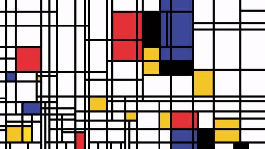
De Stijl - was a Dutch style of pure abstraction developed by Piet Mondrian, Theo Van Doesburg and Bart van der Lack
Mondrian was the outstanding artist of the group. He was a deeply spiritual man who wanted to create a universal visual language that was free from the nationalism that led to the WW1.
Mondrian gradually simplified the elements of his art to a grid of lines and primary colours which he configured in a series of compositions that explored his universal principles of harmony. He saw line and colour as having counteracting forces. Vertical lines embodied the direction and energy of the sun's rays. These were countered by horizontal lines relating to the earth's movement around it. He saw primary colours in the same way: yellow radiated the sun's energy; blue receded as infinite space and red materialized where blue and yellow met.
1 note
·
View note