
Don't wanna be here? Send us removal request.
Statistics
We looked inside some of the posts by belinda-moo-blog and here's what we found interesting.
Average Info
Notes Per Post
0
Likes Per Post
0
Reblog Per Post
0
Reply Per Post
0
Time Between Posts
2 days
Number of Posts By Type
Text
17
Last Seen Tumblr Blogs


Fun Fact
130K people were victims of a chain letter scam that affected Tumblr in May 2011.
Text
2807QCA Task 05
CRITIQUE
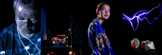
https://illustrisphotography.com/project/ist-digital-portfolio/
Given the limited timeframe, I believe I’ve produced a striking, thought-provoking series of images with a clear visual and conceptual direction.
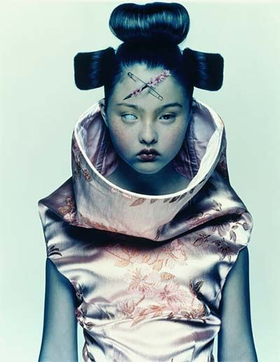
My geisha image, I think, strikes a good balance between fashion shot and conceptual statement, showcasing the fabric/garment but adding an unsettling, futuristic twist. The lighting is soft and flattering to both the model and garment but needs further refinement—the rim light in particular.
The set illustrates its concept quite effectively; the viewpoint, framing and forced perspective help create a sense of scale and place (resembling a city despite being made of computer innards), as do the tech noir hues. The exposure could have done with being brighter, and I would have liked to have incorporated mobile screens or something to replicate digital billboards.
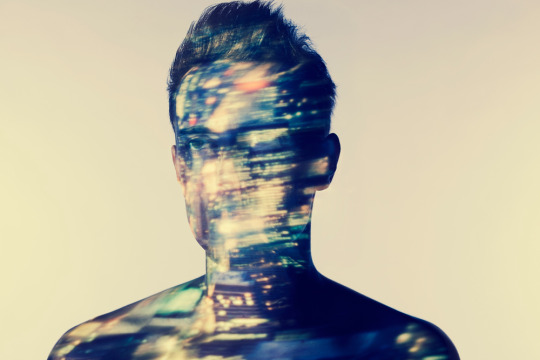
I like the dark, futuristic aesthetic of the portrait but the angle of view and the scale of the projection have partly obscured what the projection is. A black T-shirt would have worked better than the grey one used, which is a bit bright and distracting. The overall hue is also slightly different from the other folio images, which makes it look the odd one out. With time I would have liked to have refined this image more, or explored one of my other ideas.
I’m fairly happy with the lighting in the still life, which has rendered nice form and detail in the metallic paper. There’s a certain beauty to this image’s simplicity, which could work as a book/album cover or product advert, but I think more sheep would have been more interesting visually and and helped to better illustrate the concept. It might have been better to construct a paper ‘world’ in which to display the sheep and light painted that to give it an ‘electric’ aesthetic.
Overall the portfolio is visually coherent, but perhaps a little too much so; more props/atmospherics in all images would have created more depth and narrative, as would have crossing different image genres. I could easily have spent a year working on this project getting it to where I wanted to be, and chances are I will continue to refine the images and the techniques I used to create them.
0 notes
Text
2807QCA Task 05
POST-PRODUCTION
All images
- Adjusted whites and blacks, clarity, vibrancy and saturation
- Corrected lens profile
- Increased and decreased exposure where desired using local adjustment brush/layer masks
Portrait
- Composited blue laser pointer over model’s pupil
- Cloned out imperfections in model’s skin; darkened hair
Set
- Composited small sections from other shots, which had better colour/lighting
- Changed colour balance of selected twinkle lights to make red (to resemble traffic/brake lights and echo tech noir aesthetic of movie influences)
Portrait
- Cloned out distracting details in model’s skin
Still Life
- Composited in black base support from darkest bracketed images to remove distracting detail of black cloth
0 notes
Text
2807QCA Task 05
STILL LIFE
Ideas Theme: Do Androids Dream of Electric Sheep? - book by Philip K. Dick, which inspired Blade Runner (i.e. distinction between intelligence and sentience) Outcome: Glowing and/or metallic origami sheep (referencing Japan and both Do Androids Dream of Electric Sheep? and Blade Runner, and symbolic of natural and unnatural creation—i.e. dreaming, cloning) arranged in geometric, machine-like order or as though being ‘counted’ by a dreaming robot
Reference Images

Blade Runner

Sipho Mabona

Owen Gildersleeve
For lighting and composition I referred to the source material in Blade Runner as well as paper artists Sipho Mabona and Owen Gildersleeve, who use soft, directional lighting to emphasise the forms of their works.
Production
As the most complex of my ideas, the still life was the hardest to visualise and execute. Constructing my original choice of sheep (which were more recognisable but ridiculously complicated to fold - https://youtu.be/HNxMc7kErO8; https://www.scribd.com/document/346652494/Gen-Hagiwara-Spirit-of-Origami) didn’t help. In the end I opted for a simpler style of sheep (https://youtu.be/1OewU1SsI5A), which was less distinctively sheeplike than I’d wanted but still more faithful to my concept than alternatives, origami or otherwise.
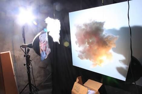
Started by experimenting with lighting. To bring out metallic quality of paper, aimed soft box at 45° to paper surface.
Experimented with orientation and composition of sheep, e.g. in geometric formation, ‘jumping’ as though being counted in a dream, etc. The jumping shots were interesting but perhaps too childlike/lighthearted for the tone of the folio.
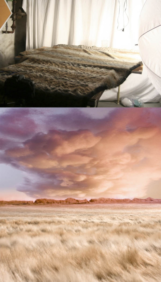
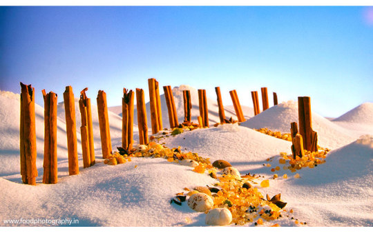
Tried light painting lines/squiggles and backlighting sheep with blue/purple torch over long exposures but results weren’t as effective as I’d hoped. Ended up shooting sheep using studio flash then compositing in a light painting separately shot at f22, 8 sec, 50mm, ISO 100.


Technical specs for my final image were as follows…
Lighting: Soft box closely positioned to side of sheep to minimise light falloff and specular highlights and create soft shadows. White reflector positioned opposite soft box to add fill.
Viewpoint: Level with subject to pick up detail
Composition: Subject placed in lower third of frame with light painting in upper third for balance and context (resembling clouds or lightning)
Focal Length: 50mm (equivalent to 80mm on cropped sensor camera) – short enough to fit in studio and long enough to provide a more natural, undistorted perspective
Shutter Speed: 1/125 sec
ISO: 100
Aperture: f8 to provide adequate depth of field

0 notes
Text
2807QCA Task 05
PORTRAIT
Ideas Theme 1: Online dating/social media, the growing remoteness of experience/emotion, technological connectedness precipitating emotional disconnectedness Outcome 1: Life size lover's arms or mosaic of friends' faces projected onto subject wearing VR headset or with eyes closed/obscured, representing how emotion/experience has been reduced to projections Theme 2: Dependence on/addiction to technology Outcome 2: Subject bound or held up like a puppet by electric cables Themes 1 & 2 combined Outcome 3: Image of tech (e.g. cables, motherboard, binary code) projected onto subject isolated against a black void, obscuring/subsuming them
Reference Images
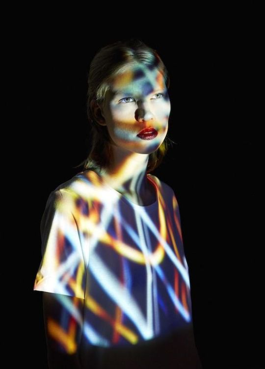
Mads Perch
Lee Kirby Production
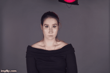
Inspired by the futuristic, projection mapping portraits by photographers Mads Perch and Lee Kirby, I decided to aim for Outcome 3. I felt that this would convey my concept interestingly and appropriately and would make a striking yet visually consistent addition to the folio.
Instructed model to wear dark T-shirt (to ensure projection didn’t get washed out) and had him stand/sit in various positions/poses. Head slightly bowed with closed eyes to convey sense of subject being focused on internal thoughts. Positioning camera at 45° to him eliminated background projection and shadow, suspending him in a black void as desired.
Tried projecting different images onto model and decided on image of network connections (https://elements.envato.com/), which supported the theme and folio aesthetic and partly resembled bindings around the subject’s body, echoing the concept of slavery to technology. (A working title for this image would be ‘Tethered’.) Tweaked brightness and size of projection until happy with results.
Technical specs for my final image were as follows…
Lighting: Model lit solely by projection directed at 45° to model’s left, creating relatively hard black shadows that seep into the background.
Viewpoint: Roughly level with subject
Composition: Subject just off centre (obeying rule of thirds) and shot mid-close up, which I felt supported the connection vs isolation concept (subject disengaged from viewer despite being so close) and provided some visual variation from the wider fashion portrait.
Focal Length: 50mm (equivalent to 80mm on cropped sensor camera) – short enough to fit in studio and long enough to provide a more natural, undistorted perspective
Shutter Speed: 1/2 sec (fastest possible with chosen aperture, ISO and projection brightness)
ISO: 100
Aperture: f2.8 to allow for a faster shutter speed
0 notes
Text
2807QCA Task 05
SET
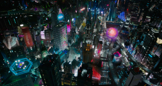
Ideas Theme 1: Virtual reality, the growing remoteness of experience Outcome 1: Appealing outdoor image projected onto black walls constructed in studio, representing the illusion of 'paradise' obscuring the reality of being stuck in a box Theme 2: Technological revolution & overhaul of economy/jobs/society Outcome 2: City built of computer parts (metaphor for technology’s impact on the economy and civilisation in general)
REFERENCE IMAGES
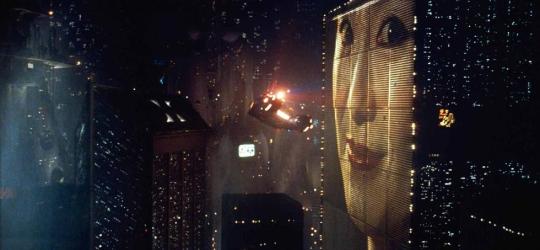
Blade Runner

Matthew Albanese
David LaChappelle
For my final concept I was particularly inspired by the sterile, artificially lit, eternal night aesthetic of Blade Runner as well as works by David LaChappelle and Matthew Albanese, which feature realistic miniature sets built using found objects. Like Albanese I planned to use forced perspective to heighten the realism of my set.
PRODUCTION
Initially set out to produce Outcome 1 but ran into all sorts of trouble with the side walls, which bent the projection. Tried projecting at different angles and positioning the walls at different angles, among other techniques, but couldn’t get the result I wanted. Considered shooting the walls and projection separately then compositing the projection over the top, but decided to try Outcome 2.
Gradually constructed city scene using computer hardware and shot from various angles to find best result, which turned out to be looking through larger 'buildings’ to smaller, more distant structures, giving the illusion of scale and distance (i.e. forced perspective). Tweaked position of props through camera lens. Planned to use diffusion spray but couldn’t get hold of it in time.
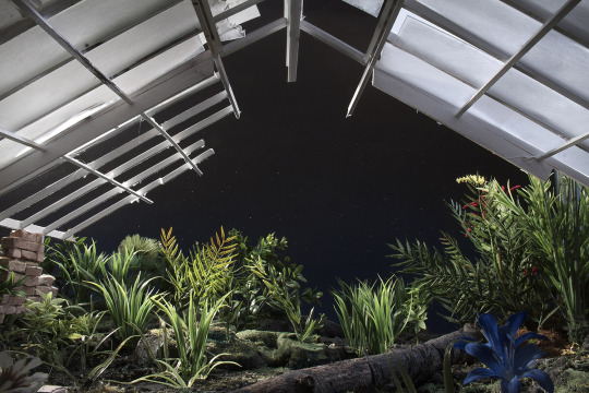
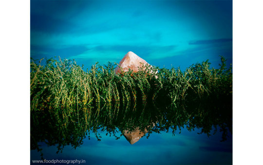
Experimented with different lighting: backlit by flash (representing 'dawn’ of new civilisation), with/without blue gelled constant light (to imitate night/cold, futuristic dystopia), light painting with torch/blue laser pointer (to imitate night/cold, futuristic dystopia), with/without twinkle lights and glow sticks.
Experimented with shutter speed, light painting and lighting duration to balance brightness of various lights.
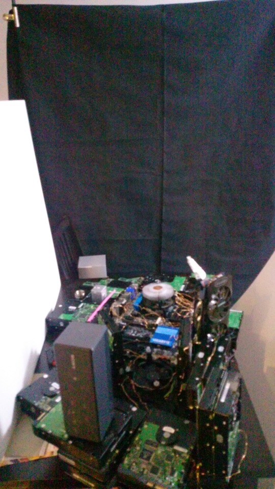
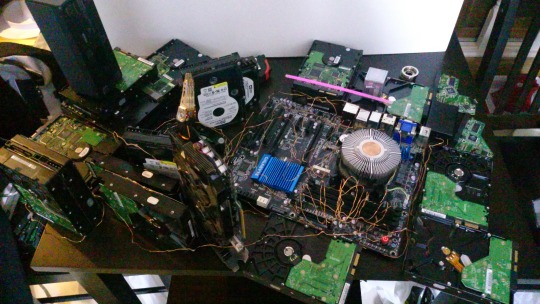
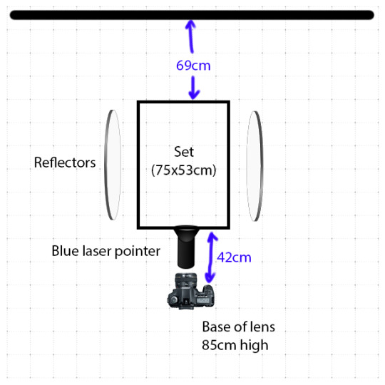
Technical specs for my final image were as follows…
Lighting: Set light-painted by blue laser pointer for about 8 sec, concentrating mainly on foreground. Twinkle lights turned on for about 3 sec so as not to overpower for laser pointer.
Viewpoint: Low but level to make buildings appear straight and tall
Composition: Focal point (round structure) positioned centrally on lower vertical third of frame with foreground buildings framing on either side to create forced perspective. Portrait orientation to fit magazines and be consistent with fashion shot.
Focal Length: 28mm (equivalent to 45mm on cropped sensor camera) – the widest I could shoot without distorting the image too much or having to quadruple the size of the set
Shutter Speed: 15 sec
ISO: 100
Aperture: f25 to give the maximum depth of field possible with my chosen lens
0 notes
Text
2807QCA Task 05
FASHION
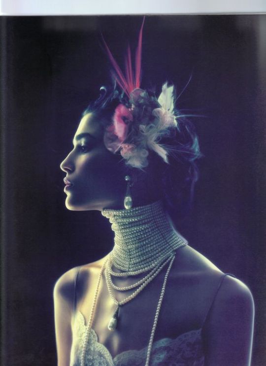
Ideas Theme: Creepiness of humanoid robots / Replacement of humans (and empathy and independent creative thought) by machines
Outcome: Geisha (referencing movie influences and symbolising tradition/culture, arts, and home of the world’s largest robotics industry) made uncanny/confronting by mask or laser eyes
Reference Images
Nick Knight
Rankin
These images by Nick Knight and Rankin are striking and somewhat graphic in different ways. Edge light and shadow respectively distinguish each subject from the background and cool colour casts give both pictures a somewhat futuristic/otherworldly aesthetic. While both are elegant and feminine in pose and dress, Rankin’s model is made deliberately frightening with a violent slash across the face and a creepy, mismatched blue eye. I wanted a much more subtle sense of the uncanny in my image and would aim for an outcome somewhere between these two examplars.
PRODUCTION
Objectives - Refine lighting style used in portrait task
- Juxtapose beauty and elegance of geisha with sense of unease Approach
According to research, the three key factors that determine a robot’s creepiness are its perceived ability to sense and experience things, a discrepancy between aspects of the robot’s appearance and/or behaviour, and where its appearance sits on the scale of human to nonhuman (http://theconversation.com/uncanny-valley-why-we-find-human-like-robots-and-dolls-so-creepy-50268).
Based on these findings, the key to making my fashion portrait stylish yet unsettling was (a) portraying my model as very slightly inhuman, yet sentient (either with a transparent mask or replacing her eyes with lasers); and (b) juxtaposing discordant elements—i.e. a delicate model in flowy, organic patterned fabric posed stiffly and staring in confrontation.
Shoot
Sought to refine lighting setup used in first fashion submission, taking cues from Erik’s portraiture workshop in Week 11.
Tweaked intensity and position of each lighting element and experimented with/without fill, with/without rim light, with/without background light, with/without coloured gels to assess and refine results.
Tried shooting with flowers in foreground but couldn’t quite get the effect I was after so left them out.
Instructed model different poses as I shot from various viewpoints. Final selection was feminine and elegant yet slightly alien, with model looking straight at viewer to enhance sense of confrontation.
To create my uncanny robot effect, shot model wearing transparent mask and created composites using red and blue laser pointers (separately shot at f8, 1/60 sec, 50mm, ISO 100) in place of model’s eyes.

Technical specs for my final image were as follows…
Lighting: Gridded soft box set at 45° to subject’s left, providing soft, flattering main light. White poly board set at 45° to subject’s right to create fill yet keep contrasting shadows and flag rim light away from camera lens. Gridded strip soft box positioned at 45° to subject’s back right, providing high intensity rim light to define subject from black background.
Viewpoint: Level with subject
Composition: Subject centred in frame (portrait orientation for magazines)
Focal Length: 50mm (equivalent to 80mm on cropped sensor camera) – short enough to fit in studio and long enough to provide a more natural, undistorted perspective
Shutter Speed: 1/125 sec ISO: 100
Aperture: f4 to allow for both shallow (but adequate) depth of field

0 notes
Text
2807QCA Task 05
CONCEPT DEVELOPMENT
The concept behind my portfolio is based on the ever-growing influence and evolution of technology, particularly artificial intelligence. The consequence of these developments on human society, psychology and the economy are predicted to be profound (see references, below). My plan was for each portfolio image to focus on a different consequence and convey the mixed sense of fascination and terror aroused by increasingly powerful/intelligent machines.
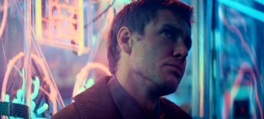
Conceptually and visually I’ve been strongly influenced by tech noir movies like Blade Runner (1982), The Terminator (1984) and Ghost in the Shell (2017), which focus on the same themes as my portfolio and paint a dystopian picture of the future. I envisaged my images as having a similar aesthetic, with stark contrast, futuristic forms and colours and (in reference to Blade Runner, Ghost in the Shell, and the home of the world’s largest robotics industry) Japanese motifs.
Blade Runner
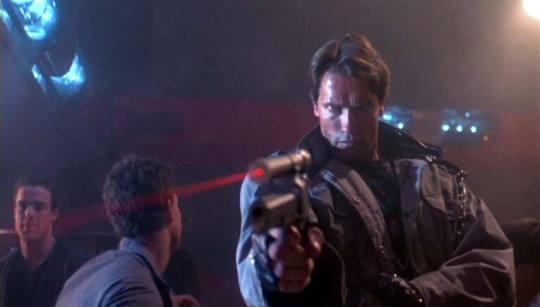
The Terminator
Ghost in the Shell
Context
My portfolio’s style and concept would make it suitable for a variety of contexts, such as more avant-garde style magazines like Wallpaper and Oyster, a future themed section/edition of Vogue or Vanity Fair, or even a feature article on technology/futurism in the likes of Time or Popular Science. It could also be used in advertising or exhibited in a gallery.
References
Cixin, L. (2016). “The Robot Revolution Will Be the Quietest One”, via The New York Times, accessed 2 September 2017, https://www.nytimes.com/2016/12/07/opinion/the-robot-revolution-will-be-the-quietest-one.html
Jackson, K. (2016). “As robots come to take your jobs these are the droids that can cook meals, pour beer, perform operations and even have sex”, via news.com.au, accessed 2 September 2017, http://www.news.com.au/technology/innovation/inventions/as-robots-come-to-take-your-jobs-these-are-the-droids-that-can-cook-meals-pour-beer-perform-operations-and-even-have-sex/news-story/7d3fd50730af956b4ae843fa48e421df
Mardell, M. (2017). “Facing the robotic revolution”, BBC News, accessed 2 September 2017, http://www.bbc.co.uk/news/technology-39028030
Stewart, H. (2015). “Robot revolution: rise of 'thinking' machines could exacerbate inequality”, The Guardian, accessed 2 September 2017, https://www.theguardian.com/technology/2015/nov/05/robot-revolution-rise-machines-could-displace-third-of-uk-jobs
“Workers could be headed for Keynesian utopia or life on the scrapheap”, The West Australian, accessed 2 September 2017, https://thewest.com.au/technology/workers-could-be-headed-for-keynesian-utopia-or-life-on-the-scrapheap-ng-b88594773z
0 notes
Text
2807QCA Task 04
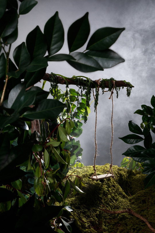
I do think my image captures my intended concept well, illustrating a realistic yet entrancing garden/wilderness from the scenes of a childhood story, memory, or both, and would work effectively in its numerous potential contexts—particularly in a poster or on a book cover.
The lighting, forced perspective and material selection have, I believe, helped to make the set convincing and three-dimensional. The quality, direction and contrast level of the lighting—suggestive of afternoon sun— highlights form and detail in all but the very darkest shadows. It also adds to the mood, as does the diffusion spray and the juxtaposition between the inviting swing and the mysterious, ripe-for-exploring greenery.
My original idea of a ray of light on the swing may have been more effective in directing the viewer’s focus to that area. A slightly lower viewpoint showing the swing suspended above the horizon may also have made the swing more prominent and easy to discern from its surroundings. Were I to reshoot I’d also try shooting the swing in motion again, perhaps with a faster shutter speed (and correspondingly brighter lighting) or with twine anchoring it mid-sway.
Finally, the sunken areas of moss are perhaps a little too dark; I probably should have padded them out from beneath or brightened them in post.
0 notes
Text
2807QCA Task 04
POST-PRODUCTION
- Corrected lens profile
- Increased clarity, vibrance and contrast curve
- Composited preferred shot of background with preferred shot of foreground, masking in extra foliage and mist from other shots to hide black cloth and enhance the sense of atmosphere
0 notes
Text
2807QCA Task 04
PRODUCTION
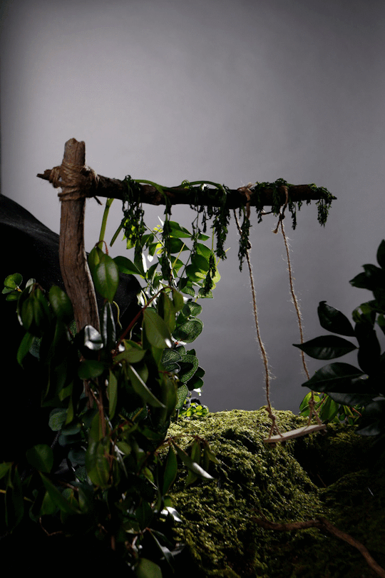
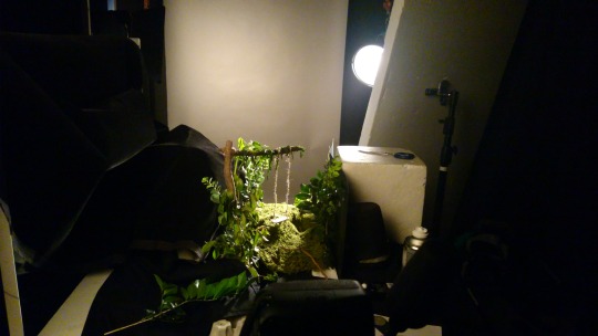
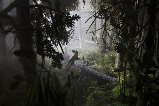
By far the most challenging aspect of this task was building the set. After some experiments at home, I constructed the set in the studio using real and artificial foliage, herbs, artificial moss, sticks, and MDF swings made to varying scales, carefully placing smaller elements in the background and larger ones in the foreground to enhance the sense of depth.
I thought in theory that building the set on location would be easier logistically, but in experience the swing support kept breaking and the ‘trees’ kept falling over! This seriously challenged my supposed preference for working with things as opposed to people. Thank God for Styrofoam, Blu-Tack and duct tape.

When I wasn’t fixing and cursing inanimate objects I was experimenting with the lighting, adding then subtracting a main back/side light, background light and fill light one by one to test then refine the results. Having tried a snoot, gridded P70 and gridded P70 beamed through a slit in black cardboard, I had little success creating the proposed ray of light on the swing. However, I did quite like how it looked lit from the back/side by the gridded P70, which gave the appearance of afternoon sun.
I trialled various backdrops (white, black, different gels) but found most too artificial looking. In the end I opted for grey. I also tweaked the arrangement and position of the set, surrounding the set with black cloth to make the foliage appear denser, and shot it from numerous angles until I was satisfied with the outcome.
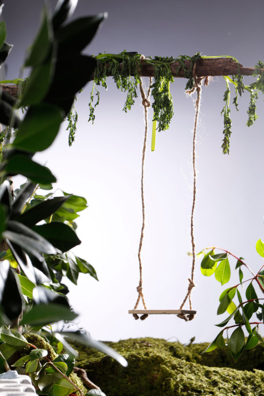

To add interest to the image I tried capturing the swing in motion. Sadly, however, I couldn’t quite capture it in focus. I settled instead for diffusion spray to give a sense of atmosphere/magic.
Technical specs for my final image were as follows…

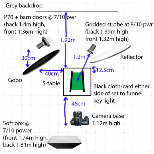
Lighting: Grey backdrop lit by P70 with barn doors. Main light (gridded P70) positioned relatively close to set to create dramatic, high contrast light falloff (and therefore illusion of depth) and directed from back/side to draw the viewer’s eye through the set to the swing. Soft box positioned above front left of set to provide fill.
Viewpoint: Almost level with subject, angled slightly down to make ’horizon’ recede beyond swing
Composition: Portrait orientation with swing at bottom right third of frame, aligning with brighter areas of image. Foliage at varying distances from camera to create depth.
Focal Length: 40mm (equivalent angle of view to 64mm on cropped sensor camera)—wide enough to create realistic looking forced perspective but narrow enough to crop out the set’s perimeter and make the foliage look much thicker than it really was.
Shutter Speed: 1/125 sec
ISO: 100
Aperture: f16 to allow for adequate depth of field
Exposure: Based on meter readings my early test shots were done at f8, which produced satisfying tonal results in my histogram and on the studio monitor. Depth of field was a bit shallow though so I bumped up the lighting by two stops and stopped down two corresponding stops to f16. I took a series of bracketed shots ranging from f11 to f22 but was happiest with the exposures at f16.
0 notes
Text
2807QCA Task 04
CONCEPT/APPROACH
To me, the construction of sets and miniatures is strongly associated with childhood, which I strongly associate with stories, wonder and discovery. The line between imagination and reality seems blurrier when you’re a kid, so I wanted a set that could be interpreted as real or imaginary—a believable and enchanting world in which the viewer could lose (or imagine losing) themselves.
The concept that I began to envisage was that of a garden—the setting of both childhood memories and countless children’s stories. At the heart of this I imagined a swing—a timeless, universal feature of childhood appropriate for the garden setting—lit entrancingly from behind or by a ray of light. (After some storyboarding, I decided to leave the swing empty to arouse the viewer’s curiosity/imagination, allowing them to imagine themselves in the scene or creating a sense of ambiguity/intrigue over a character that is present yet not present—possibly freshly embarking on some adventure, playing hide and seek, invisible/imaginary or even something more sinister, e.g. disappeared.)
I could see this work being used in a variety of contexts: advertising, editorial, on the cover of a book or music album, or in a promotional poster for a film or stage production. My plan was to combine forced perspective, directional lighting and light falloff to both create the illusion of reality and draw the viewer’s eye into the image. As in cinematic set design, a proper scale determination would help enforce a sense of realism; in keeping with the theme of childhood I decided to try the common doll’s house scales of 1:6 and 1:123, as well as 1:9 for comparison. (1:9 ended up looking best.) To add depth, mood and atmosphere and (hopefully) define rays of light I decided to try adding some dust or mist.
3Zwerman, Susan & Jeffrey A. Okun. 2012. Visual Effects Society Handbook: Workflow and Techniques. Burlington, MA: Focal Press.
0 notes
Text
2807QCA Task 04
REFERENCE IMAGES
Cinematographer/director Adam Makarenko and photographer Matthew Albanese construct elaborate, realistic miniature sets before photographing them. Makarenko creates realistic depth with the help of light falloff, while Albanese does the same using forced perspective.
http://www.adammakarenko.com/
http://www.matthewalbanese.com/
Jignesh Jhaveri is a food photographer who creates landscapes out of edible ingredients. Unlike the realism of the above exemplars, Jhaveri’s clever choice and arrangement of props suggest a familiar yet alternative reality by drawing upon the forms, colours and perspective of real landscapes.
http://foodphotography.in/creating-landscapes-with-food/
0 notes
Text
2807QCA Task 04
RESEARCH
Set construction offers to the photographer/creative director practically limitless potential—to grab attention, immerse viewers, and render a concept/narrative all the more tangible and powerful. I studied architecture many moons ago and really like the idea of constructing and shooting sets for advertising or editorial, so saw this task as a worthwhile challenge.
The most memorable sets, to my mind, are those most convincing and/or clever at representing a real or imagined world, so to prepare I researched scenic design and visual effects for film and theatre. Due to budget and logistics, a miniature scale model quickly emerged as the most viable solution for my set construction. Used since the early days of cinema2, this technique would require…
- Accurate scale measurements3
- Forced perspective (dependent on a wide angle lens, an aperture small enough to keep both background and foreground in focus1, and careful placement of elements)
- The combination of larger scale elements in the foreground progressing to smaller scale elements in the background to produce a greater illusion of distance3
1"Forced Perspective: The Easiest In-Camera Effect," Videomaker Magazine, accessed 16 August 2017, https://www.videomaker.com/article/c2/18285-forced-perspective-the-easiest-in-camera-effect
2Gress, Jon. 2015. [digital] Visual Effects and Compositing. New Riders.
3Zwerman, Susan & Jeffrey A. Okun. 2012. Visual Effects Society Handbook: Workflow and Techniques. Burlington, MA: Focal Press.
0 notes
Text
2807QCA Task 03
CRITIQUE
I believe I’ve produced a successful fashion portrait that’s fit for its intended context and fulfils my intentions of romanticising a story, style, label and/or garment.
The soft, directional, high contrast lighting suggests context and showcases the form and texture of the dress while the colours, props and model’s characterisation (created with a natural, mid-movement pose and immersed expression) infuse it with emotive and narrative power, evoking the charm and style of a time gone by.
Overall the lighting, though flattering, arguably lacks the dreamlike quality of some of my exemplars. I would like to explore alternative lighting techniques to achieve this.
I had intended for the rim light to be more behind rather than to the side of the subject but this would have required her to remain stationary (which would have been less interesting) or be photographed in motion in exactly the right spot at exactly the right time (which would have been difficult even without the added requirement of a natural, flattering expression).
I prefer the image with the bokeh than without but feel that this could have been handled more convincingly—namely in camera.
I’m fairly satisfied with the composition but am concerned that I’ve cut off the model’s legs at an awkward spot. The opinions I canvassed didn’t mention this; it will be interesting to hear my tutors’.
0 notes
Text
2807QCA Task 03
LIGHTROOM
Corrected lens profile and white balance
Increased overall exposure
Adjusted contrast, clarity, vibrancy and saturation
PHOTOSHOP
Expanded canvas to create equal space around subject
Removed marks and creases from curtain and extended curtain to expanded image edges using clone and smudge tools
Enhanced colour of curtain
Tweaked colour balance of lipstick to better match dress
Darkened rim light on model’s right side, which seemed over bright
For added depth and context, added separately shot fairy lights using screen overlay
0 notes
Text
2807QCA Task 03
PRODUCTION

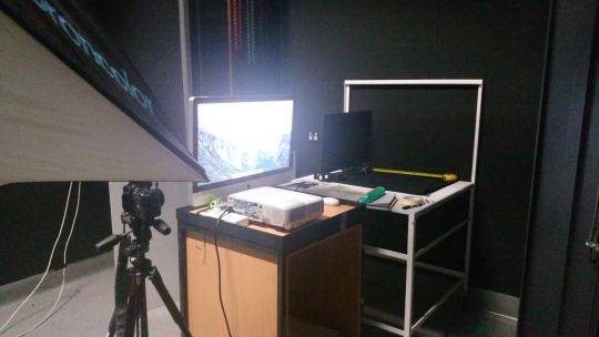
I conducted a number of test shoots to help determine my lighting and set up, starting with one light, moving it relative to my subject until I was happy, then gradually introducing and subtracting other lights (background, fill, hair) one by one until I was happy with the results.
After a last-minute wardrobe issue that required me to consider and prepare for an entirely different concept, I made arrangements with my talent and booked the art practice studio. I had only used this studio once (in 2015) so would have liked some more time to familiarise myself with it before the shoot; however, compared to the foundation studios it offered more space (which I needed) and flexibility in the event of me having to initiate Plan B. This did mean a bit of trial and error was involved on the day of the shoot, but I allowed myself plenty of time to prepare before my model arrived.
Despite trying to plan for every eventuality and booking more modifiers than I would need, I still found myself short of the appropriate reflectors. AV Dispatch was closed that day so I had to make do with what I had, changing a 4x1’ gridded soft box from my key light to the rim light and beaming a narrow angle reflector at a poly board to replace the soft box as key light.
I had planned to shoot my model through out of focus fairy lights to enhance the sense of context but at the time could only find blue lights, which I was concerned would add a tricky-to-remove blue cast. I later found white ones so shot them separately and added them to my final image in post.
Technical specs for my final image were as follows…
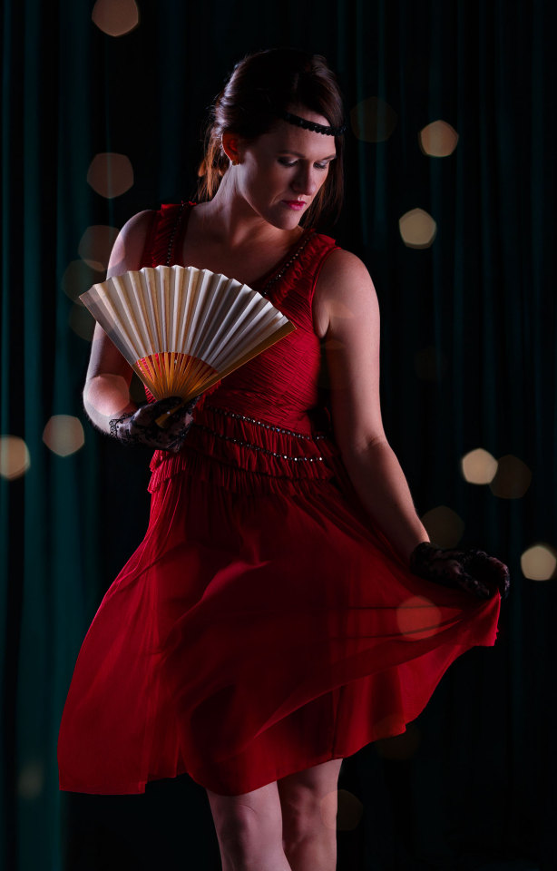
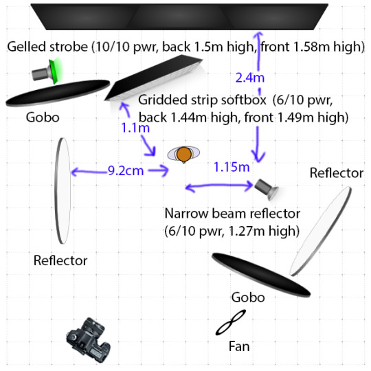
Lighting: Backdrop (studio curtains) illuminated from the left by blue/green gelled zoom reflector with barn doors to give them a turquoise appearance. Subject softly key lit from front angle by strobe with narrow beam reflector aimed at poly board. To help separate subject from background, I used a hardish rim light from a 4x1’ gridded soft box set horizontally above and to back right of subject. Low-level fill light provided by another poly board to subject’s right, creating dramatic high contrast.
Viewpoint: Roughly at subject’s waist to capture 3/4 portrait
Composition: Subject placed in centre the frame (vertical orientation to suit most magazines and posters)
Focal Length: 50mm (equivalent to 80mm on cropped sensor camera) – short enough to fit in studio and long enough to provide a more natural, undistorted perspective
Shutter Speed: 1/125 sec
ISO: 100
Aperture: f8 to ensure eyes were in focus regardless of model’s movement
Exposure: The key light was initially set to 4/10 power, which I metered at f8 - mid-grey at my desired aperture. I wanted the subject’s skintone to be a couple of stops brighter than that so increased the strobe power to 6/10.
With a white poly board bouncing fill light into the model’s right hand side, the shadow side of the face was metered at f4, providing a dramatic high contrast ratio of 3:1.
The backdrop (initially lit by a strobe at 8/10 power) was metered at f2.8, i.e. three stops darker than mid-grey. In test shots viewed on the studio monitor, this seemed too dark and the turquoise colour was much too subtle. I therefore increased the strobe power to 10/10, which gave a much better effect.
0 notes
Text
2807QCA Task 03
CONCEPT/APPROACH
In my selection of garment, direction of model and hair/make-up artist, lighting and props I’ve tried to create mood and convey some notion of narrative—elements equally or arguably more important than the clothing itself—to (hopefully) capture the viewer’s imagination in the way that my exemplars do. I imagined the context of the work to be lifestyle editorial or advertising for a fashion label, jeweller, perfume company or even a performer—the kind of commissions I wish to pursue.
The garment, a 1920s inspired party frock in rich red (the hue classically associated with energy, passion, drama, spontaneity and luxury1), formed the basis of my concept. The dress (and its designer) conjure a sense of old world romance, glamour and fun, and I wanted the image to do the same. To achieve this I wanted to portray the dress' wearer as (like my exemplars' female subjects) enigmatic and elegant yet confident and sensual. I envisaged the final image as vivid and enchanting, a moment spontaneously glimpsed or fondly reminisced upon.
Having chosen a model/makeup artist who could embody this feeling/character, I showed her images of 1920s style hair and makeup to use as a guide and supplied a few props to help complete the outfit/idea. In my trial shoots I decided to use the studio curtains as a backdrop to provide context: a stage or party, perhaps. (I gelled them a rich teal colour, partly to contrast but not compete with the red dress and partly for its associations with confidence, elegance, exoticism and high value.1) Then, on the day of the shoot, I directed the model through various poses—some static, some moving—with the aim of eliciting a natural expression and enlivening the dress.
1Eiseman, L. 2006. Color – Messages & Meanings: A PANTONE Color Resource. Gloucester, MA: Hand Books Press.
0 notes