
Statistics
We looked inside some of the posts by bellamancuso and here's what we found interesting.
Average Info
Notes Per Post
0
Likes Per Post
0
Reblog Per Post
0
Reply Per Post
0
Time Between Posts
5 days
Number of Posts By Type
Text
17
Last Seen Tumblr Blogs


Fun Fact
Tumblr was acquired by Yahoo for $1.1B in 2013.


Text
Process book 2
Feedback
Before print, I got some feedback based on my current book. The feedback included making all the text on the contents page all lowercase or all uppercase rather than having a mix of the two. I was also told to drag the chapter pages to full bleed so that when they are cropped there is a lesser chance of it being white. I would like to add two evaluations to my process book so I aim to start writing these in the lead-up to my outcome. By doing this, my aims and intentions will be clear. I later asked my peers if I should align the numbers to the last words of the previous page on my contents page. I'm glad that I did this as I got a range of opinions and the majority agreed that this would look better than what I had done.
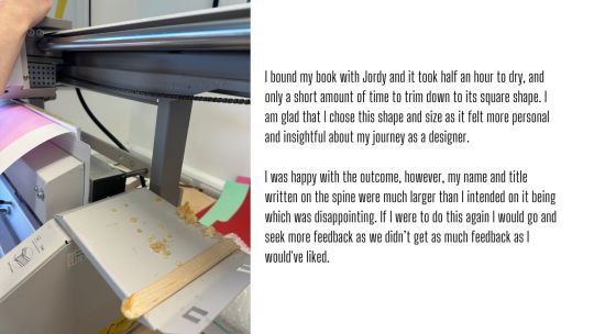
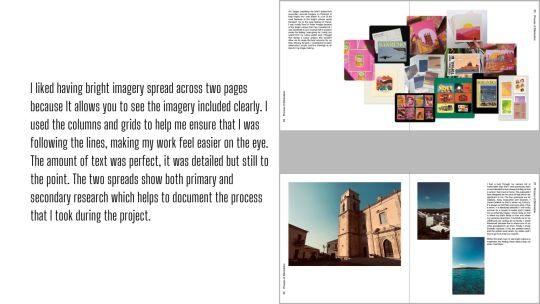
I took a photo of some of my favourite pages once I had bound the book together. I was so happy with the outcome and glad that I took feedback from Briony before I printed as it made a world of difference to the appearance of the book. The feedback helped me to refine the layout and improve its visual appeal. I was happy with the number of pages I allocated to each brief as I felt that I was able to show enough of my work to explain how far I had come from the start of the briefs.
Next year I will try to think more outside the box with my process book, as I kept it safe this year as I was just getting used to the content I needed to include and how to bind it once it is printed. I plan on experimenting with new layouts and aim to incorporate new colours and textures into my book pages to add depth and detail to my pages. I hope to create an engaging process book that truly reflects my growth and creativity.
Bibliography
Year 1 overview
I was set 4 briefs: Communicating in Colour, There’s an App for That, Place of Words, and Process Books. These projects tested my ability to work as a group, my digital skills and my research skills. I thoroughly enjoyed these briefs as they were all quite different and kept me busy throughout my final term.
Throughout the projects, I was inspired by a number of things such as images I’d seen on Pinterest or books and magazines I had come across. My initial idea for my Place of words project came from a mind map I produced as a starting point for the brief. I enjoy creating mind maps and mood boards before I start a project as they help me think more spontaneously before finalizing any ideas. The main body of my research was conducted online, however I also completed primary research. I found secondary research more useful as it was easier to find, but my primary research helped influence more of my design choices. For the group project we split the research among ourselves and ensured we all fully understood the brief before starting our Adobe XD file.
A challenge I faced during this term was trying to juggle all my projects simultaneously. However, I believe that my time management improved compared to my last brief. This time, I ensured that I worked through all the briefs at the same time to try and complete them with enough time to start my Process Book. Having critiques and getting feedback from peers helped me to keep my projects moving as it gave me more perspective as to what was going well and what I could improve. I completed a number of prototypes in comparison to my last brief, which I believe helped the success of my projects this time around. A valuable piece of critique I received was to always remember and think back to who my target audience is.
Overall I was happy with all of my outcomes and think that I had enough time to complete them all. I feel that these projects have influenced my approach to future projects as I aim to have more of a time plan and structure that I follow like I did during this brief. I think that putting my postcards, app and magazine into mock-ups helped me to visualise my outcomes further and think that they looked professional for the time period that I was given to produce each brief. In conclusion, this term has not allowed me to improve my skills but has also provided me a valuable lesson in time management and the importance of feedback. In future, I will implement these skills to my briefs to aim for a successful approach.
0 notes
Text
Process book 1
3 chapters.
1- Place of words
2- There's an app for that
3- Communicating in colour
Initial Ideas
At first glance of the brief I was quite intimidated by the fact that it had so many pages and I was worried about what content I would need to fill all the pages and interestingly design them. After being shown examples of past pupils' work, I wanted to make my book feel like a visual journey. I already knew that I wanted my book to be easy to navigate and enjoyable to read, and seeing the examples during the brief helped me to understand how I could achieve this.
I was fond of the full-text spreads where the whole page was covered in a quote or statement and I also quite liked the work produced by Victors Mihalevs which had funny images to go alongside the text.

Contents
I liked these contents pages in particular as they had a basic colour pallet and large type which covers the front page. This style almost hides the content and doesn’t give away too much of what to expect inside. I like the formal feel of these pages and the minimal information.


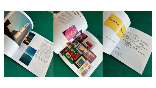
I made a mindmap based on front covers which interested me to look at. I liked the ones which used photography as it’s a subject that I thoroughly enjoyed whilst taking my A Levels and wish to interpret into my future work. I thought that the text over the photo was quite eye-catching and the scale of images on the books also caught my attention. I felt that having a pink colour would scream Bella.
Similarly, I created a mindmap of images that I had found on Pinterest and made a mood board of layouts that I aim to take inspiration from and experiment with my own work. Having done prior research on some books layouts I am now ready to do my own trial and error, with visual hierarchy in mind.


0 notes


Text
Place of words 3

How can I make my collage feel more comical after feedback?


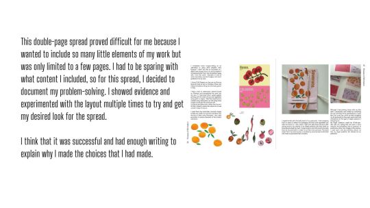
Based on my previous research and mood board, I created some imagery tailored to my article and its content. I learnt how to wrap the text to the image so that the text followed the shape of the grapes. I felt this was effective because it added interest to my article. I think that these images in particular felt comedic and overall worked well with the feedback given to me during my group critique. I experimented with collaging images as well as colouring. I kept the page a light purple to contrast the darker purple grapes. I liked the page being in a different colour as it made it feel unique and visually appealing.
Research


Image making
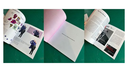
I created some more images based on ideas I previously had and wrote down on my mindmap. I put the wife's face wrapped on the Ferrari to highlight part of the article which mentions Ferrari firing men rather than correcting his wife. I experimented using the ferrari red as a subtle element within the artwork but thought it looked tacky and less classy. The black and white of the image made it feel like the time period that the story was set in.


Things I want to change

Feedback
Some feedback I received was to move page numbers further into the margin so that they don't sit too close to the text. I was also told to make the large collum of text into two separate columns so that I could avoid the feeling of it being too much like a book. I had a look at some books that were suggested to me with headings and intend on using this to influence my work. I was a fan of the headings because they broke up the text and drew the eye to different areas of the page. I mentioned that my front page was pixelated, however, I was told to leave it as it fits the era that it was taken in. The small rectangle of eyes had much better quality which makes it feel more intentional. I also had to line up the text that is on the grapes page to match the text that is on the first page so that it reads as a double spread. Finally, I was told to add more red to the front page somewhere either on the 079, title or date. By doing this, the red will carry through each page of the magazine.


Feedback
In my last group critique, I was told to change the page number size and not to worry about the purple box which appeared around the grape man when importing it to the InDesign file. I was also told that my font looks a bit big but any smaller will make it hard to read. I was happy with my feedback as it meant I only had small adjustments to make to my final outcome. I later experimented with making my font smaller and I agree, it did make it difficult to read so I kept it how it is. I was also pleased that everyone was a fan of my font because I did a lot of searching for a font which felt like the ones I had researched but a more modern version.
0 notes
Text
Place of words 2
I have chosen to do this article because it explains the history of the two car makes. I enjoyed reading about them both and the rivalry the two hold and think that I can create some really interesting imagery from this article. The article contains a variety of information about the overall performance of the cars and the competition that flourished between the two.


Feedback
During my group feedback, it was suggested to me that I keep my target audience in mind. I was told to have a look into Italy as a country from the people, to the scenery in hopes that the images I create are broader than just cars. I was also told to possibly have a comedic take on my work so that it feels more current and less of a serious article. Moving forward I will research comedic artistic styles that could be useful within my work. I will also start to consider fonts and colour palettes.
Toiletpaper Magazine
‘Toilet Paper is an artists' magazine by Maurizio Cattelan and photographer Pierpaolo Ferrari (Le Dictateur). The magazine contains no text; each picture springs from an idea, often simple. Since the first issue, in 2010, Toilet Paper has created a world that displays ambiguous narratives and a troubling imagination. It combines the vernacular of commercial photography with twisted narrative tableaux and surrealistic imagery. The result is a publication that is itself a work of art which, through its accessible form as a magazine, and through its wide distribution, challenges the limits of the contemporary art economy.’


0 notes
Text
Place of words 1


I began this brief by picking out two words from two boxes. One box was full of words and the other had the words context. My first word was collection and the context given was technological. I used the app Miro to help me list 20 words I associate with collection and 20 that I associate with technological and used images to start creating inspiration.
My initial ideas came from the two lists I created using Miro. These topics were ones which I felt that I could create good imagery from as well as find an interesting article.
Image making workshop
Today I brought in 4 secondary sourced images to help me to create my images. The photos I brought were of Tesla crashes, AI and robots. I thought that they would be suitable for an image-making workshop as lots was going on in the photos so I could pull out my favourite elements I used the photos as a starting point to help me create my images. I believe my most successful piece was the Lino print and I wish to further explore this method moving forward. If I had more time I would try to create further outcomes.


I used triangles and squares of different sizes to create tanagrams. I feel that using the lino was my favourite outcome as it looked the most refined and detailed. I created a collage of a car as well as painting a section from another of my secondary sourced images. I liked collaging as the imperfect shapes layered became something more interesting to look at once layed down.


I started looking at front cover inspiration but felt like it was more appropriate for a poster than a magazine. I will create some quick imagery and see if anything stands out to me whilst I am image-making and use that for the front page. I will also look into colour palettes which I think will suit the magazine.

In this Find The Grid workshop we worked in numbered groups to create the grids on a larger scale using tape and a large blank space. I had several roles within the group, such as calculating widths and lengths and applying tape to the wall. I enjoyed working as a group as everyone got involved and it was interesting to see how other people applied their strengths to this exercise. My favourite part of the exercise was being able to talk to others in my group and compare thoughts about how we wish to tackle the task.
If I were to do this activity again, I would make sure that we spent more time trying to split up roles rather than completely working as a group as it slowed us down quite a bit. I was glad that the maths wasn't too hard as I don't particularly enjoy doing it, however, I would now know what to do if I wasn’t working as a group.
Grid inspo
I took several photos from Pinterest to help me with research towards my magazine. I was enticed by the colours and large fonts which take up a large portion of the grid. When I create my magazine I want to have a lot of colour to reflect my enjoyment of the subject. I did this research to help me better understand how grids can be used effectively. I also noticed that some of the pages I looked at didn't follow the use of grids which interested me as they layered photos with lino print.

Primary Research
I went to the library to have a look at colours and textures that they have to offer. I had a look through colour swatches for some inspiration and learned a great deal about the impact of different colour combinations and textures on design. This experience helped me to understand how to create more visually appealing designs. Being able to feel textures and see colours, provided valuable insights that I was able to incorporate into my work. I also enjoyed experiencing the colours true shades and tones which vary from the ones you may find on your screen. It enhanced my ability to create visually appealing and cohesive designs by giving me a clearer understanding of colour dynamics.

3 questions I would like to answer:
What colours will be appropriate for my magazine?
What is a piece of work I like and why?
What themes, colours and textures relate to the 1960'S?
0 notes
Text
There's an app for that presentation


The final outcome can be found on my Canva presentation.
0 notes


Text
Communicating in Colour Outcomes


Please refer back to my presentation on Canva as Tumblr has made my image quality extremely bad
0 notes


Text
Communicating in Colour 1


I started looking at secondary imagery for inspiration.


I then began my own primary research.


0 notes
Text


I took part in a workshop where I made a zine based on the phrase "public opinions and jealousy form insecurities"
0 notes


