
Don't wanna be here? Send us removal request.
Statistics
We looked inside some of the posts by bhanu-prakash-developing-skills and here's what we found interesting.
Average Info
Notes Per Post
0
Likes Per Post
0
Reblog Per Post
0
Reply Per Post
0
Time Between Posts
5 days
Number of Posts By Type
Text
17
Last Seen Tumblr Blogs


Fun Fact
Kazakhstan’s Minister of Communications and Informatics has blocked the Tumblr site because it contained 60 sites of terrorism, extremism, and pornography in 2015.
Text
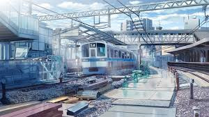
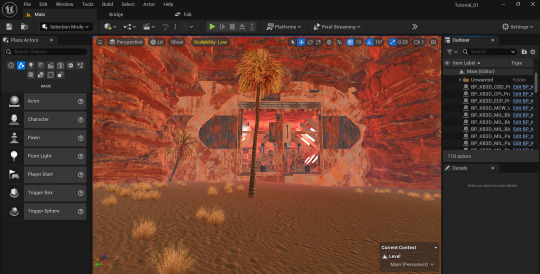
Development 02: Places of Mind -Final Output and Challenges
The final stage involved refining the environment and addressing challenges encountered during development. Perspective issues within the railway system required multiple iterations to ensure the scene felt expansive and immersive. Prop placement was also a challenge, as maintaining a balance between realism and gameplay functionality required constant adjustments.
Lighting was refined further to enhance the mood and guide the player’s focus. Subtle effects like fog and glowing embers were added to add depth and atmosphere. Despite the hurdles, this stage taught me the importance of iteration and problem-solving in environment design.

0 notes
Text
Development 02: Places of Mind -Lighting Setup
In this stage, I focused on implementing lighting to enhance the mood and atmosphere of the environment. Drawing inspiration from games like Assassin’s Creed: Valhalla, I aimed to create a mix of dramatic shadows and glowing futuristic elements.

Directional lighting was used to mimic a low, atmospheric glow, while emissive materials on futuristic structures added a surreal touch. Adjustments were made to balance light and shadow, ensuring key areas of the environment were highlighted without overwhelming the scene.

0 notes
Text
Development 02: Places of Mind -Base Environment Setup
The first development stage focused on setting up the environment layout for Places of Mind. Using Unreal Engine 5.4, I designed the railway tracks as the central gameplay feature. The tracks were positioned to create dynamic paths, incorporating elements like gaps and curves to add visual and gameplay interest.

For references, I used images of abandoned rail systems and urban industrial settings. Assets from Kitbash 3D and the Fab Marketplace were used to populate the scene with props and architectural details, such as stone pillars, railway supports, and metallic structures. These elements were arranged to create a visually balanced composition that would guide the player’s movement.
0 notes
Text
Development 01: Red vs Blue - Products and Process Reflection
This last stage of Red Chases Blue was all about making all these facets come together and creating a coherent and immersive ecosystem. After establishing the base and lighting, I went in and tweaked the scene with effects, prop placement and responded to the obstacles I had faced since the last step in the process. This stage was the most time-consuming since it needed to refine every element for a smoother emulation.
Perspective management was one of the bigger challenges that I had. Maintaining the sense of the vastness of the desert landscape while establishing a strong anchor at the crash site called for constant adjustments to the composition. I used deeper angles on the camera and subtle prop placement to help steer the viewer toward the direction of the wreckage while keeping the ambient tension of the environment intact. This meant adjusting debris, shaping the dunes, and ensuring the overall space facilitated the story being told.
Placing props was another area of high effort. The high concentration of the scene without drowning the viewer was a difficulty. The debris had to feel more like a composite, random yet intentional, you know, that it told the story of the crash without really being detrimental to the magic of the desert.” Subtle effects: dust particles and heat waves enhanced environment immersion.
Lighting had been settled in the previous stage but continued to be tweaked to sync to the final composition. Combining the shadows and highlights allowed the wreckage to take center stage without losing the dramatic setting of the desert. This included mixing the directional lighting and ambient effects where they would best add to the scene and depth and tone.
There's a lot learned from this project, and through that I have realized the intersection of complexity in the environment design. As a new medium environment artist mastering how to coordinate textures, light, and composition has proven to be a huge learning experience. This project has challenged me to improve my skills and tackle challenges with patience and creativity.
Red Chases Blue — the final scene — was a blend of creativity and technical effort to capture a mystical desert narrative. It is a stepping stone for future projects and motivates me to do more as an artist.
0 notes
Text
Development 01: Red vs Blue - Environment Lighting
Once the basic environment for Red Chases Blue was established, I proceeded into the lighting phase. Lighting is used to tell a story, setting the mood, directing the viewer’s gaze and adding depth to the scene. For this project I wanted to create a dramatic, immersive space that highlighted the harsh, yet mystical aspects of the desert crash site environment.

Initially, I pulled lighting movie styles from films such as Dune and Mad Max: Fury Road. These references allowed me to experiment with ways to create contrast between light and shadow, while still making the environment feel dynamic and cohesive. I envisaged the lighting to give the wreckage an obvious prominence but also to accentuate the textures and depth of the desert setting.
Using the advanced lighting capabilities of Unreal Engine 5.4 I played with how directional lighting could create that stark light of the desert sun. I changed the angle and intense new light to cast long, dark, travelling shadows across the sand and the rubbish, evoking a sense of isolation and tension. To create an impression of depth I added soft ambient lighting in warm tones, echoing the glow of the setting sun. The overall effect softened the intensity of the aggressive key light source and lent a magical look to the shot.
It took many passes to get the right balance. The main issues at first were overexposure and inconsistent shadows, but after tweaking the settings a bit, I managed to set up lights that highlighted the right mood and drew your attention to where the crash site would be.
This lighting step brought the shot to a whole level, giving depth, mood, and an overall graphical hierarchy to the environment. Now it's time to work on a scene improvement with effects and solve problems met during development.
0 notes
Text
Development 01: Red vs Blue - Environment Setup
The first step in developing Red Chases Blue was scratching out the base environment using a symmetrical balance composition. Additionally, by layering with a commonality among the other pieces in the scene, i create a natural transition that helps bring cohesion within the scene as well as allows important things to pop at the viewer, as memes, expressiveness and design should. Desert chaos also becomes order with the use of symmetry, reflecting the mystical and ordered nature of Shambala.
I used a mix of custom models and assets from Kitbash 3D and the Fab Marketplace for this part. The cargo set and wreckage elements were critical to building that scene, they're amazing details that really helped move the design forward. These were desktop assets engineered to convey balance and serenity in the midst of a chaotic crash.
For this, I used the terrain tools available in Unreal Engine 5.4, customizing the landscape and ensuring the focal point of the scene would be the crash site. The dunes and debris around the wreck were arranged to lead the eye in concert every which way toward the wreckage, and blast path, locking the composition steeped by both dynamic and street design. Symmetry granted me the ability to spread elements across the scene and have a well-balanced layout.
To develop my design, I derived inspiration from references that highlight symmetrical compositions in nature and man-made landscapes. Although this is an early setup with no lighting and effects, the prop and terrain placement is good and provides a base for the next development process.
Had I just done this in the first step it would have set many more lines up for the fine tuning of the project. Thanks to the Kitbash 3D and Fab Marketplace assets, I spent the majority of my time on layout and composition, making sure the environment reflects the wider narrative.
0 notes
Text
Competition 02
In this project I worked as a 3D artist and I was responsible for the designing modelling and texturing of every asset they need in order to create the in-game world. Whereas my teammate worked primarily on gameplay and the design of levels, I handled all aesthetic aspects, making sure they worked technically and stylistically within the scope of what the game was.
The base of the level, as well as complex pillars, the trap walls and decorative elements were among the primary assets of the game. All models were texturized for a better graphical skin to _ the world. The blade fan was meant to create an active gameplay mechanic on how we could make it modelled precisely so it worked dynamically well during the game play, and the trap walls purpose were to equip players to an action they can take.
A big pain point here was optimizing the assets to where it ran well but still looked good. This necessitated a great deal of delicate balance between poly count and texture resolution. Texturing was especially important, as it served to reveal details and increase the game's immersive quality. I worked with my teammate to make sure the assets matched the level design.
The game came to completion, although we faced some unique export issues that were more of an unforeseen obstacle during the later stages of the comp.; however, we had enough time and the comp didn't close on us until we got it in. Through this, I learned a lot about problem-solving, time-management, and how much a P.O.C. or playability of concept can benefit collaboration during the game development process. Watching the final level being born was extremely gratifying, and my 3D work constituted the backbone of the visuals of the game.
vimeo
0 notes
Text
Competition 01
When I entered the Game Development World Championship (GDWC) it felt like a very exciting opportunity to showcase myself as a 3D artist. Participants in the competition had 30 days to design, develop and complete a game level, so the schedule was tight. My main focus was 3D modeling and texturing, whilst my teammate dealt with gameplay and level design.

"We got to thinking and decided to make a game based on taco sushi, an octagonal TV series, and end up with a competition that involves zany, quixotic challenges. One asset we obtained from the Unreal Marketplace, and that we planned to feature prominently in the game was a talking cat as our main character. I went to added a blade fan which was a paramount piece in playing this level dynamic. We even had a bunch of models and buildings made elsewhere that we could simply drop into our game to save us time and give us more time to build the game specifically.
I mostly modeled and textured all the major components that made the level feel alive. Developing the insides of the level, pillars, trap walls, and different preventions to improve the play experience. The designs were inspired by the style of Takeshi's Castle, where I wanted the challenges to be fun, yet somewhat annoying, but which would tie in well with the overall theme.
I found that planning the level helped a lot keep the modeling process simple. By the time we started implementing assets in the game, we knew how the obstacles and environment would work. The hard deadline forced me to be productive and innovative and also work alongside my partner to make sure that I could integrate the models in the game world seamlessly.
0 notes
Text
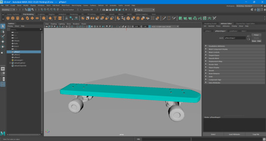
3D Printing 02
The Viking game object was made using Maya for modelling, very time-efficient and great for easy geometry creation. The base was shaped with symmetry and proportion. Based on the reference image, I added extra details like carvings and interlacing characteristic to Norse design.
In Maya UV mapping was done so the design’s carvings and patterns lined up correctly. When laying out the UV map, we aimed for a clean and utilitarian layout well suited for texturing and 3D prints. Screenshots were captured at every phase to provide progress updates.
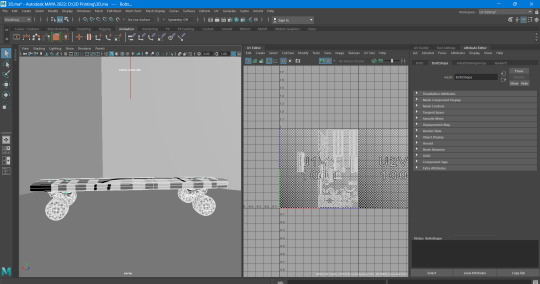
Once the modelling and UV mapping were done the object was ready for 3D printing.
0 notes
Text
3D Printing 01
For this 3D printing task I decided to do a model for a Viking-inspired game object connected to the Places of Mind story. – ARTIFICIAL VIKINGS VESSEL This design embodies translates the ingenuity and unique cultural significance of Viking craftsmanship into an innovative, historically inspired object with a contemporary twist.
One of the reference images I had during research really stood out to me. With all of its doodads and whorls, this object seemed like a Viking artifact fit for a Viking museum. The design seemed to be practical, though decorative, fitting into the Viking ideal of functionality mixed with artistry.
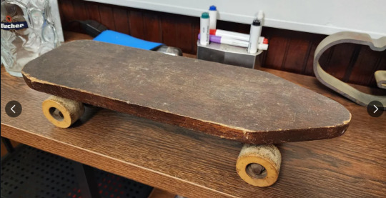
I researched Viking-era tools, ornaments and game pieces for historical accuracy. Many of these objects showed an emphasis on symmetry and detailed carvings, with references to Norse mythology apparent through knots and animals. These references shaped the game object, keeping it in a Viking universe while making sure that it could also be printed in 3D.
0 notes
Text
Lighting And Shadow 02
Despite the challenges that I faced initially, I adjusted the lighting to better fit with the mythological inspiration I had for this part of the piece. The main challenge was to balance the glowing pureness of Shambala with its threat of shadows that remind us of its sacro-saint but inaccessible nature.
Directional lighting that was sculpted to resemble soft, glowing beams projected by divine forces, throwing long, dramatic shadows on the temple ruins. Emissive Materials were also tweaked to allow the sacred carvings to faintly glow in the environment, giving it a mythical feel. We layered volumetric fog with ambient lighting to create a dreamlike quality, evoking mythological representations of sacred spaces.
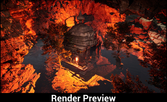
Last but not least, lighting and shadow tweaks change up the environment, making it look exquisite and thematically tight. It took many iterations and technical hurdles but the end result is a manifestation of Nostalgia and Memory as intended.
References:
Kalki 2898 AD. (2023).
God of War. (2018).
Mythological art and cinematic lighting references.
Unreal Engine 5.4 (Software).
0 notes
Text
Lighting and Shadows 01
When I got to the lighting stage it became clear to me a lot of work was going to be needed to get the right feeling. I tried to experiment with a lot of methods by viewing YouTube tutorials regarding complex lighting and shadow techniques in Unreal Engine. While these resources offered good learning experience, I was still feeling the need to polish my skills.
So the lighting setup will emphasize the divine spirit of Shambala. Early tests were made to try out emissive materials for incisions, directional lighting for dramatic shadows, and volumetric fog to add depth. However, striking a balance between a perfect landing and a forgettable one was difficult, given how heavy some parts felt without a proper sense of exploration.
This post is a work in progress as we learn more and iterate on creating an immersive lighting environment. Even so, much work remains to get the scene closer to its ideal mythic tone.
References:
Unreal Engine 5.4 Tutorials (YouTube).
Mythological and cinematic lighting references.
0 notes
Text
Nostalgia and Memory 02
After I established the concept I moved on to working on the environment design for Nostalgia and Memory. This is the actual level design I made for Shambala, utilizing Unreal Engine 5.4 and aiming to present an sacred, yet virtually malicious identity, or mimicking that of ancient architectural themes Reconstruction of divine memory.
The design started with sourcing high quality assets from the Fab Marketplace. These encompassed complex temple designs, old structures, and meaningful engravings. Its layout was designed to reflect symmetry and the idea of reverence. The environment consists of an impressive opening to Shambala, surrounded by tall pillars and carved lit motifs.
The base layer focused on placement and composition to build towards visual balance. There are winding pathways, hidden alcoves, and elevated platforms that give the space dimension and texture. The overall design matched the mystical tone, but in this stage, I kept the lighting very minimal to see what this area turned out to be and I felt it was a place that should have the divine essence of Shambala but wasn´ t able to convey that.

In this stage we set the foundation for emergencies, lighting, and shadow in the next stage with the hope for a stylized look reminiscent of mythology. Demo Progress- Although we can see the power of the environment in this stage and it has a lot of potential but requires more work to show the best atmosphere.
0 notes
Text
Nostalgia and Memory 01
Nostalgia and Memory are in direct relation to the continuation of the narrative behind Places of Mind. This one deals with Red barians, now Vikings, stealing into a mythical version of Shambala searching for the unattainable Elon Musk chip. The theme of memory is ingrained into the folktale by the belief that God, represented by divine light, can be found in even the darkest times such as in the chaos of the Red force.
I researched mythological representations of the divine light, the designs of ancient sanctuaries, and was inspired by religious art, films, and games to develop this concept. Films such as Kalki 2898 AD and Dune served as gorgeous visual references for surreal landscapes with luminous, ethereal illumination. The developers behind mythology-influenced releases, such as God of War, also propelled the use of natural, striking contrasting light and dark to create an elevated sense of divinity.

I did some architectural research for Shambala as well. The design process was inspired by ancient temples, elaborate carvings and insignias of authority. These factors contributed to imagining Shambala as a sacred, secured space that is both rich in its history and multidimensional in myth. It was here that the duality of light and shadow took centre stage, the metaphorical battle field for the Red warriors first pushing back the restoration before turning to the deliberate vandalism of the structure as preservation became an intrusion.
This literature base paved the way for designing an environment that embodies the sacred, past time, and the superreal. The aim is to suggest a nostalgia for divine myths while rooting the story in a voracious grab for power.
References:
Kalki 2898 AD. (2023).
Dune. (2021).
God of War. (2018).
Art on the theme of divinity or mythologyÆs light
0 notes
Text
Places of Mind 02
Following in the theme of Red Chases Blue, Places of Mind takes a Medieval look at historical wars, mixing together Viking mythology with an industrial and modern delivery. As the story will take place in a heavily industrialized London Bridge, the main mechanics will revolve around railway tracks which turn into an element of the gameplay. This environment is a projection of the antagonism between history and futurism.
I used Unreal Engine 5.4 to block out the establishment of the base setup. The railway tracks encouraged gameplay with turns, twists, and spaces to fit the gameplay and maintain a good composition. These tracks I surrounded with architectural elements based on medieval London Bridge but with modern and industrial details incorporated. This helps to create a one-of-a-kind blending of past and future.
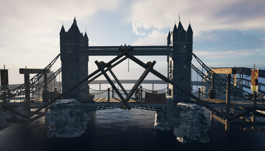
The scene was populated with assets from Kitbash 3D and the Fab Marketplace. This populated the environment with industrial props, stone arches, and railway pieces, while creating a defined environment. Props placement was done based on symmetrical composition principles to maintain visual balance and flow in the space.

This stage was mostly about structural layout and prop placement it sets everything up for the lighting and other touch-ups. This unlit environment encapsulates the idea and sets the foundation for future development phases.
0 notes
Text
Places of Mind 01
After Red Chases Blue, the story moves on to, Places of Mind, following which the Red warriors will embark on a quest to find a way to corrupt this advanced domain, and dislocate its processes. That idea was based on a dream I had while watching the show Vikings about many years later after the Vikings captured London Bridge. This included the world, which combined this vision with the game’s brutal aesthetic to make the basis of this environment.
The Places of Mind notion gives this historical baseline a speculative spin. Racers race on railroad tracks skating on a vibrant playing field. This setting marries the grittiness of Viking lore with the quickness of futuristic game mechanics. While the game concept is not finalized yet, the main focus is environment design, as the idea is to show the tension and very complex nature of imagined world to person from the moment he/she steps into it.
Imagining the haunting visual aesthetics of Assassin’s Creed: Valhalla and the gritty tone of Vikings, I started to realize medieval London Bridge was saying something historical. Pairing these ideas with a modest industrial aesthetic and modern track systems, I sketched how they might inform a railway-inspired area of play. This combination of both aspects became the base for the Places of Mind story.
References:
Vikings Series. (2013–2020).
Assassin’s Creed: Valhalla. (2020).
0 notes
Text
Red vs Blue 03
Diving further into Red Chases Blue, I had moved on from building the cargo plane base model to start incorporating it into the larger desert environment. But this stage did not come without its own challenges. Unreal Engine is indeed a powerful tool, but after its use, textures, lighting, shadows, etc. were a lot more complex that I had anticipated.
Textures were one of the big problems I encountered. To help the cargo plane and its surrounding environment blend seamlessly, we needed to find the correct materials, and then tune their properties for realism. The sand textures, for instance, had to feel real, but also need to convey the violence of the crash. The plane itself needed layers of detail scratches, rust, burn marks to tell the story of destruction and survival. The level of detail required to find the balance between eye candy and realism is something I would need to fine tune in the development phase.
Shadows and light were also a big issue. I was aiming to make a more dramatic scene with deep contrasts between light and shadow, but early attempts all lead to somehow uneven or fake lighting. The desert’s open setting required careful placement of directional lights, and finding the right intensity of shadows to create depth and mood took more time than anticipated.
Looking back at these issues, I thought that I should pay more attention on these factors in the development process. Preparing this project in iterations, one of the first things I intend to improve upon is the texture of the objects, acquire knowledge in more lighting solutions and and try to refine the compositing of the scene. One of the most valuable takeaways from this Stage is to learn the merits of patience and iteration behind environment design.

The current stage establishes a good starting point for moving on to phase two, where I will be resolving these initial technical questions and focusing on world-building within Red Chases Blue.
0 notes