bijouzen
treat
i have so many sideblogs oh my god *makes a new one*18 • they/it
1740 posts
Don't wanna be here? Send us removal request.
Last Seen Blogs

overallquizzes
Sans titre
bunnycatgirlbot
🌟bimbots will say "ummmm does not compute? lol"🌟
shehasbigfeet
SHE HAS BIG FEET
kairunatic
Too lazy to come up with anything

heraldofsomething
Only when you fall do you learn if you can fly.
Note
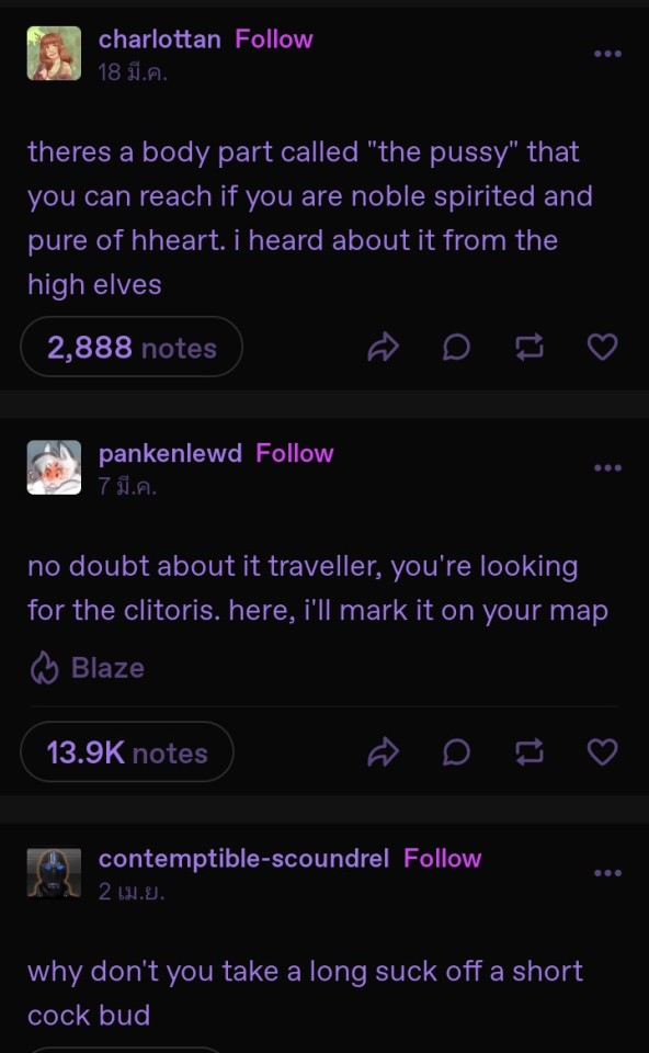
aint neko tism that shit that catgirls have
ding ding ding that's one point on the board for anon
986 notes
·
View notes
Text

cant get more fascist police state than snipers on rooftops overlooking peaceful protests.
this is what democracy looks like.
16K notes
·
View notes


Text
by talos this can’t be happening is a mandela effect because the actual phrase is by the gods this can’t be happening and i’ve never heard anyone say the former in game
186K notes
·
View notes
Text
they should add a drop of glowing purple fluid to doctor pepper. just one drop
10K notes
·
View notes
Photo

LISTEN UP AGAIN KIDS
STOP REBLOGGING THIS FUCKING GARBAGE POST. IT IS 100% FUCKING BULLSHIT AND CAN AND MOST DEFINITELY WILL LITERALLY KILL.
DO YOU NOT SEE WARNING LABELS THAT SAY “DO NOT INDUCE VOMITING”? THEY AREN’T FUCKING AROUND. YOU CAN FUCKING BURN THEIR ESOPHAGUS BY CAUSING VOMITING, CAUSE CHOKING, DROWNING, OR MAKE IT WORSE!
AGAIN DO NOT FORCE ANYTHING DOWN ANYONE’S THROAT. THEY. CAN. DROWN.
IF SOMEONE IS LOSING CONCIOUSNESS ALL THE CHIT CHAT IN THE WORLD WILL NOT PREVENT IT AT THAT POINT THEY ARE IN SERIOUS DANGER.
“Buuut i don’t wanna take them to the hospital!!!”
WELL SUNSHINE GLAD YOU’D RATHER HAVE A DEAD FRIEND THAN A LIVING ONE BUT YOU’RE IN LUCK
CALL FUCKING POISON CONTROL. THEY ARE NOT THE COPS. THEY WILL HELP YOU.
AND IF THEY SAY GO TO THE FUCKING HOSPITAL YOU GO TO THE FUCKING HOSPITAL. NO EXCUSES. 0. NONE.
I have seen this shit cross my dash SO MANY TIMES so PLEASE fucking reblog this and prevent some well meaning idiot from accidentally killing someone they love!
672K notes
·
View notes
Text
My Favorite Cheap Art Trick: Gradient Maps and Blending Modes
i get questions on occasion regarding my coloring process, so i thought i would do a bit of a write up on my "secret technique." i don't think it really is that much of a secret, but i hope it can be helpful to someone. to that end:

this is one of my favorite tags ive ever gotten on my art. i think of it often. the pieces in question are all monochrome - sort of.

the left version is the final version, the right version is technically the original. in the final version, to me, the blues are pretty stark, while the greens and magentas are less so. there is some color theory thing going on here that i dont have a good cerebral understanding of and i wont pretend otherwise. i think i watched a youtube video on it once but it went in one ear and out the other. i just pick whatever colors look nicest based on whatever vibe im going for.

this one is more subtle, i think. can you tell the difference? there's nothing wrong with 100% greyscale art, but i like the depth that adding just a hint of color can bring.
i'll note that the examples i'll be using in this post all began as purely greyscale, but this is a process i use for just about every piece of art i make, including the full color ones. i'll use the recent mithrun art i made to demonstrate. additionally, i use clip studio paint, but the general concept should be transferable to other art programs.


for fun let's just start with Making The Picture. i've been thinking of making this writeup for a while and had it in mind while drawing this piece. beyond that, i didn't really have much of a plan for this outside of "mithrun looks down and hair goes woosh." i also really like all of the vertical lines in the canary uniform so i wanted to include those too but like. gone a little hog wild. that is the extent of my "concept." i do not remember why i had the thought of integrating a shattered mirror type of theme. i think i wanted to distract a bit from the awkward pose and cover it up some LOL but anyway. this lack of planning or thought will come into play later.
note 1: the textured marker brush i specifically use is the "bordered light marker" from daub. it is one of my favorite brushes in the history of forever and the daub mega brush pack is one of the best purchases ive ever made. highly recommend!!!
note 2: "what do you mean by exclusion and difference?" they are layer blending modes and not important to the overall lesson of this post but for transparency i wanted to say how i got these "effects." anyway!
with the background figured out, this is the point at which i generally merge all of my layers, duplicate said merged layer, and Then i begin experimenting with gradient maps. what are gradient maps?
the basic gist is that gradient maps replace the colors of an image based on their value.

so, with this particular gradient map, black will be replaced with that orangey red tone, white will be replaced with the seafoamy green tone, etc. this particular gradient map i'm using as an example is very bright and saturated, but the colors can be literally anything.

these two sets are the ones i use most. they can be downloaded for free here and here if you have csp. there are many gradient map sets out there. and you can make your own!
you can apply a gradient map directly onto a specific layer in csp by going to edit>tonal correction>gradient map. to apply one indirectly, you can use a correction layer through layer>new correction layer>gradient map. honestly, correction layers are probably the better way to go, because you can adjust your gradient map whenever you want after creating the layer, whereas if you directly apply a gradient map to a layer thats like. it. it's done. if you want to make changes to the applied gradient map, you have to undo it and then reapply it. i don't use correction layers because i am old and stuck in my ways, but it's good to know what your options are.

this is what a correction layer looks like. it sits on top and applies the gradient map to the layers underneath it, so you can also change the layers beneath however and whenever you want. you can adjust the gradient map by double clicking the layer. there are also correction layers for tone curves, brightness/contrast, etc. many such useful things in this program.
let's see how mithrun looks when we apply that first gradient map we looked at.

gadzooks. apologies for eyestrain. we have turned mithrun into a neon hellscape, which might work for some pieces, but not this one. we can fix that by changing the layer blending mode, aka this laundry list of words:

some of them are self explanatory, like darken and lighten, while some of them i genuinely don't understand how they are meant to work and couldn't explain them to you, even if i do use them. i'm sure someone out there has written out an explanation for each and every one of them, but i've learned primarily by clicking on them to see what they do.
for the topic of this post, the blending mode of interest is soft light. so let's take hotline miamithrun and change the layer blending mode to soft light.

here it is at 100% opacity. this is the point at which i'd like to explain why i like using textured brushes so much - it makes it very easy to get subtle color variation when i use this Secret Technique. look at the striation in the upper right background! so tasty. however, to me, these colors are still a bit "much." so let's lower the opacity.

i think thats a lot nicer to look at, personally, but i dont really like these colors together. how about we try some other ones?

i like both of these a lot more. the palettes give the piece different vibes, at which point i have to ask myself: What Are The Vibes, Actually? well, to be honest i didn't really have a great answer because again, i didn't plan this out very much at all. however. i knew in my heart that there was too much color contrast going on and it was detracting from the two other contrasts in here: the light and dark values and the sharp and soft shapes. i wanted mithrun's head to be the main focal point. for a different illustration, colors like this might work great, but this is not that hypothetical illustration, so let's bring the opacity down again.

yippee!! that's getting closer to what my heart wants. for fun, let's see what this looks like if we change the blending mode to color.

i do like how these look but in the end they do not align with my heart. oh well. fun to experiment with though! good to keep in mind for a different piece, maybe! i often change blending modes just to see what happens, and sometimes it works, sometimes it doesn't. i very much cannot stress enough that much of my artistic process is clicking buttons i only sort of understand. for fun.
i ended up choosing the gradient map on the right because i liked that it was close to the actual canary uniform colors (sorta). it's at an even lower opacity though because there was Still too much color for my dear heart.

the actual process for this looks like me setting my merged layer to soft light at around 20% opacity and then clicking every single gradient map in my collection and seeing which one Works. sometimes i will do this multiple times and have multiple soft light and/or color layers combined.
typically at this point i merge everything again and do minor contrast adjustments using tone curves, which is another tool i find very fun to play around with. then for this piece in particular i did some finishing touches and decided that the white border was distracting so i cropped it. and then it's done!!! yay!!!!!
this process is a very simple and "fast" way to add more depth and visual interest to a piece without being overbearing. well, it's fast if you aren't indecisive like me, or if you are better at planning.

let's do another comparison. personally i feel that the hint of color on the left version makes mithrun look just a bit more unwell (this is a positive thing) and it makes the contrast on his arm a lot more pleasing to look at. someone who understands color theory better than i do might have more to say on the specifics, but that's honestly all i got.

just dont look at my layers too hard. ok?
1K notes
·
View notes


Text
i hate how they market alexa as a ‘member of the family’ like that’s SO fucking blatantly insidious and terrifying also if i wanted an untrustworthy/cold/emotionless machine in my life i’d just talk to my fuckin father
243K notes
·
View notes
Text
shoutout to slow learners. shoutout to people who take a very long time to parse and grasp new concepts. shoutout to people who struggle to follow directions. shoutout to people who can't perform a task just after watching someone else do it. shoutout to everyone who needs learning aids, needs to take notes, needs to try multiple times, and needs to be told the explanation repeatedly.
you're not dumb. you're not lesser. you're not doing it on purpose. everyone learns at their own pace, and people forcing you to learn faster than you can are the ones causing a disruption in your ability to learn. it's not your fault.
13K notes
·
View notes
Text
my lord i fear i must inform you that you have reblogged a post made by the general whose forces encircle my fortress. please delete it posthaste
13K notes
·
View notes