
Statistics
We looked inside some of the posts by bionicly-blog and here's what we found interesting.
Average Info
Notes Per Post
6
Likes Per Post
6
Reblog Per Post
0
Reply Per Post
0
Time Between Posts
4 months
Number of Posts By Type
Text
17
Last Seen Tumblr Blogs


Fun Fact
The Tumblr app for Google Glass was released on May 16, 2013.
Text
The test in the grid
This is a test post, to test a new React frontend for this site. It’s currently in AngularJS, which for...reasons...I don’t like as much.
1 note
·
View note
Text
Deepworld

I’m working on a new app for iOS, codenamed Deepworld (it’ll change at launch time). What’s the app about, you ask? Well, it’s better if it’s shrouded in mystery, isn’t it? ;)
1 note
·
View note
Text
Data Insights Case Study Part 3 - Exploratory Insights

In the previous posts, we basically got from a question we want to answer all the way to a preprocessed data ready for some analysis on top of it. We’re now ready to take this preprocessed data further, think over our analysis strategies, and start pulling some insight out of it.
To start with, let’s move some of the code from the main function into the class level functions so that we can reuse them. We’ll also rename the columns to make it easier to visualize...the long names aren’t helpful right now.
Add a new function in InsightTools:
def pivotNormalize(self, df, indices, pv_columns, exc_columns):
dfp = pd.pivot_table(df,index=indices, columns=pv_columns, fill_value=0, aggfunc='sum')
dfp = dfp.reset_index(level=exc_columns) scaler = StandardScaler()
dfp_std = pd.DataFrame(scaler.fit_transform(dfp), columns = dfp.columns)
In the main function, after the select * from ed_ec_trans, add the following lines:
dfp_std = iTools.pivotNormalize(df, ['yr', 'country', 'ec_val'], ['edu_ind'], ['ec_val'])
dfp_std.columns = [col[1] for col in dfp_std.columns];
dfp_std.columns.values[0] = 'ec_ind'
dfp_std.rename(columns={ 'ec_ind':'y', 'SE.PRM.ENRL.FE.ZS': 'x1,', 'SE.PRM.TCHR.FE.ZS': 'x2', 'SE.SEC.ENRL.FE.ZS': 'x3', 'SE.SEC.ENRL.GC.FE.ZS': 'x4', 'SE.SEC.ENRL.VO.FE.ZS': 'x5,', 'SE.SEC.TCHR.FE': 'x6', 'SE.SEC.TCHR.FE.ZS': 'x7'}, inplace=True)
This will rename the long columns to something more helpful when it comes to data manipulation / exploration later. This also explicitly labels 7 columns as the “x” potentially explanatory variables, and 1 column as the “y” target variable we want to understand what drives that variable.
There are many ways to explore the data, and my philosophy is always, start simple. Yes, Tensorflow is sexy and cool, but don’t go and build a Tensorflow graph when you can simply do, say, a linear regression to get a “baseline” insight into how target variable may be explained. You may not ALWAYS want to start with linear regression, and obviously it is very simplistic and probably won’t explain the data very well as data in the real world often are non-linear. But what’s the harm, right? Start simple and evolve your exploration.
Now, before we get too far ahead, we should do a easy-peasy scatter matrix to see how the variables relate to each other in a preliminary fashion, with the idea that we will zoom into the variables that seem to show higher correlation with the target variable, for further processing (see my point above about evolving the exploration). Let’s use the seaborn library in Python:
sns.set(style='whitegrid') #be sure to import seaborn style...
sns.pairplot(dfp_std, size=1.0)
plt.show()

Look at that, huh? We can already see a few potentially linear and non-linear relationships:
Between y and x6, x7:


Between x1 and x3, x4:


and a few more pairs (try running the code for yourself to see what these may be).
Let’s also do a correlation matrix, get some hard numbers:
corrs = np.corrcoef(dfp_std.values.T)
corrmap = sns.heatmap(corrs, cbar=True, annot=True, square=True, fmt='.2f', annot_kws={'size': 15}, yticklabels=dfp_std.columns, xticklabels=dfp_std.columns)
plt.show()

Note that even though we visually saw some potentially non-linear patterns, the correlation matrix’s numbers are quite low due to the fact some of these patterns may be non-linear. That’s why it’s beneficial to do both the numbers and the visual plots.
Now that we’ve identified some interesting variables, we’ll use the next post to do simple linear regression and then gradually evolve the model for more sophistication and insights.
2 notes
·
View notes
Text
Concise Python
[data.update({ f.split(".")[0]: pd.read_csv("data/" + f) }) for f in data_files]
I love how concise you can get with Python. The above one-liner builds a dictionary of dataframes loaded from files. 80 characters of elegance.
1 note
·
View note
Text
Today’s mysterious chart

Another one...what might this be? What could it tell us? what else do we need to do to extract more insights?
1 note
·
View note
Text
Data Insights Case Study Part 2 - More Preprocessing

In the last couple posts, we’ve:
Identified the problem / hypothesis to go after.
Figured out the data set to work with.
Figured out a subset of the data to load into a relational DB (and structured in a roughly “standardized” format).
Connected the data in the relational DB to frontend Python and showing the data as a Pandas dataframe.
Now we have to do more work. If you even give a cursory look at edu_indicators_f and econ_indicators data (or the tables in the relational DB), you’ll notice how the data is uneven and not ready for an algorithm like logistic regression to operate on them:
Different potential parameters and potential target variables have different volumes in the data
There are a LOT of such parameters and target variables (132 economic indicators and 23 education indicators)
The years have different ranges for different parameters/variables (although most end around 2014).
The values have a wide range, and are likely not comparable and would distort algorithms that try to extract insight out of them.
For example, run these queries:
select distinct indicatorcode, count(*) as volume from econ_indicators group by indicatorcode order by volume desc;
select distinct indicatorcode, count(*) as volume from edu_indicators_f group by indicatorcode order by volume desc;
select distinct(indicatorcode), min(year), max(year) from econ_indicators group by indicatorcode
select distinct(indicatorcode), min(year), max(year) from edu_indicators_f group by indicatorcode
select distinct(indicatorcode), min(val), max(val) from edu_indicators_f group by indicatorcode
You’ll see some results such as:

The challenge, then, is what do we do about it. There are many ways to tackle this but this is how I approached it:
First, the target variables. There are 132 economic indicators, so it’s not very practical to try figure out the relationship between the education factors and ALL the economic indicators. We’ll have to filter down to a few candidates that covers the most number of countries and the most number of years:
select distinct(indicatorcode), count(distinct(countrycode)) as numcountries, count(distinct(year)) as numyears from econ_indicators group by indicatorcode order by numcountries desc, numyears desc;

Obviously, some intuition/judgement need to be made here to pick the top features, or it could be done through a threshold (e.g., numcountries >= 230). For purposes of this initial data exploration and not having to write 2313414 posts, we’ll stick to NY.GDP.MKTP.CD for now, as the target variable, and can always revisit later.
create table econ_target as select indicatorcode, countrycode, year, val from econ_indicators where indicatorcode = 'NY.GDP.MKTP.CD'
Second, for the features (educational indicators), we don’t need all of them either. Because it’s a much smaller set, we can probably use downstream algorithms like PCA to figure out which subset best explains the values in the target variables. But for sake of this initial exploration (and again, not having to write 2313414 posts ;)), we’ll arbitrarily limit it to at least 230 countries and 45 years. We can always come back and all the rest back in for more in-depth exploration.
select distinct(indicatorcode), count(distinct(countrycode)) as numcountries, count(distinct(year)) as numyears from edu_indicators_f group by indicatorcode order by numcountries desc, numyears desc

create table edu_candidates as select indicatorcode, countrycode, year, val from edu_indicators_f where indicatorcode in ('SE.PRM.ENRL.FE.ZS', 'SE.SEC.ENRL.GC.FE.ZS', 'SE.SEC.ENRL.FE.ZS', 'SE.PRM.TCHR.FE.ZS', 'SE.SEC.ENRL.VO.FE.ZS', 'SE.SEC.TCHR.FE.ZS', 'SE.SEC.TCHR.FE')
Third, for both education and economic indicators, we don’t need the country name or the indicator name, nor the ID columns. Rather, we can drop these and rely on the code columns. When we need to identify what the actual variables are, we can always use the original table mappings to retrieve the full names. To make downstream (e.g., Python side) processing easier, let’s consolidate both candidate feature and target variables in one table and join on the country and years. Also, since we don’t care about what the target variable is called (it’s always 'NY.GDP.MKTP.CD' in our case), we can drop that as well:
create table ed_ec_trans as select ed.year as yr, ed.countrycode as country, ed.indicatorcode as edu_ind, ed.val as edu_val, ec.val as ec_val from econ_target as ec, edu_candidates as ed where ed.countrycode = ec.countrycode and ec.year = ed.year;
Fourth, we need to read it into the Python side (using Pandas), and then reformat it so that all the variables in edu_ind are turned into columns (features), to make it easier to process downstream. If you need a primer on how pivot tables work in Pandas, check this out. Now, assuming you’re using InsightTools class that we defined in the previous post, replace the credentials with your own:
def main():
iTools = InsightTools('localhost', '<your database>', '<your user>', '<your password>'); df = iTools.fetch_data_as_pd('select * from ed_ec_trans limit 200');
dfp = pd.pivot_table(df,index=['yr', 'country', 'ec_val'], columns=['edu_ind'], fill_value=0, aggfunc=‘sum’)
dfp.to_csv('dfp.csv')
Note the limit 200 and the CSV file. This is so that you can quickly test and check whether the format of the data is what you expect...and while you can print to screen to check, with large dataframes (even with something like Python’s tabulate) it becomes harder to read. But limit the results and export to CSV and then you can view it nicely in Excel or Libreoffice (if you’re on Linux like me). Also, don’t forget the aggfunc=‘sum’ since by default, pivot_table will try to aggregate by averaging the values...and while that may be ok, we don’t want to do computations in our data just yet as we’ll do quite a bit of these in the next post.

Now, If you look closely at the CSV file as shown in Libreoffice, you’ll see how ec_val is in the index section as a level (our target variable) and all the edu_val variables on the right of it are the feature columns that we’ll deal with in the next post.
Before we can use the dataframe further, we need to pull the target variable out of the index and onto its own column:
dfp = dfp.reset_index(level=['ec_val'])
If you export to CSV again, you’ll see how ec_val is now its own column and not part of the index:

We can leave the year and country as part of the index.
Fifth, we need to scale the values in the feature and target columns, as we don’t want certain features to otherwise distort the downstream algorithms. There are many ways to scale, but to start with (and keeping in mind we may do PCA later on), we’ll use standardization. And we’ll also move up the 2nd-level education column names to first level and name the economic indicator variable (the ‘y’) variable as well, so we can more easily refer to all these later:
from sklearn.preprocessing import StandardScaler;
scaler = StandardScaler()
dfp_std = pd.DataFrame(scaler.fit_transform(dfp), columns = dfp.columns)
dfp_std.to_csv('dfp_std.csv')
dfp_std.columns = [col[1] for col in dfp_std.columns]
dfp_std.columns.values[0] = 'ec_ind'
You’ll see the the dataframe that’s almost ready for downstream processing when you open the CSV file:

Finally, did you notice something we did earlier that we should undo? ;) If you’ve been paying close attention, we need to remove the “limit 200″ and then run the script again, to pull in and preprocess the entire dataset:
df = iTools.fetch_data_as_pd('select * from ed_ec_trans');
In the next post, we’ll start the fun stuff to actually clean insight from the preprocessed data.
0 notes
Text
Learn Swiftly

An interlude from the data posts.
Swift is not just a great language for building apps on the iOS, but a platform for doing machine learning on mobile devices (MLKit) in ways that we can’t foresee right now. Just take a look at how easy it is to use the natural language tools right out of the box:

I posit that as devices get more powerful devices, and able to run machine learning algorithms “locally”, we’ll see a trend of more and more “active” devices vs “passive” ones we are used to. There was a whole bunch of talk about smart appliances years ago that didn’t really pan out, but it may now -- where machines are more aware of the context we live in and can reach out to us rather than wait for us to do something.
This can be both a great productivity / convenience boost and an annoying, risky system that invites abuse. The key then, is for forward-thinking folks and businesses to think through how such localized machine learning can make life better, more productive, more proactive, but at the same time preventing exploitation of the system.
0 notes
Text
Data Insights Case Study Part 1 - Preprocessing

You can’t just up and apply an algorithm to any data set and hope for meaningful insights. I mean, you *can*, but the chances for meaningful insights are...low. As folks say, garbage in, garbage out, and when it comes to data there’s a great deal of similarity to mining for precious gemstones where you’d have to shift through a lot of noise to get to the valuable stuff.
So you have to preprocess the data first, which includes (but not limited to): 1) from a high level, figure out what problem you want to solve and the subset of data that might help you with this problem, 2) check if such data have missing or corrupted values, 3) figure out from that subset of data what features you want to focus on that best explains the underlying pattern, and 4) maybe visualize a few things to get an intuitive sense of the data structure. All that is BEFORE you apply a single machine learning algorithm to it, like SVM or decision tree or whatever. Really, all this boils down to is, finding the underlying “pattern” (to either just get the pattern or predict new values based on the pattern), and you may not even NEED machine learning algorithm if the preprocessing already told you the insights you need. Read on about an example to operationalize these:
1. If you recall the previous post, the a friend asked me to look at the following question: “does better/more education for girls and young women lead to better economic performance for a given country?” So we don’t need ALL the data from the Indicators table. To me, you need two “buckets” of data: 1) anything around education, and 2) anything around GDP/income.
2. Thus, there are two queries to run, to create subset of data to start further processing on:
create table edu_indicators as select * from Indicators where lower(indicatorname) like '%education%';
create table econ_indicators as select * from Indicators where lower(indicatorname) like '%gdp%' or lower(indicatorname) like '%income%';
This conveniently creates two tables that focuses on education and economic performance. Now, since we’re interested in education for girls/women, there’s a further filtering on the education table:
create table edu_indicators_f as select * from edu_indicators where lower(indicatorname) like '%female%'

It’ll create a table like the above.
3. Now, the next step is to take a look at the quality of data. Because we’ll do more in later steps involving Python, we won’t do all the possible things to look at the data, but rather, a quick look of if there are missing data and the total volume of data:
select count(*) from edu_indicators_f
select count(*) from edu_indicators_f where val is null
select count(*) from econ_indicators
select count(*) from econ_indicators where val is null
4. Since we have a good subset of data loaded in 2 tables in the database, we can now switch over to Python to do additional preprocessing. Because I hate to write more code than needed, I’m writing a bunch of modules that can be reused in the event that there will be different tables and different datasets in the future:
import mysql.connector as sql; import pandas as pd;
class InsightTools: def __init__(self, host, dbname, user, pwd): self.db_connection = sql.connect(host=host, database=dbname, user=user, password=pwd) def fetch_data_as_pd(self, query): return pd.read_sql(query, con=self.db_connection); def main(): print "Creating toolkit" iTools = InsightTools('localhost', '<your db>', '<your user>', '<your password>'); print(iTools.fetch_data_as_pd('select * from econ_indicators limit 100'));
if __name__== "__main__": main()
This should print the data you loaded into one of the tables.
In the next post, we’ll finish the Python preprocessing where we examine the data in more details by creating dataframes with proper feature columns, and figuring out what features to focus on by using methods that evaluates how well a feature helps explain the overall patterns.
0 notes
Text
Today’s mystery chart

Mysterious chart here. Is this a meaningless chart? Or does the data need to be transformed into another dimension? Or are there too many outliers? :)
0 notes
Text
Data Insights Case Study Part 0 - Question & Setup

So I decided to see just how much insight you can glean from “data in the wild”. You know, data that hasn’t been cleaned (or cleaned enough) and no textbook is ever going to use that to teach folks about algorithms using such data because it’s going to take a couple years at the rate the data needs to be cleaned and transformed first. This is going to be a multi-part post on getting insight in such a real-world case. It’s going to be hard and annoying.
But you always start with a question first. The question I had from a friend was, “does better/more education for girls and young women lead to better economic performance for a given country”? This is a good question, and our intuitive answer is “yes”. But the question then becomes, how, and how much?
To answer that question...well you need data, and hopefully a lot of it. This is where Kaggle comes in. Specifically, this data set on World Development Indicators. While it isn’t by any means the biggest data set ever, it is quite huge compared to classroom data sets used to teach you data science or machine learning.
And because it’s real data, it doesn’t behave like you’d expect or want it to. More on that later. But first, given it’s (at the time of writing) 350+ MB worth of data, how do you even decide where to start?
To me, it’s a bit of an iterative cycle. You start with a hypothesis (more education for girls -> better economic performance) and try to identify likely variables that may help answer this question. There’s always caveats like cause and effect vs correlation, overfitting, etc. etc., but to me, always start simple by looking at things and making a list of variables you think may help you down the road. And then you can worry about the caveats later.

But first:
1. This is a huge file (see a snapshot of indicators.csv above) for local processing (say, a Macbook Air). Excel ain’t gonna cut it. You’ll need to load this into a relational database. I chose Postgresql but really, for something like this you can choose whatever else you like, such as MySQL or Oracle...
2. Once you’ve setup the relational DB, the next step is to create the tables to load both the raw data (indicators.csv) and the metadata (country.csv). Just run “head indicators.csv” at the terminal to take a look at the names of the headers and first few rows of data, to get a sense of how the tables should be set up. Then run something similar to the command below to load the data into the pre-created tables:
copy indicators_raw FROM '/path/to/file/Indicators.csv' delimiter ',' CSV;
3. Check to make sure the data wasn’t loaded improperly or somehow corrupted (unlikely to happen but you don’t want to try data analysis on something that was wrong in the first place). Maybe do a simple count(*) or just spot check here and there.
4. Start writing Python scripts to help you manage the data exploration and wrangling. More on this in the next post, but a preview of where this is going is the following function, which is just a helper function to load and normalize data:

0 notes
Text
Angular Momentum

I always like to say, it ain’t the technology, but how you use it. You could have the shiniest gaming desktop powered by enough CPU and memory to run a mini-datacenter, but installing Windows 95 on it won’t do you any good (sorry to Microsoft and any MS-fans out there -- but again, if you’re a fan of Windows 95 I’m not going to be too sorry about it). Or you would have a Mustang with 600+ brake horsepower but if you’re going to drive slowly on the right lane with the windows rolled up...well, you get the idea.
But every now and then, comes along something that you genuinely want say, “this is absolutely tremendous!” even if you’re using that thing in a way that it may not be primarily intended for. Something like Angular 4 (or 2...I can never get the marketing stuff right...what happened to Angular 3??). It’s the Tesla of the web app world; lean, fast, modern, and just a plain joy to use (and no, I’ve never owned or driven a Tesla, this is all mental extrapolation of what it would like to be driving a Tesla). It even comes with it’s own CLI for testing and deployment! There are some quirkiness, such as debugging a production app, that may be annoying (or at least, I haven’t gotten to how to do it properly. But all in all, amazing...
bionicly.org is now re-coded entirely in Angular 4. It’s quite literally an app, rather than what you would customarily think of as a website. It looks the same as the old version, which is coded in Angular 1.0, which was itself preceded by another iteration coded in Ember.js. More good stuff and Angular experimentation coming soon on the site, but for now -- if you’re a technologist and you haven’t gotten to Angular 4, you’re doing yourself a disservice...stop what you’re doing and schedule some time to check out one of the finest modern coding framework there is.
0 notes
Text
White swans
There are two ways of making huge capital gains:
Create the future (example: be like Jobs before the iPhone was on the market)
Bet/invest/gamble on others who do this
This means:
Forget what the latest hot stuff are (who cares? They’ve already saturated the market)
Forget stuffy analysts who issue their predictions (they use same old linear methods that never predicts anything except by accident)
Forget hipster analysts who do the same stuff, just looking better while doing it
Forget conventional wisdom (duh?) and what your family tells you
If it scares you, and excites you at the same time, it may be a good indication of a white swan in the making
Use some form of stop-loss orders (or its equivalent in case you aren’t trading)
Make small bets, but be sure these bets aren’t what everyone else is already betting on
Read obsessively on everything
Think obsessively about the future, about humanity, about gaps
0 notes
Text
Golem

If the industry’s goal is to create a true AI, they’re working at the wrong place. Deep Learning and other algorithmic research do push the boundaries to be sure, but they ain’t gonna get us an emergent phenomenon that is true intelligence. You heard it from here first: true AI will only happen with the convergence (ha, pun intended if you know how Deep Learning works) of the software stuff and the hardware stuff. Probably especially the hardware stuff. The way people are doing AI right now is just...math (sometimes seriously convoluted and buzz-word worthy math, but still...math).
Don’t ask me what this means, exactly -- I don’t know. It’s a hunch, backed by experience and learnings. Maybe it’ll be enabled by Quantum Computing Units(tm), because (maybe) our brains are quantum devices. Maybe it’ll be a hybrid of biological cells and artificial controllers. Who knows?
But I’m pretty sure it ain’t gonna come out of algorithmic advancements alone.
0 notes
Text
The Creativity in the Limitations
Two observations of human nature:
We overestimate what we can do in a single day, but,
We underestimate what we can do over a long period of time
Ever planned a rather ambitious, lengthy check-list of To-Dos only to see it get crushed under the steamroller called Procrastination and Laziness? Or, more often, see it pathetically fizzle out by exhaustion and daily routines? Well, you ain't alone there. But I posit a rather counterintuitive solution to this: give yourself only a small chunk of your day to do all these tasks.
Yep, you read that right: instead of blocking half a day to do your chores, make an artificial limit of, say, only 30 minutes. It'll accomplish two things, primarily:
You'll actually make some damn progress.
It won't feel like a freaking set of chores when you know it'll end shortly, and you can get back to playing Unreal Tournament XXXI....
But there's a bonus point: you may actually become more creative in your tasks/chores/challenge when you're forced to complete something in 30 minutes rather than 3 hours. Seriously! The creative mind often (but not always) works under a demand system. When demand is low (you've got tons of time), it's also low -- the Creative Mini-mind part of your brain's got better things to do (like daydreaming) than actually helping you solve your problem. But when demand is high (you're holding a metaphorical gun to its head), well, you know...
It's a forcing function, almost. So the next time Procrastination and Laziness start eyeing your task list with baseball bats in their hands, just remember: short-burst and consistent execution is better than long grind and burning out.
0 notes
Text
Nutritional Engineering

For myself at least, I've cracked the biocode to running longer and faster, through some very specific nutritional engineering process:
Oatmeal - for steady glucose release and no-crashing.
Kale - for increased oxygen circulation*.
Coffee - for decreased adenosine (longer and better neuromuscular power output).
Fish - proteins, obviously.
Process + volume: At least 2 hours before running, and with 2 cups oatmeal, 2 cups kale, at least 2 medium-size Starbucks coffees, and a small portion fish.
*Conjecture only, not verified with any sort of scientific process.
0 notes
Text
The elegance of jQuery
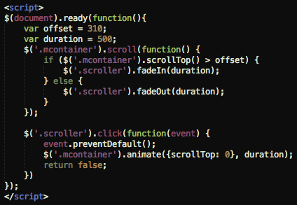
The snippet above is all that's required to build a sticky button that allows users to auto-scroll to the top of a long mobile page.
0 notes
Text
Order in the Entropy

Been reading The Chaos Imperative by Ori Brafman. For a long while now, I've believed in the power of random functions/nonlinear actions to bring really amazing things to our lives. The question really, is how to sustain these continued injections of such randomness in our lives, when the modern world structured by Outlook calendars and Asana checklists and other ordering functions keep us on a path of linear momentum. Don't get me wrong; we need order and structure to execute our plans and meet our goals. But ordering functions and linear momentum are the "10 - 20%" functions. You'll make 10% or 20% next year. Or you'll be 10% or 20% more efficient next year. Or you'll get a 10% or 20% head start on your competitors. What I'm talking about here, the random functions and nonlinearity, these are the 200% - 1000% or even 10,000% functions.
Now that really excites me. (Don't tell me you're not!)
So back to my original point: how does one sustain such injections of chaotic nuggets in our lives when one is constrained by ordering functions, and limited by the physical and/or mental energy capacities? We all know those moments at 9:48 pm on a Wednesday night when we don't feel like booting up our brain system for yet another marathon.
[To be continued...]
0 notes