
Don't wanna be here? Send us removal request.
Statistics
We looked inside some of the posts by blewwhitee and here's what we found interesting.
Average Info
Notes Per Post
1
Likes Per Post
1
Reblog Per Post
0
Reply Per Post
0
Time Between Posts
6 minutes
Number of Posts By Type
Text
5
Last Seen Tumblr Blogs


Fun Fact
Tumblr Inc. has $15.1M in annual revenue.
Text
My Life of Graphic Designer

I’m a student of multimedia art and design, but I’m just an average designer today. Last time, I woke up late, like 9 am or 10 am, because I had work the whole night, like doing photoshops, UI, and so on. I was all alone in my condo for college while my family was in Lapu-Lapu City, which is far away from here. Of course I don't have a part-time job and I’m doing the chores like cleaning my room and cooking, and I always procrastinate, like looking at the phone and watching shorts of random videos. At least there are tips and tricks for using Photoshop and design references. Despite staying in the condo for the whole time, I go outside riding a bike, going around my condo, walking, and buying food to get refreshment. In the meantime, I keep posting my design work on Instagram so often as a part of the portfolio. If the deadline is far, then I work ahead but slowly. But I stay awake for the whole night to finish the work quickly when the deadline is near. What's worse is that Adobe keeps crashing and losing my progress. It’s frustrating. Like I said, I keep waking up late at 9am, and I skip breakfast. So yeah, that’s my life as a graphic designer.
While doing this, it affects my mental health. Being alone can be so tough for the whole weekday because, you know, it will affect me like everything inside is quiet. All I did was lie down, having a mental health break from class activity, social isolation, and boredom. And yes, I’m improving my skills in graphic design to slowly become passionate, but that’s not good enough because I’m afraid of what comes next. I’m an introverted person and prefer having short conversations, and when I look up the video about having a job as a designer. You need social skills in not only one company they work for, but also more than one company they work for the company’s needs in terms of advertisement and others, which makes me think that it is tough for more. I was pressured, and I’ve been thinking for a long time about the future of my career. I feel depressed because I don’t know what to do, and I feel like doing the same thing as in the past. Then, I’ll ask my parents about the life of a job, and I’ll hang out with my siblings to go somewhere else to give motivation after staying in a condo for a long time. It’s important to give support, gain a social life, and get rid of mental health problems. If you have an art block, then take a rest and hang out with someone. Lastly, becoming an artist is my secondary goal, but my primary goal is to find something enjoyable in life, like a good lifetime, such as going out of the Philippines, buying food, and so on. And of course, find happiness. Whatever the case, I want to buy it and need to go, like, anything. And having the passion of being a graphic designer to make myself proud despite my struggle with it. Every decision matters, whether I’m right or wrong. I made mistakes. But still, I keep moving forward. That's what life is.

0 notes
Text
I use Adobe App in Day 1 to Now
I’m gonna share my life of using any Adobe App from day one to now. So, what is Adobe? Adobe is a software app that it uses for online design tools, picture editing, and vector creation to mobile app development, video/audio editing, print layout, and animation software. There are the list of Adobe products which are Photoshop for editing images, Illustrator for making logos and any vectors, InDesign for creating newspaper, magazine, and other printing papers, After Effects for motion graphics, Premiere Pro for video editing, and much more. So let’s share my experience of using Adobe apps.
Day 1 to 5
First is Photoshop. The most used adobe app in the So here is my first impression of this.
There’s a lot of tools and the UI is too complex. Good thing there is a help and guide when I first open the photoshop. After the tutorial, I find it easy to use, but there are so many tools I want to learn, especially the menu part.

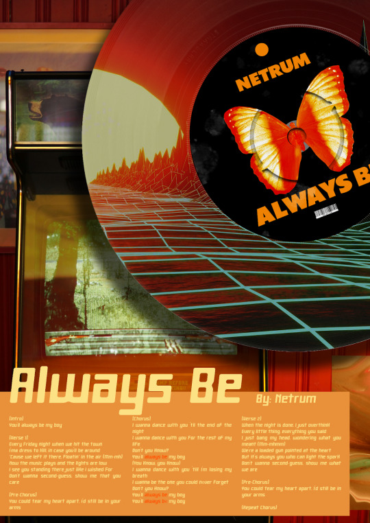
So, this is my first artwork in photoshop and It look unreal and the color won’t match. The image is pixelated, which makes it look bad and I put myself in the picture. The tools I used are the pen tool that cut and traced the image of the castle, the characters, and me. It takes a lot of time to trace and there’s gotta be a way to trace quickly, also the colors and filters as well to adjust. But hey, this is my first time using photoshop. Plus this is for academic purposes.
The rest of the day is just focusing on learning the tools like filters, selects, properties, adjustments, and a lot more rather than making artwork. It’s important to know those tools in the toolbar to adapt just in case. I’m a slow learner and this is gotta be a long time. After this, it looked complicated and painful, I was panicking on how to get rid of the gradient tool and I accidentally deleted my asset by shortcut key control plus. What key? And I delete that concept wasting like two hours and take a break.
DAY 6 TO 25
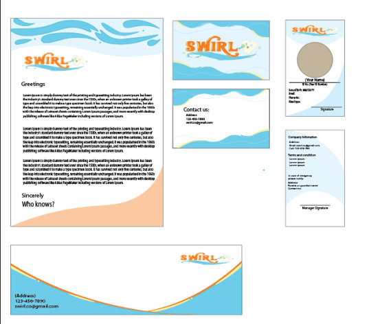
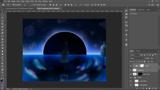
I paired up with one student who loves J-pop idols and we’re about to make a poster about a toothbrush theme using Illustrator. I made up the title called “Swirl” and my partner made a logo with a cute tooth. Also, I’m making business cards, envelopes, and newsletter.

As for the Illustrator workspace, The UI is simple enough compared to photoshop. It can be used for making logos and vectors like icons. When I start using Illustrator, I use a pen tool and then tap it to make a point then draw the line by tapping another point to create a shape. Also, hold it to curve the line as well. Simple, but I’m struggling to adjust the curvy shapes. If you want to draw, I prefer to use photoshop because most designers recommend it.
DAY 26 TO 60
The next day will be focusing on the mockup design using Photoshop. It’s simple and all you have to do is place the rectangle, right click it and click the convert to smart object then double click that shape and it will proceed to another tab. After that, place the poster then save it and go back to the first tab. That’s it. Also follow the mockups by adjusting the rectangle. I was taught on Youtube how to do it.
In continuation of the “Swirl” brand, I made a poster individually which I improved a little and it looks empty. I know those tools but it was painful. I was so frustrated on how to blend the water part. I feel rushed and I ran out of ideas regarding the background part and it’s empty

Finally, the last four posters are by pairs. One for the original flavor of mouthwash, two for the same brand with J-Idol made by my partner and one poster for a variation of three posters. It’s fun to have a partner and make a poster together. Everything is for academic purposes and I do enjoy photoshop and illustrator.


After we made it through. My Youtube short algorithm is all about graphic design tips and the progress on making photo manipulation, hacks and tips on photoshop, also illustrators tips and tricks for the rest of the day. I look up on Pinterest and search the ideas regarding the photo manipulation, poster, typography and of course, tips that make the tool useful.
DAY 60 TO 75
I use Illustrator to explore more when I have free time and I made this for fun
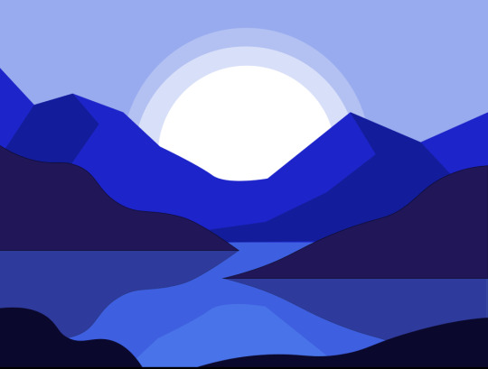
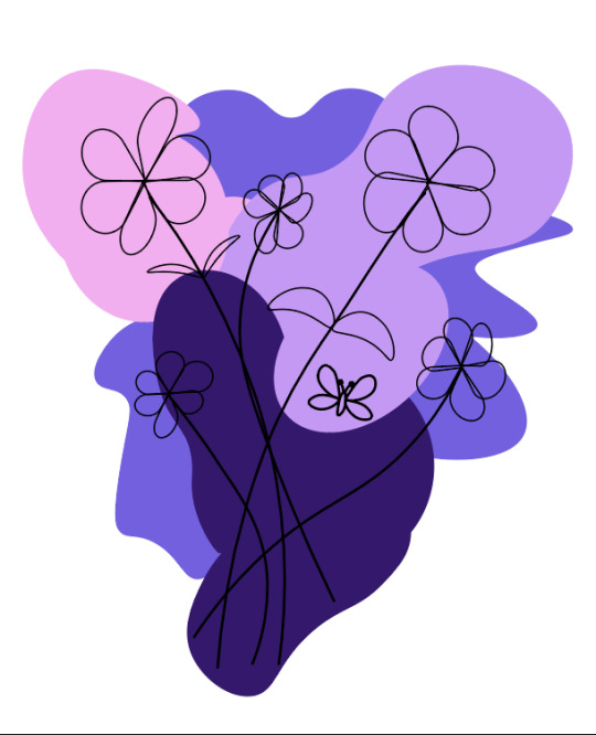
In the blue illustration, I used a Pen tool to create a mountain, Shape tool for the circle and a rectangle for the surface of the water. So yeah, it’s static and simple. Same thing as lavender flower at the right side, I use pen tools, curve pen tools, and shape
Days later, I’ll explore InDesign. It's like a combination of Photoshop and Illustrator but it’s for magazines and newspapers. I’m not much of a magazine and it’s about layouting.
Turns out, I'm not interested in this a little because it’s more focused on content than design. I’m not a journalist as you know, writing stories and I had experience of grammatical errors like too much. I prefer Photoshop, but just in case, I use it for layout if I have my work written.
Day 70 to present
I lost count on how many days and here’s what I did. I use photoshop a lot because I love doing posters and photo manipulation. Most of my work is inspired by Pinterest.


As a continuation of the designing journey, I’ll explore more to gain creativity skills and make a workflow easy. Also the last two unfinished and in progress and I’m busy at college. Next up is After effects, the motion graphic. to explore but this is getting more complex than photoshop. I hope this is fun.
0 notes
Text
Figma for Beginner
Figma, a collaborative interface design tool. In contrast to standalone programs like Sketch or Adobe Illustrator, Figma can be operated fully within a web browser, making it compatible with both Macs and Windows-based PCs. You may use it for free, too
Figma's ability to facilitate real-time collaboration on a single file is another significant benefit. If designers wish to share their work using traditional "offline" programs like Sketch and Illustrator, they usually need to export it to an image file and then send it by email or instant messaging. So here’s how to use Figma for beginners
Step 1
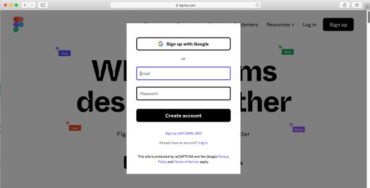
Visit www.figma.com on any website, select "Get started," input your information, and do a brief verification task. If you already have an account, sign in. A page with a few additional onboarding questions will appear once you complete that, and then Figma will launch a project file with some samples of what you can build using the tool.
Step 2
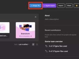
Click the Figma button in the upper left corner, choose File, and then choose "New design file." This should open a new file in a new tab in your browser with an empty canvas. Let's begin a new project.
Step 3
Press F to select the Frame Tool or you can click the Frame tool icon in the toolbar at the bottom of the status bar. In essence, a frame is an element that contains other components. If you have ever used Sketch or Adobe Illustrator, you will know that they work similarly to an artboard.

There are two methods for making a frame. We may choose a preset Frame size from the Properties box on the right side of the window, or we can click and drag in the canvas area

Step 4
Let's type some words. To create a Text layer, click anywhere in your frame after selecting the Text tool by pressing T. This will be incorporated into the design of a button. Use auto layout to dynamically modify alignment and fill in with colors. You'll save time and create responsive and flexible designs as a result.
Step 5
Create a rectangle and arrange the layers. To select the Rectangle tool, press R. Around the words you just made, drag a rectangle that resembles a button.

The text is now obscured by the rectangle. We must utilize Figma's "Arrange" instructions to resolve this. Navigate to the Layers panel located on the window's left side. After selecting the text layer, a variety of choices will appear when you right-click. After selecting "Bring to front," the text will now be positioned above the rectangle.

Step 6
Change the rectangle's color and give it rounded corners. Choose the newly formed rectangular shape. It is possible to round the corners of any form using the "Corner Radius" parameter in the Properties panel. Enter the amount of pixels you want to round each corner here.

Step 7
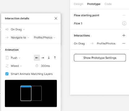
Now, you’ll make a UI by using prototype. Add the frames and go to prototype at the right side of windows. Click the button you made then click the blue add button and drag it to the other frame to make the interaction. You can apply animation if you want and preview it to test it out.
Now you're learning how to develop user interfaces. Feel free to explore Figma more. Developing concepts and references for websites, mobile applications, and other goods may be enjoyable. Additionally, the user experience prototype.
0 notes
Text
7 Best Website for Graphic Design Resources
Here are the 7 best websites for graphic design resources. supply resources and tools for project creation, serve as a source of creative inspiration, and assist designers in streamlining their processes. These tools, which might include fonts, icons, photos, templates, tutorials, and more, let designers focus on more difficult parts of a project and easily visualize concepts.
1. Behance - is an Adobe-owned innovative networking platform that focuses on showcasing and discovering creative work as well as finding inspiration.

2. Unsplash - is a high-quality stock picture website run by a group of photographers. This website allows anybody to download photographs for commercial or noncommercial use.

3. Freepiks - is one of the most well-known free picture stock sites available. It includes photos of various types, drawings, icons, typefaces, mockups, and other materials.
4. Coolors - Coolors.co is an all-in-one application that proposes amazing color palettes, allows you to design a palette from a picture, and even creates gradients.
5. Canva - It’s a widely used free graphic creation tool. It offers a straightforward clicking and dropping image editor that can generate anything from a social media picture, banner, logo, or poster to a presentation.
6. Dribbble - Dribbble is a popular website for creative people. This is where creative professionals from across the world display their work and build their personal portfolios.

7. Flaticon - Flaticon is the most comprehensive resource, with over 33,99,000 vector icons for your website, social networking, and online apps made by Freepik.
Reference:
0 notes
Text
The Principle of Graphic Design
Graphic design is the use of visual components such as typography, pictures, colors, and forms to effectively express a message or concept. It is the process of developing visually appealing and meaningful material in order to engage with an audience, whether for a product, event, or other kind. It’s an ability that may assist in creating high-end graphics to market companies on a national and worldwide scale.
Here are the Principles of graphic design
Balance - relates to how visual weight is distributed in a design. Balanced designs convey a feeling of stability and harmony.
Three types of balance
Symmetrical - This sort of design is built along a vertical and/or horizontal axis, with the weight of the pieces evenly distributed over both sides of the arrangement.
Asymmetrical - This style of balance uses size, contrast, and color to smooth the flow of a layout. It is commonly observed on websites, when two sides of a page differ yet include comparable features.
Radial - The design components are arranged in a circular pattern on the layout. This creates a sensation of movement and vitality in the viewer's eyes.
Alignment - It ensures that design pieces are visibly integrated. Proper alignment results in a clean, orderly appearance, making the design more unified. Text and graphics can be aligned along a similar axis to produce a more visually pleasing arrangement.
Hierarchy - It refers to the placement of items to indicate their significance. A well-defined hierarchy directs the viewer's attention across the design in the desired sequence. This may be accomplished by adjusting the size, color, and positioning of items.
Contrast - is the disparity between two or more design components. High contrast highlights text and components, enhancing readability and emphasis. This may be accomplished by variations in color, size, form, and texture. For example, bright lettering on a dark backdrop produces a high contrast and is simple to read.
Rhythm - pulls together several parts to get a more organized and uniform appearance. Repetition of particular features, such as logos or colours, may help a brand stand out and improve its overall appearance.
Proximity - is the concept of grouping similar components together to demonstrate their relationship. By putting related things near together, viewers may better perceive their relationship. This enhances the overall structure and readability of the design.
White Space - The empty space around design features, often known as negative space. It reduces complexity and allows the design to "breathe." Making good use of white space increases readability and concentration by emphasizing the most critical aspects.
Unity - Ensures that all design aspects operate together in harmony. A unified design has a consistent appearance and feel, making it both visually appealing and easy to understand.
The purpose of the principle of graphic design is to help with the placement and arrangement of parts in a composition so that the final designs are balanced, effective, and pleasing to the eye. By serving as guides, these principles assist designers in achieving visual impact and harmony. Adding graphics to your design will help you demonstrate your creative abilities, create a good impression on your clients, and apply for jobs in advertising or marketing across all company sectors.
Reference:
1 note
·
View note