
Don't wanna be here? Send us removal request.
Statistics
We looked inside some of the posts by blogblogbrog and here's what we found interesting.
Average Info
Notes Per Post
1
Likes Per Post
1
Reblog Per Post
0
Reply Per Post
0
Time Between Posts
8 days
Number of Posts By Type
Text
4
Photo
7
Last Seen Tumblr Blogs


Fun Fact
After the announcement of the deal with Yahoo!, there were 170K signatures of unhappy Tumblr users petitioning to prevent the sale in 2013.
Text
The Final Group Project Journey
For the final group project, we took turns to come up with topics. Healthy eating, child-raising and a backpacking guide were among the ideas raised. I suggested a guide to surviving quarantine which we ultimately decided on due to the appropriate time. Mid-way during our project, the circuit breaker occurred and it was timely for us to edit the content to suit the topic of staying at home during the circuit breaker.
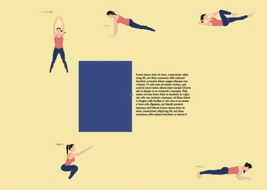
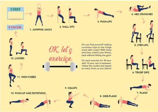
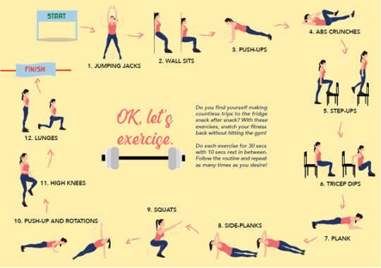
We discussed the content we wanted to put in the journal and came up with 4 main spreads at the initial stage – an information spread on symptoms of COVID and how to keep clean even at home so that millennials could monitor themselves, followed by an exercise spread based on the 7-minute home workout since many were complaining about the closure of gyms and the sudden shift to sedentary lifestyles at home may cause many to reduce physical activity in an unhealthy manner, as well as a recipe page made up of simple yet trendy recipes which made use of few and more common ingredients, since many also complained about their palates being bored while staying at home, and lastly an entertainment spread with Netflix and YouTube recommendations since entertainment was prime to helping people stay in.
Based on this, I came up with a few initial sketches for the team.

(Cover spread)

(Information spread)

(Exercise spread)
(Recipe spread)

(Entertainment spread)
I sketched these on the iPad and after sharing it with the group quickly, our team members suggested we try another layout for the entertainment spread as it was slightly cluttered. They suggested using a flowchart as inspired by Buzzfeed quizzes so that we could include an interactive element. Additionally considering the goal of our spread was to encourage people to stay at home by invoking some sort of excitement and fulfilment in staying at home, an interactive element was essential to helping us entertain the readers in this entertainment spread.
Subsequently, I came up with this spread:

(Second sketch for entertainment spread)
Hay Thi and Pei Xin also came up with moodboards for the art-direction we were aiming for.


The above were the inspirations for the colour palette we intended to use.

(Palette 1)

(Palette 2)
(Palette 3)
We intended to use more neutral tones for a cleaner approach, with accent colours for the illustrations for them to stand out.
We also intended to use lineless vector graphics and chose inspiration graphics to suit these.
We then worked on the slides and after the first critique, we were advised to put extra consideration to using brighter colours since the goal of our spread was to invoke excitement and brighter palettes would better suit this goal. Additionally, we were also advised to pay special attention to typography when presenting larger chunks of text, as well as try to use a more realistic approach for our illustrations.
We thus went with a brighter overall palette:

and a brighter palette for additional colours in some of our illustrations to make them pop:

Considering we had to illustrate exercise moves for readers to follow, and also illustrate food for the recipes to make them look appetising, a realistic approach as well as colours which popped were necessary.
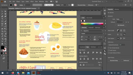
As such, we delegated the work Pei Xin was in charge of illustrating the humans, I was in charge of illustrating everything else including the food, the icons and other non-human illustrations while Hay Thi and Atikah were in charge of the layout and text content.
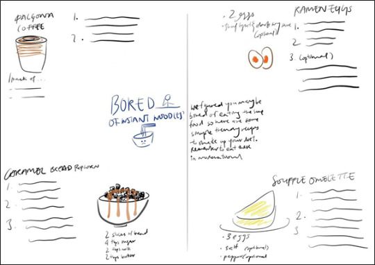
I started off by illustrating the food and initially made use of lighter tones

(Dalgona coffee 1st draft)
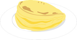
(Souffle omelette 2nd draft)
However, after placing it in the document, and also receiving feedback, I realized that due to the size of the illustrations, some lines were unclear and the colours were dull in comparison to the background. Understanding the importance of making the food pop, I adjusted the lines and colours.

(Dalgona coffee final draft: more contrast in colour with thicker lines – black bg as lines were white)
I used more saturated colours for the other art as well.
As for the illustration of the popcorn bread, I decided to go for a more 3D look. Since the bread looked like squares on a plate on a 2D level, I found that the regular approach to this bread was too plain and flat and did not do well to make the food look more appetising. As such, I used more shades and colours in the production of this. Using a photograph as the base, I traced the outlines of the cubes, before doing the shading.
After drawing out the shapes, I began to shade each side of each cube with a different shade, to create more depth.

Hence the final product which went for an approach with slightly more depth. This was necessary to make the food appear more appetising.
Moving on, intermediate feedback also prompted me to change some of the colours of some icons to be more saturated to stand out. For instance, below shows some edits I made to the colours of icons.

(Friday night icon 1st draft: too similar to the background)

(Friday night icon final: increased saturation of the colours)

(Various colours attempted for the fashion quiz icon: chose the middle as it was heavily saturated and stood out most)

(Various colours attempted for the shopping quiz icon: chose the middle as it was heavily saturated and stood out most)
While colour was important, we were also reminded that the smaller icons should not be as detailed, considering their size. This was important when it came to illustrating the face mask for the relaxation quiz icon.

From left to right: the design on the far left was my initial design. However, when placed on the spread, I found that it looked emotionless and hence I decided to throw in a splash of joy and use a smile instead (middle). However, considering the advice given in the intermediate review, that details would be hard to see for smaller icons, I widened the smile to make it more obvious (far right) for the final illustration used.
Moving on to layout:
Starting from the first spread, we initially intended the layout to consist of an illustration in the center and surrounding body text.

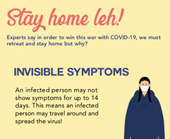
However, we tweaked the info in this spread to be about why people should stay at home, as our initial feedback expressed the information of COVID-19 to be out of line from our main goal of encouraging people to stay at home. Hence we tweaked the information to be four reasons to stay at home.


This was our new layout and our team member, Pei Xin, decided to illustrate two people wearing masks as the center illustration. (font changes and alignment changes were made which will be discussed later)

Ultimately, the feedback we received was that there was a missing link between the illustrations and the information, contrary to the rest of the spreads. As such, after this round of feedback, I decided to use a new layout and we agreed to illustrate the two points – invisible symptoms (main reason we should stay at home) and as a form of gratitude for healthcare workers (our second point.
I thus came up with a new layout:

With approval from the rest of the team, I got to work to change all the illustrations. I removed the masks on the humans and changed the illustration of the left girl to be a regular asymptomatic person – illustrated by her smile and regular appearance but with the added illustrations of the virus near her to denote how she is unaware of the virus she is spreading – followed by the man on the right to be a healthcare worker. These two illustrations were used to illustrate the two points on the left.
Hence, after reworking the illustrations and layout, this was the final product.

The layout for the exercise portion was slightly trickier.
My initial sketch involved the illustrations surrounding the borders as shown below:

However, I believe that amidst working on this spread, Hay Thi wanted to place more emphasis on the moves and due to the illustrations being varied in terms of shape and size, she initially tried to place them together as shown below:

However, while illustrating, Pei Xin mentioned that she wanted to use multiple drawings to show some moves that were hard to convey through a single static illustration. As such, after receiving the final illustrations, we reworked the layout:
Placing the illustrations in were slightly daunting as they were varied in shape. I decided to number the moves to make the order clearer.
While editing, I was actually super mindful of the gap between 7. And 8. In fact, I was really pissed off, trying to shift everything around to cut off that annoying space.
After feedback, Ms Tifffany mentioned how the space between double illustrated moves were too large. And while editing and cutting the space out, I managed to cut down on the space between 7 and 8 slightly! Even though it was not that noticeable (I shared this joyously with my teammates who said they could not tell the difference in gap between 7 and 8 haha!) But this was important because even though it was a small change in the gap, the other moves were pushed nearer to each other and as such, the overall product was more evenly spaced and the turning gap between 7 and 8 did not stand out as much so hurray!
The final product is shown below:
Our team member, Pei Xin, also suggested another layout. However, even though it was neat, we had to scrap it because it did not illustrate the moves in order and it would be confusing for readers on how they should plan their workout as well:

Thus we did not use this.
The next spread’s layout was the most trying time for me to be really honest.
This was our initial layout:


It was beginning to prevail that the omelette and ramen egg recipes were beginning to be unclear. As we changed the fonts and colour schemes, it basically got worse and I tried to reduce the text sizes and shift the recipes further from each other:

Though I tried to clearly separate the recipes, another issue arose and many feedbacked that on first glance, it was difficult to pinpoint which body text belonged to which title or illustration. Additionally, Ms Tiffany also pointed out that there was an awkwardly large gap between the souffle omelette and the recipe below which was imbalanced compared to the left side. As such, I tried various layouts and shared them with the group.
The first suggestion we had from someone on the forum was to use coloured blocks.

However, they were really odd as the style did not really match the rest of the other spreads and the blocks were just kind of strange.
The next approach (suggestion) was to place the illustrations at the corners to clearly mark out 4 different illustrations for 4 different recipes.

This was… just no to be honest. The placement of the recipe titles and its arrangement with the recipes was not intuitive at all and turned out really odd – as if the recipes were missing a title – oh look it’s on the side. So I scrapped it quickly.
I tried just making some minor tweaks:

but my groupmates found the souffle omelette illustration to still be too dangerously close to the ramen egg recipe. (I wanted to go with this personally, but my group mates later settled on another design)

Pei Xin then suggested moving the illustrations to the center as shown above and so I tried a few layouts based on that idea:

There was a gap between the omelette and the ramen egg (AGAIN!!!) which stood out even more now that it was more cramped on the left.
I then tried more variations:


However, all these had awkward spaces and ultimately when I presented the below layout, my groupmates agreed that that was the best approach:

Pei Xin suggested blowing up the illustrations but we agreed that it was too overwhelming and the illustrations behind the text interfered with the readability of the text.

Thus, based on the previous layout, I made some tweaks and adjustments and we decided on the final product:

While I still preferred the earlier layout which I mentioned, the recipes here were much more intuitively placed and easier to follow so I could understand why this choice was agreed on ultimately.
For the final spread, our layout changed many times:
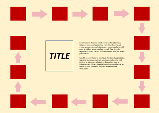
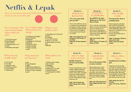
Hay Thi changed the layout from a flowchart (light blue: flowchart, dark blue: central illustration):

to a quiz and answer:
As we were afraid that the right spread would be too wordy, we tried to add an illustration at the back off the spread. I lowered the opacity and used very light shades. Below was our intermediate product and grid structure.


However, after feedback, we learnt that the TV at the back distracted readers from the content and hence, Atikah decided to cut the words (description of the characters) and replaced them with illustrations which she worked on. After I added icons and side illustrations, this was our intermediate product:

The feedback we received (apart from colour which I mentioned in front), was that the icons somehow separated the questions from their answers and so after tweaking the alignment and placement of the icons, this was the final product:

I made sure that the icons did not separate the questions from their answers and also tried to move them closer such that there was no big gap between the questions and options.
The last part of my blog post will be about the font.
We initially used transitional fonts such as Baskerville and Didot as it gave off an elegant vibe and aided a minimalistic approach.

However, we received intermediate feedback that the typeface did not do well for readability of large chunks of text, and that they also did not help with evoking the excitement and joy. As such , we opted to use sans-serif font Avenir for the body text as it was easy to read and rather than exuding elegance, gave off a cleaner vibe.
It also did not give off as much a formal and elegant vibe which was good since we wanted to go in the direction of joy and happiness. This was further aided by our use of Couture Black for the headings which was a pretty font that could give off a vibe of casualness. We explored some pairings for the title and found a pairing of script title and sans-serif body to be interesting:

The contrast added a nice splash of fun and thus we chose Blackbird to be our script title.
This was thus our final product:
Overall, for our delegation of tasks, I worked on the initial sketches, and illustrations before the intermediate check, followed by the layout, text alignment and overall doc before the final presentation. For the presentation, I did the slides while the other members filled up the forum text and edited some information in the slides. After the FP, I did the final edits for the overall design while Atikah worked on Section 1 (research) of the design doc. I worked on Section 2 (design), while Hay Thi worked on Section 3 (specifications). We worked on Section 4 (reflections) together while Pei Xin made the cover page.
This is a screenshot of the layers we used:

Thus concluded our fun exploration of this journey of working on a spread! <3
0 notes
Text
Assignment 3 Commentary
Before coming up with ideas, I brainstormed for topics that I was interested in researching on for the infographic. I came up with a list of topics such as:
- Trending music
- Asian Oscar nominees
- Academy awards for Best International Feature Film across the years
- Dance
I searched for infographics relevant to these and found that dance infographics looked relatively different from what I had in mind – I expected infographics to show dance steps but most of them described the dance as a whole with fewer illustrations. I found a lot more infographics on music and film awards (Spotify even automatically made infographics for each individual user’s listening habits) and decided to think of fresh topics on dance to make a more original infographic.
Ultimately, as I was listening to a Doja Cat song which was getting growingly viral on TikTok with a simple short dance routine, I became momentarily inspired to make an infographic on Viral Dances across the decade. After doing my research, I came up with some sketch attempts to illustrate the most popular viral dance of each year over a span of 10 years (which I later narrowed to 8 so more space could be dedicated to illustrations of the dances).
These are some of the rough sketches with short explanations below.
Prior to sketching, I already had the idea to use silhouettes to represent the moves and hence sketched with that in mind.

The above is a bunch of sketches I made in attempt to organize the dance moves. I tried incorporating them into a circle but I eliminated that idea because I wanted to show a series of dance moves (dance sequence) to illustrate steps. And I felt that a circular illustration of clusters of dancing figures would look to disorganized for an A4 sized infographic.
Another idea I had was to illustrate moving figures in a timeline such that one series of moves would progress into another. This was inspired by two things:
1) Akuma from the game ‘Street Fighter’ which inspired the idea of multiple figures in a straight line

2) https://www.youtube.com/watch?v=EUFKjo8uPpA
The concept of changing locations using dance moves. The shadow transitions inspired this concept too. (kind of like the Shadow Imitation Technique in Naruto) The idea of transition came from these sources
3) https://www.youtube.com/watch?v=UhqA0CaPrF8
The concept of identifying similarities in dances which was used in this video also inspired this.
I ultimately decided not to use this concept because I found that by doing so, I would have to find similarities between dance moves. And since I wanted to illustrate the progression/evolution of viral dance moves, I would have to fill in the transitions between the different dance sequences with extra steps.
These extra steps would not have existed in the original dance sequences since the viral dance sequences representative of each year were vastly different. I felt that these intermediate transition steps may confuse and mislead viewers. Kind of like forcefully transitioning between viral dances with little visual similarity.
Ultimately, I settled on a timeline concept. I tried a few more styles for the timeline such as:

And a regular vertical timeline.

Ultimately I decided on a vertical timeline to have a neater presentation and better use of the space. I tried a few sketches and researched on some related facts I could possibly place in the infographic.

My first draft was a vertical timeline segmented by the representative platform which the video was popularized on. Illustrations of the main dance move were first incorporated in the year number. A short segment was also dedicated to explain what a viral dance was, for those who did not know.
A description of the background of the dance move and how it got popular was described.

However, I decided to expand on this skeleton draft by incorporating more illustrations of the dance sequence. I decided to move the words around to accommodate the dance sequences.
I also decided to segment a larger area for more background information so the timeline would not be the only thing. I sketched different versions of this segmentation.

This was one of the segments I tried to sketch. However, I found that this would render the timeline way too small to be of significant attention. Hence, I edited from the first draft and made the changes.

I decided to segment the top portion for some facts, and went with a browser theme to segment some facts about dance. The new description included both the history of how the dance move gained its virality and how the dance was essentially done.
After the critique, I received the comments that the text was too long and I could omit some details to shorten the text. Hence, working on that prototype, I set off to first gather the illustrations for the dance moves. These illustrations would be a huge portion of my infographic.
For consistency, I wanted the same figure to be represented across all the dances so that it would be easy for the viewer to interpret without confusing them. As such, I got a model to perform the moves which I recorded in slo-mo and later screen captured three main moves for each sequence (except for The Floss, which I later narrowed down to two moves since that would be clearer than having an intermediate move).
I decided the colour of the words by using similar shades to their corresponding social media platform where they had gone viral on.
The process of obtaining the illustrations was rather tedious and would be explained below:

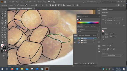
I used magnetic lasso on Photoshop to extract the figure as a layer.

Then I created a clipping mask with a black-coloured layer to obtain the silhouette.

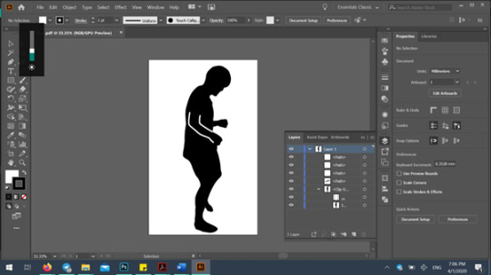
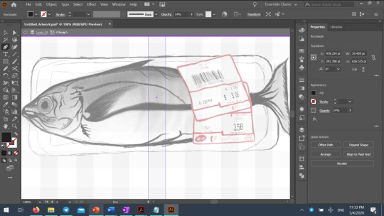
The below is a screenshot of the layers for one of the silhouette files during editing on Photoshop.

After exporting the silhouette as a PDP file, I opened it on Illustrator and referenced the original image to fill in important details that were not visible in the silhouette. As seen below, the original line at 1.0pt was too fine and when I zoomed out it was too faint.

As such, I increased the white lines to 6.0pt as per below. The screenshot below also shows the layers used for each of the silhouettes within Illustrator.
I did this for all twenty-three (23) of the silhouettes used for the infographic and put them in the file according to my sketch.
I followed most of what was portrayed on the sketch. However, I faced a challenge when having to place the silhouettes over the words. The initial plan was to place the smaller silhouettes over low opacity wordings. However, I felt that it would have been difficult to see the words or even pay attention to it. I also felt that the illustrations were too small.

As such, I adjusted the leading of the words and blew up the illustrations. I also decided to tweak certain sizes of the illustrations to provide some variation.

After doing this, I found that the words were still blocked. Especially with its low opacity, I figured that it would have been overpowered if I were to change the background colour, which I intended to. Thus, I decided to adjust the leading and tracking of all the words such that the illustrations would fit within the spaces between the letters well, instead of outright blocking the words. Additionally, I changed the opacity of the words to 100%.

I received this suggestion, after my second critique, to reduce the opacity of the illustration. I did not want to do so because this would steal the attention on the illustration from the viewer. While the name of the dance was important, the illustration was the most important and basically the highlight of the infographic. As such, I readjusted the illustrations instead of reducing their opacity.
While some of the words were slightly blocked, I made sure that the overall word was well visible and understandable.

Continuing my journey to complete the second critique prototype, I followed the sketch and completed it. However, I found the typography of the title to look strange, which I ended up mentioning in my forum post.
I tried a few fonts but ended up going with an italic one since I wanted a cleaner look. This was one of the bold fonts I ended up scrapping because the long sentence of words looked too imposing being in bold:

I spaced out my illustrations, not wanting to cramp up the infographic at this stage.
I chose a faint orange background because all the text colours were well visible on it. And I also did not want to go with a white background because the theme was viral dance, which was a more exciting, fun and casual topic. As such I wanted to make use of colours to convey this lighter mood. White would have been too sterile for the theme.
I tried to play around with the background as well, and initially added giant blown-up silhouettes in the back. On reflection, I found that a huge reason for this issue I had with the background stemmed from the over-abundance of empty space between the diagrams. I would later tackle this issue ater the second critique.

Ultimately, I abandoned the silhouette backgrounds because I felt that it drew attention away from the content, and also interfered with the timeline (which I wanted to be white since white looked best pierced through the icons like a kebab haha)
Hence this was my second critique submission in the end:

After receiving comments from the second critique, I found the need to adjust 3 main things
1) The size of my illustrations and to add more visual directions.
2) Increase the visibility of my title since it was not well-visible.
3) Change the second fact about 1 in 10 dancers going professional since it was not directly related to Viral Dance.
The first thing I did was to tackle 1 and 3. I first changed my fact to a fact directly relevant to viral dances and raised a fact on the current most popular dance trend in 2020. Since, 2020 is not yet over, this would be a nice fact to raise and a nice verdict for the viewer to call as the year progresses. (if someone were to see this in 2021 and the overall 2020 viral dance representative ended up to not be Renegade, it would be a funfact to know that in the first quarter of the year, Renegade was a strong contender)
I mentioned the choreographer’s name, since there had been controversy over how little credit was given to her despite the virality of the choreo. As such, this was both a funfact and and attempt to subtly pay homage to her. To illustrate her, I sketched and traced her on ProCreate on the iPad, referencing the original video of her choreo before repeating what I did for the other illustrations (magnetic lasso, clipping mask etc.)

Next, I added more details to the dance illustrations to emphasise the directions for the movements.

I then blew them up such that they were much more visible. In doing so, I realized that with the empty space filled up more, the background need not be fancy or more attractive and it solved my background worry too.
Adjusting the title was the hardest part and I tried various variations of bolding, changing the font, italicizing and more:

I even tried removing the windows theme and played around with the size of the bordering rectangle.


Ultimately I tried to shorten the title, changing it and playing around with the fonts, tracking and opacity/shades.


I decided to just align the words center and blow them up as large as possible.


I even attempted to use small caps but it gave off a sterile vibe that was too calm for my more exciting theme. Ultimately I realized that it was vertically dismissive and decided to tweak it such that it took more vertical space.

I ended up with the style below. Where I used visual hierarchy to focus on viral dance trends, bolded the whole title and also used the ‘8 years of’ to allow it to be more vertically imposing.Thus the final decision on using this.

Thus concluded my final submission. Below is the screenshot of the layers as well as the final work.

Final work:

0 notes
Text
Assignment 2 Commentary
For the purpose of this assignment, I started off by brainstorming for ideas for a storyboard. I used the following criteria to eliminate the many ideas I came up with:
- Feasibility (should be able to shoot conveniently and easily)
- Story should be short and simple considering we were using only less than 9 still images to tell a full story
I came up with a few ideas for the storyboard
1. Stalker with a twist: shows a couple in bed with one party asleep; shot of phone shows that the alarm is about to go off in 5 minutes; awake person climbs out of bed and through the window and is shown back in their own room with many polaroids of the person, previously pictured to be asleep, all over their wall
2. Simple conflict of two people fighting over toilet paper in a supermarket
Ultimately, I eliminated 1 as there were too many details and props that needed attention and 9 frames may leave many gaps in the story presented and the storyline or twist may not have been sufficiently expressed.
After deciding on the storyline, I came up with a rough sketch of a storyboard:

The main conflict was heavily reliant on the concept of the height difference highlighting the inferiority and physical imbalance, hence at this stage, I clearly decided that a low-angle close-up shot should be used to highlight the intimidation resulted in by the taller subject and a high-angle shot should be used to frame the shorter subject to emphasise his inferiority in physicality. I planned for full body shots during their conflict to highlight their height difference as well.
I then rethought certain details and tidied up the storyboard to be much cleaner and clearer to reference.
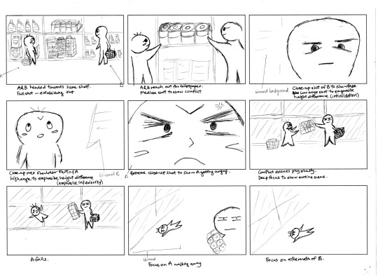
I edited some of the angles for more consistency (1 and 2, 6 and 7 to have similar angles and focus on different framing). I also edited the first frame such that there would be no huge jump between the establishing shot and the subsequent shot.
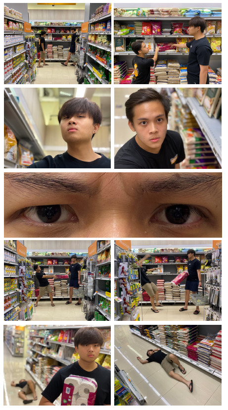
During the shoot, the framing of 6 and 7 had to be tweaked on the spot, due to the filming location being more cramped then intended.
After the shoot, I picked shots of different angles and framing and eliminated them. These were some of the eliminated shots.

Shot 3 had the most B-cuts. While I had already planned for a low-angle shot, I attempted this with frontal shots and different positions of the actor. I initially also attempted to highlight the height advantage of this actor by getting him to tilt his chin up in a frontal shot. However, that proved insufficient to highlight superiority and so I opted for shots with less zoomed-in framing and more obvious low-angle use. (final shots will be shown below)

Similar to Shot 3, Shot 4 had many B-cuts too and after attempting different framing of the subject, I found that a medium close-up that showed some parts of the floor in the background worked best to highlight the high-angle adopted.

Shot 5 was a result of many rounds of experimentation which I found an extreme close-up to the facial features to be the most expressive of determination and disgruntled mood of the subject.

Shot 7 presented two artistic choices I had to make in showing the subject falling backwards. I tried stationary ‘fake-falling’ shots with the subject in sharp focus which did not work well and looked deliberately orchestrated. Ultimately, I went with shots where the subject was in blurry motion to show that he was actually falling backwards. This was imperative in my story.

Shot 8 also included many tries. Initially planned to be an eye-level shot, I experimented with over-shoulder shots as well, and also directed the actor to face away the camera and then towards the camera. Ultimately, the eye-level shot with no eye-contact and the actor facing off-camera worked the best in creating some sort of slapstick humour, showing that he was pretty much unbothered by the conflict that ensued and effortlessly grabbed the toilet paper.
This was my submission from the critique:

The main comment that I received was that my prototype looked like a collage of thumbnails and the layout served no purpose in aiding the story. As such, I tried various methods such as reducing the spacing between images, emphasising shot 5 (the close-up of the subject’s features) and finally decided to group the images into pairs which segmented the story clearly. Shot 5, being the central shot preceding the conflict was edited into the middle of all the images on its own. I decided to focus on only the eyes which I felt sufficiently showed his frustration and determination, leading to him snatching the toilet paper.
This is my final prototype:
0 notes
Photo
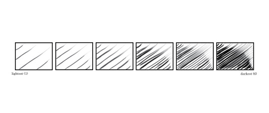
Week 8: In-Lecture Patterns Activity
Use of brush strokes to create a pattern from light to dark
0 notes
Text
Assignment 1 Commentary
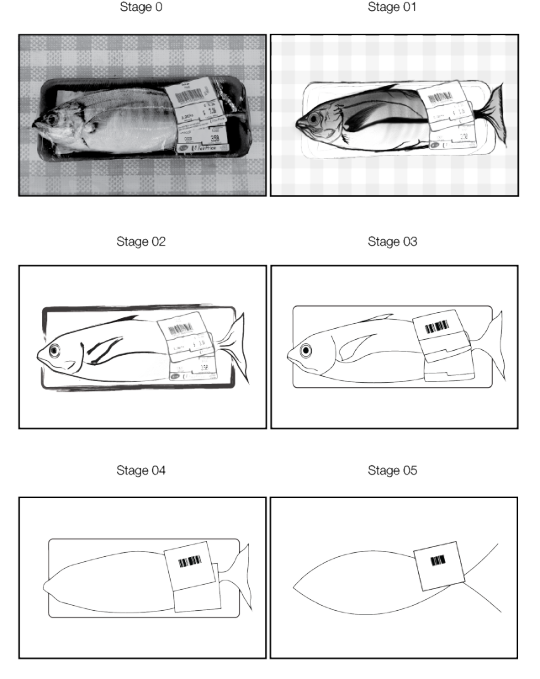
For the purpose of this assignment, I chose a photograph of a packaged fish I found in the supermarket.

Before beginning the assignment, I did a rough sketch to plan what I should do for each slide.
I began to sketch Stage 01 using ProCreate on the iPad. My rationale for using the iPad was to emphasise minute details such as the fish fin very specifically to create more texture. This detailing was important for me because I planned for Stage 01 to basically be a detailed copy of the original and should be closely detailed.

I copied the background later, using Illustrator. I retained the red outline of the price tag to accentuate it.
Another important part of Stage 01 included also highlighting certain important features of the fish such as the outline, the fins and certain lines.

Moving on to Stage 02, I removed the background, the original packaging plate and reduced the opacity of Stage 01. Next, I created a new layer and used Illustrator to emphasise the important outlines of the main parts that defined a fish: the outline, the fins, the eyes, mouth and gills. The original packaging plate from Stage 01 was replaced with a rounded rectangle. The main goal of this stage was to reduce fine details such as some gradients and most of the details were faded to show the important parts to remain. The packaging was changed to a rounded rectangle to lend more structure to the diagram. One of the concepts for the abstraction process was to replace details with basic shapes. I used a brush pen for this stage to retain the sketchy lines that were used such that there would be no huge jump.

For Stage 03, I replaced all the lines with solid lines instead of brush strokes before removing the gradient and background details. I also redrew the price tag using solid lines and removed details such as the brand as the barcode and price were the most essential and defining features of price tags. I made the fish simpler by removing the details and focusing on the defining features, the outline, eye, mouth, fins and tail. This referenced Stage 02 where I darkened the details I wanted to focus and emphasise on.

Stage 04 was an essential stage where I removed all features of the fish and reduced it to its outline. The idea was that the outline of fish was able to well define the fish. I kept the price tags and the packaging back as I wanted to show that the fish was specifically a product - packaged fish not just any fish. I reduced the curvy lines of the price tag to squares for it to be reduced to basic shapes and retained only the barcode which I found was indicative of a price tag, even without the price itself.

In the final stage, I reduced the fish to a simple curved line which retained the shape of the fish, showing its body and tail which were sufficiently definitive of a fish. I reduced the price tag to a single one. I faced difficulty reducing the barcode considering the A4 sized deliverable which would make fewer bars appear like a black rectangular blob rather than a barcode.

After the critique session, I learnt that my progression from Stages 01 to 03 were to minimal which resulted in abruptness in abstraction from Stages 03 to 04. As such, I made tweaks to Stage 02 where I completely removed the shading and gradient details and reduced minor details. Similarly, I removed colouring completely from Stage 03 such that its progression to Stage 04, a basic outline, would be smoother. Apart from minor tweaks, I also considered the comment to rethink the necessity of colour and deemed it unnecessary for red to contribute to indicating the price tag as a price tag. It merely showed it was a discount item which was not an integral detail. I also noted to push the abstraction of the barcode a lot more and after rounds of experimentation, managed to reduce it to 5 bars.

As such came my final product below.
0 notes
Photo
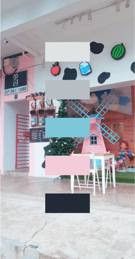
Week 7: In-Lecture Colour Palette Activity
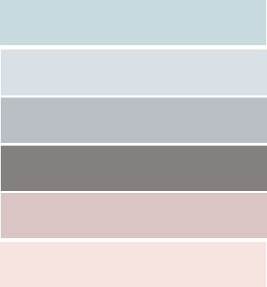
From top to bottom:
#DFE3E4: a very light grey, close to white, fills the exterior wall of the shop, giving it a neutrally clean feel and mood of tranquility; this calm mood and clean feel evoked is appropriate for a cafe where customers may sit and chat idly while enjoying their drinks
#B7BFC5: the marbled floor is predominantly coloured in this greyish-blue hue. the neutrality of the grey is complemented by the calmness provided by its slightly bluish hue, effectively matching the pale grey/white on the walls to similarly evoke the sense of quietness and calm tranquility
#7DC7D8: is a light blue shade used on the wings of the windmill; this pastel blue is used to complement the pastel pink windmill and accentuates the overall pastel aesthetic of the shop (more to be explained in the pink shade)
#F4CBD9: is the main pastel pink shade dominating the body of the windmill; as mentioned, it is matched with its pastel blue shade to accentuate the pastel aesthetic of the cafe and gives it a sense of playfulness and possibly creativity; it is also more striking and saturated that it’s paler counterpart on the walls on the left of the image which is an even paler pink, thus allowing the entire windmill to stand out (especially with the muted and neutral flooring and exterior walls, as well as it’s darker backdrop, a much darker brick brown)
#232A37: is a bluish black shade used for the patches on the white (or light grey) walls; they are clearly used as patches on the white background just like cows’ black patches on their white skin. This use of colour clearly represents a cow and matches the cafe’s main menu which predominantly comprises milk and milk tea beverages.
0 notes
Photo

Week 6: In-Lecture Exercise
The typographic representation makes use of center alignment which makes it difficult to find a start and end point within each sentence, reducing readability for the viewer. The height of all characters are also uniform and it is unclear to the viewer which alphabets are supposedly in upper case(all of them appear to be upper case) and this further reduces readability. The font is also reminiscent of institution names (Sports Clubs, University varsity clubs etc.) which would be more suitable for the title than the body text. A chunk of text in upper case is overwhelming for the reader as well.
Suggested changes:
I would make edits to the body text and use a font with both upper and lower cases and is simpler
Separate the title text further from the body text to create a better visual hierachy to bring attention to the title.
I would ailgn the text left then make use of tracking to fine-tune and justify the lines to reduce the amount of negative spaces and justify the whole chunk of text to increase readability.
0 notes
Photo


Week 5: In-Lecture activity
(1) and (2): Long shots that frame the subject within the much larger surroundings are used to pull focus to what seems like its victim lain at its feet. In particular, I used the rule of thirds with the subject’s eye-line matching the visual line to evoke some sense of provocation - as if the subject is proud of its kill/victim lain at its feet.
(3) is a low-angle full shot of the subject. The low angle suggests superiority over the viewer, meant to exert intimidation and render the viewer somewhat weak and inferior to the subject.
(4) is an extreme close-up of its eyes that brings focus to the subject’s eyes, meant to threaten the viewer and evoke some sort of fear in the viewer, as if the subject’s eyes are already locked on us.
0 notes

Photo

Week 4 In-Lecture Advertisement Analysis
Signifier: slices of tomatoes stacked up in a tall pile to resemble a ketchup bottle
Signified: Heinz ketchup
The slices of tomatoes are stacked up in a tall pile to resemble a ketchup bottle, even accompanied by the Heinz Ketchup labels. The advertisement is trying to convey that their tomato ketchup is made from fresh tomatoes and tastes fresh.
The tagline states that 'No one grows Ketchup like Heinz'. Ketchup is a sauce but here, it is portrayed to be fresh, authentic and not artificial, in fact being 'grown', when it cannot actually be literally grown - only tomatoes can be grown -. This reinforces the message that their Ketchup tastes fresh and is made from actual tomatoes that they have grown themselves, unique unlike any other Ketchup brands which may be artificial.
0 notes
Photo

Week 2 In-Lecture Exercise 2
Those Things Had A Different Meaning To Me by Herakut, 2016
The artwork depicts a fictional character, Pikachu (character of the video game Pokemon) with human like arms, embracing a little girl who is holding a Pokeball (iconography within the same video game). The two are illustrated against a backdrop of colourful splattered paint and writings which are difficult to decipher.
The Pikachu which is conventionally depicted in the original game to be small in size like a small animal, is depicted to be of a larger adult human size. Here, it is coloured a bright yellow, depicted to also have a large human arm and hand which it embraces a little girl with. The little girl is depicted with lips drooping and eyes distant, yet she is shown to be leaning into the Pikachu’s chest while clutching the Pokeball. It is also to note that the Pokeball and Pikachu’s head are differently depicted in a glossy texture, converse to the rest of the artwork which is illustrated in a duller manner. The child is also depicted uncoloured apart from occasional strokes of paint which also covers the background.
The Pikachu embracing the girl seems to hint at it being a protective presence for the young girl, almost like a parent. This is further supported by the little girl leaning into its chest with a neutrally calm expression, emphasising the sense of security she experiences in the Pikachu’s arms. While both characters are staring in the same direction, the Pikachu clutches the girl tightly and the girl seems to clutch the Pokeball like a weapon. The virtual world of the Pokemon game seems to be illustrated as a safespace for the little girl. The brightly and glossily coloured Pikachu and Pokeball also juxtapose the lack of colour of the little girl in an attempt to emphasise the imaginative nature of this virtual safe space. Ultimately it can be interpreted as though the virtual world of gaming (in this case Pokemon) is capable of providing a safe space for, and protecting the child player, but from what, it is unclear. It is likely that the imaginative nature of this game could perhaps provide the children player with a safe space for imagination and creativity as emphasised by the haphazardly coloured background.
While the message of the virtual gaming world as a safe space is clear, it is unclear what it protects children from. Could it be from the troubles in the real world? Or could it be protecting the children’s imagination and creativity from being jaded by reality? If so, the lack of colour in the illustration of the girl does not seem to match this interpretation. The illustration lacks these answers and seems up for interpretation of the viewer. This open interpretation may be aptly interesting if creativity is indeed the subject of the illustration.
1 note
·
View note