
Don't wanna be here? Send us removal request.
Statistics
We looked inside some of the posts by blogmorley and here's what we found interesting.
Average Info
Notes Per Post
6
Likes Per Post
6
Reblog Per Post
0
Reply Per Post
0
Time Between Posts
17 days
Number of Posts By Type
Text
2
Photo
2
Last Seen Tumblr Blogs


Fun Fact
Tumblr.com rank in the US is 25.
Text
Project 3 Retrospective
Okay so I really struggled with this project, especially at the start. I wasn’t sure from which perspective we were working from (that being either the client of a design firm or a design firm designing for a client) and that's my fault. A lot of the pitfalls of this project for me were a result of distraction, absence, and not communicating with my instructor. I think maybe it’s just because it’s the end pf the semester, but I’ve felt so burnt out over the last couple weeks.
For this project, once I figured it out that is, I created an brand identity for Gallery Morley, an art gallery that aims to bolster creativity through partnerships with local artists and through it’s work with both high school and college art programs. I used deep, rich primary colours to quickly and easily designate the focus on creativity and the arts. I put a particular focus on the colour blue, but only because it’s my favourite colour.
I used a simple layout for the design brief, using Helvetica Neue for it’s modern and clean applicability and played with the positive/negative spacial tug-of-war of black and white for the margins of the pages, as well as the page numbers. The brand identity is marked by a simple geometric square with Gallery Morley tucked into the bottom left corner. This design was not only simple clean, but also made it easily transferable to apparel and small goods, as can be seen in the series of mockup images found within the design brief.
Overall I enjoyed this project and course, as I’ve always had an interest in advertisements, the communication of design, and how the combination of good design and targeted marketing can attract and influence people. That being said, I take issue, especially in the last couple years, with the pervasiveness of advertising and design, the co-opting of design by profit-motivated firms who might use imagery from and/or social movements in general to make a quick buck. On the other hand, I think the only thing that can push back against something like that is good design.
6 notes
·
View notes
Text
Project 2 Retrospective
For my second project, I chose to create a project as a means of getting the attention of MSCHF, an art and design collective based out of Brooklyn, NY. Their works are very modern, creative, and seem to make heavy use of irony. Working within these parameters, the project idea I decided on was to stream user submitted content onto an old iMac G3 24/7.
This demonstrates, in my opinion, the randomness and potential for disgust and unnerving content to be found easily. I believe it demonstrates the visceral randomness of the internet and, considering that all content is user-submitted, it paints a portrait of the mentality of the modern internet user, which is mostly everyone considering the infiltration of the internet in our everyday lives.
The initial problem I ran into was sourcing an iMac G3, as most that I found online ran between $200-$500 with an additional $150 for shipping costs. The second, biggest hurdle was the cost of maintaining a 24/7 livestream, which is not cheap as it turns out. To solve this, I may have to use a platform such as Twitch and then figure out some form of compliance with the Terms of Service via blurring extreme content that may not be platform-appropriate.
Overall I think this project is workable and that I have the background necessary to complete it, but I also may have bitten off a bit more than I can chew, at least in the timeframe. Should I finish this project within the next few months, I will be sure to update with a link to on-going stream.
0 notes
Photo


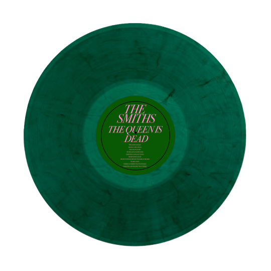


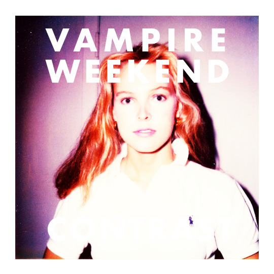
For our first project, we explored appropriation through the reworking and parodying of vinyl album covers. The albums I chose to explore were MF DOOM’s Madvillainy, Johnny Cash’s Cash, Descendent’s Milo Goes To College, Vampire Weekend’s Contra, and The Smith’s The Queen is Dead. Ultimately, I chose to go with The Smith’s album, mostly in part to the fact that the Queen had just died and so the subject matter was pretty topical. The original album features a photo of Morrissey lying in repose, and so I replaced that photo with a photo of a memorial for the Queen, featuring a small stuffed Paddington Bear in the centre of the photo.
On the back of the album, I mostly just played with the tracklist, trying to have fun with some of the song titles. For example, “Vicar in a Tutu” became “Vicar in a Boy” and “The Boy With The Thorn in His Side” became “The Boy With His History Teacher At His Side”. a reference to the play The History Boy. Some titles were easier to make funny, such as Cemetery Gates, which I changed to simply Cemetery Gates (Liz’s Song).Others, like The Queen is Dead, simply needed an exclamation point to flip the sentiment of the song title on its head.
For the vinyl record itself, I kept the green and pink colour scheme of the album case, as well as the typeface used on the front. I also brought over prudent information like the track listing.
0 notes
Photo


For the second part of our project, we explored metaphor through the lens of advertising an art and design college. I began by ideating different slogans and quips that were tangentially related to art, then connected them through imagery generated in PhotoShop. Unknowingly at first, I began to create a series of posters that were related through their simple backgrounds, shared typographical elements, and playful images.
The poster I ended up choosing and then creating a mockup for was the “STOP CLOWNING AROUND” poster, which features a pair of red clown shoes sitting on top of a garbage can. The image is against a red background with golden yellow text. I chose this one because it, in my opinion, was the most humorous and so would be more likely to stick with someone after they had finished viewing it.
0 notes