
Statistics
We looked inside some of the posts by blpproduction-blog and here's what we found interesting.
Average Info
Notes Per Post
0
Likes Per Post
0
Reblog Per Post
0
Reply Per Post
0
Time Between Posts
5 minutes
Number of Posts By Type
Photo
7
Text
8
Link
1
Video
1
Last Seen Tumblr Blogs


Fun Fact
If you dial 1-866-584-6757, you can leave an audio post for your followers.

Text
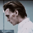
Vision 8 (5/10/2016)
THIS BLOG IS DEDICATED TO THE REFLECTIVE ESSAY FOR VISION
Vision Assignment 2016
Brittany Lazzarini-Pholi
Vision has always been an intimidating element to technical performance for me. I have often avoided vision and projection, not using it or relying on others to implement it. This task forced me to face that fear and not only present vision but create content to do that.
The audio track provided for the task was, although detailed, fairly open to interpretation. I took this track and decided to generate a piece that examined key themes of mortality, war, change and love, and really draw a connection between the live performance happening and the vision element. After listening to this track a few times I compiled a word list of phrases to encourage ideas, this list included emotive terms such as retrospective, reflective, melancholy, reminiscing, death, family, laughter, loss, old fashioned and rough voice.
As the live performance element was one of the most important for this task I aimed to make the main shot act almost as set. That way there could be a desk placed center stage that would fit into the visual world. Working for a local historical pub I was lucky enough to have full access to their upstairs dining room including furnishings and photos.
This meant I could easily create the look of an old room with history and film shots that would create a sense of atmosphere. This approach to the task impacted the hardware and setup I used for the project. I worked with a single projector mapped to a flat white wall. Then measured the beam angles to ensure the desk was positioned correctly.
Using varied opacity, extreme close up shots and slow cross fades I could control the flow of the film and create small moments in-between the elements of the text. By slowly fading in footage of a charcoal drawing I could connect the final section of the audio to the previous. This last section has a major shift in tone and can be quite intense compared to the section prior. Using this drawing shot I could create tension and tie together these two sections simultaneously.
I enjoyed this task as it gave me a chance to experiment. I got to work with creating a ghost like figure (achieved through changing opacity) creating an eerie effect. But also I was able to play with charcoal and then add this element to the work. This task has provided a base of skills that I can employ for future content tasks which, although not be frequent, will definitely come in handy.
If I were to complete this task again there are a few things I would do differently. These include filming more footage, adding an additional projector and mapping to the desk so the drawing could be done digitally also considering the use of live feed when drawing to create a more interactive piece. However within the time constraints and my limited knowledge of Final Cut Pro I am extremely happy with how this project went.
0 notes

Text
Audio 8 (1/9/2016)
THIS BLOG IS DEDICATED TO THE CONCEPT DOCUMENT
Concept Document – Audio Assignment 2016
“Shadow Factories” – Peter Carey
When reading Peter Carey’s short story “Shadow Factories” for the first time, an image of an urbanized, sterile, dystopian world came to mind. This story; consisting of only five paragraphs, gave, to me, an impression of an almost Orwellian world. A 1984 society: with Big Brother at the heart. Controlling actions, thoughts, ideas and shadows. It is this idea that has driven my audio design.
By exploring and abstracting the text it became apparent that “Shadows” could be any number of things ranging from memories, to vices, to addictions, even to propaganda. Continuing the theme of 1984 I decided to approach this text with a mix of modernity, cult culture, voice-over and rhythmic beats. In this sense it is not a linear reading of the text, but more a work generated from the piece. Using themes, ideas, motifs and moments throughout “Shadow Factories” I aim to generate a piece of Audio Design that the listener can respond to in a variety of ways.
Within the design multiple sound clips were used and edited. The use of well-known movie quotes, current songs and catch phrases give the piece grounding in pop culture. This is then subverted with the use of heavy industrial tones, radio fuzz and feedback, and rhythmic sounds to create tension.
The main vocals within the design consist of a sleep mediation track, a reading of “Shadow factories” and a 1950’s makeup tutorial. Although these pieces seem completely unrelated, similarities can be found in the tracks, as well as oxymoron’s created via juxtaposing the clips together.
There are moments where many tracks are layered throughout the piece to build tension and suspense, while certain clips highlighted to add emphasis. Throughout the piece I have edited the pitch of certain tracks as this assists in creating non-human like tones, despite the fact the clip may obviously be a human voice. I have also used effects such as delay, reverb and distortion when experimenting with sounds for the piece. Among the sound effects there are elements that were recorded in the field including; the 90’s music, footsteps and knocking.
The more I worked on this design the more apparent it became that this was an abstract almost surrealist view on Carey’s story, and the more I wanted to push the boundary of this. Within the piece I aim to elevate the listener, have them follow the rise and fall in the pace of the piece and fear this society of the shadow box. I would like for them to remove themselves from the story and become immersed in a soundscape that could be on the TV or radio of this world.
As part of the design process it became more important for me to create a strong sense of this world and place rather than recount the stories within the text.
Some videos that acted as inspiration for this task are linked below:
(Theses are both audio and visual inspiration)
https://www.youtube.com/watch?v=EICCRiwlQd0 (Audio)
https://www.youtube.com/watch?v=XnTnR6Y4MEo (Visual)
https://www.youtube.com/watch?v=a8TPXFoXO5A (Visual & Audio)
https://www.youtube.com/watch?v=mMyp_7d1Ajg (Visual & Audio
0 notes

Text
Vision 7 (4/10/2016)
This class was dedicated to working on the task for the vision assignment. I used this time to film footage. The concept for my vision task was: a single long shot of an old room, this is broken by close ups and extreme close ups of objects in the room including roses, candles, whisky and photos and then slowly, fading in over the top a charcoal image is drawn across the entire video slowly fading the image to black.
This seemed like a relatively simple task and I set about filming. One of my main challenges was to know how much footage I would need. It was a valuable lesson from this task that when you think you have enough footage, film more. For 15mins of footage you need quite a lot of filming. This can be resolved by tightly storyboarding the shots also. Another element that cause some trouble was the idea of the charcoal drawing. I had the option of using live feed and filming the drawing, before overlaying the image over the top of the existing footage. I went against this idea as I didn’t think this would add to the production value and if there was need to align cues at any point it would be easier to do with pre-recorded footage. After resolving this I have to chose an angle and film these shots.
It was a conscious decision to film my static long shoot into the corner of a large dining room, this gave me an almost 3D effect and allowed me to suspend the disbelief of the audience a little further.
After this I then completed my editing in final cut pro and use opacity, cross fade and blur to give me the desired effect I was after.
0 notes

Text
Audio 7 (29/08/2016)
This class was spend working on the assignment for the following class. This time proved as excellent time to practice using Qlab and getting used to plotting sound, something I am not accustom to.
For this task I decided to create something that was slightly abstract to the text. Generating a work that reflected a society similar to 1984, and used the ideas from the text to set that seen. I wanted my work to be the background noise in an urban dystopian society. I used a variety of sound effects to do this including dial tones, alarms, bells, warning signs and music with a heavy beat. This gave the piece a general overall sense of unease and made the audience feel uncomfortable for an unknown reason. I have overlapped various element to make a sound scape that grows and envelops the listener into this world. Then I have interjected parts of the Shadow Factories voice over. Throughout the piece recordings from our original field recording task can be heard and form an important part to the text.
Overall I learnt a lot completing this task that I would never had learnt had I not undertaken this assessment. I have furthered my Qlab skills and my audio knowledge greatly. Understanding now many principles, that I didn’t not grasp or know of before. By achieving this I feel more confident and at ease if were thrown into the deep end and asked to design an audio element for a show.
I have not had the change to work again in reaper 64 or the audio section of Qlab but I will aim to practice these skill sets in the future for further productions and I think these are valuable tools for performance technology.
0 notes
Photo

Lighting 7 - Artefact (Concept Image Board)
0 notes
Text
Lighting 7 (11/11/2016)
This blog is dedicated to the Concept Document of the lighting task.
A variety of elements impacted the way I interpreted this play and the way I have chosen to design this play.
“It's the subtlety underneath the obviousness that gives strength to The Threepenny Opera.
— Lotte Lenya
This quote sums up my approach towards the design and this assignment. It is to use the techniques of Epic theatre and Brecht to create a design that is both extreme and minimal; to find a middle ground of simple extravagance.
I personally have been inspired by German Expressionism and used this concept and these ideas to impact this design and the overall style of this piece. This is reflected in the set design, lighting and particularly the jail scene.
Bertolt Brecht was like no other in his time or since. He helped to pioneer a style of theatre, Epic Theatre. This style of theatre has often been remounted and re-contextualized, performed in various countries over various time periods. Brecht style theatre is even studied as a base text in the NSW HSC. This demonstrates the importance of his techniques and style.
Within his theatre Brecht’s aim was create situations that had the audience think about the problem presented at hand, not to be swept up in the magic of the theatre. He often interrupted scenes with song, this gives a jolt to the scene and the audience. He used plot twists and the technique of “Alienation” to keep this feeling within the audience. He also kept the theatre in its bare form, showing full stage actions, lighting and rigging. Using completely washed lighting states and very little colour. These are all techniques that are central to Brechtian theatre and are expected in all of his works. This is an expectation that I will employ within this production.
I have chosen to recontextualise the play, by changing the original storyline and context from England to 1940’s America. By changing the location and time period to 1940’s Harlem a further layer can be developed where race and cultural context become a massive factor in the play. The coronation is changed for the 1940 inauguration of Theodor Roosevelt. And there have been minor changes to the script throughout.
This then leads to nationality changes of the cast and there becomes a racial issue as apposed to a moral or monetary divide between the Peachums and Mac. The traditional themes of loyalty, love, family, corruption and brutality remain they are just now underpinned by a cultural sub-text. Mac, Lucy and the police officer brown are now African American. While the Peachums are Italian American, with possible ties to the Mafia. This is a realistic and probable reflection of Harlem in the 1940’s. The plan to disrupt the coronation is now a plan to disrupt the inauguration in Washington. These changes impact the design element for the show. This also makes it relevant in modern times with current issues occurring in American and the “Black Lives Matter” Movement.
This change makes the play a social view on modern social and cultural issues and brings it into the 21st century. Brecht aimed to make the audience focus on issues of the time and by changing the context of the play we are asking current audiences to do the same.
This not only works technically in the script, with dates and events, but works artistically and leads to further creative development in the show.
The colour palette I have generated specifically for the purpose of this show. Working with deep reds, oranges, pinks and a warm wash throughout. I have also included a variety of blues and purples. Brecht rarely employed a large amount of colour in his work so I kept a lot of the design to a wash state and used colour to emphases the set pieces.
The costumes selected are of typical 1940’s fashion, they are modest and true to the time period. They women often wore skirt and blouse combinations with hats while the men dressed in suit and tie. It has been a conscious decision to have limited colour used in the costumes, such as Polly’s dress, Mr Peachums pocket square, Mac’s hat. This are highlighted in the warm light of the stage and will then match the colour used in the set and lighting to make them pop.
Each costume is tailored to the character and matched to their profile, while extra cast and chorus are in simple plain clothes that fit the historical time period. These individual breakdowns of the costume can be seen in the character analysis document.
The design chosen has ladders along the far OP and P sides of the stage, also stretching onto the back wall. These ladders can act as exit and entrance points for the cast and are a large influence on the blocking and lighting. These ladders represent a struggle, a climb, climbing to greater social status, climbing to greater political status, climbing to a better life. A sense of striving to achieve; not unlike the American dream. Although simple a lot can be displayed in the use of these ladders.
There is then a backdrop along the back wall of the space. This backdrop is inspired by the image “Harlem Street With Church” by William H. Johnson circ. 1939/1940.
Having a flat and static backdrop along the rear of the stage was a design feature from the very first set concept designs. This sets a boundary to the almost seamless space. By employing the Brechtian technique of showing all of the staging and extending this by allowing the ladders to stretch off stage a sense of endless space is created. This backdrop brings back the boundary and reminds the audience this is a show they are watching. The style of the backdrop is similar to some styles of German expressionism artwork and finding the William Johnson print that reflected both the context and style allowed this theme to flow through the space.
Additional set pieces will them roll in as trucks onto stage, a flat piece for the brothel, a flat pieces for the shop etc. These will be stylized and the only element to the show that are garishly coloured. The Peachum’s shop is a vibrant orange colour, the stable is pink, the whorehouse is a rich red colour. These are all colours represented in the colour palette.
The lighting design for this show was to employee techniques of Brecht. The use a large warm was from both front, back and side, gives an even wash and also allows for all areas of the stage to be seen as is Brechtian practice. To offset this colour is used exclusively for the set, giving vibrant lighting changes and an overt way to allow the audience to read a situation (Ie Red for the whorehouse)
These states are then broken by the moments of song where follow spots are used and lanterns are brought out to break the tension and create a cabaret feel or mood.
The only time where this over all theme or style is broken is in the final act where jail scenes are created by focusing the moving fixtures onto the ladders to create long, exaggerated shadows, similar to German expressionism.
I have created this work on an exceptionally limited budget with the aim of using as much venue stock as possible. Hiring in only a few items that I need.
Throughout the design I have aimed to emanate a Brechtian style, while also including my own personal flare and elements. This will hopefully create a fusion of ideas and generate an interesting and new piece of theatre. Breathing live into an 88 year old Opera.
0 notes

Text
Vision 6 (3/10/2016)
In this class we were presented with our vision task. This task was to create a 15min video that ran with an audio piece. It had to be stylized and well planned and shot, edited and played by ourselves. We had to consider multiple elements including how we planned to present the footage in playback.
This task seemed to be daunting as we were all still fresh to creating content.
Once given the audio we could begin. After listening to the file a few times I began to develop some early conceptual ideas about the piece. This was told from a male voice almost entirely and sound effects could be heard. There were moments of silence and yet moments of laughter and singing. After searching the script it became relevant this is front a film. The overall tone of the piece, I believe, was reflective and retrospective. I wanted to created something that showed this, gave a sense of someone letting you see into something private of theirs, almost like peaking over someone’s shoulder and observing.
This task was slightly frightening for me as I had not had to create something like this since first year. However after breaking down and analyzing the text I felt much more confident and able to work quickly on the piece.
Words that I associated with the text are: Nature, Peaceful, Gentle, Retrospective, Reflective, Melancholy, Reminiscing, Death, Family, People, Laughter, Loss, Old Fashioned, Rough Voice, Punishment, Diegetic and non Diegetic sound, War, Birds, Language, Words, Smoke, Breath, Hurt, Mother, Children, Dread, Acceptance.
0 notes
Text
Audio 6 (25/08/2016)
In this class we began to audio plot our pieces in the space, we started layering our Qlab files and look at levels in the space. Here I learnt how to work a matrix in Qlab which is an extremely valuable lesson for when I have to work with audio on future shows.
Some basic notes about Qlab in this lesson were; never audio number your cues – this will only make it harder later, plot your intensity – you don’t want to overload your audience immediately, you should be able to build a graph of the intensity of your work. These notes combined with some handy shortcuts came in useful within this task.
Another element to this class was the idea of pushing boundaries, as theatre develops and we aim to create unique experiences for each audience member, we need to look at the way we want our work to be perceived and look at how we want to work in the industry. Are we here to create works that are comfortable for the audience and provide pleasant viewing or are we looking to build works that challenge convention and make people uncomfortable. These decisions are entirely up to us, and how we chose to conduct our careers.
We were also encouraged to collaborate closely with other members of the creative team, engage with them, inside and out of the theatre and create something special rather than a work commitment. It is easy to turn up, do your bit and leave, but much, much harder to have an active artistic and creative voice in a work. This discussion was an interesting moment for the class and myself as we were challenged on the way we want to conduct our careers.
0 notes

Text
Lighting 6 (25/8/2016)
This blog is dedicated to the class trip to Abbotsford Convent to see the Globelight festival. This was a compulsory class excursion and proved to an interesting evening with a variety of exhibitions and displays.
“GLOBELIGHT aims to bring together a creative community of artists and designers working with the medium of light.” This is the opening statement of their mission statement and sums up the entire mission of the company. Operating since 2015 globelight brings together a variety of arts to create exhibits that are focused on light and the creation of light.
One piece that personally interested me was the piece by Veronica Cavern Aldous. This piece was made of simple squares and LED lights that complimented each other, yet fulfilled her desire to demonstrate a deeper meaning. The tone of thiswork resonated with me as well as the colour and intensity. I could have watched the way this sculpture interacted with its space and the people in the space with it for hours. It was so simple yet so mesmerizing that I was taken aback by the work.
In the artwork statement Veronica states this;
“Light in plinth 5 (just taller than me), 2014-2015 is one of the last works in my PhD project. At that time I was interested in ideas about passive solar houses as a way of connecting with nature and natural light. With this and other works I was comparing how disconnected our buildings are from nature and natural light by aligning the works to true cardinal points of north, south, east and west with an aim to subvert the studio or gallery spaces. With this work I had begun to use my own height as a unit of measurement to be compared with the architecture around me. I continue to be interested in connection between my practice and Colour Field Painting and Post-minimalism.”
This was an enjoyable exhibition and was not what I was expecting from the event however it gave me some ideas and inspiration for works later on and showed a variety of ways that LED can be used to create works.
0 notes