
she/her, late 20s ★ god gave me typing fingers, and i'm making it everyone else's problem.
Don't wanna be here? Send us removal request.
Statistics
We looked inside some of the posts by bobafett and here's what we found interesting.
Average Info
Notes Per Post
390K
Likes Per Post
236K
Reblog Per Post
154K
Reply Per Post
392
Time Between Posts
5 hours
Number of Posts By Type
Text
17
Last Seen Tumblr Blogs


Fun Fact
The average Tumblr user visits about 67 pages every month.


Text
i didnt know you were allowed to do things for the sake of wanting to do things. i thought you were just supposed to keep that locked inside your ribcage and let it rot you inside out until youre limping around as the desiccated corpse of who you could have been
#tbh i could have used this post circa 2014#but i think i will instead take it as a sign to dye my hair blue
43K notes
·
View notes
Text
Pride and Prejudice
A gift bind for a friend -- Pride and Prejudice by Jane Austen. Ivory bookcloth and matte gold HTV (even prettier in person, the photos don't really capture the gleam), endpapers from Sustain and Heal on etsy and line art from EchilibraStudio on etsy (the peony line art collection, I had to add the line border to the flower frame). The typeset is from Lysae, provided on the @renegadeguild website.


33 notes
·
View notes
Text
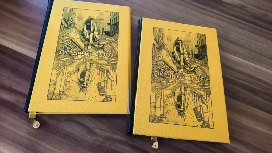
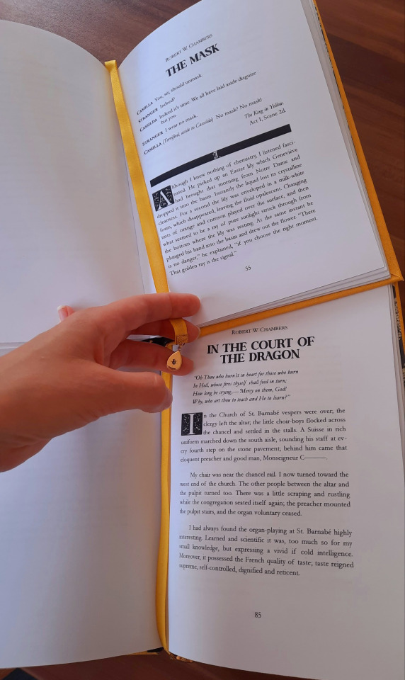
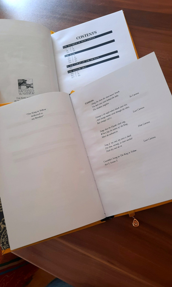
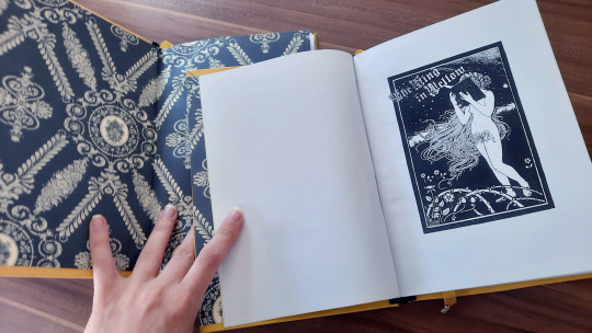
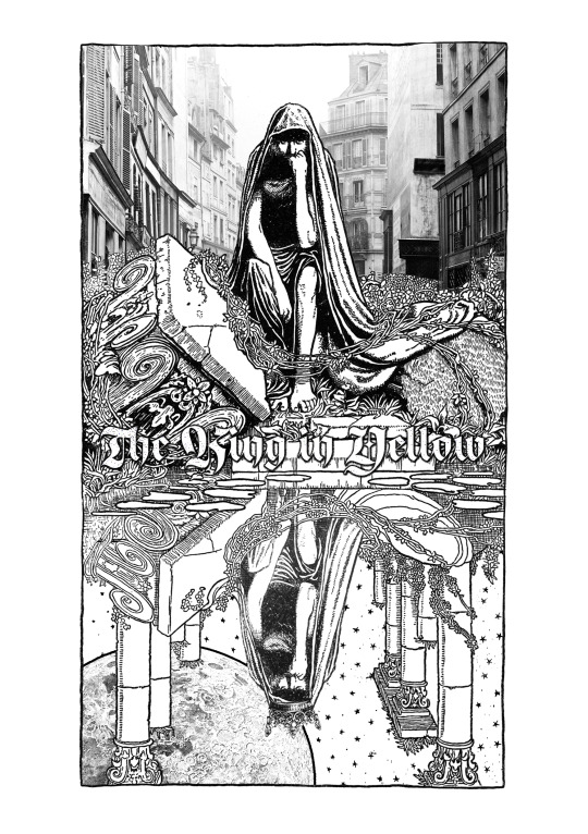
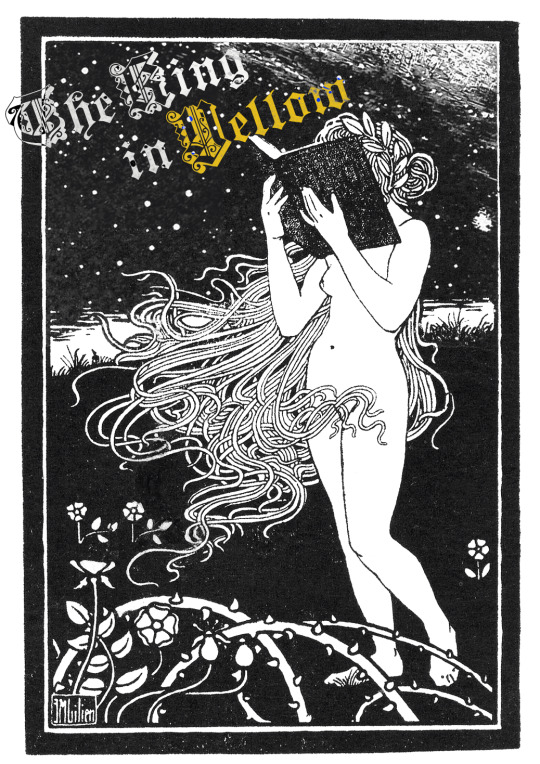
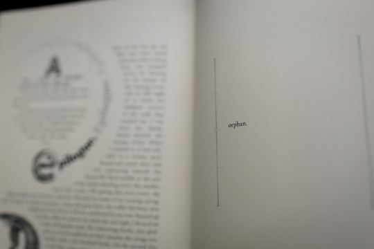
The King in Yellow by Robert W. Chambers
I am quite happy with this typeset and since the text is in the public domain I've decided to share it! I think it's good. It's in A5 size, feel free to do whatever you absolutely want with it. Assorted thoughts under the cut as usual.
Typesetting this was a blast. The excerpt from the play at the start of The Mask is my favorite of it all, I think that page looks really good. One change I made to the original text is that I went with the more... academic, maybe? approach of italicizing any mention of the play's name instead of having it in quotation marks - the original work also italicizes the names of newspapers so it only felt fair to do it to the play, too.
And yes, I only did the first four stories. I have to admit I've never managed to read the nonbe-King-ed stories in this collection.
This was my first time attempting to print on bookcloth. I only have access to a DinA4 black and white laser printer so my options were relatively limited - I decided to use a nice yellow bookcloth to offset the lack of color in the cover image, and designed the image specifically in black and white for this very purpose. Due to the size constraint I decided to do a sort of three piece bind, with the covers being seperate pieces from the spine material. I could've decorated the back too with this method but honestly every time I fed bookcloth through this paper printer was nervewracking (even though thankfully it all turned out perfectly fine) so I just left the backs blank as with all of my other binds so far.
This was also my first time stamping individual letters on leather. It went... okay. I accidentally stamped the "O" in "yellow" so hard it cut through the leather - and then I liked that effect so much I cut the O out of the other copy on purpose. Not wanting to buy more specialized paints left me with rather limited options to fill the letters in. I ended up wiping them down with white fabric paint designed for (linocut, etc.) printing, then painting over the excess white with black leather paint. End result: not perfect, but passable for what it is.
I bound two copies of this, one of which I was planning to give to the free little library around the corner. Unfortunately I somehow managed to make the front cover of one of the binds half a centimeter too short. I have no idea how the hell I accomplished that. The defect is large enough that the text block is partially exposed from the front when the book is closed, which I feel like makes the text block too vulnerable to be put into strangers' hands so it'll just have to live on my bookshelves instead. I guess I'm doing the public a service by not inflicting the terror of the King in Yellow upon them. It does really bum me out that this happened; I know this is just my fourth completed bookbinding projected and when compared to, like, my fourth ever drawing then all things considered it's not only pretty good but also completely understandable that I would make some sort of silly mistake, but still. Ugh. Trying not to beat myself up too hard about it.
The cover image was adapted from an illustration by W. Heath Robinson, with an assortment of other public domain work used alongside it. The title page is an illustration by Ephraim Moshe Lilien with added parts from an illustration by Charles Augustus. My source for the text was Wikisource, which transcribed an 1895 edition. The endpapers are a majestic blue Italian carta varese - I chose blue as a color contrast to all the yellow.
118 notes
·
View notes
Text
I'm trying to figure out if there's a location in the house I can go that would be an improvement, and the only answer I've come up with so far is "the chest freezer in the basement"
Currently experiencing a state of being (heat wave + broken ac + house built for the winters of the northeast) that is making a pretty compelling argument for bringing the undercut back
#if someone finds my preserved corpse in a year it was NOT my roommate I did this to myself#from the beehive
5 notes
·
View notes
Text
Currently experiencing a state of being (heat wave + broken ac + house built for the winters of the northeast) that is making a pretty compelling argument for bringing the undercut back
#extremely arizonan voice: why is it so HUMID#it's currently 77 with 83% humidity and I have genuinely tolerated 110 degree heat better#kill me#from the beehive
5 notes
·
View notes
Text
I think venus flytraps should be intelligent and ambulatory. I think they should get into the cupboards. I think they should purr when you pet them.
89K notes
·
View notes


Text
what i like about airports is that once youre in there theres no going back. I mean youre there until they let you out
29K notes
·
View notes
Text
angel: i can't ever go into the daylight....... we are separated by circumstance and the curse of what i am. i bear this curse and will do everything in my power to reconcile who i was. but only at night.
spike, actively sizzling under a blanket: ouchie
167 notes
·
View notes
Text
Can someone explain Dwarf Fortress to me???
12K notes
·
View notes
Text


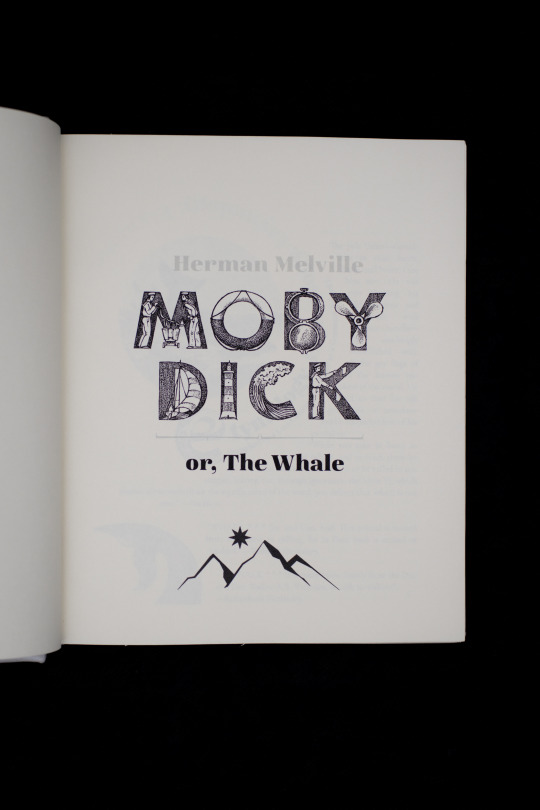


Fanbinding(ish): Moby Dick by Herman Melville
If you've been following me for a while you may remember that I started this typeset in, ahem, November 2022. Finished it in October 2023. Finished binding it in 2025. Did I make it take 3 years on purpose? Or was it always second on my list of projects and I was totally going to do it soon?... I don't want to talk about it.
Blatant lie: I do want to talk about it.
What's fun about this bind is that I found the leather for it in Greece in spring 2024. It's shiny! It's sort of pearlescent! It's white! It's absolutely not made for bookbinding! I knew that at the time, but hear me out: it was shiny. It was sort of pearlescent. It was white. It was also prone to scuff marks and stretchy as fuck.
It was also, it turned out, about 1" too short to do a full cover.
So I abandoned my dream of doing this Beatles White Album style and added the stripe down the middle. (I then drew a harpoon on that stripe at the last second because I thought it looked too much like a flag.)
I used a hot stamping machine to make the patches for the spine. It was my first time trying that: in the future, I'm going to pare the leather before cutting the patch, as that gave me a lot of trouble and I was ultimately unsuccessful. So it looks a little bulky right here, but, such is life. I seriously considered listing the author as Merman Helville, but I refrained.
This was my third laced-cord binding (wherein the cords are laced in through holes in the cover board and then hammered--mostly--flat) and I've decided it will be my last. Will I stick to this? Who knows, that's what I said when I finished my first one and also my second one. I might try fake raised cords in the future, or sew onto cords but then only lace them in through one hole to keep the cover smooth. This would mean I still have to fray them out, though, which is not particularly fun. (It's improved by doing so while watching Black Sails.)
My goal for the typeset was to make it technically readable but absolutely impractical, and I think I have achieved this.
I still think the last page is tied with the "Oh fuck" halo as the funniest pages I've ever typeset.
363 notes
·
View notes
Text
Caduceus Clay 99% of the time: I have healing spells to save my friends, I'll cast bless so you guys get a d4, protection spells, general status effects to make the fight easier
Caduceus Clay 1% of the time: I'm tired and frustrated so have a fuck-ton of necrotic damage right in your face, please die.
2K notes
·
View notes
Text


Wall have ears. They also love gossip and having your attention 🫶✨
69K notes
·
View notes


