
Don't wanna be here? Send us removal request.
Statistics
We looked inside some of the posts by bradyfleuette and here's what we found interesting.
Average Info
Notes Per Post
1
Likes Per Post
1
Reblog Per Post
0
Reply Per Post
0
Time Between Posts
22 minutes
Number of Posts By Type
Text
7
Last Seen Tumblr Blogs


Fun Fact
In 2020, 44% of users from Denmark used Tumblr daily.
Text
Reading Reflection 2 (Interview on James Victore)
I think James was blessed to discover his passion for design at a young age. Many people go their whole lives never finding a career they are passionate about. Much like how my dad's interest in cars trickled down to me, James's parents' passion for art trickled down to him. He also shows how things that don't work can turn into blessings through his rejection from the Air Force Academy. Driven by his goal to become the best poster designer on Earth, he started his career. He was designing book covers for up to $3,000 per job, and transitioned to the job of his dreams (Designing Posters) in 1992. He felt passionate about it because it helped display the true story of how European immigrants treated Native Americans. Due to bad financial habits, he was broke and received many eviction notices. He then claims that he was not true to himself when he stopped making posters and started pursuing commercial work to make money. When the Internet started to gain popularity, James was at a disadvantage. This stressed him out to the point that he blew up on his wife and they divorced. When he tried to get back into the commercial business he was denied by most places that preferred expensive agencies. He is famous for his style of design which he thanks his risk taking habits. His story shows the path of life is very rarely a straight line, and that we all make mistakes. However, if you have enough drive, you can do anything.
0 notes
Text
Reading Reflection 1 (Michael Beirut On Being a Graphic Designer)
I found his enjoyment of record covers and museum in art very relatable. I do not think people should be limited to liking one form of art. I believe Beirut's versatile taste in art allows him to have a wider range of design capabilities in contrast to a snob that only appreciates art that is found in museums. I can understand why he wanted to become a graphic designer. It is very rewarding to gain positive reinforcement through other peoples appreciation towards something you create. It may not be on the same level as Beirut, but when people compliment my car, it is an amazing feeling. Seeing your work mass produced and spread around your social circle to be appreciated by all has to be an amazing feeling. It must have felt like a dream come true when Massimo Vignelli (the person who designed the subway map of New York and American Airlines logo) offered him a job. His acknowledgement of his weakness made a lot of sense. as someone with a short attention span, his claim of it often leading to designers rushing their projects makes a lot of sense.
0 notes
Text

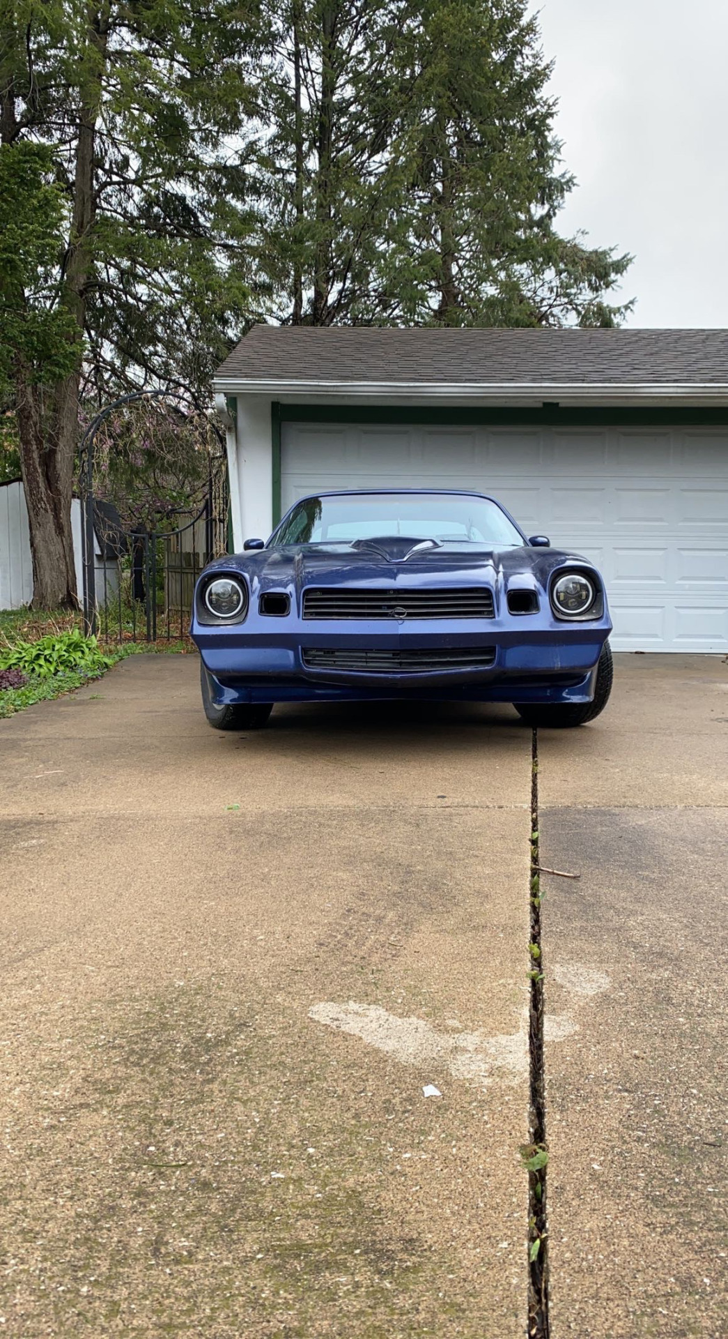
Project 4
For the fourth project, I edited an image of my car to look like it was doing a large burnout. I started by using the draw tool to make an outline the original image (pictured on the bottom). I then used an image of clouds and deleted its background. I used a cloud with a brown and gray tint to match the could and dreary aesthetic of the original image. Then, I copy and pasted this image to create many small clouds that outline my car and give the impression of burnout smoke. I then combined all of the cloud layers into one image. Afterwards, I used the erase tool to get rid of any pieces of cloud that covered the car. I then used the blur tool to blur the lines between the different clouds so they looked like they were one giant cloud. To complete my project, I used the blur tool on the cement to give the impression that the car was in motion.
0 notes
Text

Project 3
The third design project required me to design a logo in adobe illustrator that represented who I was. I started by drawing sketches on a sheet of printer paper. After consulting with my class and professor, I decided to go through with the concept sketch of a logo that had my name in a circular pattern around a leatherman multitool. I decided to use the leatherman to depict myself as handy and versatile. I then decided to go with the black/white color scheme because I enjoy contemporary and minimalist design styles. I started the design process by finding an image of a leatherman to use as a reference point. I then drew an outline of it, but did not draw all the tools (to keep my logo simple). Next, I filled in the outline. Afterwards, I used the ellipse tool to create the joints. I first created white circles, and then put smaller black circles on top of them so only the white outline was showing. When finished with the leatherman, I began to type my name. I used the ellipse tool to place a circle around my logo so when I placed down text, followed a circular pattern. When I displayed the draft to my class and professor on critique day, I was advised to cut down on the space between the letters of my first name. I took their advice and made the altercations to create my final product (pictured above).
0 notes
Text
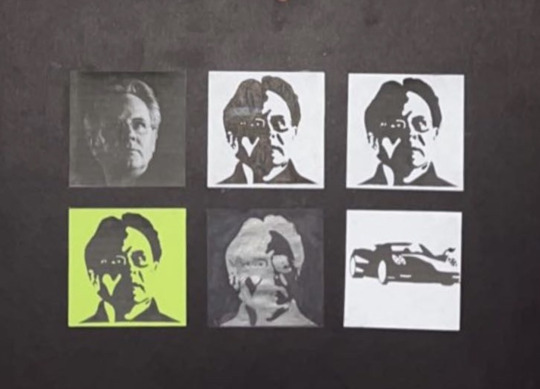
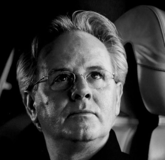
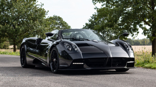
Project2
For my second project, I created an image board displaying Horacio Pagani (Founder of Pagani Automobile), and one of the cars he designed (A 2020 Pagani Huayra Roadster). I started my project by adjusting the contrast on the original image of Horacio Pagani (because the image was originally in black and white, I did not need to use the greyscale tool). I then printed the result to use as my first (top right) image on my picture board. Next, I used the brush tool to draw outlines of the contrasted image, and the paint bucket tool to fill them in. I then printed out the modified image. To create the second image, I stacked a normal sheet of printer paper onto the image I printed out. I used my phone flashlight and watch box as a DIY light box to trace the outlines in pen. I then filled the images in to finish my second (top middle) image on my picture board. To start the third image, I cut the blacks out of the modified image I used with the light box to create the second image. To make sure I glued them into the proper place, I used the second image on the light box to outline where the black pieces of paper went. I then glued down the black pieces of the image I cut out to complete my third part of the picture board (top right). I performed the same process I used to create the third image to create the fourth part of the picture board (bottom left). The only difference is that I used neon green paper as a background in contrast to white paper. I repeated the process used on the second part of my picture board to create the fifth part of my picture board (bottom middle). The difference was that I used pencil on black paper in contrast to pen on white paper. This was a bit more challenging because the silhouette of the image was not as clear under the black paper as it was under the white. To create the sixth part of my picture board, I used the same process as I did when modifying the image of Horacio Pagani, but used it on one of his cars. Because I was able to cut out most of the car in one piece, I did not need to use a light board when I glued it down. I then used a scrapbook paper cutter to trim the images down to 4x4. When I glued them down, I had trouble aligning them. I blame this on two things.
1). The poster board I used had to be cut in half. When I cut it, the edge frayed which may have diminished the accuracy of the lines I drew with a square to give me an idea of where the images needed to be glued.
2). I have terrible depth perception.
0 notes
Text

Project1B
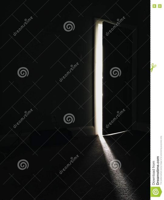
For Project1B I decided to display the effects abusing drugs can have on someones family and close friends. I was inspired by a story a friend once told me. His brother formed an addiction to ADHD medication. Late one summer night my friends brother pounded on his door and begged for the key to safe with his ADHD medication. My friend locked is door, but felt bad because he could not help his brother when he was going through hardships. I chose to use the a picture of a partially open door shining light into a dark room as the original image (pictured on the bottom). I then added emojis representing the reasons my friends brother was pounding on the door. The key represents the key his brother was trying to get. The pills and syringes represent the drugs his brother was trying to obtain. The stopwatch represents the rush his brother was in to get the key. I added a scribble under these emojis to represent the confusion from addiction caused his brother. I represented my friend as a stick figure struggling to keep a door closed. I did this to represent the mental struggles he went through when he was unable to help his brother. I edited this image in snapchat because it was the beginning of the class and I was not yet experienced with photoshop.
0 notes
Text


PROJECT1A
The bottom of the two images above is the one I used as my base image for the first part of project 1. This image is from the town I live in (Aledo, Illinois). Despite the sun and bright colors in the original image portraying Aledo as a charming small town, it was a place I had to get out of. Growing up, I always wanted to do big things in life. Aledo did not fit into my future plans so I chose to go to Furman University. There are many people from Aledo who have large goals like I do. Many of these people give up on their goals and settle for a life a younger self promised them they would never live. My goal in this project is to display this hold small towns have on people. My friend once stated "Some People Just Can't Escape" which is what I decided to title this work. I edited this image using the text feature in Adobe Photoshop. I chose the font I did because its composition is messy, matches the original text, gives the impression that it was written in blood. Because dried blood is often used in horror movies to show the marks of a victim trying to escape, I though it would work perfectly.
1 note
·
View note