
Don't wanna be here? Send us removal request.
Statistics
We looked inside some of the posts by briannaandgracekoha-blog and here's what we found interesting.
Average Info
Notes Per Post
0
Likes Per Post
0
Reblog Per Post
0
Reply Per Post
0
Time Between Posts
12 hours
Number of Posts By Type
Video
5
Photo
5
Text
7
Last Seen Tumblr Blogs


Fun Fact
China blocked Tumblr because of pornography and censorship problems in 2013.
Video
tumblr
FINAL ANIMATION
Having taken the feedback regarding keeping the video within the context that we made it in (view master) we have reached this point with the final animation.
It is much quicker and relevant to the whole idea of the viewmaster. The addition of the sound effects for the relevant objects and timing the “click” of the viewmaster adds some extra depth to the video paired with the faster version of ‘Little Things’. It is simple yet reminiscent of the main object and we hope that this will be interesting for the target market and inspires them to look at the website and buy tickets.
- Brianna
0 notes
Photo


Here is a side by side example explaining the change required from the previous blog post
- Brianna
0 notes
Text
Feedback on animation
Today we were given some really useful feedback on the animation. I have been feeling really unmotivated with it because I feel like it hasn’t developed and I do not know how to develop it!
Jason said that he felt we had taken it out of the context we had created by using the view master. The way each scene transitioned wasn’t really relevant to the viewmaster as the only context we had given was the red ring around the outside to make it seem like the viewer was looking through that... however it wasn’t really giving off that effect as the objects were travelling in from outside this so it wasn’t really like you were viewing from one point. Having already ditched the idea of using the leaves in the animation there was even less of a mask for the objects to come through so it was just not making sense visually.
It was suggested that a way that we could better achieve the visual communication of the viewmaster was by having the viewer enter the rectangle pieces that you can see at the top of the viewmaster wheel, and have these coloured as though you are entering a specific world. Within each composition the object makes a slight movement, or alludes to the movement, and then the whole composition transitions across to a new coloured composition or world containing a new object. This would be more reminiscent of the way a viewmaster works when you look through it.
A really important component of our animation is the pace of it. By putting it in Instagram, we need to make sure that it is punchy and captures the viewers attention to avoid them scrolling past. We wanted to use the viewmaster as the start image in order to capture attention through a nostalgic object, and then once it is zoomed in it needs to be quick and punchy cutting between scenes so this is another thing that needs to be developed from here onwards.
- Brianna
0 notes


Photo


Updated illustrations to fit with the poster development...
As this is a transmedia campaign, when we made the decision to finalise the pink, blue and orange colour way on the poster, I had to update the colours on the illustrations we were using for the animation.
This was an important step in order to make everything cohesive.
0 notes
Photo


I played around with colour combos and imagery. I think the dark blue text best fits with the aesthetic and colour scheme of the posters and animation. I also prefer this layout over the previous and want to continue to develop this. Having a different illustration for each play would also create variety.
0 notes
Text
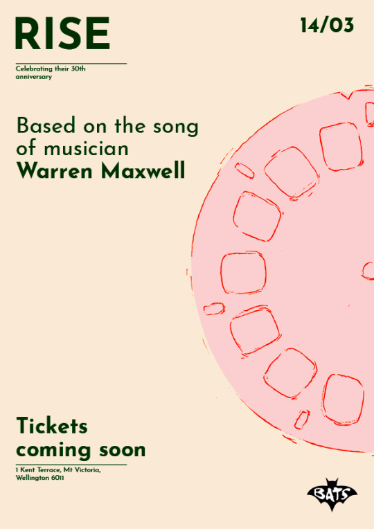
Final Poster

Above is the final poster for our multi media campaign.
From the previous design I changed the layout of the text. Your eye is drawn to ‘Rise’ then to the imagery in the centre, down to the right hand corner. I used the view master in our poster as it is the key part of our animation. The floral imagery surrounding portrays the growth of life of each play. It also enhances our soft aesthetic, engaging our younger audience. The text is minimal and simple.
0 notes
Text
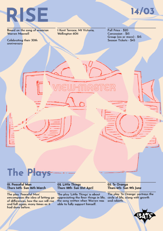
Poster Iterations
After the interim critique I wanted to improve the poster design. I decided to change the focal point of the poster to the view master as that is the key illustration of our animation. I had slightly changed the colour palette, especially the main colour from red or blue. I prefer this as it is softer than the red. The font size of the secondary text is larger than it should be.
The poster below engulfs the entire page, almost to the point where the text is lost within the background. I prefer the layout of the first poster over the second.


- Grace
0 notes
Text
Updated Illustrations
After the interim presentation I decided to play around with the style of the illustrations more as the two styles clashed. Below we have a variety of line work combined with solid colour. I prefer the sold colour on the wheel rather than the view master itself.
Im unsure on what will look better, I personally like the combination of line work and solid colour, as they contrast against one another. I also think it would be smart to continue using this as it’s what we’ve already been using.


- Grace
0 notes
Video
tumblr

We received feedback from Jason. He thought the mobile web design was cohesive with the animation but the posters lacked interest. He had also said the style of illustrations clashed with one another. I will try a solid style like the leaves to see if the overall poster will be cohesive. I also need to work on the text. In terms of cutting it back and rearranging. Brianna and I decided to only focus on making one poster stronger. I’d like to improve the website by adding illustrations and maybe changing a few of the layouts.
- Grace
0 notes
Photo


Above is the website design for the interim presentation. Brianna and I have yet to sort out the information that will be written for the plays but will sort this out next time. The style lacks cohesion with both the poster and animation. I like the layout of the three play pages but think they could be more interesting in terms of colour and imagery. As a whole imagery and colour could enhance the whole layout as right now they are quite simple.
- Grace
0 notes
Text
Website Iterations
Below are the beginning stages of the website development. I’m unhappy with the layout themselves and the overall style of the illustrations. I might try developing a few of the layout designs below as I think they could work with some refinement.


- Grace
0 notes
Video
tumblr
We ran into a few difficulties having used hand illustrated imagery. This video is an example of a big fail that happened when trying to rotate the wheels of the car!!
It was difficult to do this seamlessly as I had to Photoshop a full wheel out of the drawings that we already had but because it was on an angle it was all bumpy.
0 notes
Text
Poster Series for Interim Presentation
For the posters we wanted to design two, a teaser poster and a release poster. For the interim presentation we have gone with these two layouts but need to confirm what colour to go with. Brianna and I are leaning towards the blue as it grabs your attention and is more youthful.


- Grace
0 notes
Text
Posters
The posters below are for a teaser and release poster. A quick couple of posters to get sense of what we want it to look like and how the text is laid out.


- Grace
0 notes
Video
tumblr
INTERIM #2 ANIMATION
For the purpose of the interim, we decided to revert back to the original plan and not have the added expressions etc that I had been experimenting with.
Overall, not a lot has developed as I am struggling with what direction to take this in. Some feedback we have been given from today is to try zooming the view master in a lot further so that you cannot see any of the outline. As well as this, the whole video is not dynamic enough. We are putting it on Instagram so it needs to be punchy and exciting for the viewer so they don’t scroll onwards. Jason suggested we do this by having the object allude to a movement, but then move on quickly once it looks like it is going to complete the whole movement.
From here onwards, I need to figure out what we are going to do with the objects.
0 notes