
Don't wanna be here? Send us removal request.
Statistics
We looked inside some of the posts by brookespatialtype and here's what we found interesting.
Average Info
Notes Per Post
0
Likes Per Post
0
Reblog Per Post
0
Reply Per Post
0
Time Between Posts
2 days
Number of Posts By Type
Text
8
Last Seen Tumblr Blogs


Fun Fact
Tumblr has been banned in Indonesia for providing people with access to pornographic content.
Text
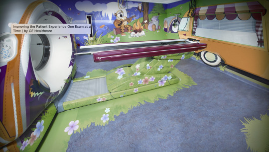
Changing Experiences through Empathy – The Adventure Series - Doug Dietz
https://thisisdesignthinking.net/2014/12/changing-experiences-through-empathy-ge-healthcares-adventure-series/
Background
Diagnostic imaging procedures are cutting-edge technology, but at the same time they are an unpleasant experience for patients – and even more for pediatric patients. Doug Dietz is an industrial designer, working for GE healthcare since more than 20 years. He remembered the first time when he saw a little girl who was crying on her way to a scanner that was designed by him. Doug suddenly saw the situation with the eyes of the girl. “The room itself is kind of dark and has those flickering fluorescent lights”, he remembers in his TED talk. He adds “that machine that I had designed basically looked like a brick with a hole in it.”
Some positive impacts derive from Doug Dietz’ Adventure Series. First of all, the patient satisfaction scores went up 90 percent. Children do not suffer of anxiety anymore. Instead some of them even ask their parents if they can come back tomorrow. It makes it easier for children to hold still during the procedure what in turn prevents the doctors from having to repeat the scan. This less need for anaesthesiologists meant more patients could get scanned each day, which heavily impacts the financial side of the equation.
The experience of joy and play during the scan also took away the fear from parents. As Doug Dietz puts it: “If you got the child you got the parent, and if you got the parent, you got the child.” He now trains other GE employees to use design thinking and innovation methods in their teams.


0 notes
Text
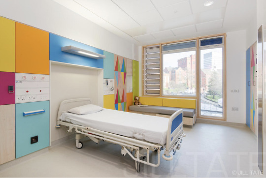
Hospitals
http://www.jilltate.com/-/galleries/architecture-interiors-landscape/latest-work/sheffield-childrens-hospital/-/medias/7dd5548c-eef1-41fb-bad7-0062dcb7eeec-sheffield-children-s-hospital-client-artfelt

0 notes
Text
Lenticular type
To help understand how to layout a lenticular wall-
http://www.schudio.co.uk/blog/2011/stuck-in-the-middle-with-chu/

Paper mock up to understand how we will be folding the paper/larger mock up

Process of the making. First we had to print a letter that we could then follow from it being projected onto the wall/cardboard.

Then we coloured in the letters on each side in a different colour.

0 notes


Text
Parc Blandan Wayfinding and Placemaking

At Parc Blandan, a new urban park that was formerly a military installation, the vestiges of an old military marking system inspired new wayfinding and signage.

Analia Garcia-Ramirez and Nicolas Vrignaud were particularly inspired by the simple and effective red circles used to identity facilities.

So they designed bold, sculptural red circles as the basis of the site's communication system.
Spot On
On a former military site, a new urban park in Lyon, France, provides access to history via playful sculptural signage.
Lyon, France’s “second city,” has many charms. The gateway to the Alps is known for its outstanding cuisine, its annual light festival, its burgeoning design and high-tech environment, and the numerous historical and architectural landmarks that make it worthy of its UNESCO World Heritage listing.
Parc Blandan, a former military barracks on 17 hectares (about 42 acres) in the city, is practically new development if you consider Lyon began as a Roman colony in 43 B.C. Built between 1831 and 1853, the site was part of a series of forts designed to protect the city. When Grand Lyon purchased it in 2007, the goal was to provide Lyon residents and visitors with a new urban oasis and make the park’s rich military history accessible to all.
The city hired landscape architects Base, Explorations Architecture, lighting designers On, and, for the site’s signage and wayfinding program, the Paris-based interdisciplinary studio of Nicolas Vrignaud and Analia Garcia-Ramirez. Vrignaud and Garcia-Ramirez’s mission was to create signage that would help visitors navigate the park and bring attention to its historical buildings and fun new features such as a skate park, an imaginary fort/climbing wall, game fields, and other amenities.
Military history A working military base for more than 150 years, Parc Blandan includes a major fort with ramparts, five entrances, and numerous buildings and features of military significance.
It was this history that inspired Vrignaud and Garcia-Ramirez to devise bold, sculptural signage elements that would create visual impact against the fort’s stone walls, gravel pathways, and green spaces. Exploring the site at the outset of the project, they discovered a series of red circles stenciled on interior and exterior walls—clearly an old military system for identifying facilities.
“It seemed appropriate to use this rational and effective tagging system as the basis for our contemporary signage,” says Vrignaud. “We kept this red circle as the only identifying shape on the site, to create a unique visual vocabulary for Parc Blandan.” Like the military markings of old, text on the signage is in white.
Vrignaud’s system needed to orient visitors to the park as well as tell them stories about the site’s history. His team created a family of five sign types in five diameters to accommodate various functional needs: orientation/wayfinding, regulatory information, site/building identification, and interpretative information to narrate the park’s military history.
The system encompasses 50 signs, including five entrance identifiers, 15 signs interpreting historical features, five outlining the park’s sustainable landscaping and design features, and other facilities and directional signs for playgrounds, a skate park, a dog area, and restrooms. To withstand the exterior environment and urban setting, the signs were fabricated (by Lenoir Services) in robust, powdercoated steel and aluminum with silkscreened text.
Connecting the dots Vrignaud and Garcia-Ramirez worked with Swiss typographer André Baldinger and his associate Toan Vu-Huu to choose the project typefaces. Inspired again by the red circles, the team opted for Baldinger’s B-Dot family, a pixel font whose letterforms are drawn from dots but are not based on a grid. The result is a highly legible typeface that looks like it was rendered from a dot-matrix printer, but with the smoothness of a classically designed typeface.
B-Dot was used for signage titles and headlines, while Baldinger’s B-Line serif typeface was used for body text. B-Line was designed to complement B-Dot, essentially connecting the dots in a smooth line for high legibility.
Vrignaud says the typefaces contributed to the project’s accessibility requirements. “In addition to the optimum font sizes and typeface legibility, we were very concerned with contrast and reading height points.”
The power of play Since the park opened in April 2014, visitors of all ages have been coming to learn about its military history, play a game of badminton or soccer, skate in the new skate park, or climb on the playgrounds. The whimsical red circles add to the fun factor and help them enjoy the park even more, especially at night. The project lighting designers bathed the largest (3,00m diameter) circles in red light to draw attention to the visual theme around the park. Visitors feel invited to interact with the circles, and they have become a popular photo opportunity.
--By Pat Matson Knapp, eg magazine No. 11, 2014
https://segd.org/parc-blandan-wayfinding-and-placemaking
0 notes
Text
Way showing

Entrance: Conference attendees are met at the front entrance with a cube displaying the conference title, which also begins the way finding line that continues throughout Paccar Hall.

Atrium: The wayfinding line continues from the outside, into the entryway.

In the atrium we utilized the interior architecture with three-dimensional structures forming a pathway. As a supplement, a wall of name tags is visible from the atrium to hint to the final destination.

Arrows paired with a type treatment on the floor indicate which flight of stairs will take them to each respective location.
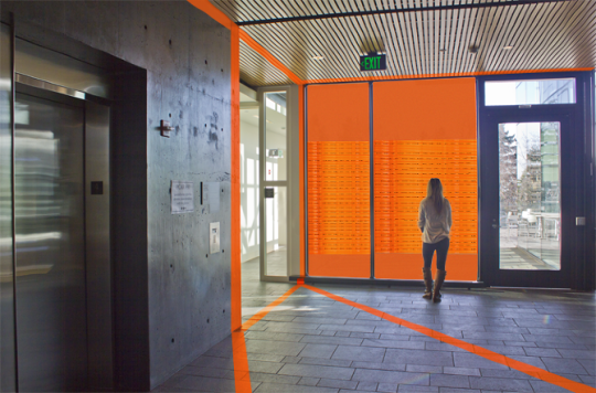
From the stairway, attendees reach the landing, and are guided to the conference hallway by the pathway lines.
http://cargocollective.com/amberjoehnk/Wayshowing-Design
0 notes

