
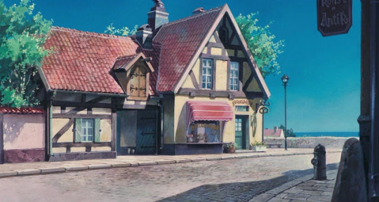
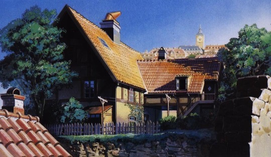
A sideblog about minecraft builds. Feel free to send builds in to get my thoughts. Header and avatar are official Minecraft concept art.
Don't wanna be here? Send us removal request.
Statistics
We looked inside some of the posts by buildthoughts and here's what we found interesting.
Average Info
Notes Per Post
3K
Likes Per Post
2K
Reblog Per Post
625
Reply Per Post
3
Time Between Posts
14 days
Number of Posts By Type
Text
12
Last Seen Tumblr Blogs


Fun Fact
In 2020, Tumblr had 29.4 million users in the US.
Text
youtube
Mogswamp posted a new video continuing his tower build, incorporating additional architecture influences and laying out his plan for the build's purpose!
Three of my favorite things in a Mogswamp video: 1. Unique editing 2. Stunning builds 3. Informative historical sidequest.
In addition to finishing the tower's exterior, Mog does a significant amount of terraforming and urban design in this video that wowed me. The landscape, foliage, and supplemental builds surrounding the tower add so much to his project. They create a vital sense of scale, liveliness, and composition in an already extensive architectural project.
1 note
·
View note
Text

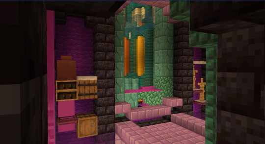
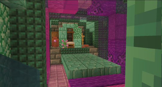
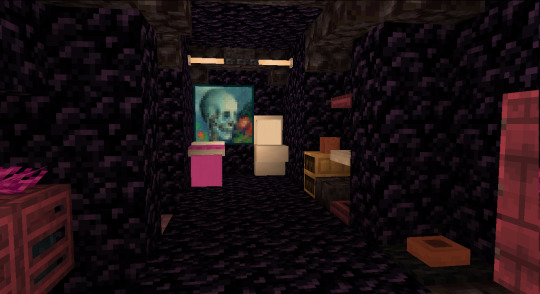
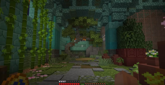
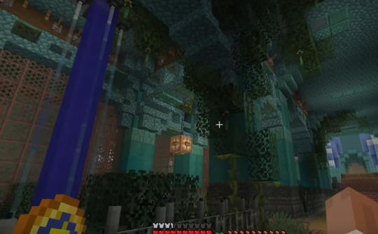
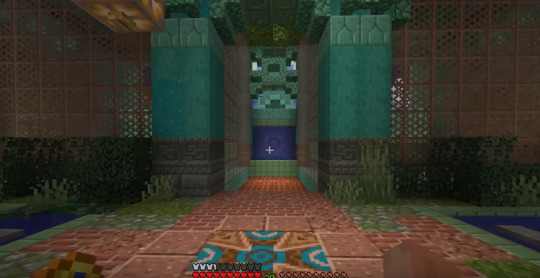
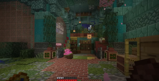
now that im all done tormenting two people in my prison (they escaped), here it is! i've been keeping it secret for months! ama

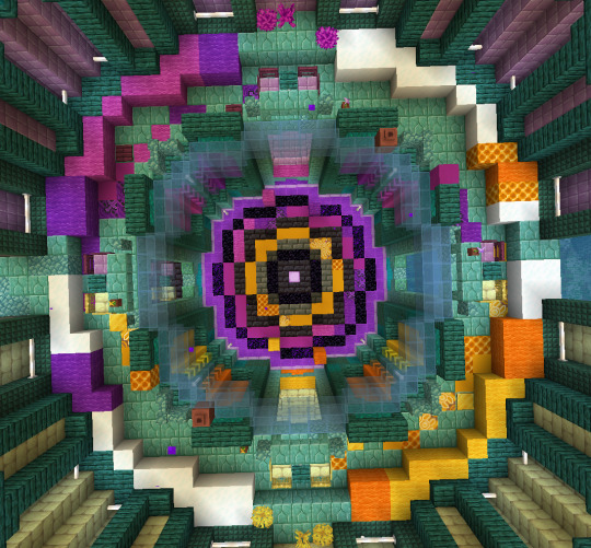


my favourite part is definitely the trap beds. you can't tell from looking at them that they're trapped!!!! but theres a mechanism behind them that drops you in the prison cell! me and ln really cooked with this design

and this is our staff room, stacked with wind charges (literally every piston door is wind activated), milk and such

there's also the shop that uses custom currency.. but it got barely used bc my inmates were very stubborn and didn't fw capitalism


heres how achoo and bugs left their cells... im keeping them like this for historic preservation u_u
youtube
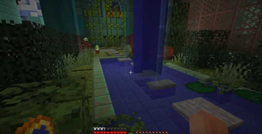
here's me walking through the whole thing :3 ftr it also has elder guardians but at the time of recording we didn't get em in
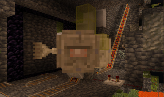
(their names are yoo joonghyuk and kim dokja)
i also have sick photos from all the rp in prison but theyre on my top secret blog and if i copy em over theyre grainy as fuck so ig you're never seeing them
so long, eyeblossom prison......
#reblog#mc builds#1. love the magenta/yellow color palette#2. in a prison the colors do create the vibe of someone who has gone a little mad
117 notes
·
View notes
Text
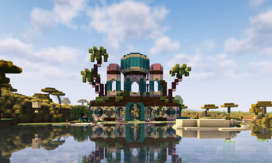
tropical courthouse :) its not fully done yet but im pretty proud of how its looking so far !!
142 notes
·
View notes
Text
youtube
Mogswamp posted a new video continuing his tower build, incorporating additional architecture influences and laying out his plan for the build's purpose!
Three of my favorite things in a Mogswamp video: 1. Unique editing 2. Stunning builds 3. Informative historical sidequest.
In addition to finishing the tower's exterior, Mog does a significant amount of terraforming and urban design in this video that wowed me. The landscape, foliage, and supplemental builds surrounding the tower add so much to his project. They create a vital sense of scale, liveliness, and composition in an already extensive architectural project.
#mogswamp#mc builds#mcyt#video recommendation#excuse the three recs in a row#but if i get the wow factor too many times in a row in a video i feel compelled to share#Youtube
1 note
·
View note
Text
youtube
AvidMC just posted a video that went in depth explaining his process for using real life reference for a minecraft build! He also uses the axiom mod to build out the tree branches, which was cool to see since I've mainly seen mcyt use the mod for landscaping and texturing.
My original post about mcyt using reference largely just gathered mcyt examples of where reference inspired builds and types of reference material. Avid's video demonstrates the process of using reference which I think is cool to see in a video!
37 notes
·
View notes
Text
youtube
Everyone check out Snarple's latest video for some awe inspiring builds!
My personal favorites from the competitions are:
Lyra's sea monster from the End of Year competition
Zirce's bison wagon from the Western competition
Knighty's explorer from the End of Year competition
Lyra's snowy cowboy from the Western competition
Todpog's tree frog from the Aquatic competition
I've mostly looked at survival builds on this blog so far, as that's what I watch, but creative building is a whole different beast. I thought it was interesting how many of the competition builds were organics, even though the themes were picked to be open-ended. Even in the Mechanical competition, where I would expect to see more architecture or machinery, the builds felt like organics.
When I've seen survival players work in creative, they tend to stick to the types of projects they do in survival, just at larger scale (like this Joel Smallishbeans' video). I think Pearl's an exception since she was known for doing creative building/organics first, and she's brought much of the large scale terraforming and organics into her survival building.
I'm curious to hear what you guys think about the divide in build styles between survival and creative minecrafters (and how that affects how they build in other minecraft modes). Also, tell me your favorite build from Snarple's video!
#mc builds#mcyt#the bakery#build competition#video recommendation#Youtube#pearlescentmoon#joel smallishbeans#snarple
3 notes
·
View notes
Text
Philza Builds #1
Disclaimer: I watch Philza's youtube channel, not his streams.
Flower Fell
Phil remade an ocean monument with coral in his Hardcore minecraft world! He drained the area around the monument, but he kept the guardians and water inside the monument to keep the coral bright and colorful.

Below the monument is a portal build that ties into the story Phil has for the area, as the Ender King tried to steal the Ocean Overlord's house.

Using glass, water, and candles he also built this ring around the monument. It makes a fun walkway around the monument and adds an extra magical vibe. It (and the portal below) echo the larger circle shape of the ocean wall, which I think helps soften the transition from the circle wall to the square monument.


The landscape around the monument features builds of every type of flower in minecraft (story-wise, the goddess Rose's work mending the Ender King's damage to the area). I love these. They make the whole area feel so much more lush, having a full range of flower sizes and greenery through the area. The lilypads and dripleaf in the ocean are favorites of mine.

He finished this whole area in about a year, which is wild. A massive and gorgeous build. He even has some farms hidden in there!
8 notes
·
View notes
Text
Minecrafters Using Reference
Reference as in real world architecture, not other minecrafters' builds, though that's a fair way to learn too. Studying real world architecture gives insights about designing buildings, while studying other minecrafters would give insight into how to accomplish certain effects in Minecraft.
I didn't have more than passing interest in architecture before watching mcyt, but now whenever I'm outside, I'm evaluating the buildings around me. Do I like their shape? color? Any interesting details? Any wear or texture? And above all: How would you do that detail/shape/etc in minecraft? (please note: I don't even play minecraft)
Rendition and Inspiration
There's a minecraft project called BuildtheEarth that's replicating the earth in minecraft on a 1 to 1 scale. There's some fantastic builds on there.
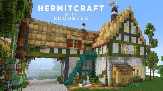
On hermitcraft, Joe Hills is known for creating to scale renditions of real world places/objects. In season 10, he's tackled a project of massive scale with Bell Labs. He used a map from the library of congress to layout all the shapes!

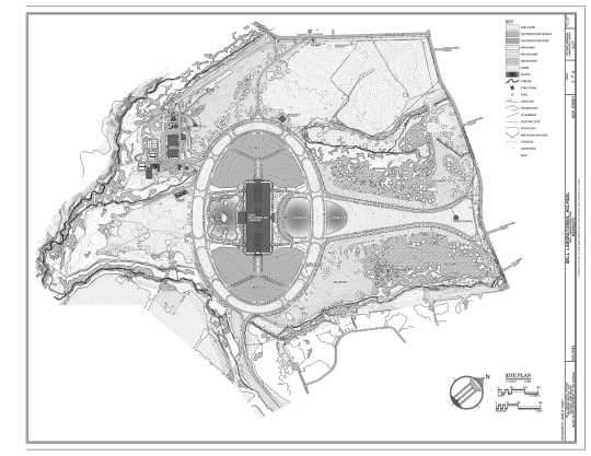
These are examples of renditions/replicas/copies/whatever you want to call it (Although Joe's doubles as a community build area in place of massive parking lots).
Then there's using the buildings for inspiration. This may involve just taking bits and pieces. Or maybe you just take a color palette. Or maybe just the shape. Maybe you don't take anything but vibes. As a general rule, I think having multiple sources of inspiration is important so the new build doesn't end up feeling like a rendition instead of its own thing.
Bdubs in season 9 used the bakery from Kiki's Delivery Service as inspiration for his mud cafe. It can be seen in the wood framing, the stairs, the archway, the shape, the shed, the chimney designs. But the colors, the composition, Bdubs made changes that made it his own and combined the addition to his previous shop Moss o Menos.
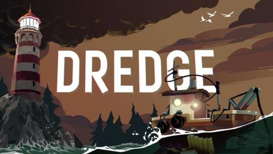
The aesthetics of Geminitay's season 10 base is based on the video game Dredge. I feel like the most obvious influence is in her research castle and fishing boats. She used inspiration from the spooky sea creatures in the game to create a uniquely frightening angler shop.

In Pearl's Build a Day series, she did a week focused on real world places. Here's the one she designed after a countryside home in Australia (her home country):


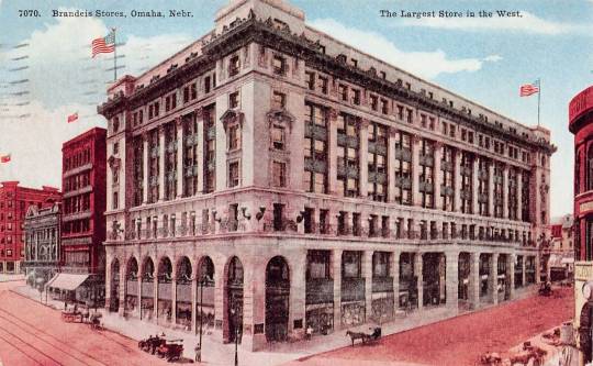
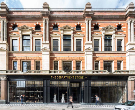
Goodtimeswithscar in season 7, when starting Aqua Town, based his shop on old department stores:

I like looking at his Aqua Town builds in comparison to his Scarland Main Street facades, which draw additional inspiration from Disneyland:


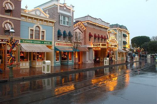
I feel like, comparing the builds you can see how he's grown; he's learned new detailing tricks, found colors and textures that work better with the architecture style. The main street has a similar layout to Disneyland, but his buildings are all unique.
Mogswamp is working on a massive build that's based on architecture drawings from Renzo Picasso:


He's incorporating groin vaults from roman architecture too!
I think builders learning about existing architecture is so good. It can give them so many ideas to add into their toolbox. It reminds them of small details that give builds life, like small sheds, some pipes, porches. And the builds don't need to be realistic; My mind goes to work by Shovel and Joel. Or everything Mumbo has done in season 10.
2K notes
·
View notes
Text
Snifferish Builds #1
Taking a dip into modded minecraft with Sniff's latest video! Specifically Chisels and Bits, which will probably show up in the future as I enjoy rats smp.
The windows and the moss and the wisteria on Sniff's cottage really show of the artistic strengths of the chisels and bits mod. Using round windows in contrast with the dramatic sharp shape of the roof helps push the cozy vibe. The lattice designs on the circle windows is so neat and keeps the pattern from becoming too repetitive. Sniff added a tiny stained glass arch above the door which adds a ton of personality to the build. Having windows cracked open and the wood chopping log also add extra life to the cottage.
Just inside the door, there's boots, a hat, and a backpack. Sniff built this cottage for themself and these extra lived in details add to the feeling that Sniff actually lives here.
Cozy is the game with this interior and I wish I could live here. Plants in every corner and a big bed with a library on one side and a sunlit art setup on the other? Dream Home.
Sniff's attention to shape and weight when it comes to sculpting cloth, like those curtains, is admirable. I love the pattern on the carpet but I'm pretty sure that's a default from one of her mods since Sniff didn't mention designing it (and she noted when she was bringing in previous models they've made like the bed). Sniff mentioned they like high ceilings, which was why they didn't do an attic. For my own person tastes, I'm more torn. Sniff ended up doing a loft which I think looks stellar, but the a-line ceiling in this section of the house, I'm less a fan of. I don't think I've ever lived somewhere with an a-line ceiling, so maybe that's why it feel off/unfinished to me?

Kitchen is cute! Love the stove, fridge and shelving! I like that the sink faucet's gold color matches the detailing on the stove/fridge. But something about the sink isn't doing it for me. I think it might be because its the least textured spot in the room? But porcelain is smooth, so a texture wouldn't make sense. I'd be curious what adding a little lip around the edge of the sink would do? It'd probably be too bulky and throw off the scale.
I just noticed that the stove wall is a different texture than the one by the sink. That's an interesting choice. In this image it didn't feel right, but I watched back her video and it looks a lot more cohesive in motion and adds some nice warmth to the room.
I couldn't get a good screenshot of the loft, but I loved the inclusion of a book press and the art desk. Adding a railing for safety, also very good.
A lovely build. The colors are warm and earthy. Chisels and Bits builders go off.
9 notes
·
View notes
Text
Bdubs Builds #1
For season 10, Bdubs has been sculpting some picturesque landscapes, but XB recently hired him to build a garden in his Guardian Temple base. When talking about builds people usually break them down into three parts: landscaping, exterior, and interior. This challenge is more of a hybrid; An interior, but instead of making chairs and cupboards, its dealing with plants and landscaping.
Down the first hall, Bdubs frames a bonsai-like tree before a small window. The shape is so distinct on this tree: Bdubs used lots of signs and fences to bend the branches just so and the leaves are in three clumps (but two are connected on the backside so it doesn't feel bare). The wall of bamboo adds detail without being distracting. The path is so good: a broken stone path that transitions to path beneath the tree, the grass and moss build up along the edges where people wouldn't be walking. The use of pots, flower pots, and similarly colored blocks to create larger pot variations is very fun. I love when builders don't just make smaller variants of a thing (boxes, barrels, trees, etc) but also make a BIG fella.
So, originally, XB had thick pillars holding the water elevator and I liked the design of these pillars! But I understand why Bdubs pulled those out and went with a slimmer approach; This freed up more room and the pools of water complement the surrounding garden.
To section off the garden, Bdubs put in an unobtrusive wrought iron fence. This makes a clear break between the reast of the building and the garden without distracting from the garden. Leaves crawling up the pillars and growing from the ceiling are always great. Bdubs tucks in various details like the vines and propagules. I'm not totally sold on the bush using the propagule to simulate a stem? But I can see the potential. The use of buttons on the lamp is neat, I think, because it makes the shape reminiscent of Guardians' spikes.
LOVE that Bdubs incorporated some Guardian iconography into his design. The brick/granite/weathered copper colored are nice because they contrast with all the greens/teals, but are more subdued than bright oranges would, letting the greenery remain center stage.
First of all, for the next hallway, including a doghouse for Bishop is such a kind gesture to XB (irl his dog Bishop recently passed away).
I wasn't sure what the item frames on the pots were meant to be until Bdubs explained it was meant to be like adding a design to the pot. I can see the merit! from straight on, I can buy into the illusion of the green and tan being painted on. But from the side, the item frame and item extruding kinda breaks that illusion for me. Perhaps it'd work best placed against a back wall, like the pots lined up back there. Speaking of which: I love the value variations and subtle shape variety Bdubs created by putting the minecraft pots next to his own custom pots. The various types of shelving holding the small potted plants are also so good; They really sell the idea of the space for me.
23 notes
·
View notes
Text
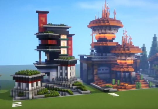
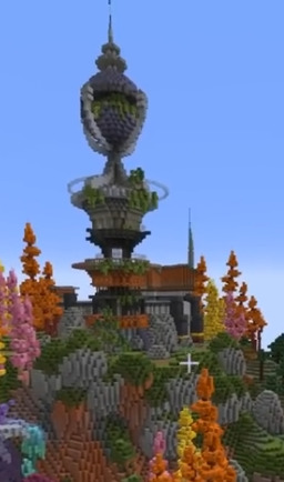
Mogswamp Builds #1

Mogswamp's builds on the SOS smp were my first introduction to their videos and wow are they fun. Coining the style as "beeselpunk" (steampunk, but powered by bees/honey), Mog starts with the Midnight Meadery (naming all the builds is a very fun bit of storycrafting with these builds). It's not my favorite build, but its a very bold design that made me excited for what builds they'd do in the future. A clocktower that is dwarfed by the clock, gears and pulleys encasing the outside. I think the subtle spiral pattern on the clock's face is excellent and the honey nests/barrels set out front with spigots do a lot of heavy lifting for the story of this build.

Sweet Pea's Honey Pot Theater is such a fun design idea. And a tricky one to pull off, I think, being a spherical building. From the front, the honey dripping from the opening makes the concept clear, but from the back the concept gets lost. The window and the maze of catwalks on the backside add a lot of interest that keep the back engaging though. The window in particular does a lot to clarify this is a building and not a rock with scaffolding attached. I love the entrance to the theater being an arched opening rather than a door; it makes it feel like a shard cracked off the pot. The coloration of the pot, pale with a darker bottom confused me at first, but I think its meant to look like a clay pot with a layer of glaze over the top, which is neat.

Mogswamp's SOS candle shop is one of my favorites. It maintains much of the color palette used in the other builds, but adds bright splashes of rainbow that make the whole build feel brighter. I love the honeycomb banners, the shape of the chimney, and the honey dipper on the roof.
The main building is up on a platform, amplifying the height variation between the building and the gorgeous pool of wax below. The beam and line holding colorful banners connects the wax pool to the building, so the two elements aren't too divorced from each other. The dome shaped roof with the tapered antenna reminds me of a bee stinger, making the roof/wall colors reminiscent of stripes. The main building itself is fairly simple, but all the extra detail and story elements (like the tank of honey protruding from its side) make this build so whimsical and unique.
11 notes
·
View notes
Text
Pearl Builds #1
So Pearl did a series four years ago where she built a build a day. Then she released a weekly video summing up her progress/process.
These two builds from the first week stood out to me because they are cyberpunk and starwars/mars inspired, which inevitably led me to drawing comparisons between the current cyberpunk builds on Hermitcraft s10 as well as Rendog's sci-fi themed base.
I like her diagonal approach to the cyberpunk build and the high contrast colors (black, white, red). The canal(?) between the buildings is an especially interesting detail to me (placed beside the stairway/hedges, it low-key reminded me of the Halo Reach Boardwalk map).
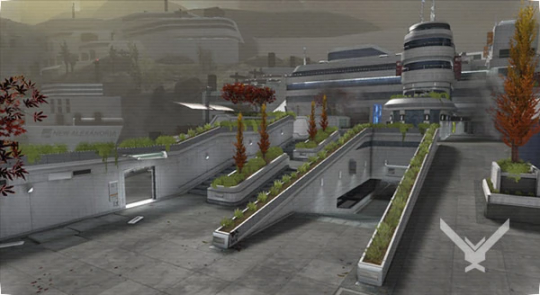
Pearl's take here is distinct from the Hermit projects! Her lush green rooftops stand out especially. Impulse and Bdubs' Pixel Pulse Valley is designed to be more dilapidated, lacking foliage, full of garbage and wear. Joel's City takes influence from Japan and makes heavy use of banners.
In her video, she mentions she didn't have very many glowing blocks to chose from. Which I do think is a weakness in the build. Those red signs she built are begging for the existence of froglights paired with glass.
The sci-fi inspired build is great too. The straight wall contrasts nicely with the cylindrical buildings. The fencing details on the wall and the antennas on the roofs add so much visual interest. The lower tower has a partial awning that breaks up the tower's symmetry nicely and complements the desert landscape.
In season 9 of Hermitcraft, her sci-fi builds focused on creating two distinct build styles within one mega-base: round and organic shapes for the aliens, square and blocky for the humans. You can see the antennas on the human buildings are arranged to look thicker, while the ones in her build a week series taper more dramatically. And while the two builds share a color palette, her human builds don't use any cylinders.

And with this tower, the shapes are less uniform, intentionally more organic/alien than the consistent cylinders of the build a day.
Ren's sci-fi base on Hermitcraft s10, while using similar colors, is much more bright, making white the star and blue/orange as accents. Pearl's build has orange as the main color and lets the white and greys sit back. Pearl's gradient work also give her build a more worn feel, while Ren's is pristine (just ordered from gigacorp).
I think its fun to see builds with the same theme showcasing such different stories and styles.
37 notes
·
View notes