
My name is Chris Keblitis. I am a Visual Communications Analyst at the GAO in Washington, D.C. Previously, I was a concept artist at NASA Langley Research Center. I have been a professional artist for 20 years. I posses a graduate degree; Master of Fine Arts (M.F.A.) in Media Design, from Full Sail University, .
Don't wanna be here? Send us removal request.
Statistics
We looked inside some of the posts by c-keblitis-blog and here's what we found interesting.
Average Info
Notes Per Post
0
Likes Per Post
0
Reblog Per Post
0
Reply Per Post
0
Time Between Posts
20 days
Number of Posts By Type
Text
14
Photo
3
Last Seen Tumblr Blogs


Fun Fact
In 2020, 44% of users from Denmark used Tumblr daily.
Text
Reflection: Professional Practice
Takeaways
The most significant takeaways I gained from this process was creating the experience map. This was a fun and interesting project. The map shows my emotional path during the entire Master’s program. The map shows how I was feeling when I began the course, where my pitfalls were, and how I overcame those struggles.

Another takeaway from this course was the importance of ethics and moral standards in regard to media design. Although I knew most of these standards, it was a great refresher to go back to the AIGA manual and read over professional practices. For example:
1- A professional designer shall not claim sole credit for a design on which other designers have collaborated.
When not the sole author of a design, it is incumbent upon a professional designer to clearly identify his or her specific responsibilities or involvement with the design. Examples of such work may not be used for publicity, display or portfolio samples without clear identification of precise areas of authorship (AIGA, 2009).
2- A professional designer, while engaged in the practice or instruction of design, shall not knowingly do or fail to do anything that constitutes a deliberate or reckless disregard for the health and safety of the communities in which he or she lives and practices or the privacy of the individuals and businesses therein. A professional designer shall take a responsible role in the visual portrayal of people, the consumption of natural resources, and the protection of animals and the environment.
A professional designer shall not knowingly accept instructions from a client or employer that involve infringement of another person’s or group’s human rights or property rights without permission of such other person or group, or consciously act in any manner involving any such infringement (AIGA, 2009).
3- A professional designer combines creative criteria with sound problem-solving strategy to create and implement effective communication design.A professional designer solves communication problems with effective and impactful information architecture.A professional designer becomes acquainted with the necessary elements of a client’s business and design standards (AIGA, 2009).
My final takeaway for this course was the collection of the professional organizations. Both researching on my own, the various professional organizations out there that can really help us and inspire us to become better designers, and reading my classmates organizations. This really was a great repository of information.
References
AIGA (2009). Design Business and Ethics. Retrieved from https://www.aiga.org/design-business-and-ethics
0 notes
Text
Reflection: Presentation of Design Solution
Design Solutions:
For the final program thesis, we were tasked with gathering our strongest projects throughout the course of this program. The presentation method was through an online website creation tool, called WIX. The goal was to create a presentation of the four Degree Learning Outcomes (DLO’s). The DLO’s were: Connecting, Synthesizing, and Transforming, Problem Solving, Innovative Thinking, and Acquiring Competencies.
The implementation of WIX was an excellent choice for presenting the DLO’s, as WIX is a very powerful tool for webdesign. In my opinion it is both an industry standard, and vital tool for a successful media designer. As a professional multimedia designer, web designer, and artist for over 20 years, I personally use WIX to create many sites, including my own portfolio,$100 million NASA contractor sites, and beauty salon day spa sites. The image below shows the title and image heading for the Connecting, Synthesizing, Transforming DLO.

Presentation Concepts:
The presentation concepts were straightforward and effective. The instructions called for the students to revise a stock web template, and make use of WIX’s many powerful tools. The home page consists of four main buttons, with a rollover ability. When the user hovers over the button, the DLO description appears. Above the main buttons there is a small navigation menu, with a home, journal, and portfolio link. When one of the DLO buttons are clicked, the user will be taken into an in-depth case study of how the student used that DLO in their featured project. When the user clicks on either of the two navigation buttons, they are sent to an external site where the student has a journal and portfolio log, the home button sends the user to the home page.
The image below displays the template home page, used to navigate to the four DLO’s. Learned Presentation Skills:

Learned Presentation Skills:
As a user of WIX for many years, I already had a strong understanding of the program and how it works. I did gain a better understanding of how to effectively lay the content out in a more organized and clear manner. Each DLO is laid out in exactly the same way, but each explains very different learning outcomes. By keeping the pages uniform and concise, the viewer can easily navigate from page to page.

0 notes
Text
Reflection: Measuring Design Efficiency
Experiences
This course was very eye opening. I have many years’ experience in the field of media design. In the past, I would create a project, and send it to people to get input. This course taught us how to put together a professional survey, and send it out to the general public, or members of a target audience. The survey tool I chose was “survey monkey.” This seems to be an industry standard in survey creation. I began with asking questions about the survey takers background. Questions such as, “What is your age group?” and, “What is your income level?”
The second part of the survey focused on the project design. With questions such as, “How does this logo make you feel?” I would then list several emotions the person can choose from. In addition, I chose several design elements and asked the respondent to choose how they liked the design on a scale of 1-10. This was a great learning experience, as I did not know how to use this tool in the past. Once I had fifteen questions crafted, I then had to find a way to link the images which related to the question in the survey.
The following images show a sample of some of the questions.


This process was not as simple as copy and pasting an image to the survey question. There was a little work that needed to be done in order to make the images appear. The images needed to be placed on an image hosting website and externally linked to the survey. Video clips needed to be uploaded to YouTube in order to work on the survey.
Future
I will be using the technique of creating a survey when searching for feedback on a design. This is a great way to get outsiders perspectives on the design. When a survey is sent to random people with whom we don’t know, we are likely to get much more honest answers than if we sent the survey to a small group of friends, or those familiar with the project.
Outcomes
The outcome of the survey was generally positive. Even though I sent the survey to many people I did not know, about 90% of the responses were as anticipated. The other 10% that had unanticipated responses was also helpful. I was able to use this feedback to improve my design process. It is also beneficial data for future projects.
The following images are samples of survey results.


0 notes
Text
Reflection: Multi-platform Design
The purpose of this course was to refine several of our projects. I chose to refine my sea turtle charity logo. I started with a sketch, then I created the vector version in Illustrator. Next, I animated the logo using 3D software. Once the logo was finalized, I implemented it into the webpage and 30 second video.
This really was a great course, I learned much about the implementation of 2D artwork into a 3D animation, yet still keep that 2D look.
Below is one of the webpages in Photoshop. I have integrated the logo into the top left corner, I had to add a brown background and then blur it out about so the busy background did not make the logo too hard to read.

Next, I used Adobe After Effects to integrate the animated logo into my 30 second video spot. In doing this, I learned how to consolidate an AE file, and drop the entire file into an existing AE protect.

0 notes
Text
Reflection: Design Integration
Experiences
The purpose of this course and the next will be to revise our past works. I began my revisions last course with re-working the Rainy Day Toys brand. For this course, I spent the first two weeks re-working the American Forests testimonial ad campaigns. The original ads lacked a certain cohesiveness. to resolve this, I created color palette and typography page. Creating this page allows the viewer to really look at the design elements and see how they all tie together across the three ads. Now, all the headers and footers look uniform, with like text and colors.

Next. the review committee felt the sea turtle wepage did not have a working navigation. For the second half of the course. I worked on creating a more simplified navigation for the tea turtle charity event. To accomplish this, I placed the actual pages in a simplified order which follows the navigation menu.


0 notes
Text
Reflection: Design Strategies and Motivation
Experiences
The was a very interesting course. The majority of this course and the next, will be to revise our past works. .The course started out the same as all previous, with a 10 page research paper. This paper explored different design strategies of successful designers. We were to research how these approaches can help us in our own design solutions. In the second week, we laid out a strat plan on how we will use our time to revise our past works.

The image above is a section of my project plan, which laid out my revision strategies for the next 10 weeks.
Projects
For the second half of the course, I was tasked with revisiting my Rainy Day Toys visual identity presentation. The first part of the revision was to take a look at the logo and think of better solutions for the font. Once the logo was redesigned, I reworked the slides. I removed sections that were not needed, such as the monogram. I also added new narration that was more clear and understandable. Finally, I added highlights and animated bullets to help the viewer locate the specific areas the narration was discussing.


The images above are screen shots of my visual identity presentation rework. The original presentation was created in Keynote. I was able to create a much more in-depth visual with Adobe After Effects.
0 notes
Text
Reflection: Organizational Structures
Experiences
This course was extremely challenging, Not due to the subject matter, but due to the inconsistencies in the writing of the curriculum. There were multiple disconnects with the directions written in the course overview as compared to the PDF. Many incorrect dates and even weeks were published in the weekly instructions. Several students were turning in assignments based on incorrect information. At the master level, we are expected to present our material in an absolute professional manner. The course writings should, at a minimum, also be at this level.
As far as the course material, it did contain some very valuable information. As a professional animator of over 20 years, I am well aware of the principles of animation, but this course was a nice refresher of what I already knew.
Future
My future will not be altered as a result of the shortfalls of this course. I will continue on my path in pursuit of a Director position at NASA. I will use the information presented in this course, and past courses to continue to refine my artistic skills and ability.
Projects
This course focused on the development of a 30 second video, complete with motion graphics and sound. The images below will explain the evolution of my final video project.

The project stated off with sketching 15 versions of a logo for a charity event focused on the preservation of sea turtles.


Next, we selected our three strongest designs and created refined versions, along with vector files of each.
Once we had three versions we were to chose our single strongest version, and animate this version.
I originally chose the middle version, but after some thought, I decided it was not working for the brand, so I created a new version which mixed pieces of each of the three logos.


Now that the final logo was created, I animated it in After Effects. I chose a watercolor bleed in effect, and I animated the feathers.

The above image is a screen grab of the animation. The full animation can be seen here.
Finally we created our 30 second video by choosing video footage that matched our moodboards from Effective Copywriting. Once we had the footage in place, we chose music from Westar.com that was suitable for the tone and voice of the charity event brand. Lastly, I placed text in the video to help convey the message the charity event is sending.

The image above is a screen shot of the video. The video can be seen in its entirety here.
0 notes
Text
Reflection: Design Research
Web Design
Throughout my design career, I have designed many websites. I never really had a specific plan, I would just start crating whatever seemed aesthetically pleasing and easily navagateable. During the process of this course I have learned creating an effective web design takes so much more than going to your nearest web template site and randomly placing images and bodies of text. In the future, I believe I will take a new direction when approaching web design. I will take the road of an art director, in which I will implement these aspects and delegate the design of the website to others.
In my search for web designer opportunities, I have noticed that some companies want the individual to have coding experience and a computer science degree. These individuals would be responsible for the actual upkeep of a custom built website. There are also opportunities for pure designers that could utilize prebuilt code. WebpageFX Inc. for example, has a listing on Monster.com that states they are looking for a talented designer with experience in Photoshop, designing inforgraphics, landing pages, prototypes, and wireframes. Here we can see that there is also a need for designers in this field.
Takeaways
The most significant takeaways I gained from this process was learning the three stages when designing a webpage. According to the Principles of Beautiful Web Design authors, Jason Beaird and James George, there are three key stages to consider when designing a successful web site, These stages are discovery, where the designer explores and gains useful information from the client. The second stage is exploration, where the designer takes the information gained from the first stage and evaluates and analyzes it. Finally, the third stage, is when we implement the design and begin creating the layout.
It was also worth mentioning Steve Krug’s outlook on web design. Krug states, “Don’t make me think!” needs to be the first rule of web design. This is a fairly obvious outlook on successful web design. Just keep the core of the site simple, and easy to navigate. We can come up with all the cool and graphic savvy assets after we have clearly laid out a simple and easy to use interface.
Projects
This project began with designing moodboards. We then chose our strongest design and developed web page prototypes based on the moodboard. The web design was based on the three stages of successful web design. We created preliminary sketches, and wireframes, then used our moodboard to implement the look and feel of the brand.


References
Beaird, J, George, J. (2014, June 17), The Principles of Beautiful Web Design, 3td Edition, Retrieved June 1, 2017, from http://ce.safaribooksonline.com/book/web-design-and-development/9781457174353
Don't Make Me Think, Revisited: A Common Sense Approach to Web Usability. (2013, December 24). Retrieved June 12, 2017, from http://ce.safaribooksonline.com/book/web-design-and-development/9780133597271
0 notes
Text
Reflection: Effective Copy Writing
Creating an Effective Ad Campaign
Creating an effective ad campaign was the primary focus of this course. I felt this course was very insightful and educational for this purpose. During the course, I learned many new design tactics and processes. We learned how to use effective copy writing to create an effective and successful advertising campaign. While creating my ad campaign, I can reflect on a quote by George Felton, “Innovation is often defined as applying an idea to a new context, or bringing two old ideas together to make a new one. ‘Steal,’ but only from another genre, category, or kind of thing” (Felton, 2013, p.89). I found this quote inspiring insightful, as I wanted to find examples of effective ad campaigns, and pull some of the elements of those campaigns into my own.
Takeaways
The three most notable takeaways for this course were the importance of creating personas, characterizing several spokespersons for different testimonials, and developing bold taglines and copy.
Personas help guide the design process by shifting the focus directly to the user. These findings help organize information, structure navigation, or even influence the formal presentation and color choice” (O’Grady, 2009). as such, for my campaign, two personas were fabricated. They were very helpful in gaining a perspective of key personality traits of the target audience. They gave a brief backstory of a day in the life of each person. They examined the technologies they were interested in and gained an insight into their charity budgets.
Next, we characterized several spokesperson for different testimonials. Here you can see six sketches of the testimonials I chose.

Once we had narrowed down our testimonials to the three that worked best, we developed detailed design elements. In the image below, we can see the uniform color palette consisted of forest green, dark brown, and black. The font selection was clean and streamlined. we developed effective taglines and copy.
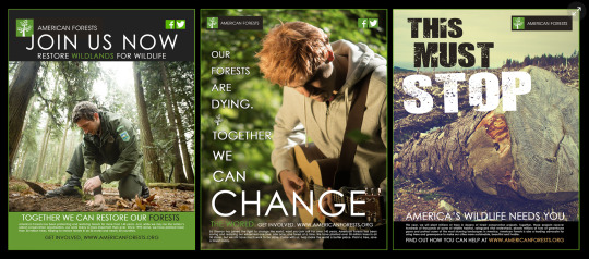
These examples show a finalized version of the ad campaign, utilizing each of these strategies.


References
Felton, G. (2013), Advertising: Concept and Copy (Third Edition), 3rd Edition. W. W. Norton & Company, 20130805. VitalBook file.
O’Grady, J. (2009, February 2). A Designer’s Research Manual: Succeed in Design by Knowing Your Clients and What They Really Need. Rockport Publishers. Retrieved from, http://ce.safaribooksonline.com/book/graphic-design/9781592535576. March 22, 2017
0 notes
Text
Reflection: Brand Development
Need for Experienced Design Directors
The world we live in today is not only highly competitive, but also heavily consumer base driven. As such, the need for experienced design directors to join senior management teams in overseeing and building a brand is essential. The Maturity Model for Design Management, as described by Alina Wheeler, applies to Margo Chase’s relationship with Starbuck’s internal design department in many aspects.
According to Wheeler, The Maturity Model for Design Management consists of Brand builders, Innovators, Strategists, Advisors, and service providers. The internal design department drives company priorities and brand vision, and leads development of brand standards. Brand standards are regularly updated and audited for usability. Brand adherence is measured, these are the Brand builders. The Internal design team collaborates with external agency in brand development, and serves as primary counsel to executive team and clients in developing branding initiatives. The team includes a dedicated brand ambassador role, this is the Innovator tier of the Maturity Model. Next, External agency develops brand standards. Internal design department helps set company priorities and leads efforts based on brand knowledge. Creative directors monitor brand adherence, these are the strategists. Then, The Internal design department designs and executes against brand standards, measures effectiveness, and adds value through best practices, this is the role of the Advisors. Finally, the Internal design department executes brand vision at request of business and against available brand standards. Standards are often outdated or lacking and adherence is informal, these are the service providers (Wheeler, 2012, p. 115) These aspects directly can relate to Chase’s interview about her design firms experience with the Starbucks brand. Chase states, “We're trusting them and they have a great in-house art department. So the trust is not unfounded that they could take our work and actually make great things with it. All of this stuff that's in front of here is things that they made and we did not make” (Chase, 2008). Here Chase is referring to working with Starbucks and their internal art department, which ultimately drives Starbucks brand development. They collaborate with Chase’s team, they external agency in the brand development.
Takeaways
I gained much insight during this course. My three main takeaways were, understanding the difference between a brand and a logo, compiling a competitive analysis, and pitching a visual identity.
The difference between a brand and a logo was probably the biggest eye opener for me. I now understand the importance of creating a whole visual identity, which is also only a small segment of the overall brand development. This is essential for a media designer to understand the differences, so they can work with companies to create successful and sustainable brands, not just nice logos.Compiling a competitive analysis is important as a media designer because this is how we will gain an in-depth insight on the company. We will find the strengths, and amplify them. We will find the weaknesses and work with their executive and design team to minimize or eliminate them. We will also identify the opportunities and threats. When we have a complete understanding of these elements, we can begin creating a comprehensive and successful brand.


Three Georgia Bob’s images are a few quick sketchup ideas for a rebranding effort.
Finally, pitching a visual identity to a company was very insightful and valuable to media designers. I learned how to use a new tool in Keynote. This allowed us to create a visual presentation, complete with voice so the customer can view the information and easily understand the material. We walked a perspective client through the logo development, and how their guiding attributes tie into the logo and brand identity. We placed the logo in several realistic mock ups so the client can see how these will look in a real-world scenario.


References
Wheeler, A. (2013). Designing brand identity: An essential guide for the whole branding team. Hoboken, NJ: John Wiley & Sons, Inc.
Chase, M. (2008, April 9). Style Guides. Retrieved February 28, 2017, from https://www.lynda.com/Design-Documentaries-tutorials/Style-guides/685/38839-4.htmlIn the
0 notes
Text
Reflection: Defining Client Needs
Brand Styles
In the highly competitive field of Media Design, it is important for a designer to create a brand style based on the clients’ unique industry and needs, rather than basing that style on their own personal tastes. Additionally, designers must possess the ability to articulate value when presenting design solutions. This can be difficult sometimes as designers speak in industry-specific language, and when working directly with clients - the majority of who went to business school- they may not only find themselves up against a language barrier but against a difference of aesthetic principles as well (O’Grady, 2009).
Margo Chase is a highly successful, world-renowned designer. In the early days of her career, Chase was known throughout Hollywood for her dark, gothic style. She was the go to designer for horror movie posters such as Bram Stokers Dracula. Early on, this worked well for her firm, she saw initial success and growth, but she did not want to get pigeon holed into a specific style. Chase knew this would eventually limit her client base. In order to really grow her business, she needed show potential clients that she was capable of more than dark gothic styles of art.
To do this, she had to communicate to her clients that she is capable of more than her well known Gothic style. She met with potential clients who knew she was an amazing designer, but were apprehensive about her style as their brands were of a softer subtle look. Chase sat with these clients and demonstrated to them that she can bring success to their business, that she is capable of creating wonderful art of any style. By convincing her clients through demonstrating her versatility, she articulated the value that she and her firm would bring them. Now she was creating style guides for clients’ such as, Polly Pocket. In a recent interview Chase states, “In recent years, I have been able to prove that and here is -- this is about as girly as you can get. These are style guides for Polly Pocket, so they are definitely not Polly the Vampire Slayer” (Chase, 2008).
Takeaways
During this course, I have gained much knowledge of not only designing for client specific needs, but the importance of typography, hierarchy, and contrast. We also learned the importance of sketching out our initial ideas, and then revising them before taking them to the next stage of development. Below are a few rough sketches for three poster designs.

In regard to typography, Ina Saltz states, “Good typography can add tremendous power to your design and your message, whether it is a print- or screen-based project, a still or motion graphic, a 3D or 2D graphic” (Saltz, 2013). In this example we can see that the typography I chose was very specific to the style I was creating. The first poster has very bold text, meant to really pull the viewer into the image. The middle poster was more stylized and scriptish. I wanted to use these typefaces to create a more renaissance feel. The third poster was created with an Art Deco style. Using a font that was common during the 30′s and 40′s really accentuates the Art Deco look I was going for here.

Typography is often the most important aspect in creating a great design for media. It can either immerse, or pull the viewer into the piece, or it can drive the viewer away from the message. Choosing the correct typeface for the individual client need is one of the most important aspects of successful design. In addition, hierarchy is the way type is organized in order to indicate levels of importance to the viewer (Saltz, 2013). When we look at print designs, we will look at the larger text first; this is why it is important to place items such as titles, as larger text. In some cases, we will see pieces of a paragraph pulled out in larger text. The designer wants the viewer to notice this text first. For this design, I created the title text in large bold font, this larger font directs the viewer to this text first.

Finally, designs with high contrast are easily noticed, identified, and read. Saltz states, “Contrasts in style, size, weight, width, color, and position separate information. You have the power to direct your viewers to see what matters most” (2013). In the examples below we can see the use of contrast is evident. There are only two colors. Each poster will successfully bring the viewer to the most important text first. The posters also show good use of hierarchy, were the largest text is noticed first.

With proper use of contrast you can direct the viewer to particular places in your design. Each of these elements of media design are of equal importance. They each must be used properly to ensure the designers’ message is being properly executed. If a designer adheres to these basic principles, they will create successful designs.
References
Chase, M. (2008, April 9). Style Guides. Retrieved from, https://www.lynda.com/Design- Documentaries-tutorials/Style-guides/685/38839-4.html, March 22, 2017
O’Grady, J. (2009, February 2). A Designer’s Research Manual: Succeed in Design by Knowing Your Clients and What They Really Need. Rockport Publishers. Retrieved from, http://ce.safaribooksonline.com/book/graphic-design/9781592535576. March 22, 2017
Saltz, I. (2013, February, 2).Hierarchy and functionality. [Lynda.com online course].Retrieved from, https://www.lynda.com/Typography-tutorials/Hierarchy-functionality/106698/121874-4.html?org=fullsail.edu PXU3. March 22, 2017
0 notes


Text
LinkedIn Link

https://www.linkedin.com/in/christopher-keblitis-5542325b
0 notes


