
canicallthisanartblog
Can I call this an art blog?
62 posts
Don't wanna be here? Send us removal request.
Last Seen Blogs

lefenua
Fenua

alindasposts-blog
Untitled
linkingnightvale
Linking Together Night Vale

sebcheb
Someone that loves Milfs

stonedgeralt
free animal
Note
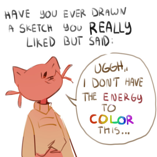
You draw hats so well and im like so amazed by it because every time i try it looks like they're wearing buckets?? how do you draw them?? :o


pringles
49K notes
·
View notes
Photo

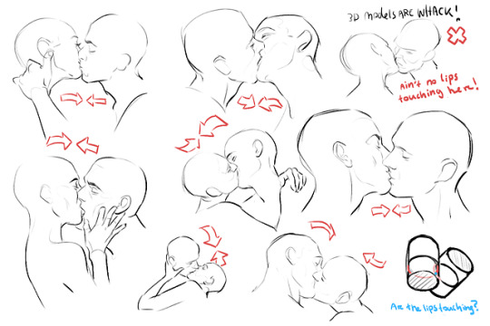
Smooching notes~!
So the people on Twitter seemed to find my notes very useful, So I am sharing them to you guys as well
have fun!
91K notes
·
View notes
Text
Something I try to keep in mind when making art that looks vintage is keeping a limited color pallette. Digital art gives you a very wide, Crisp scope of colors, whereas traditional art-- especially older traditional art-- had a very limited and sometimes dulled use of color.
This is a modern riso ink swatch, but still you find a similar and limited selection of colors to mix with. (Mixing digitally as to emulate the layering of ink riso would be coloring on Multiply, and layering on top of eachother 👉)

If you find some old prints, take a closer look and see if you can tell what colors they used and which ones they layered... a lot of the time you'll find yellow as a base!
Misprints can really reveal what colors were used and where, I love misprints...
Something else I keep in the back of my mind is: how the human eye perceives color on paper vs. a screen. Ink and paint soaks into paper, it bleeds, stains, fades over time, smears, ect... the history of a piece can show in physical wear. What kind of history do you want to emulate? Misprinted? Stained? Kept as clean as possible, but unable to escape the bluing damages of the sun? It's one of my favorite things about making vintage art. Making it imperfect!

You can see the bleed, the wobble of the lines on the rug, the fading, the dirt... beautiful!!
Thinking in terms of traditional-method art while drawing digital can help open avenues to achieving that genuine, vintage look!
49K notes
·
View notes
Text
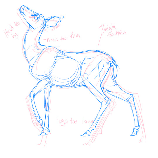
How I Study Anatomy
Everyone says NEVER TRACE!! THAT'S ART THEFT! Ok but we can do a little crime in the name of Learning.
Trace to learn, not to earn.
I like to take my own photos, but you can study whatever you want. Link back to original photos, and don't post copied artwork unless the artist is dead, cool with it, or both.
As always with learning, start every sketch with the intent to throw it away (trash for paper, quitting without saving for digital) This takes the pressure off and lets you make Bad Art, which is very important.
So let's make Bad Art of a Deer
because I happen to have one handy
Start with a photo of your subject in a nice/neutral pose with all four feet visible. (so not like me)
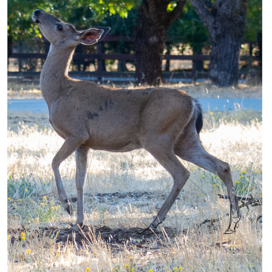
Freehand copy it. Try not to stylize, focusing instead of matching proportions and pose. Don't get too detailed!
It's ok if your art looks terrible and has broken legs. I've drawn LOTS of deer so I have a leg up. Everyone's art sucks in their own eyes and here's where mine went wrong:
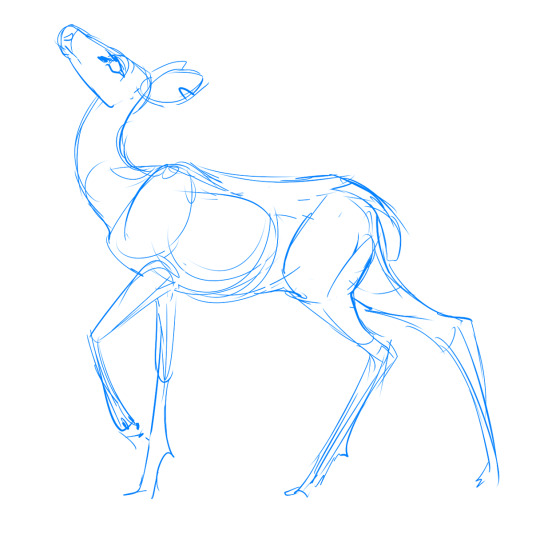
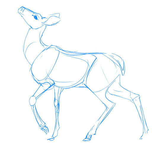
Either lasso-distort (recommended for beginners) or redraw a copy of your first sketch with your reference behind it (scaled to match the main body of your sketch)
Put the original and modified sketches together and compare the differences. Write it down if you want. This shows you where your eyes saw things the wrong size, so you can correct for that next time.
After learning about both deer and yourself, try freehand copying again.
Marvel at your newfound knowledge and skill!
but there's always room for improvement
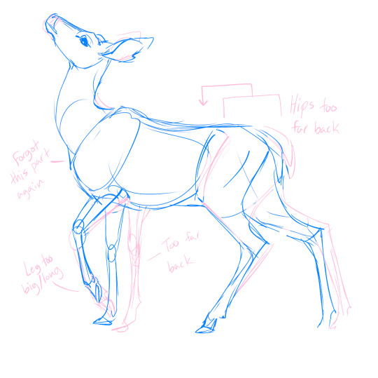
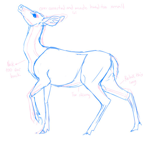
You can stop here and move on to your real drawing, Or do another freehand-fix-compare cycle. I actually overcorrected my "draws heads too big" and veered into "heads too small."

Another note on tracing: Learning HOW to trace is more important than anything you could learn By tracing. Draw the Anatomy, not the outline. In real life, things don't have outlines, they have bones.
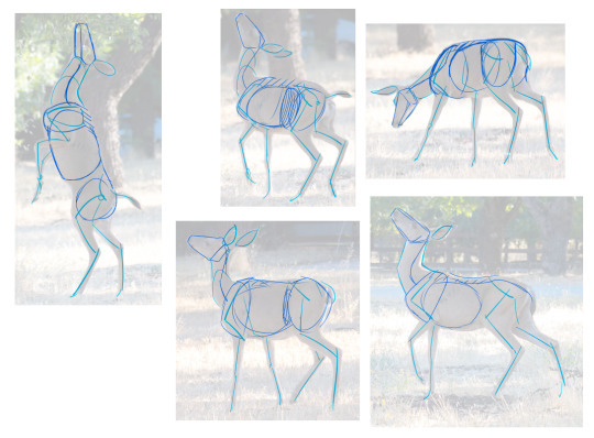
These are from the same shoot which is extra useful for consistency. The lines are minimal and follow where the animals joints are, and only important parts are drawn.
You won't know what Important Parts means right off the bat, which is where in-depth study comes in. You need to do learn the hard parts to do the easy parts right.
Next up: how to study bones and muscles.
30K notes
·
View notes
Text
THE ONLINE ARTIST HANDBOOK
So I think a lot of us are struggling with being an online artist these days, with the navigation of various socials being increasingly obscure and even perilous at times
It’s why I had an idea: The Online Artist Handbook
What is the Online Artist Handbook ?
It’s a collaborative google doc where all artists all over various social media websites can contribute their knowledge of said socials to help everyone thrive ! This includes becoming more familiar with various customs and ways to post as a part of building your online presence, and things to watch out for.
The document is completely free and open-source: everyone can use it, edit it, cite it, download it, whatever !
How does it work ?
There are two documents: one document is used for submitting notes about various social media platforms, and a second one is a read-only document where all the information is properly written out to ensure clarity and ease of reading.
I’d like to contribute !
That’s so awesome ! Thank you so much ! You can contribute to the document yourself here: [Google doc link]. The clean version of the document can be found here: [Google doc second link]
Remember to add yourself to the contributors section to be credited for your help !
Let’s go Tumblr ! Let’s create a community artist resource !
2K notes
·
View notes
Text
youtube
not giving medical advice nor am i a medical professional (especially with hand stuff, theres a lot of different sources that could be causing pain that aren't actually your carpal tunnel), BUT, if you experience pain around your wrist/between the mounds on your palm, i really like this self massage
(again though, be careful + listen to your body + if you do a stretch or exercise that hurts, stop doing it!)
73 notes
·
View notes
Photo


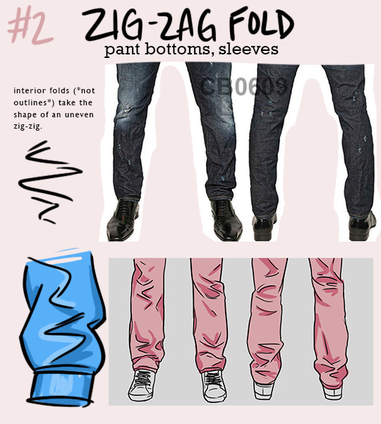


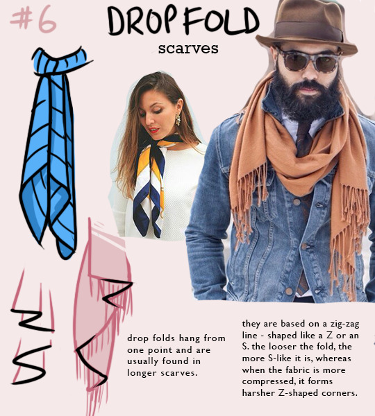
NOTE: one type of fold will rarely appear on its own - they interact with each other quite a bit! for example, spiral folds might define the outline of a pant leg, while the interior folds might be zig-zag folds.
i’m trying to re-learn how to draw clothing, so i made this little guide to the most common shapes of folds that appear. hope it helps someone else too!
64K notes
·
View notes
Text
✨USEFUL ART RESOURCES✨
I've been sharing some stuff I use on tt and ig so here's a compilation of it for y'all too
all except for two of these are totally free btw
happy arting 🤙🤙
4K notes
·
View notes
Text
i hate that every time i look for color studies and tips to improve my art and make it more dynamic and interesting all that comes up are rudimentary explanations of the color wheel that explain it to me like im in 1st grade and just now discovering my primary colors
145K notes
·
View notes
Photo


no one asked for this but anyway. i made some notes on how to make a likeness, in this case specifically tom hardy. if you care about drawing tom hardy. but there’s no law saying your eddie brock has to look like tom hardy, so don’t worry. like I said, this is also just stuff that can help you if you want to learn to draw someone specific.
744 notes
·
View notes
Text
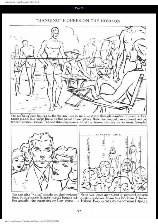
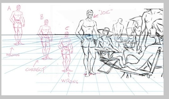
I was talking shop with an artist in the studio today and I shared this page from Andrew Loomis, which might be the single most valuable page I've ever encountered in a how-to-draw book. I can't BEGIN to say how many hours this "hanging figures on the horizon" technique has saved me.
(EDIT: Over on another site, someone said they didn’t understand how to read this pic, so maybe adding a second pic and some explanation will help?)
Let’s say I want to draw “Joe” standing further back. I need to know where to place him so he looks like he's the same height, even though he's further away. If I get it wrong, he’ll look giant or tiny.
I can do that by making sure that the horizon cuts thru Joe AT THE SAME HEIGHT, no matter how close or far away he is. In the original picture, it cuts thru the original Joe at the waist.
So let’s look at three different Joes.
A: Wrong. Horizon goes thru his knees. In this context, he’s a giant.
B: Correct. Horizon goes thru his waist, just like the original Joe!
C: Wrong. Horizon goes thru his head. In this context, he’s tiny.
7K notes
·
View notes
Photo

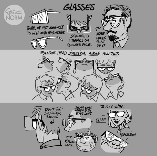
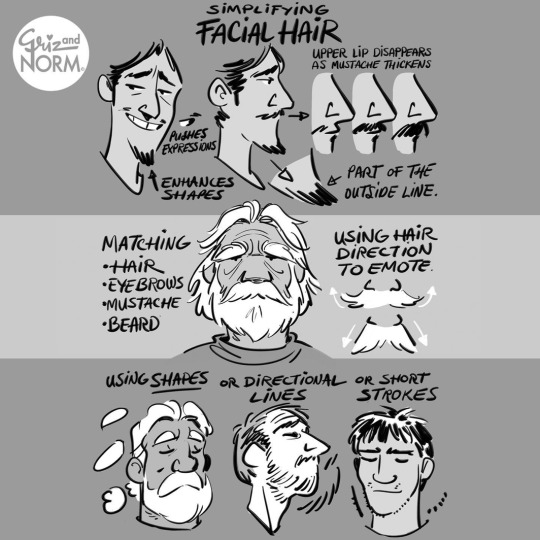
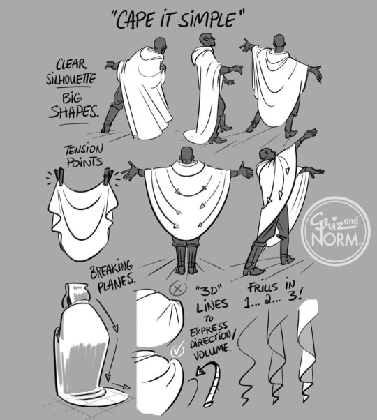

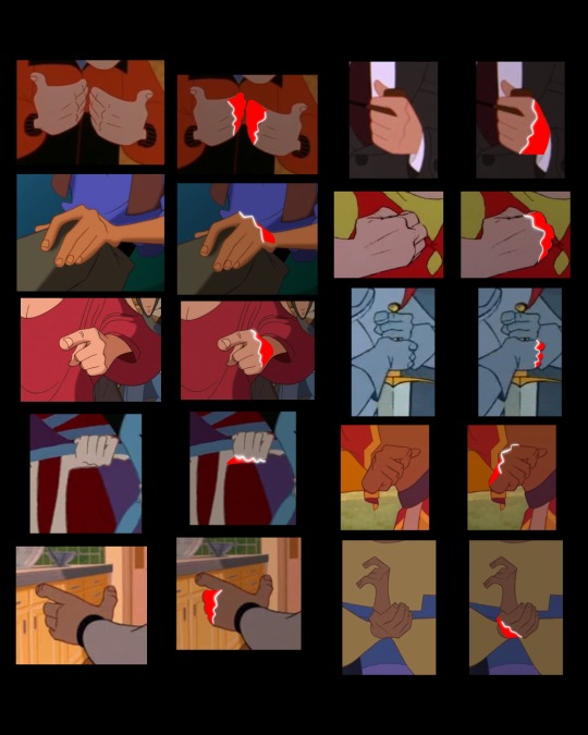
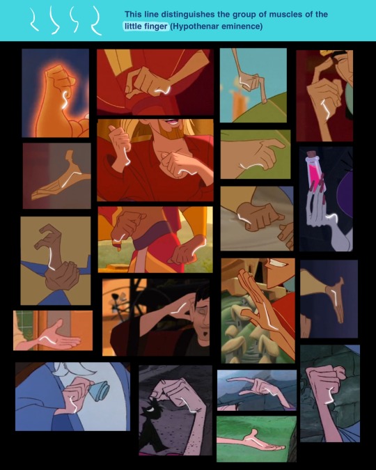
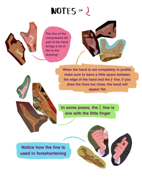
Drawing tips by Disney artists Griz and Norm Lemay
30K notes
·
View notes

Text
Hey guys, you know about the Same Energy website right? has someone made a post about that? Cuz otherwise im gonna sing its praises to high heaven for its artistic references
53K notes
·
View notes
Text
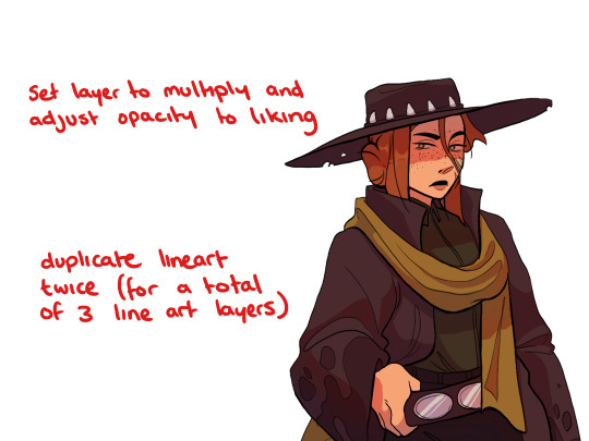
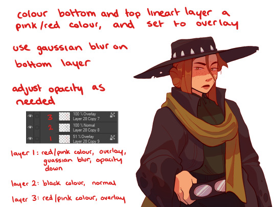
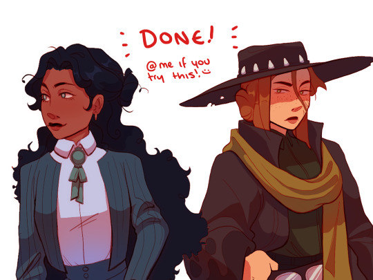
How I do my Lineart (new tutorial? yay?)


Babe wakeup mossy dropped a new tutorial after 9873928739238 years anyway, how i do my linearts. hope this helps! also as usual dont be afraid to ask anything (relating to art ofc) and i'll help explaining however i can
4K notes
·
View notes
Photo

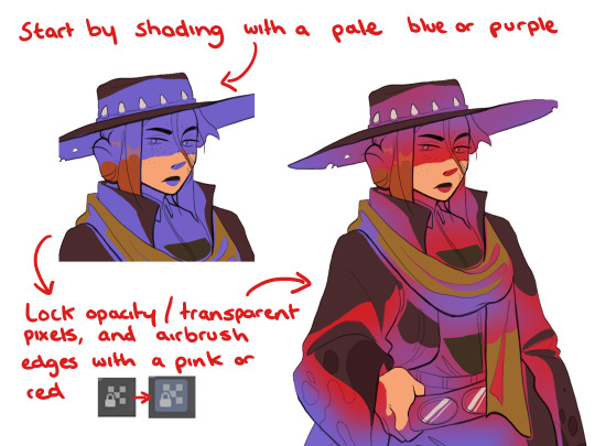
Short thread on how to do minimal work on shading and line art that makes your art 1000 times better
sorry if this is confusing, ask and I’ll try to clarify
28K notes
·
View notes