
Don't wanna be here? Send us removal request.
Statistics
We looked inside some of the posts by cava102 and here's what we found interesting.
Average Info
Notes Per Post
1
Likes Per Post
1
Reblog Per Post
0
Reply Per Post
0
Time Between Posts
2 months
Number of Posts By Type
Text
15
Photo
2
Last Seen Tumblr Blogs


Fun Fact
Tumblr’s reach among the 26-to-35-year-olds in the US is 11%.


Text
Week 1-3
BRAINSTORM
Using 3d printed type to make a silicon mould of the words ‘Squish me’ encouraging a tactile response
Misesives A-Z into a form interpreted through ex
Naval Brodies blur
Meta Eric speigalman
Making the words out of silicon instead of using the silicon to mould something else
0 notes
Text
rEfLecTiOn
For me the CAVA103/104 Typography session was eye opening and increadably informative, i have learned alot about Typography (a major skill i will need to be a graphic designer). whilest I Initially knew that text was an integral part of a design, i did not know to what extent, at the vastness of everything to consider within Type itself.
Learning the craft of Typography is more vital to my practice Than i initially thought.
the ransom noteactivity We completed helped me see typography for a living breathing thing, no different from any artwork or performance.The way this was comunicated so well i think was due to the nature of the work being analogue and tactile realy widened my perspective in letterform arrangement, i also found myself weighing visual images equally with text moreso than i did before.
I found The digital Typography challenging at first but found that with more confidence in myself that i found the program to be more fluid and responsive to the tasks i wanted it to do. I struggled somewhat with Contextualising the overall composition to correlate with the content in the text, something i thought should be incorporated into each design.
The Monogram exersizes i found to be the most exciting as i felt i reallly opened up creatively and found that my use of type in designs had increased to a point where i didnt need to use my own strokes as much to alter the design aestheitic so much as tweek Composition to suit my Monogram. For my mnogram i used B and H aswell as a D (design) i feel by using the Gillsans D i created a contemporary allusion to the coat of arms detailed in the lectures while pretaining the aesthetic of the design to mirror the software used such as adobe suite, ontop of adding detailed flaring to tie it together to represent myself as an aspiring graphic designer who is seeking a corporate career in marketing.
Overal i think this rotation taught me a monumental amount of information that is critical to my practice in such a little span of 3 weeks. And i feel this has layed a foundation to hopefully become a greatly skilled Graphic designer being Typographicly litterate.
0 notes
Text
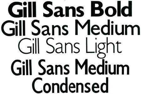
Created By Eric Gill an artist spaning disciplines from wood-engraving to sculpture and calligraphy. During the 1920s Gill focused on type design whereby he created Gill Sans in 1928. Gill Sans was issued by Monotype from 1928 to 1930.
Gill Sans’ inspirations can be traced to the typeface designed by Gill’s teacher, Edward Johnston, in comparison Gill´s alphabet is more classical and Proportionate.
Gill Sans is characterised by its signature flared capital R and eyeglass lowercase g. The Typeface (according to Typedia) “is a humanist sans serif with some geometric touches in its structures.” Its design is also inherantly British, displayng features such as Legiblity aswell as being sleek and modern while cheerfully idiosyncratic.
Gill Sans lighter weights are designed to fit well with text, while the bolder weights make for clear and consise display typography.
Originally Gill Sans was an uppercase set. The lowercase characters were added in some years later as it became more relavent. Further weights and variations of Gill Sans were also added Incramentally.

Gill Sans now represents one of the most widely used typefaces and is a part of one of the biggest Typeface families with a Pro version including 17 original sets plus new sets. This extesive typeface is extended in many glyph sets.
My Fonts. stattes that “Gill Sans has reached this level of near-ubiquity” beacause of an imensely powerful and underrated reason: because it is an exceptionally distinctive design that can lead to a near limitless potential range of uses. another main reason for the enduring success of the design is that it is based on Roman character shapes and proportions which is dramatically different to any other sans serif font to date.
Gill also worked a sublte warmth and humanity into his design that emulates his own personality, which is partially why each weight retains a distinct personality of its own.
This toolkit’s wide range of styles include the standards such as Light:which is open and elegant, Regular thats flat-bottomed d’s, flat-topped p’s and q’s and triangular-topped t’s create a compact and muscular aestheitc.
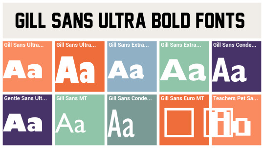
Gills Bold styles tend to echo the soft light style while extra bold and ultra bold have vivid personalities of their own, Often these are used in Newspapers like the Sunday telegraph and the daily as eye-catching headlines.
References:
Community, Typedi, Gill Sanns
http://typedia.com/explore/typeface/gill-sans/
Monotype, My.Fonts. 2017.
https://www.myfonts.com/fonts/mti/gill-sans/
Lou, Freya. The History and Characteristics of the Gill Sans Typeface 2017.
https://owlcation.com/humanities/gill-sans-typeface
0 notes
Text

is a font that was designed by Adrian Frutiger (1988), used as a muti purpose “sans-serif geometric typeface”, and has been influenced by fonts like Futura and Erbar.
Avenir has distinct flat top vertices, larger height and aperture. These features are more evedent when compared to Futura’s curved tails on certain letters.
Avenir once only offered three weights (regular, italic and bold). It wasnt until the font became so widely used that it was altered to be a six weight typeface.
The Fonts origins were plagued with issues due to the fact that the font was introduced at a time when computers werentt widely used. the issues were with the digital display of computers at the time and the memory needed to store a font as explaied by Murray. M.
these issues were eventually fixed through collaboration between Frutiger and Akira Kobayashi in reworking the font. After the issue ajustment the name was changed ‘Avenir Next’. the designers wanted to “reinterpret the geometric sans serif... of the 20th century in a typeface that... aesthetics of the 21st century.” similarly to its insporation Font ‘futura’ (which translates to ‘future’) Avenir Was designed to be an insight into the modern future.
Most commonly used in branding and promotional material, specificly relating to social trends or technological developments. The Font itself was designed to relate healivly towards the future, and gives the allusion of brand or business is enterprises being pro future and having foresight, seeming more reliable. LG uses Avenir in its branding and promotional material towards its Electronics. Beconing the need for a font that mirrors the constantly developing and very modern ideology for technology.
According to Fonts.com, Avenir’s type family since has expanded including more weight changes to the font, accomodating more uses for the font.
References:
Fonts.com n.d., Avenir, Fonts.com,
2017. https://www.fonts.com/font/linotype/avenir/story
Murray, M 2014, Avenir, morganlmurrayims224researchtopic.wordpress.com, weblog https://morganlmurrayims224researchtopic.wordpress.com/2014/06/19/avenir/
Lino Type, Avenir Fonts,
https://www.linotype.com/1116/avenir.html
Ayne Greave, Avenir Typeface,
http://ayneegreave.altervista.org/avenir-1988-adrian-frutiger/
1 note
·
View note
Photo

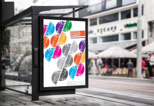
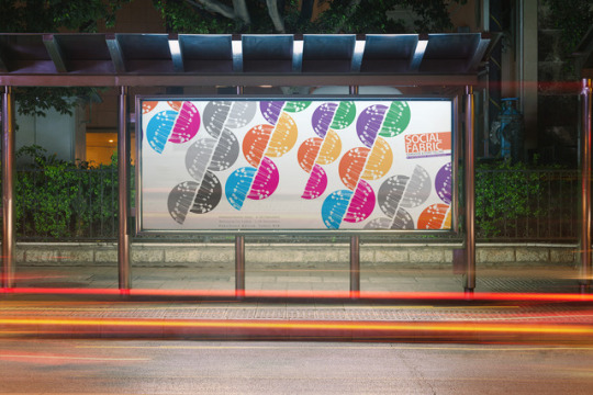
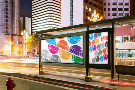
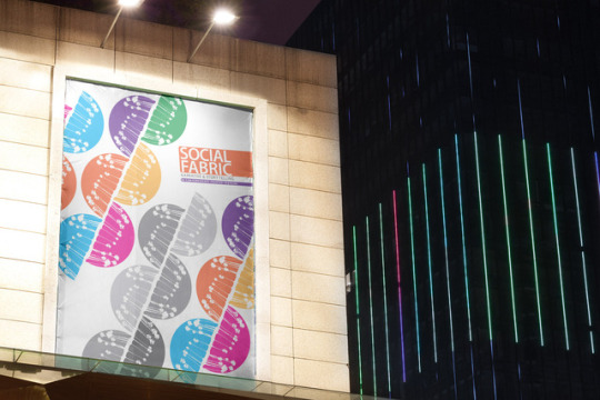
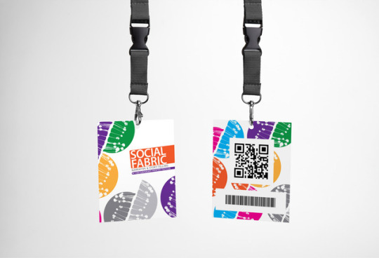
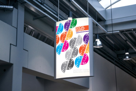
Collateral Advertisement Mockups.
Plus Dynamic Landscape Design.
0 notes
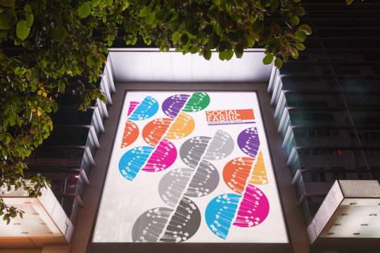
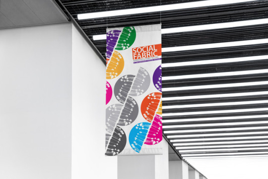
Photo
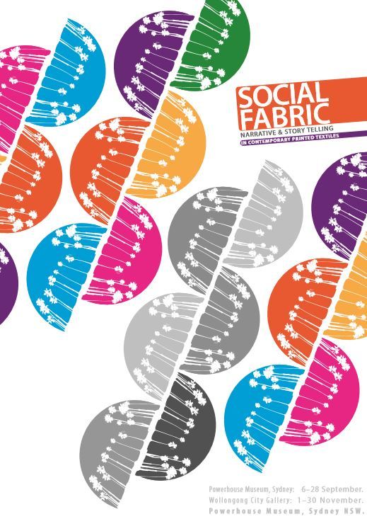
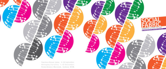
Final Design Reflective statement.
As a whole I think the design Was implemented well. I have rationalized my developments within the previous blog statements in the development of the design. But I feel as a whole the design Ties the Text in nicely. I clustered the text inwards and then Used colored shapes behind the text to Tie The text into the color scheme of the design Aswell as the layout.
I feel competent in that the design emulates the aspects that I was trying to achieve in the design, focusing on DNA as a social fabric, with vibrant inviting Colours that draw the viewers eye, and catches a glimpse of the familiar (text book-esk layout) the design I feel is a great opener to the exhibition, it is sleek and sophisticated without being overpowering and domineering. The work itself is an amalgamation of experimentation development and research that fits the brief In appealing to the general Public aswell as scholarly art Goers .
The design also has Undertones relating to Racial Equality, In that it does not matter what colour each of the parts of the DNA strand is within the design, it is the collection as a whole that makes up The Image. Implying the same for Society and Commenting on the Divercity of Social Fabric.
I had trouble with the Text being Dead Straight or on a complimentary angle to the design as I felt either were too sharp and took away from the design. After lots of experimenting I found that offsetting the text slightly gave it a softer approach in the design and also tied the form into the design itself.
I found I wanted the dates and Specific areas of the exhibition to be A light grey, just enough to be seen when needed but not to take away from the design. But in doing so I saw the color of the design Make the Gray Text disappear.
I then greyscale’d the middle pattern to tie the grey in to the design which in turn made the Light grey text at the bottom right corner More accessible. I used the natural white space within the design to insert text that could be easily found and read with the design being a conduit for a reading with that continues down the design and into the dates info at the bottom right.
I feel like through this process and workshop I learned a lot about being self critical, and being able to give myself self constructive criticism from an objective standing. I found working with text a lot easier after this workshop and I have learned how to tie patterns, colors and texts all into one design, as not to take away from each element.
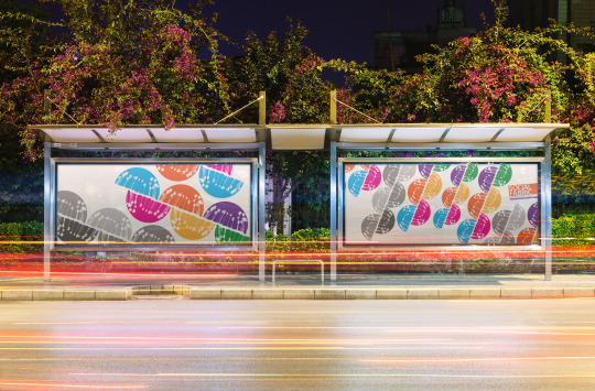
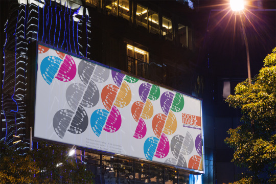
Collateral advertising I feel could be used with this design in the development of the Exhibition. It could be on Pamphlets when entering the Exhibition. it could be used on banners outside the Center it is exhibited on. It could be printed on the side of busses around the area Aswell as used in key card accesses to the facilities within the exhibition.
It also could be used for Advertising Merchandise such as A shop front, billboards and key Cards for the exhibition, Bus stop adverts, posters, exhibition Banners, lit signs and many more. example of the shop front below...
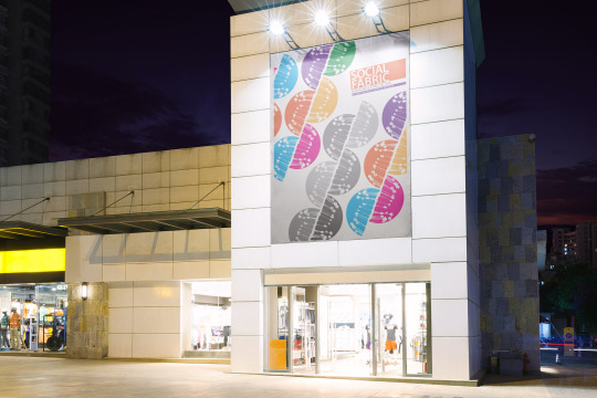
I feel like the design could be used on many platforms to advertise the Exhibition Effectively and I’m very glad that I have this design to add to my Portfolio for any Potential employees.
0 notes
Text
Methods of Printing
Hand Block Printing engrave Copperplate Printing perceptible Printing Stencil printing Roller, Cylinder, machine printing Screen Printing Digital textile printing
0 notes
Text
Brief History Of Textiles
Was Known within Europe through the Islamic world Around the 12th Century and was distributed as goods in trade for high prices. The Dyes used in Europe at the time tended to liquefy causing bleeding. This meant that it could not be used for repeat printed Patterns. Large Prints were used as Wall hangings to declare a symbol of wealth or social status. And thus did not need washing. When paper Technology was Implemented, similar printing methods where taken to create woodcut prints. The first signs of This Textiles printing dates back To ancient Incas of Peru and in Chile and with the Aztecs of Mexico. It is impossible to accurately date such methods as each culture did not keep Written documentation.
0 notes